Purpose
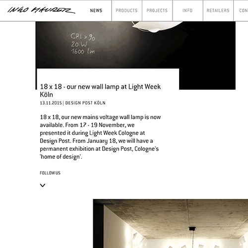
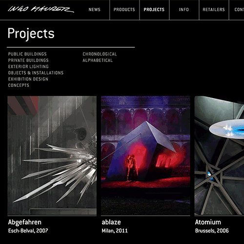
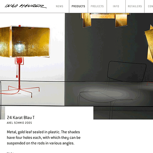
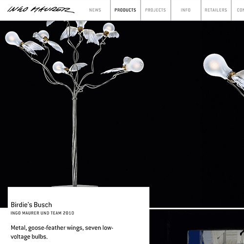
Their website, https://www.ingo-maurer.com/en/, is visually captivating, solidifies their design principles and evoke a sense of wonder and magic the same way with their light products. The website sells itself as a magical, experimental, quirky, and modern playground for lighting. They are serious in their concepts, but are fiercely fun and have a lot of work.
Ingo Maurer successfully brought the nostalgia and surprise of their products on to their website. They are very strategic in creating a visual layout that is contemporary and not so basic. By using a simple scroll down and a menu on top, they were able push and incorporate elements about themselves in a very subtle and effective way. Their website places images and text seemingly out of random order, but it works effectively. Information provided is short and to the point. Their images are left mostly unexplained to allow the work to speak for itself. The interesting thing about their website it’s very professionally put together but the simple tactics that create magic, makes potential clients and consumers feel intimate with the website.
Their Voice
The lighting design company is confident, bold, and fun. They aren't afraid of trying new things and believing in magic at the same time. They are:
- new
- mysterious
- exciting
- quirky
- modern
- professional
- delightful
Tone
Their main website where they present themselves and their products and projects is like presenting finals in art college. It has spirit, concepts, magic, and professionalism. Each item is dramatized and made equally as important as the other products. Ingo Maurer shopping page is less dramatic, serious, and magical. It’s very simplified for consumers to shop with ease without having to think about the complicated reasoning, concept and design behind each lighting product.
Lighting Brand
They want to share their wonderful crafts of light. They want to not only create products but start projects and face challenges that prove to be inspiring ands invigorating. Ingo and his team provide light installations and objects that are pleasant and fascinating. Through these ideals, they project and reflect their brand in the same manner.
Personas
Clark
He's a BFA product design student at Parsons and has an intense lighting project for his studio class. He has been faced with the challenge to create a lighting fixture that offers a new insight and adds to the history of lighting. Tough. At the initial first phase of the project is research. He is looking into what designers are inspired by and creating. Maybe he’ll get a clue or at least inspiration from Ingo Maurer’s website to develop concepts. He is amazed by the simplicity and yet fierce website. He finds a lot of information on where to visit the showrooms and the process behind the lamps. He then sends the website link to many of his product design friends and professors. He constantly re-visits the site for inspiration.
Claire
A high-end successful CEO of yada yada famous clothing business, is looking for a new lamp to suit her new high-rise apartment. She herself is an art lover and is into modern but unique furnishings. She asked her friend, Julie, about any special lighting showrooms to visit and explore different lighting options. She finds out about Ingo Maurer and visits their website and is intrigued by their expansive lighting options. She loves the website and how it presents information. And she admits she has never seen any lighting products like theirs, but feels the products are too quirky and not modern enough for her taste.
Claudio from Showroom 53
A very new and experimental contemporary art gallery, Showroom 53, is interested in creating a mesmerizing exhibit that will put them on the map. One of the gallery owners, Claudio, has heard of Igno Maurer and searches their site to find information about their projects. Intrigued and excited by the prospect of working with the lighting brand, Claudio presents the idea to the gallery. Through the website, Igno Maurer can be easily contacted and is very helpful. The gallery and the lighting brand becomes very close and remain good friends.
Wireframe
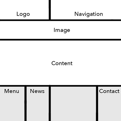
Copy Deck
Title:Product
Header 1: Bibibibi
Header 2: Bibibibi
Sub-header 1: 1INGO MAURER 1982
Header 3: Porcelain, metal, plastic. Adjustable reflector.
Follow Us Link
Body:Ingo Maurer designed the Bibibibi originally as a wedding present for friends. The legs came from a plastic Stork, which he had seen at Woolworths. The birds were sold out, but only a pair of legs without torso was left. The sales person did not want to sell the incomplete product, but we see here how the story ends. The playful new table lamp was very well received, and in the beginning was made as a limited and numbered series. Bibibibi soon after became a full member of the collection and has been available for over 30 years.
The white porcelain plate reflects a soft light that is glare-free, and can function shelf for small but important objects.
Footer: Bibibibi was designed specifically for matte light bulbs. From our current stock we still deliver with a 60 W matte light bulb. As an alternative, we recommend an LED retrofit lamp from Philips (see above).
Competition
Ingo Maurer’s website is very different and unique in their website design against many of their competitors. Other lighting brands like Flos or Blackbody are very modern and updated. They are unique in their own taste and are doing something completely different to Ingo Maurer. Flos is very direct, sensible, and simple. It works well for who they are as a brand.
Ingo Maurer website, of course, reflects they brand and their products so well. They are in a very good place for their site, but they always can push their brand, image, and look even further. here
