Developing the Idea
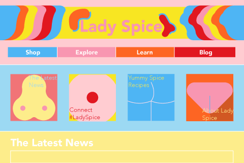
Lady Spice is a new line of “naughty” genitalia inspired pepper grinders for young, sexually active and cooking fanatic women. The kinky, fun and novelty series, comes in four different shapes and colors inspired by boobs and pee-pees. Lady Spice is a great product to for a platform that is fun, modern, quirky, and exciting.
On the website young women can find product information, which retailers to shop for the series, and even get info on sex-ed. The intent of the website is to create a playful and inviting atmosphere that celebrates curiosity and exploration in the hearts and pants of the young by introducing the Lady Spice series.
Discovery and Research
I visited different websites to look at how retailers marketed pepper grinders versus how sex shops marketed vibrators and dildos. Maybe I could find inspiration or see differences of two completely different markets and combine different aspects for the Lady Spice website. All the websites had a couple of things in common: organization; clarity; and ease. None of the websites really interacted, created an experience or formed a relationship for the user and the product. The design was set up to be: product; product information; buy. With the Lady Spice website, it will hopefully create a bridge that makes users see more than just a product.
Williams Sonoma
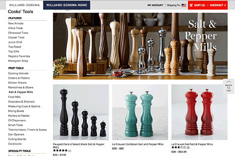
Within the big bubble of Williams Sonoma , there is a pepper mills category. The category contains many different brands of pepper mills from OXO, Le Creuset, Peugeot, and even Williams Sonoma’s own brand. They did a good job combining different brands and looks into a very clean, organized, and effortless shopping experience. The website doesn’t really create a story with users. It just presents information and products very clean.
Peugeot
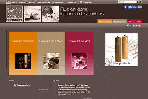
Peugeot feels and looks “old-fashioned.” They created their website to resemble the craftsmanship in their products. But Peugeot is simply overloading information with a very simple and basic website. The site seems very stubborn and hard-headed. It doesn’t flow simply effortless or clean like the other websites.
Babeland
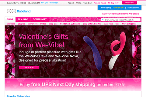
Babeland is highly reflective of the products they sell. It does pack a bit too much information, but the website in general is very helpful. They created a model that simply is fun and modern. Navigating the site is easy and it feels comfortable for users to shop for sex toys. They present the sex toys in a very un-shameful or embarrassing way.
Spencers
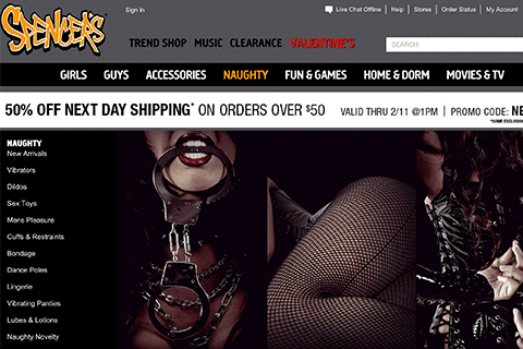
Spencers is a very stark contrast to Williams Sonoma, Peugeot, and Babeland. It is dark and feels underground. The product is simply put out but it doesn’t do anything more. It doesn’t connect or create a connection with users to the website. It in a way shames users for buying products. The website is so focused on their own image, it doesn't convey the importance of the products.
Target Your Audience
The audience I am targeting with this website are young users of the Lady Spice series.
Lady Spice is targeting young women between 18 and 26 who are curious, adventurous, kinky, and fun. The series is meant to be a novelty, a fun and quirky pepper mill. It’s the pepper mill you use to strike up laughter and fun conversations when you invite the crew over for dinner. The website continues this livelihood and spirit by presenting visual information quickly and easily. The website provides the information about the series, but it does more than that. It initiates fun, interesting and informal conversation about sex and food. It creates a community of these specific young and kinky women.
When these women go on Lady Spice, they are looking for more than just product information, retail and blah. They are looking for stories, to connect with others, to learn, to join a community, and to talk without fear. They are looking for fun. They are looking for inspiration and having a voice that is not so easily allowed in society.
Inspiration
Wireframe
Illustrator Comp
