Website Style Guide
 Jennifer Xiao
 Jennifer Xiao


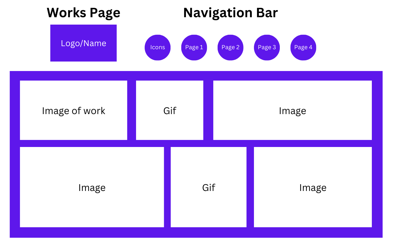
Works Pages
Title: Jennifer Xiao
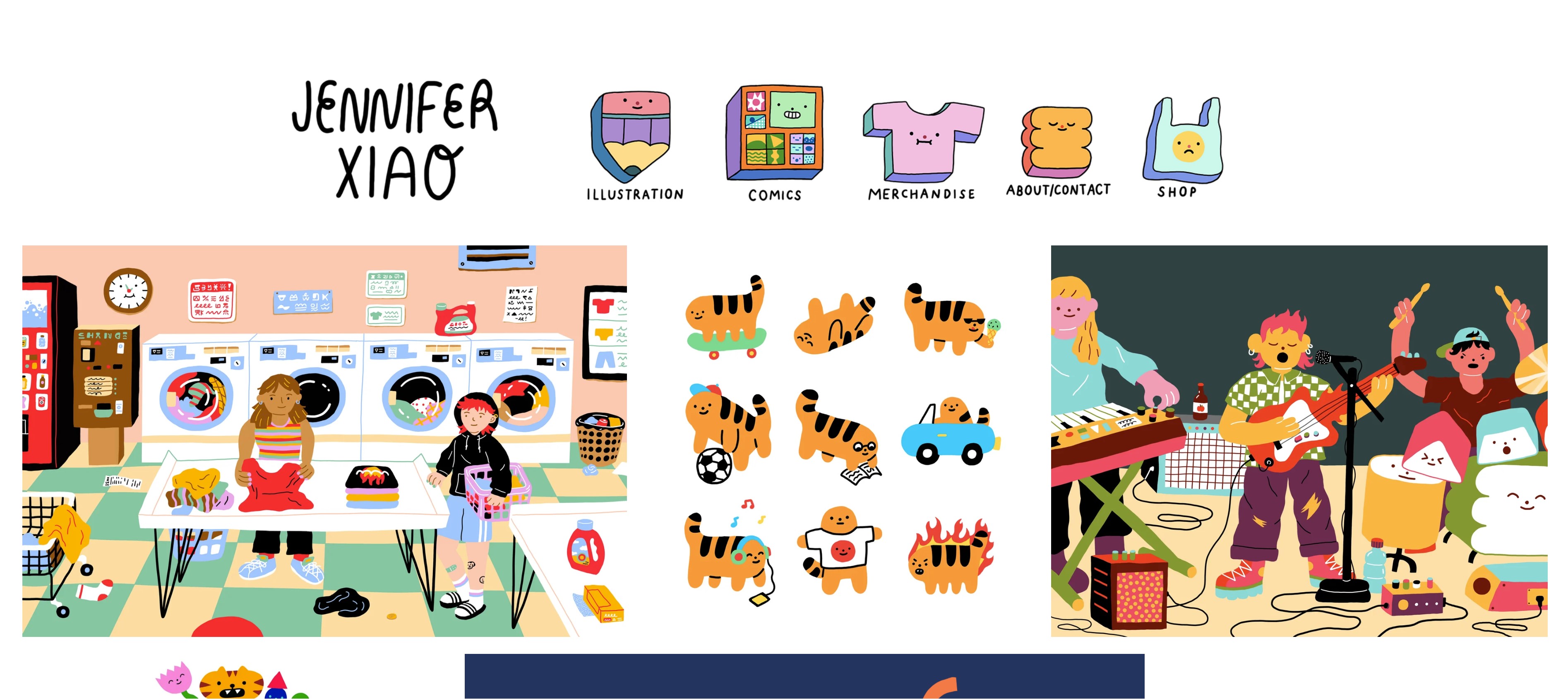
Heading: Illustration
Body[grid arrangement]:
Caption: Laundry Day, Personal illustration
Links/Footer:
About/Contact Page
Title: Jennifer Xiao
Heading: About/contact
Body:
Text: Jennifer Xiao is an extremely talented, funny, cool, smart, professional, hardworking, humble, and award-winning freelance illustrator. She also likes to write, and sometimes this writing is paired with drawings to make comics and cartoons.
Let's work together (in exchange for fame or fortune, preferably both)!
jenniferxiao0@gmail.com
Select Clients (yes, I have the Corporate seal of approval):The New York Times, Tumblr, New Yorker, It's Nice That, Dropbox, Converse
Links/Footer:
Xiao’s website stacks up well against the competition given her commercial success and large social media followings. That success can be attributed to her simplistic yet unique clean website design that immediately shows the viewer her work. The distinctive aspects of her website are the interactive navigation buttons illustrated by her and the incorporation of GIFs alongside still illustrations. The site is colorful, inviting, and user-friendly, which all contribute to Xiao’s illustrative style/brand. But, when looking at the competition there could be a more clear way to contact Xiao like adding an email address underneath the logo.