Develop Your Idea
I want to simultaneously show my work in a clear way while also having a fun interactive personalized portfolio that shows users my creative style. I basically want the experience on the website to mimic the style of my work.
Discovery and Research
I mostly gathered illustrators I liked and researched their various websites until I found different aspects to serve as inspiration for my site.
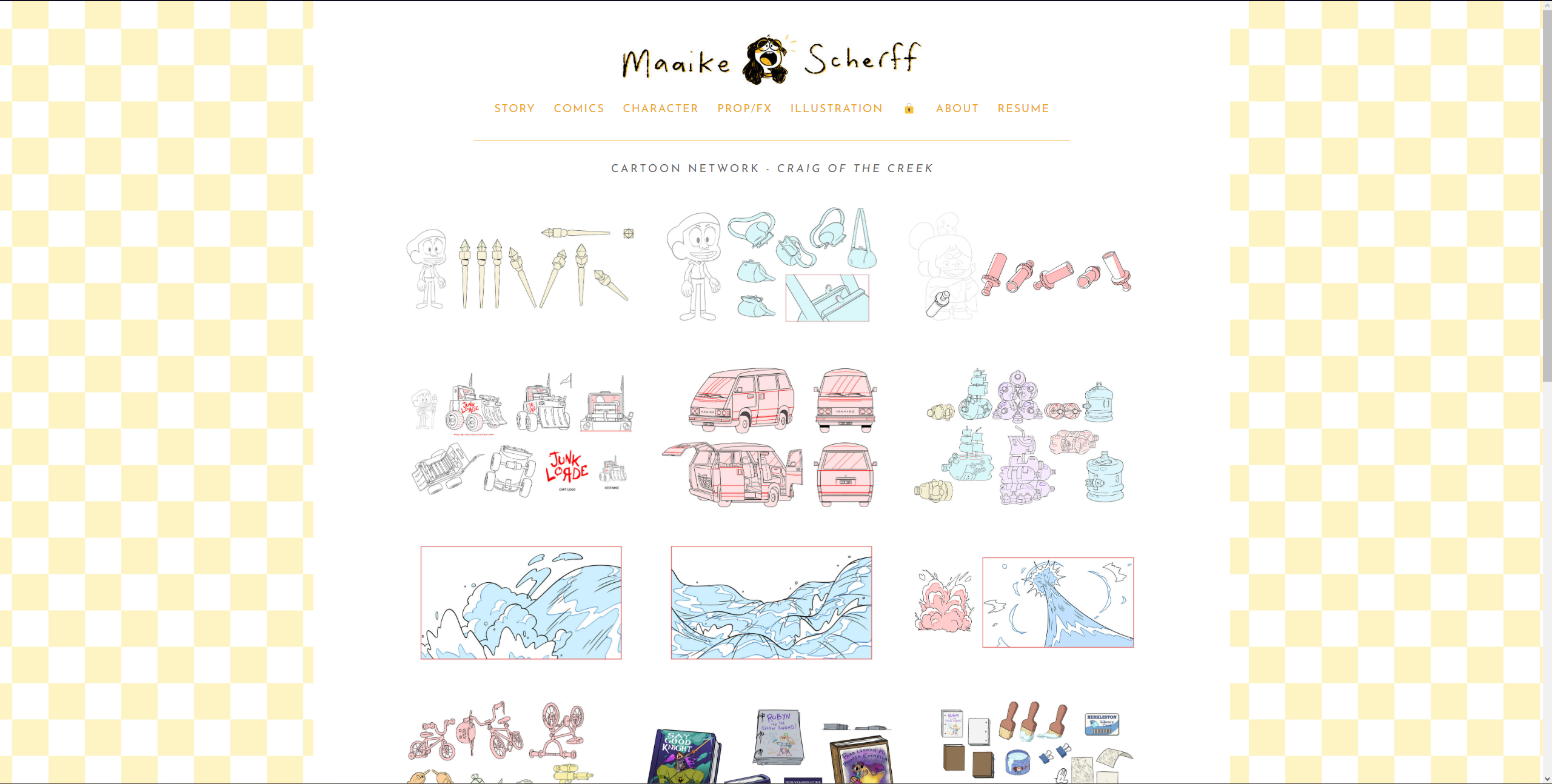
Maaike Scherff: I like how scherff’s work is displayed in a very satisfying grid with images that become larger and turn into a slide show when you click on them
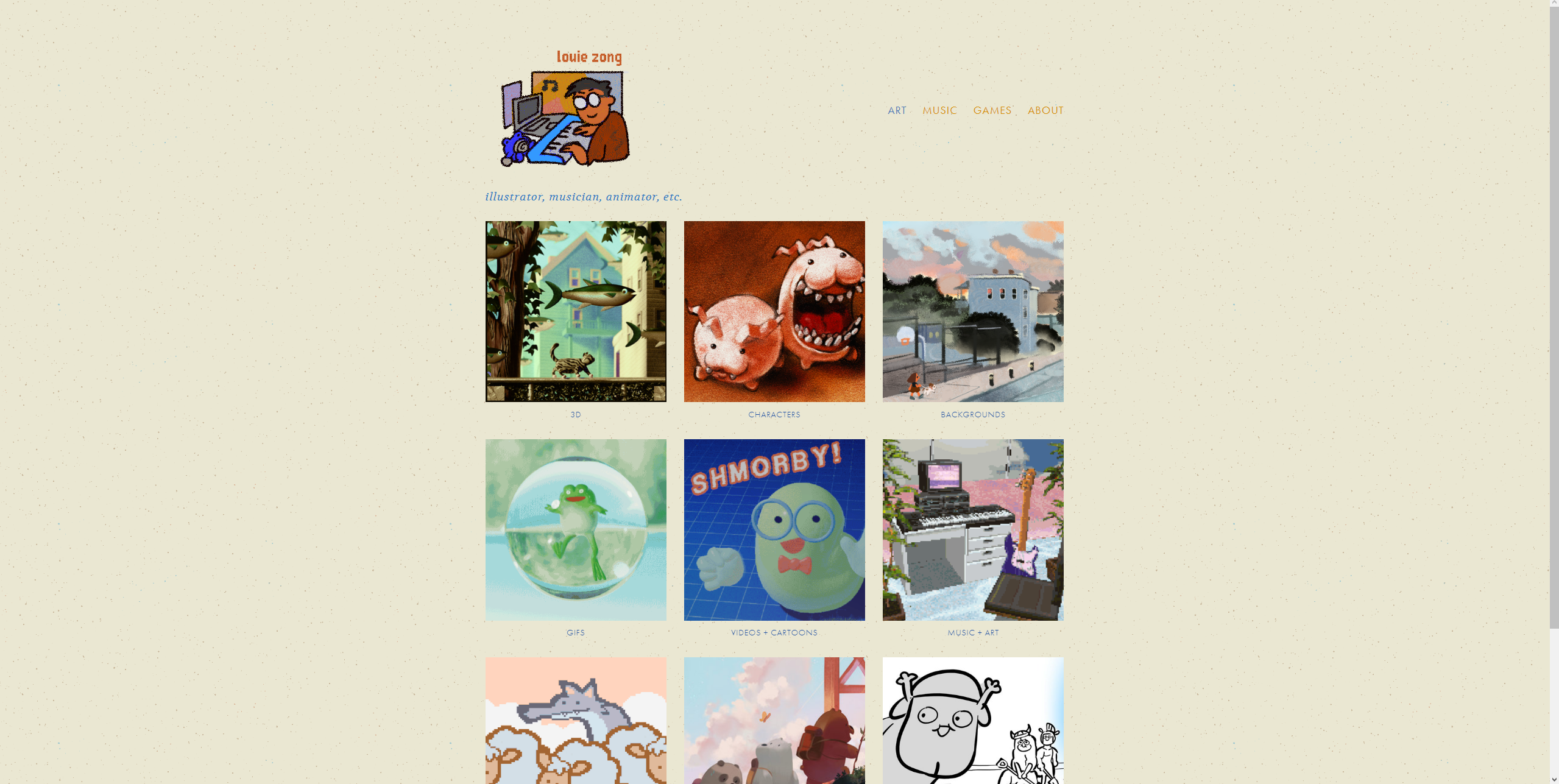
Louis Zong: Zong’s site has a cool sketchy feel and I like the design of his title logo. I also want to incorporate the clicking of the logo leading back to the home page.
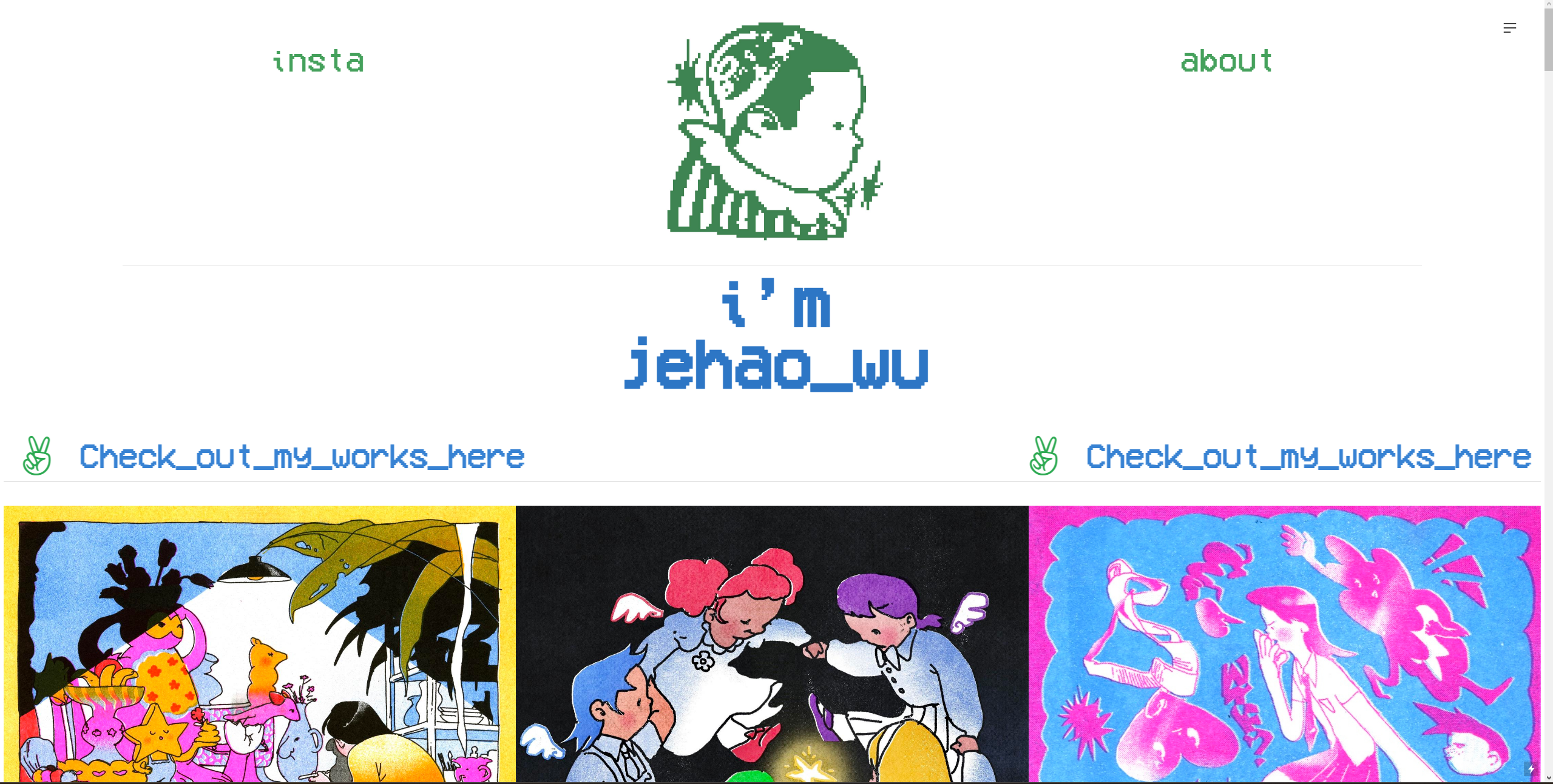
Jehao Wu: I really love the pixel art aesthetic and the scrolling banner with a fun message. The logo is also really aesthetically pleasing.
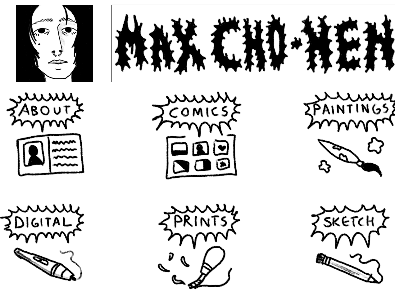
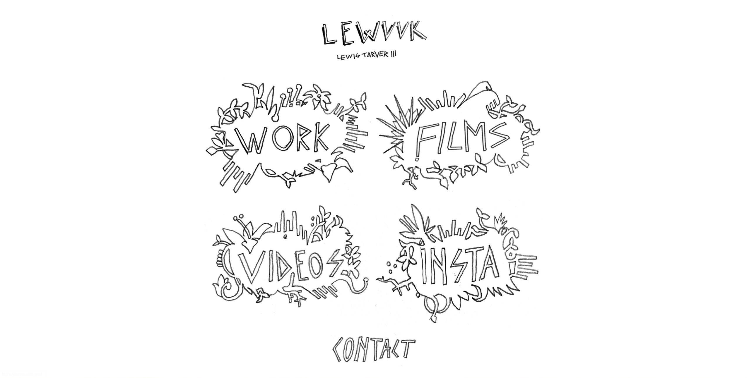
Lewis Tarver: Lewis’ site inspires me user design wise because of how unique the buttons are to get to various pages. The buttons are all clearly hand drawn and give the website an interesting interactive element without being too complex.
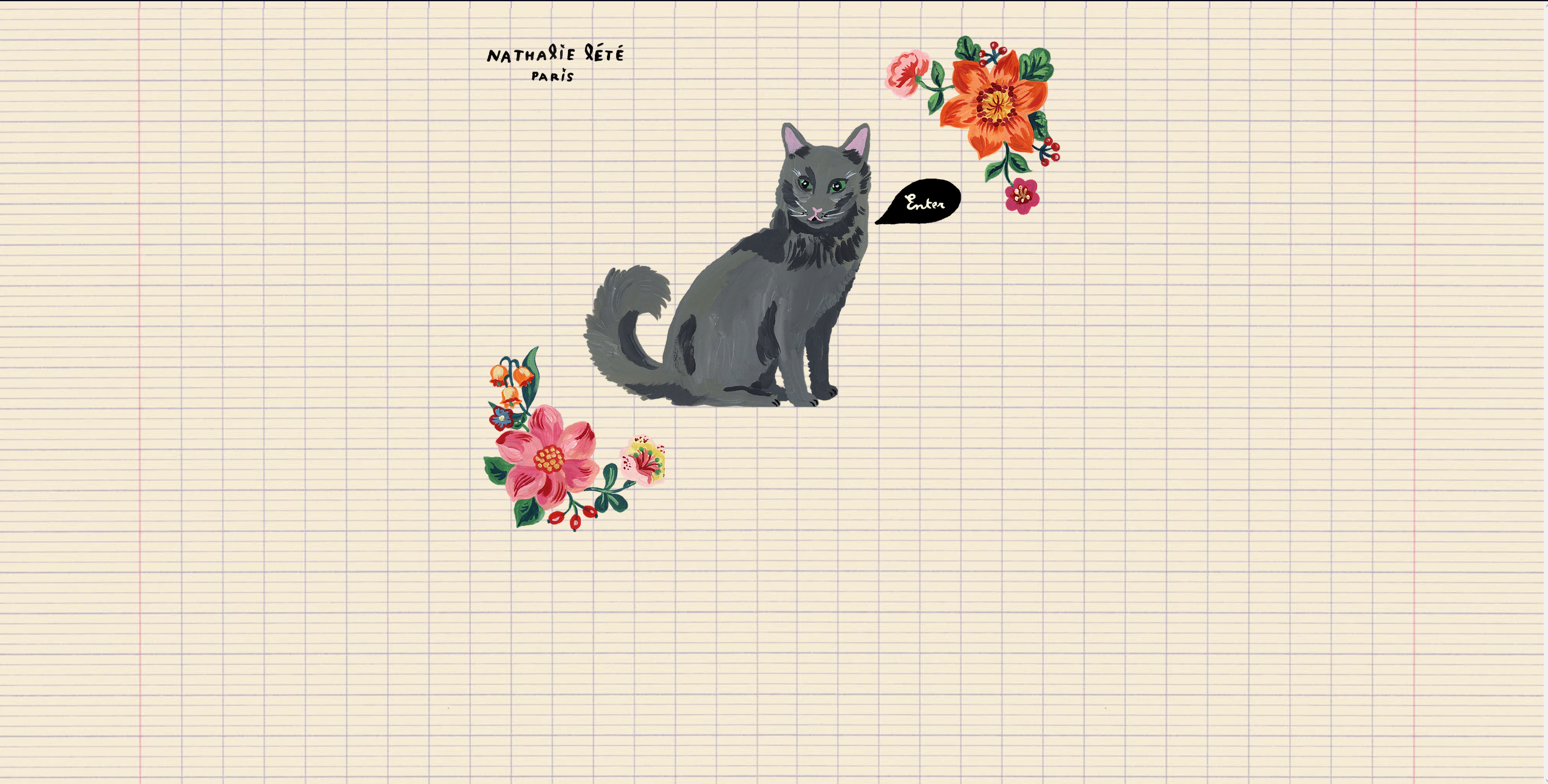
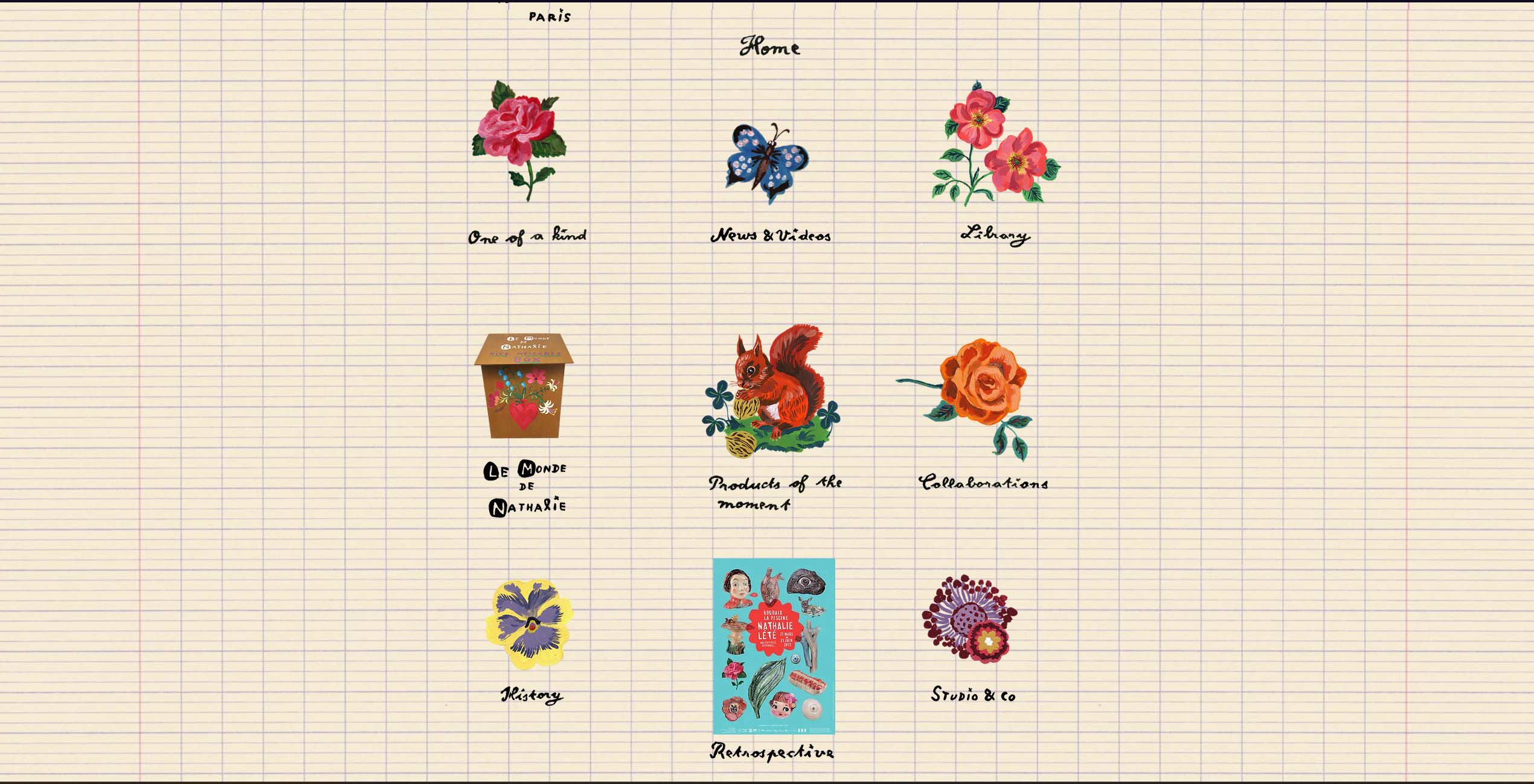
Nathalie Lete: Lete’s site is probably my favorite with the cool notebook background and painted icons. I also enjoy the “enter” cat and the fading in of page transitions.
My research into other creative illustrator websites showed me that my ambitions did not have to be super high set in order to make something interesting. Essentially sometimes less is more. The research also helped me solidify the exact design and interface I want to use for my website.
Target Audience
My target audience is people within the illustration industry as well as clients/people who might just be interested in my work. I want the design of the website to be easy to use and be aesthetically pleasing in a way that shows my personal style.
Inspiration and Concepts
Thumbnails and Sketches
Wireframes and Prototypes

Responsive Mockup
Link to mockupPhotoshop Comp
