Intent
Danny Jones is a 3D designer based in San Fransisco. His website https://yasly.com/ features all his work, a link to his Instagram and Behance, a “Play” page (not entirely sure what this is, it features images), and an About page that includes a short bio, his skill set, and a link to contact him. The portfolio and about pages of the website signify that it is aimed to attract more potential clients and collaborators. It is set up as a portfolio and a condensed resume (kind of) to exhibit his skills.
Voice
The voice of YASLY is energetic, clean, bold
Tone
Danny Jones’ tone on his home page is energetic and clean. The bright colours attract attention but the layout and use of white keep it clean. The work and play pages are bold but organised with large photos in a grid set. The about page is conversational, casual, and slightly busier than the rest of the website. It includes more text since it provides some biographical and skillset information and personality.
Brand
The branding is quite youthful with the use of colours and crossed-out words in the “play” and “about” pages. The large images and text also add to the fresh feeling. The simple, consistent, and organised layout keep the website quite elegant. The only page that diverts from this is the about page which is busier but allows Jones’ individual personality to come through.
Persona
- Artists and Designers (to collaborate)
- Maria is a lighting designer looking for a unique way to advertise her sculpture lighting fixtures. Each piece she creates is custom made and one of a kind. Her designs typically end up in exhibits and luxury hotels and residences. Her designs combine organic shapes with contemporary colours and material, such as cast metal and recycled plastics. She is looking for a designer to situate her lighting fixtures in surreal interior spaces in a modern and new way.
- Home: while the homepage doesn’t incorporate exactly what she needs, the shapes and colours align with her general aesthetic. It is clear that Danny Jones’ is knowledgeable about the use of lighting, colour, and shape in his designs.
- Work: Maria sees some of Danny’s furniture and interior design pieces right away. She scrolls through to see what else Danny can offer and learns that his skills are widespread through all types of 3D designing.
- About: Maria learns more about Danny’s approach to design and the software he uses to create them. She can easily send an email to him on this page and follow his social media platforms.
- Potential clients
- Vie, a combat-style video game is looking for a 3D designer to create new avatars for their latest update. Vie’s aesthetic is futuristic, brightly coloured, and surprisingly non-gore-ish. Instead of blood Vie uses metallic aesthetics to create fantasy-style fighters. They find the work of Danny Jones on Instagram and are led to his website.
- Home: the use of colour and texture illustrates what Vie can expect from Jones’ work. This page is quite limiting so they move on to the “work” page.
- Work: Vie scrolls through many types of designs, from furniture design to advertising, photography. While many of the designs are not exactly what Vie is looking for, the general aesthetic relates to their own. They eventually pass some of Jones’ work that directly translates to what they’re looking for. On the way, they see the different clients that Jones has worked for, including notable brands such as Facebook and Playboy.
- Play: the unclickable images are interesting to look at but Vie there is no context surrounding them apart from the heading of the page “PLAY — COMPUTER-GENERATED SIMULATIONS, ERRORS, ABANDONED IDEAS, AND MUSIC © YASLY / DANNY JONES” The title is intriguing enough for Vie to move on to the last page.
- About: Vie reads through the short biography which includes his skillset, which fit the job they’re looking for. They use the email on this page to reach out.
- Other Artists and Designers (as inspiration)
- Miriam Al Khatib, an interior design student at Parsons School of Design, finds yasly.com while looking for the perfect portfolio website to base her own website on. Miriam's design aesthetic changes from one project to the next, but the conceptual ideas bring many of her projects together. She explores topics such as mental and physical health, poverty, refugee crises, and throughout all, respect for the environment around us. Danny Jones’ website instantly draws her in, but his work also intrigues her. She has found not only a website she loves but also another designer that she feels inspired by.
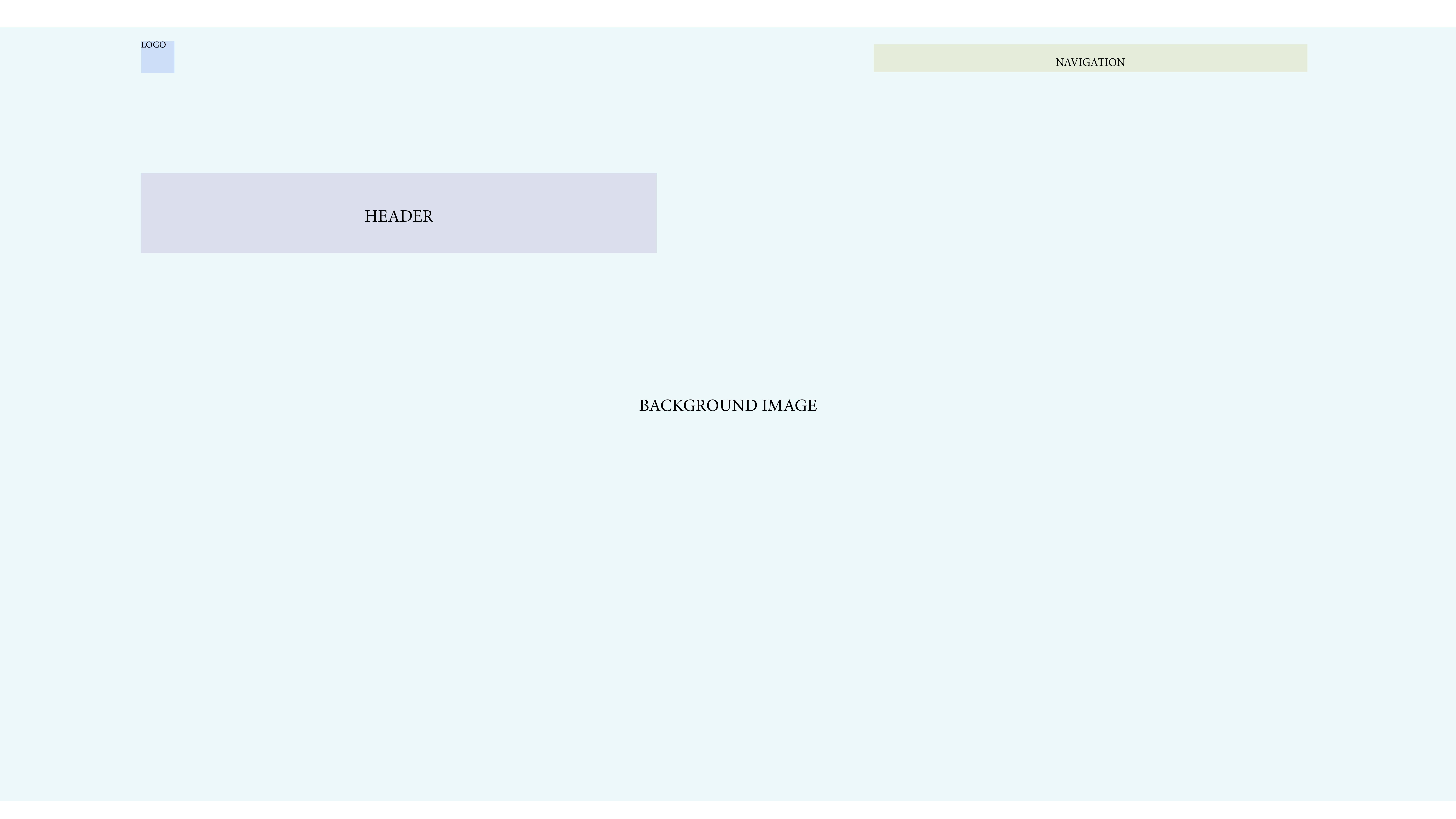
- Home page: the use of bright abstract shapes against a white background attracted her. The inability to scroll and get lost in too much information right away allowed Miriam to absorb the home page before exploring the rest of the website.
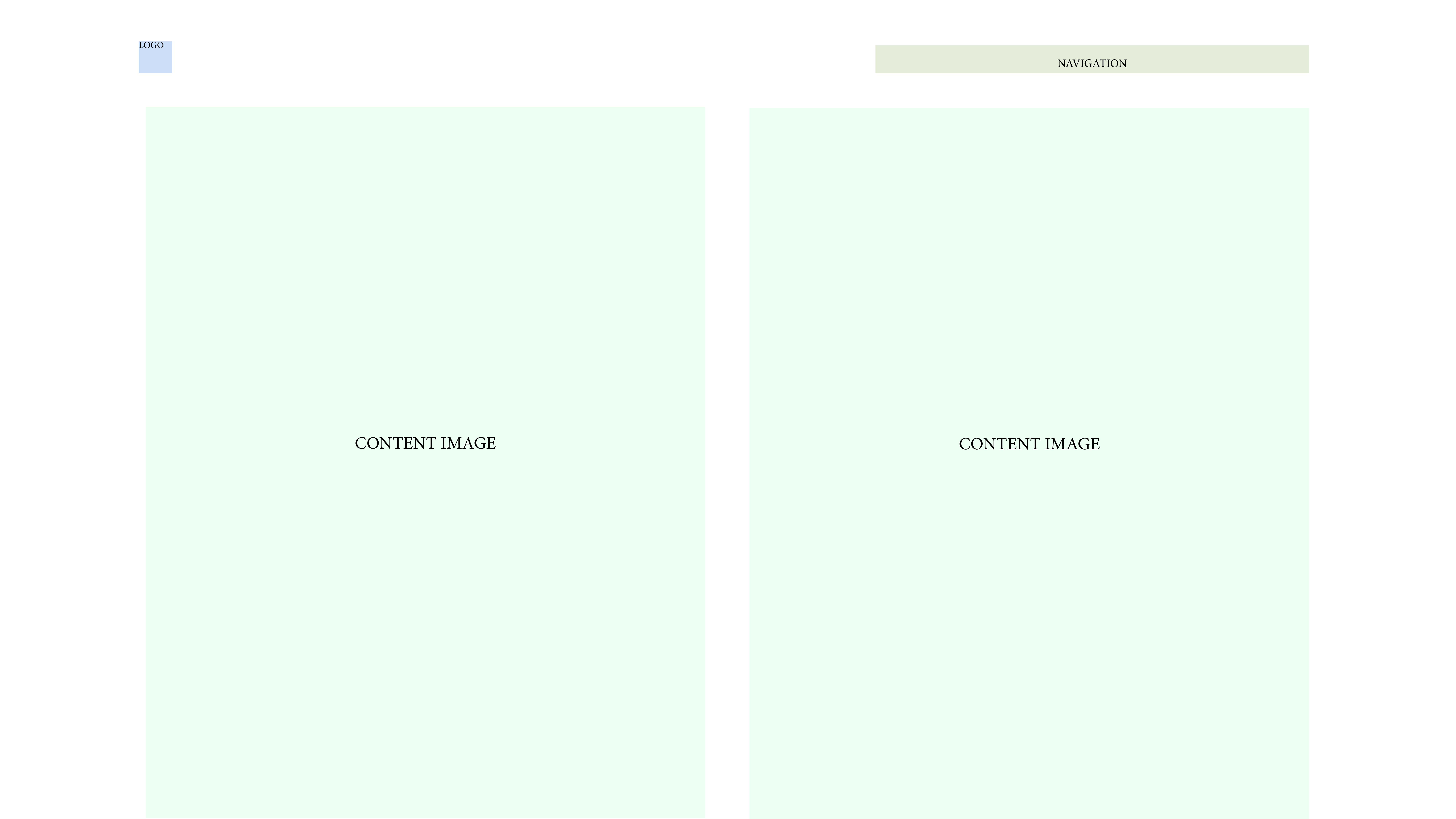
- Work: the large portrait aspect-ratio images, large text, and enough white space in between felt very easy to navigate without getting lost or distracted. Miriam was able to click through many of Jones’ work without feeling bored or overwhelmed.
- Instagram/Behance: Miriam bookmarked and followed these accounts for future reference, then went back to the website.
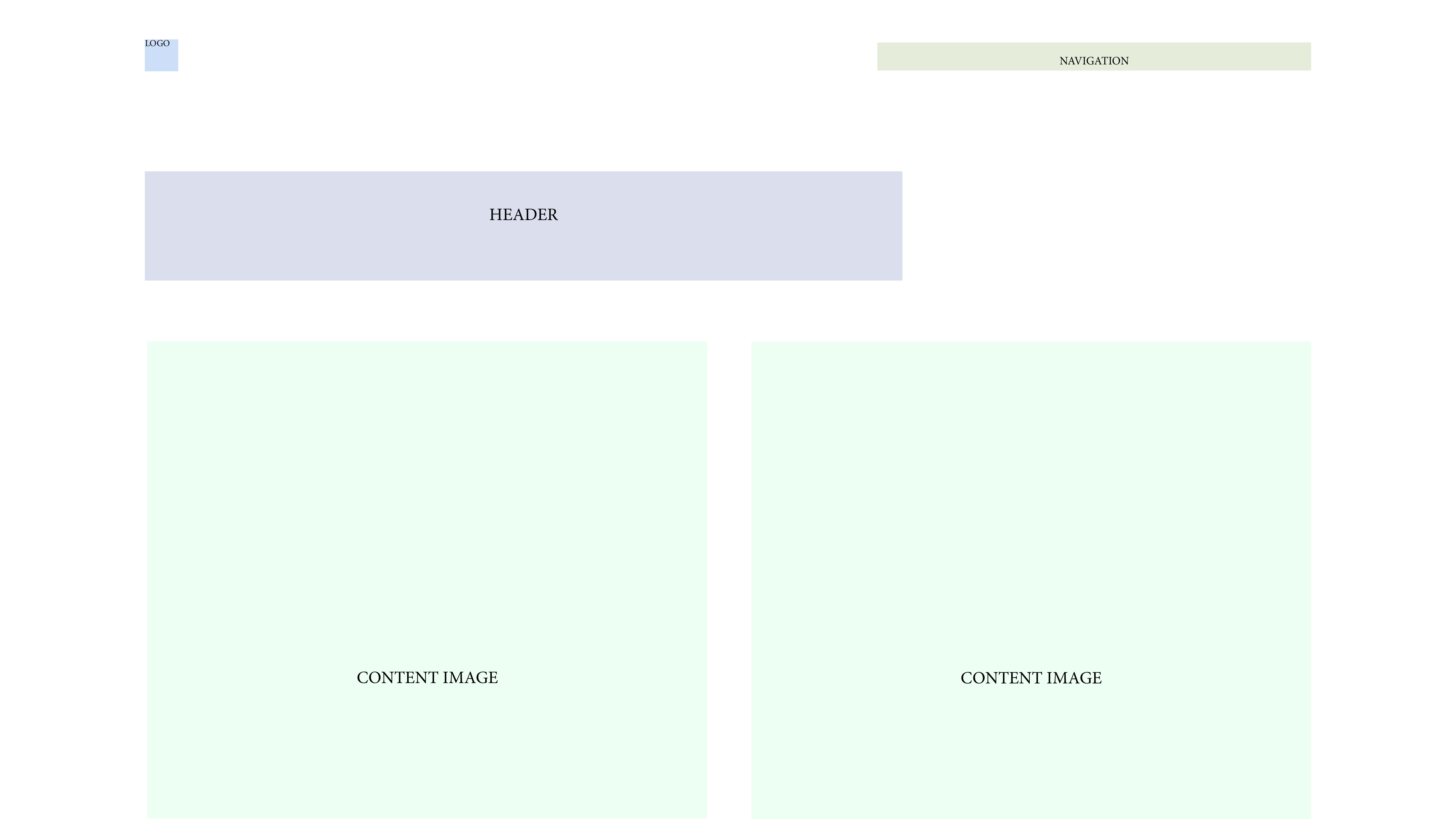
- Play: while Miriam is unsure about what this section of the website is, the cross-through word “errors” is interesting to her. The images on this page are similar to those on the “work” page, however, these images have no titles.
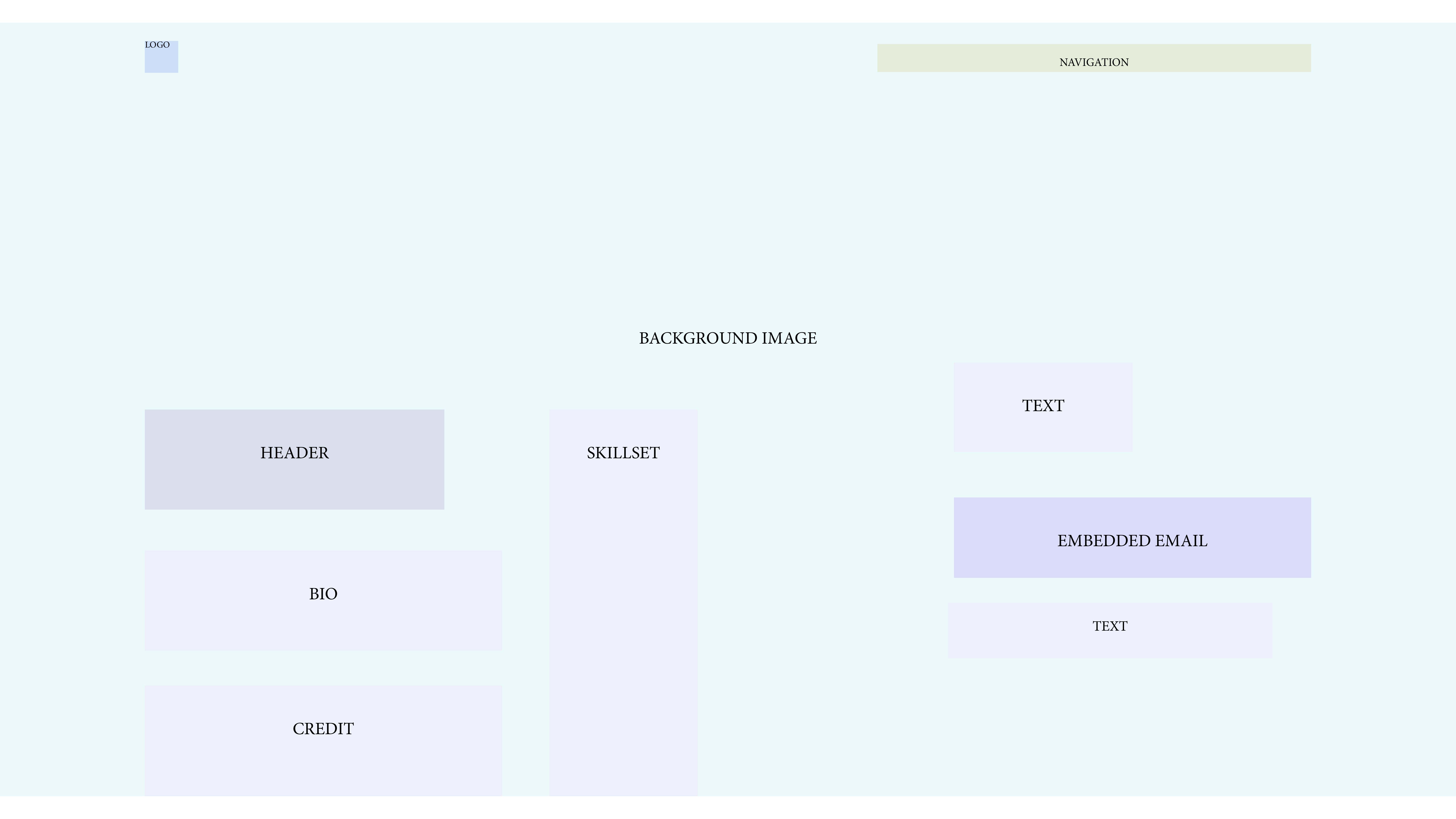
- About: The inverted silhouetted image brings attention to the center of the screen. Miriam reads the biography and learns the designers' name, intention, and some of his skills. Another crossed out word: “VRAY”. The following phrases stood out “Big or small. Hit me up.” “Up with dystopia.” “fire mixtapes” “rare tiktoks”
Wireframe
Home

Work

Play

About

Copy Deck
Title: YASLY / The Work of Danny Jones
Header: DANNY JONES — 3D DESIGNER — SAN FRANCISCO, CA
Links: Work Instagram Behance Play About
Competition
This page has a cleaner foundation than a lot of other software design websites. While the base is very organised the colour and shapes of the content itself stand out in a way that is manageable for visitors to digest thoughtfully and easily. They are not overwhelmed by too many shapes, fonts, sizes, and colours all at once. This makes it easy to direct their attention to Danny Jones’ work itself, rather than the website. The website enhances his work without dulling it down or overshadowing it.