Develop Your Idea:
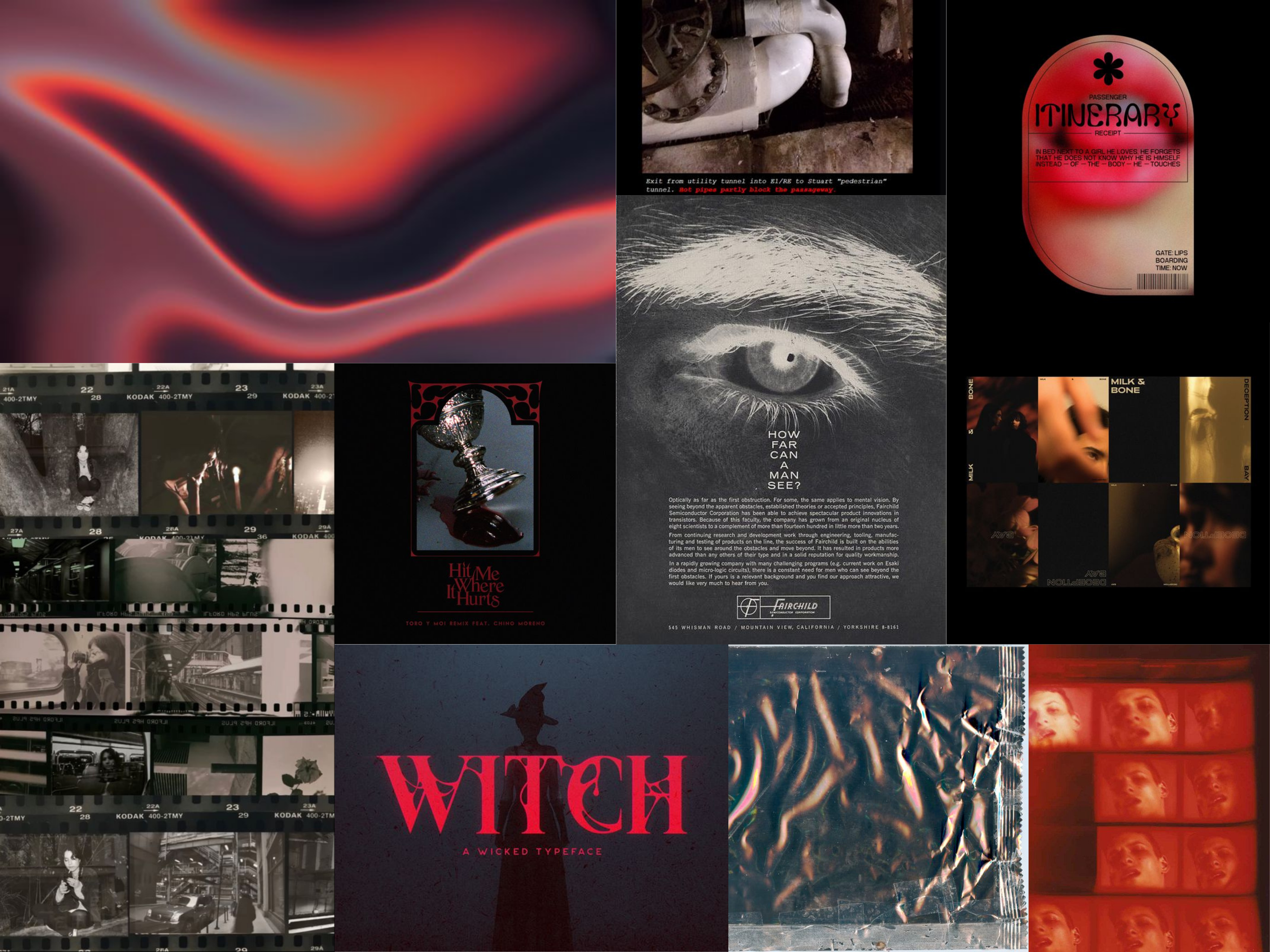
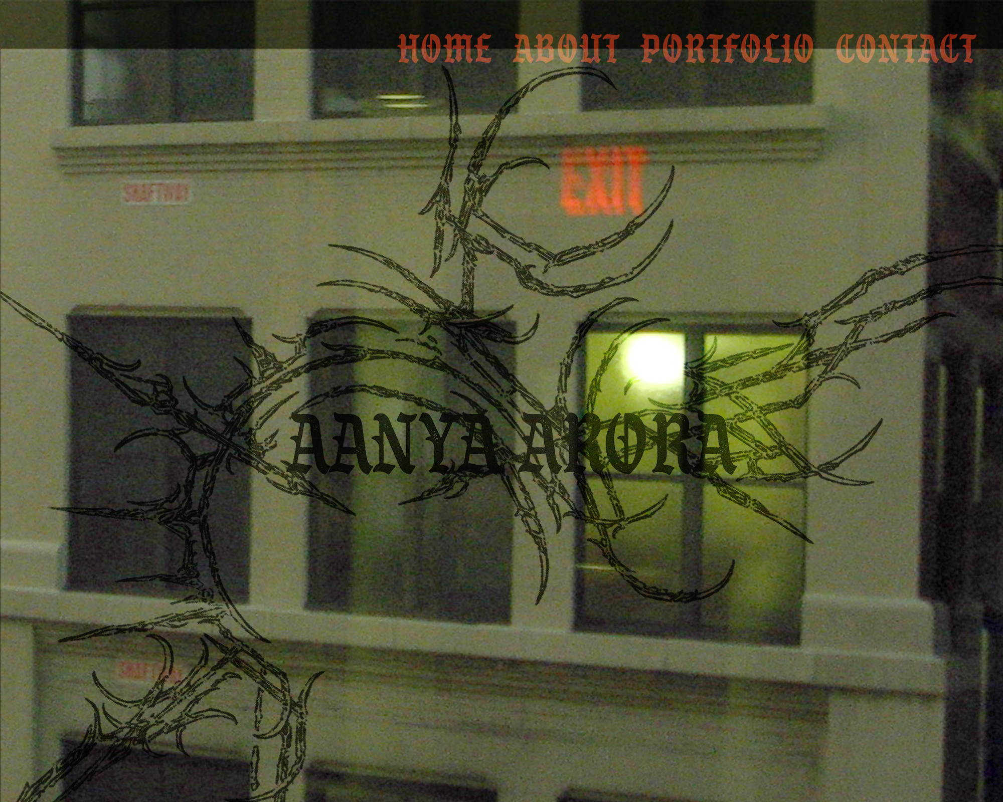
My body of work showcased within a piece of my work: the website should have the same voice as my art.
My body of work showcased within a piece of my work: the website should have the same voice as my art.
I started by researching my favorite artists’ websites. What I found was that most of these artists (as modern/contemporary artists) were represented by a gallery, and therefore did not have a website of their own. The biggest disappointment for me was Tony Oursler’s website. As one of the most influential projection installation artists, you would think he would have an interactive website that functioned like one of his pieces. Even with the websites I’ve listed below, the only one that functions as a fully thought out piece of artwork is Marianna Simnett’s. Olafur Eliasson’s website has a floating geode that moves around the screen as you interact with his website. The layout is nice as well, but it isn’t anything extraordinary. I like the opening text that appears on Jake and Dinos Chapman’s website, but everything else about it feels like simple block elements.
What I have discovered through my research is that I want my website to be both a functional portfolio that displays my work in an easy, user-friendly way, but also function as a gallery designed specifically to encompass MY work; something that feels to the user, that they have entered a different environment, a different world, that was created by the artist whose work that they are viewing.

