intent
The personal website provides a place for the artist, Zoe Mowat, to display her work and designs on a digital platform. She specializes as a product designer and additionally, teaches at the university level. The site includes final renders and creations while also demonstrating her design process and how she thinks in terms of creativity.
top of pagevoice
The overall voice of the website is very professional and calming. Mowat’s work is displayed similarly to a museum exhibition, with blank white walls. This allows for the work and her design skills to be the center of attention rather than the website.
- calming
- professional
- sleek
- modern
- informative
- image-heavy
tone
The website has a very consistent feel that has a similar overall tone between the different pages. That tone is professional and calm but can be seen as kind of cold and lacking in personality.
home
The tone of the “home” page is very concise, as not much information is displayed. Instead, her chosen project is displayed, with a link to its individual page.
work
The tone of the “work” page is professional, acting as an overall display of all her works on a single page. Each main image of a project leads the viewer to the project’s own page.
work content
The tone of the content for the individual projects can be described as very objective. The text that accompanies the finalized photos of the product describes the product and some reasoning as to why some choices were made, all based on the facts of the design process.
about
The tone of the “about” page can be described as restrained. The text is written in the third person perspective and describes how Mowat works and what she focuses on in her process. It also includes where she has exhibited work and where she teaches. It does not have any information that can be personal.
press
The tone of the “press” page is very proud, and self-evident. The page consists of images and links to various articles and excerpts that have been written about Mowat. The page is more informative and does not feel like bragging, which some of these pages could feel.
shop
The tone of the “shop” page is dignified, specifically since a price is put on the designs that she makes. The products create a grid that mimics an online shop, except this is inside a website with a different intent.
contact
The tone of the “contact” page can be described as instructional, where it only contains information about emails and a submission form to easily email directly to her.
top of pagebrand
The brand of this website is very consistent, there is no question that this was designed by the same person with a strong idea of how she wants to be represented in a professional setting. The modern look of the website, as well as the modernity of the interactions and movements, make it feel upscale and serious.
The photos that are displayed on the website have clearly been professionally taken, with all of the main ones having a white background. On top of that, the main color of the website is white, with all the text either pure black or shades of gray. The font also adds to the idea of this design being sleek and modern because every font used is sans serif.
The benefit of having a design like this is you are more likely to be taken seriously in the workplace, and that is helpful especially when you are an independent designer. The design is also calm and does not take away from any of the products that she is displaying, putting the emphasis solely on her work. The drawback of having this type of design is the idea that it could come off as cold, or lacking in personality. It is hard to judge Mowat’s character, especially if the viewer does not know her personally.
top of pagepersonas
casual viewer or shopper
SAMMY: a passionate hobbyist that is looking for inspiration in furniture making and product design in general. They have a lot of time on their hands to find smaller design firms and different types of product designers. If they find something that they really enjoy, they would not hesitate to buy and support artists and designers.
After stumbling into Mowat’s website, Sammy is immediately greeted by the home page, which includes one project Mowat has done. They are impressed by this work and decide to stay on the site and look through the pages, notice the navigation panel, and click “work”. Doing this leads Sammy to a grid of different designs. Sammy notes and appreciates the neat design and easy navigation.
While browsing the different projects, Sammy stops and reads some of the captions, understanding why some design choices were made, and makes a mental note for their own practice. After scrolling through the designs, Sammy remembers that at the top of the page (in the navigation) there was a “shop” page, and decide to scroll up and click it.
They browse all the options, they go back and forth between designs. They have decided that they really want to support this artist that they found and buy something directly from her. They finally chose an item and go through the process of putting in all of their information. They get a confirmation and exit the website satisfied.
employer or potential client
ELLIOT: a businessman looking to hire designers to help his business create the perfect product. He is looking for someone that has a strong design process and an eye for specific aesthetics. His business is not a large corporation, so he cannot really afford to make a mistake in who he hires, and needs to see if the new addition to his team would fit in their work community.
After following a design company, and appreciating their attention to the design of the products, Elliot wants to recruit someone from their design team to join his own start-up. He opens Mowat’s website with the clear goal of understanding her style and seeing if she is a good fit.
He is welcomed by a strong product on the home page along with a webpage that makes it stand out, while maintaining its professional touch. He is impressed with the presentation of the products, the website, and in the quality of the photos.
To see what else she has done, Elliot goes up to “press” and scrolls through the different articles, clicking some of them. After reading up on what people are writing about Mowat, Elliot goes to the “about” section to see what she says about herself.
He is now confident that he wants to reach out and see if she is willing to meet with him to discuss possibly working together. To do that, he goes to the “contact” button in the navigation and fills out the form. After clicking submit, he exits the website feeling hopeful.
potential design student
DAISY: a design student researching professors for the next semester, as class registration is coming up. She looks at the possible product design professors and sees Zoe’s name on the list. She looks up her personal website to see if she would enjoy taking her class or feel she could learn something from her.
Daisy, while looking for a future professor, is greeted by Mowat’s home page. She is immediately impressed because the sleek and professional design looks very thought out and modern, qualities you want from a professor. She looks around the website, finds the “work” button in the navigation, and begins to browse the projects. She is impressed by the photos and how professional they look.
Through the website, Daisy can tell that Mowat knows what she is doing as a designer, and clearly has a recognizable aesthetic and style that shows up in all of her work. Although the website does not tell Daisy what kind of professor Mowat will be.
To find out a little bit more, she goes to the “about” section and learns what Mowat would describe herself as, and it helps her understand her as a person more. Daisy also browses the “press” page for a little, to get a better understanding, but after that, she exits the website feeling more informed.
top of pagewireframe
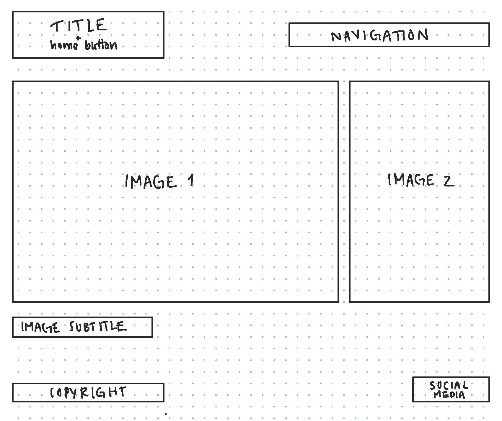
"home" page
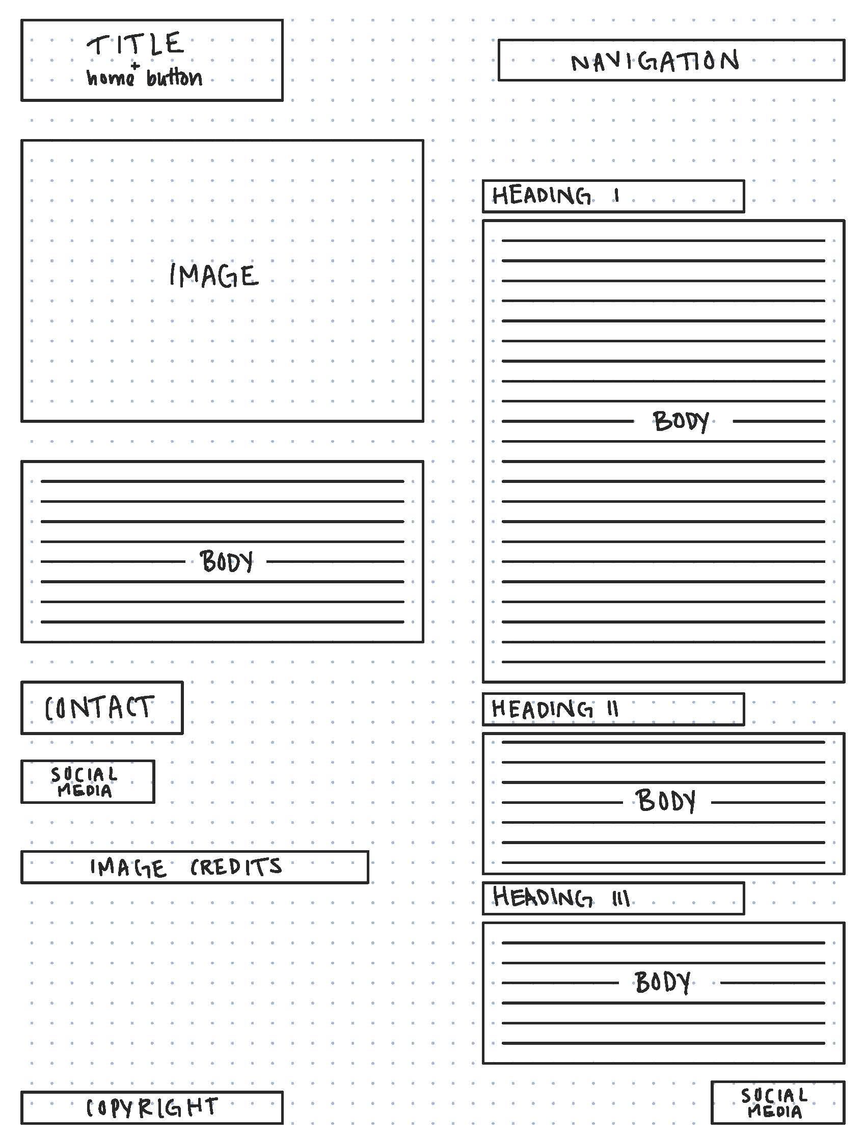
"about" page
top of page
copy deck
Title:
Zoe Mowat
Image I:
[view one of Aizome Sideboard] (link to the individual page)
Image II:
[view two of Aizome Sideboard] (link to the individual page)
Heading:
Aizome Sideboard — for Ariake (link to the individual page)
Subheading:
© 2022 Zoë Mowat Design
top of page
competition
Against the competition, this website is very put-together. Oftentimes, product designers that make their own websites do not look as professional as they can be, but this one is very professional and clearly, the designer has some experience with graphic design.
Some competitors have more of their own voice showing through the product displays and the way they write about them. As well as taking the “about” section to be more personal than what Mowat has. Most product designers would have a more plain website overall, in terms of backgrounds, fonts, and colors, due to the works that they are displaying often having color in them. With most of the website being images, having a busy background would be distracting from the designs.
BACK TO TOP