WEBSITE ANALYSIS
erichu.info
guide:
- INTENT
- VOICE
- TONE
- BRAND
- USER PERSONAS
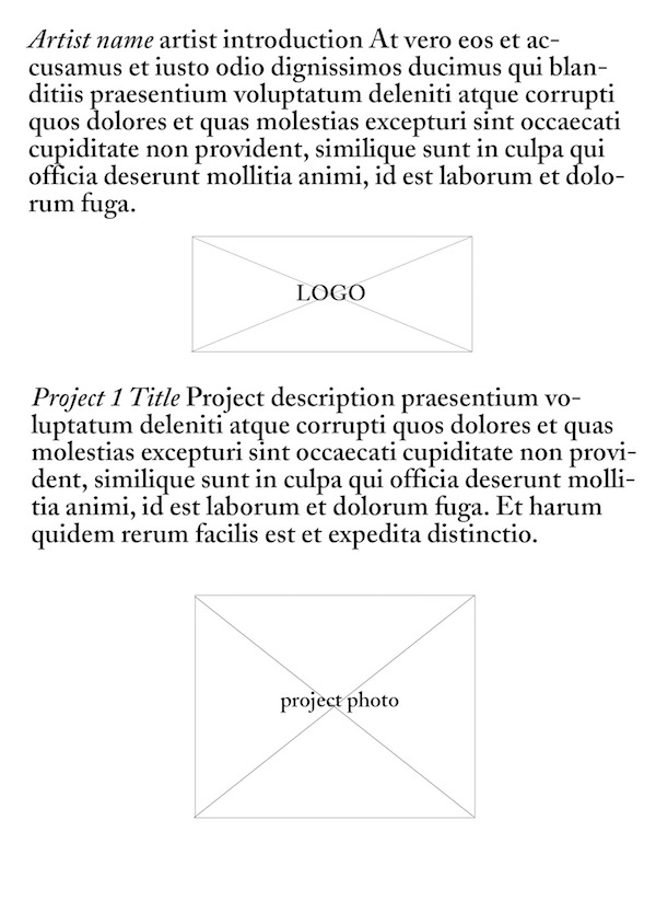
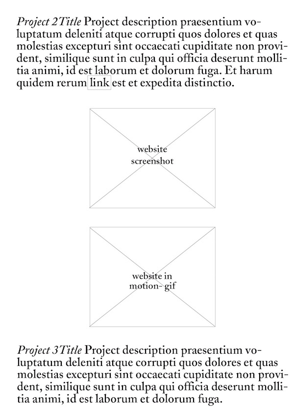
- WIREFRAME
- COPY DECK
- COMPETITION
INTENT:
The intent of this site is to showcase the work of art director and developer Eric Hu in a creative and engaging format.
VOICE:
Concise and informative. First-person. Approachable. The text on this site is meant to explain the visual elements presented.
TONE:
The tone varies among project descriptions. For example, the description of project “Satie” explains the form of the book, its inspiration, and its format. However in the description of the “A Thousand Characters” project, the designer chose to explain his process and mediums used (hand-drawn with mouse, manipulated in photoshop). He also explains that there will be illustrations available online soon. The author uses his discretion from project to project, deciding what information is relevant and compelling to share his audience.
BRAND:
The website’s brand is established through a few stylistic choices that carry throughout the entire site. The site consists of one page with the intent that the user will continue to scroll in order discover the site’s featured projects. Each project begins with the project “title” (font: Bau LF size: 51px color: black) followed immediately by the “description” (font: Big Caslon size: 52px color: black) as one chunk of inline text with no breaks. Occasionally this text contains hyperlinks, all of which are treated the same as “description” text with the addition of a 1px solid border around the linked text, creating a box. At the end of the “description” block, there is sometimes an additional box of outlined text that’s treated differently than the regular body copy (font: Bau LF size: 18px color: black). This boxed text is sometimes classified as “postscript” and it serves multiple purposes. For instance, in the very first chunk of text, the site introduction, this box is used as a “read more” link. In other instances, it’s not hyperlinked but instead is used to cite the names of individuals who also worked the project at hand. The designer’s choice of large, beautiful and readable typefaces and his decision to indicate different types of type information using thin black outlines makes the site feel fresh, readable, easy to understand, open, and well conceived. Consistent with the brand, the visual representations of the designer’s projects are clean, crisp, and thoughtfully implemented. For instance, the book projects are photographed beautifully and presented in a simple, straightforward manner. A website project is presented using animated gifs to show its interactive elements, demonstrating the designer’s thoughtful approach to communicating visual information.


USER PERSONAS:
- Simone, Design Student
Age: 25
Job/Interests: Visual Design, Art
How did she land here? Simone is a graphic design student and hobby photographer looking for inspiration. She found Eric’s site via siteinspire.com, a site dedicated to showcasing beautiful web design.
Experience: Simone often looks up portfolio sites of art directors and designers to get a feel for current design landscape. She’s familiar with the contemporary trend of websites that lack a navigation, and instead are designed for the user to continually scroll, so this is not new to her. She enjoys engaging with the site, scrolling down to discover visually exciting projects by the designer. After she scrolls through the first four projects, however, she begins to feel concerned. She wonder’s if this will become a game of endless scrolling. To her delight, she finds herself able to scroll to the very bottom of the page, discovering that the site indeed does have an end point. At the bottom of the page she’s confronted with social media links. She’s decided that she truly admires Eric Hu’s work and decides to click on his blog and then deicides to follow him on twitter.
- Jacob, Musician
Age: 32
Job/Interests: Music
How did he land here? Jacob’s girlfriend is a design fiend and an avid collector of magazines. The other day, his girlfriend picked up a magazine and McNally Jackson called Talk Magazine and she couldn’t stop raving about it. Since Jacob hasn’t figured out what to get her for her birthday next week, he thought maybe he could find similar magazines or get her a subscription to “Talk”. He did some research on Talk to find out more about it. In a frenzy of clicking, Jacob ended up clicking on the “Talk” site’s hyperlink to Eric’s page.
Experience: Jacob doesn’t really know why he’s on this website but he likes the design and thinks it’s something his girlfriend might like, too. He scrolls down quickly without reading the text. He copies the hyperlink and emails it to his girlfriend. Then he leaves. the site.
- Miranda, Potential Employer
Age: 52
Job/Interests: Landscape Architecture, Board Member of American Society of Landscape Architects
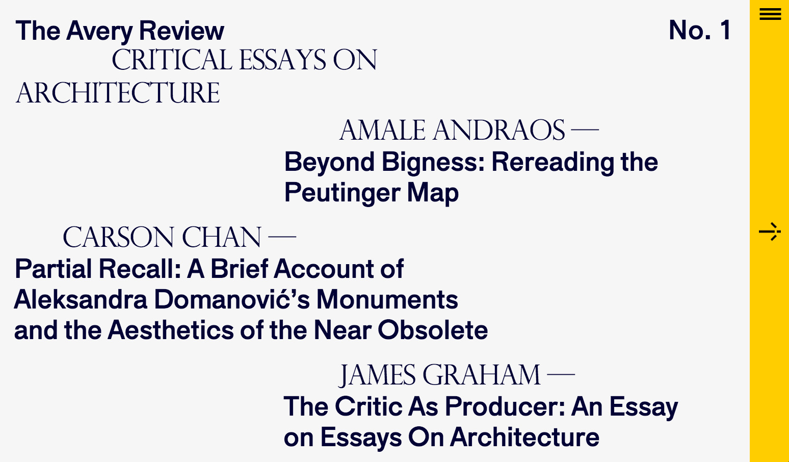
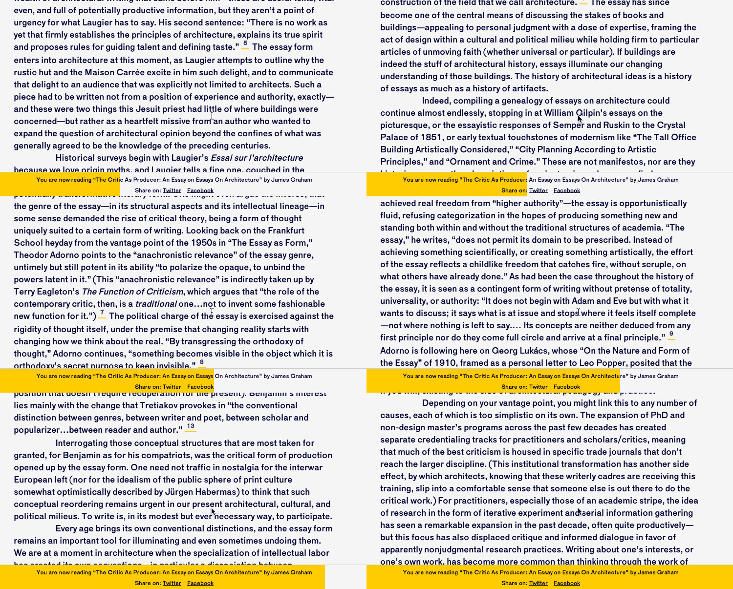
How did she land here? Miranda and her team at ASLA have been discussing a redesign of the ASLA website for years now. Although she is not the most web savvy individual, she has taken it upon herself to research sites related to her field to get a sense of how the ASLA might move forward with their redesign. When she stumbled upon the fresh design of the Avery Review, Columbia University’s journal on architecture, she was so pleased with the clean look and clear functionality, she decided to find out who designed it. That’s how she found out about Eric Hu and landed on his professional portfolio website.
Experience: Miranda immediately began reading the text on Eric’s website. She is not extremely computer savvy, and her instinct is not to immediately begin scrolling. She started to read and carefully scrolled through Eric’s site. She was pleased with how readable the type was. She was even more pleased to see the showcasing of the Avery Review project toward the top of the page. She noticed an embedded video of the avery review site in action and found it to be a little bit overwhelming and distracting, as the video showed quick scrolling. She was pleased to discover that when she hovered over the video she had the ability to pause it. Her next instinct was to reach out to the designer and get a sense of what types of projects he works on and his pricing. She wanted to find his contact information, and was dismayed at the fact that even as she kept scrolling it was nowhere to be found. At one point she decided to scroll back upwards, and noticed that when she scrolled up a small drop down bar appeared with a link to his email. She clicked “email” and began typing.


COPYDECK:
COMPETITION:
- Simone, Design Student