idea development
This is a "portfolio" website. The challenge is to create a website that displays my work in a way that's compelling to a potential employer. There are tons of student portfolio websites out there... what's going to make mine different? Because I don't have a lot of content yet to display, my goal is to make the site as beautiful and typographically interesting as possible using the skills learned in this class. The medium is the form. I'm approaching this site from a more experimental perspective. I want my site to be functional, design-oriented, and interesting. Perhaps my website should be about giving a straightforward gallery of my work. But I'm not interested in doing that... otherwise I'd just get a squarespace. I put a lot of work into a web design project last semester. I think what could make my site stand out, and what would be a huge challenge (one that I want to take on!) would be to attempt to design out one of the pages from my project last semester, so that when a user clicks on that portfolio item, they're taken to a live webpage built on my design. This might take an enormous amount of time, but If I can build just one of the pages from my design, I think I'll have a much more compelling portfolio site.discovery & research
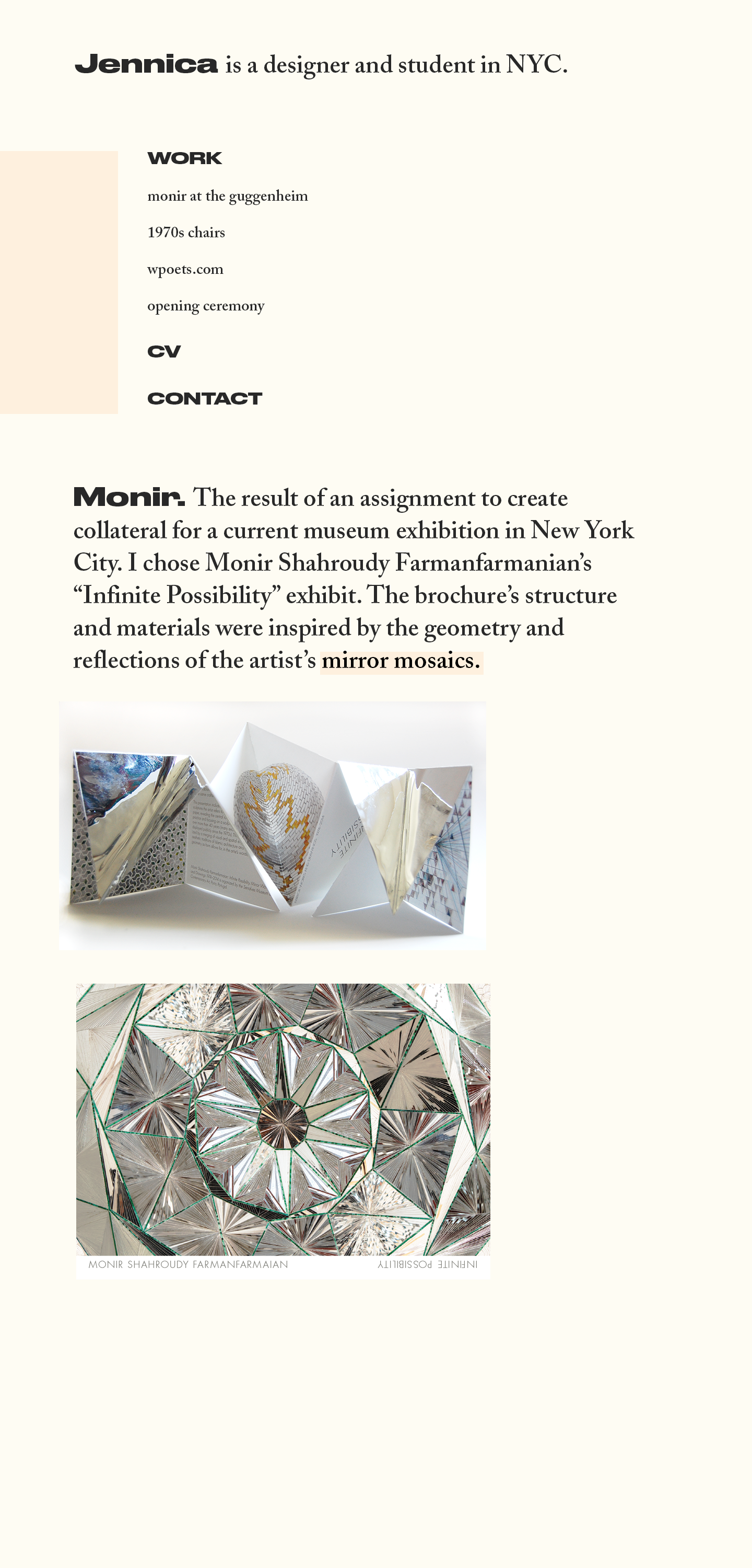
The page I analysed for assignment one is a big inspiration to me. This site is easy, good-looking, open, and playful. I have found several sites that inspire me based on the work of the designer who's portfolio site I analysed, along with several others from siteinspire.com.target audience
The target audience here is anyone in the field of design. I believe that showcasing thoughtful web design skills can appeal to any sort of designer, whether it be an architect or a print designer. The most important audience for this site is potential employers. More specifically, I want to hold the attention of design firms looking to hire people with fresh ideas. I don't want to work for a company that design's clunky chunky websites and boring corporate collateral... so naturally, I don't want my site to look corporate or clunky. I also want people to have fun discovering things on the site.inspiration

thumbnails
wireframes
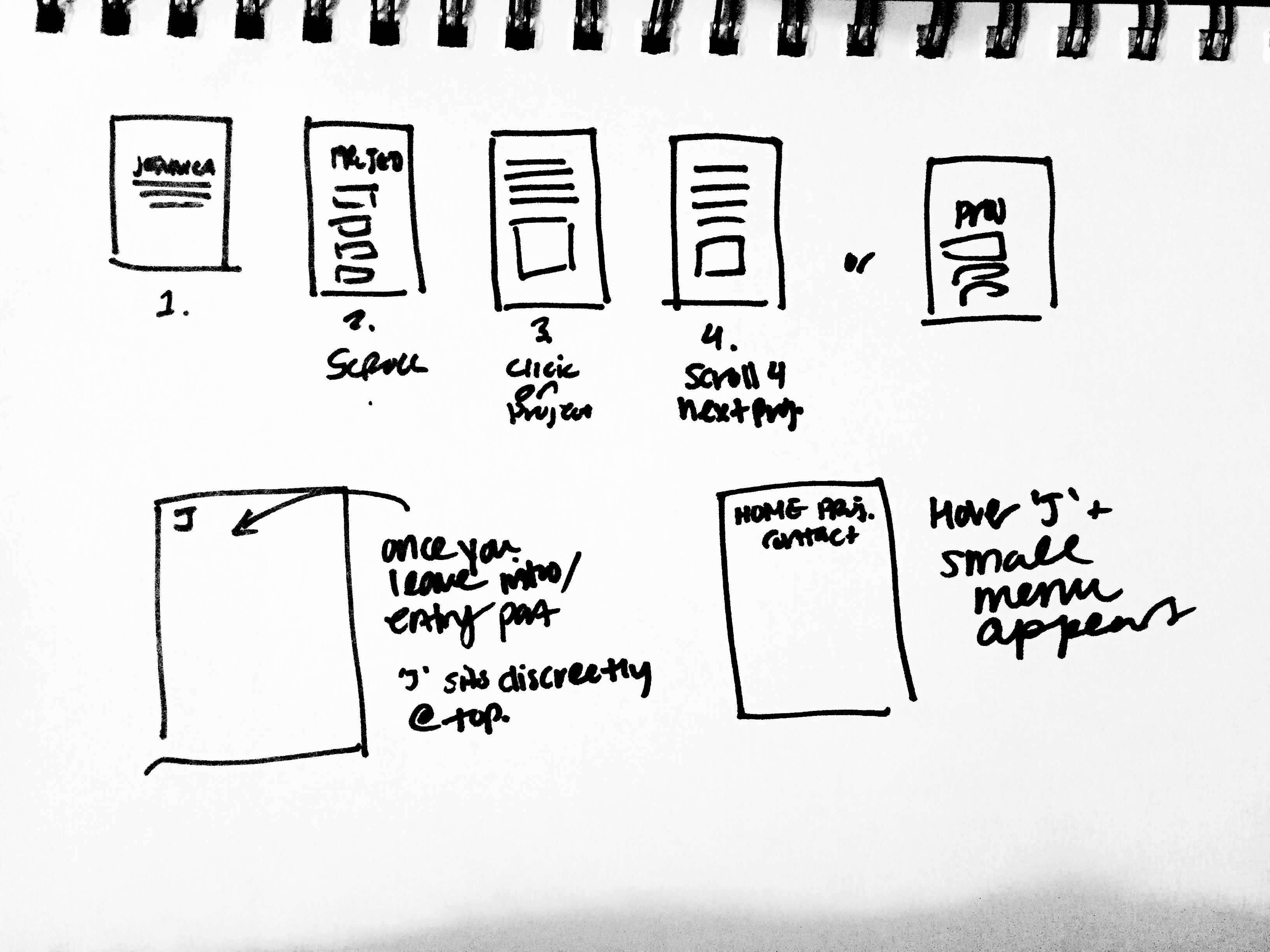
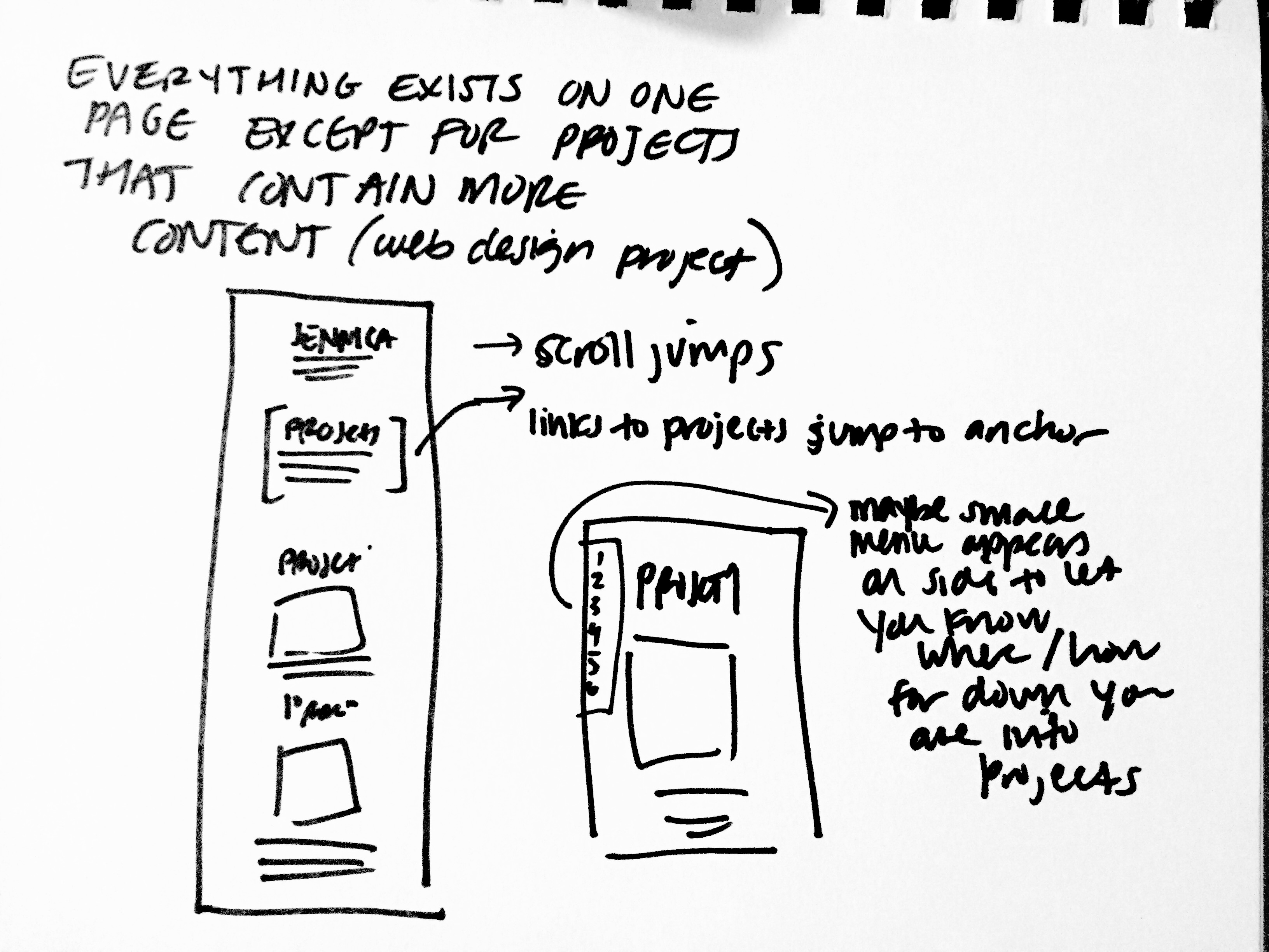
very basic layout of site:
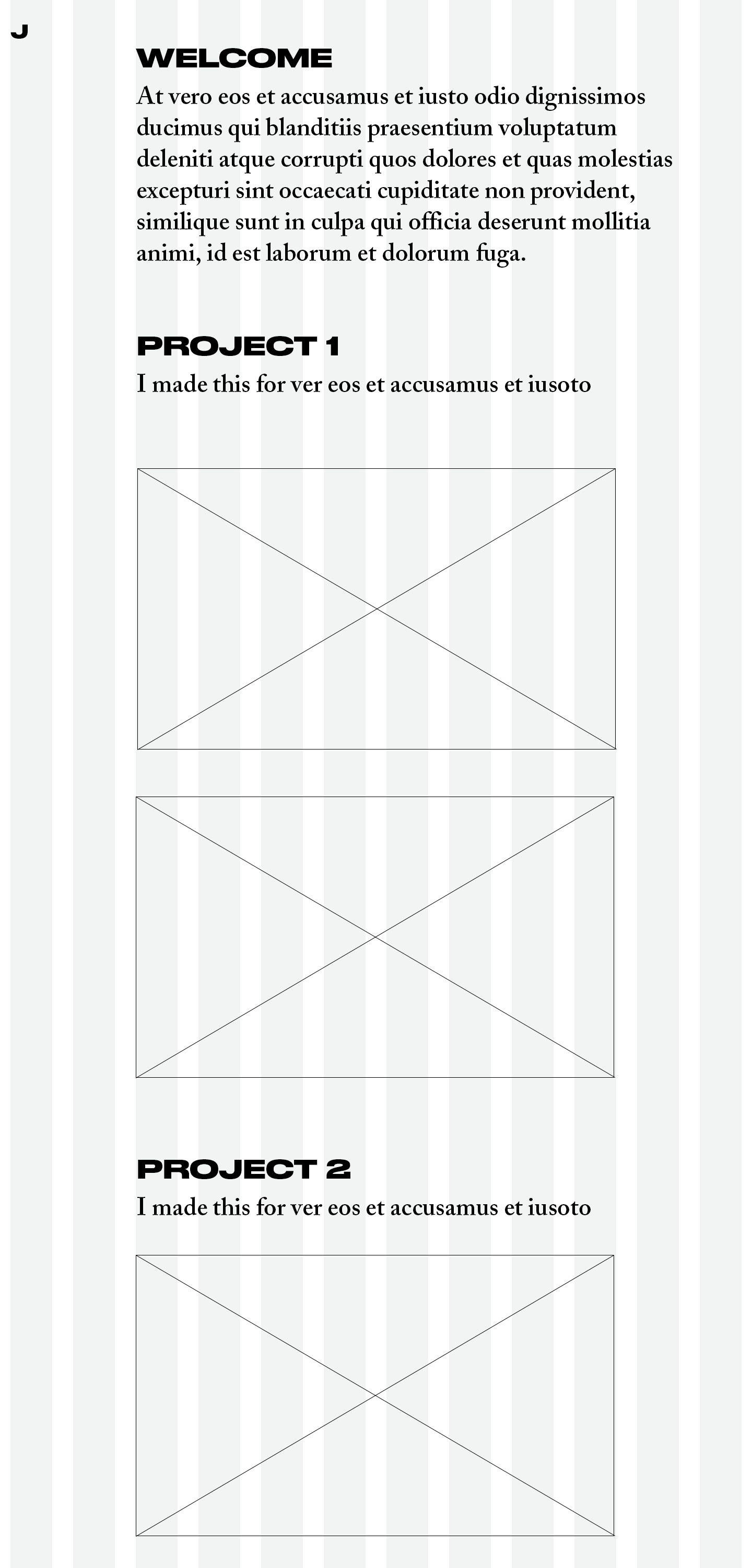
incorporation of a side bar navigation. i don't want the user to feel worried
that they're going to scroll endlessly. it's nice to be able to keep track of how deep you've got into the page
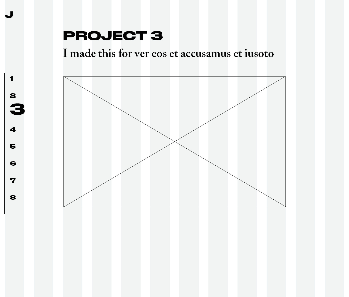
top-left corner logo hover state reveals menu items
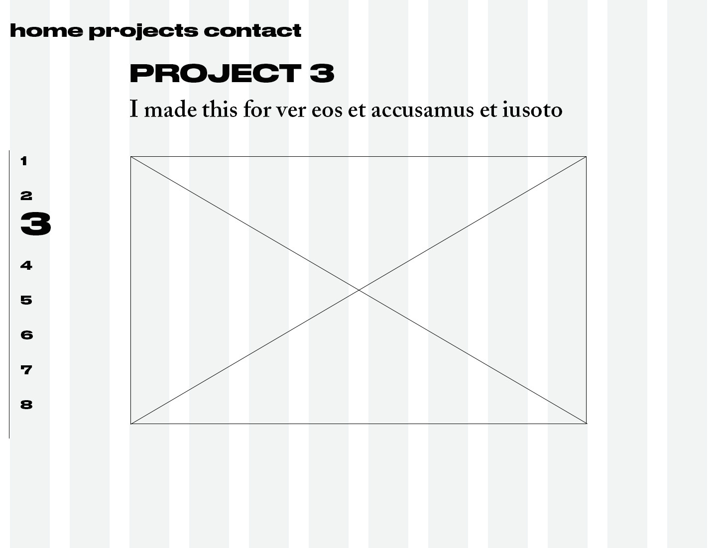
comp
