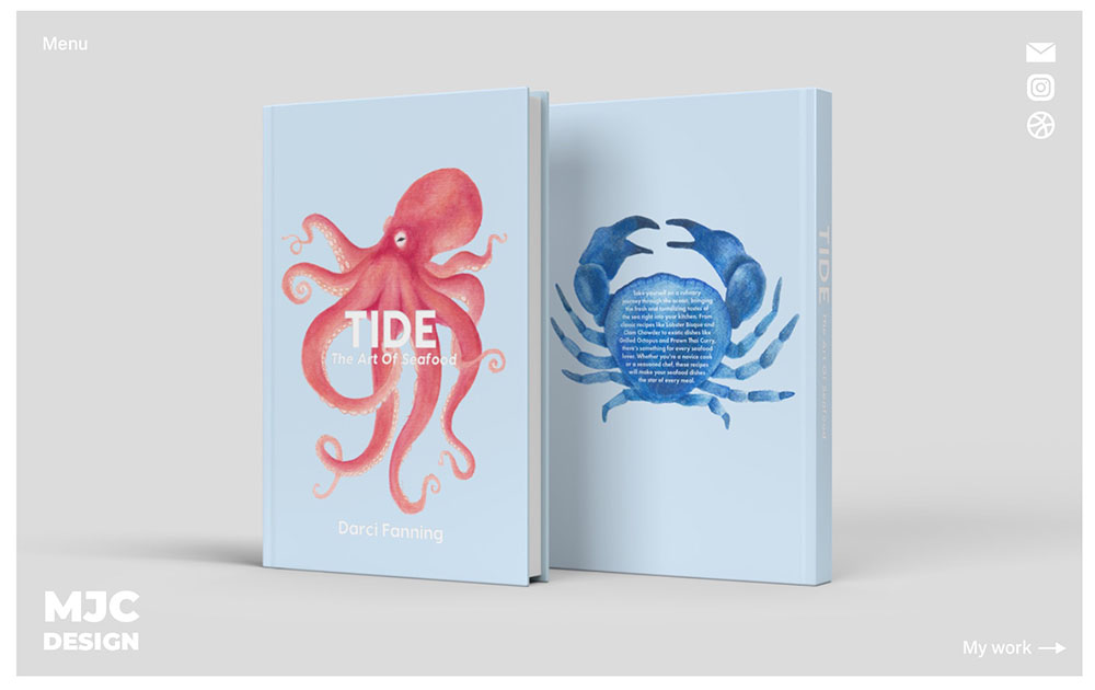
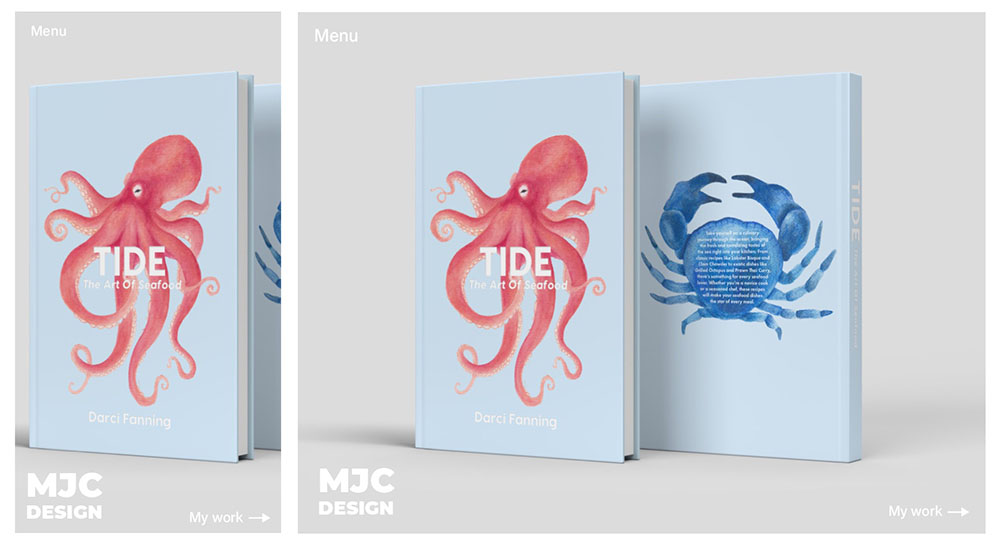
Develop Your Idea
My goal for this website is to create a portfolio of work to showcase who I am as a designer. I want it to be visually appealing and engaging with a somewhat minimalistic aesthetic to show versatility. I would like to highlight my skills and problem solving abilities and showcase my personality while still maintaining a high level of professionalism and credibility.
Discovery & Research
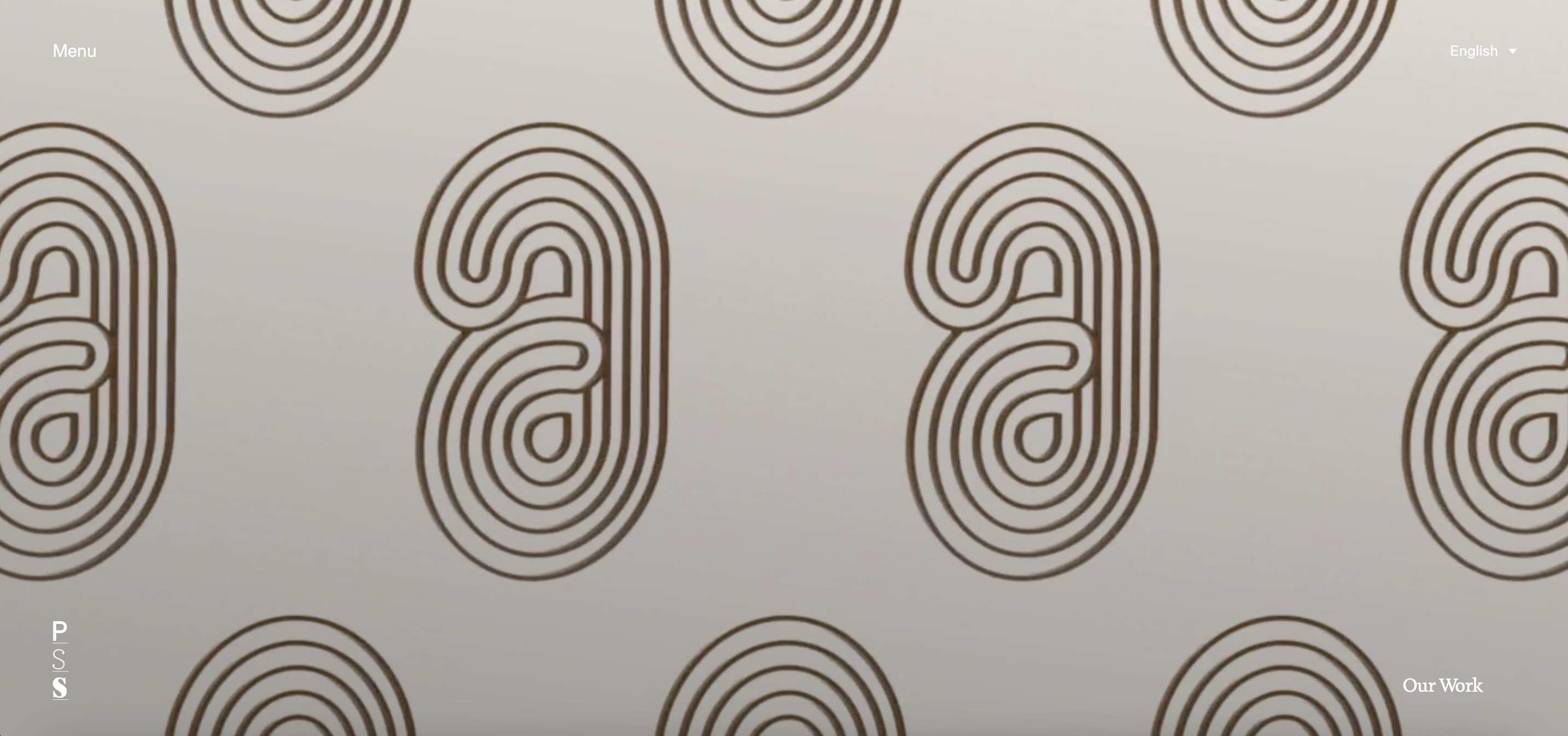
Website 1: Paper Stone Scissors
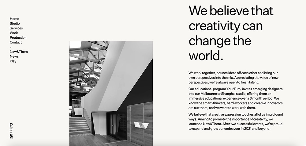
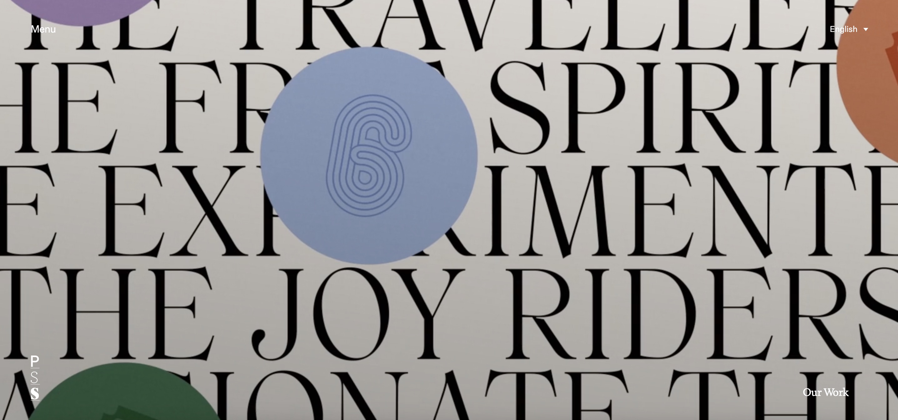
Paper Stone Scissors is a creative agency based in Melbourne, Australia. They are a team of designers, strategists, illustrators, producers, animators and managers. They have worked with some of the most influential brands from generic to luxury. Their website is a culmination of interactive pop-out menus and a largely neutral colour palette with an emphasis on type and imagery.
Their website establishes the agency as upscale and result oriented. The neutral background colour and use of type maintain a sense of professionalism and minimalism. The unorthodox placement of type across the website, particularly on the ‘Services’ and ‘Production’ pages, shows users that they aren’t afraid to do something different which intentionally sets them apart from other creative agencies. In saying that, the website doesn’t establish the brand as having a niche or particular style which in turn leaves it open to a wider range of clients.
This is a great example of using a website to boldly showcase work and effectively display skills to establish a brand.
paperstonescissors.com
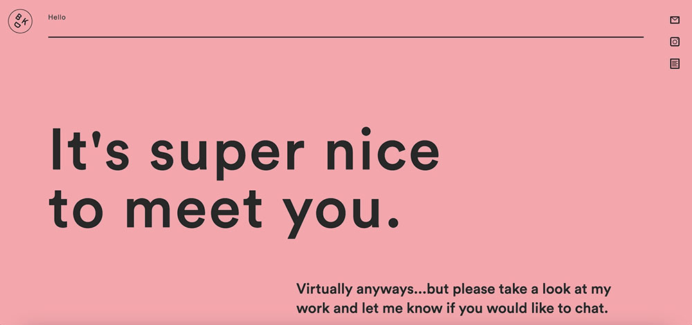
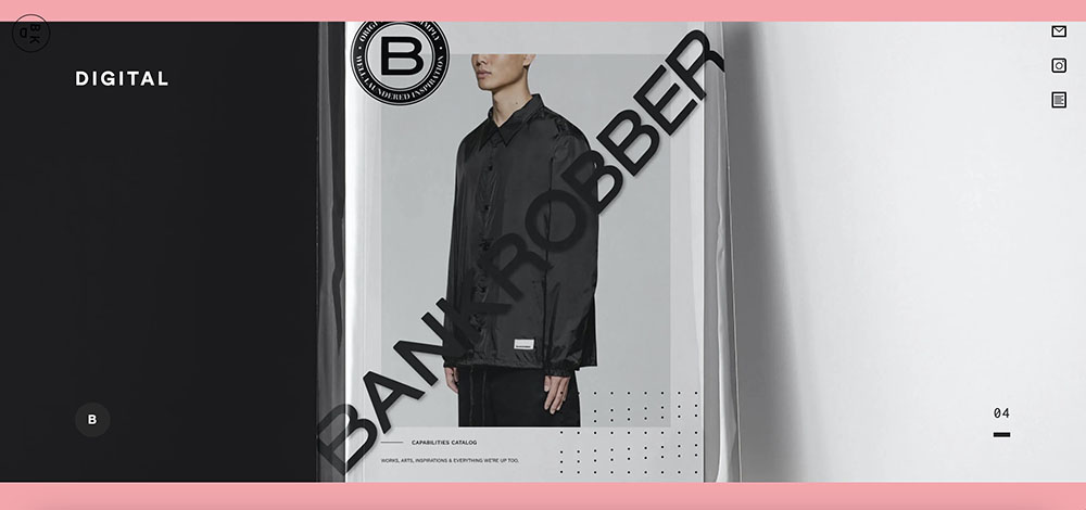
Website 2: Be Kind Design
I was originally drawn to Be Kind Design’s website because of their use of typography and their layout. The opening frame of the home page is very simple, yet effective.
When scrolling down the page, they list their services while showing an example so that the viewer can get a sense of their work and what they do at the same time.Their contact links are pinned to the top right corner of the site, making them accessible throughout the duration of the audience’s browse.
bekinddesign.com
Target Your Audience
My main audience will be comprised of potential clients and future employers. The website needs to be easily navigable, visually appealing and highlight my skills effectively. If a client or employer does not like the impression of the home page, they probably won’t continue browsing the pages. Therefore, the landing needs to grab their attention and make a statement about my personality and experience.
Inspiration & Concepts
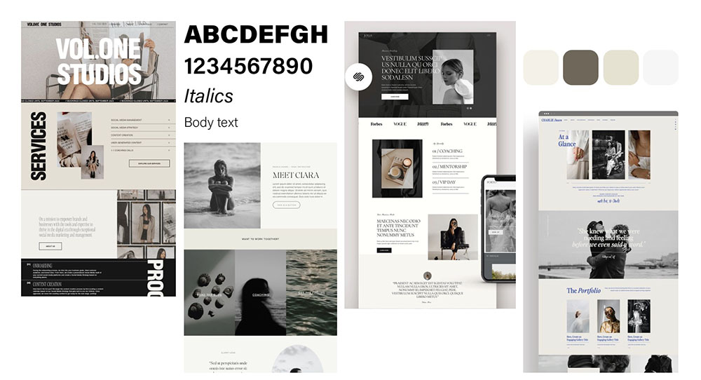
Thumbnails & Sketches
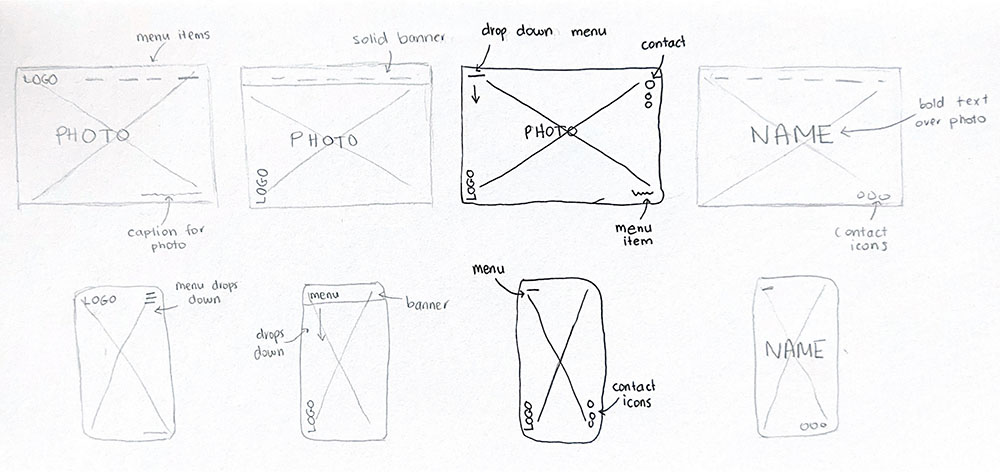
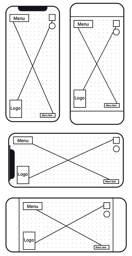
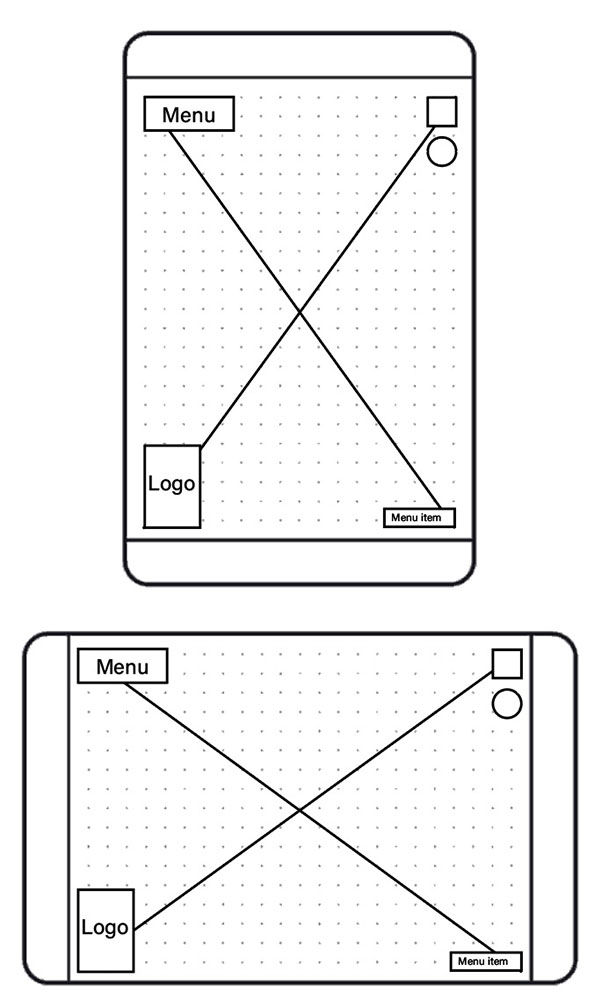
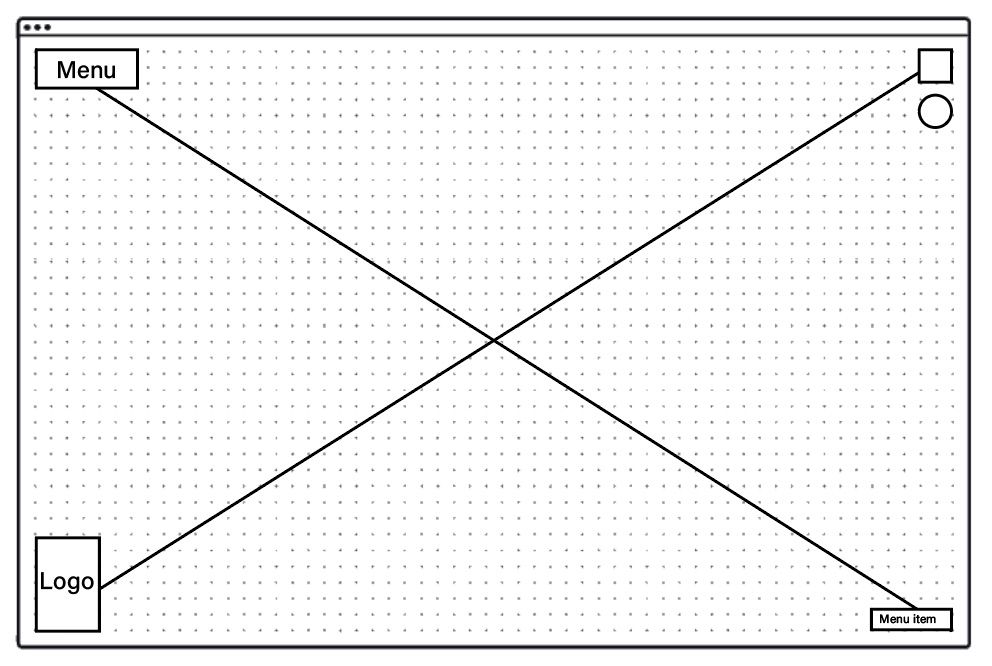
Wireframes & Prototypes
Photoshop Comps
