My Idea
I'm eager to create a website that offers an immersive and captivating experience while addressing the challenge of short attention spans. It will all start with an engaging journey that delves into a bit about who I am, utilizing CSS animations and videos to create a personal connection within the first 10 seconds. This initial narrative aims to pique curiosity and lure the audience in, enticing them to stay and explore further. To maintain their engagement, the website will incorporate interactive elements that encourage user participation. At the same time, I'll ensure that the site maintains a minimalistic and simple design to prevent distractions and confusion. This approach ensures that all information is easily comprehensible, allowing visitors to focus on the content and the unique journey I aim to take them on, ultimately making their experience both captivating and memorable.
Discovery and Research
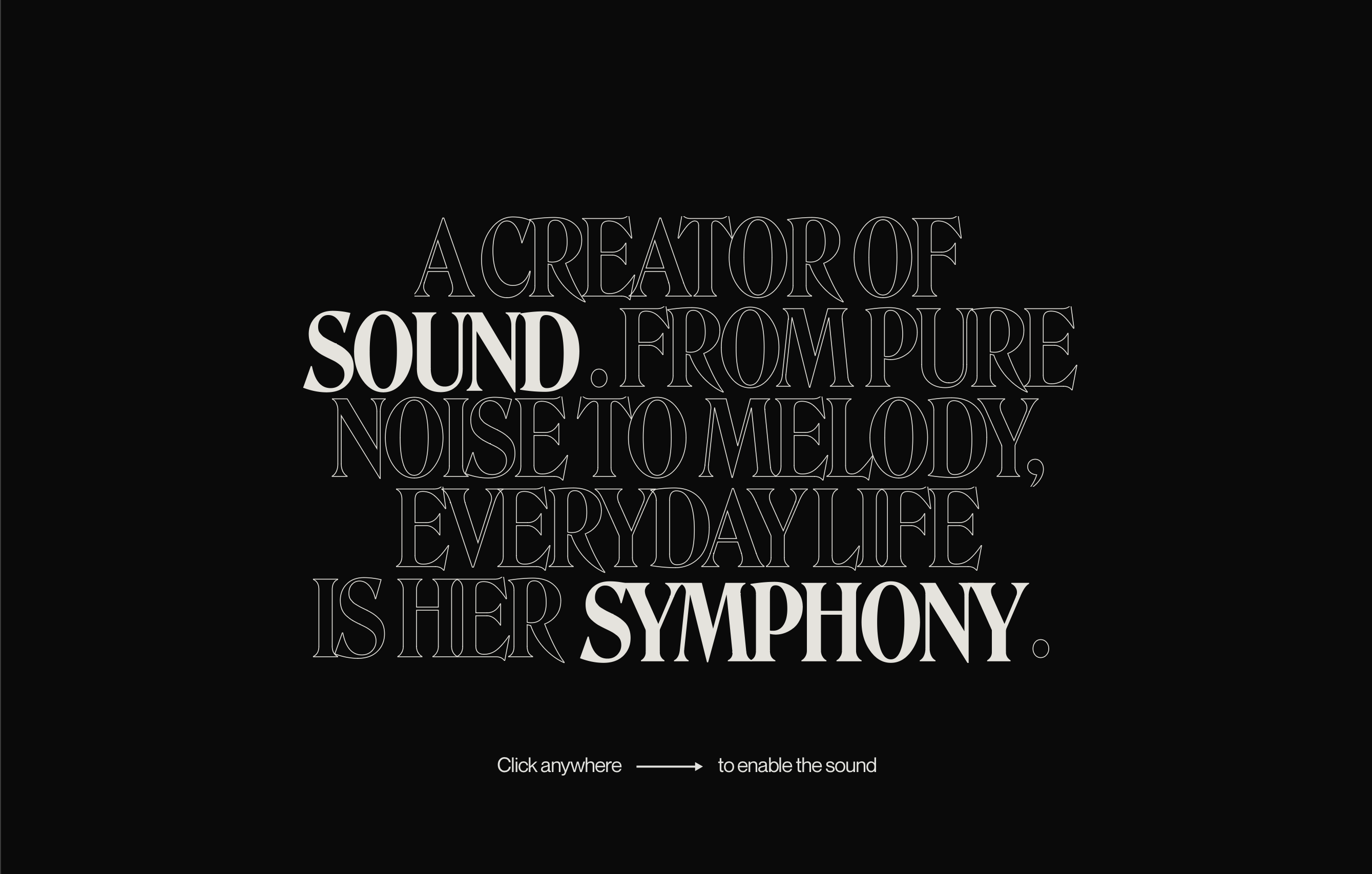
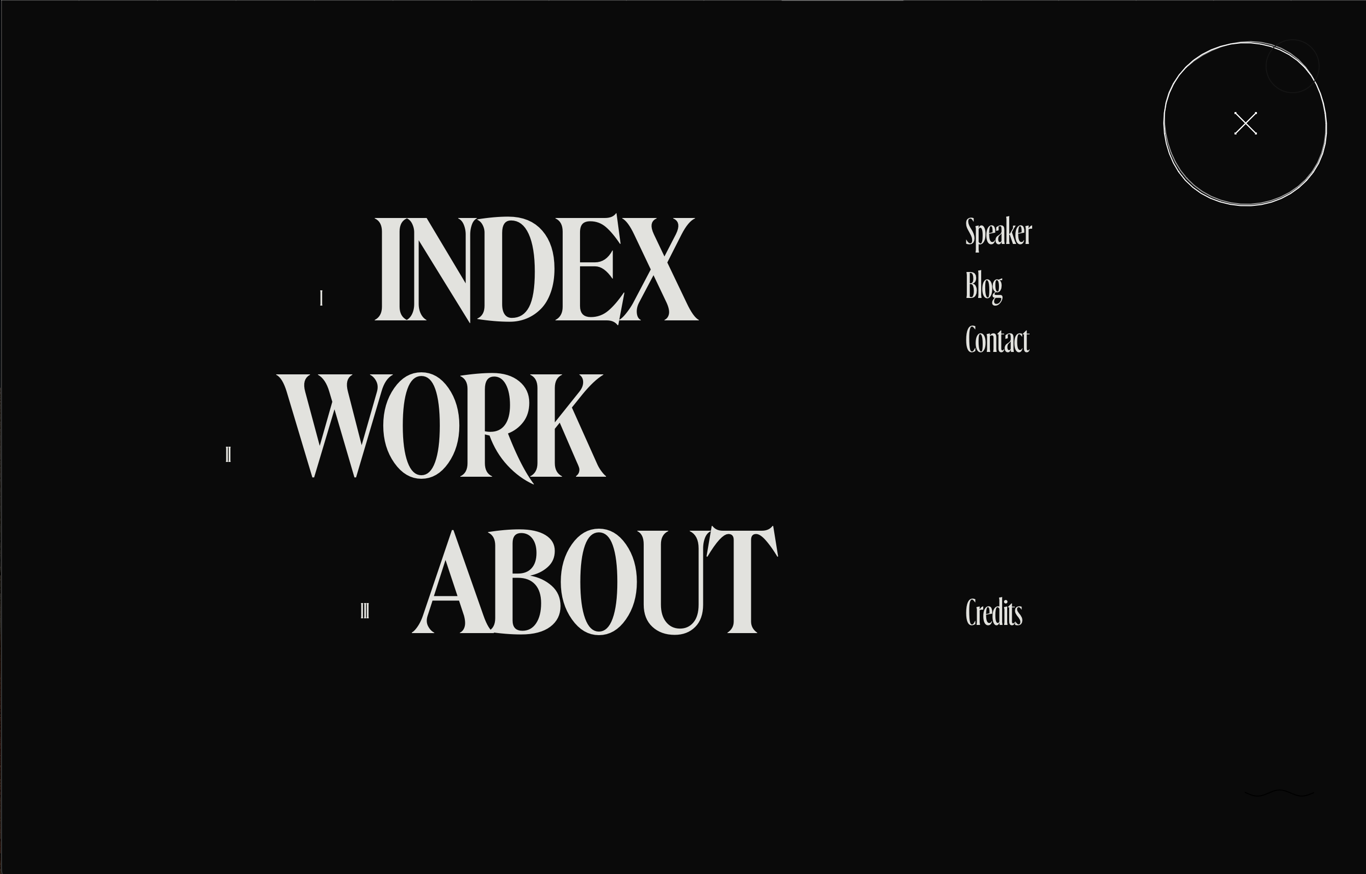
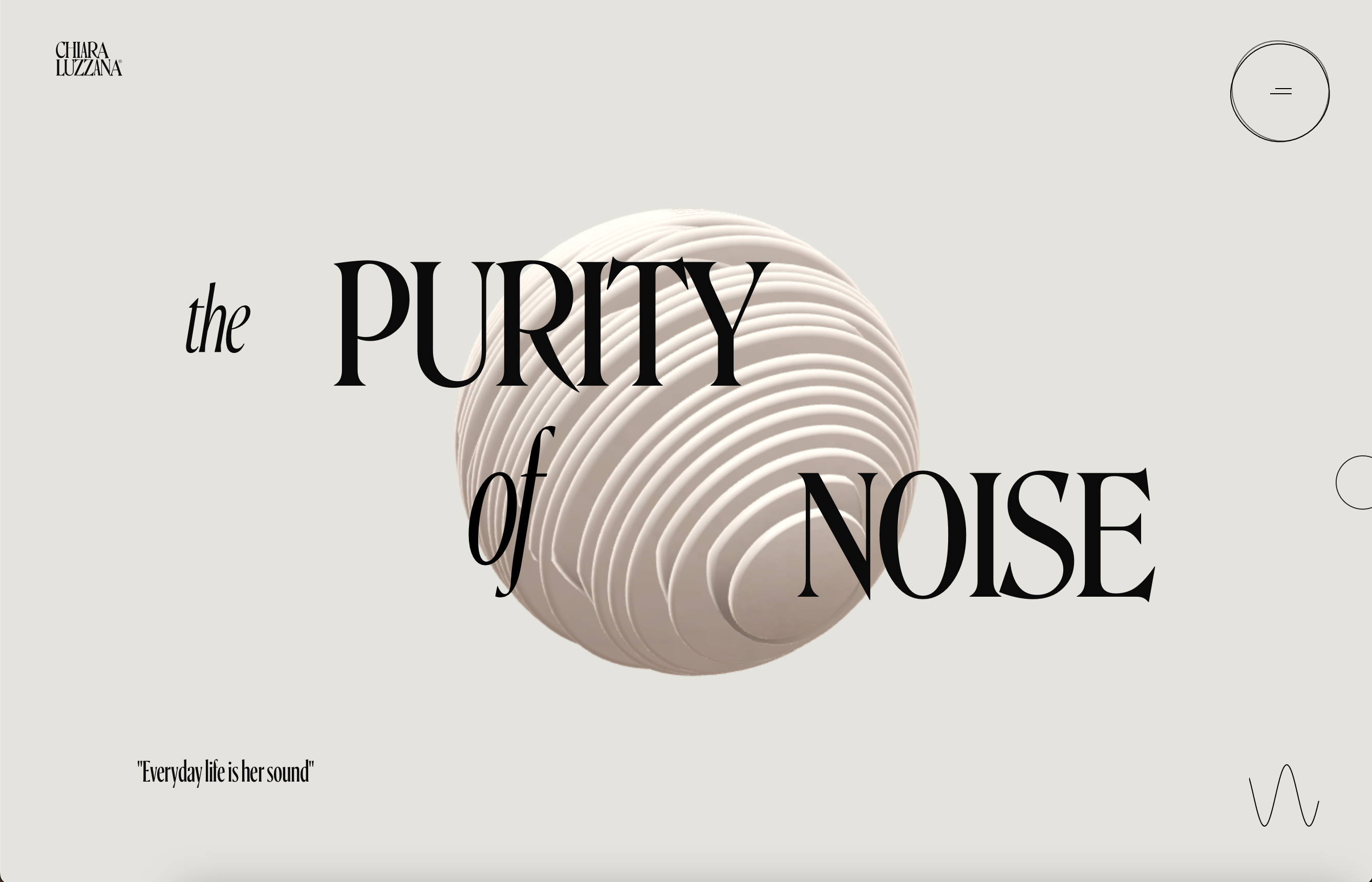
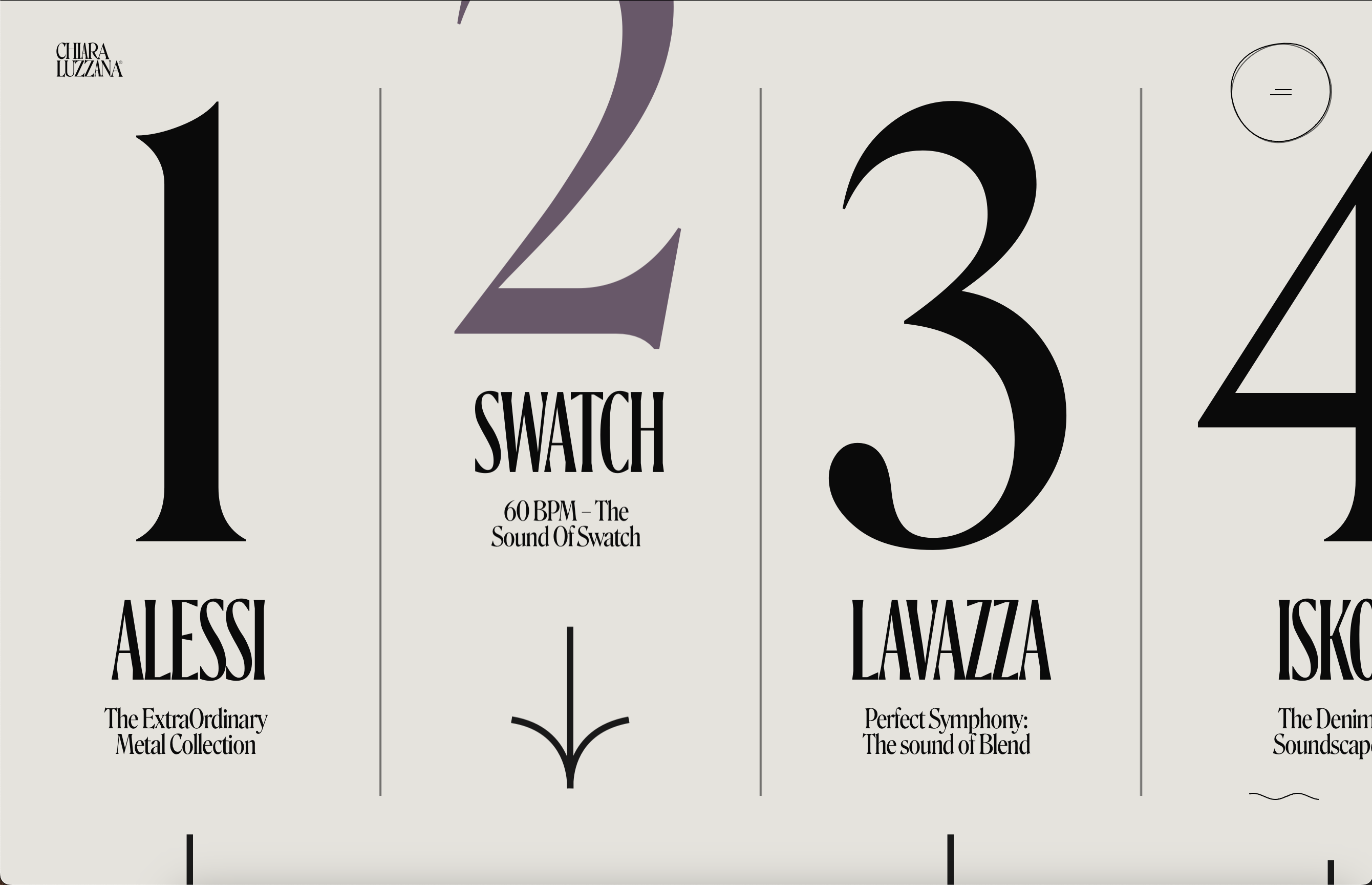
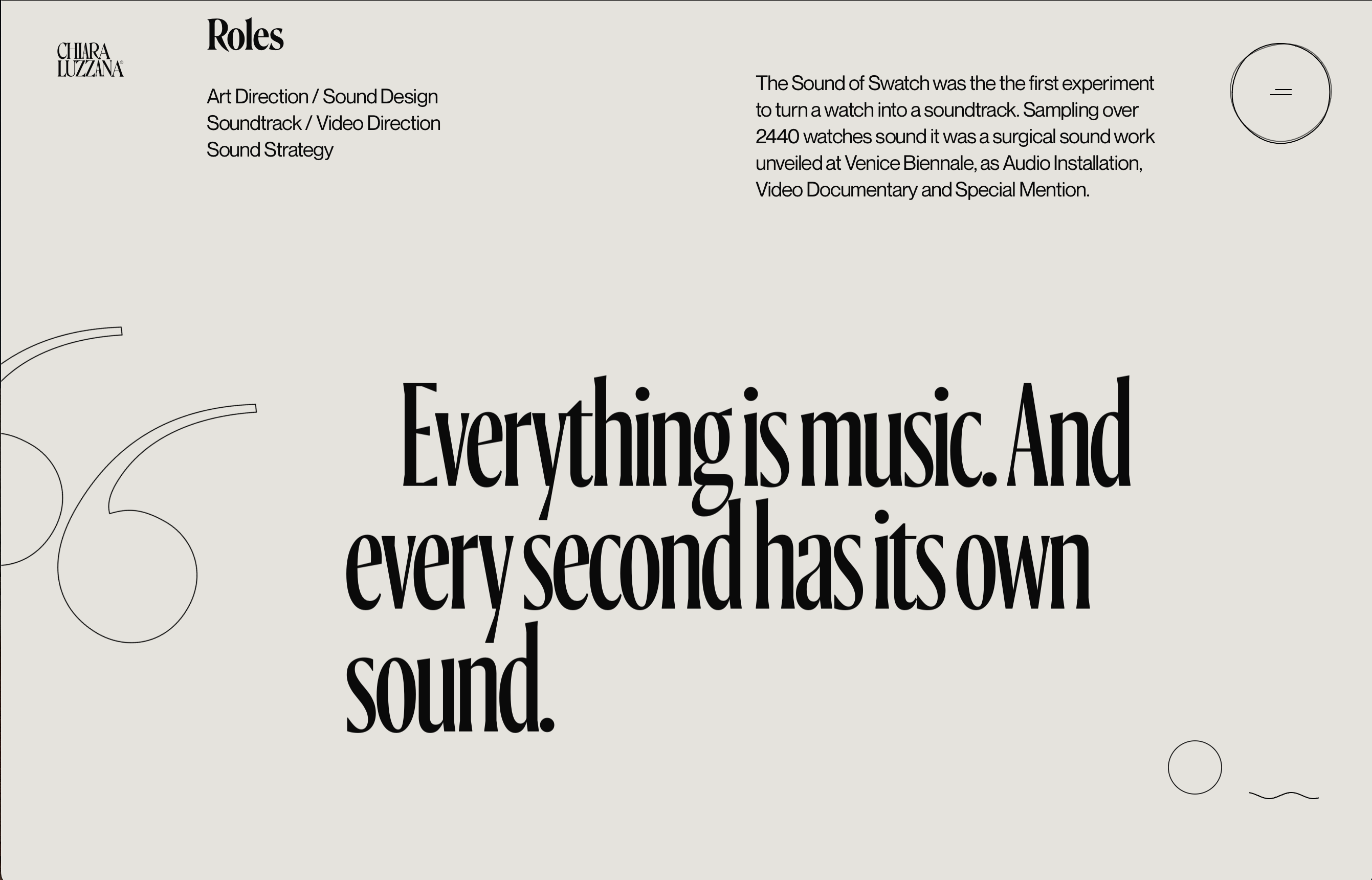
I appreciate this website for its thoughtful design choices. The use of animations adds a dynamic and engaging element to the overall user experience. Simplicity reigns supreme here, making navigation effortless and allowing the content to take center stage. The choice of fonts is not only aesthetically pleasing but also intriguing, adding a unique touch to the site's personality. What's particularly commendable is the minimalistic approach to text initially presented, which leaves room for curiosity to flourish and draws visitors in, compelling them to explore further.
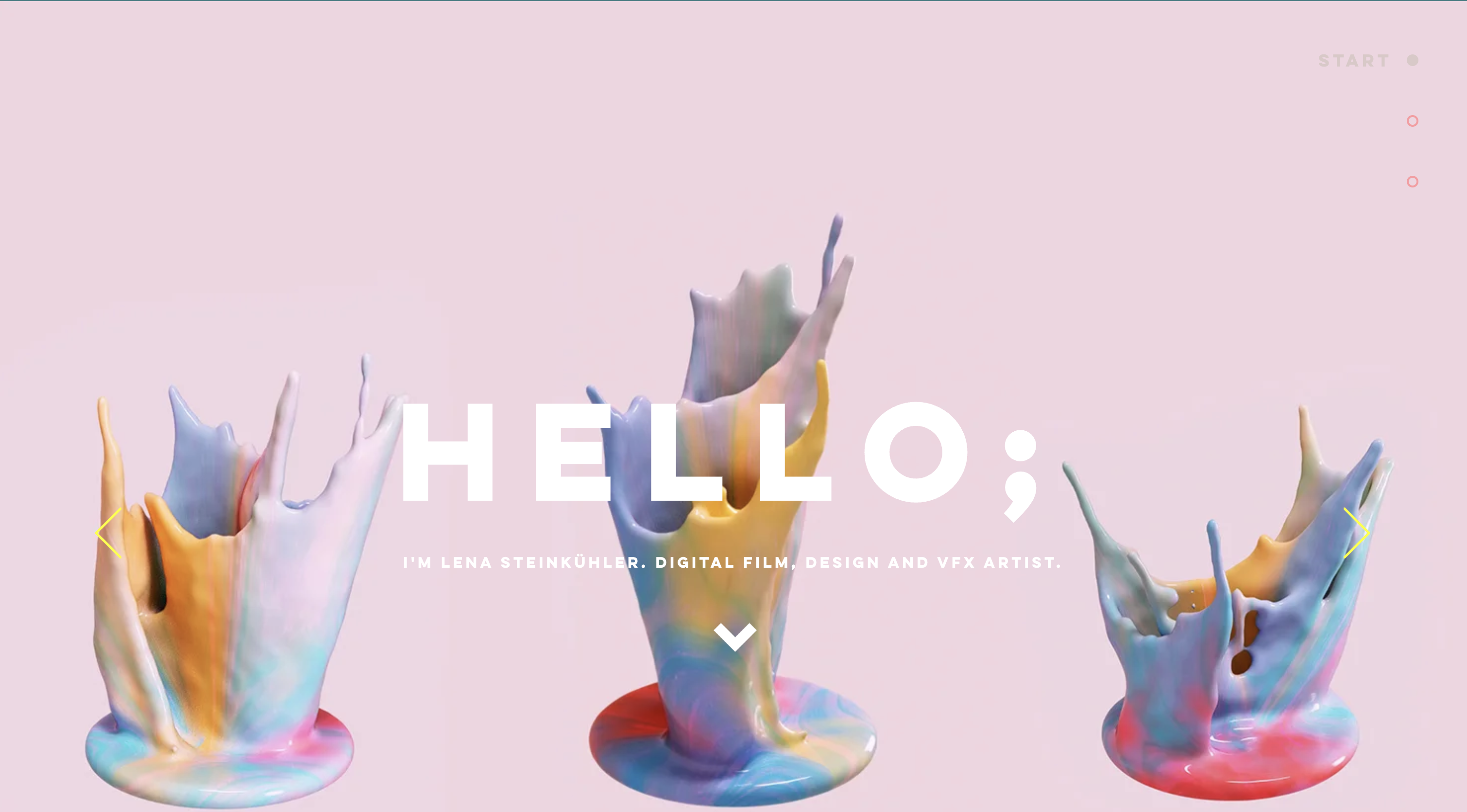
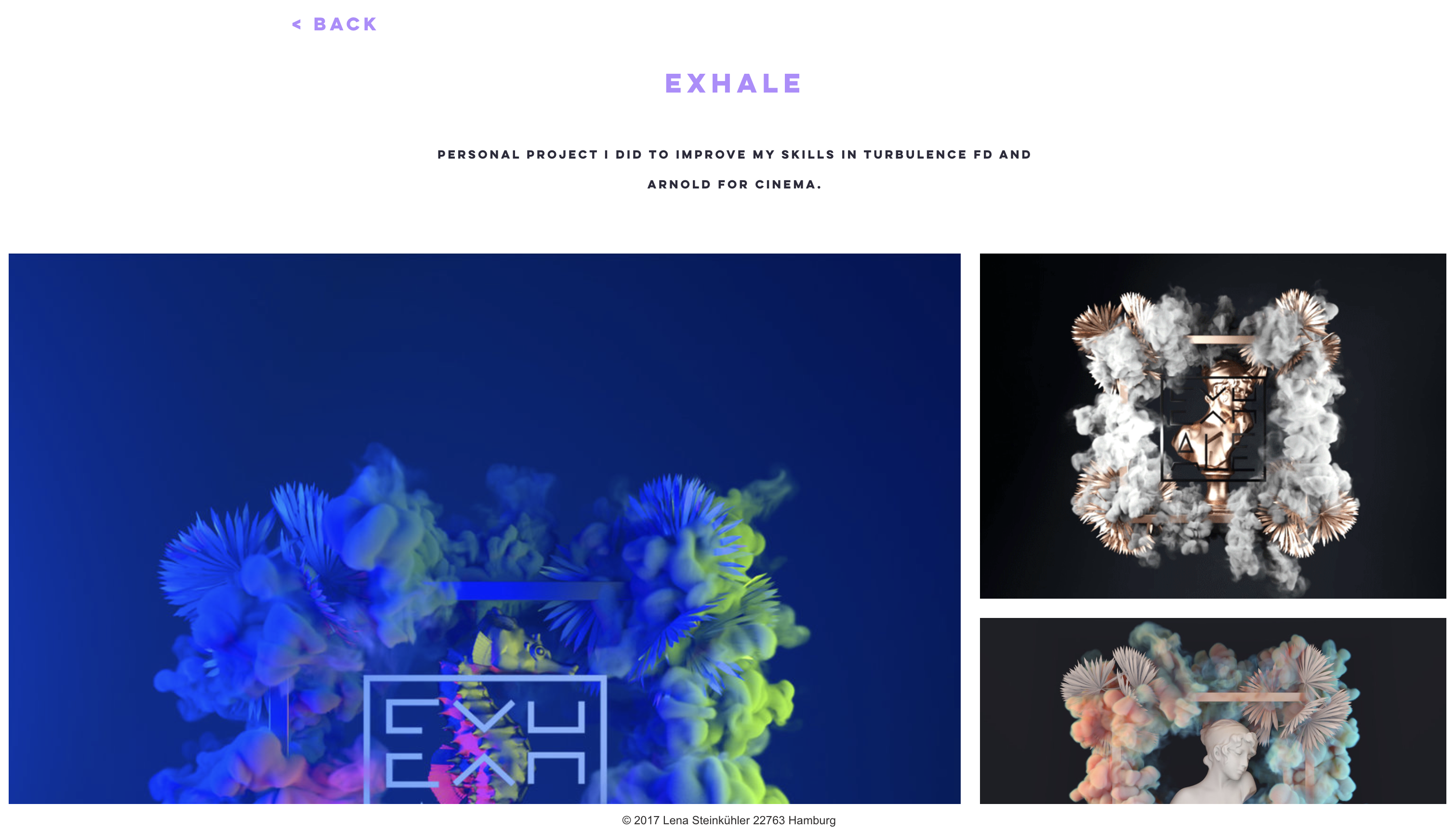
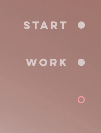
I'm genuinely fond of this website primarily because of its elegant simplicity and minimalistic design. It excels in presenting content in a clean and uncluttered manner, allowing the work to shine. The way it showcases the portfolio with images, where clicking on each piece reveals detailed elaborations, is both user-friendly and aesthetically pleasing. Moreover, the dynamic background adds an element of sophistication and dynamism, contributing to an overall engaging and memorable browsing experience.
Target Audience
My website caters to a diverse audience, encompassing employers, web designers, businesses, aspiring students, design firms, and fellow peers. For employers, it serves as a comprehensive showcase of my skills and portfolio, helping them gauge my suitability for various roles. Web designers and design firms can find inspiration and insights into my creative approach. Businesses can explore collaboration opportunities. Upcoming students can seek guidance and motivation from my journey. Lastly, my peers can share in my experiences and perhaps engage in fruitful discussions. The website aims to be a valuable resource for a wide range of individuals and entities within the design and professional communities.
Inspiration and Concepts
Color Palletes
Moodboard
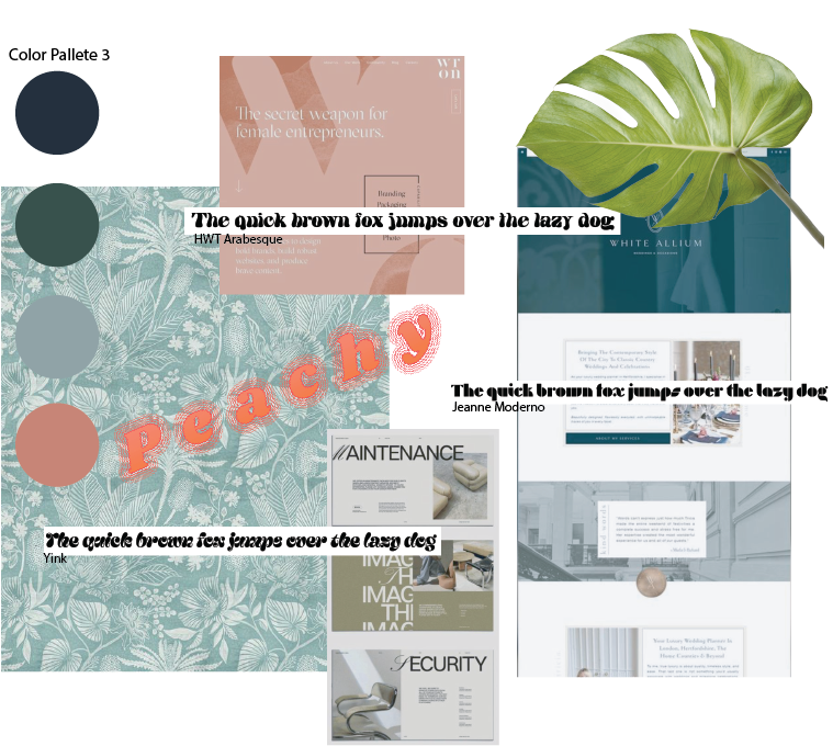
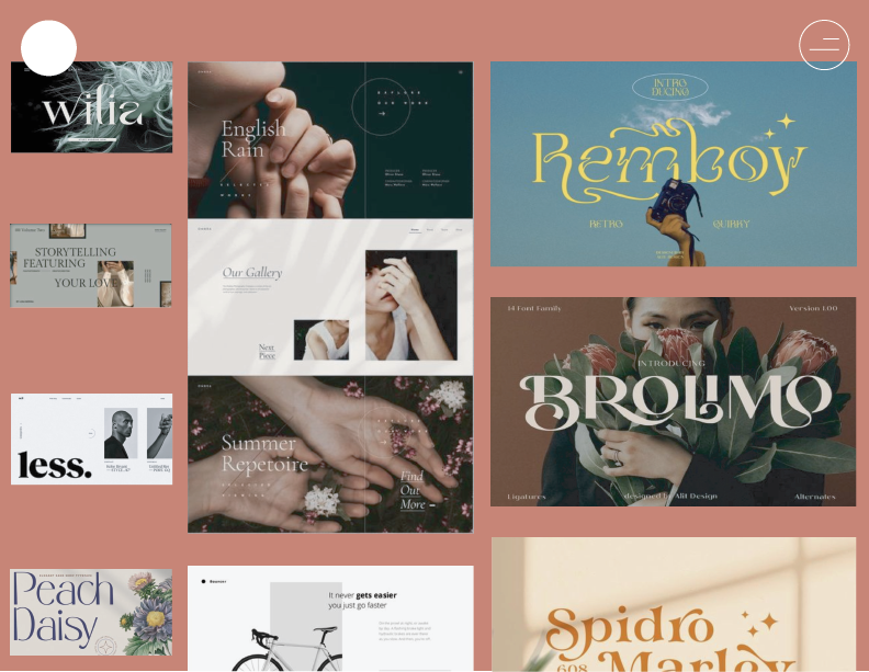
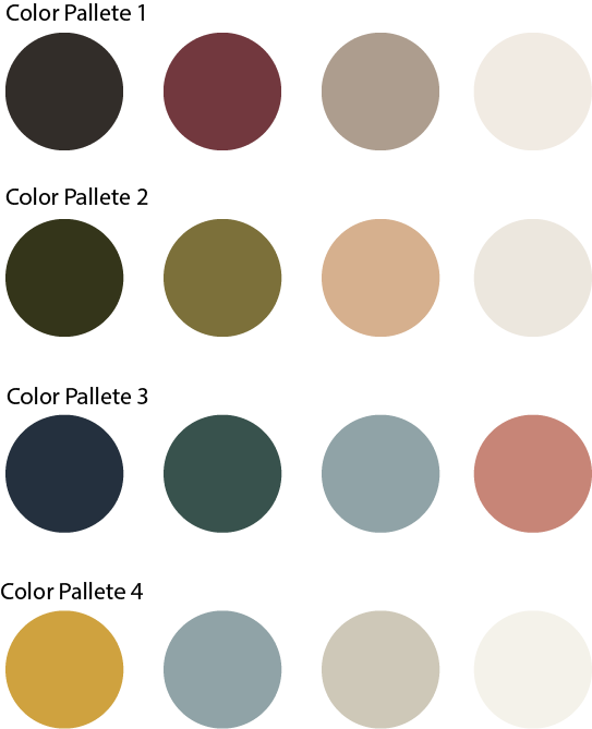
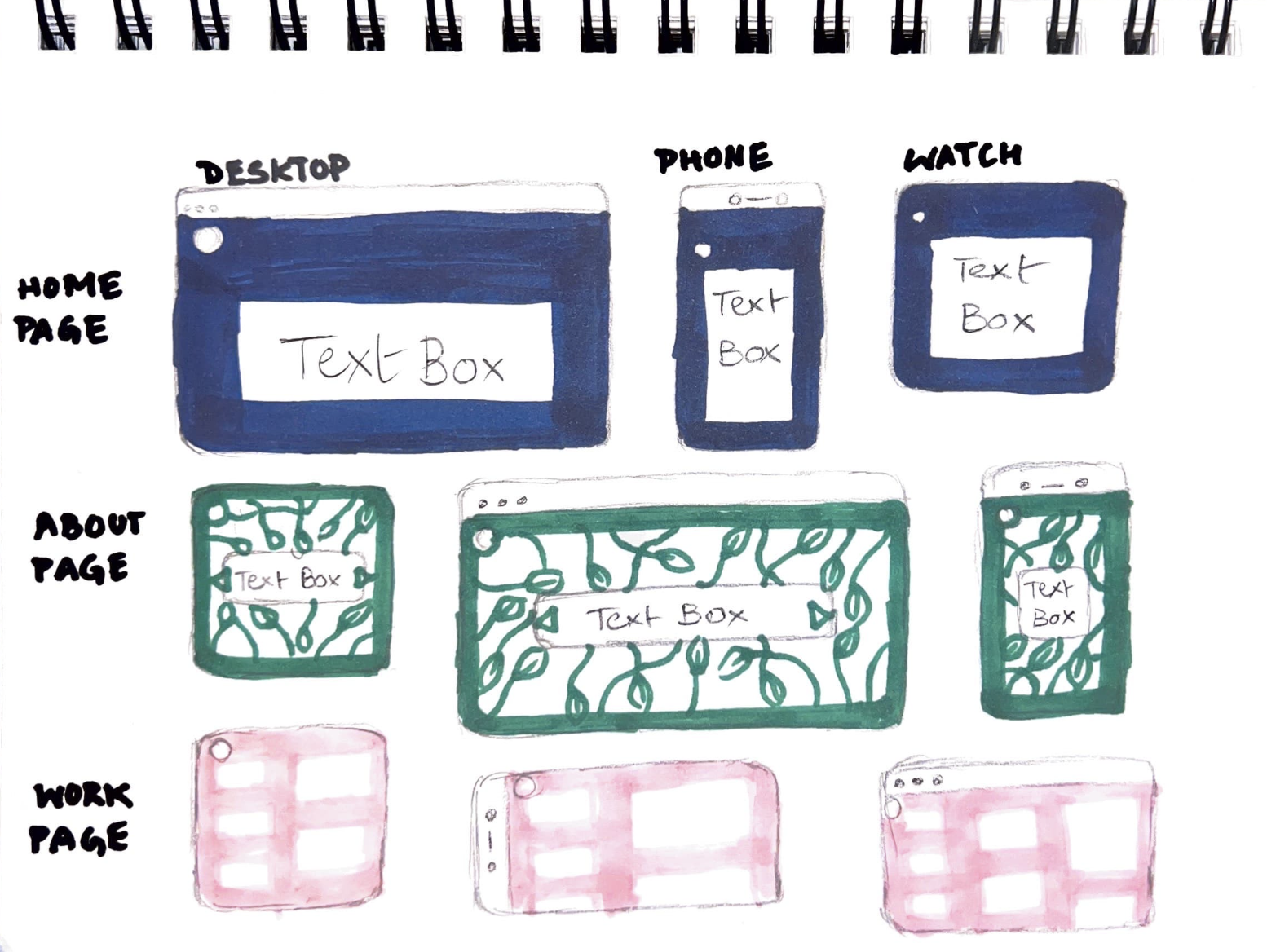
This moodboard serves as the primary wellspring of inspiration for my forthcoming website. My vision revolves around the harmonious interplay of various shades of blue, with a bold and contrasting infusion of vibrant pink. To ensure visual diversity and avoid a stark color-blocked look, I plan to incorporate cool prints into the design. Additionally, I find the three distinct fonts I've discovered particularly appealing, as they exude a casual and relatable charm, fostering a deeper connection with the site's visitors. As for the web layouts, I have sketched out a handful of ideas, all of which embrace a minimalistic ethos, allowing for clean and uncluttered spreads that prioritize user experience.
Thumbnails and Sketches
Wireframes and Prototypes
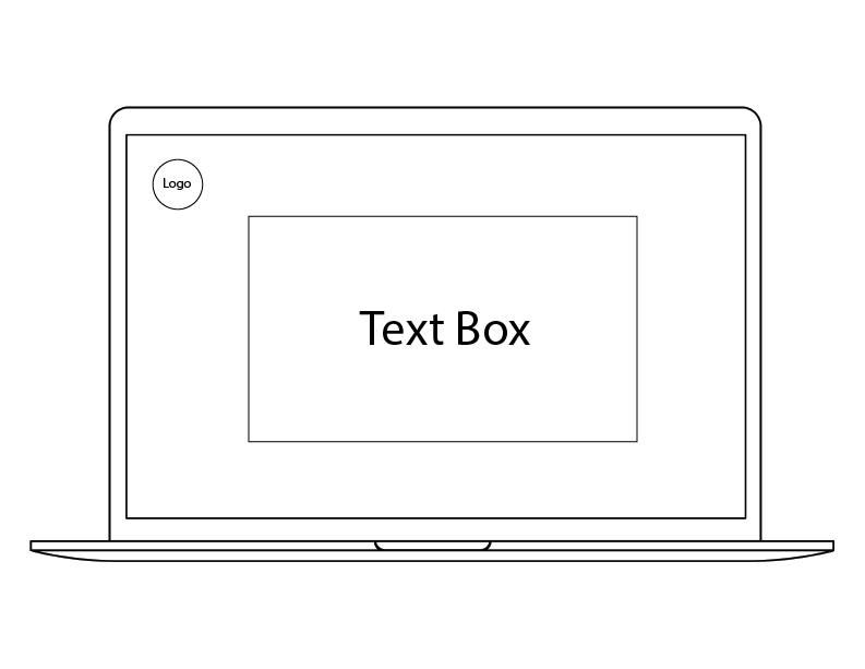
Home page
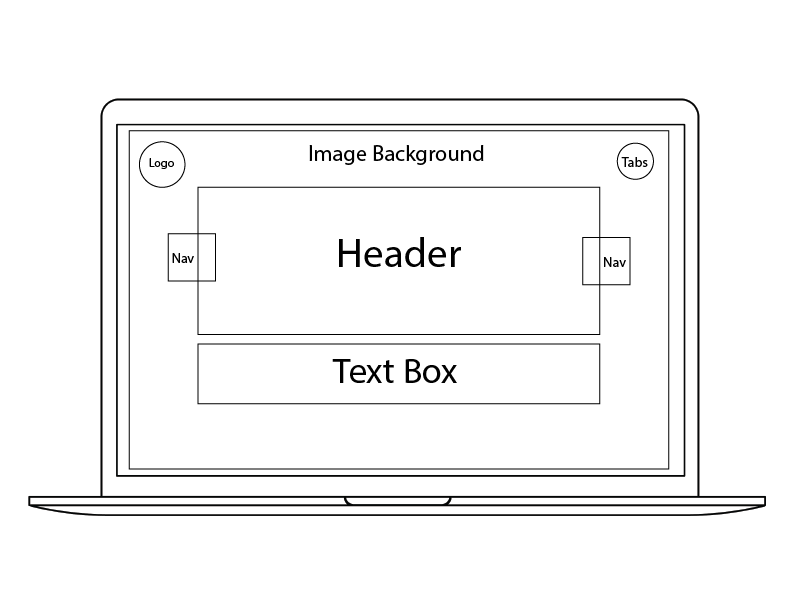
About page
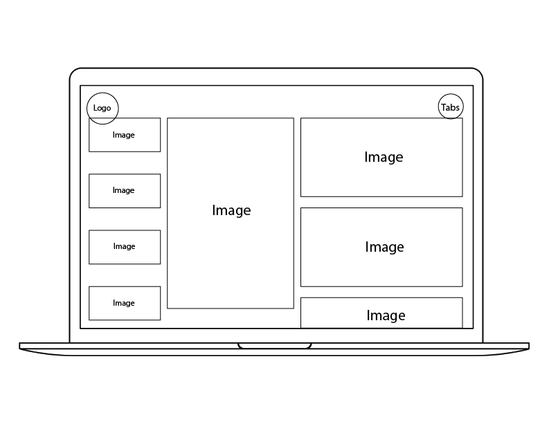
Work page
Responsive Mockup
Github link for responsive mockupPhotoShop Comp
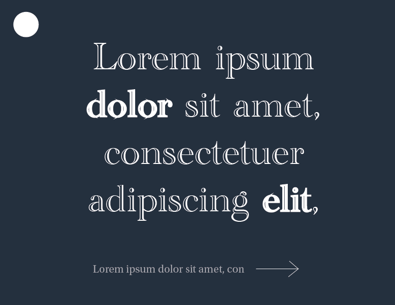
Home page mock-up
About page mock-up
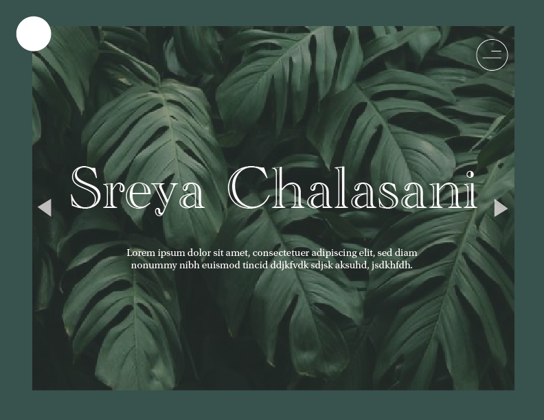
Work page mock-up
