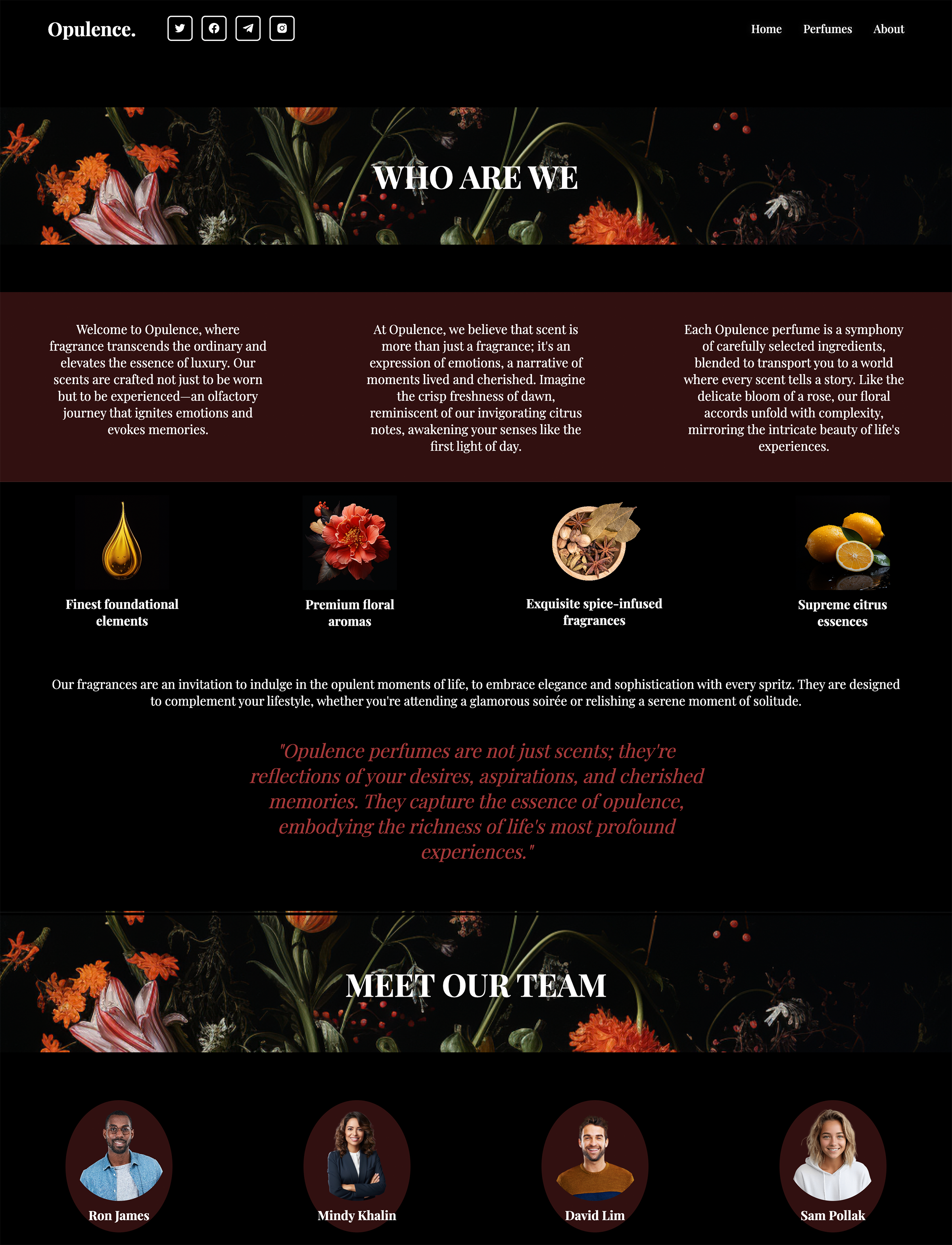
My Idea
Problem Statement: Enhancing the Online Luxury Perfume Shopping Experience
In the realm of luxury perfume industries, there exists a significant gap in the online shopping experience that hinders consumers from fully connecting with and understanding the essence of the fragrances offered. The current state of perfume brand websites fails to effectively convey the intricate details of scents, leaving potential customers yearning for a more immersive and informative experience. Key issues include:
Lack of Sensory Engagement:
Online visitors are deprived of the sensorial experience that physical stores provide, leaving them disconnected from the actual smell and emotional impact of the perfumes. The absence of an olfactory component in the online environment diminishes the overall appeal and understanding of the products.
Limited Comparative Analysis:
Consumers face challenges in comparing and contrasting different perfumes, as most websites lack comprehensive tools or information for such evaluations. The absence of a systematic approach to scent comparison impedes confident decision-making and inhibits the exploration of alternatives.
Inadequate Emotional Connection:
The current online platforms do not effectively translate the emotional resonance that each fragrance embodies. Consumers are left without a meaningful connection to the mood or feeling a perfume is designed to evoke, hindering their ability to make informed choices aligned with their personal preferences.
Dependency on Physical Stores:
The deficiency in providing a rich online experience compels consumers to rely on physical stores for purchasing decisions. This dependence limits accessibility and convenience for a global audience, hindering the potential for wider market reach.
Discovery and Research
Aēsop
A Beacon of Minimalistic Excellence in Luxury Perfume Retail
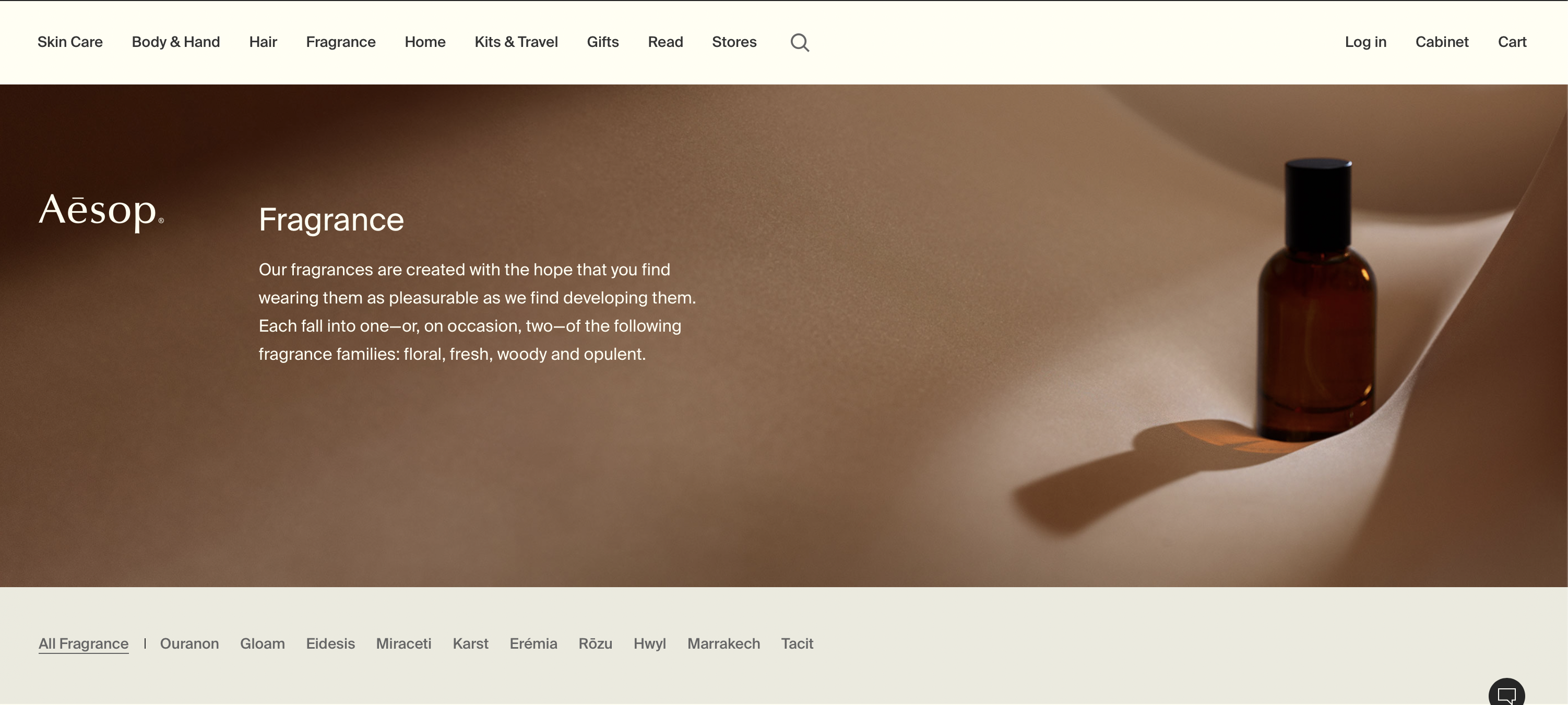
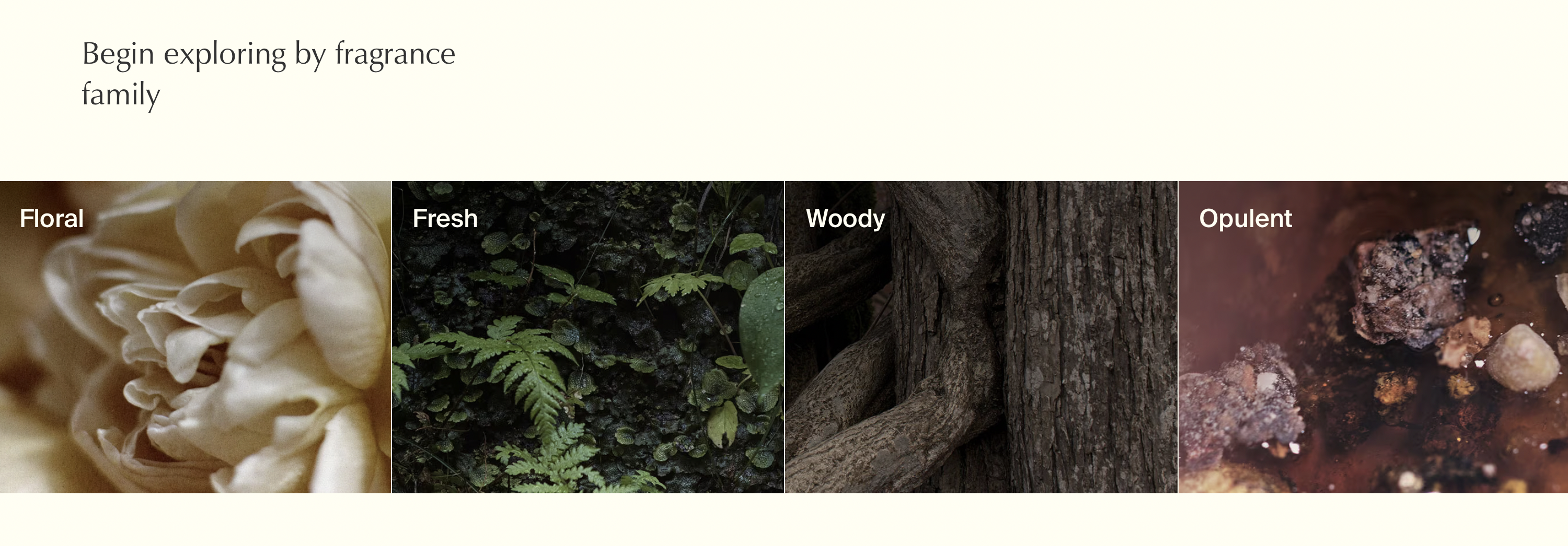
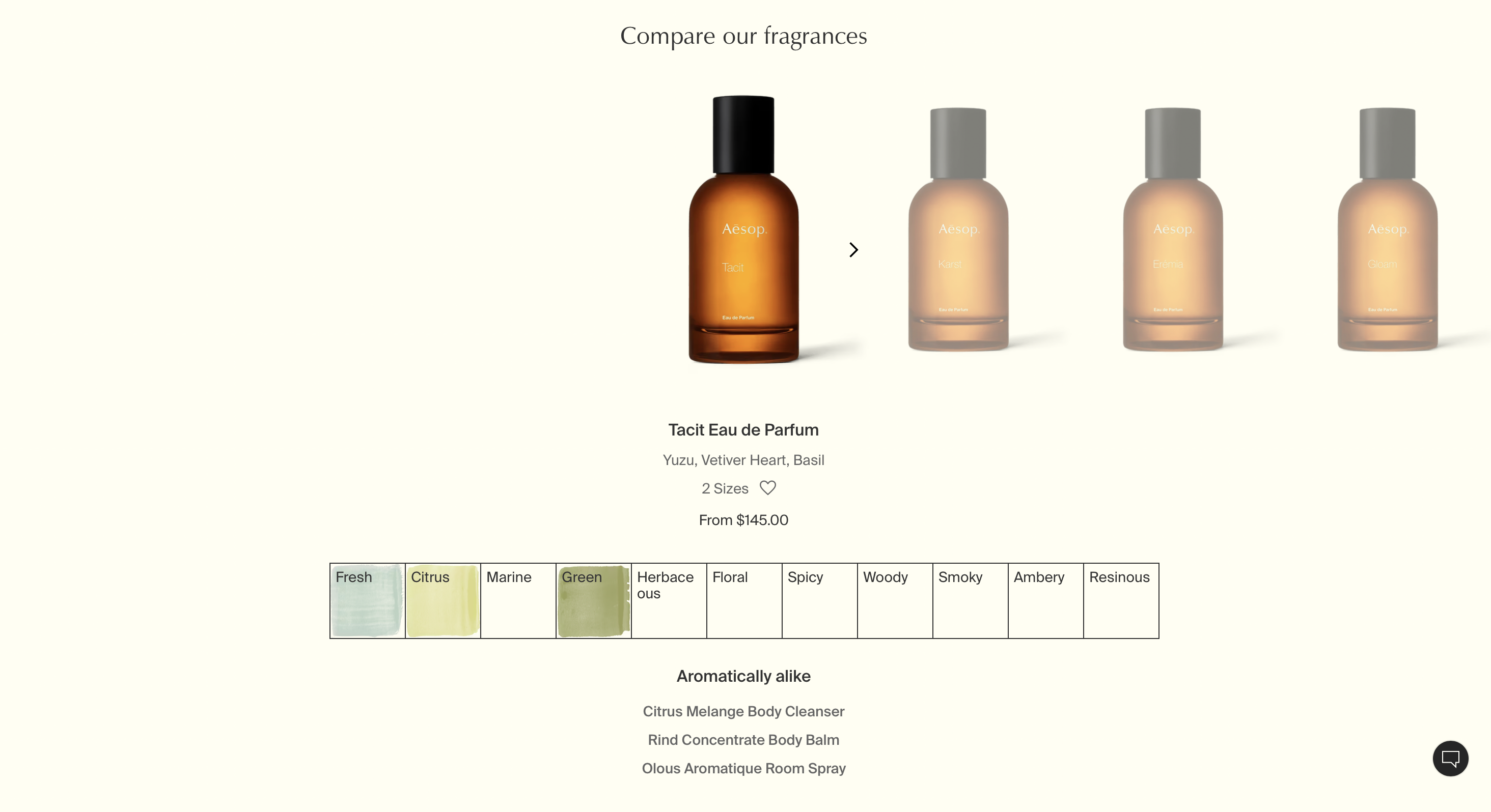
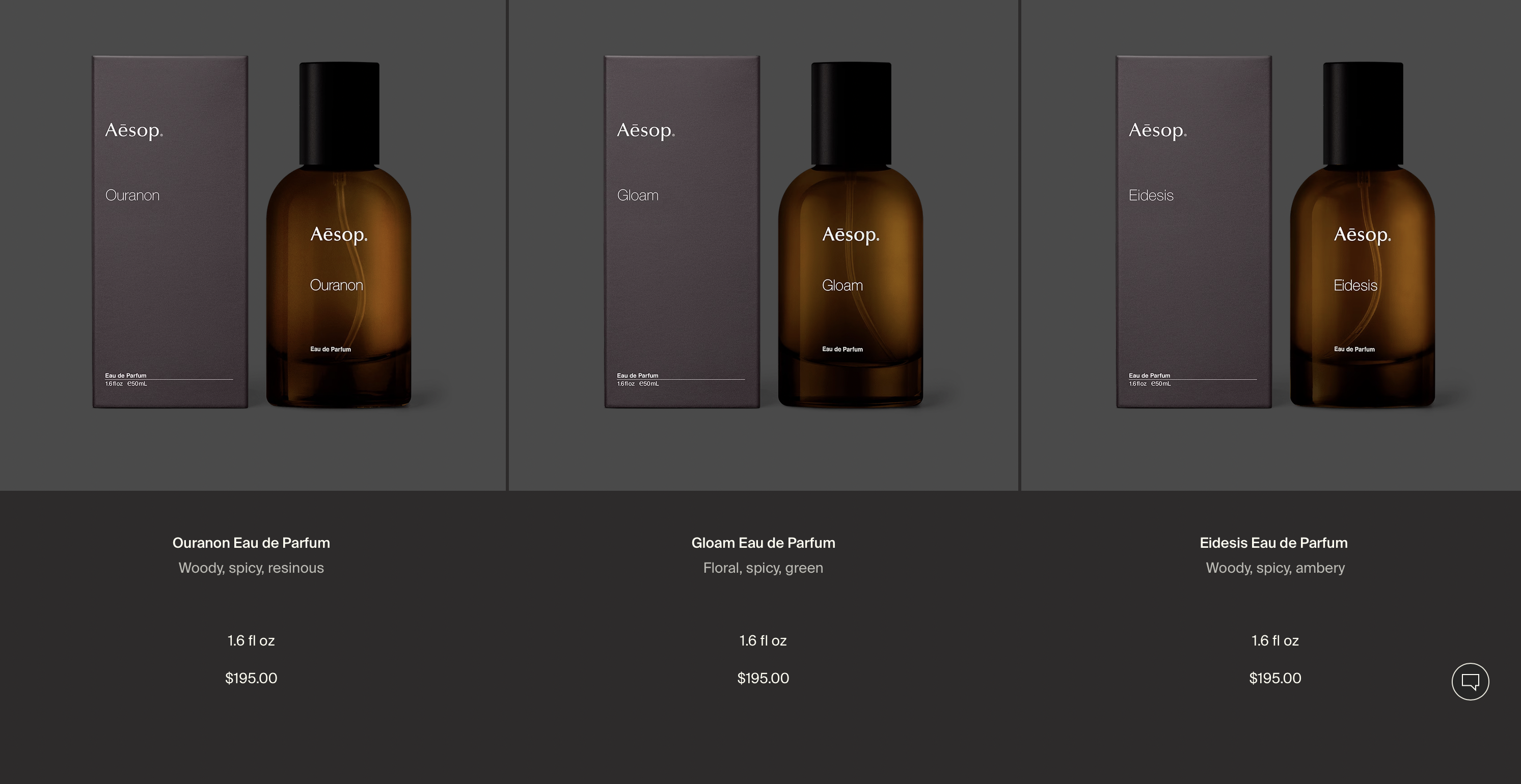
The Aesop website stands out as a paragon of elegance and minimalism in the realm of luxury perfume brands. Adopting a clean and sophisticated design, the website embraces simplicity to enhance user experience. The minimalist approach is not only aesthetically pleasing but also serves a functional purpose, allowing visitors to navigate effortlessly through the fragrance offerings. Aesop excels in providing an immersive experience by employing tools for scent comparison and categorization. The intuitive design allows users to explore the perfumes based on their main undertones, enabling a more personalized and informed selection process. Moreover, Aesop's innovative approach of relating scents to familiar smells creates a bridge between the digital and physical world, facilitating a deeper connection between the consumer and the product. The website successfully combines aesthetics with functionality, setting a high standard for the industry.
Jo Malone
A Confounding Digital Landscape Diminishing User Experience
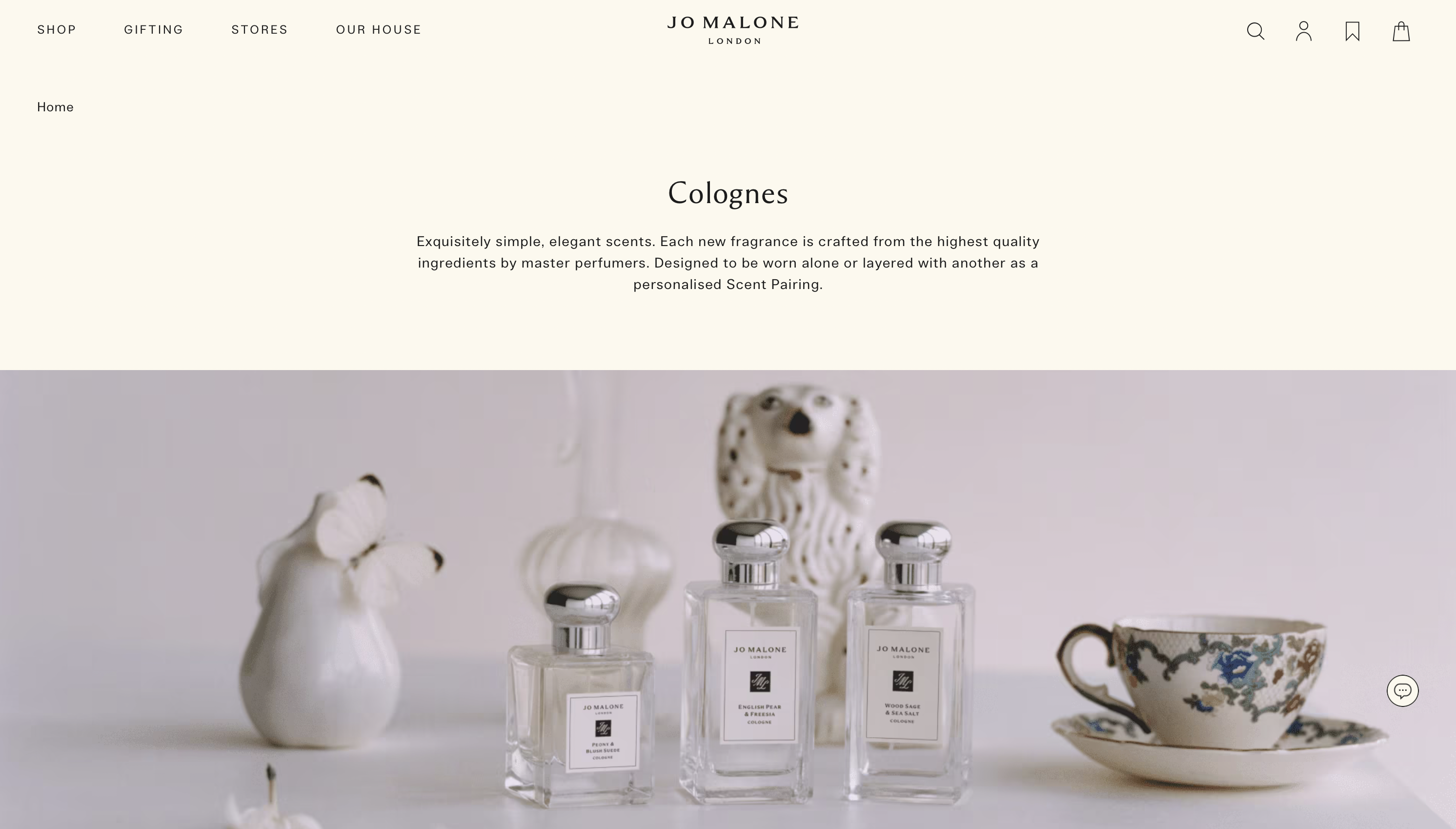
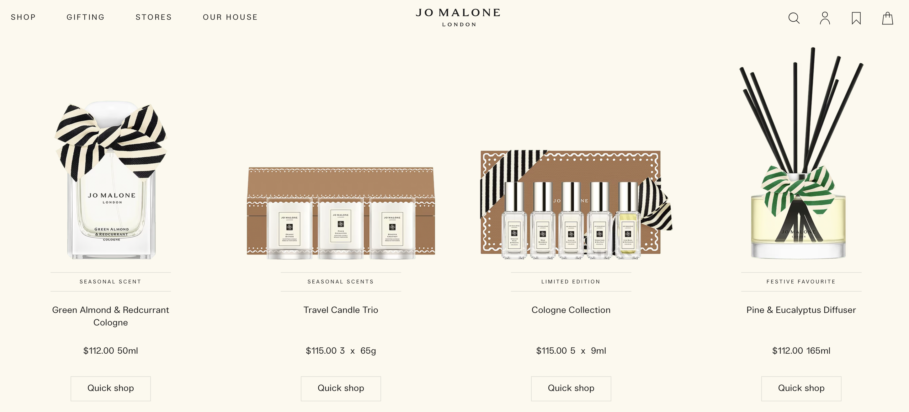
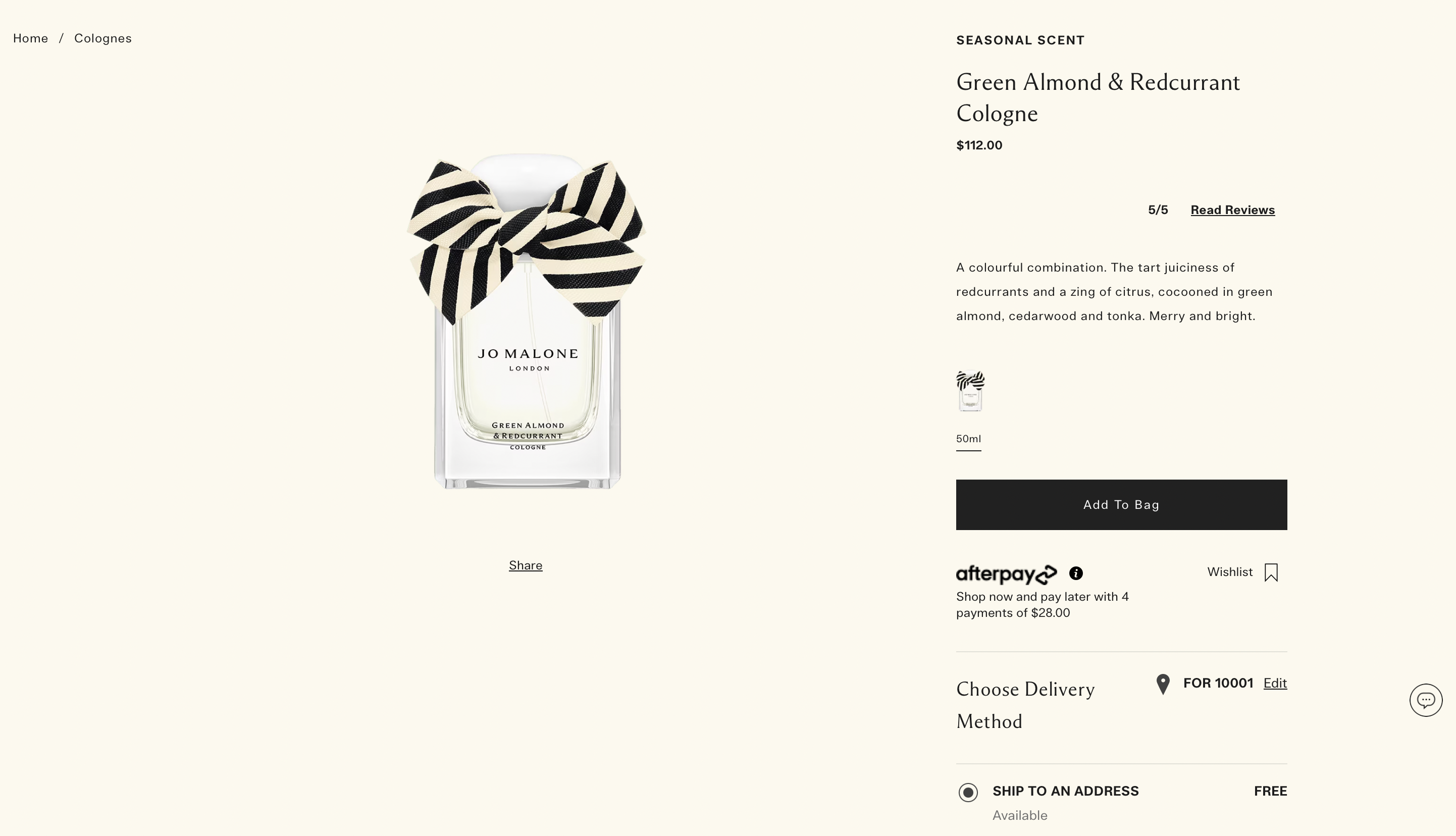
In stark contrast, the Jo Malone website falls short of delivering a compelling and user-friendly online shopping experience in the luxury perfume domain. The website's confusing layout, interspersed with promotional ads among the perfumes, disrupts the flow of exploration and can be disorienting for users seeking a seamless journey. The overly basic design lacks the sophistication expected from a luxury brand, and the absence of clear categories for their products adds an additional layer of complexity. The haphazard showcasing of products not only intimidates users but also impedes their ability to make well-informed choices. Furthermore, the emotional connection is notably absent, as the website fails to evoke the desired sentiments associated with the brand's fragrances. Jo Malone's digital presence falls short of meeting the expectations set by its luxury status, emphasizing the importance of a refined and user-centric online platform in the competitive landscape of luxury perfume retail.
Target Audience
This innovative e-commerce platform revolutionizing the online luxury perfume shopping experience, caters to a discerning and diverse audience that appreciates the artistry and intricacy of premium fragrances. The target demographic is characterized by individuals who value both the sensory and emotional dimensions of perfume exploration. The ideal audience for this project includes:
1. Affluent Perfume Connoisseurs:
Age Range: 25-55 years old
Description: Individuals within this age group are financially established and possess a refined taste for luxury goods. They seek exclusive and unique fragrances that reflect their discerning lifestyle.
2. Digital Natives with a Passion for Luxury
Age Range: 18-40 years old
Description: Tech-savvy individuals who have a strong online presence and appreciate the convenience of digital platforms. They are enthusiastic about luxury products and seek an immersive online experience when exploring and purchasing perfumes.
3. Gift Shoppers Seeking Thoughtful Presentations:
Age Range: 30-60 years old
Description: Individuals who often purchase luxury perfumes as gifts for special occasions. They value a platform that provides detailed insights into scents, aiding them in selecting the perfect fragrance to suit the recipient's taste.
4. Global Luxury Enthusiasts:
Age Range: 25-45 years old
Description: This project aims to attract a global audience with an appreciation for luxury perfumes. The platform transcends geographical boundaries, offering accessibility to individuals who may not have easy access to physical luxury fragrance stores.
5. Educational Seekers in the World of Fragrance:
Age Range: 25-45 years old
Description: This project aims to attract a global audience with an appreciation for luxury perfumes. The platform transcends geographical boundaries, offering accessibility to individuals who may not have easy access to physical luxury fragrance stores.
Inspiration and Concepts
Moodboards
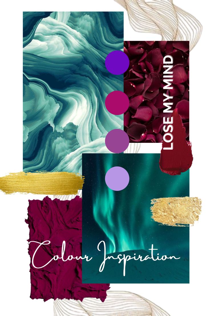


Creating a moodboard for a perfume website is an artful way to visually communicate the emotions and sensations the fragrance evokes.
In terms of typography and design elements, the website could utilize elegant fonts for headings and delicate script for descriptions to align with the perfume's character. Perhaps incorporating subtle animations or transitions that mimic the unveiling of secrets or the unfolding of a love story can further enhance the mood and captivate the visitors.
Ultimately, the moodboard serves as a visual roadmap, guiding the website's design, color scheme, imagery, and overall ambiance to resonate with the emotions and sensations that the perfumes aim to evoke.
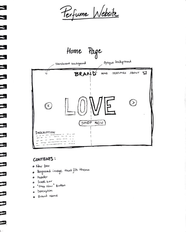
Thumbnails and Wireframes
.jpg)
.jpg)
.jpg)
.jpg)
.jpg)
.jpg)
PhotoShop Comp
Home page mock-up
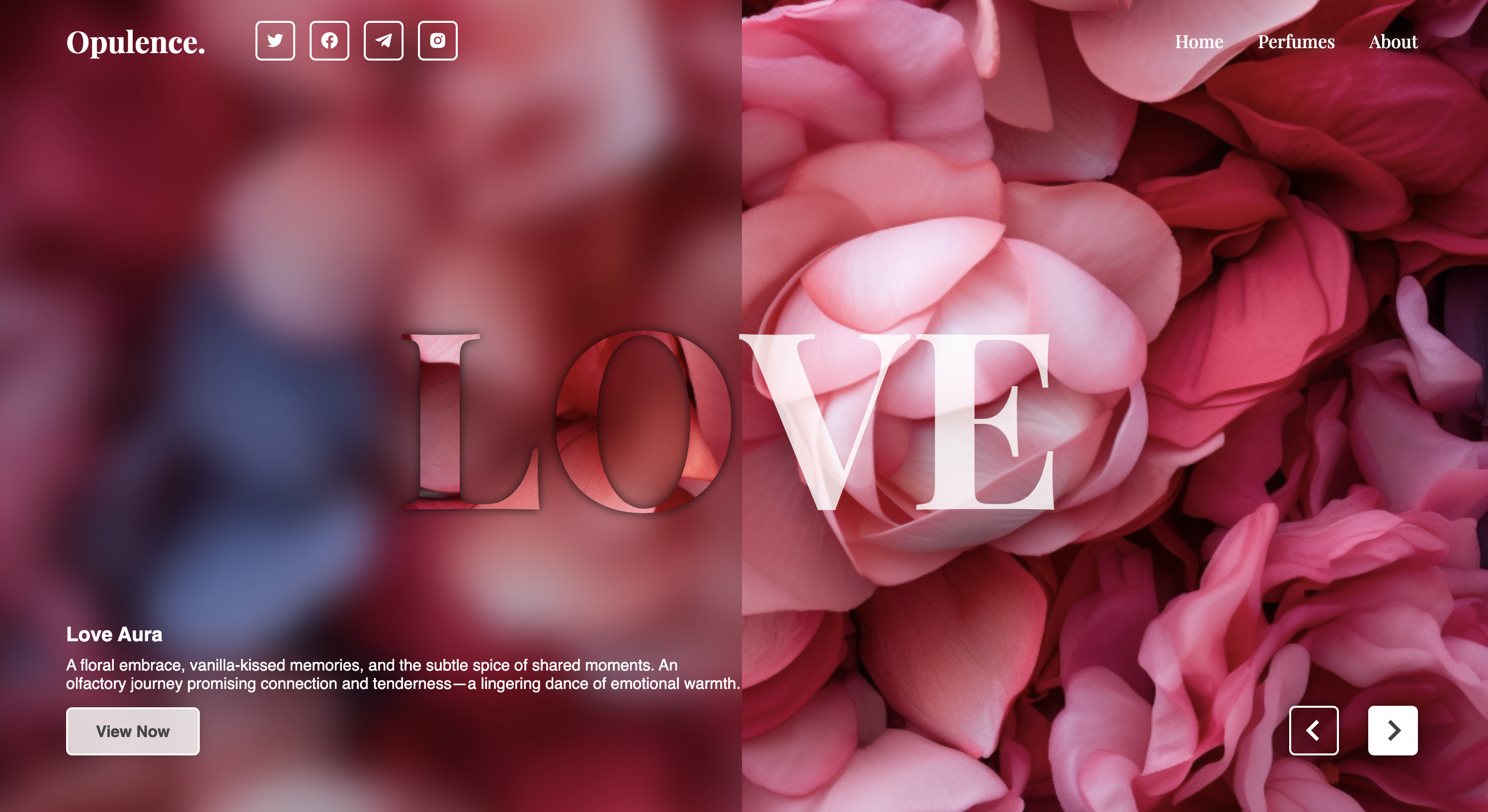
Theme page mock-up
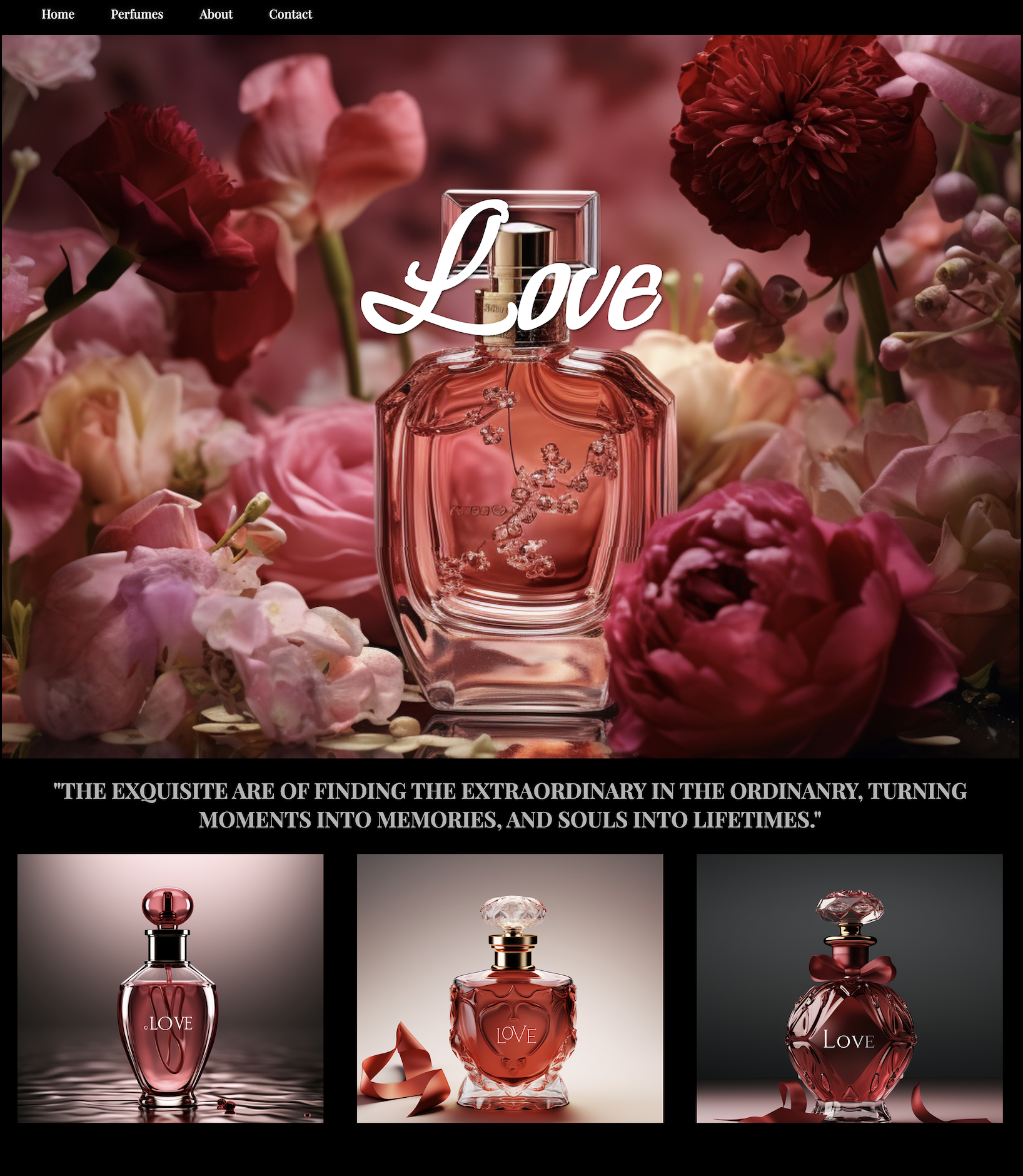
Perfume mock-up
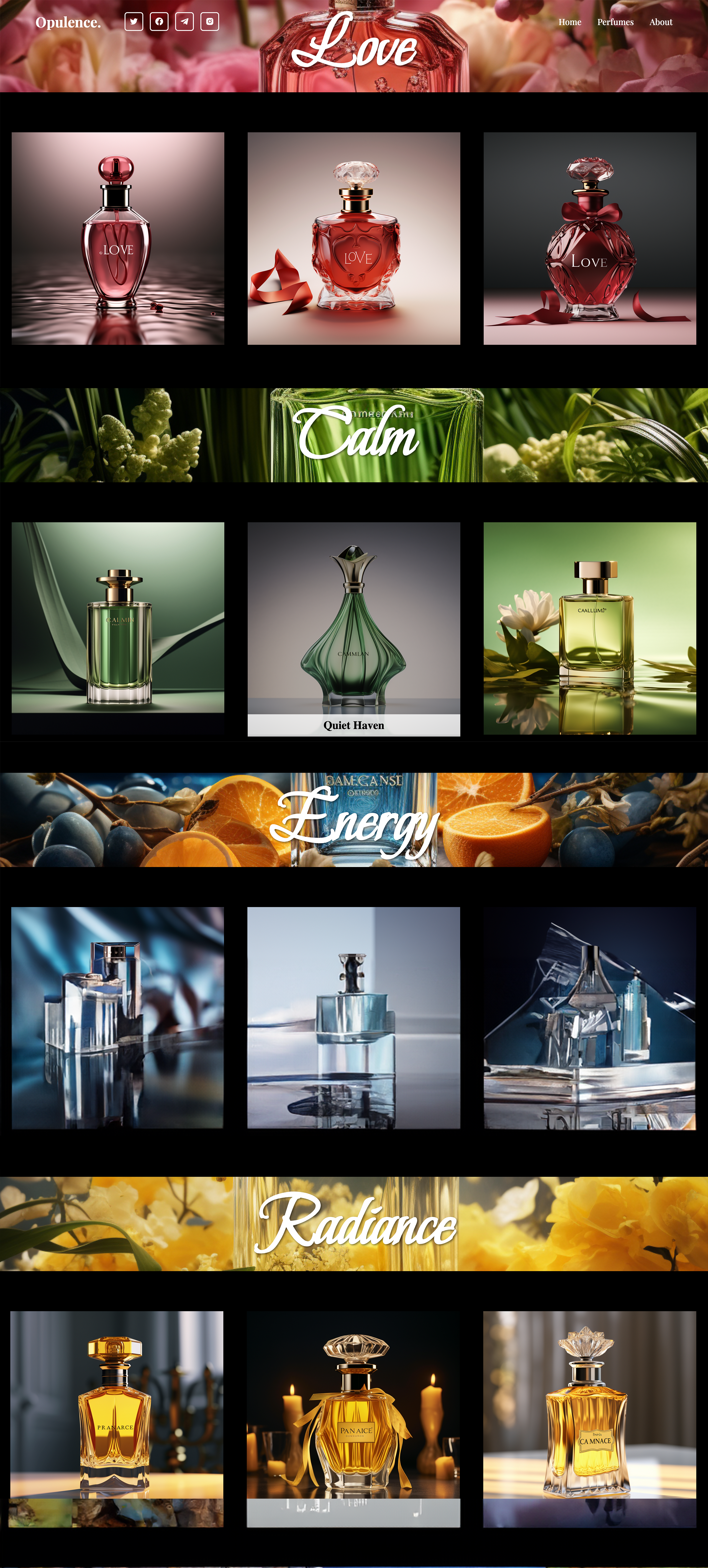
About mock-up
