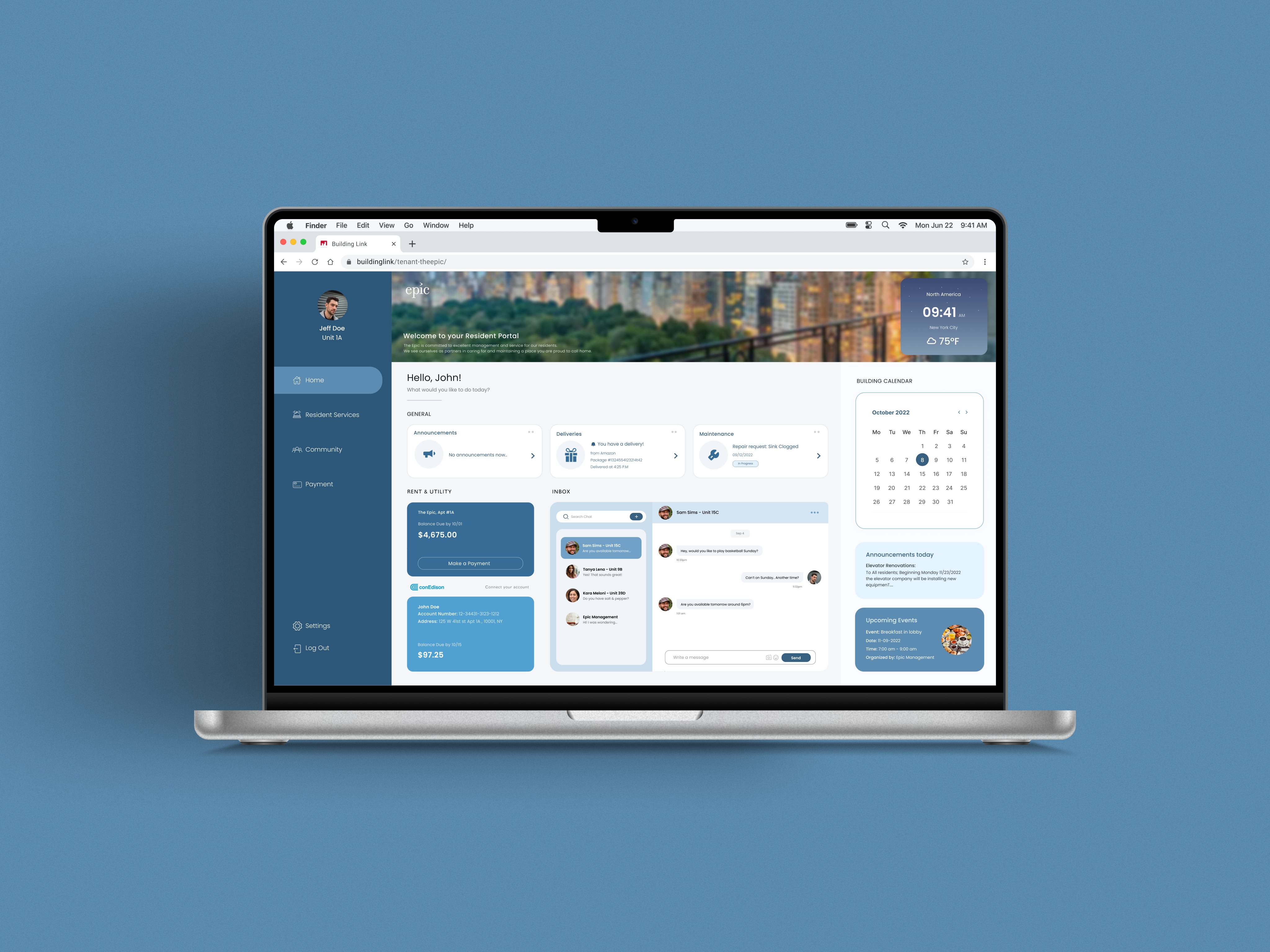
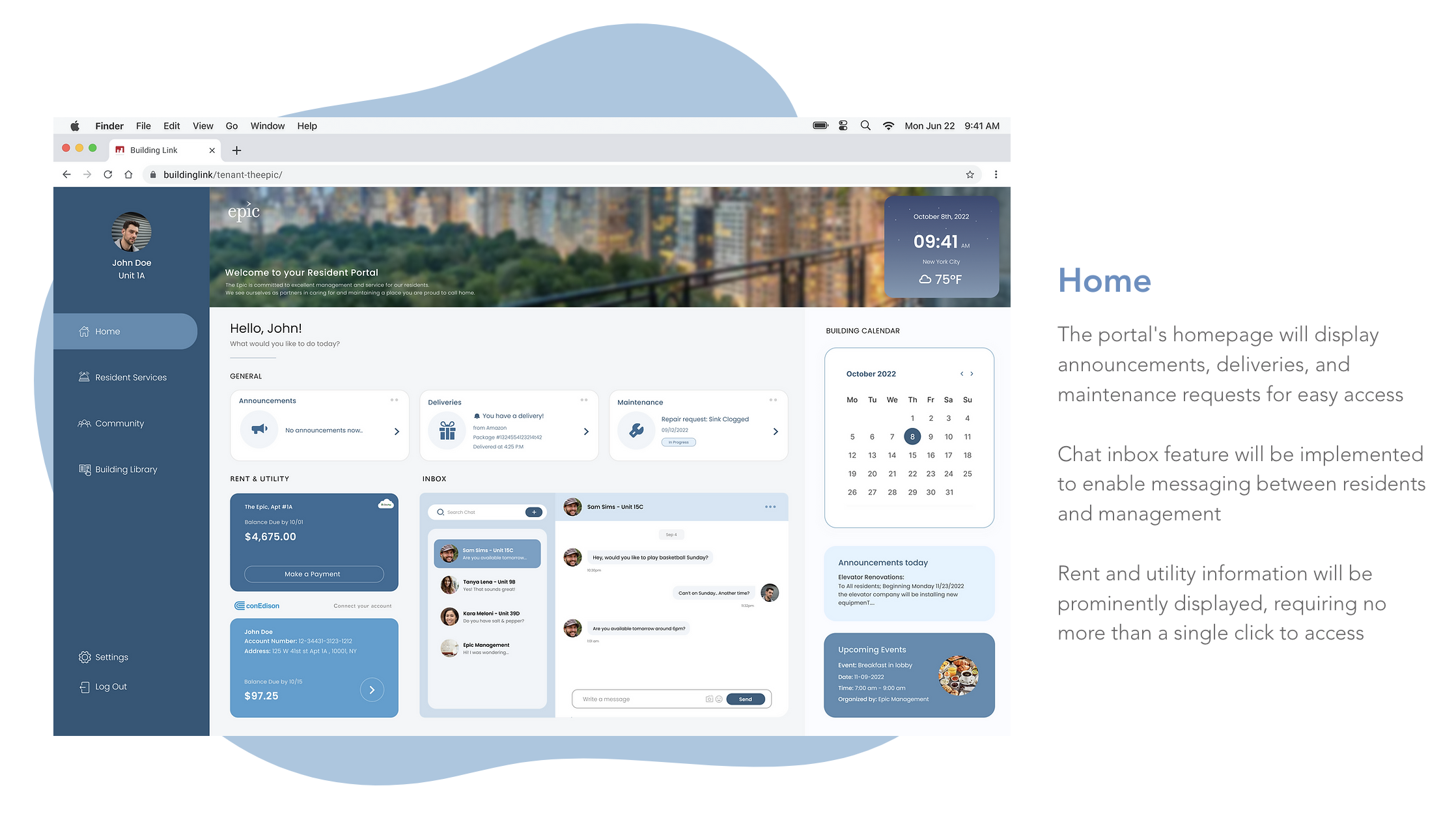
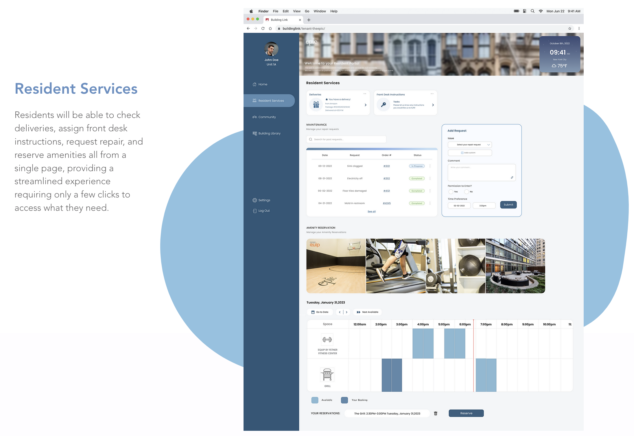
OVERVIEW
Waking up to the maintenance workers knocking on my door is definitely a frustrating way to begin my day. However, there was no option for me to select my preferred times on the portal. After experiencing delays, setbacks, and challenges in communicating with the building's management team, I had an epiphany - what if I could take this initiative and redesign the portal's interface to make it more user-friendly and something residents can actually enjoy?
WHAT WAS THE PROBLEM?
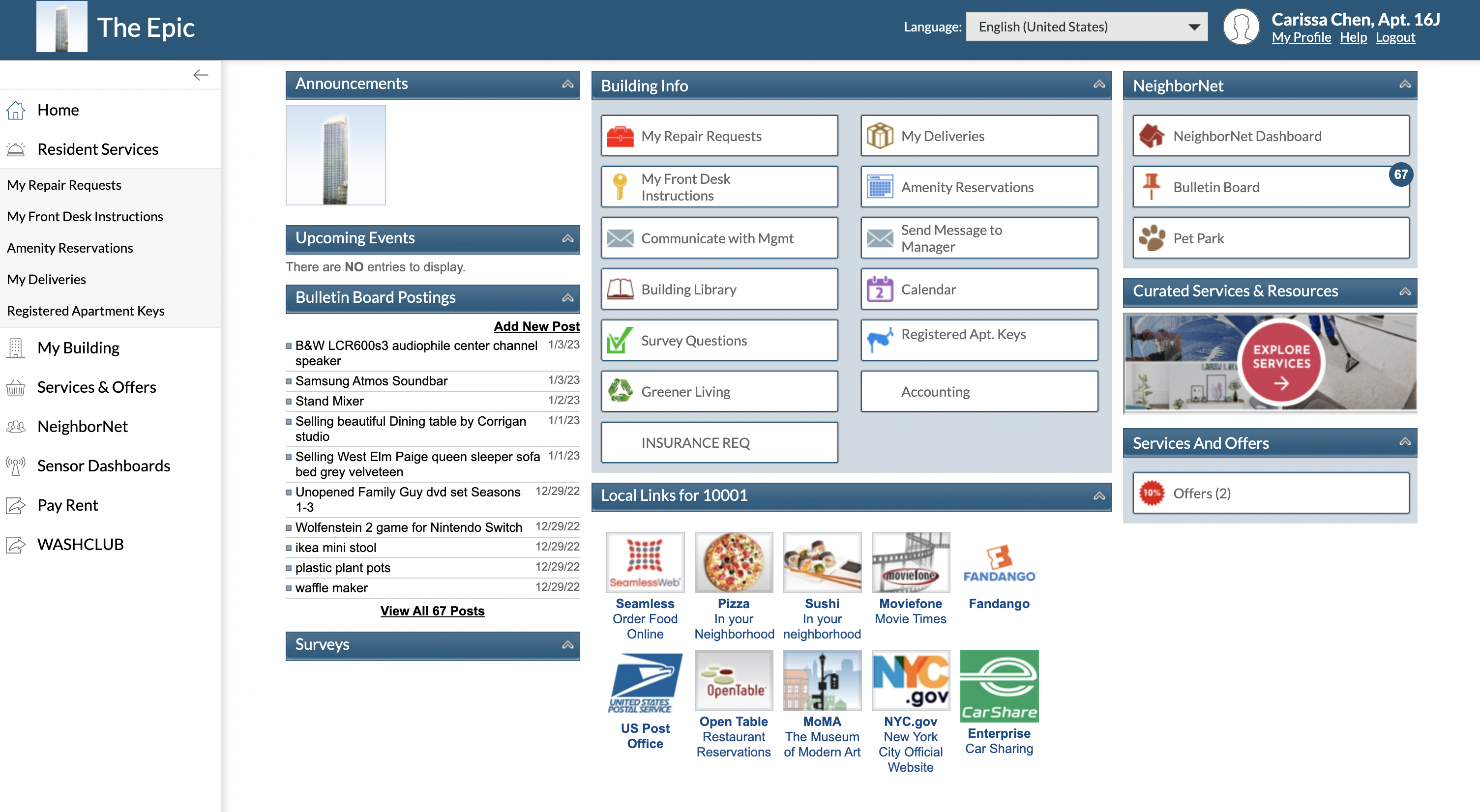
The current portal is outdated in design.
To improve the portal's usability and user experience, I conducted a thorough site audit of its design, content structure, and functionality. However, I was disappointed to find that the portal's design, usability, and content structure were outdated and reminiscent of the early 2010s. The interface lacked essential features, a clear visual hierarchy, and intuitive navigation, making it difficult for residents to locate the features they needed to request services seamlessly.
THE SOLUTION
Let's connect!