Xiaoke Song: I'm drawn to Xiaoke Song's personal site as a jewelry designer. You enter by clicking a circular badge with his name, and inside a paragraph hides clickable letters that open other sections. The neutral tone echoes the calm precision of his pieces, so the interactivity feels intentional rather than flashy. It's distinctive, engaging, and still easy to navigate.
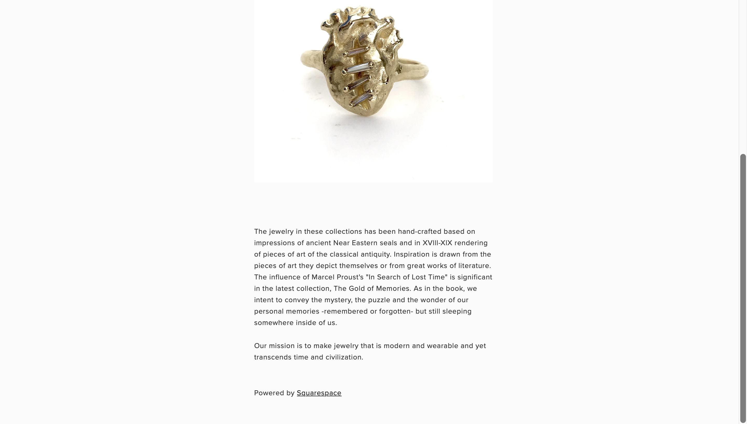
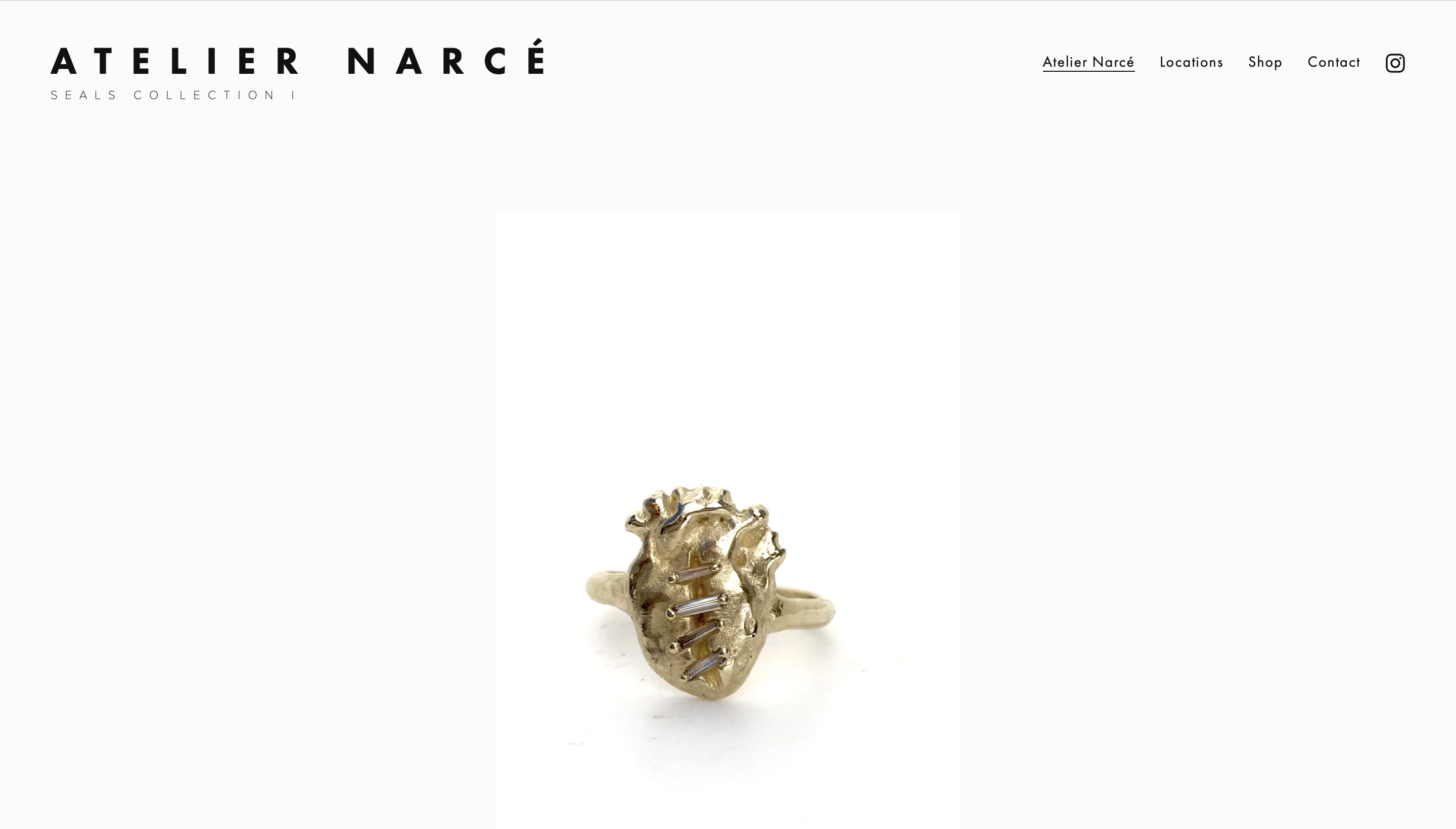
ATELIER NARCE: I'm drawn to how their homepage gets straight to the point. It leads with a large photograph of a signature piece, followed by a concise intro. The rest of the sections are clearly labeled and easy to follow. Ample space and restrained typography make reading effortless. The design steps back so the work stays front and center. It's a great example of simplicity used with intention.
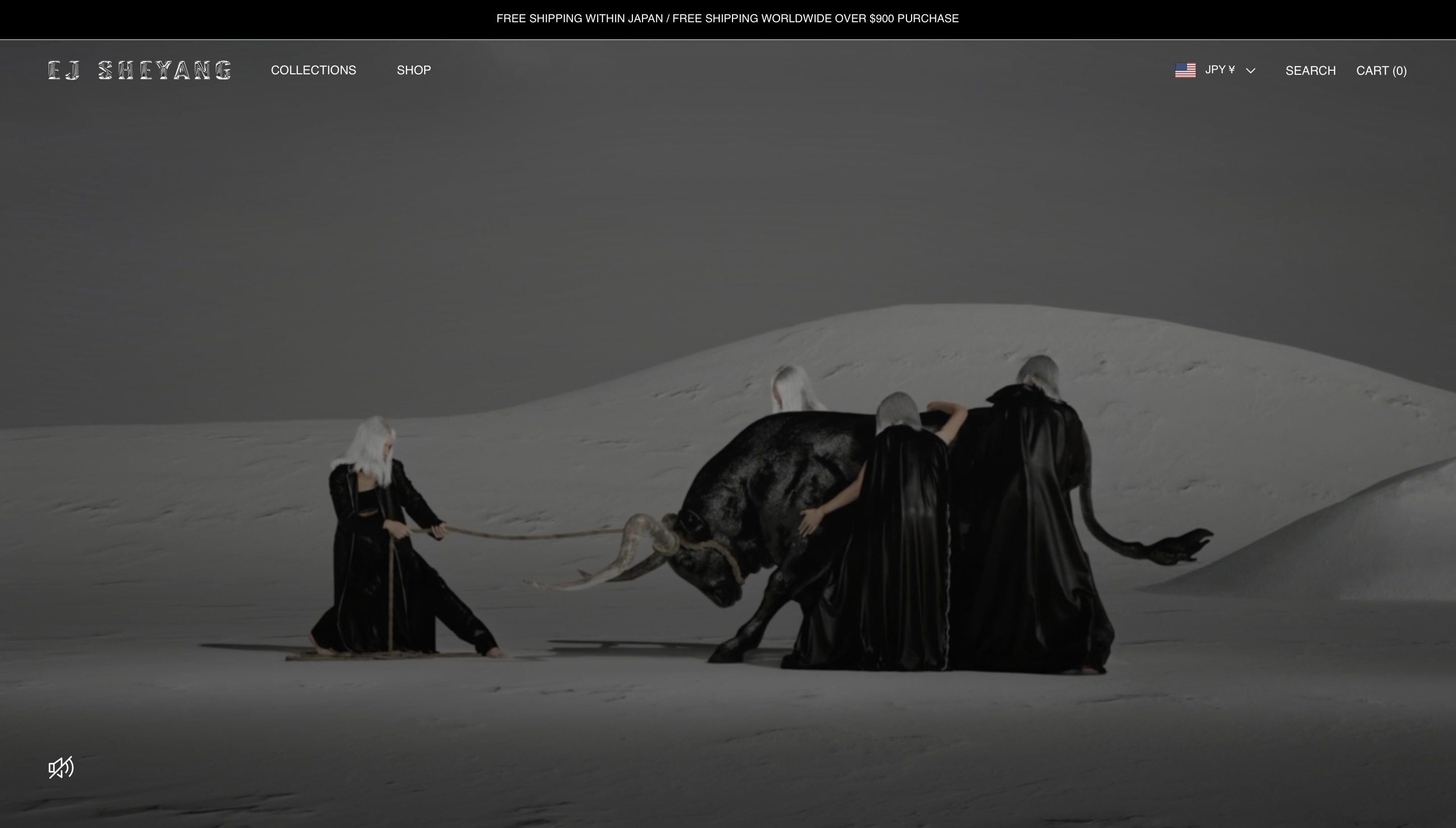
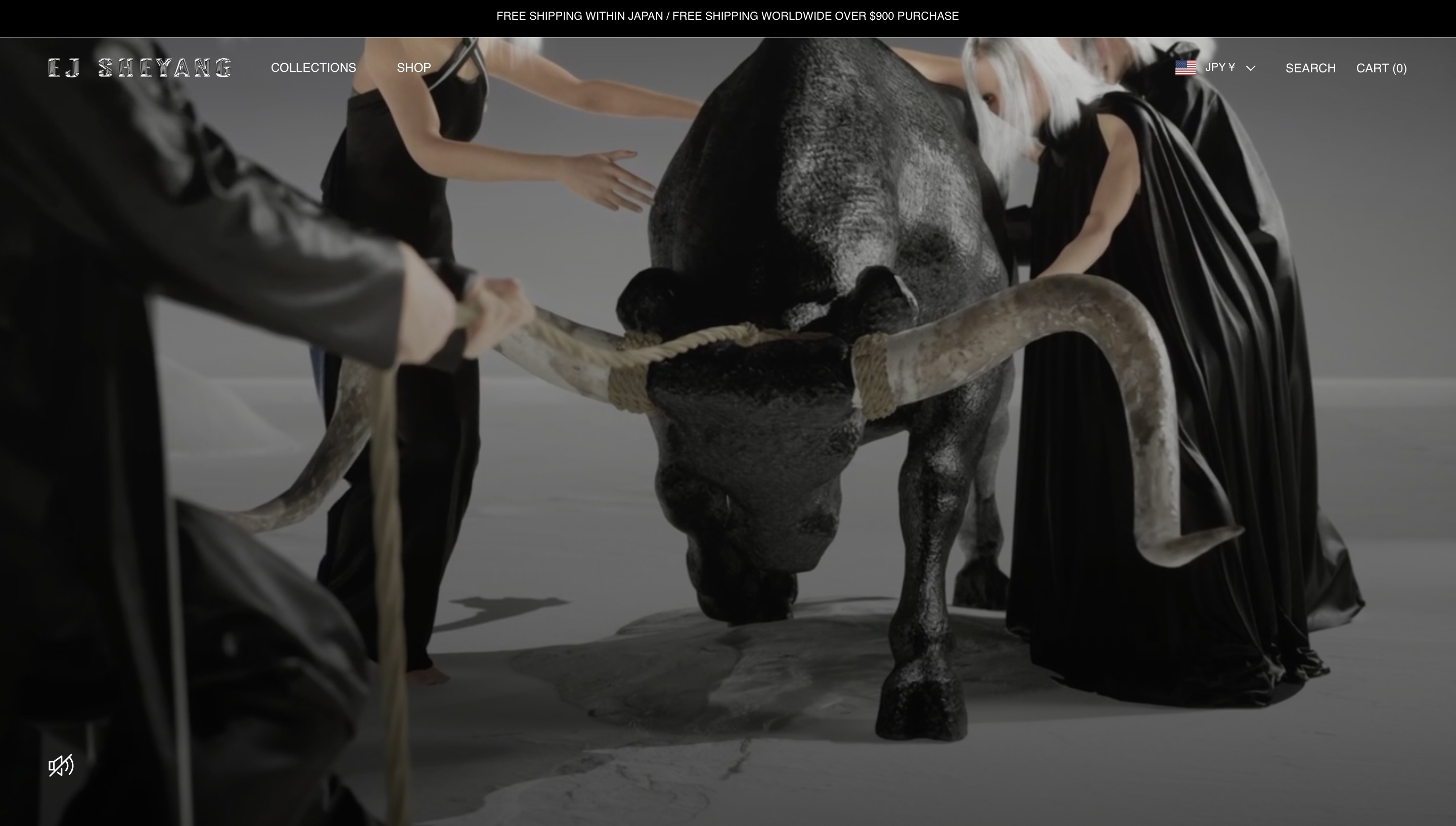
EJ SHEYANG: The homepage opens with a video that blends 3D modeling and live-action footage. The mix feels tactile and futuristic. It grabs attention immediately and pushes me to explore the brand. It also inspires my own approach: I'll feature one of my 3D pieces on the homepage as a motion-led hero, paired with clear copy and a "View Work" call to action.