Developing the Idea
I want to create an interactive, visually engaging website that showcases my artistic style and capabilities as an illustrator and attracts paying clients.
I want to create an interactive, visually engaging website that showcases my artistic style and capabilities as an illustrator and attracts paying clients.
Artist 1. Emiozaki (https://emiozaki.com/shop )
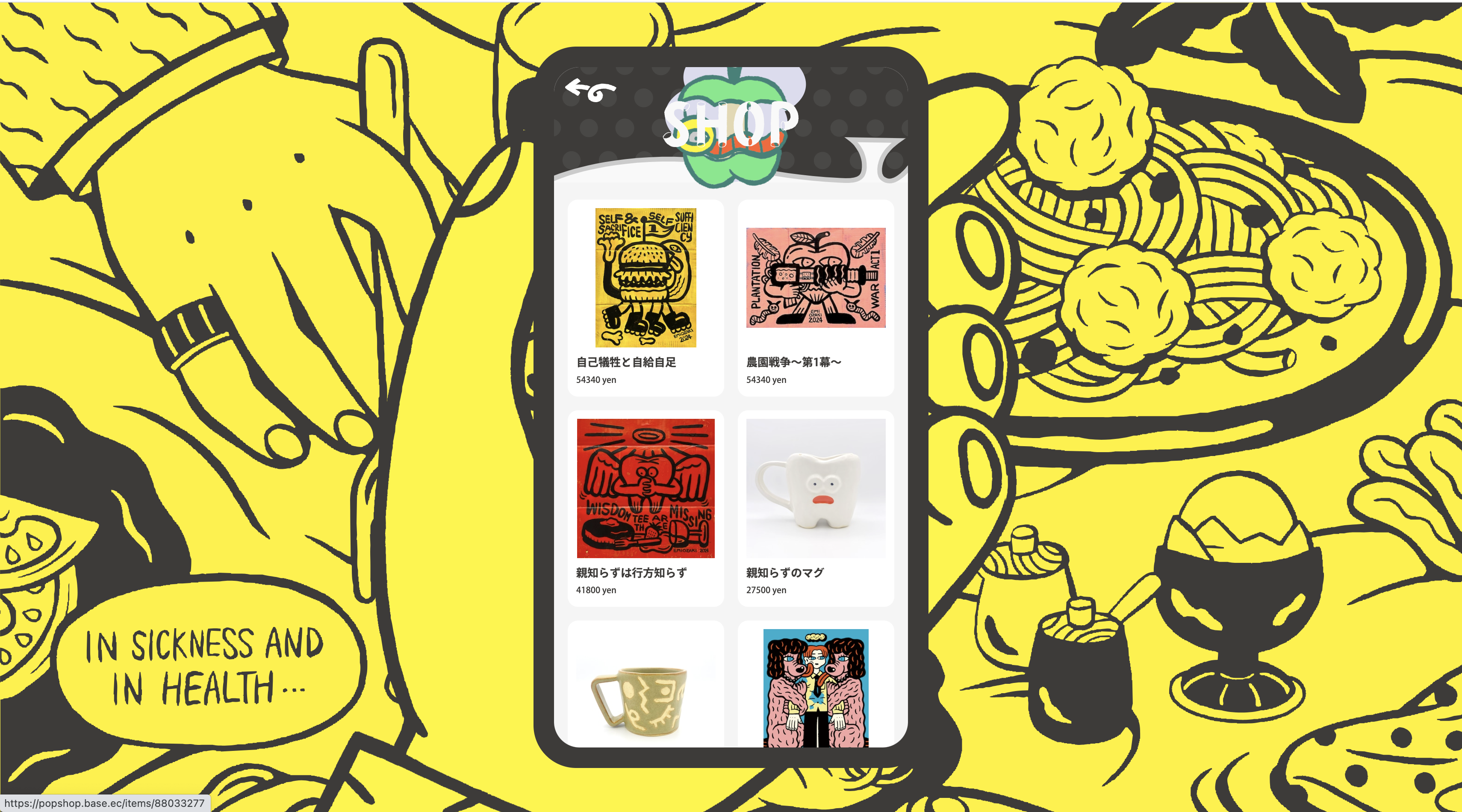
The website mimics a phone's user interface and provides an interactive user experience. It uses bright colors and fun graphics to appeal to the audience. It also showcases its artistic style, which is consistent with the products that it sells. However, it also displays its other selection of works—possibly to expand its market and open up the possibility of working with different types of clients. Clear directions and headings help the users navigate the site. Prices are indicated at the bottom of each product, demonstrating that the website's intended purpose is to attract sales and primarily functions as a shop. I like how the website's graphic and interactive elements work together to provide a fun and unique user experience when navigating the artist shop. The website also uses a lot of bright colors and icons, with minimal text - which once again emphasizes and doesn’t distract from the primary intention of selling products.
Artist 2. Currynew (https://currynew.com )

A straightforward portfolio with minimal text and a strong emphasis on images and artwork. The “personal” and “commercial” categories are listed, indicating to his clients the scope of his work and the audience he caters to. The website is organized well. It is easy for the user to scroll through and see his various pieces of artwork. Since he has an extensive collection of works - aside from the opening banner - the scales of the other artworks are more minor, allowing users to gauge and form a general impression of his art by displaying a broad overview. I especially like the banners at the top of the homepage and how they automatically flip through artwork. This doesn’t require any additional effort from the user and once again showcases the extent of the artist’s skill and style.
Artist 3. Sheya Chen (https://sheyachen.com )
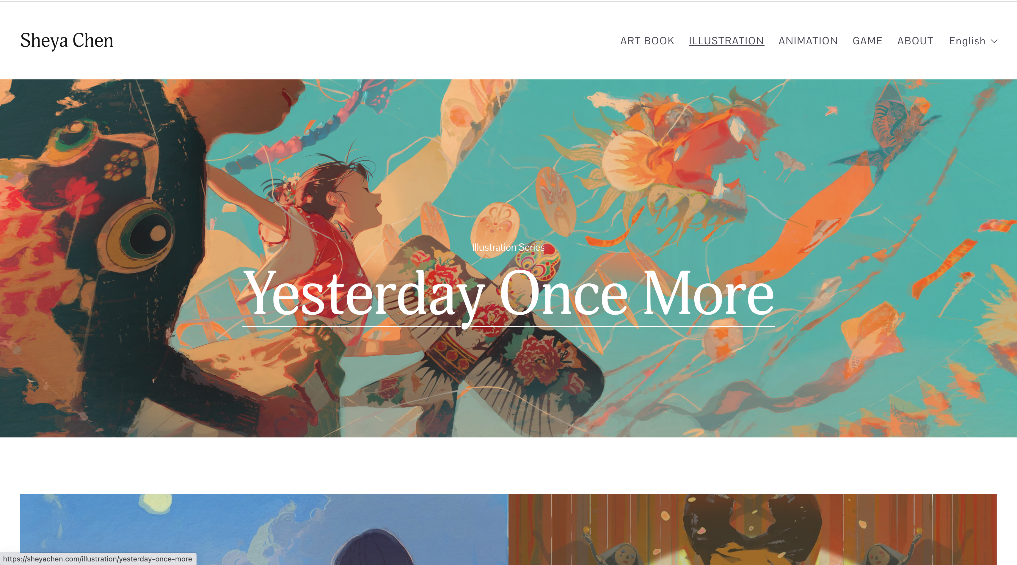
This website is also pretty direct in promoting the artist’s various artworks and mediums. The images are displayed on a larger scale than Currynew’s selection of works. The difference in sizing may depend on the number of pieces available for display. This approach may be a better option for artists with a smaller range of artworks, where the piece's details can be better shown. I like the relatively packed homepage, while the other pages are sparse. This prevents users from being overwhelmed by the potential crowding of images. Despite the varying layouts, the website is tied together and remains cohesive with the artist’s distinct style.
My primary audience is individuals or companies with similar artistic vision and stylistic compatibility who might be interested in commissioning me for customized artwork.
