Midterm Worksheet
Step1 Idea
As an illustrator, I wanted to turn the website into an online portfolio to browse. This site will not be a templated artist site, but a meticulously designed artwork. I want to make the details of the network the best possible for the audience to enjoy.
Step2 Research
I started searching the list of artists I followed on Instagram and started looking for their website designs. Their website types are not the same, there are probably the following categories:
1/ Gallery-type website
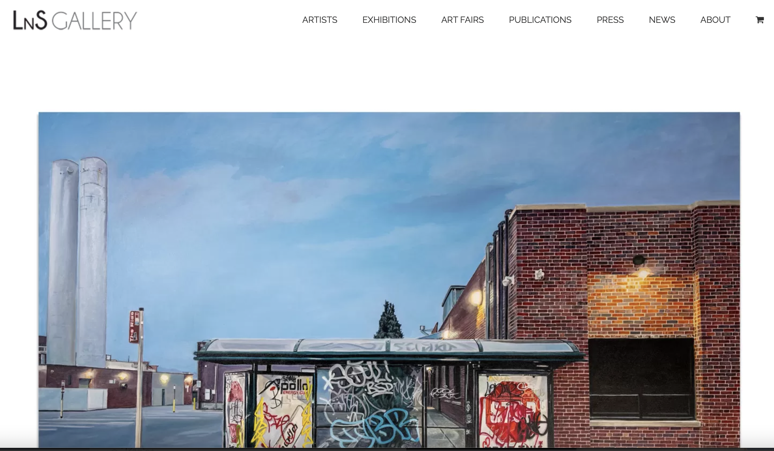
Sometimes individual artists sign up to galleries to show and sell their work. For example, Rafel Soriano's work is represented by Lns Gallery. As the gallery's main painter exhibiting in New York, his paintings occupy a large space on the front page. Then scroll down to see other works. I wondered if I could put my proudest work on the front page to attract the attention of the audience. This is a typographic choice.

2/ Simple business personal website
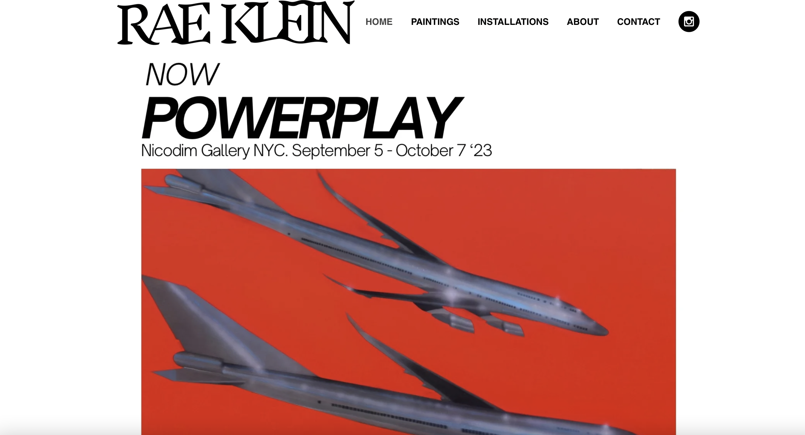
Rae Klein is one of my favorite artists, and she is also a long-time gallery collaborator. But she has her personal website as her portfolio, and the style of the website is very minimalist, also with a representative large picture on the homepage instead of a grid-like small picture. She recently had a solo exhibition in New York, and her latest work has become a tool for her to promote potential clients.

3. Creative art interactive website
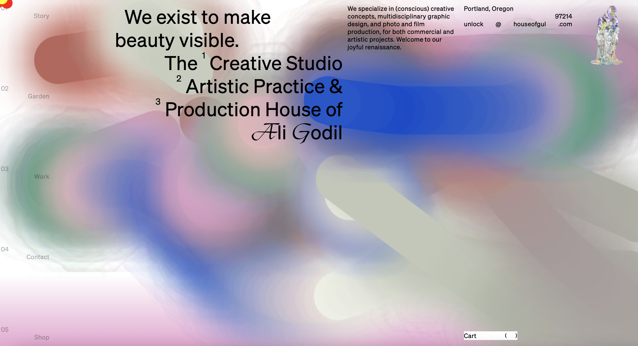
House of gul is a website that shows me amazing ideas, and users can doodle freely on the homepage to achieve the design they want. The brush strokes change color as they move, and the entire site has a high degree of creative freedom like a canvas. While scrolling the page, different rotating glass sculptures appear in the home page. If you don't operate for a long time, there will be a scene of a forest while the deer are passing by.

4. A personal website of an visual artist
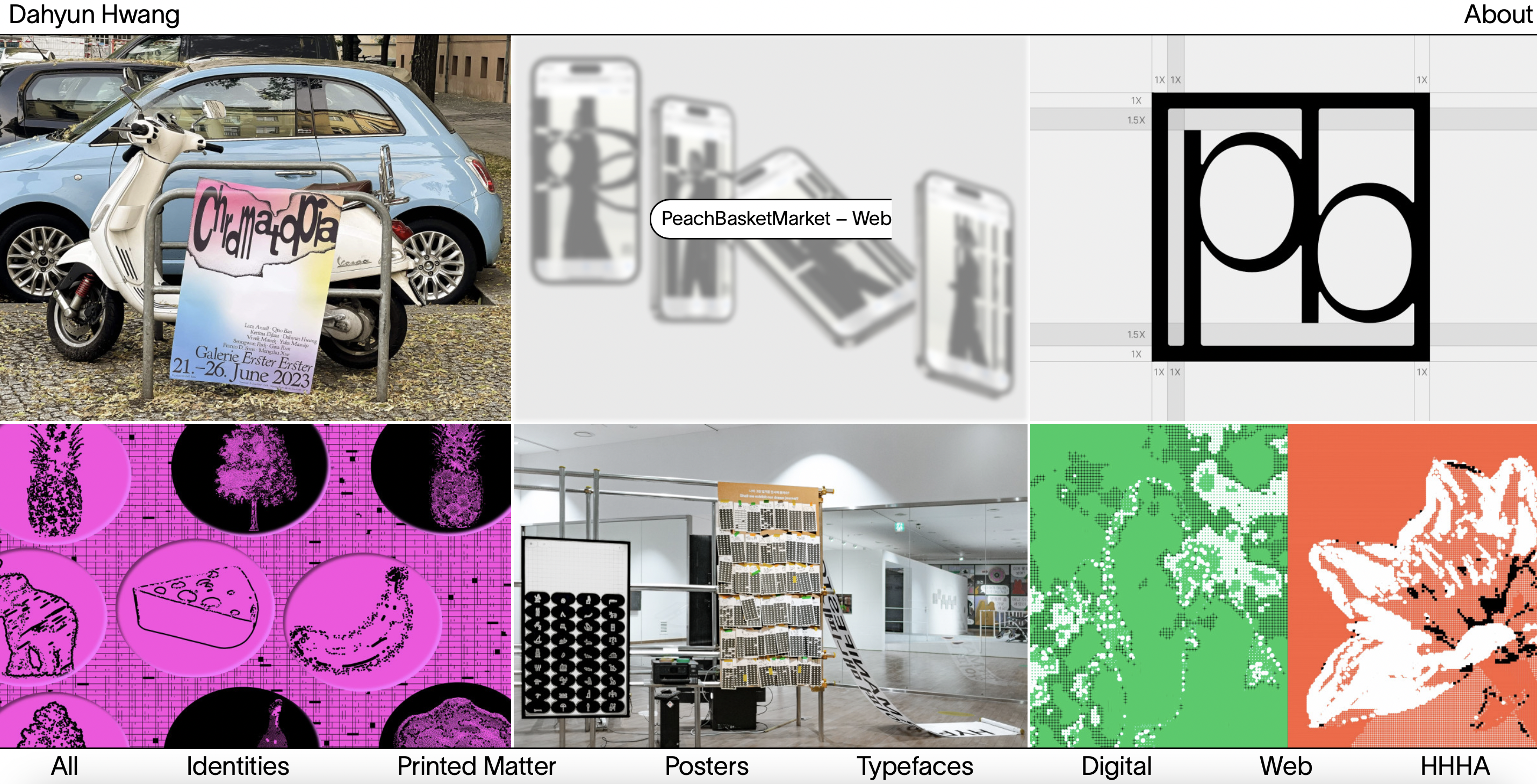
Dahyun Hwang's personal website is full of trendy aesthetics of graphic design, and colorful images fill the homepage. The text design of the web page is very simple, black and white and simple boxes, but this just sets off the color of his work. I think it's a simple yet effective way to typeset.

Steps3 Targeted audience
My target website users are millennials with an aesthetic foundation and potential customers who want to do business with me. Of course, a personal website is more convenient to communicate with the artists, they can use a simple link to log in to my website to view all my works, which is very convenient.
Age groups: Young artists or art students will be my main age audience, and of course I will keep the text readable while maintaining the illustratory.
Step4 Inspiration
Browsing through a variety of illustrators or interactive websites inspires me to think about their layouts, colors, and patterns. Sophie page and house of gul are the two sites that inspire me the most right now.