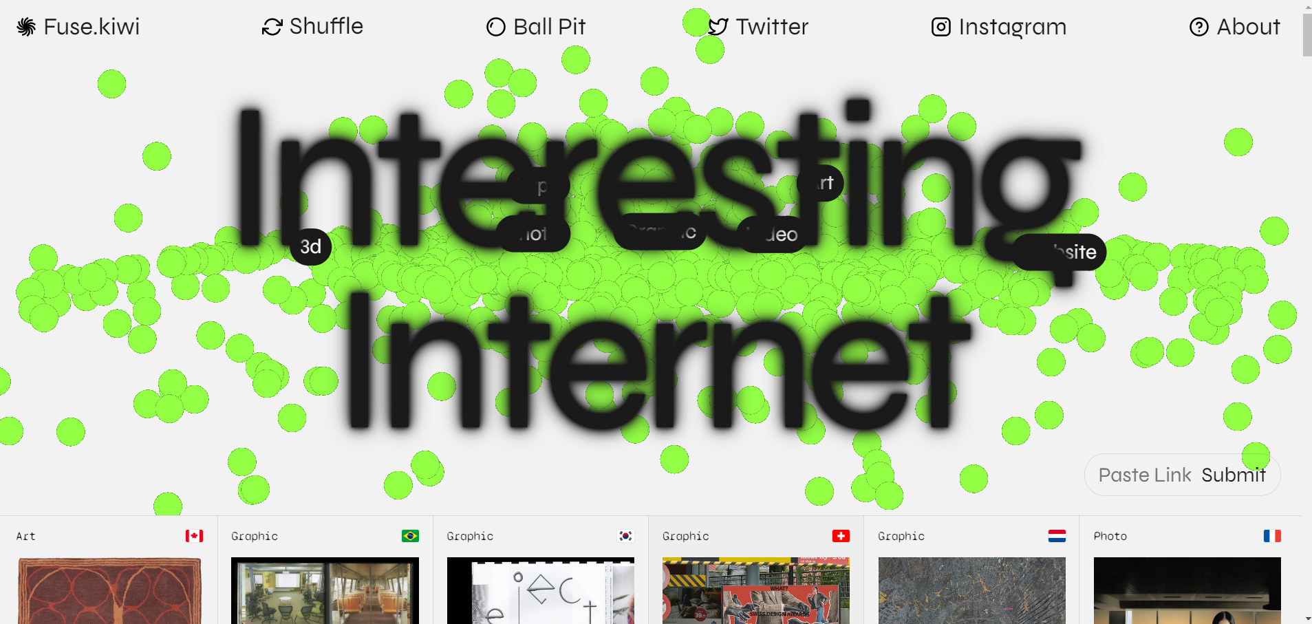
Week 2: Website Analysis - Fuse
Website: https://www.fuse.kiwi/

1. Intent
The intent of Fuse's website is to showcase its expertise in creating powerful digital experiences through strategy, design, and technology. The site aims to attract potential clients who are looking for innovative digital solutions and to establish Fuse as a leader in the digital agency space.
2. Voice
The voice of Fuse's website is professional, confident, and innovative. It communicates expertise and a forward-thinking approach, appealing to companies looking for cutting-edge digital services. The language is direct and clear, with a focus on showcasing the agency's capabilities and successes.
3. Tone
- Home Page: The tone is bold and welcoming, designed to make a strong first impression with concise messaging and dynamic visuals.
- Work/Case Studies Page: The tone is informative and detailed, highlighting specific projects with an emphasis on the outcomes and impact of Fuse’s work.
- About Page: The tone is more personal and engaging, offering a glimpse into the company’s culture, values, and team dynamics.
- Contact Page: The tone is straightforward and encouraging, making it easy for potential clients to reach out for inquiries or collaboration.
4. Brand
Fuse’s brand is modern, tech-savvy, and professional. The website's design is clean and sophisticated, with a dark color scheme that adds a sense of depth and seriousness. It uses a combination of sleek typography, bold imagery, and interactive elements to convey its expertise in digital solutions.
5. Competition
Compared to competitors, Fuse’s website stands out with high-quality visuals and animations that create a dynamic user experience. While many agencies use similar layouts, Fuse differentiates itself with:
- High-quality visuals and animations that create a dynamic user experience.
- Clear and concise messaging that quickly communicates what Fuse does best.
- Strong storytelling in case studies, making the work feel more accessible and relevant.
Lessons from the competition: Fuse excels in visual storytelling but could improve by providing more detailed descriptions of services or methodologies, which some competitors do well.
6. Personas
Persona 1: Alex, the Marketing Manager
- Background: Works for a mid-sized company looking for a digital agency to help with a website redesign and digital marketing strategy.
- Goals: To find a reliable and innovative agency with a strong portfolio.
- Attraction to Site: Impressed by the case studies and Fuse's clear presentation.
- Actions: Explores the Work page and reads about Fuse's approach before reaching out via the Contact page.
- Return Potential: High, as Fuse seems like a strong candidate for future projects.
Persona 2: Jessica, the Startup Founder
- Background: Founder of a tech startup looking for a digital presence.
- Goals: To find an agency that can create a compelling online presence.
- Attraction to Site: Appreciates the modern, interactive design and emphasis on user experience.
- Actions: Reviews the portfolio and services to determine if Fuse aligns with her needs.
- Return Potential: Moderate, depending on fit with budget and specific needs.
Persona 3: Tom, the Corporate Executive
- Background: Corporate executive exploring digital transformation initiatives.
- Goals: To find a digital agency offering strategic insights and scalable solutions.
- Attraction to Site: Interested in Fuse’s professionalism and strategic approach.
- Actions: Assesses the strategic value of Fuse’s offerings and may contact them for further discussion.
- Return Potential: High, especially if Fuse can demonstrate success in large-scale projects.
