Intent:
What is the intent of the website? Use the intent to inform all of the other qualities. This should be a short and concise statement, as in to sell skills.
Active Theory is an Amsterdam and LA based Digital Production Studio, that specializes in building digital experiences that people love. Active Theory provides texture and futuristic movement to the big and small screen, including splash effects, cloth simulations, fuzzy surfaces and more with 3d design. They effectively designed their website layout to match this futuristic aesthetic, peppered with 3d movement tracking the users mouse movement on certain pages with 3d elements to establish their technological design skills. This effectively adds further enjoyable UX. The homepage really emphasizes the main focus of the studio, which is a portal to the various official works and collaborations the studio has been working on. Active Theory’s portfolio is the website's primary purpose and its extensive list matched with various infamous names in movies in television (Harry Potter, Rick and Morty) as well as museums and art installations help to establish extensive experience and prestige. Through unique design elements tied to the user's interaction with the site, as well as the extensive previous work showcased, potential clients easily become convinced to want more of their services and contact them.
Voice:
What is the voice of the website? Is the site’s voice impassioned, assured, energetic, or conversational? Pick a number of descriptive adjectives that capture the experience that whoever had the site built attempted to convey the intent.
The Voice of Active Theory.net is very formal, clean, assured and effective. Most of the language on the site is extremely minimal but direct, allowing the primary content, the digital previous works and the website visuals speak for themselves in establishing the more aesthetic and thematic values the brand has to offer. Most of the text is there to aid in the various pockets of digital work the studio offers, in a navigation page within the works page: this leaves the page looking less cluttered and the various different mediums of digital production become extremely impressive and all get to shine equally, rather than coming off as messy, overwhelming or cluttered in one combined previous works list.
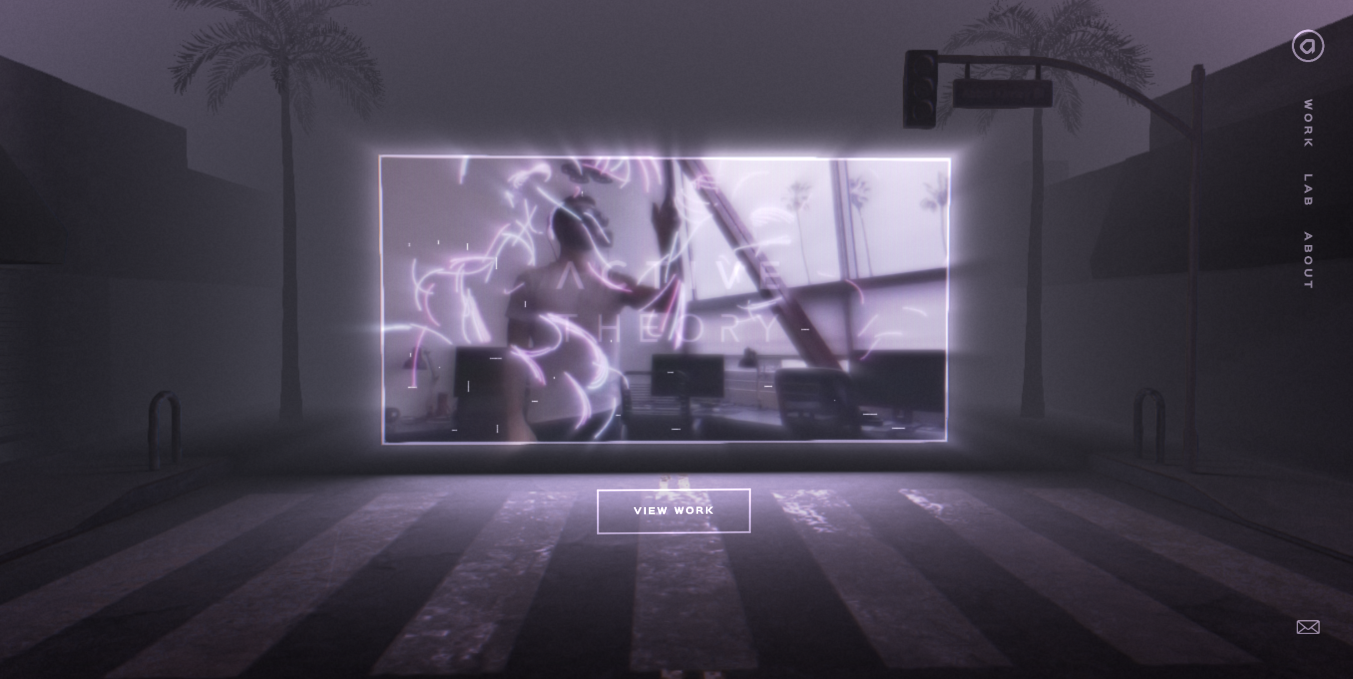
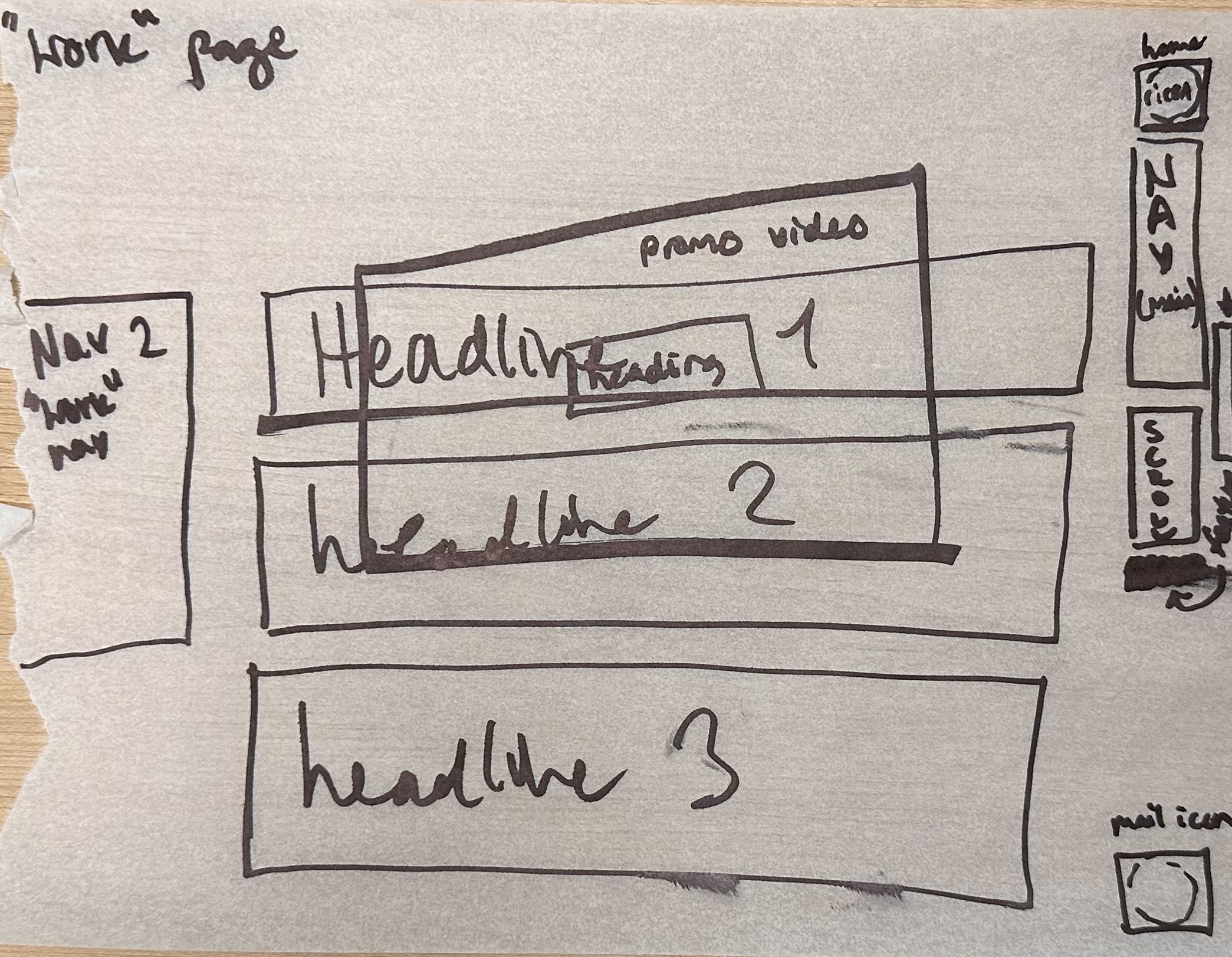
The Home page’s main content shows a screen displaying a collage of excerpts from previous works the studio has created/worked on with the Studio's name on top of the videos, with a link to the “View Work” page - on this page is also a navigation to “Work”, “Lab” and “About” as well as the studio’s social media (Facebook, Twitter and Instagram). The minimal amount of pages and text on the first page make the user hone in on and analyze the content on the screen, and through moving the mouse quickly realize there is a vr like element to the suburban backdrop that not only shifts in perspective but also eventually switches between mimicking LA and Amsterdam, the two locations of the brand (a clever detail for a home page).
Tone:
The tone of the website slightly varies depending on the page. Each page however, consistently adds concise paragraphs or lists to emphasize the multifaceted and extensive expertise of the brand and its extensive skill set.
Home page: The presentation of the home page is extremely limited in terms of text information. The page is centered on the Active Theory name, and a boxed link to the work’s page. While the navigation and contact mail are present, this page gives a sense of mystique and greater intrigue as a floating cube showcases a collage of previous installations and works of the company. Here the tone in its limited vocabulary lets the visual work speak for the company.
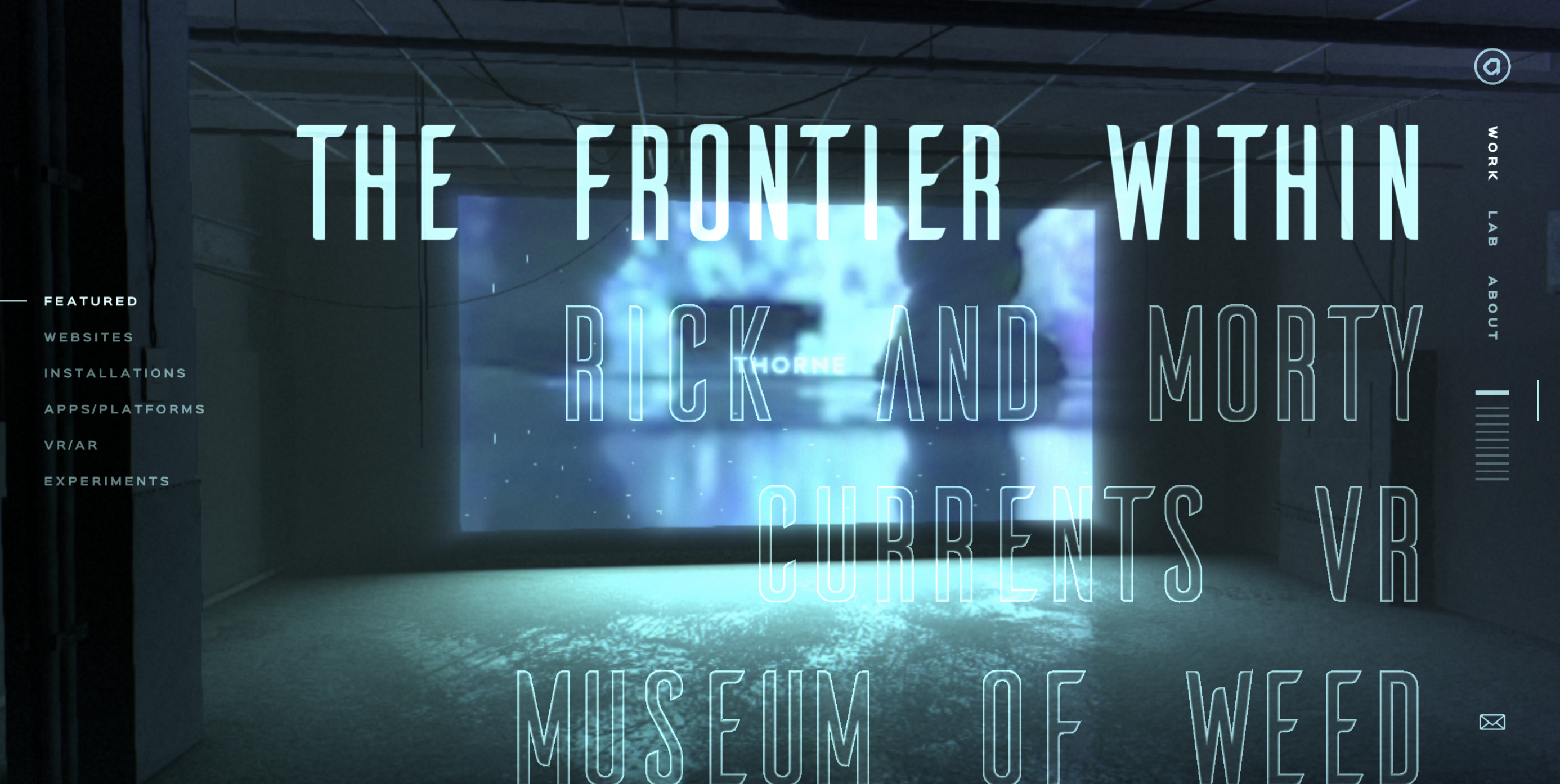
Work page: On this page the tone conveys a high sense of experience and status as the list of previous works is emphasized and categorized by type of digital category: (featured, websites, installations, apps/platforms, VR/AR, and experiments). Within each category a cube displaying glimpses of the categories’ work is shown in the background, on top of it the brand/company the project was for is shown in all capital, bold and the largest lettering on the entire website. The various brand names including many infamous (nationally and globally known) brand names adds an element of these individual brand’s prestige / status to the Active Theory brand’s credibility and creativity. Each Brand/collaborator links to a new page that provides a vague and one-two sentence description, which prompts more mysticism and intrigue for the user to interact with the actual off-website product/experience.
Brand:
Active Theory’s website establishes their brand as futuristic, dark and efficient.
Interestingly, analyzing many of their client’s and completed works, including the Spotify Wrapped feature and the Harry Potter Pottermore Quiz, their client list and products do not match the dark, mysterious aesthetic of the website. The aesthetics of these collaborations and their own digital installations are quite brighter and arguably more optimistically user inviting. Active Theory’s own branding, however, seems to have made this conscious choice of dark colors and futuristic teals and purples to both associate the brand to trendy futurism aesthetics (aka being trendy) and a darkness in imagery to add more depth or mystique to add to the brand’s intrigue and aesthetic appeal.
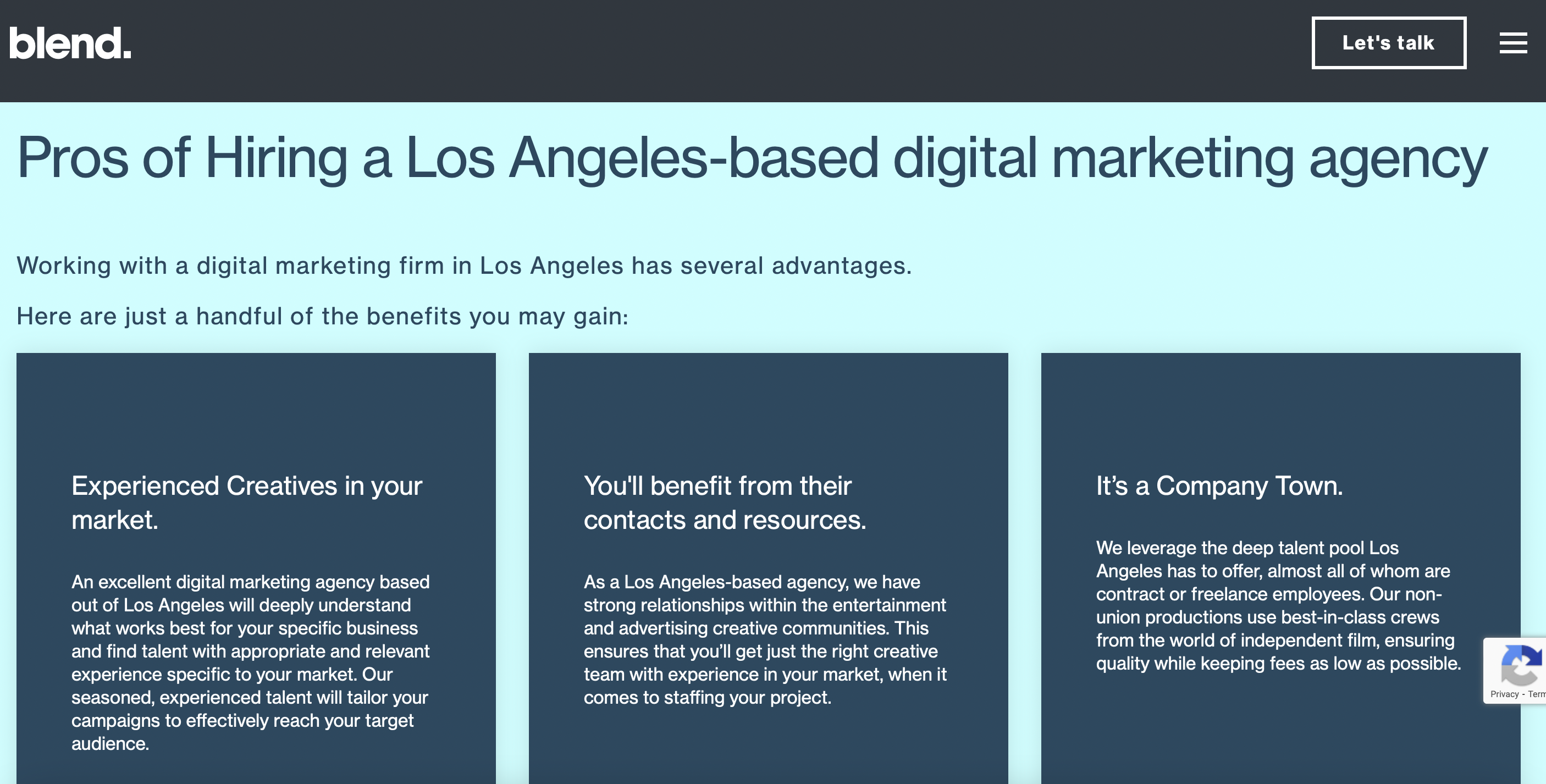
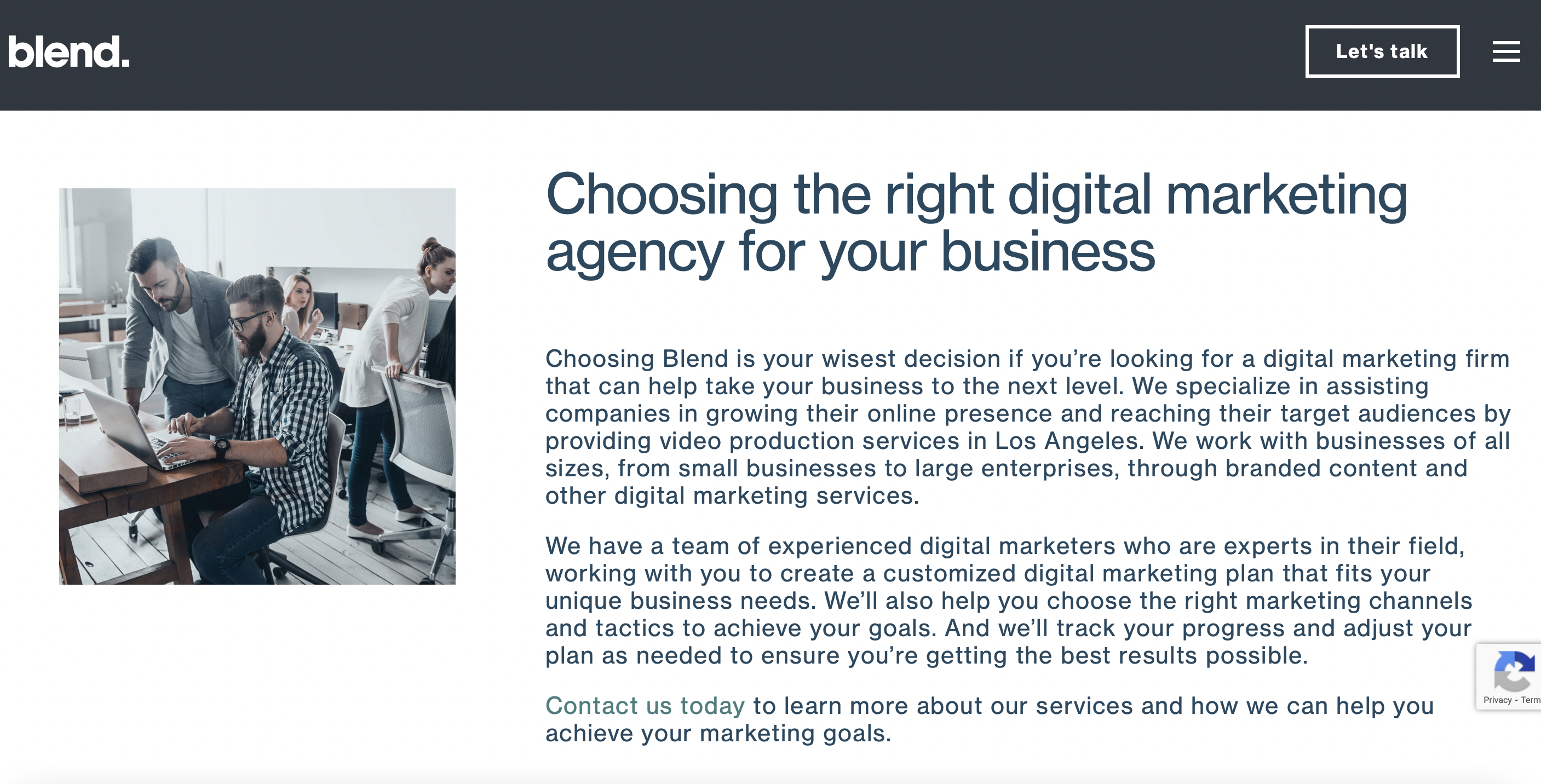
In contrast, other digital production companies (We Are Blend, Ruckus Marketing) tend to over saturate their website with extensive text boxes and articles about their services - which does not align with their products often being visual-focused user experiences.
Visualizing the Website's Audience
Potential clients and their recruiters
Jay Smith has just moved up in the ranks, and proved himself to be a formidable entertainment recruiter in the event department at I-D Magazine. His next project at the mag is one he does not take lightly, as he has been trusted by his higher ups to orchestrate the entertainment and recruit the lighting team and concept for their Melbourne I-D party in May. Sponsored by Absolut Elyx, the luxury vodka brand shifting the Swedish alcohol brand into the future, he decides on needing a futuristic light show inspired by diamonds, to match the vodka’s essence, and he also wants an interactive AR display to make the event that much more interesting and unique for their clientele and guests. His friend and ally Lizzie, recommends Active Theory’s work after having been introduced to them on her interview with Bon Iver and their collaboration on his new album’s digital experience on Spotify, created with AT. Perusing their website, Jay sees how many big names they’ve worked with, and breathes in a sigh of relief to see they’ve worked in larger spaces than his before, providing simulations, exhibitions and light shows in major museums and art galleries. As he flips through the VR/AR section on the work’s tab, he is convinced that it’s worth the time and effort to email his proposal to the nearest LA office to schedule a zoom meeting to get the ball rolling.
Potential employees
Fatima Gonzales is a fresh out of college and aspiring to transition from freelance video production to a solid 9-5 gig. She’s green and she’s racked up college debt and she wants to work at a company she’s proud of dropping at parties and at family reunions, and wants to walk into a workplace everyday with constantly new, challenging but most importantly exciting projects that leave her college peers in the dust.
Upon searching for Digital Production Studios based in LA, she finds Active Theory on Google’s search engine. She is immediately drawn to how the branding seems to infer a off kilter aesthetic direction and concept to the website. As she explores the different tabs to learn about the studio, she feels herself more drawn to the interactive 3d designs peppered throughout the site, her mind already curious if she can figure out how this is achieved. The lack of deeper information about the company’s structure, responsibilities and resources makes her seek out this more crucial information via their Linked In and Twitter. Here she sees the AI video productions that she can see herself producing and bookmarks the page to routinely check if a job opening appears on their careers page. But via Linked In, she must add an alert to their studio to properly receive an update on potential openings.
The press
After the exhibit created for I-D’s Diamonds Party in Melbourne, attendee Doja Cat tracks down and hires Active Theory to create an interactive website more fitting of her current pop record’s theme, in time for her final release before going on hiatus. The website includes various interactive decorative elements and includes brand new visual and sonic content to help boost streams of her latest album, while teasing snippets of her next track throughout easter eggs on the website. This drives website visits up 700%. Everyone and their mother is hovering over artifacts and items throughout her web page to find the next daily clue to complete the puzzles to her next project. This catches the eyes of Rolling Stone’s editor Marshala Simone, and she through their website notices this is their first collaboration with a musical artist directly, yet they have contributed greatly to American pop culture through video games, Spotify user interactive features and more. She scans the page to see which office (Amsterdam or LA) was responsible for the Doja Cat job and cannot find a clear answer. As a result, she calls the LA office to confirm and clarify they alone worked on that project and she pitches a desire to meet with them and feature them in the next Rolling Stone issue to discuss the future development of UX and tech within the music industry. The secretary notices the great opportunity and forwards her call to the CEO for further planning.
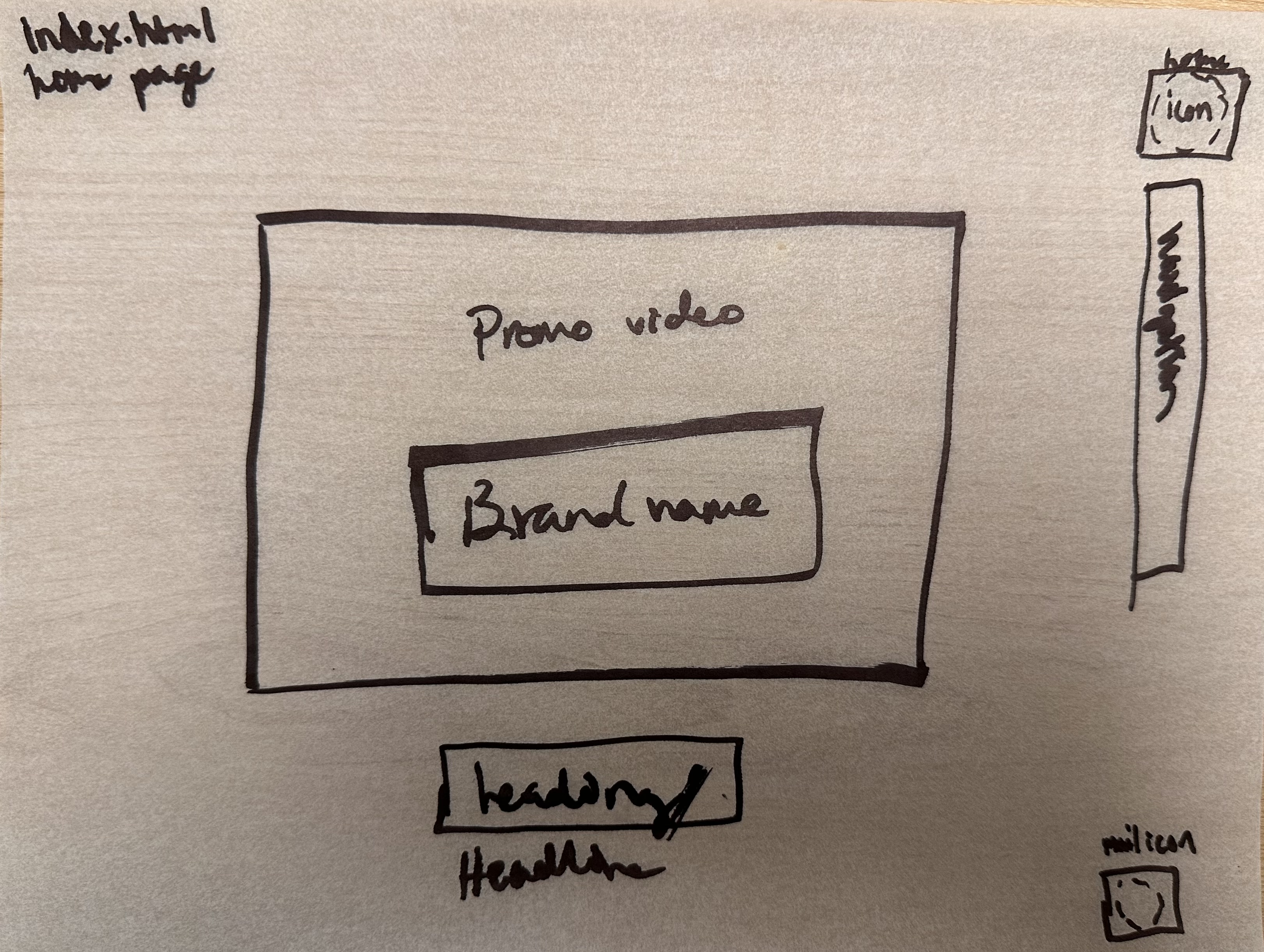
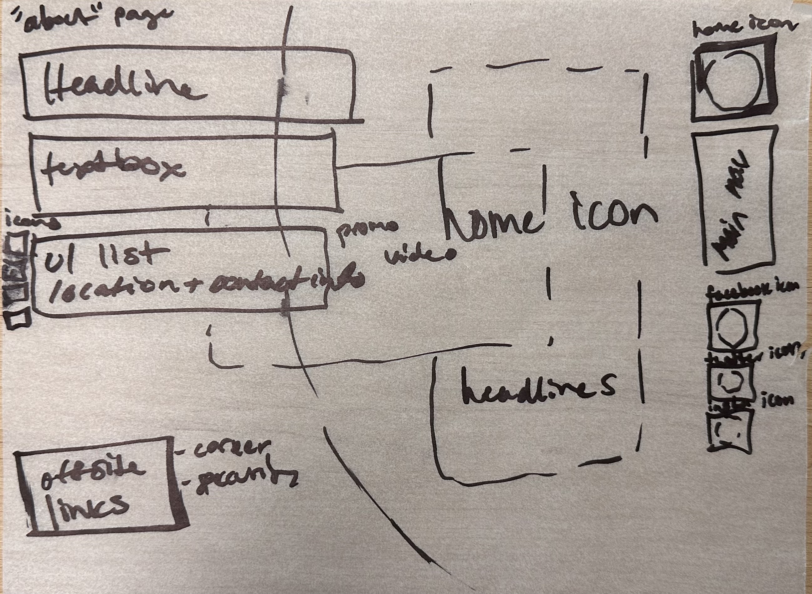
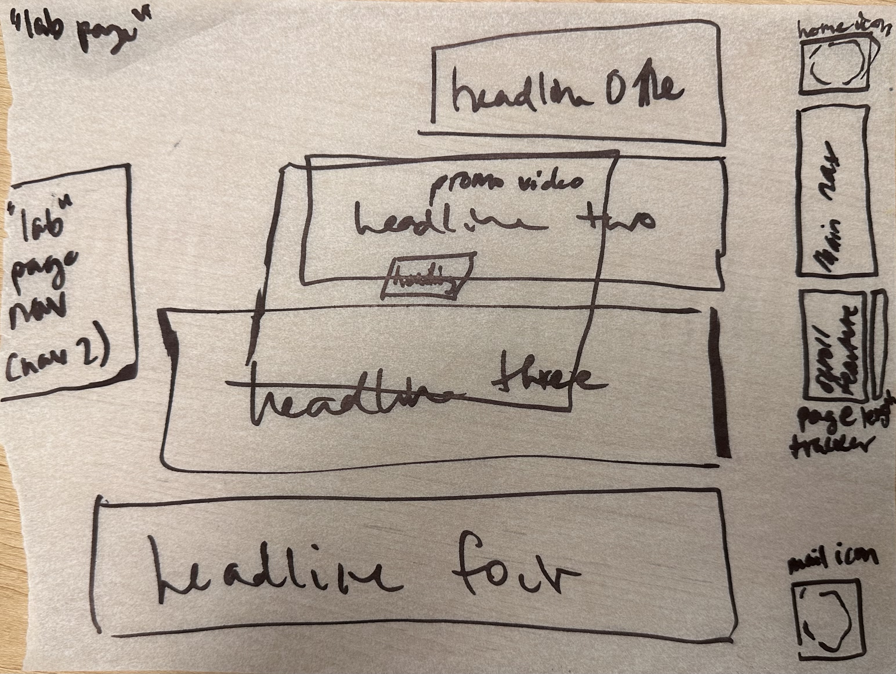
Wireframe for Main Pages
Copy Deck:
In developing a website for a client, the content is often done by different people and the designer requires that all the copy for the website be assembled into a copy deck. Copy the content of the first page, break it down and label it as if it were part of a copy deck. Take a look at the SAMOCA copy deck example for guidance.
Index Page
Title: (Video slideshow) Active TheoryHeading: View Work (link to work page)
Subheading 1: (home symbol image) Home Body copy: -
Subheading 2: Work Body copy: -
Subheading 3: Lab Body copy: -
Subheading 4: About Body copy: -
Competition:
In contrast to Active Theory's effortless flair, other digital production companies (We Are Blend, Ruckus Marketing) tend to over saturate their website with extensive text boxes and articles about their services - which does not align with their products often being visual-focused user experiences.
Their competitiors seem to provide more educational articles on different aspects of digital production and marketing, which could be extremely useful to smaller business who are aiming to begin marketing and curating digital content on a higher level, however, for the brands that already have established vision and a large consumer base, this website bores with its heavy text content and does not effectively utilize the visual space to impress.
We Are Blend's Website is filled with tedious text and wonky grids
Active Theory really shines on it's website because it shows rather than tells us what they can offer.