Step 1: Devolpment
I want to create a space that brings together all of my favorite channels and interests into one platform so that one doesn’t have to have multiple tabs go through various websites. I want to server both informative and business. Ultimately my goal is to design a clean and engaging site that out racks a few of the current sites I use today, ex in terms of visual display, color etc.
Step 2: Discovery and Research
I visit most of my liked websites very often, at least twice a day, and examined the visuals as well as the informative content and noticed its quite time consuming to search up various sites in a timely manner. Although all of these sites are very unique in style they also navigate differently and provide content very differently. This influenced my idea to design my website and create a platform to have all my favorite categories and likes into one site.
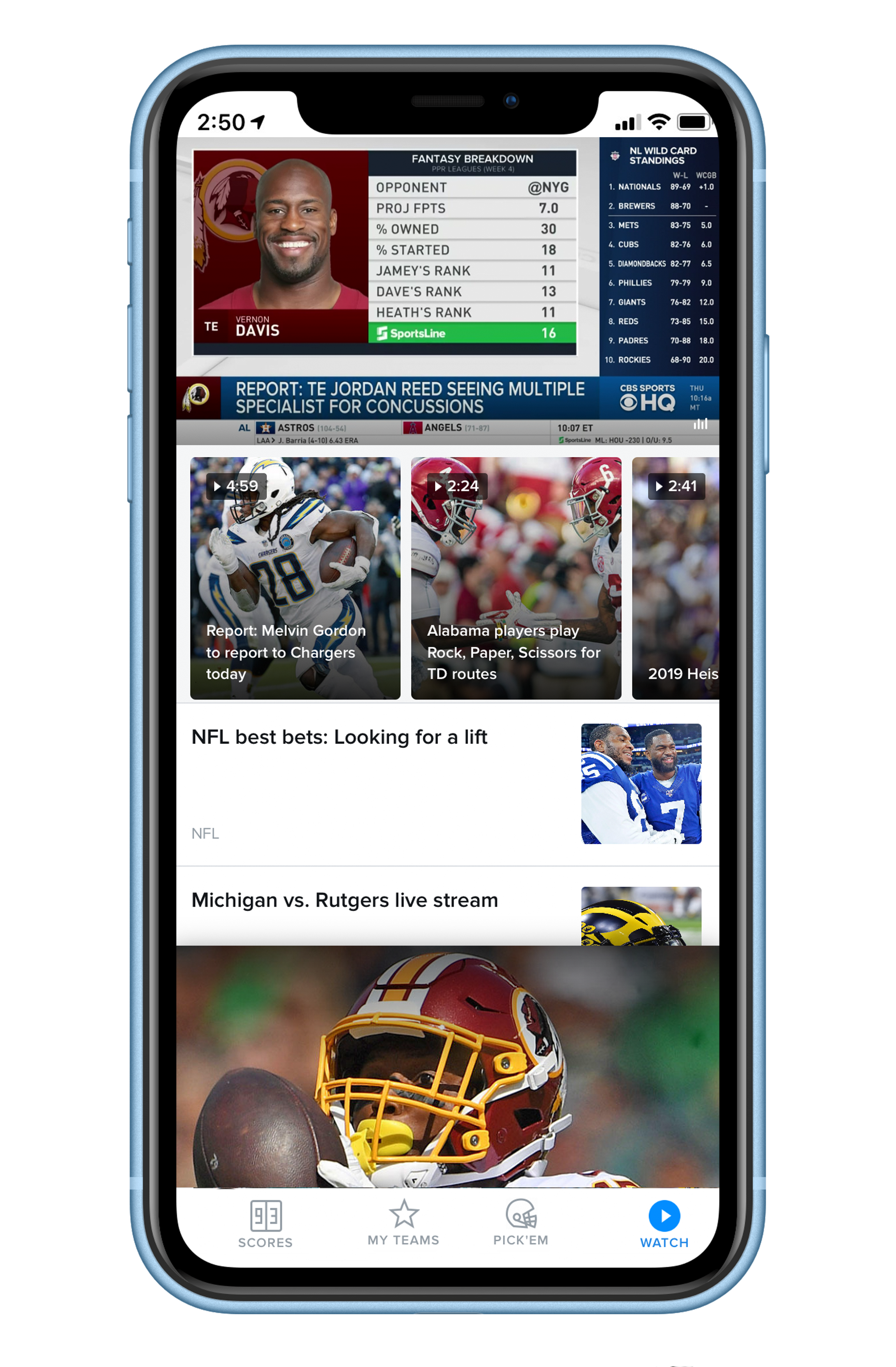
ESPN.com
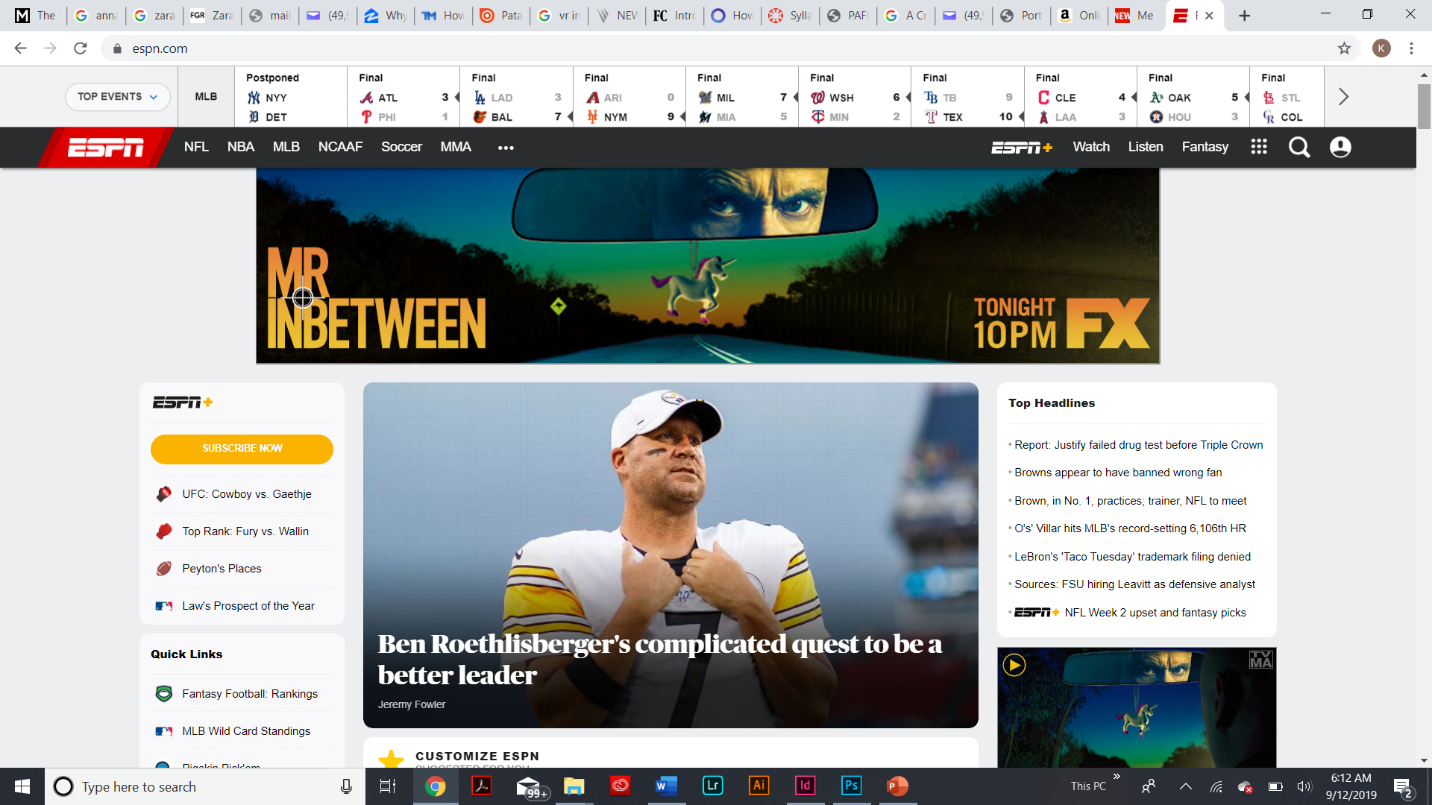 The ESPN landing site is simple and very content heavy as seen through the design. The sites design consists of thin type and a lightly grey background so that the content becomes heavily focused within the human eye. The navigation of the website is organized into specific categories (tabs) to allow the user to navigate to his or her favorite sport and catch up with today’s trendy stories and scores.
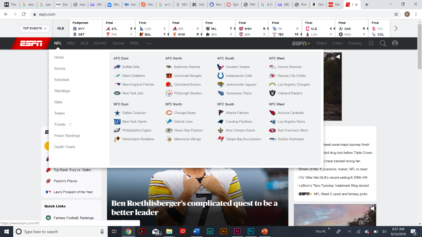
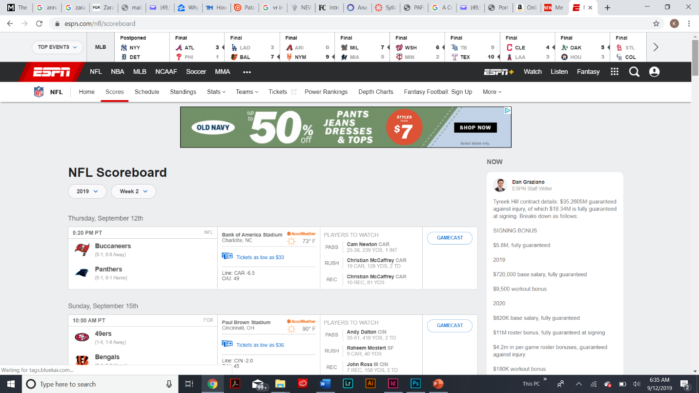 Before actually going to into the content you really want to read about or know you first need to navigate at the top to which category then team you want to search. It is then the user is brought to a new page containing scores, top moments, schedule est. What I like that ESPN did was put together a functional slideshow to captivate the “top” stories fans need to be aware about.
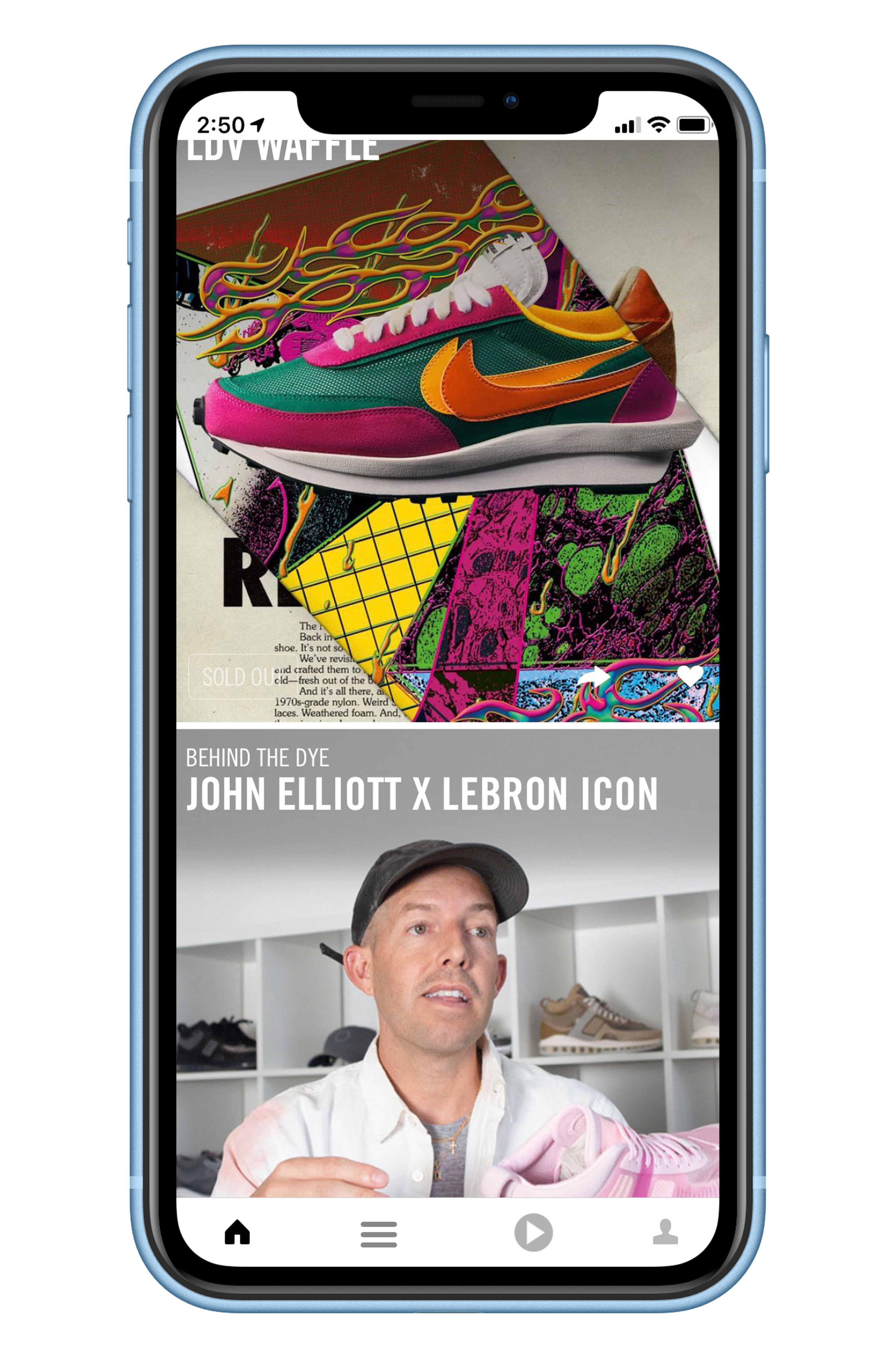
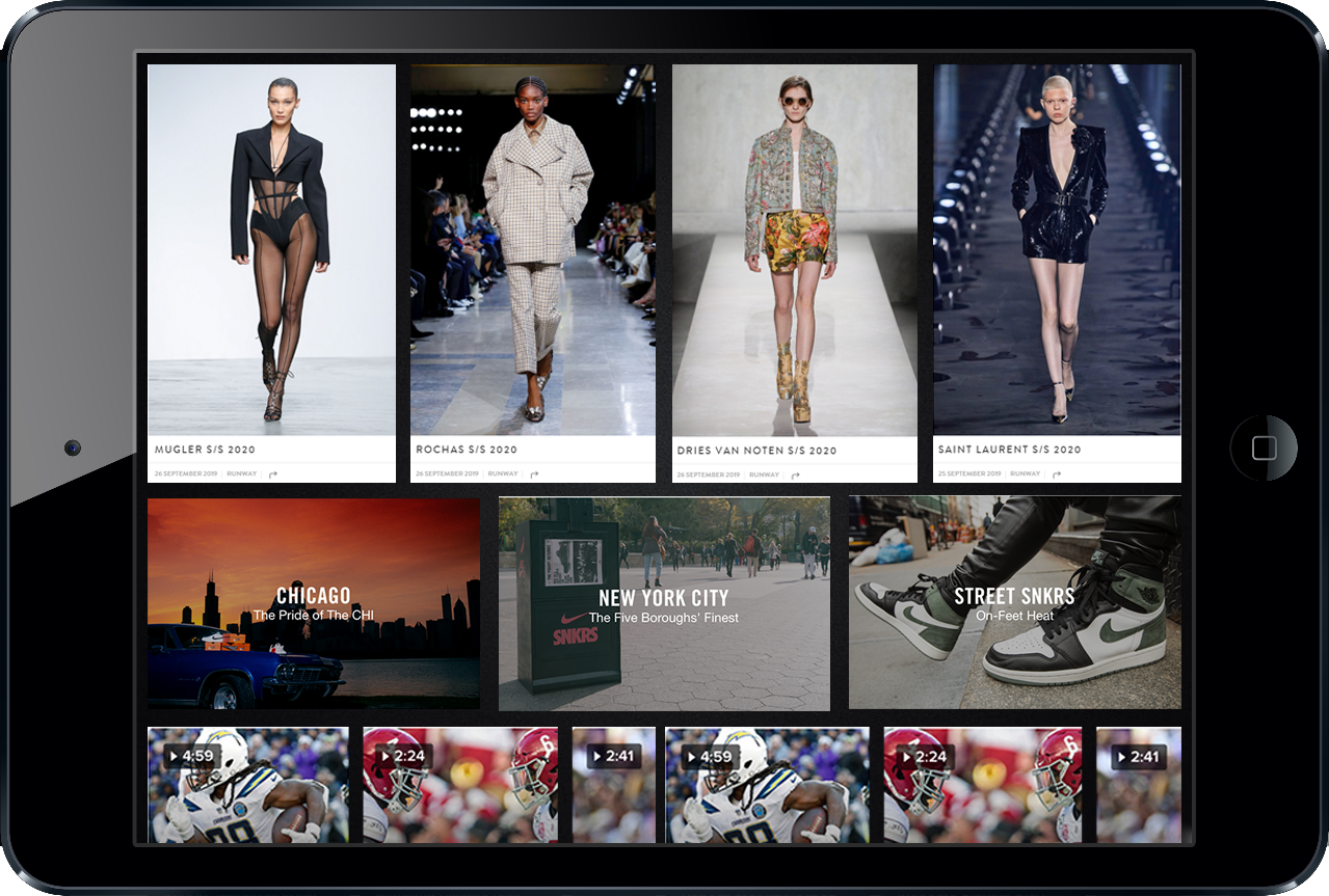
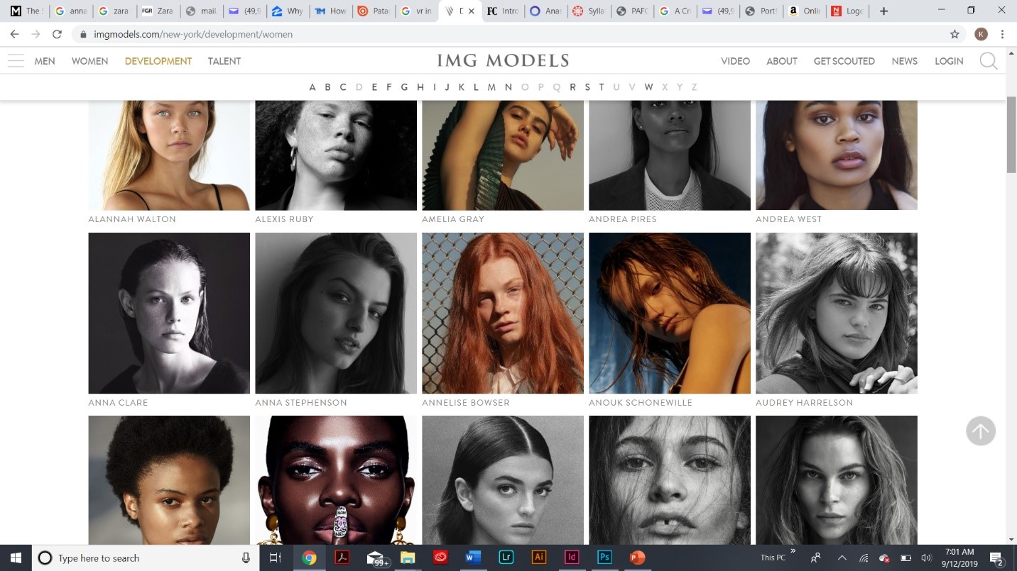
IMG Models
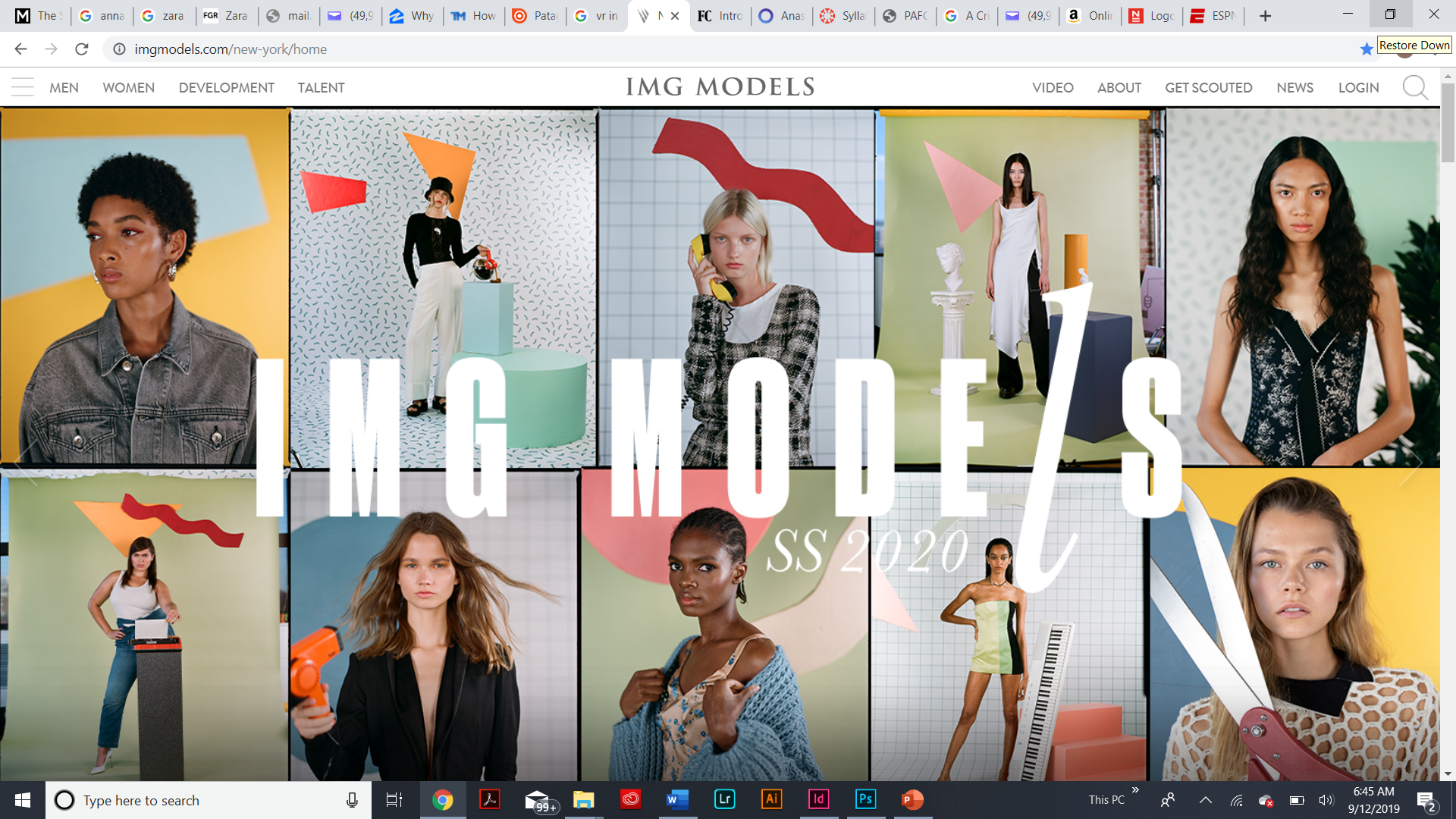 IMG Model’s landing page to me is very eye pleasing and successful in terms of creating a visual experience and really a grand entrance to their site as sometimes they have short clips playing right as soon the site loads up. The site is easy to navigate as its not as complex with content like most others through the top left where the user has the option to use the “hamburger” icon or simply the taps to the category the user wants to see.
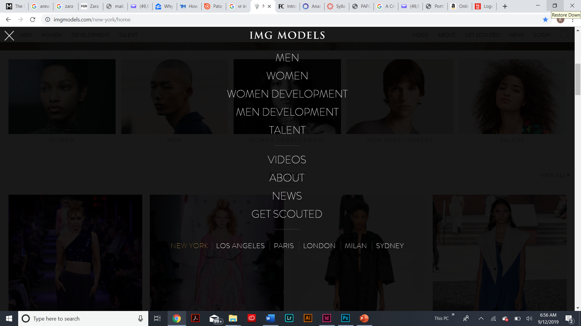 Very minimalistic but yet pleasing. The organization throughout the page (the thumbnails/profiles) is not only beautiful and noteworthy but it also provides great navigation as all models are alphabetized and a great deal of diversity. I’ve to a conclusion that I’m going to implement IMG Model’s landing page to my own site in order to better capture users through amazing visual content and experience.
Step 3: Target Your Audience
My target audience for my website are potential users who share the same taste in fashion, sports, and business as me. I want to create an engaging space that allows users to go from one category of interest to another using the same site by creating a simple but yet visual and creative user interface with various categories from various industries so that in the end intrigue users to continuing using the site.
Step 4: Inspiration
Step 5: Thumbnails
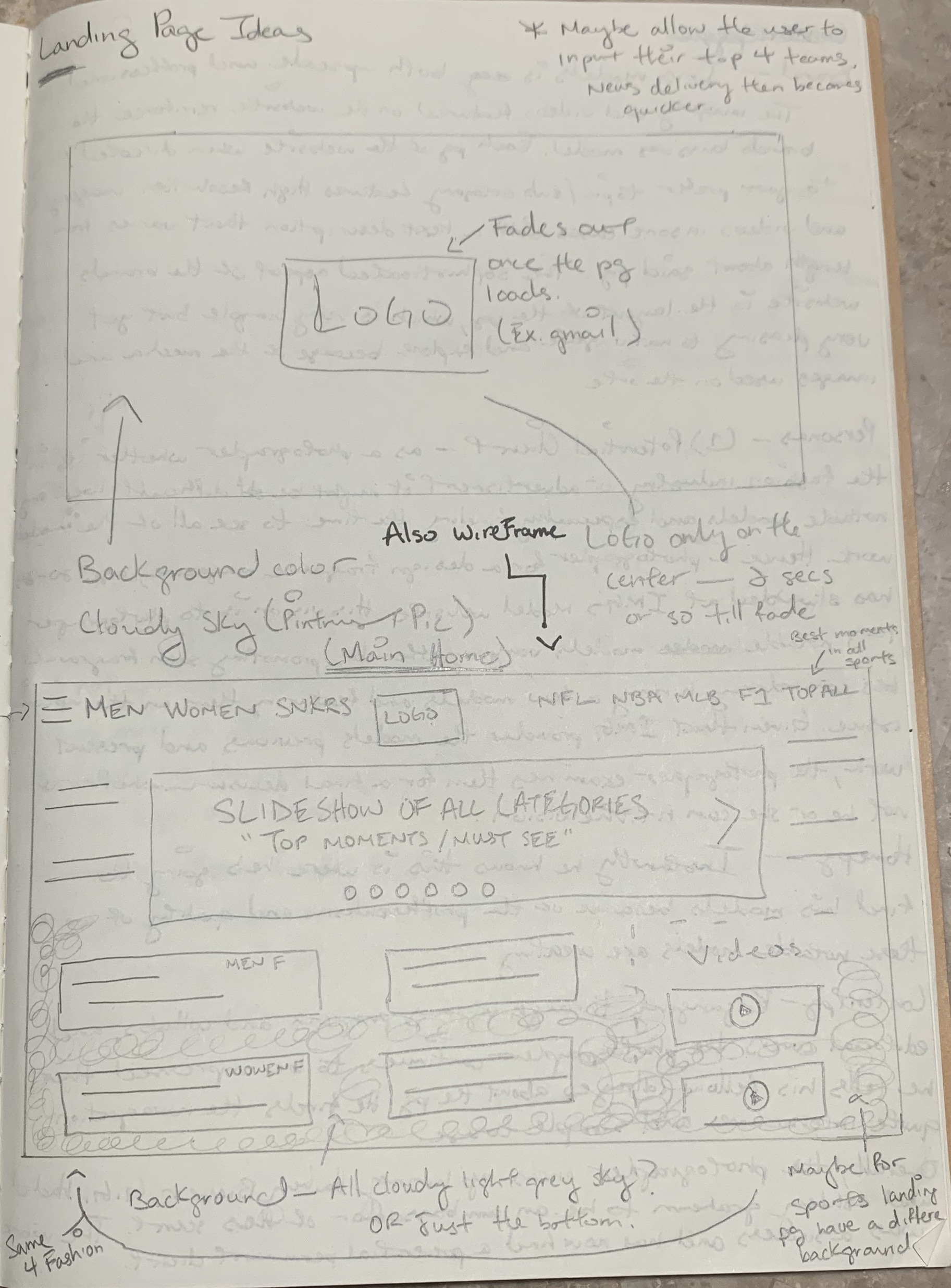
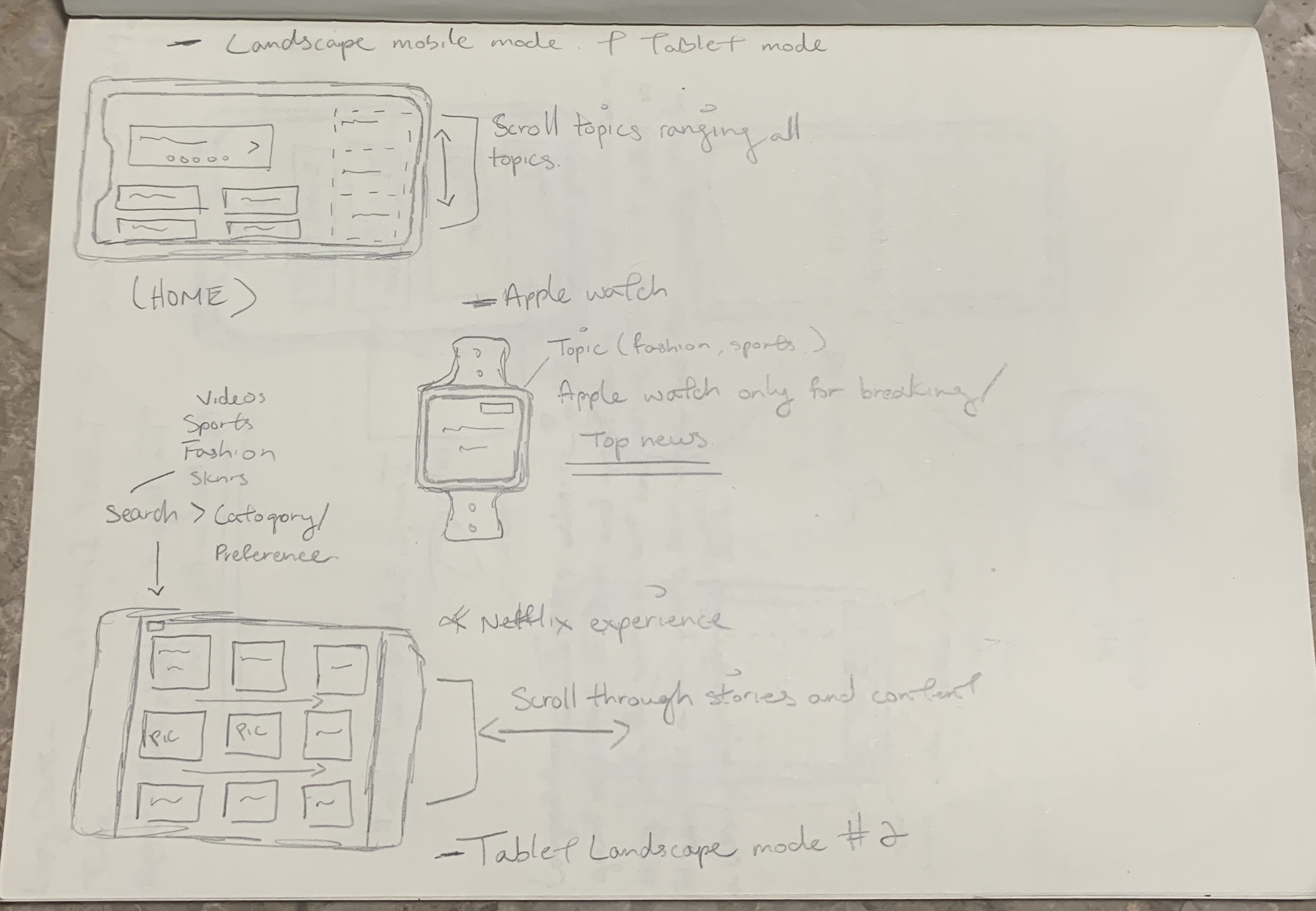
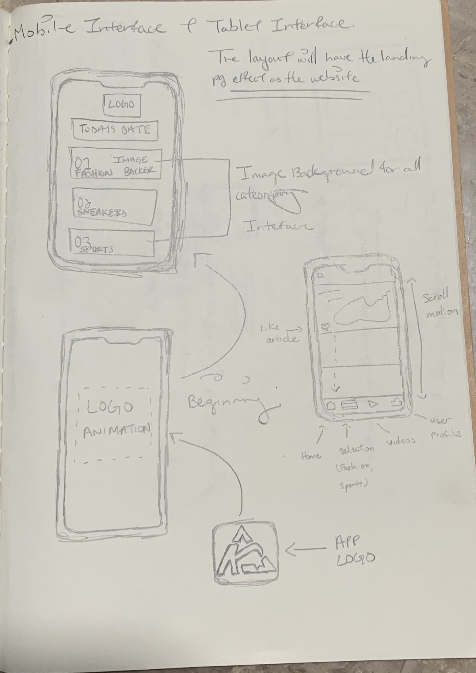
Step 6: Wireframe
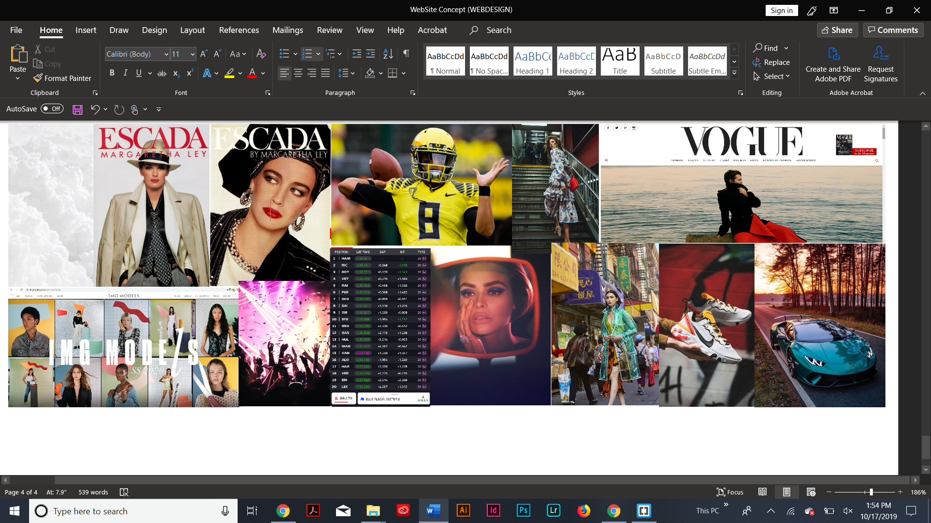
Step 7: PhotoShop Mock-up