Midterm 8 Steps Worksheet — Assignment 2
Develop Your Idea
For my website, I am wanting to create a portfolio that can showcase my writing and design work. I am a journalism major and writer, so I want a place to store my best work, making it easy to send to potential employers. I am also a communication design minor, so this will also be useful to showcase my digital design work. As of now, my problem is that I do not have a portfolio website to link when I'm applying for internships, so this will be my solution.Discovery and Research
For this step, I have researched and found portfolios for a variety of writers and designers who use different mediums. Each of these websites has a different tone and voice, which lets me know that my website should be unique and different as well. I already follow a lot of people who inspire me on social media, so I went and found their portfolios as well.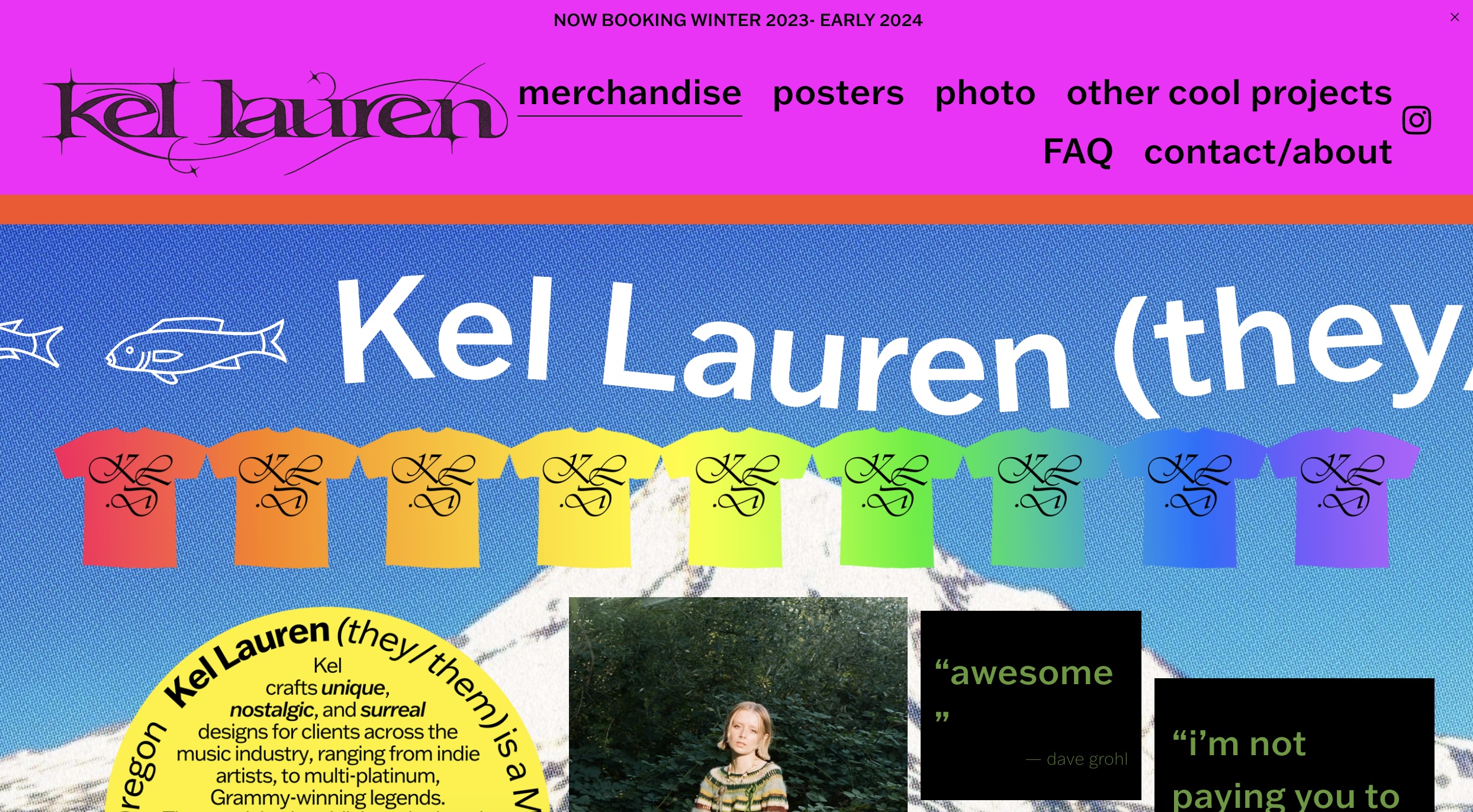
Kel Lauren is a designer who designs merchandise and posters. While I don't resonate with her design style, I love that her website is unique, different, and true to herself. When clicking on her website, she's included a different curser and many moving elements. She includes a variety of colors and typefaces, making the website visually interesting to look at. She also includes reviews from consumers of her past products and a blurb about her work.
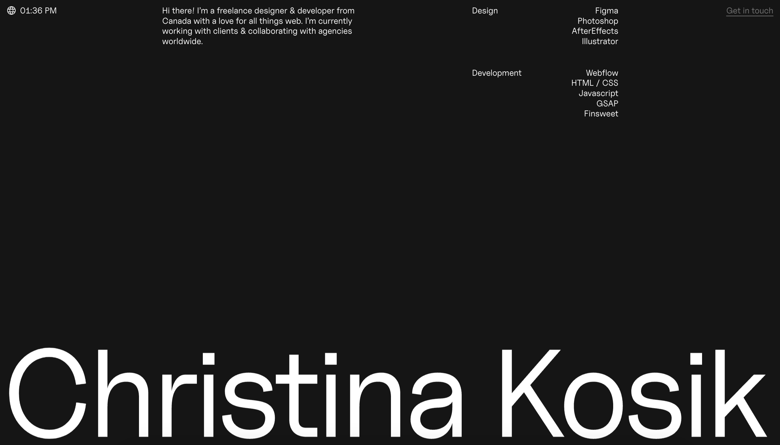
Christina Kosik is a designer and developer. Her website is one that I resonate more with, as I want my website to be more minimal in order to highlight my work more. I personally love the minimalist look. I also love the use of white space and the size of her name on the main website page. There is a blurb about herself at the top, and then a list of her different skillsets which you can click on to see her related work.
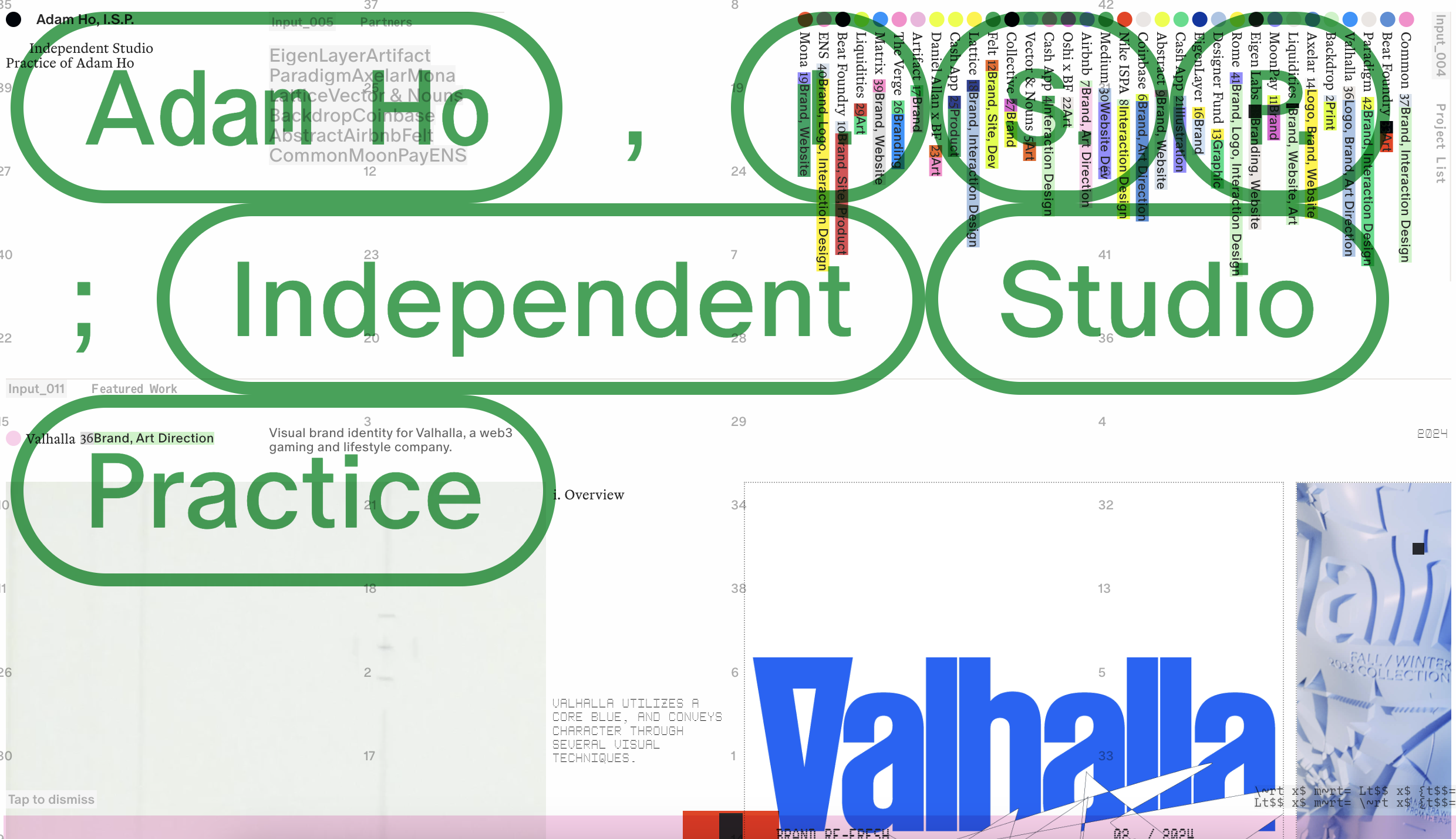
Adam Ho is a designer, developer and art director. His website is initially confusing for me to look at. I like that every time you open the website in a new tab, the colors change. Then, you can click anywhere and the overlaying text will disappear. There's a lot to look at on this website, but it's still visually appealing to look at.
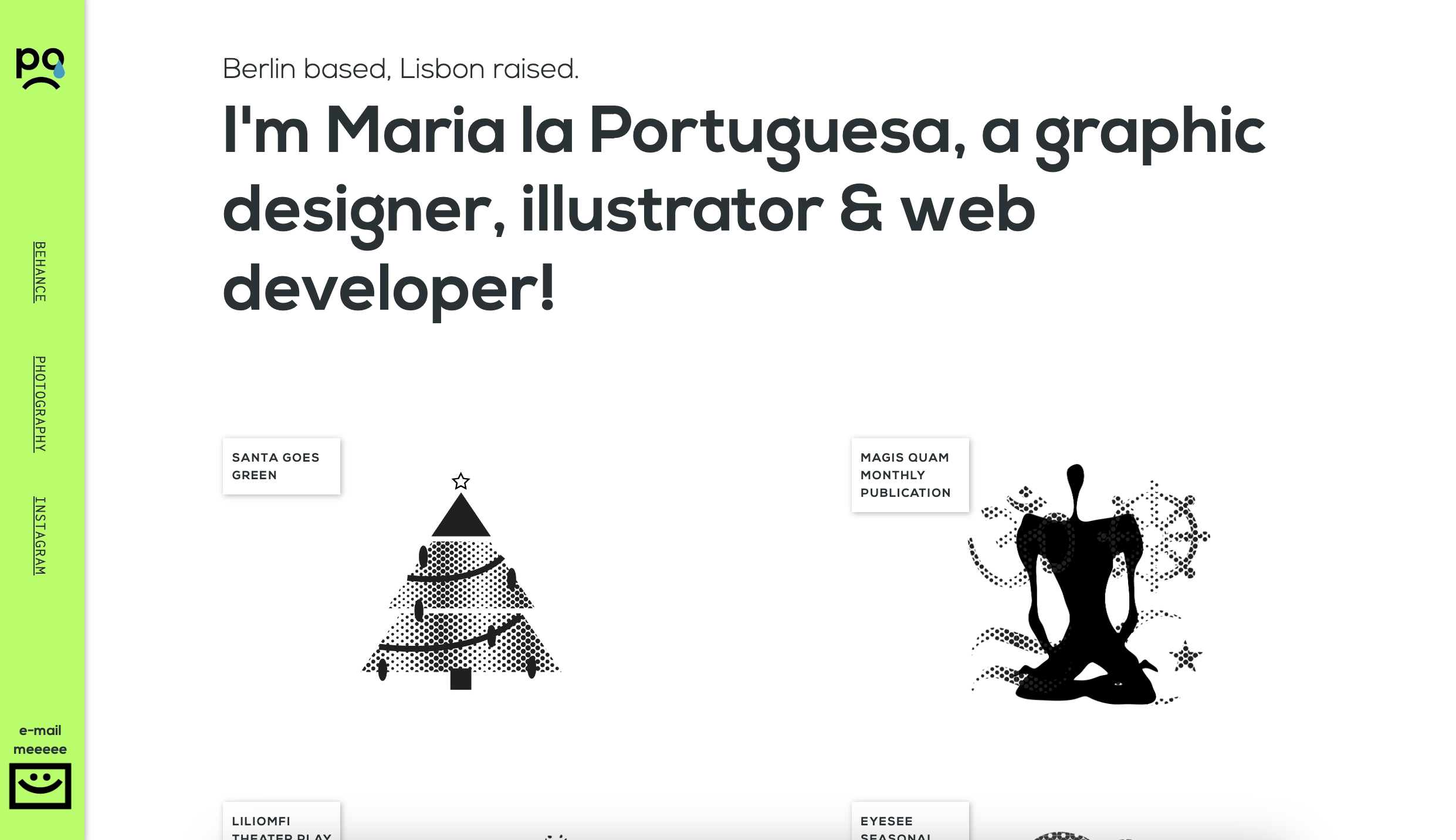
Maria la Portuguesa is a web designer, graphic designer and illustrator. I personally love the color scheme of her website, as black, neon green and white is
one of my favorite and random color combinations. I like the simplicity of the website, and I also like how the navigation bar is set up vertically instead of horizontally, which is
something different.
Target Your Audience
My target audience for my portfolio website are potential employers looking to learn more about myself, my process and the final outcomes of my work. Not only do I want to display my work, but I want to display the process: like sketches, idea development and mockups. More than anything, I want my website to be minimal and simplistic, as I want it to be as easy to navigate and look at as possible. That to me is the most important thing.Inspiration and Concepts
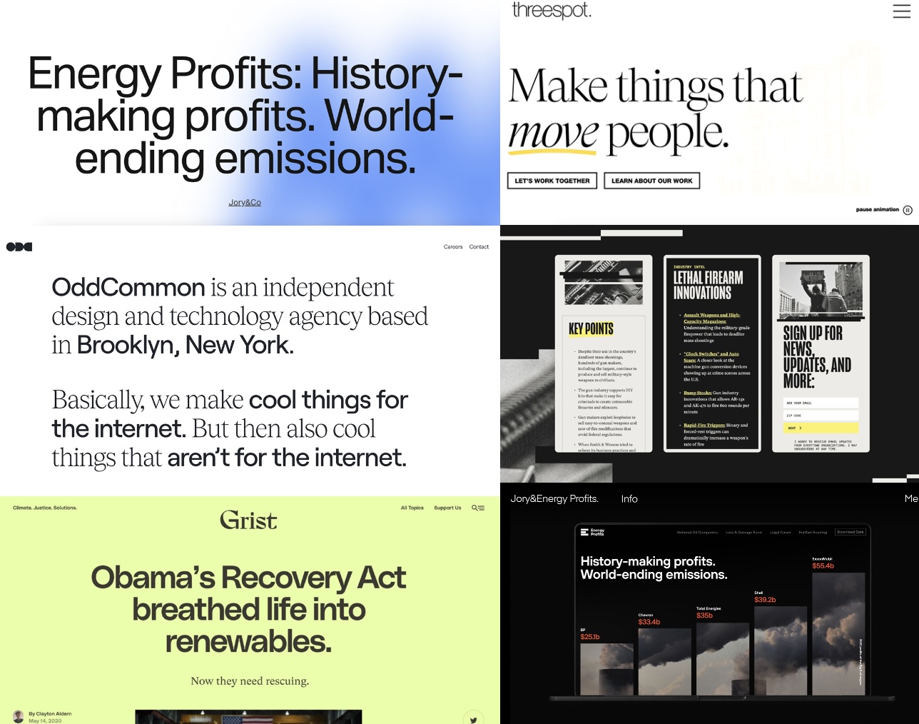
Thumbnails and Sketches
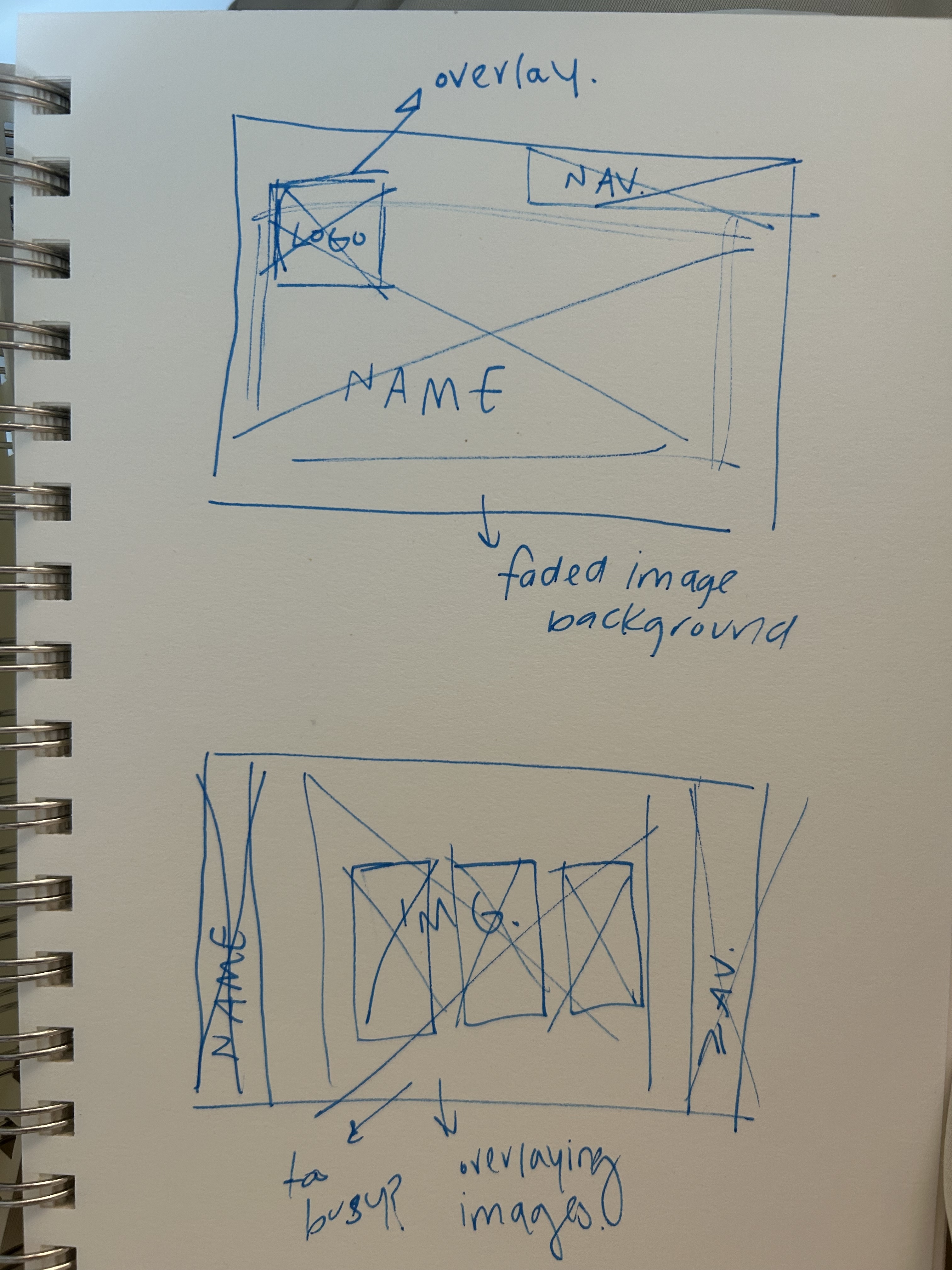
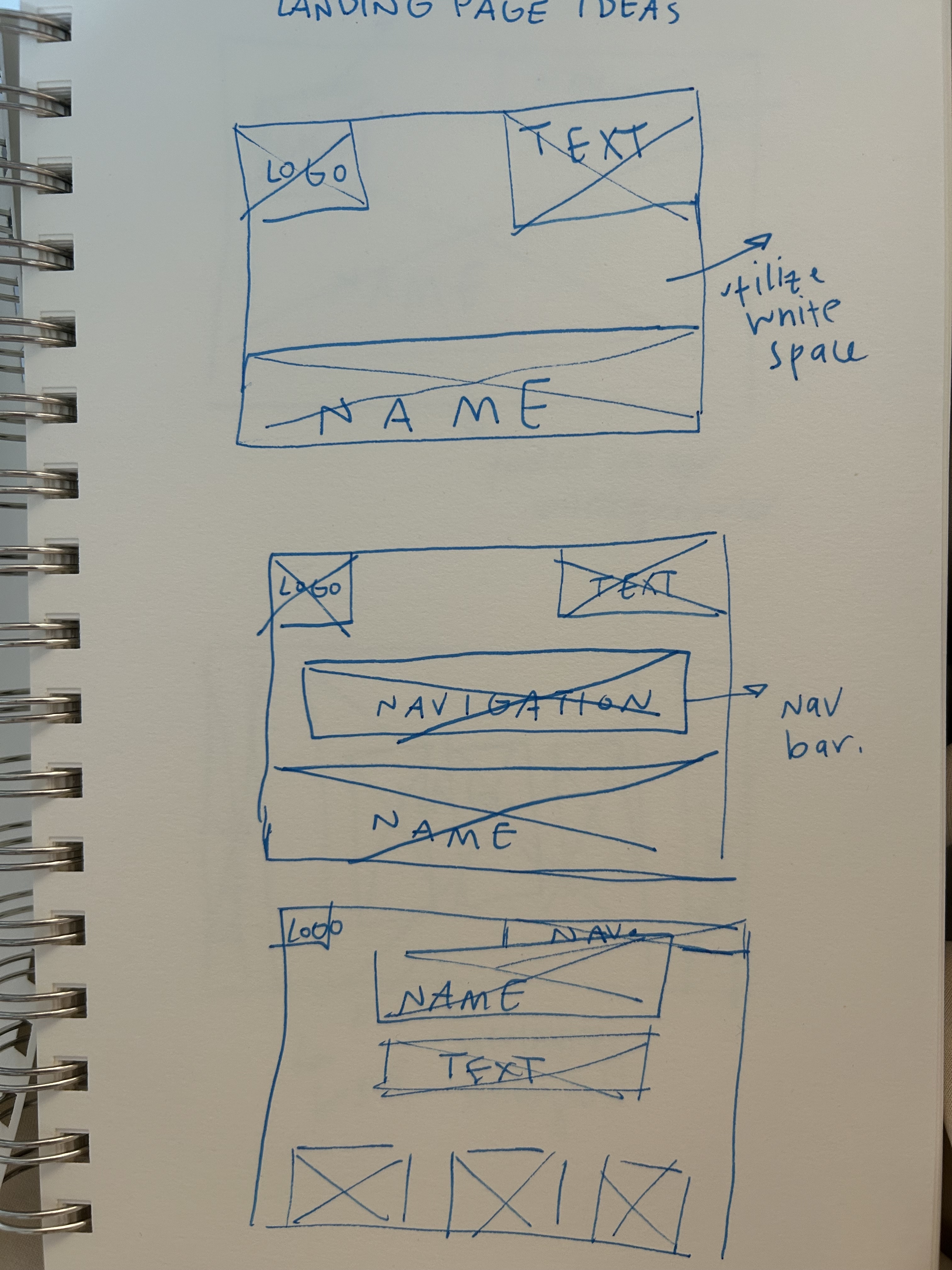
Wireframes and Prototypes
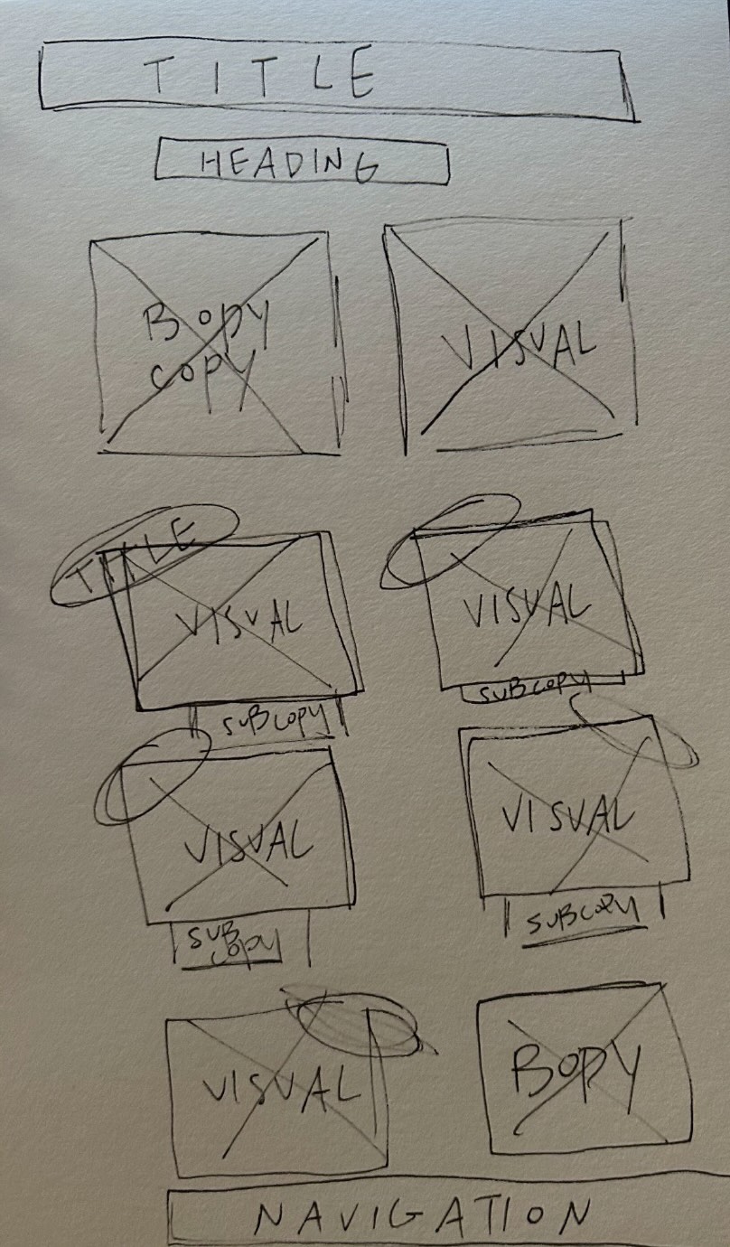
Responsive Mockup
PhotoShop Comp