MIDTERM WORKSHEET (8 STEPs)
back
BUILDING MY OWN WEBSITE? GO!!!!
1. Develop Your IDEA!
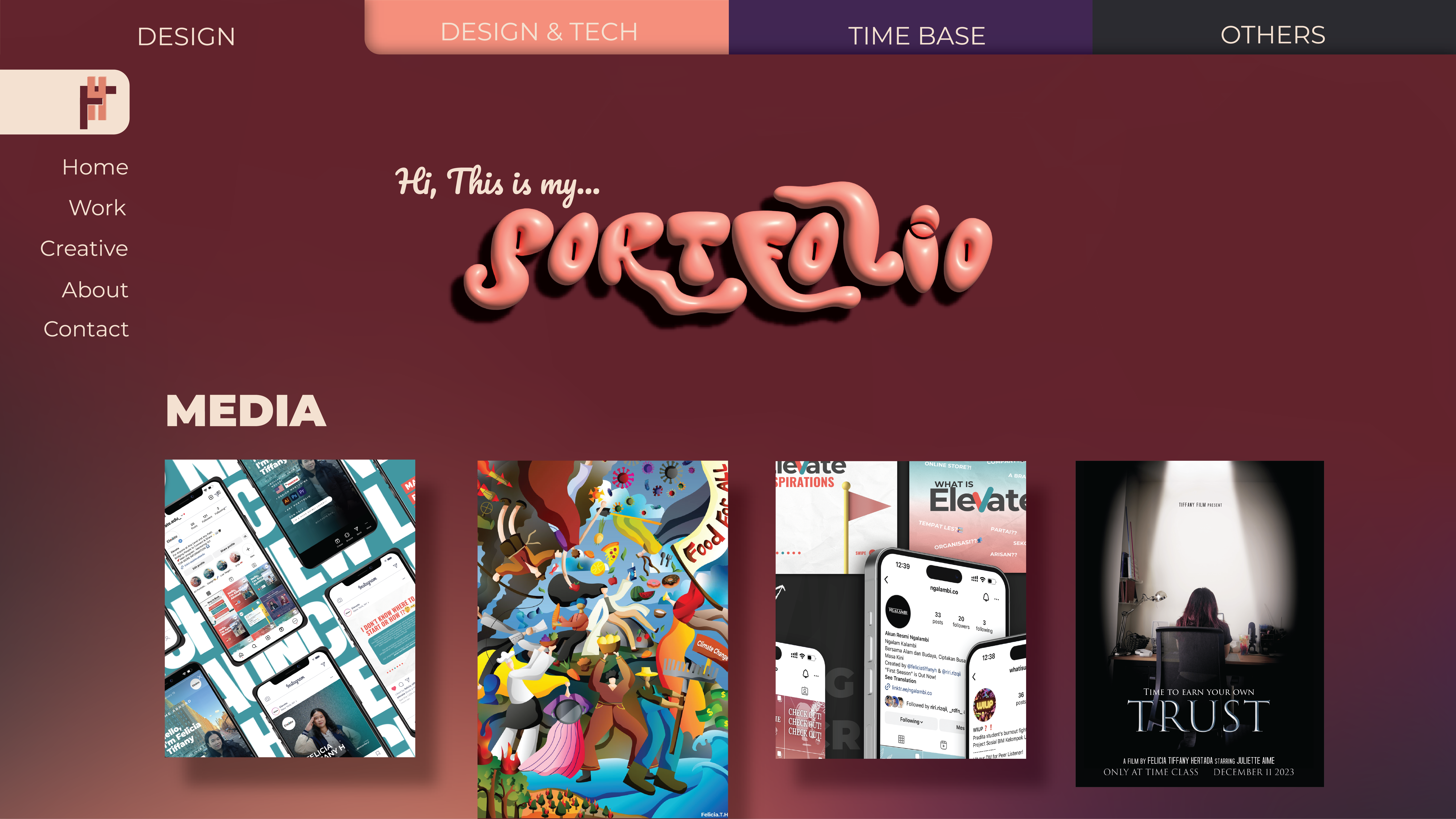
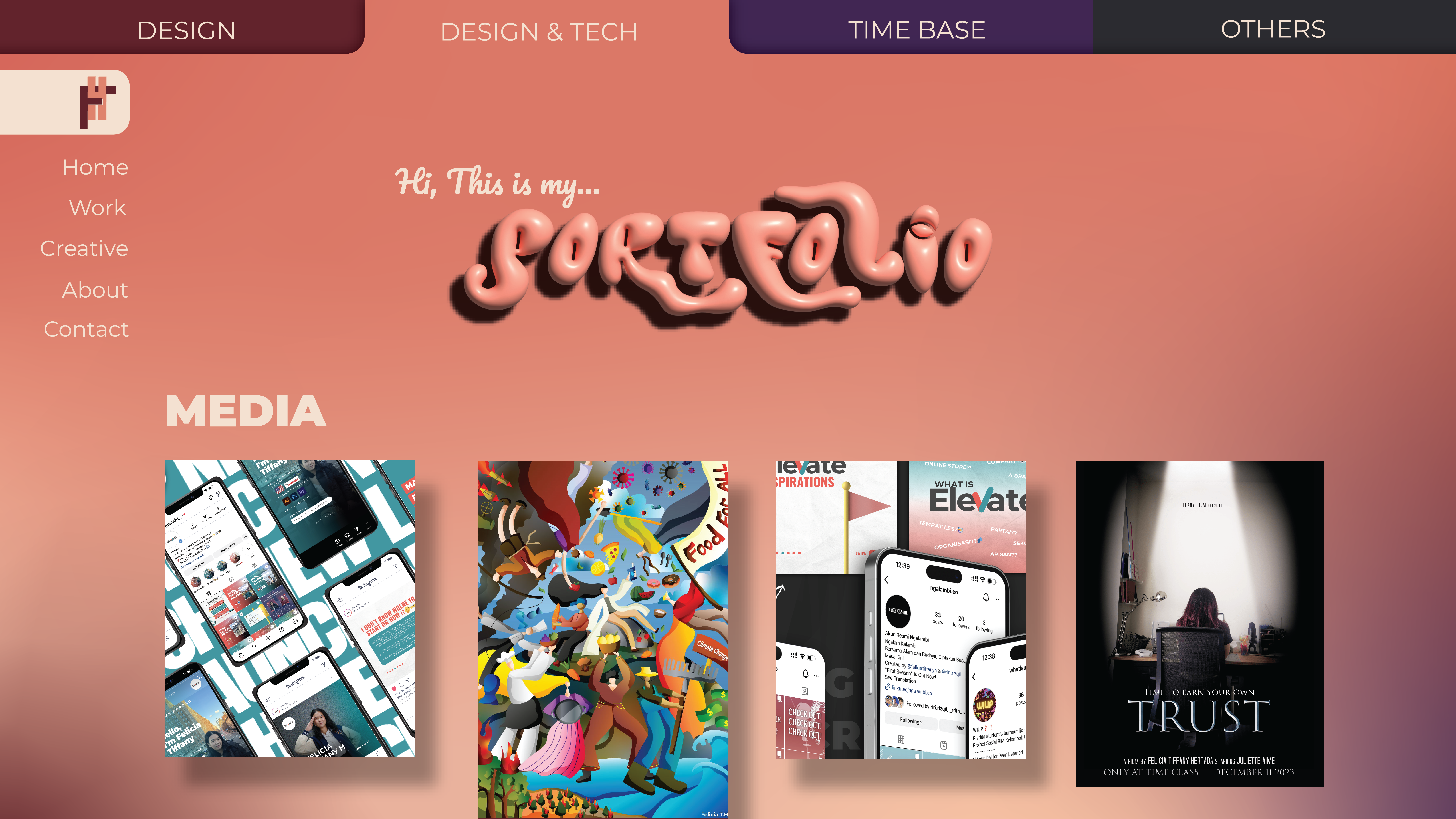
I want to create a website that showcases my work across various categories, with a strong emphasis on design and technology. The site should be easy to navigate, especially when viewing my portfolio, and should allow me to update new projects easily. My goal is to have an interactive experience that captures the audience’s attention right from the start, engaging them with creativity throughout.
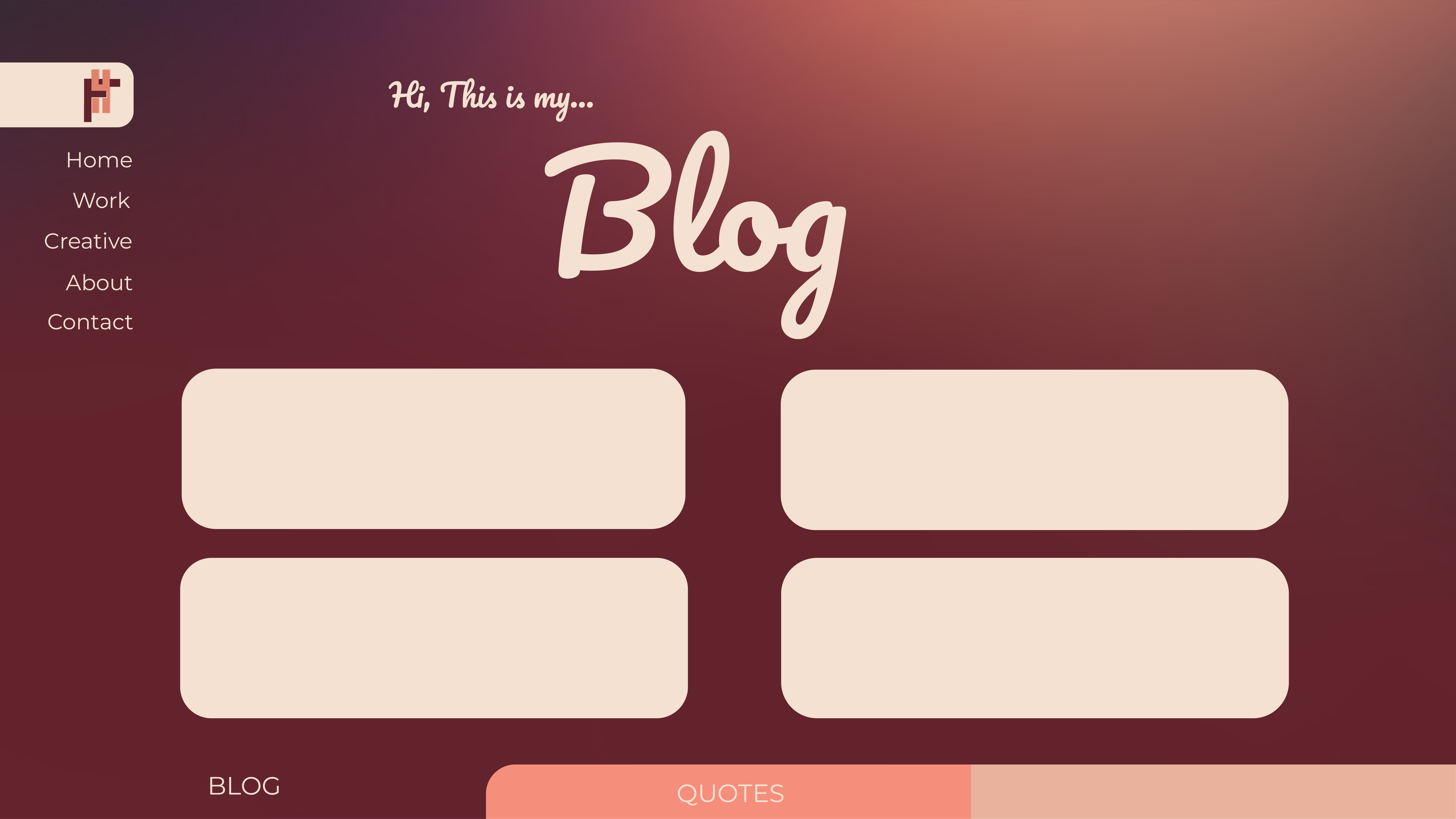
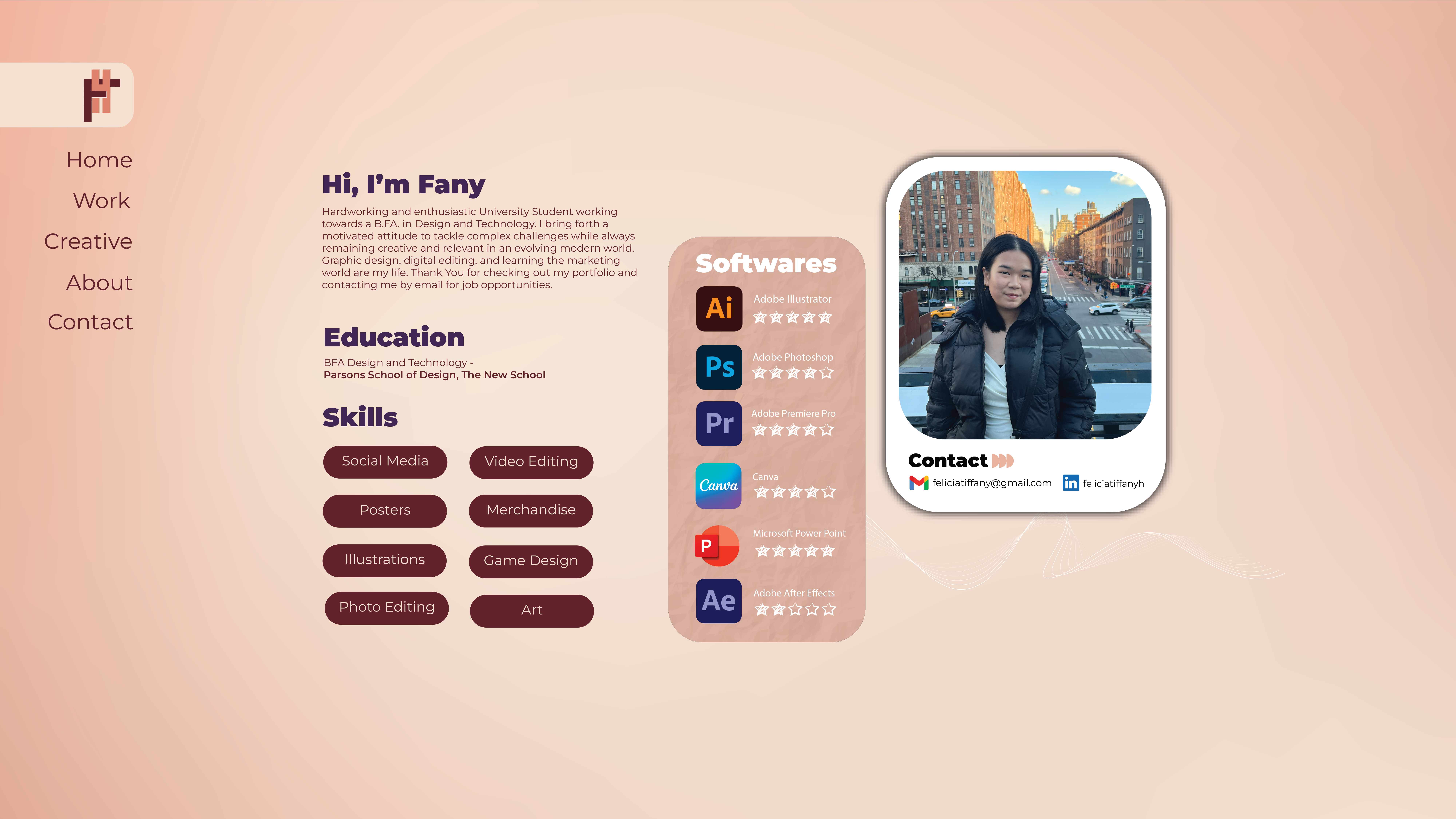
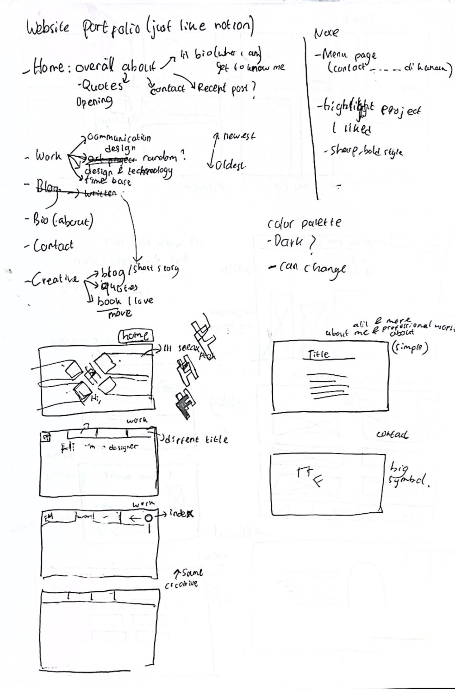
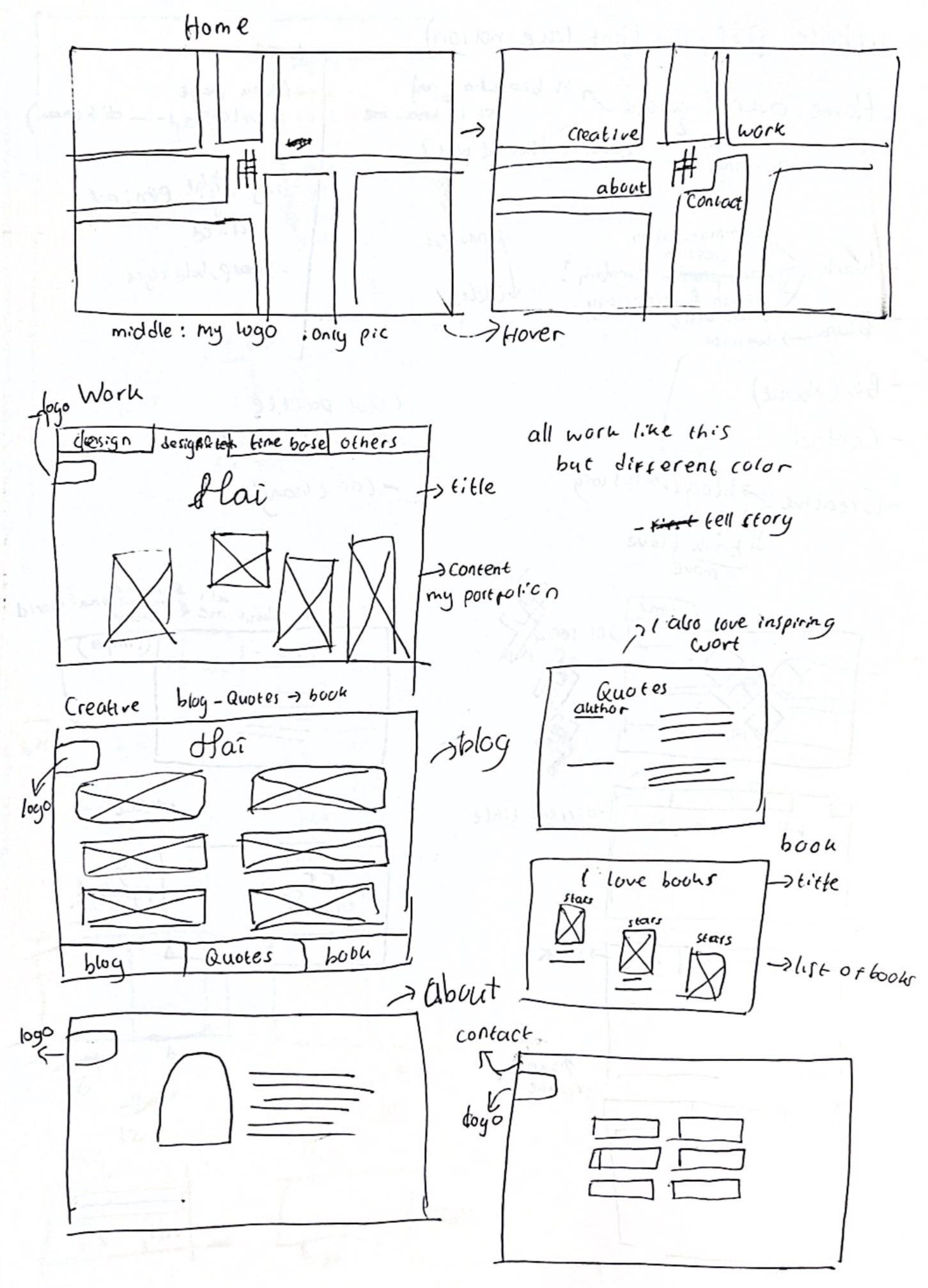
In addition to showcasing my design work, I also want the site to present my professional background, similar to LinkedIn, highlighting my ability to collaborate, adapt in the workplace, and demonstrate a range of skills. I’ve noticed that many websites focus on one specific aspect, but I want mine to serve as a platform for personal branding, reflecting my multifaceted expertise and versatility. So, I might create a multiple subpage that’s easy to understand.
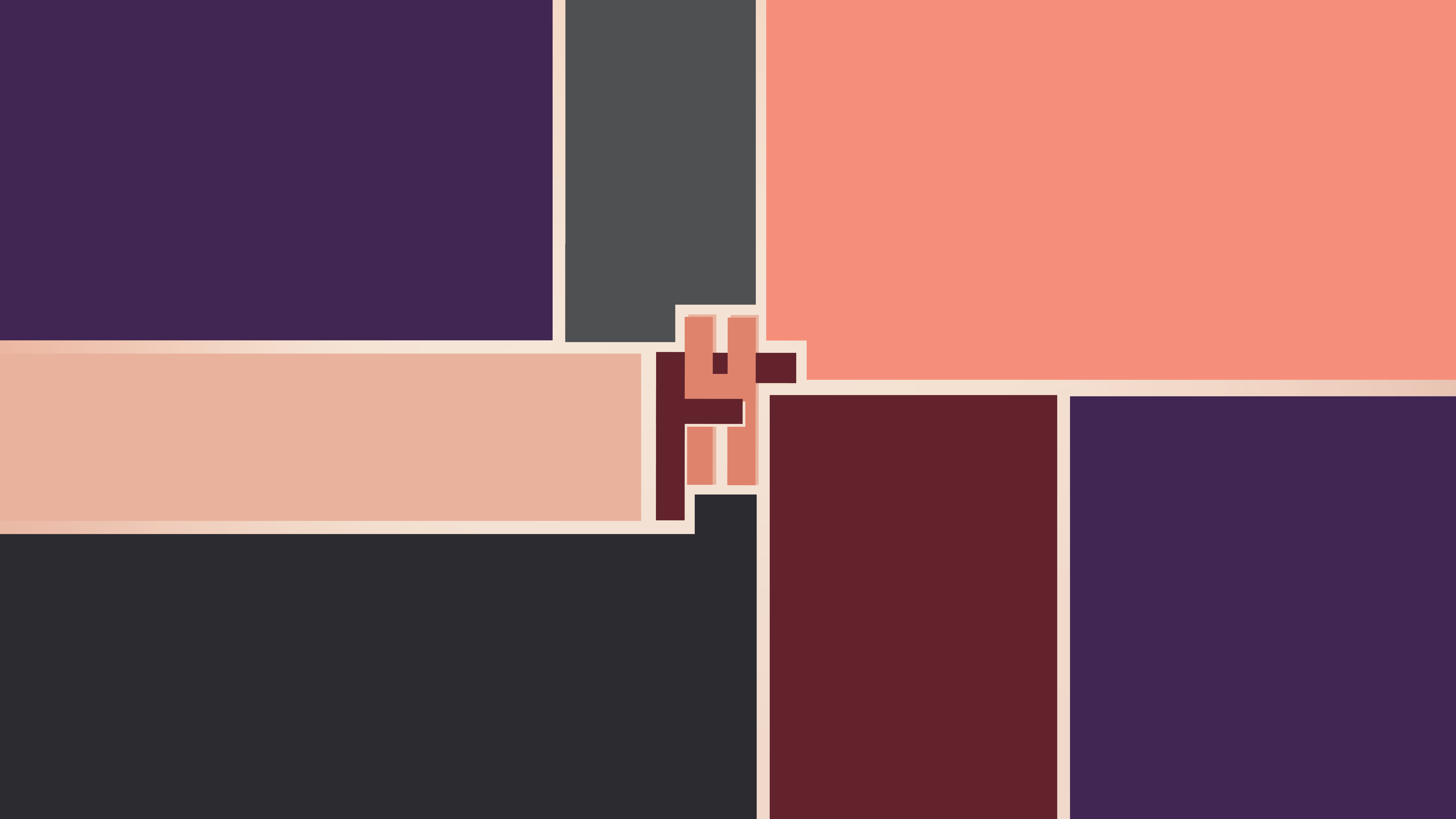
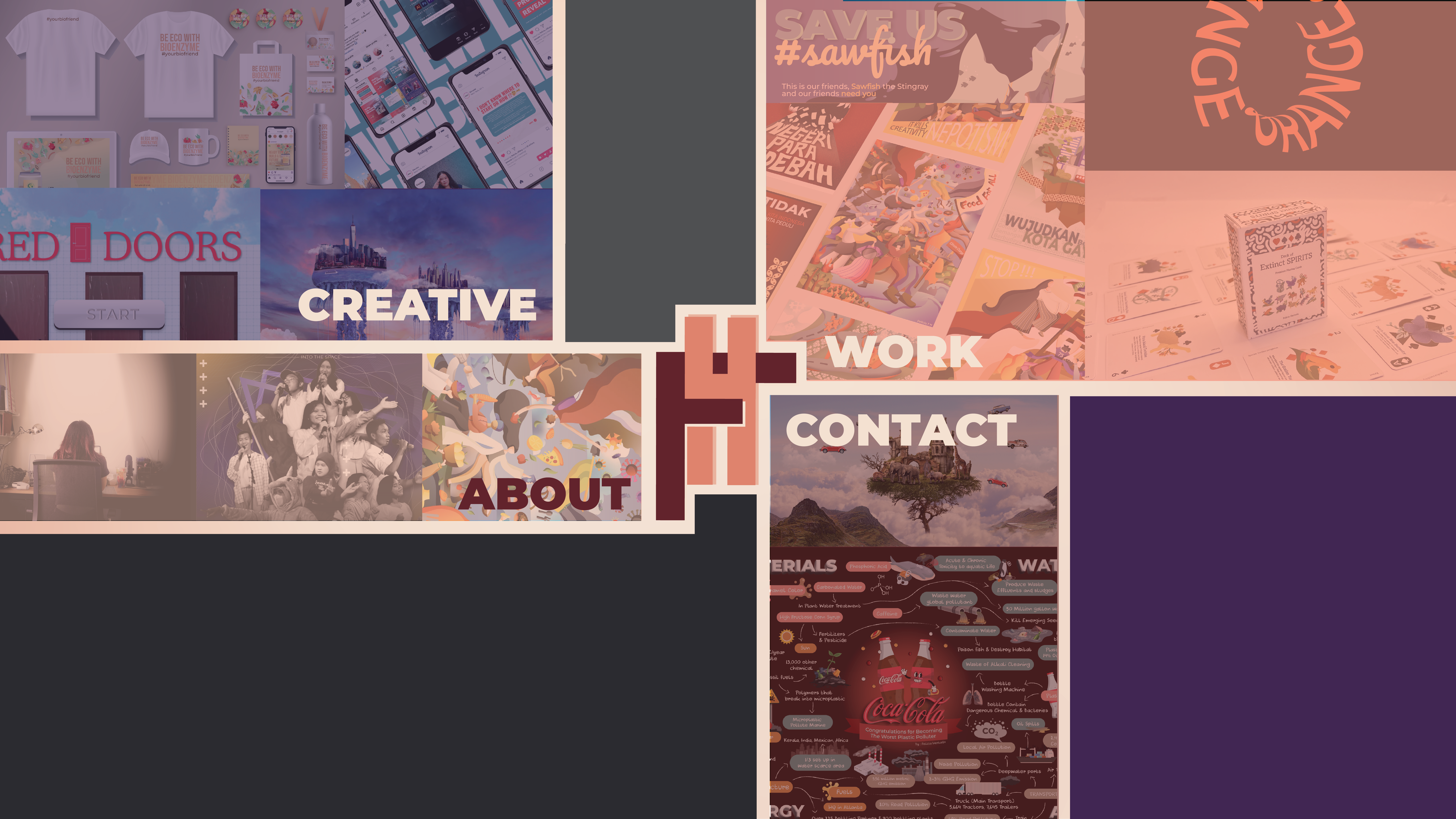
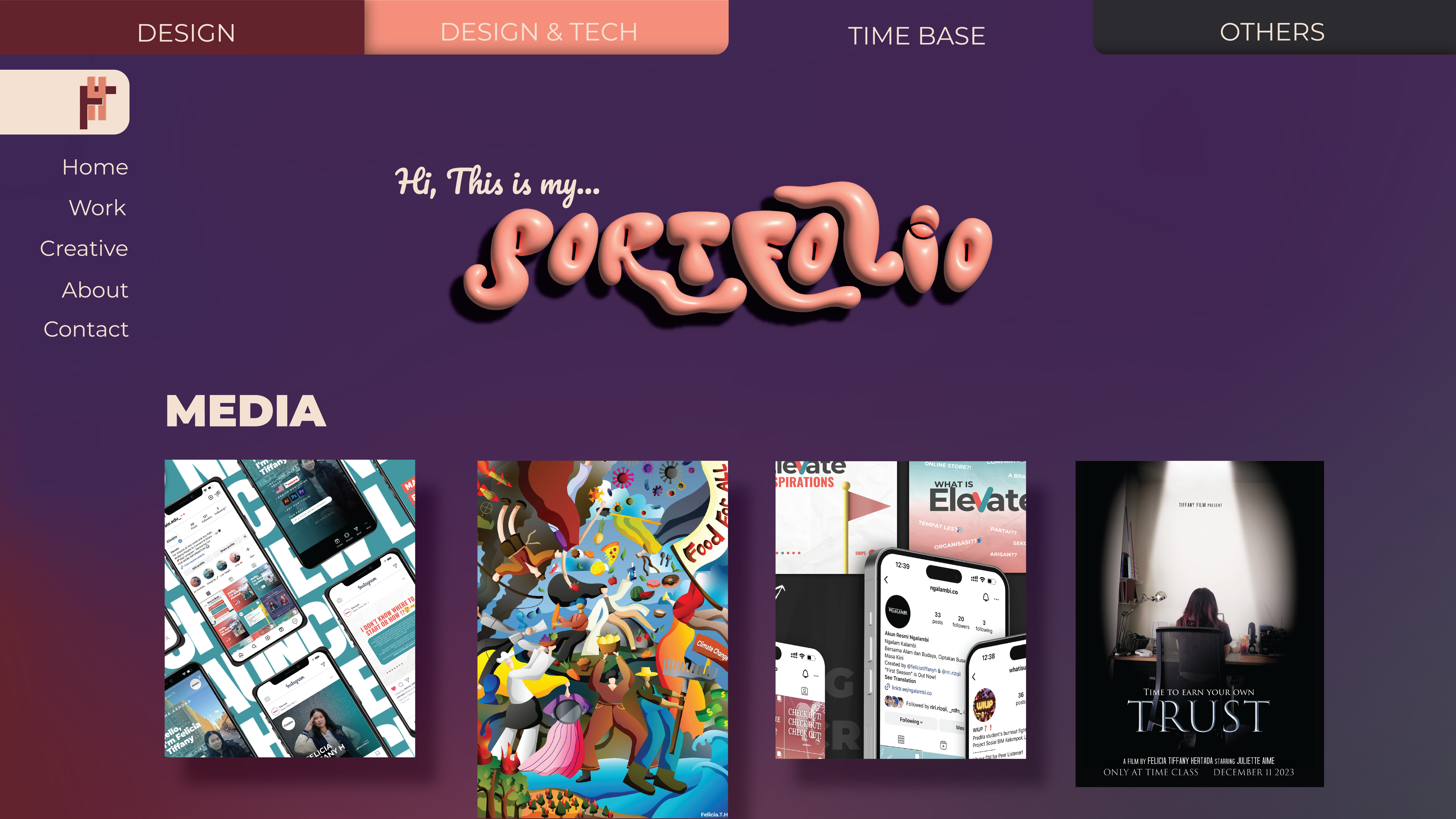
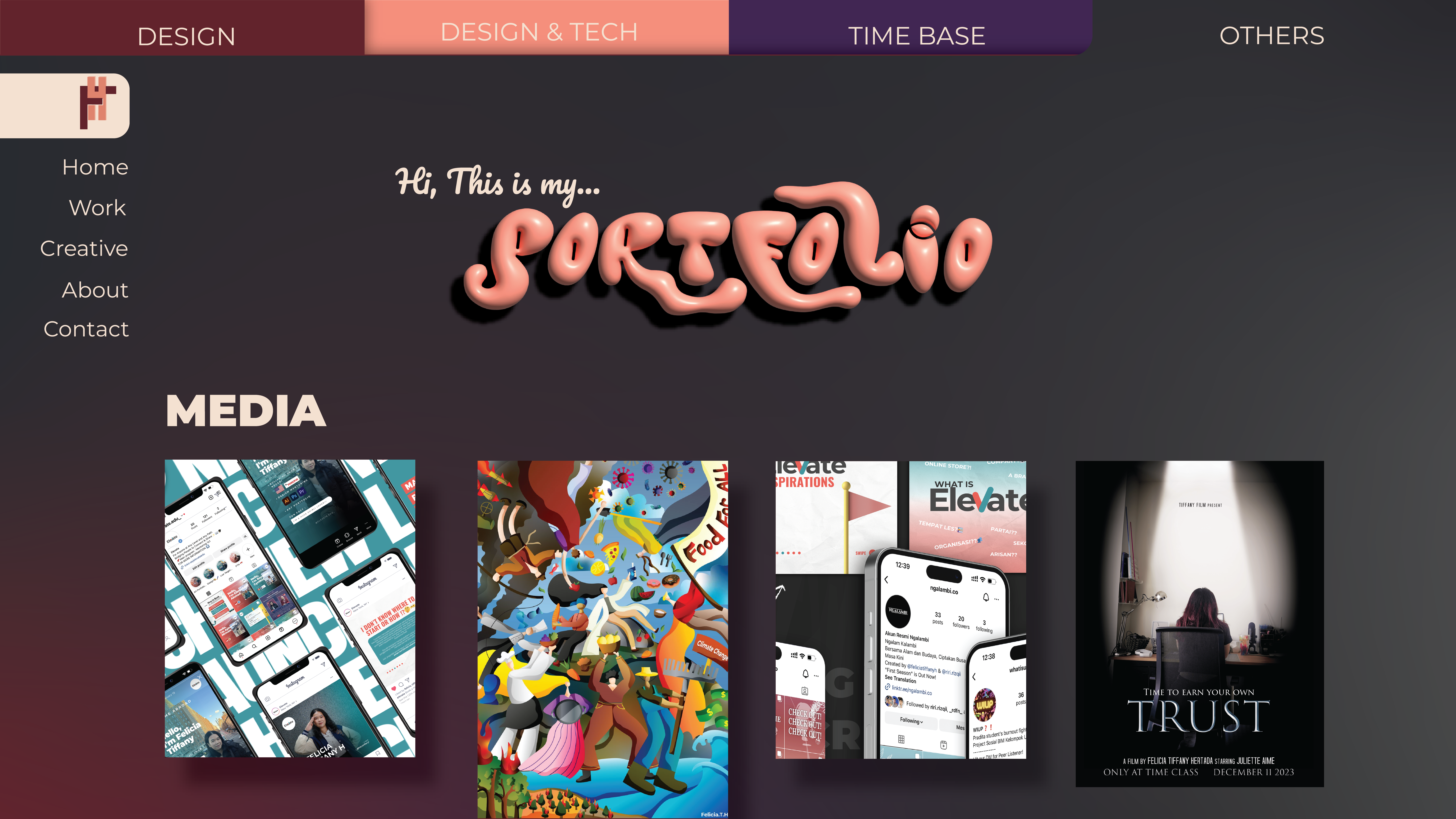
For the design, I envision something simple yet elegant, incorporating subtle technology elements like interactive features. It should have a timeless aesthetic, one that can evolve with me over time, but remains true to my personal style. I also want an unexpected, unique, and different menu page.
2. DISCOVERY AND RESEARCH
Not only knowing what I want, I also did some brainstorming. There’s many aspect I want on my website after knowing many reference. These reference and research help me to learn what I can do with html and what interactive feature I can include. I also did learn about communication design and typhography through this website.
Tobias van Schneider
This website is a really cool example of website with clean and visually bold design. It’s giving an impactful affect to the audience with clear sections for work, blog, project, and many things. Even though the content is many, this website is easy to navigate and have f**ull-page immersive scrolling, with well-placed calls to action, allowing the work to speak for itself.
Jeffrey Ellis
This project page is a fantastic example of sleek, engaging design that highlights both his creative process and the final product. The clean layout allows the content to shine, while the use of bold, modern typography adds a professional touch. I especially love the detailed process breakdowns alongside vibrant visuals makes it easy to follow his journey from concept to completion. It’s clear, well-organized, and visually stimulating, creating a compelling narrative that effectively showcases his skills and attention to detail. I also like the colorful yet simple design of the website with animations and smooth transitions that elevate the user experience.
Arte proyecto 70
Every people that come across this website must have agree that the first page of the website is really unique and interesting. I really love how simple but creative it is. Even though it’s different, it doesn’t confuse the audience and definitely eye-catching. Other than that, it’s interesting seeing how the layout is all align to the left and also if you notice, the menu page is changing place everytime.
Rina Maimon
What I really like in her website is quite similar to Arte proyecto 70, the first page that show up. However, her first page show the style of work she done by showcasing pieces of her work. It’s also interactive with a beautifully simple layout that lets her work take center stage and people can play with it. Even though the other page is simple, her website is a visually pleasing, grid-like format, drawing attention to each individual piece with clear, high-quality images.
Sean Halpin
This website is an energetic, quirky, and highly interactive experience that reflects his playful design sensibility. The landing page greets visitors with eye-catching, bold illustrations and a dynamic, animated layout, immediately drawing people in. His use of color is striking but well-balanced, and the creative design choices add a lot of personality to his work. The navigation is smooth, with clear transitions that make exploring the site feel fun and engaging. Some interesting things that I love from this is the font selection, the consistent style, and one unique feature on the bottom of the page where you can change to day/night mode.
3. TARGET AUDIENCE
My first target audience is hirer and anyone I’m sending this portfolio for. From this, I was thinking that they might be a designer, technologist, or marketer. However, I also want my website to be seen for anyone as art inspiration or as personal branding for me. Because my work is diverse, I want the audience to be able to go through my portfolio easily and found my skill they are looking for. I want it to be able to show my way of thinking, design process, and style of aesthetic.
4. INSPIRATION AND CONCEPT
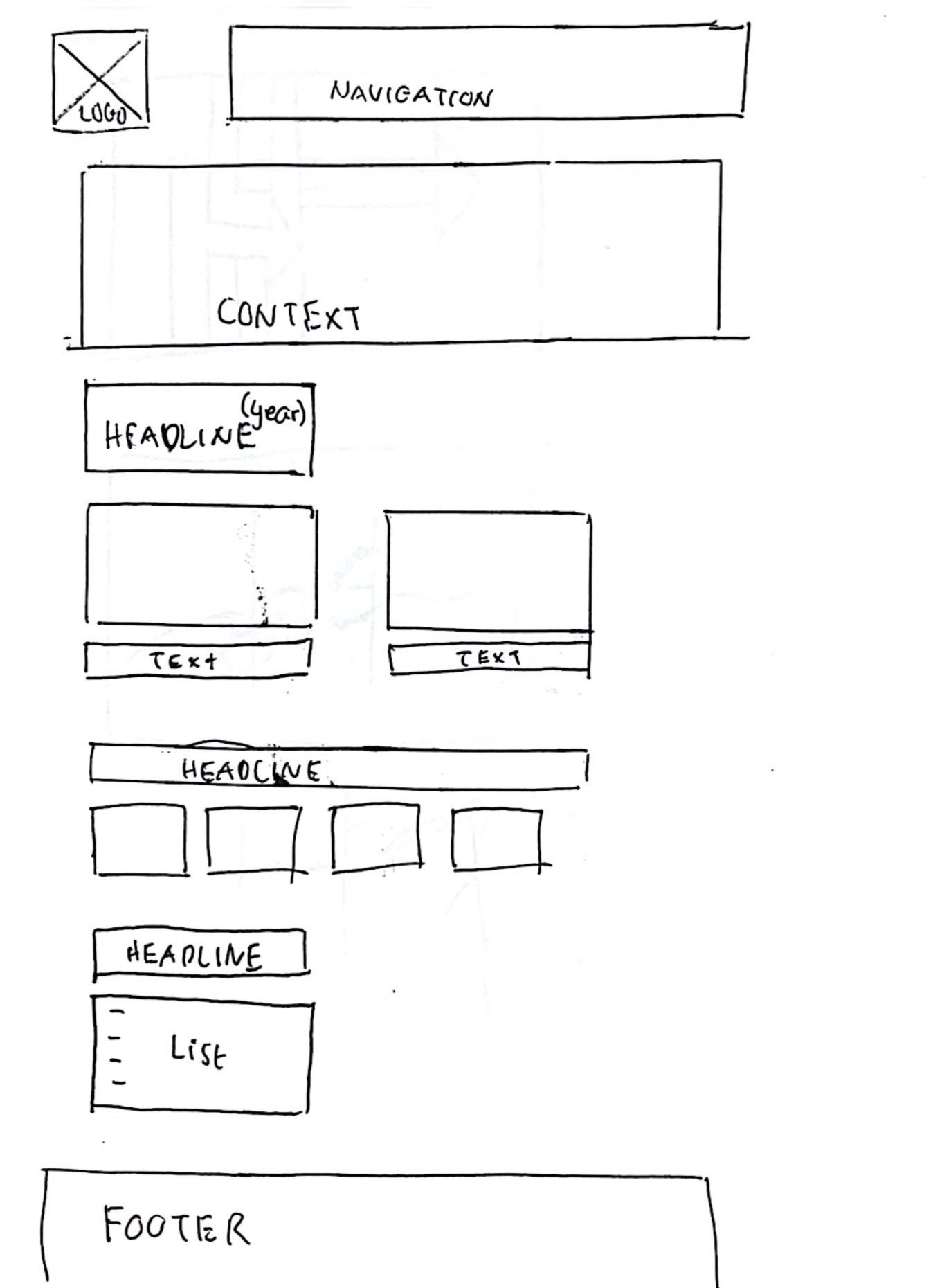
The target audience from here is definitely the main hirers or people who are interested in her work, especially maybe web designers, news business company, multimedia editor, graphic designer, and Indonesian artist. I believe it’s best to be straightforward in this field and giving small information to give the context of the websites or graphic she made is important. So the way she organize her portfolio like a news website make the target audience familiar with it. She also make her work has a small headline and news highlight and organize it the way audience can see which project she likes more by having the list of more work under every year.
5. THUMBNAILS and SKETCHES
Sketches on Sep 2024
New Sketch on Oct 2024
6. WIREFRAME and PROTOTYPES
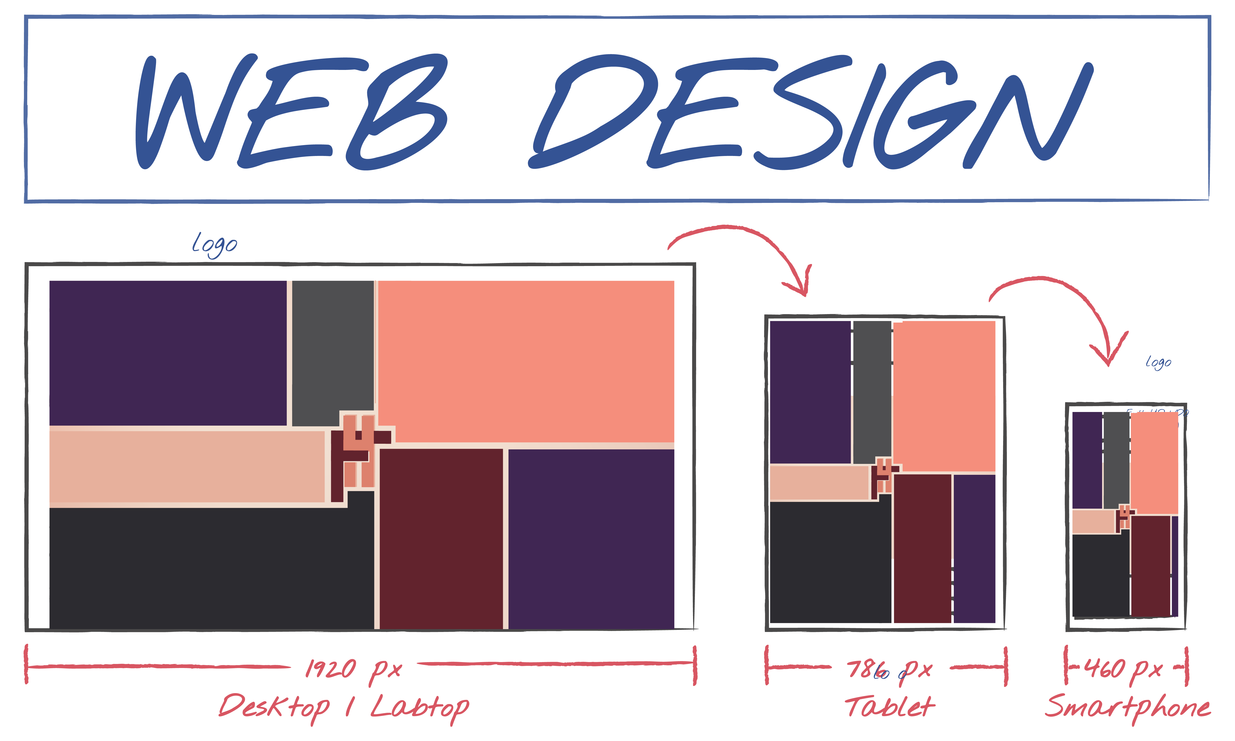
7. RESPONSIVE MOCKUP
7. RESPONSIVE MOCKUP
8. PHOTOSHOP COMP
