WEBSITE ANALYSIS
UMI SYAM

back
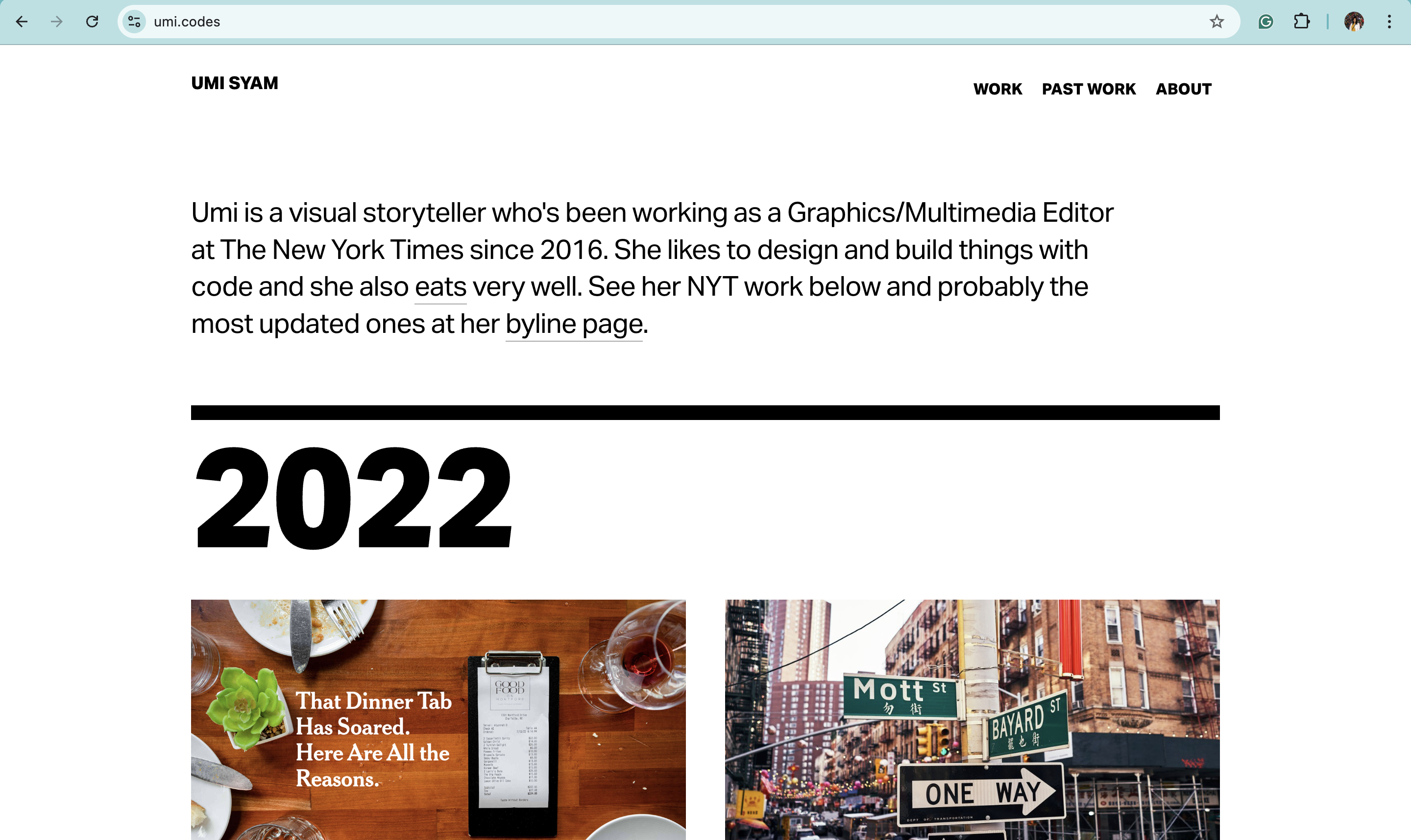
A few days ago, I was told by a friend about a web designer who I can also call an artist. Her name is Umi Syam. She is from Indonesia and he also graduated from Parsons Design and Technology (MFA). There are similarities with me, but the difference is that she is much cooler. Back in Indonesia she worked at Microsoft for quite a while straight after graduation. Then she moved to New York and worked as a graphics and multimedia editor in the Digital News Design department at The New York Times. As she has been studying coding for a long time and from his current job, it can be seen that she is very professional with web design. She has created many websites and interactive news features at the New York Times, as can be seen here.
1. INTENT
She want to showcase her work in graphic and multimedia whether it’s right now as she work in New York Times or in her past student work. She orders her work according to the year from the latest work to the oldest and we can see how she grow. After I searched around, she turned out to be an award-winning enterprise storytelling project ranging from the Olympics to the elections. It's really cool to see that her website tells the story of her career journey and is very easy to navigate.
2. VOICE & TONE
Clean, minimalist, and professional, reflecting a modern and futuristic aesthetic, yet approachable. The first time seeing her website, I feel that her website is conversational, informative, and neutral. Her intent is showing her work in various website so I believe the tone of her personal website is to create the neutrality in the audience eye’s. For example when someone goes to one of her work (example : https://www.nytimes.com/interactive/2018/10/11/style/this-is-18.html). They will get the feeling of happy and colorful website. Before going to see her other homework, the assumption is that the audience will go back first to her website and restart their feeling and goes to other rollercoaster of emotions in her other work. Other than that, her work usually diverse from many tone of website and so the neutrality and professional voice in her website help in visual aspect in showing her portfolio. This website tone also create the impression of professional business woman in her name but still showing the creativity from her work.
3. BRAND
The website positions itself as a cutting-edge, forward-thinking digital artist's hub, with a focus on technical innovation and art in web design.
4. PERSONA
The target audience from here is definitely the main hirers or people who are interested in her work, especially maybe web designers, news business company, multimedia editor, graphic designer, and Indonesian artist. I believe it’s best to be straightforward in this field and giving small information to give the context of the websites or graphic she made is important. So the way she organize her portfolio like a news website make the target audience familiar with it. She also make her work has a small headline and news highlight and organize it the way audience can see which project she likes more by having the list of more work under every year.
Possible PERSONA
Herry:
Age: 35
Occupation: Creative Technologist
Goals/Interests: Alex is looking for inspiration and guidance on integrating art with technology, especially in interactive and immersive web projects. They appreciate minimalistic, aesthetically appealing digital experiences that push boundaries in both design and user interaction.
Motivation : They want to collaborate with or learn from artists like Umi who innovate through the fusion of code and design. Website will help on navigate through Umi work.
Tiffany:
Age: 20
Occupation: Creative Technology Student
Goals/Interests: Tiffany is looking for alumny or graduate that work in web design industry. She is searching for inspirations to build her own website to showcase portfolio in web design.
Motivation : She want to learn from Umi Syam website that's easy to navigate and give neutrality feeling to the audience. She allso want a professional looking website
Jamie:
Age: 40
Occupation: Marketing Manager at a Tech Startup
Goals/Interests: Jamie wants to develop innovative marketing campaigns that incorporate digital art and interactive experiences. He aim to collaborate with designers and developers to create visually engaging content for the company's online presence.
Motivation : Jamie believes in the power of visual storytelling to connect with audiences and drive engagement and see this potential throught Umi work. Thus he want to learn more about Umi work and might be interested in hiring her.
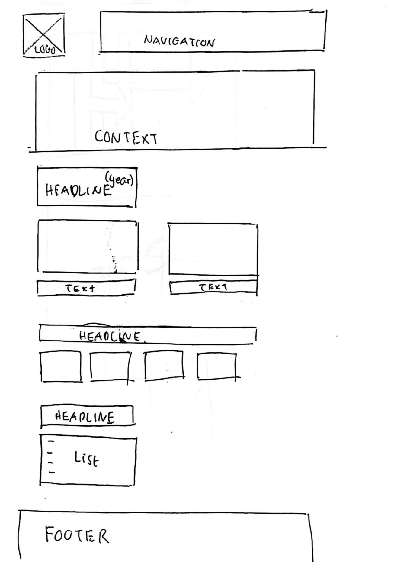
5. WIREFRAME

6. Copy Deck (CONTENT)
She is organizing the content or her work by time which I think is effective because she work a lot in news production (New York Time). She produced a lot of web design and the way the content organized align with her work now. Which look like just a news website. I'm thinking that categorising the works by year is something I would do too. However, she also has other categories in the menu for people who want to view in a different order. She made her past work, which mostly in her master at Parsons’s Design and Technology, organized like in order of time but more like a list instead of news website.
7. COMPETITION
Her simple website makes people addicted to scrolling through the pictures of her interactive website. Knowing which photos are the highlights is also important and I like how the website doesn't make me stop scrolling all the way to the bottom. She also consider putting some of the work as highlight and the other (maybe least favourite) as only points.
Other than that, what makes her interesting and appealing is how passionate she is about food. Even most of her work in past school is about food. Maybe everyone who scrolls through her website will be able to know how much she loves food and the flavour of this information I think will be very attractive to the audience (especially the people who want to use her services).I believe personalised things like this can be interesting and show that we can be passionate about a job. This can become one of the content strategies. Adding a little story to make things interesting.
In addition, I believe her website portfolio is interesting because we can go to see and play with other website she has, easily getting through each of it. Also, the websites that she created, mostly contain interactive elements and have room to explore. Some of the website she made also has a game or something that triggers our mind to interact with it. I also would love to incorporate moving animation in the website and also giving some small tweak or playful part in the website.