MIDTERM WORKSHEET (8 STEPs)
back
BUILDING MY OWN WEBSITE? GO!!!!
1. Develop Your IDEA!
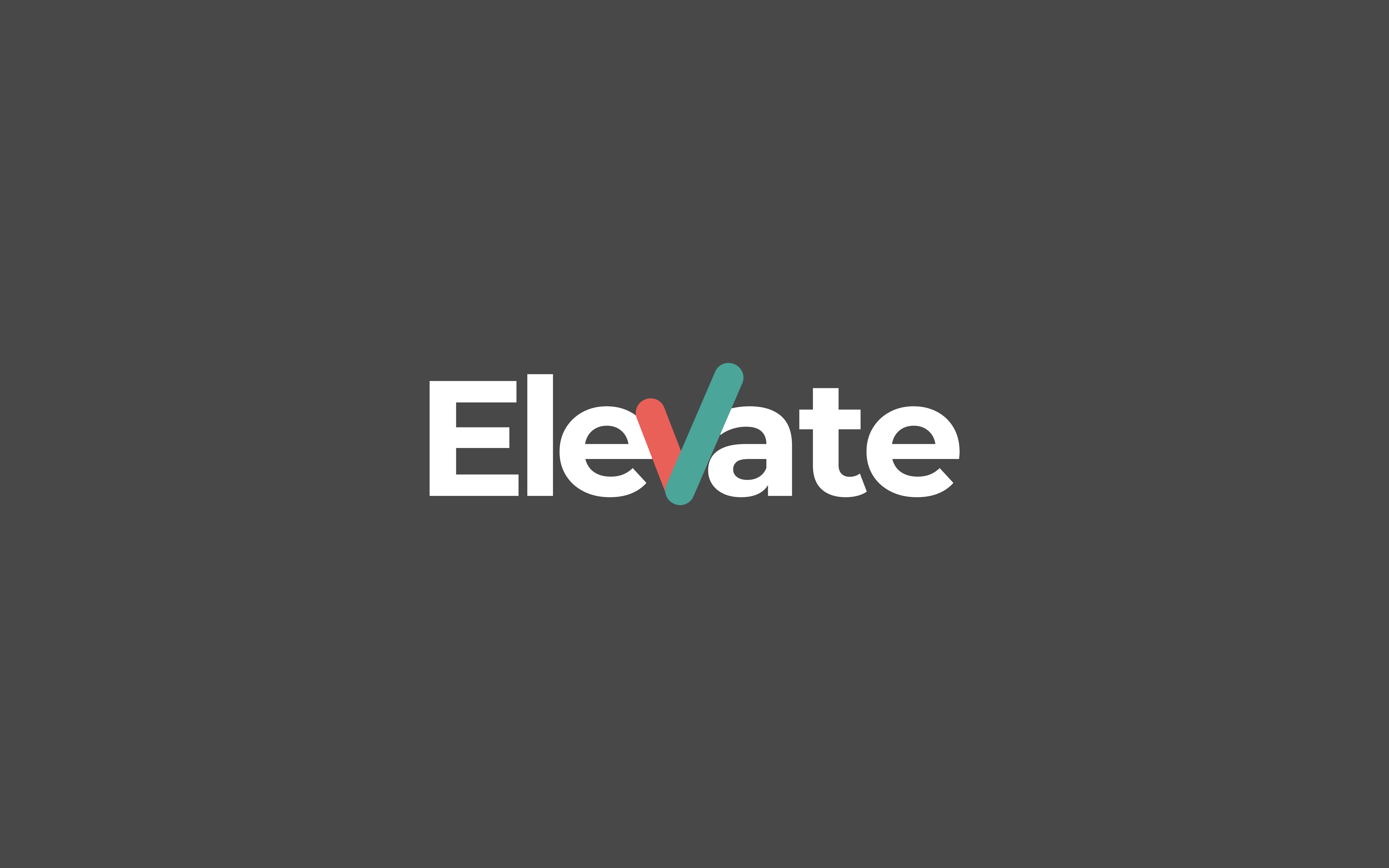
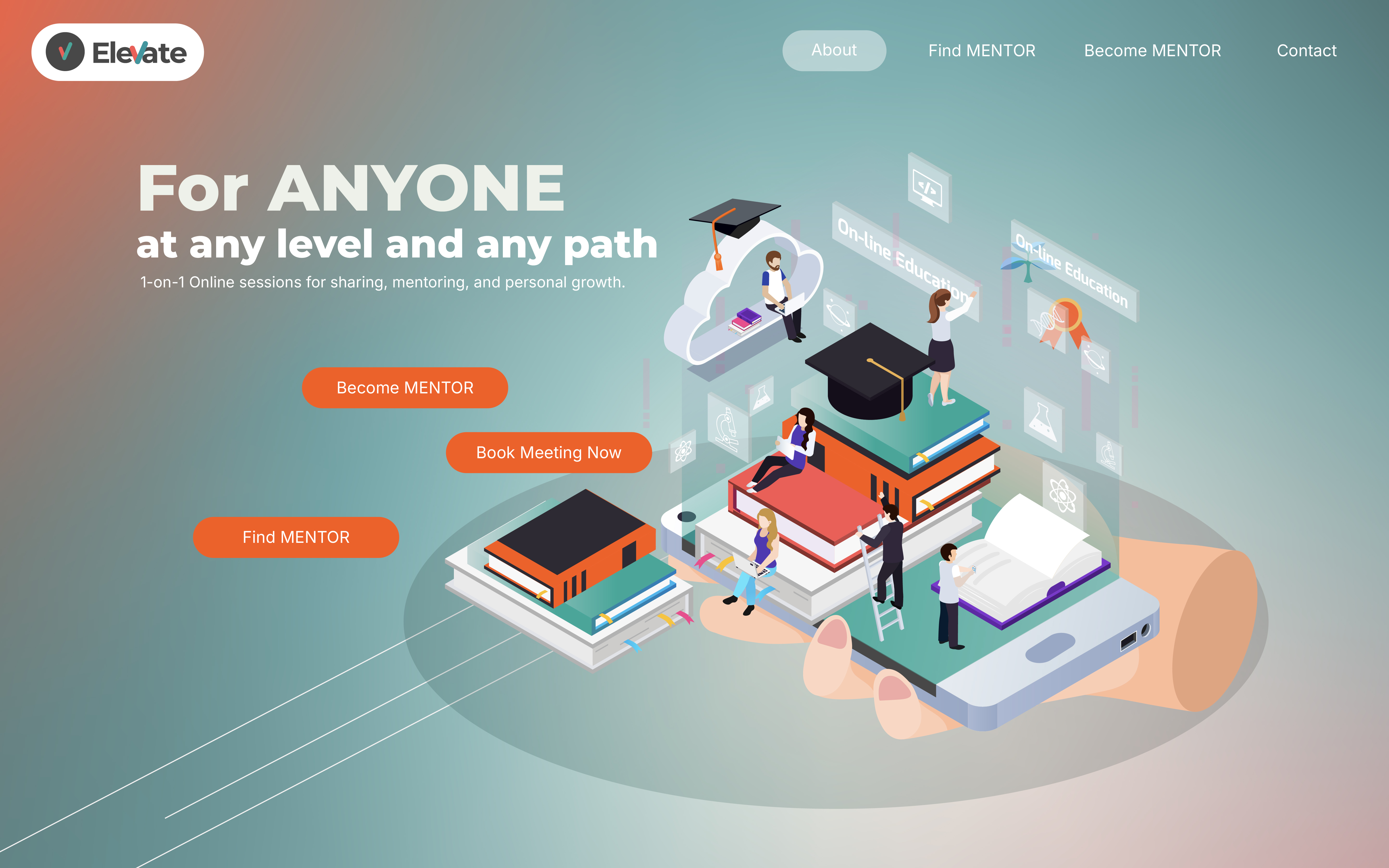
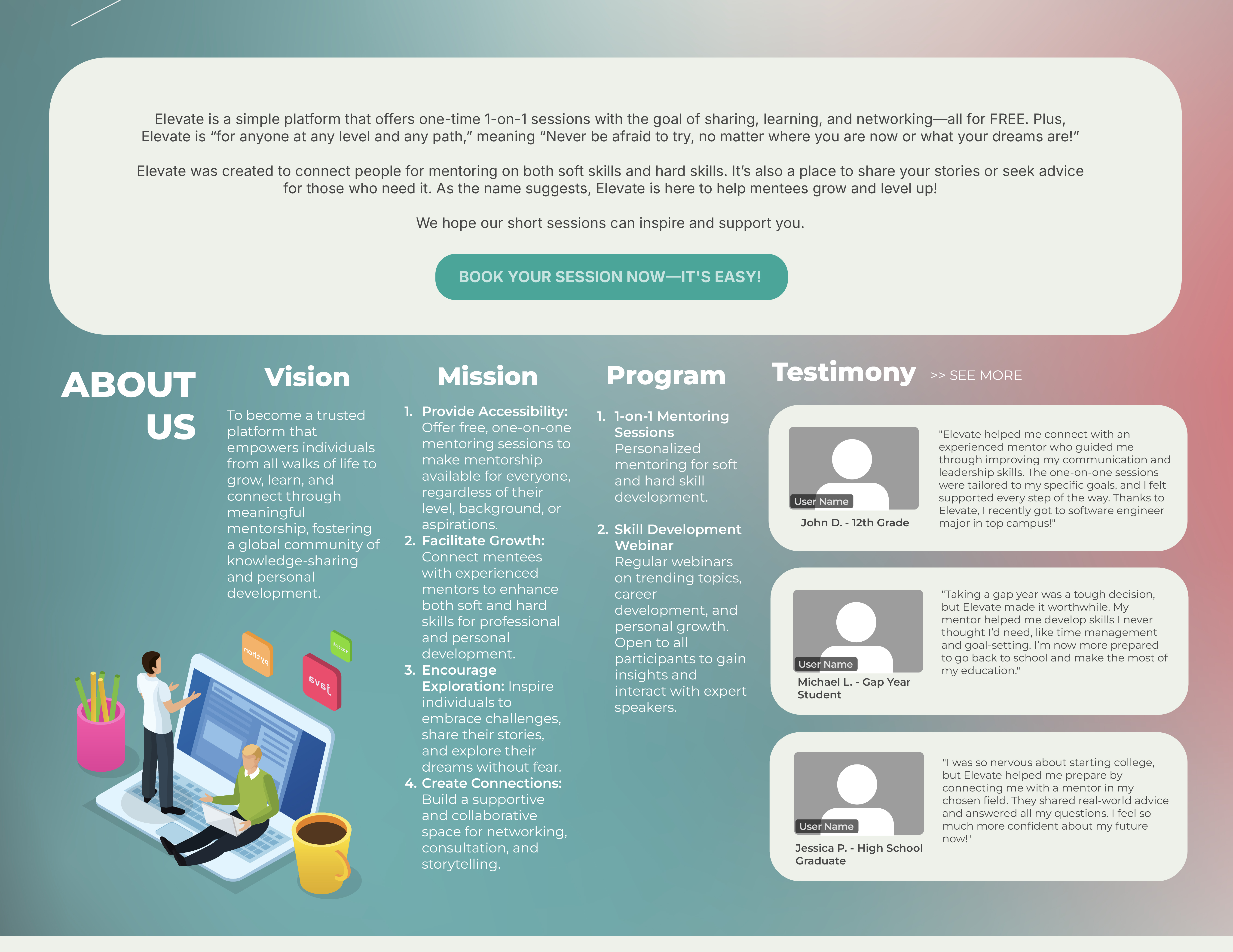
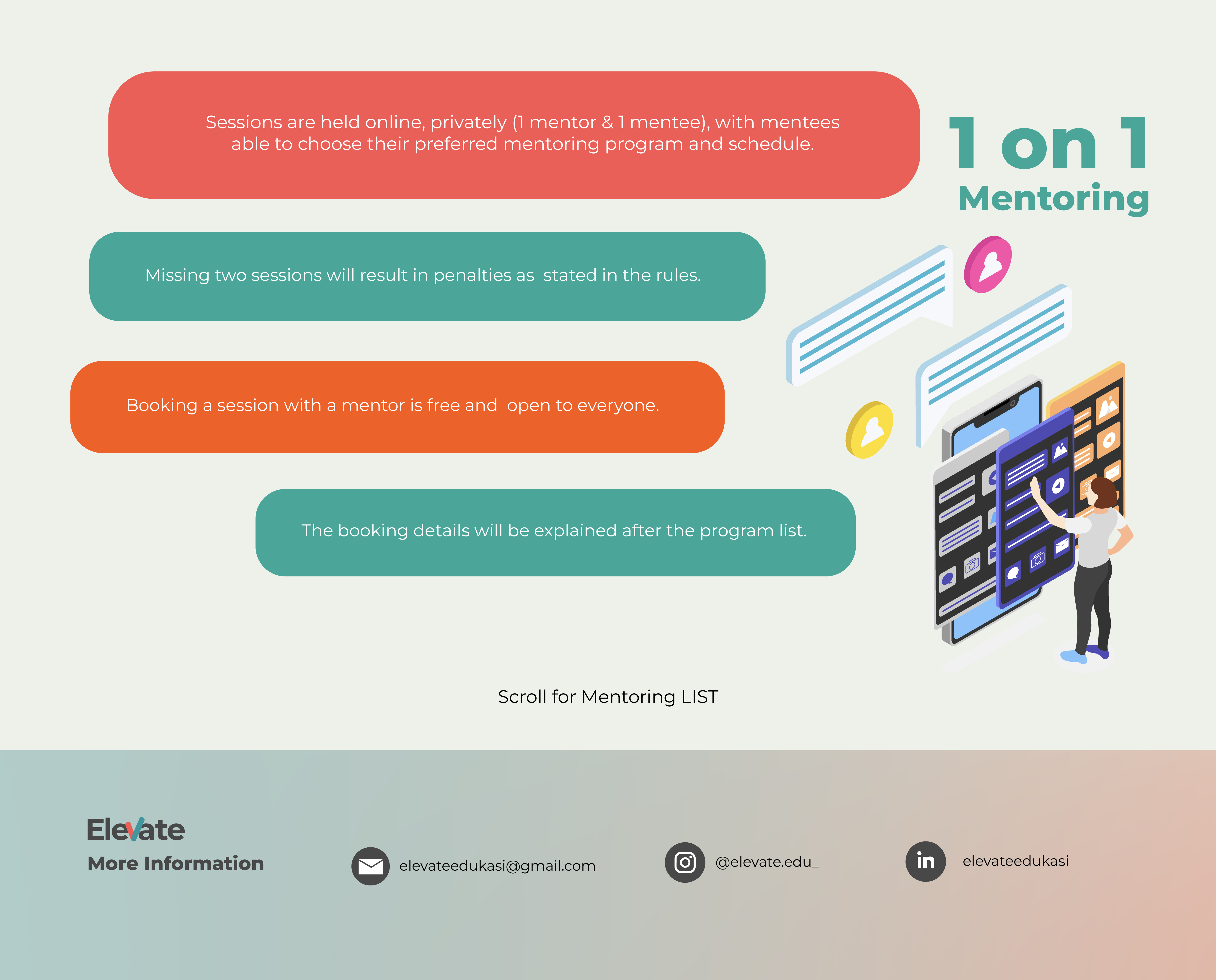
I’ve chosen to create a website for a mentoring platform that my friend and I started a long time ago. Although it’s not very active now, I want to revisit it for this project because I believe service businesses need a well-designed website to serve as their storefront. My vision is to make a website that’s easy to navigate and tells the story behind this platform. I want it to be informative, inviting, and memorable.
I’m also exploring an unconventional design—a bit more artistic and abstract—but not overly so, as I still want it to be professional and reflective of our brand. The website should include animations and interactive elements that guide the user through a journey, making it both engaging and easy to understand. I plan to incorporate a hierarchy so visitors grasp the core purpose, the main message, and the booking process for mentoring services. The goal is to create a website that encourages users to explore everything our service offers and stay engaged on each page.
2. DISCOVERY AND RESEARCH
STRIPE
-
**Polished Animations and Interactivity**: it integrates smooth animations and interactions that make learning about their services enjoyable. I specifically like the simple and smooth animations
-
**Structured Storytelling**: Each section of the website feels like part of a story, gradually introducing the user to Stripe’s services.
-
**Professional and Streamlined Design**: Although it’s highly interactive, the design maintains a professional tone that reinforces Stripe’s brand image.
Nurture Digital
-
** Unexpected Scrolling Patterns: Again with the unexpected interaction. Instead of standard vertical scrolling, Nurture Digital uses creative scroll animations and transitions that add a cinematic feel.
-
** Cohesive Visual Storytelling: Their site design feels more like a film experience, with elements of suspense and reveal as users navigate.
-
** Experimental Layouts: The website breaks away from rigid structures, which gives it a spontaneous, freeform vibe.
Superlist
-
** Playful Typography and Colors: Superlist uses bold, vibrant typography with playful animations that make the content feel fresh and informal. It’s also fun to navigate trough,just like playing with cards
-
** Layered Visual Elements: The site uses overlapping images, animations, and text to add depth and keep the user’s eye moving.
-
** Distinctive Color Palette: Superlist uses unusual colors to make its content stand out, keeping the experience memorable and unique.
Resn
-
** 3D Graphics and Interactive Elements: Resn uses high-quality, interactive 3D elements to create a visually captivating experience. I am amazed with the animation and 3D aspect. One impression is from how cool it is.
-
** Abstract and Artful Design: The website is almost surreal, featuring bold colors, animations, and unique effects that are both unexpected and engaging.
-
** Exploration-Based Navigation: Users are invited to explore the website as if it were a game, making the experience more memorable. It also provide the sound, which is something unexpected and interesting.
-
**It’s a cool website even thought at first I was confused what it’s about or how to navigate
Other
3. TARGET AUDIENCE
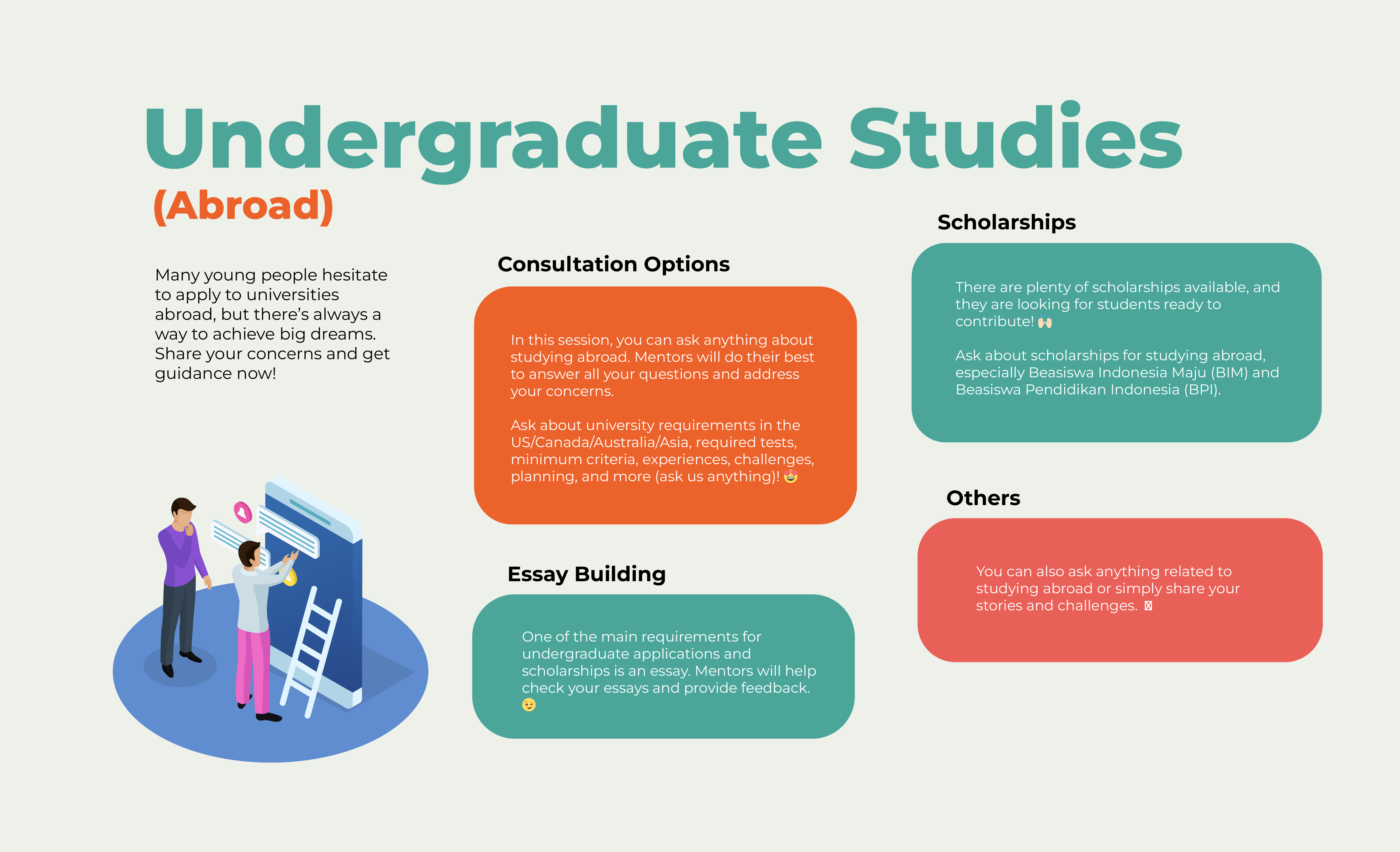
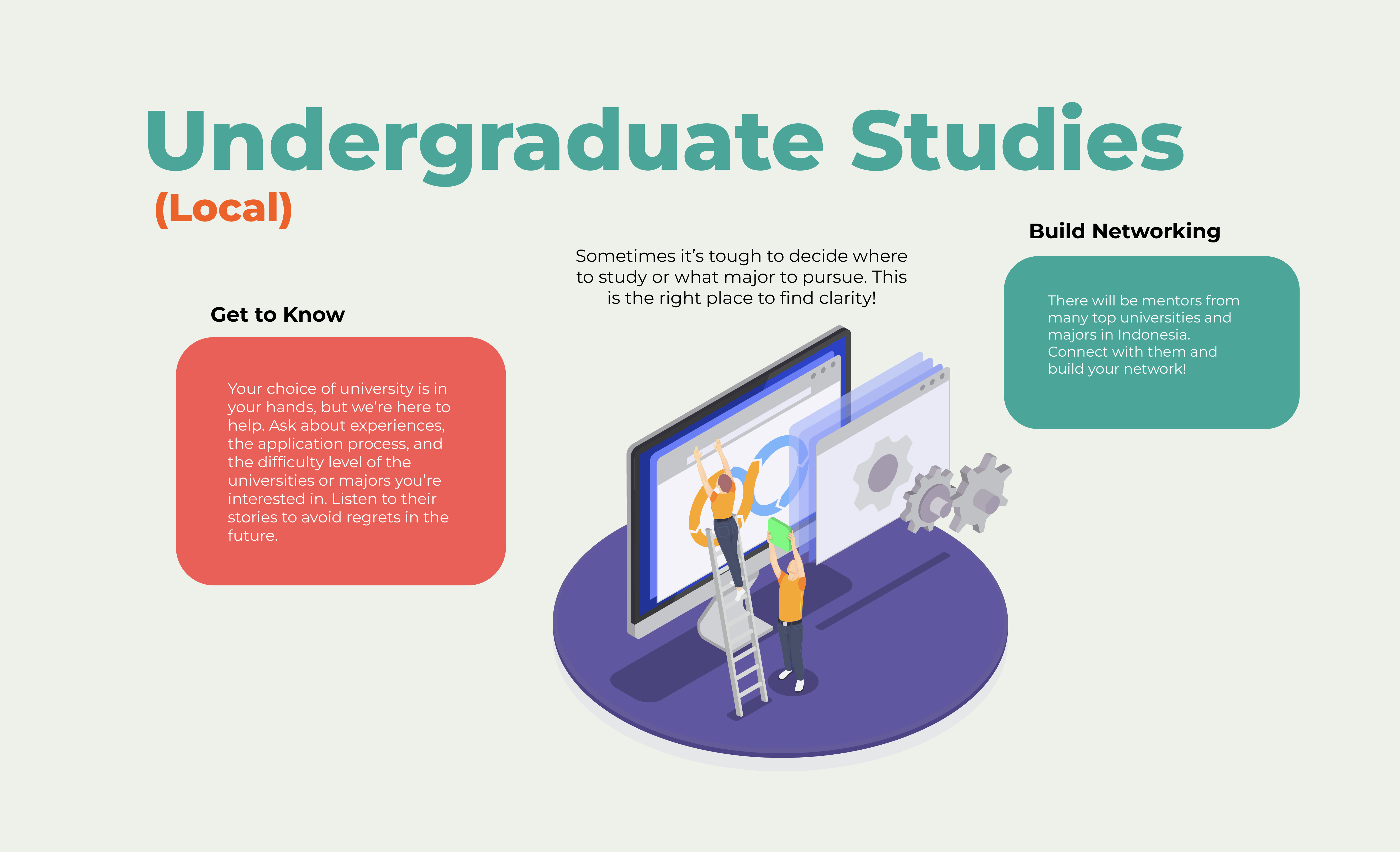
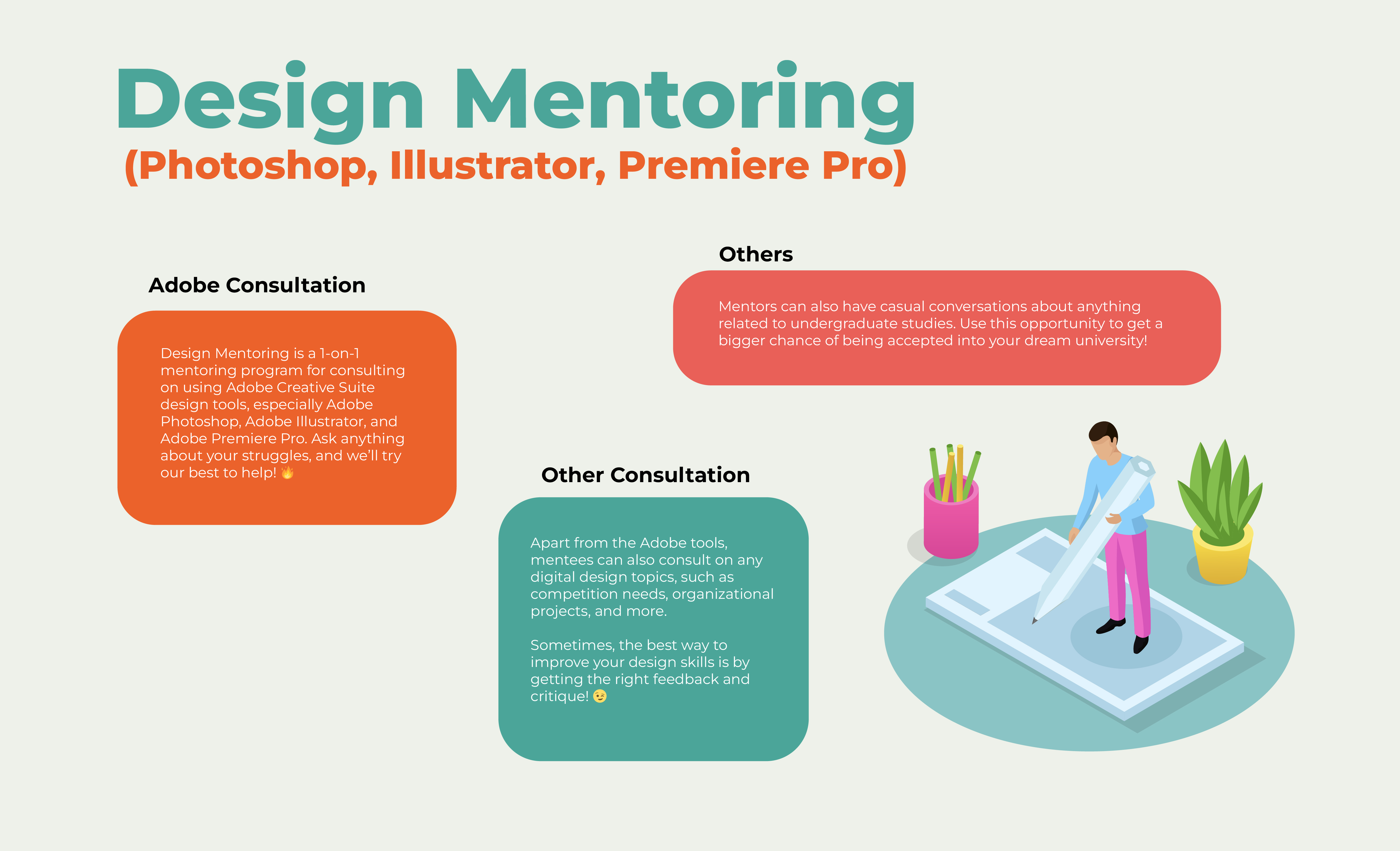
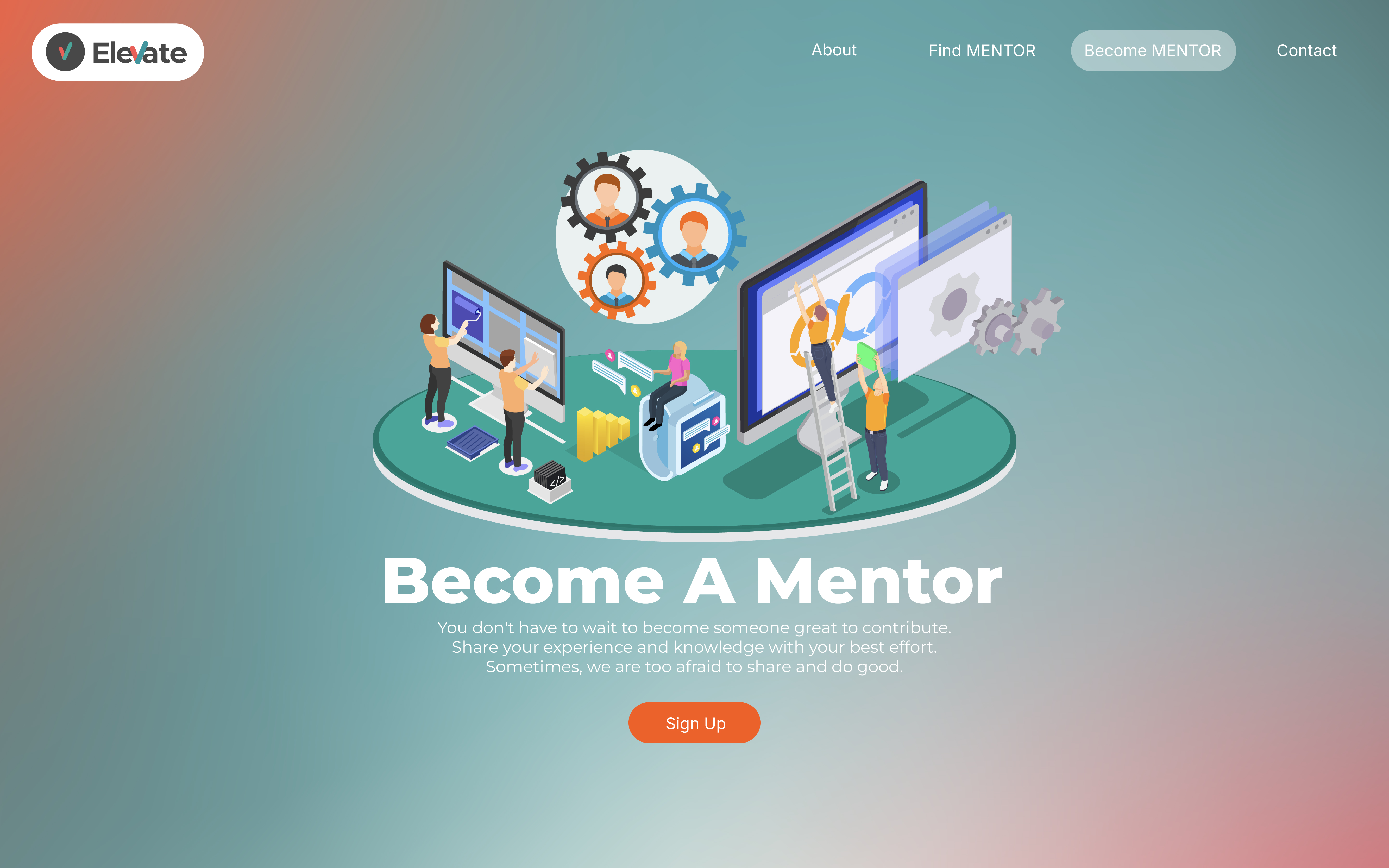
The target audience for this website includes individuals interested in engaging with our mentoring services, prospective mentor candidates, and potential sponsors. Although these groups have different needs, a unified approach is to make the website highly engaging and visually compelling. Storytelling elements should be at the forefront, communicating our purpose, vision, and mission effectively, as these are aspects that resonate with all audience types. A powerful first impression is essential; demonstrating our commitment and professionalism through a polished, modern website design will build trust and credibility from the start.
In terms of user experience, the website needs to prioritize accessibility and ease of navigation. Given the diversity in our audience's geographic locations and varying levels of digital proficiency, the site should follow a straightforward interaction model. However, we can elevate this simplicity by incorporating innovative animations and interactive elements that captivate users without overwhelming them—creating a user journey that feels fresh and unique.
For Indonesian users in particular, aligning the design with popular local trends is key. This may include using colors, fonts, and visual styles currently in vogue in Indonesia, while still maintaining a professional and clean aesthetic. The goal is to balance modernity with functionality, making the site feel relevant and inviting. This approach will ensure that, regardless of the user’s background or technical skill, they will feel drawn in, able to easily navigate the site, and engaged with the content we present.
Ultimately, by focusing on a professional, user-friendly, and trend-conscious design, we can create a platform that effectively serves our varied audience, enhances their user experience, and strengthens our brand identity in the mentoring industry.
4. INSPIRATION AND CONCEPT

5. THUMBNAILS and SKETCHES
6. WIREFRAME and PROTOTYPES
7. RESPONSIVE MOCKUP
8. PHOTOSHOP COMP

Scrolling Photoshop comp