1. Idea
I intend to make a portfolio — a website that will showcase all of my work at the same place for convenience of myself and my target audience. For the people to be able to interact with it and purchase or request a commission easily if desired. I want my website to stand out from the websites on the market. I want it to be clean, simple and accessible and present my work in the best light. I also want it to be consistent with my personality, with the mood of my works, and with the message that I carry through my art. Since my art style is not consistent and is still in its developing stage, I cannot compile a portfolio of works that would be unified by the style. But I can — by the subject.
2. Research
Miki Katoh
-
link to the website!
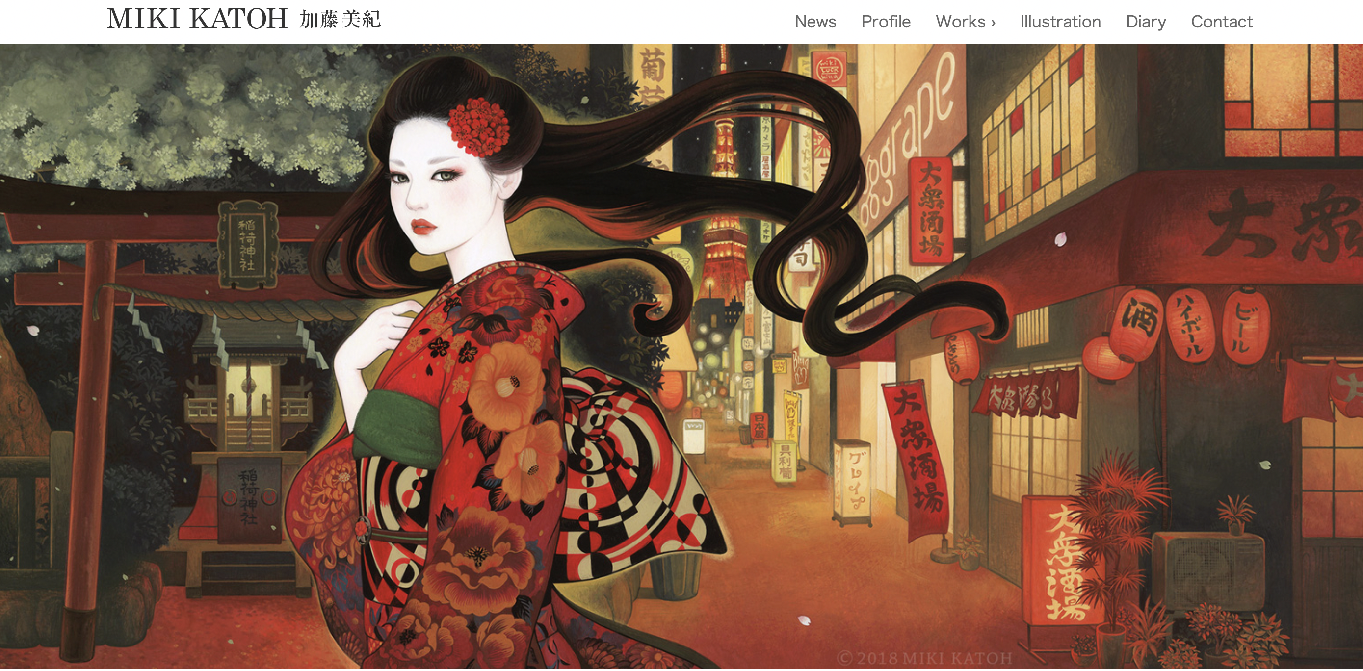
The homepage is minimalistic: it has Miki’s name on the top left corner in simple straight capital letters On the left there is a bar that navigates you to news, profile, works, illustration, diary, and contact. On the rest of the page there is a horizontal slideshow that showcases Miki’s work. The gallery of the works has small squares with the works with a name and a year underneath each square. When opening an image, there is information about size, year, name, material, etc.
Since Miki has been a part of more than fifty exhibitions in Tokyo and other places, I assume that her target audience are the exhibitions’ organizers, private collection owners, and individuals who want to purchase a commission.
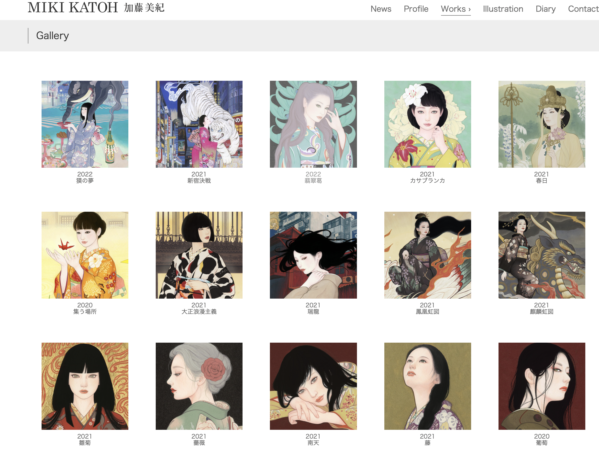
I personally think that putting a navigation menu at the top right corner is not a good idea. For me it was also a little hard to navigate through the website. The news tab has loots of different information, maybe even too much (but it’s in Chinese so I can’t speak for sure). The color of the letters was a bit pale. Overall, I didn’t love the website but I love the art. However, the gallery page looks very good. You can’t really see all of the images in a big size (and that’s good because that is what the homepage is for) but they are very structured.
Annie Ryan
-
link to the website!
Annie’s website is beautiful. This is the home page:
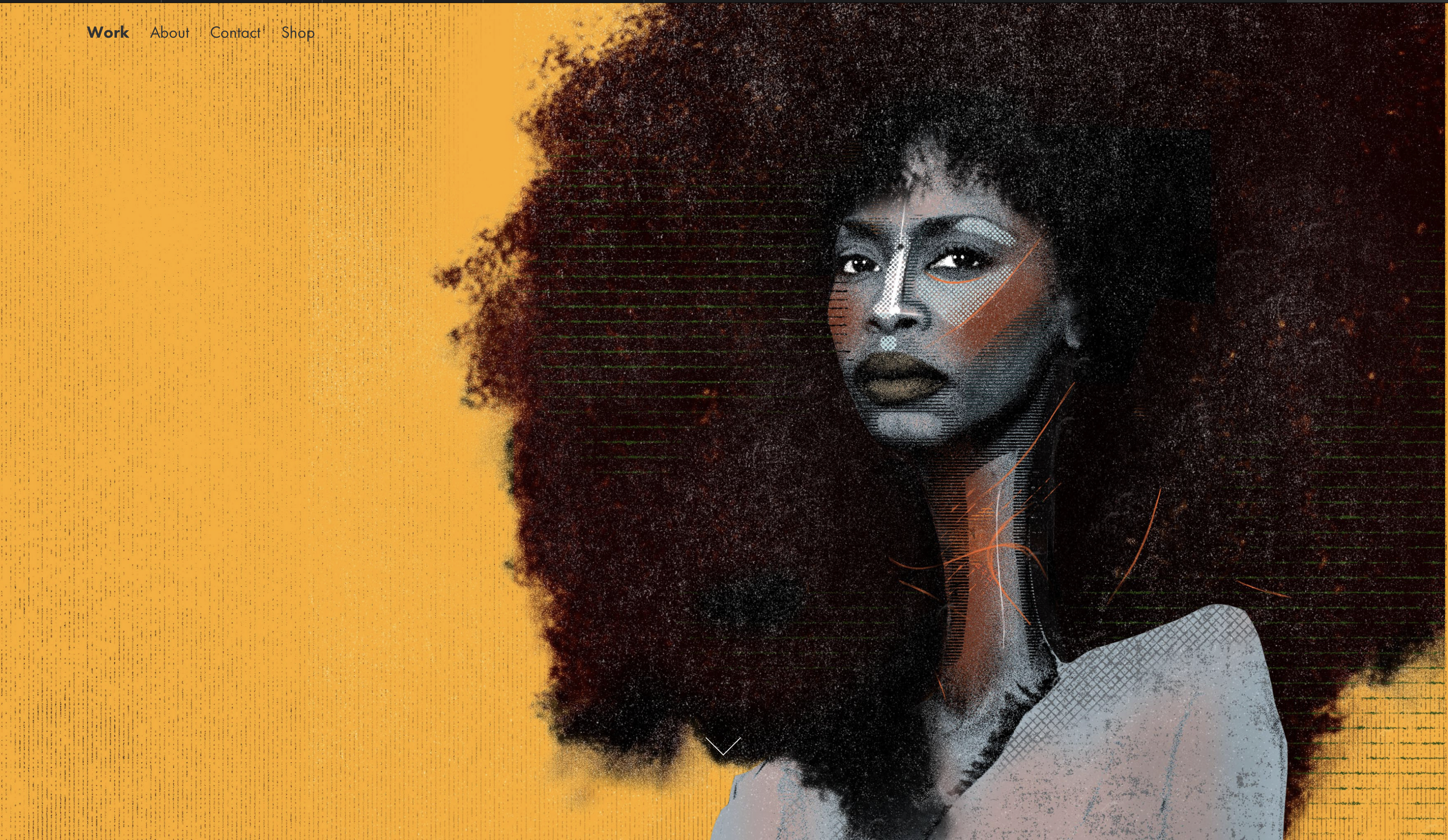
My immediate reaction was to scroll down and when you scroll, her works appear in large sizes. It might be too many works on one page because at some point I got tired of scrolling. The idea of having One large image on your homescreen is cool. The “about” page is simple: text and a photograph, the contact page is also simple and short. I think the experience was a bit repetitive. I’d iclude a couple of pages with different kind of works. I think the home page should still be separated from the “works” page. That will make the experience of looking through the works more interesting and abundant (and will still be simple and enjoyable)
Ippo Rybatzki
-
link to the website!
Ippo’s website is an amazing example of how you can build your portfolio in a nice and eye pleasing way, if you don’t yet have a consistent style (or simply don't want to).
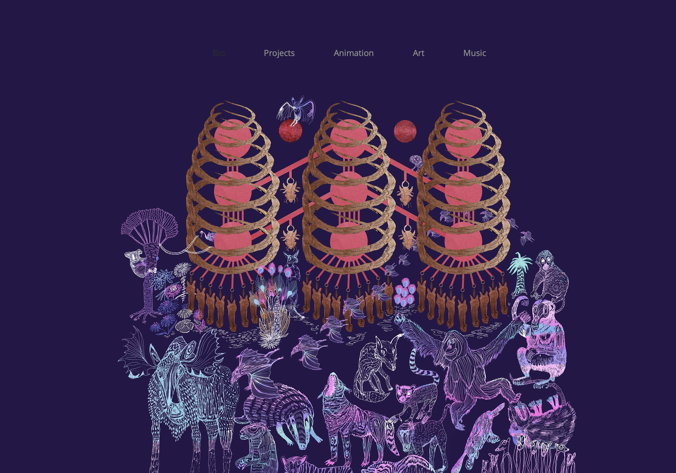
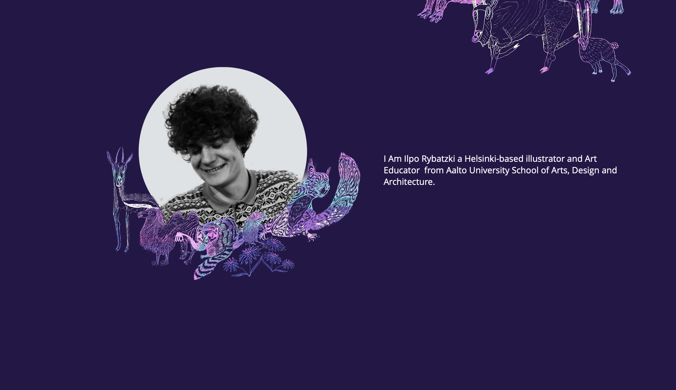
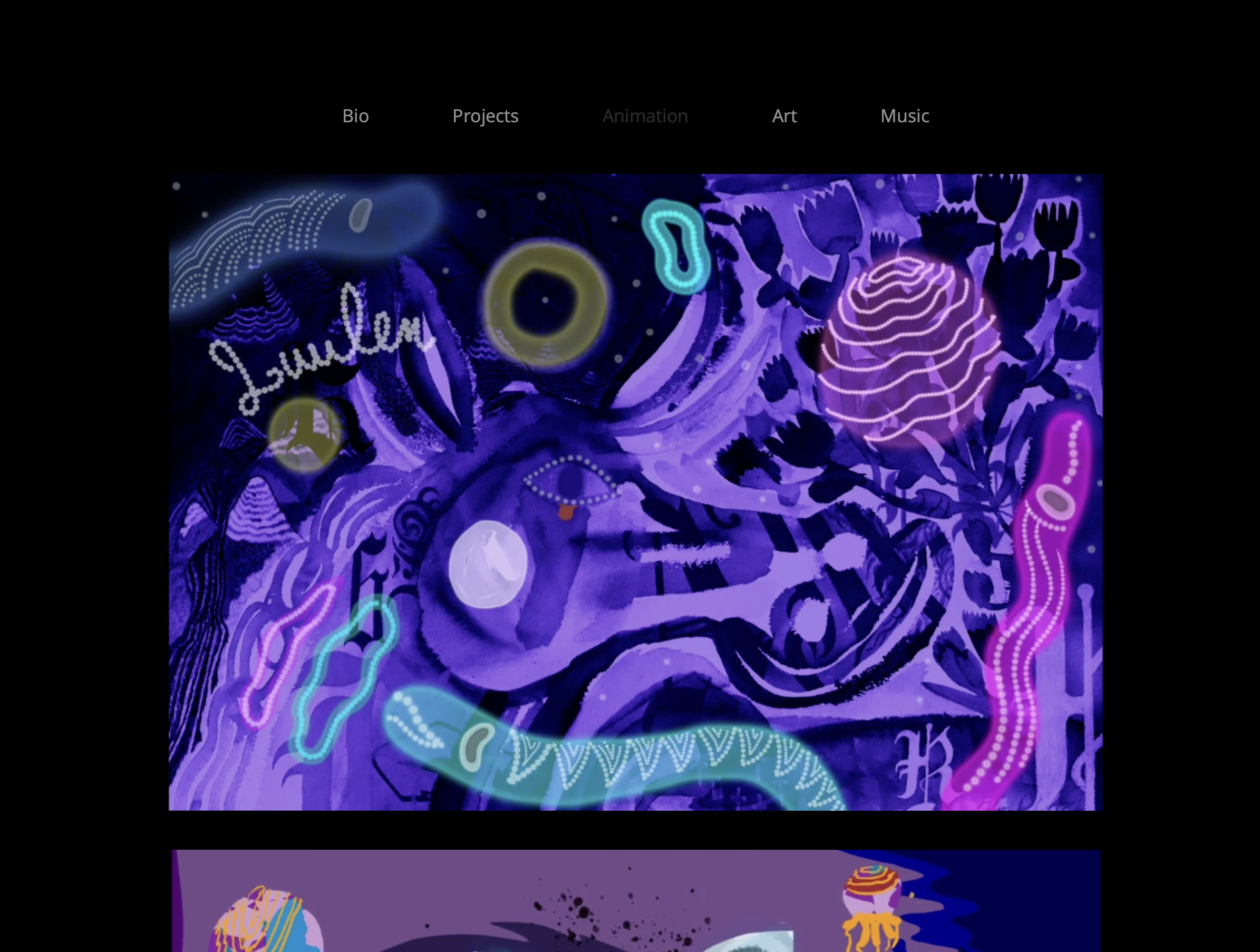
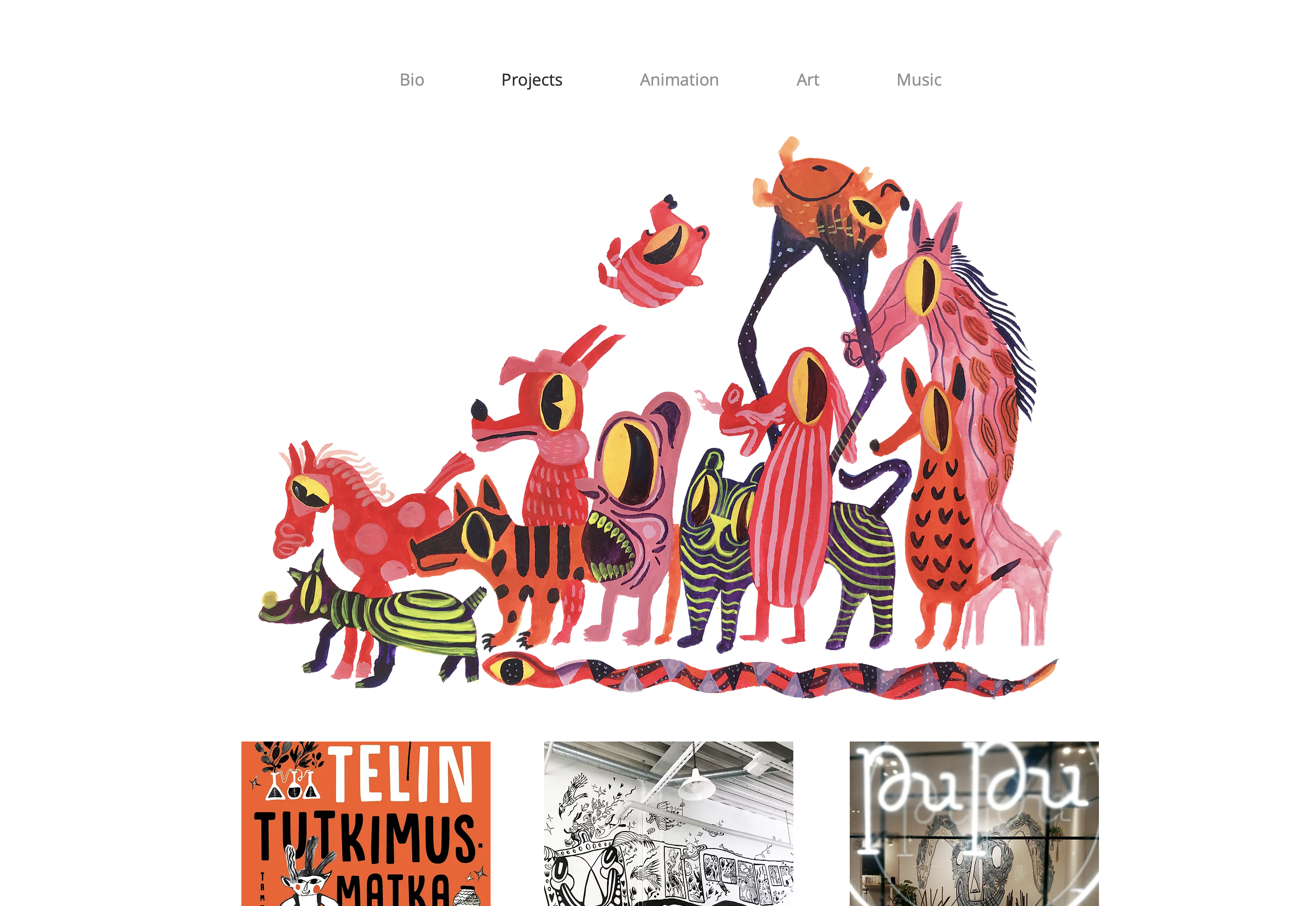
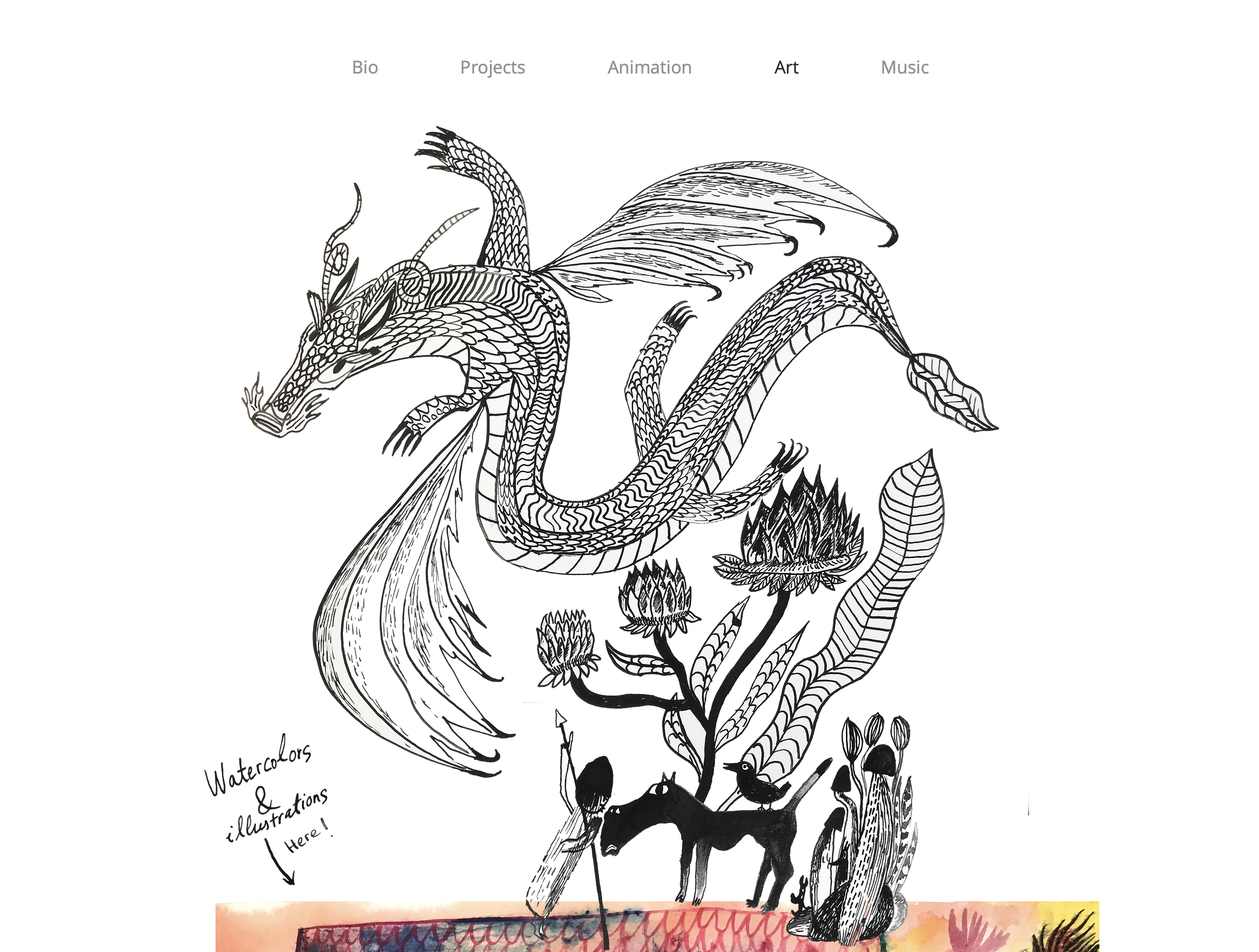
I like the way in which many websites’ homepages create an “intro” to the illustrator’s art. They don’t necessarily exhibit the work, but give a hint into the artists’ message, style, object of interest, etc. That way the customer, the user, knows from the first glance what this website will bring them.
Dao Inguen
-
link to the website!
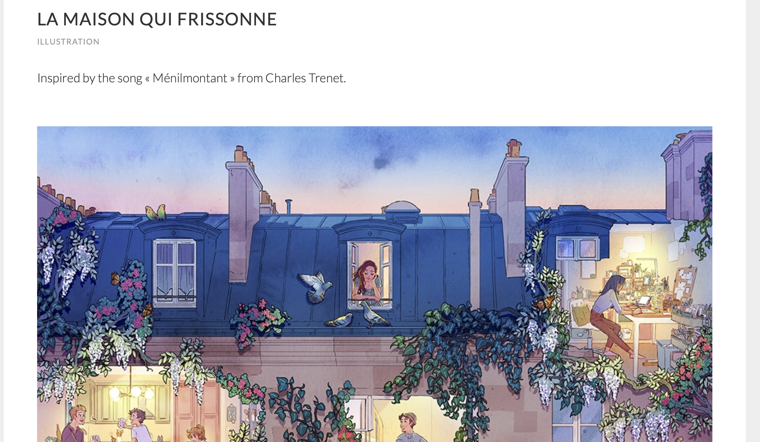
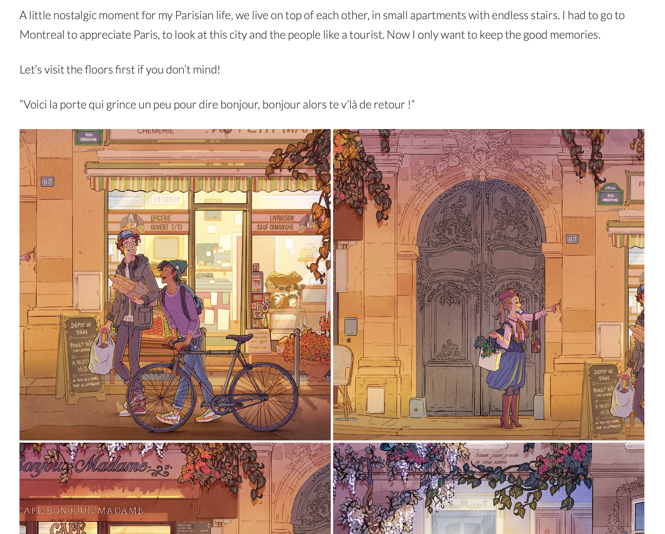
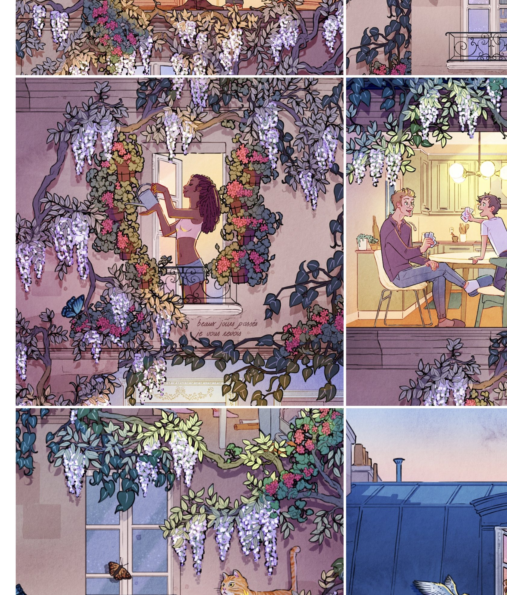
In Dao’s website layout, I only like the part, when you open an original artwork. You first see the whole artwork, then lots of images of the different parts of the art.
The page has some description about the process, inspiration, etc.
The thing I don't like is that the art doesn't fit on the page - - you have to scroll to see all of it.
The Tokyotier
-
link to the website!
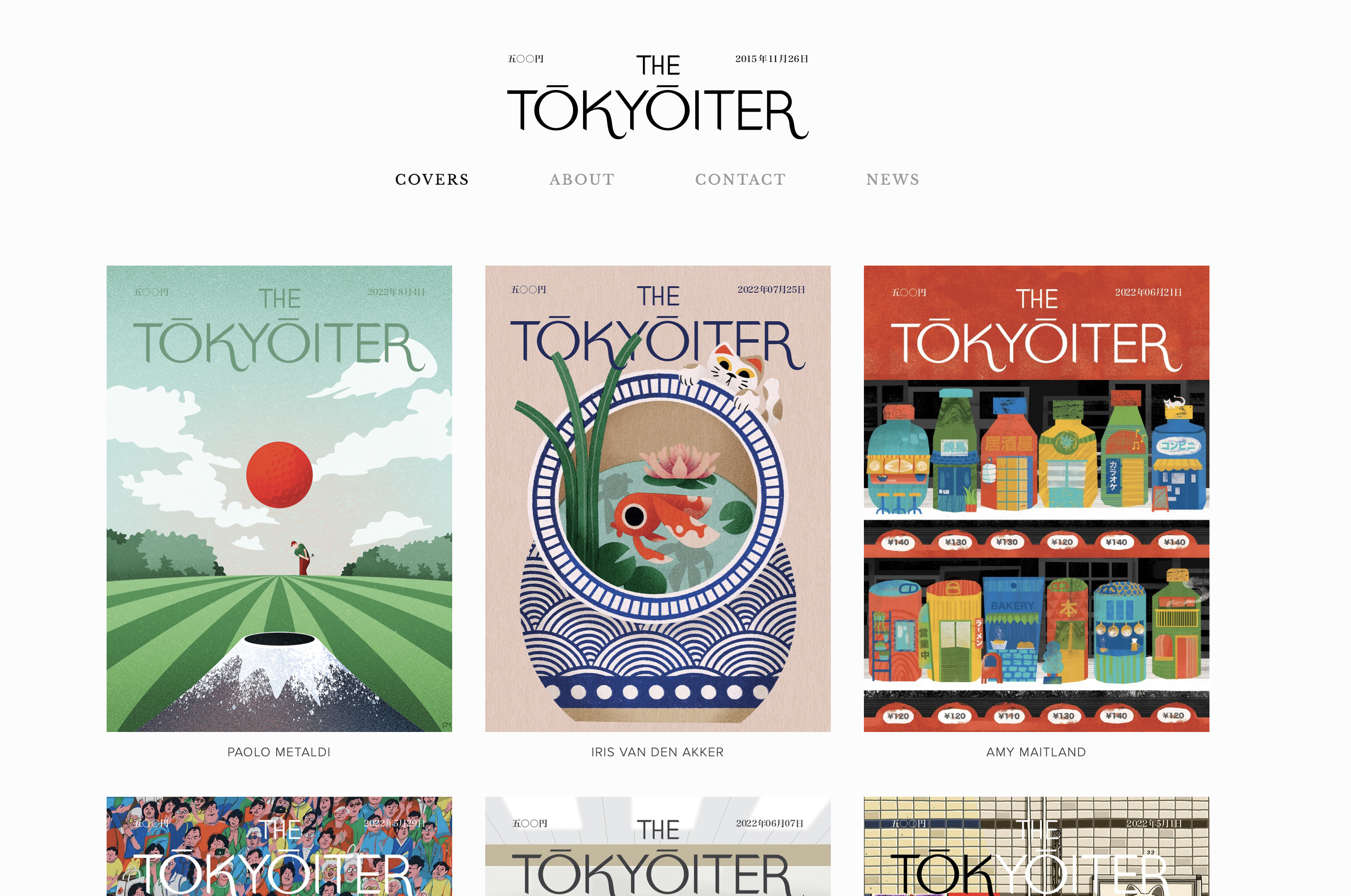
The Tokyorier is not a website owned by one illustrator but by multiple. It is a parody of The New Yorker and a creative coalition of Tokyo-based illustrators and artists.
3. Target Audience
Current
Looking through my current works, I notice that my subject of interest is people. I like drawing people in different locations, situations – imaginary and not so. I illustrate books I read, recreate the movie I watch, and take inspiration from those who surround me. My target audience are the people, who are into character illustrations, who like hanging posters on the wall or collecting the authentic works of different artists. Other artists who are interested in the same type of things. And prospective employers, too.
In future
My target audience are those who have connections to my art and would be interested in purchasing it. I am also open for commissions. I want my website to show that I am contactable. I can work with clients and solve problems as an illustrator. In future, I would be happy to work with the publishing agencies and working authors to design and create covers for the books of a certain genre + the magazines
4. MoodBoards/Inspiration
5. Thumbnails & Sketches
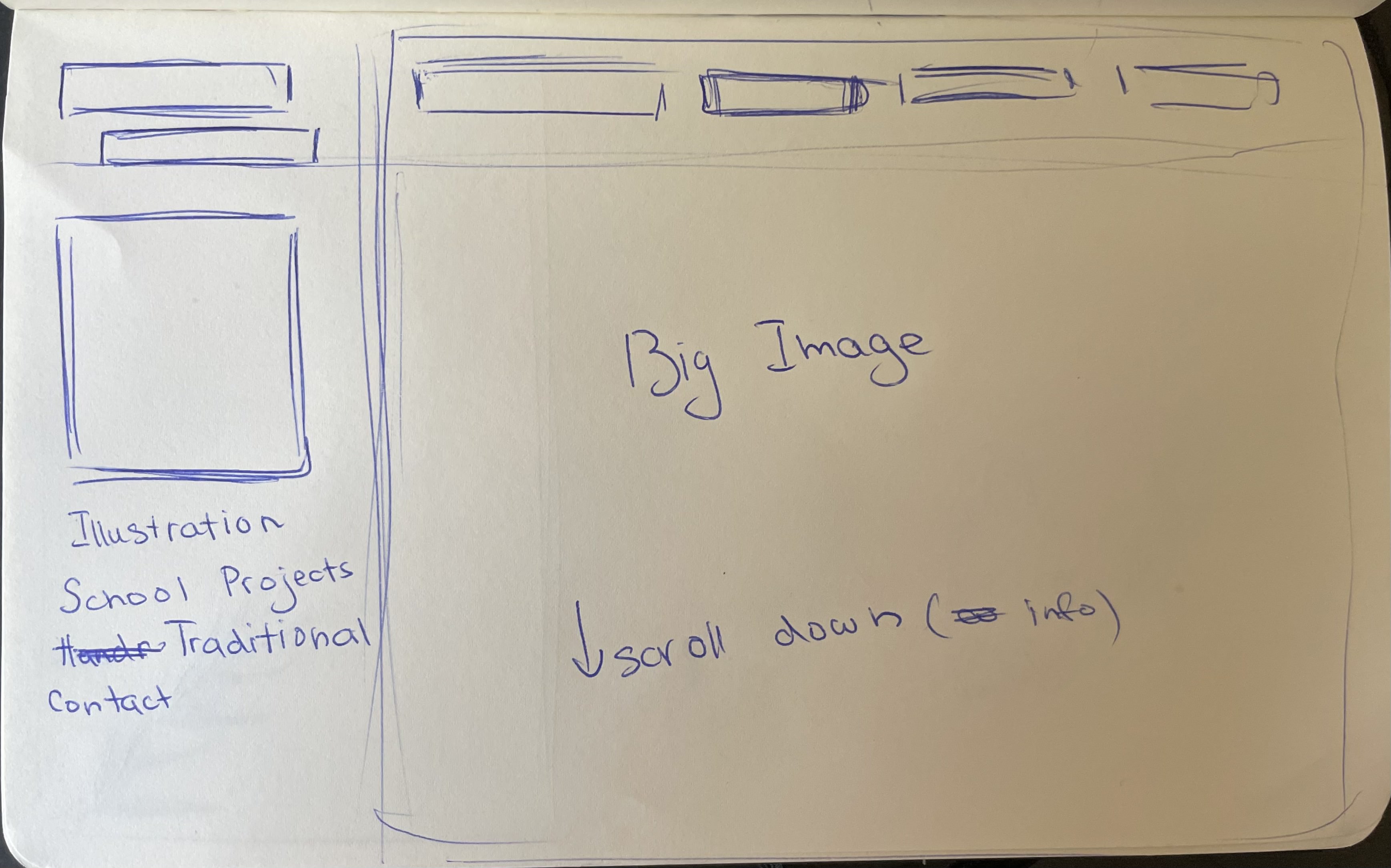
7. Photoshop Comp
Desktop I:
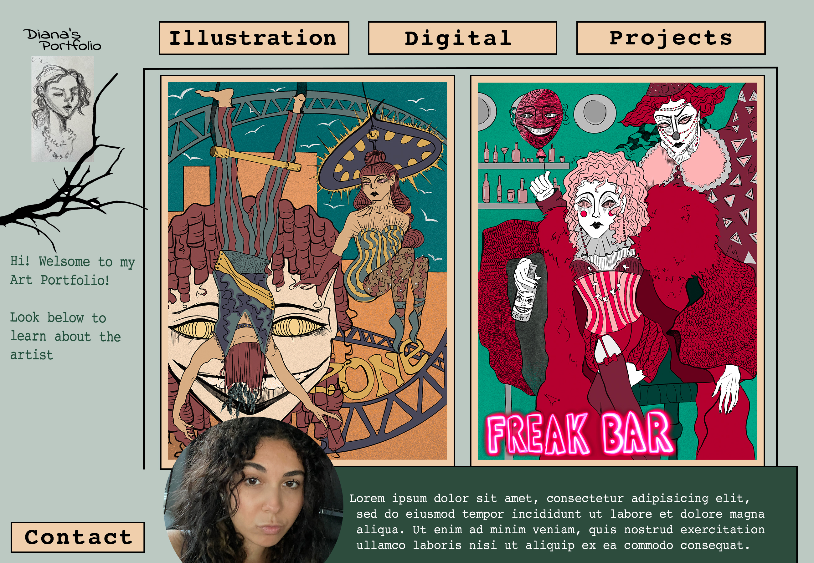
Desktop II:
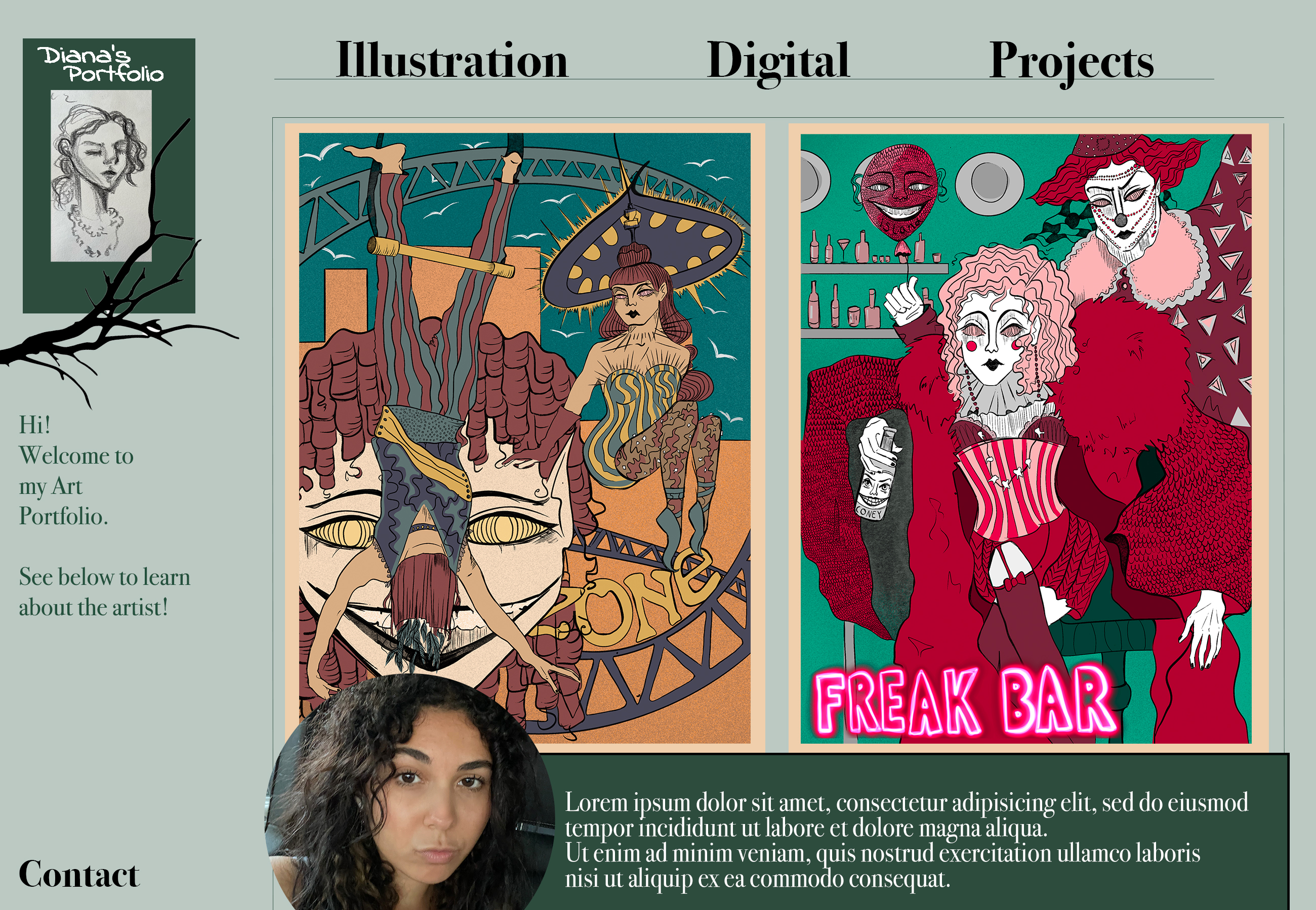
Desktop III:
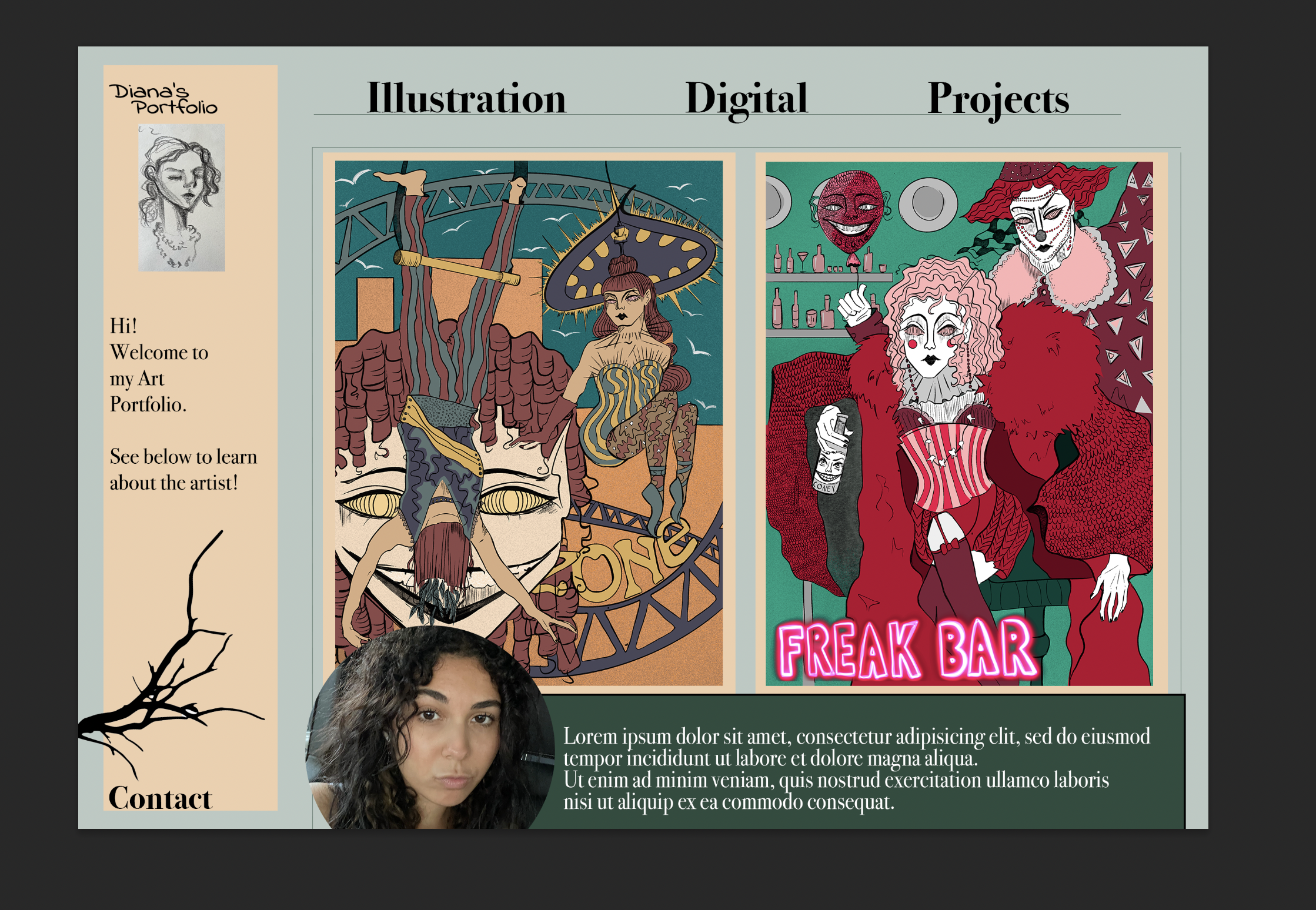
IOS I
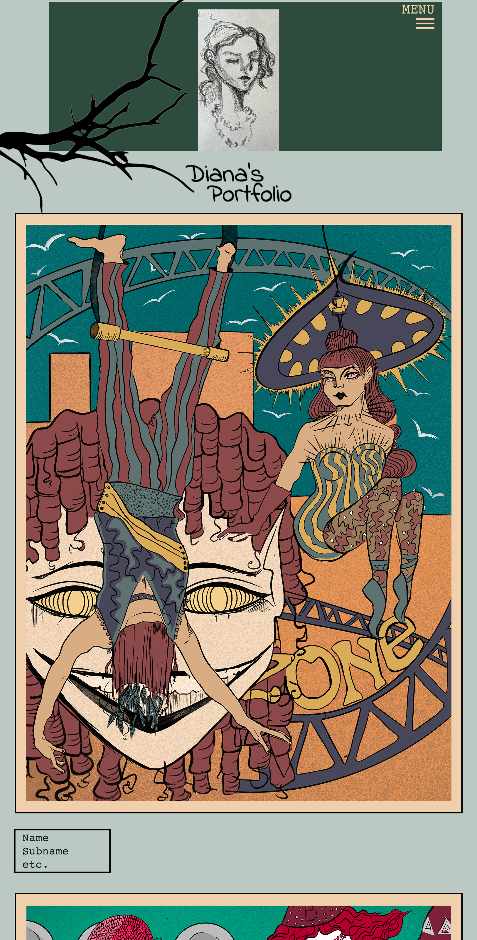
IOS II
