John Malta

Introduction
I looking to make a portfolio website by the end of the this course, so I looked at a bunch of my favorite contemporary illustrators, photographers, and filmmakers websites, to see what worked best. The work I’m hoping to eventually put on my site will be interdisciplinary and will involve several different projects and sub-projects so it was a bit difficult finding a single portfolio that satisfied all of that. Some of the site I really liked were Emily Kai Bock’s website, Sandy Kim’s website, Ryan McCardle’s website, Patrick Kyle’s website, Niv Bavarsky’s website, and Colin Alexander’s website. But for the purpose of this assignment I’m going to examine John Malta’s website.
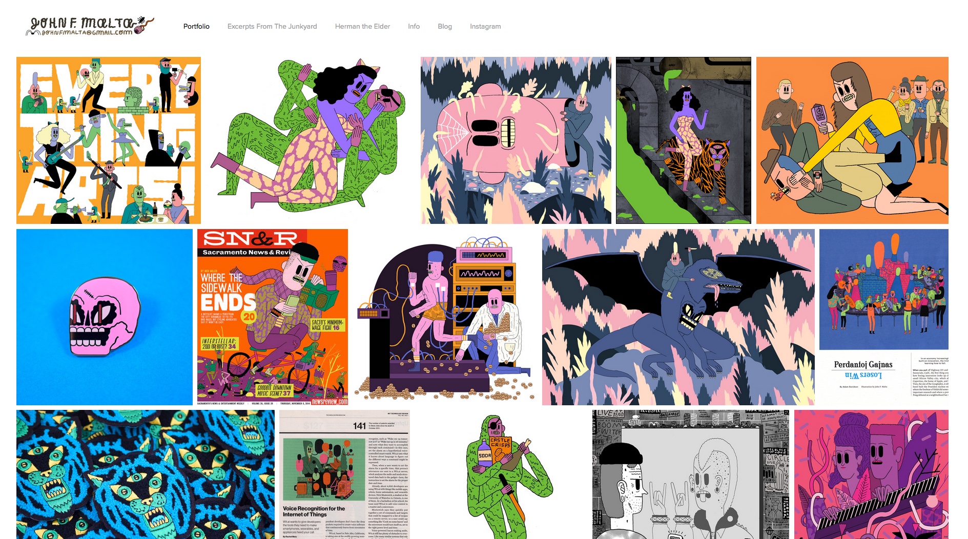
John Malta has a very unique voice and vision among contemporary illustration. His work and the tone of his illustrations was heavily influenced by DIY and Punk aesthetics, yet he is very clean and deliberate with his color choices and articulation. John Malta’s site perfectly mirrors that. The organization John’s illustrations is very sporadic and all over the place at first glance. But the arrangement of images is very well thought out and concise.
Everything feels very vibrant and loud, but John arranges all of the content on the site so that it’s clear and easily navigateable. The over all tone of his work and the site is very playful and juvenile. However, John displays it in a very professional manner to make it easier to work with in the norms of the illustration industry. The two contrasting components of Johns aesthetic and approach are exemplified in the layout of the portfolio as well as his illustrations.
The intent of the website is to create a stimulating collection of John Malta’s past work that encourages people to take their time to look through all of it, while also making it easy for people hiring him to get a general sense of his work.
I kind of hate this term, and I don’t really feel like it speaks to the intentions of what John Malta is trying to do with his site. I think, yes he does have a consistent look and tone with his work which reinforces that it is his, but none of the content on the site seems as though it was made solely to fit into a “brand” he’s made for himself.
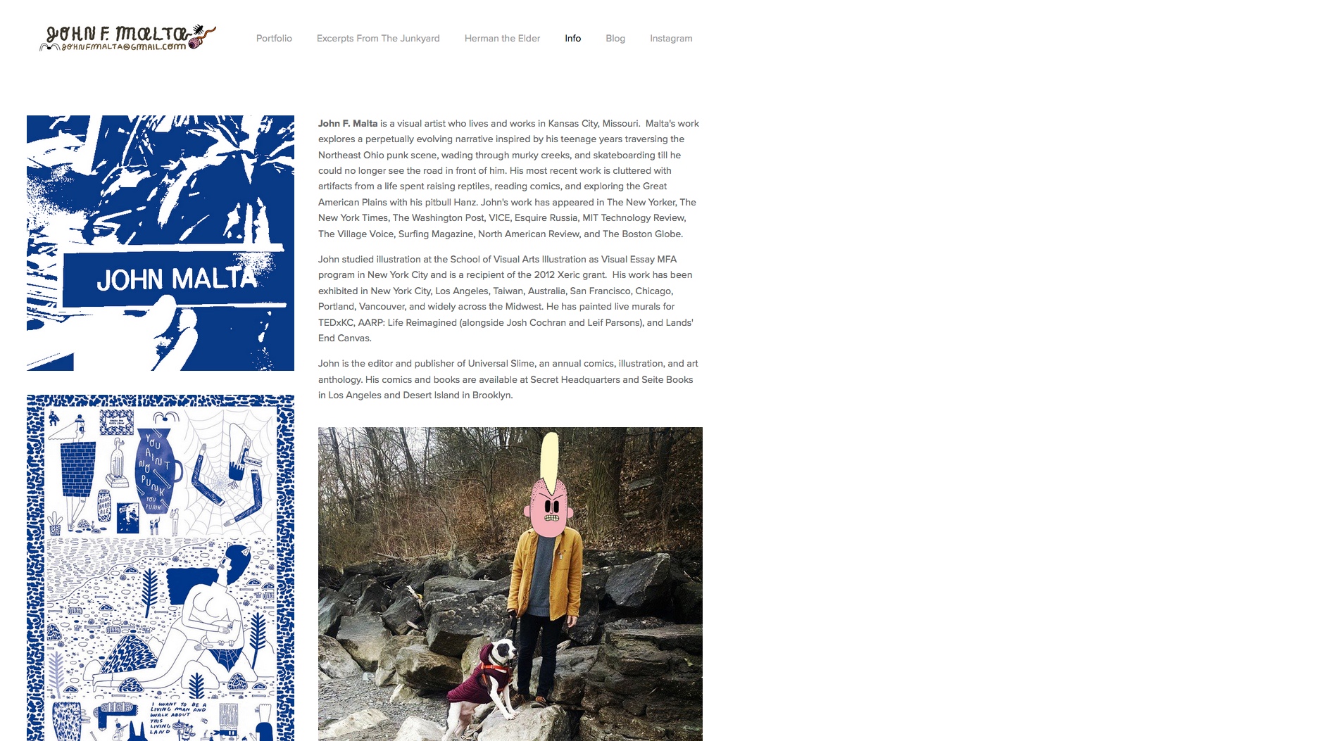
First and foremost, the main target for a portfolio site like this one is for art directors to find John Malta’s work and hire him for commissioned work. Walter, who is an art director for Lucky Peach, would stubble upon John Malta’s site, after working with several other artists that are friends of John’s. Walter would at first be intrigued by the sheer wall of illustrations that John provides on the homepage. Walter would slowly purse through each illustration based on the thumbnails that appeal to him. Then he would go to the info page, which gives a description of John Malta’s personal live, education, and experience. Walter might look at some of the other projects on the site or John’s blog to get a better idea of John’s sense of humor and personal projects.
Fans are the next biggest group John is inevitably trying to satisfy though this portfolio site. Amy, who’s been a fan of John’s illustrations for years would be really excited to see his updated website, with new up to date work. Amy would be glad to see that the images are all incredibly hi quality and are easy to see close up. Amy would enjoy the new info section with some nice personal photos and links to interviews he’s done in the past. Amy would be glad to see some individual tabs for some of the bigger comic projects John has done lately, but would be sad to see that some of his older comics and zines are no where to be found on his site.
Whether they are individuals or retailers, merch buyers are farther down on John’s list of targeted audiences. Sarah, who’s been meaning to buy one of John’s enamel pin’s would be excited to see such a huge collection of John’s work, but would be disappointed that their was no dedicated store tab. Even with the merch items that are shown on the site, there’s no links to where you can buy them or that let you know if they’re still available. This is truly frustrating since there’s also no online store detail on John’s blog or social media. Sarah is pissed.
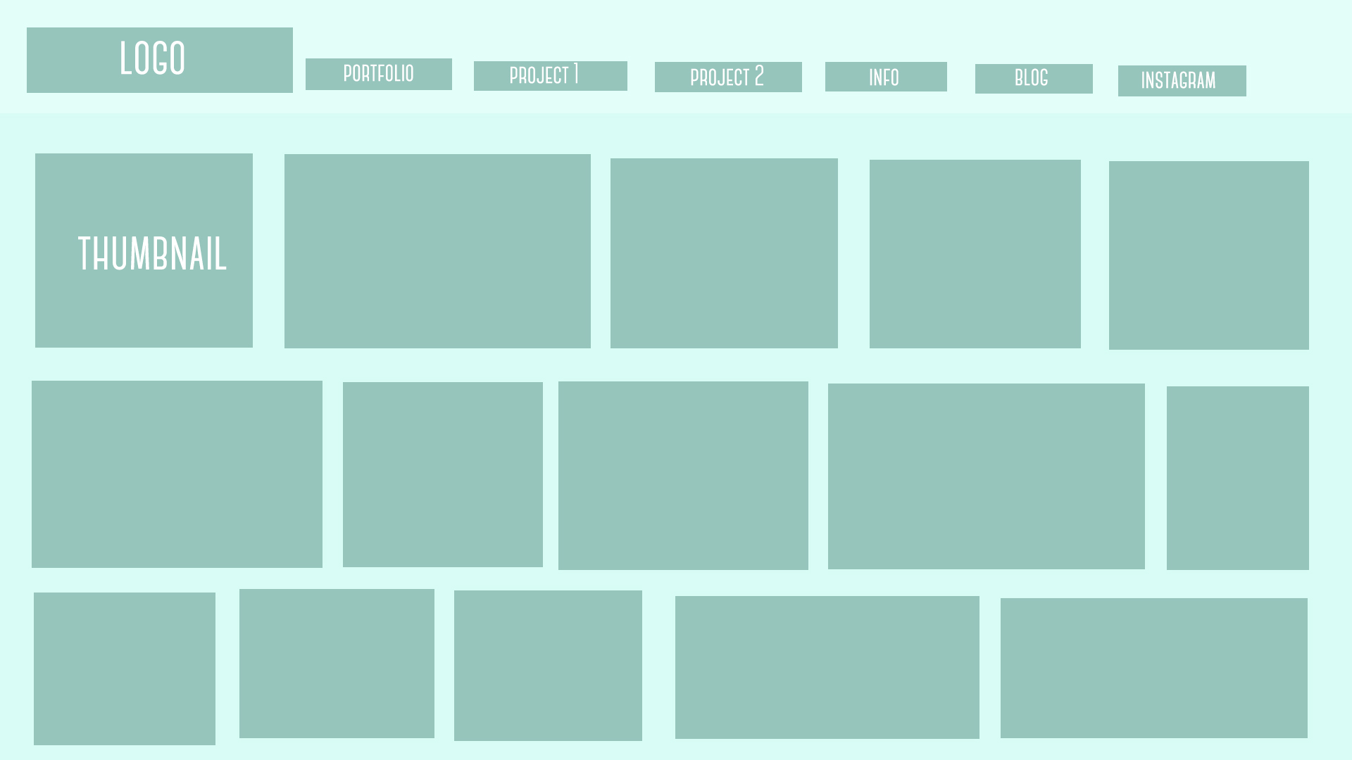
Header Bar: John Malta Logo, Portfolio tab, Excerpts From The Junkyard tab, Herman The Elder tab, Info tab, Blog tab, Instagram tab
Body: A grid including 9 rows of 5 thumbnails each (all of which have varying widths). Once the cursor hovers over each individual thumbnail, a brief description of the individual piece, including the name of the project and the client it was for, appears over top of the thumbnail. A few of the thumbnails include; Client The San Francisco News & Review / / Art Director Brian Breneman, Uncommisions / / Sewer Brawl, Quest Crusher / / The Decaptiation Of The Cave Dweller, etc…
Based on the other portfolios I looked at, by artists at a similar stage in their career as John Malta, John’s website is totally comparable. The format and amount of work is incredibly similar to Patrick Kyle’s portfolio, and both work really well to satisfy each audience that would potentially be looking at their site. I know John has done a remarkable amount of work in his career so far, and a lot of it is absent from this site. I’m not sure if the decision not to include it is becasue that older work is a worse representation of what he is trying to now, or if including it would just make it overwhelming. But In my opinion, I feel like his portfolio would benefit even more with some more of this old work on it, and with more subcategories for stand alone comics and projects he’s done in the past.

Voice

Tone
Intent

Brand
Target Personas

Art Directors

Fans
Merch Buyers

Copy Deck
Competition