Develop your idea:
This website will serve as a powerful platform for Gr∞r (groor) to showcase its commitment to sustainability through innovative home and kitchen products. Through a visually appealing design and informative content, customers will explore the brand's ethos, discovering a range of eco-friendly solutions. With a seamless blend of aesthetics and functionality, the website aims to communicate Gr∞r's dedication to a greener lifestyle, fostering a connection with environmentally-conscious consumers.
Discovery and research:
Our Place.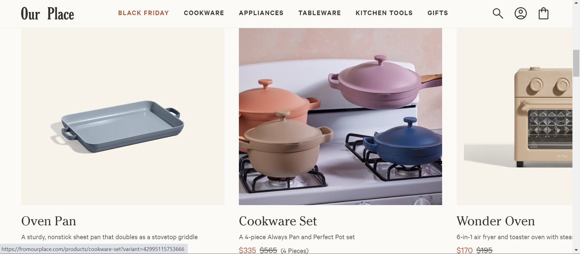
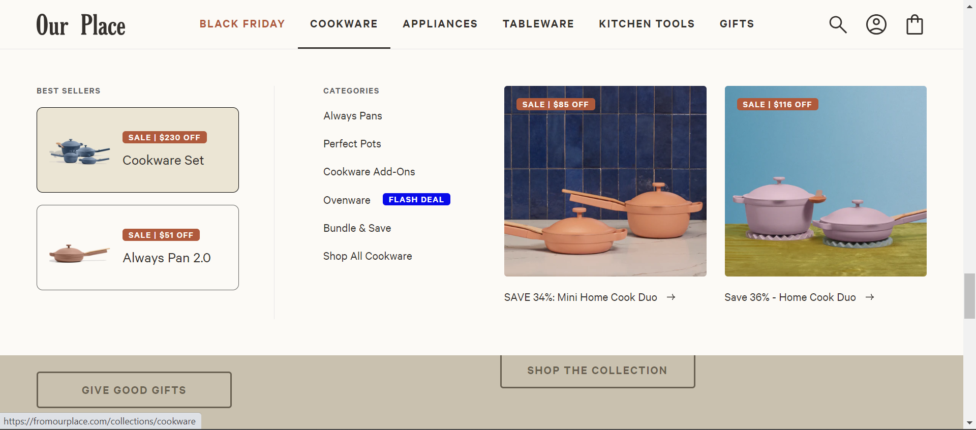
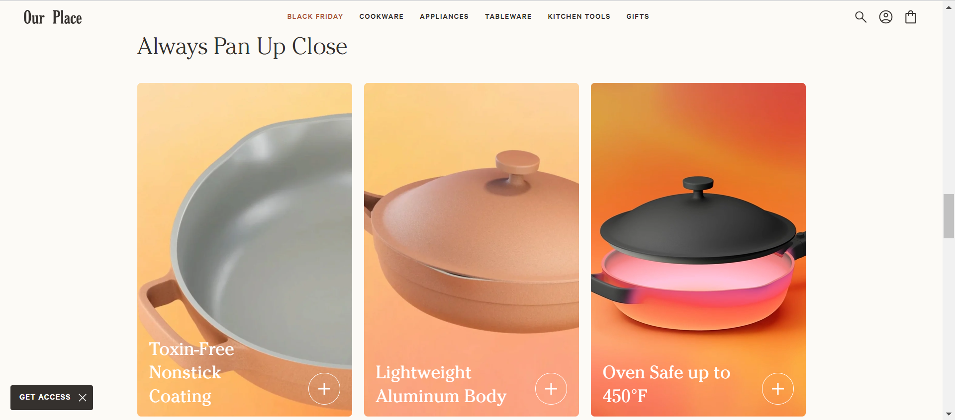
Their website does a great job of communicating product details and the variety available to the customer. The best feature according to their website is the hover feature which gives an insight into the product in an actual setting. One thing that could be improved is the essence of sustainability that should be conveyed from the mood of the website.
Branch Basics.
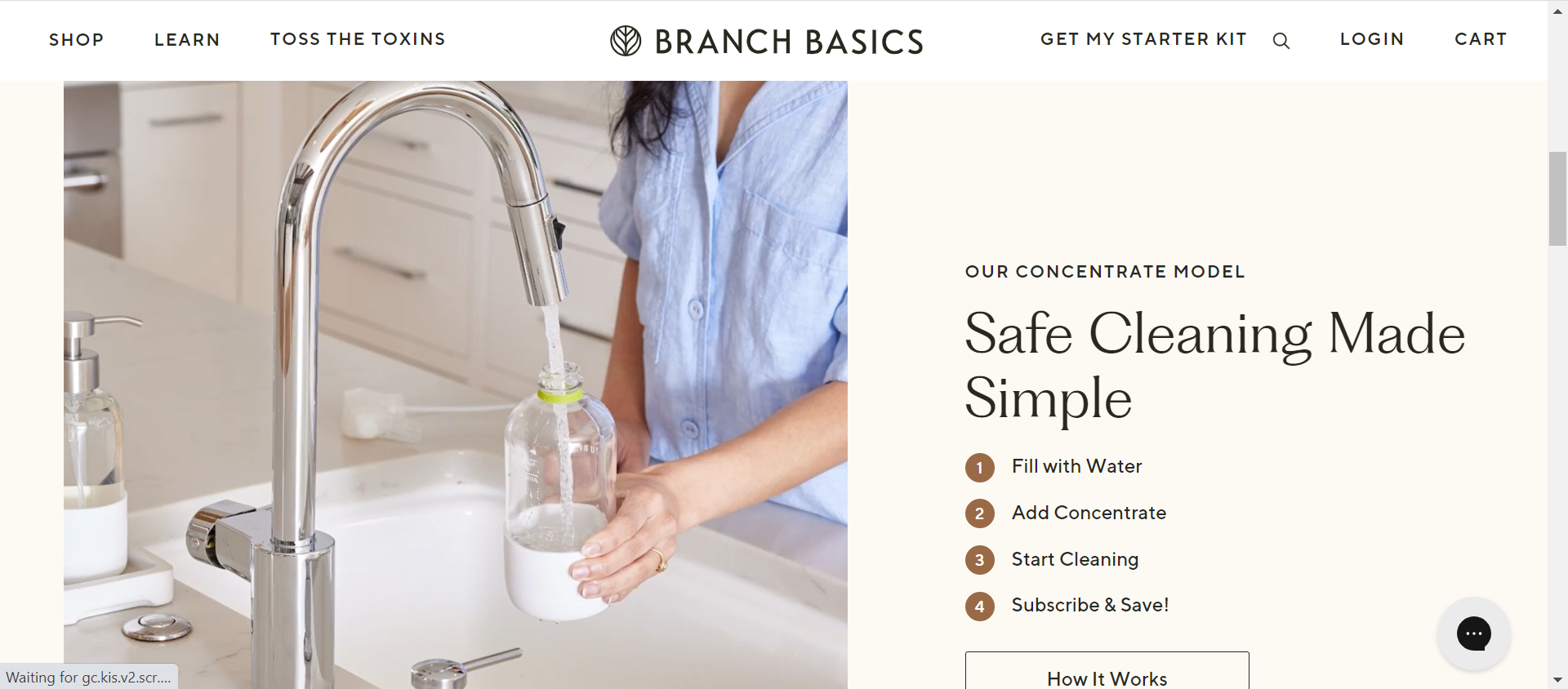
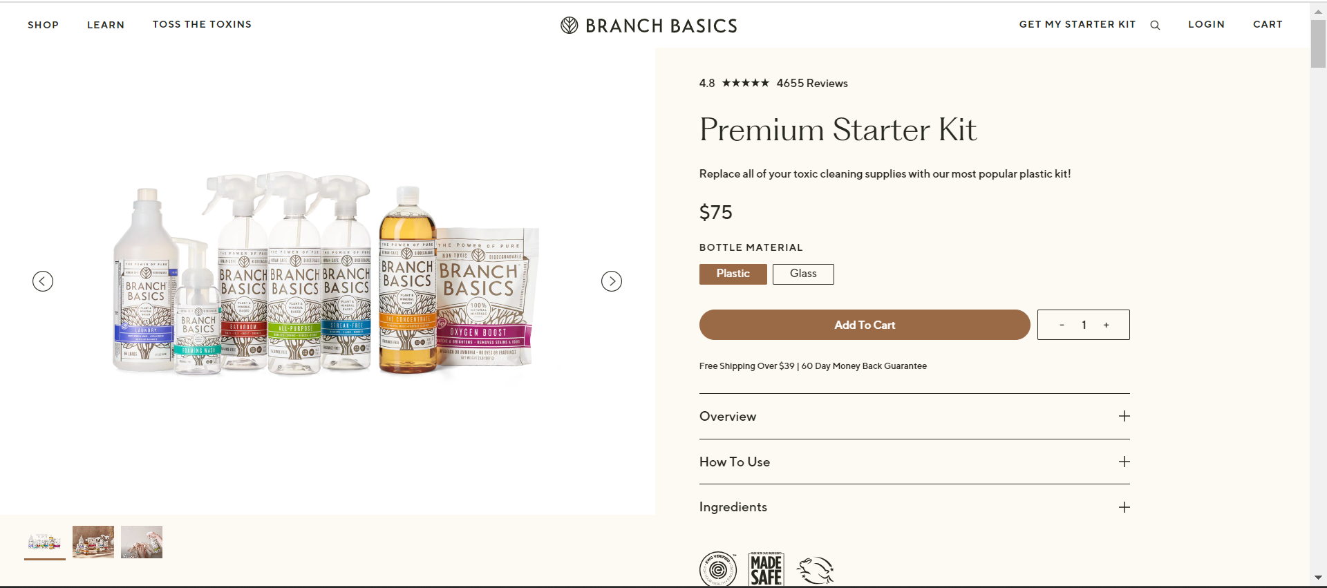
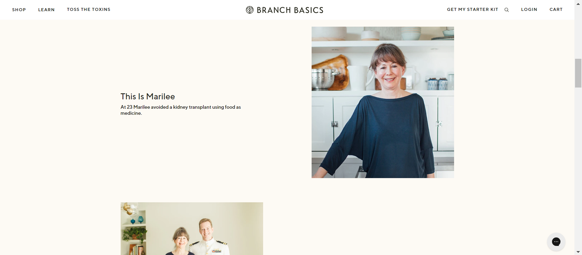
Their website had tone-down colors and easy-to-read font to convey the message of environmentally friendly and wellbeing message. The focus on how the product works by using different image shapes and contrasting birder make it very eye-catching which is important.
Target audience:
I want to create a website that instantly attracts environmental supporters by looking at the home page of the website.
Inspiration and Concepts:
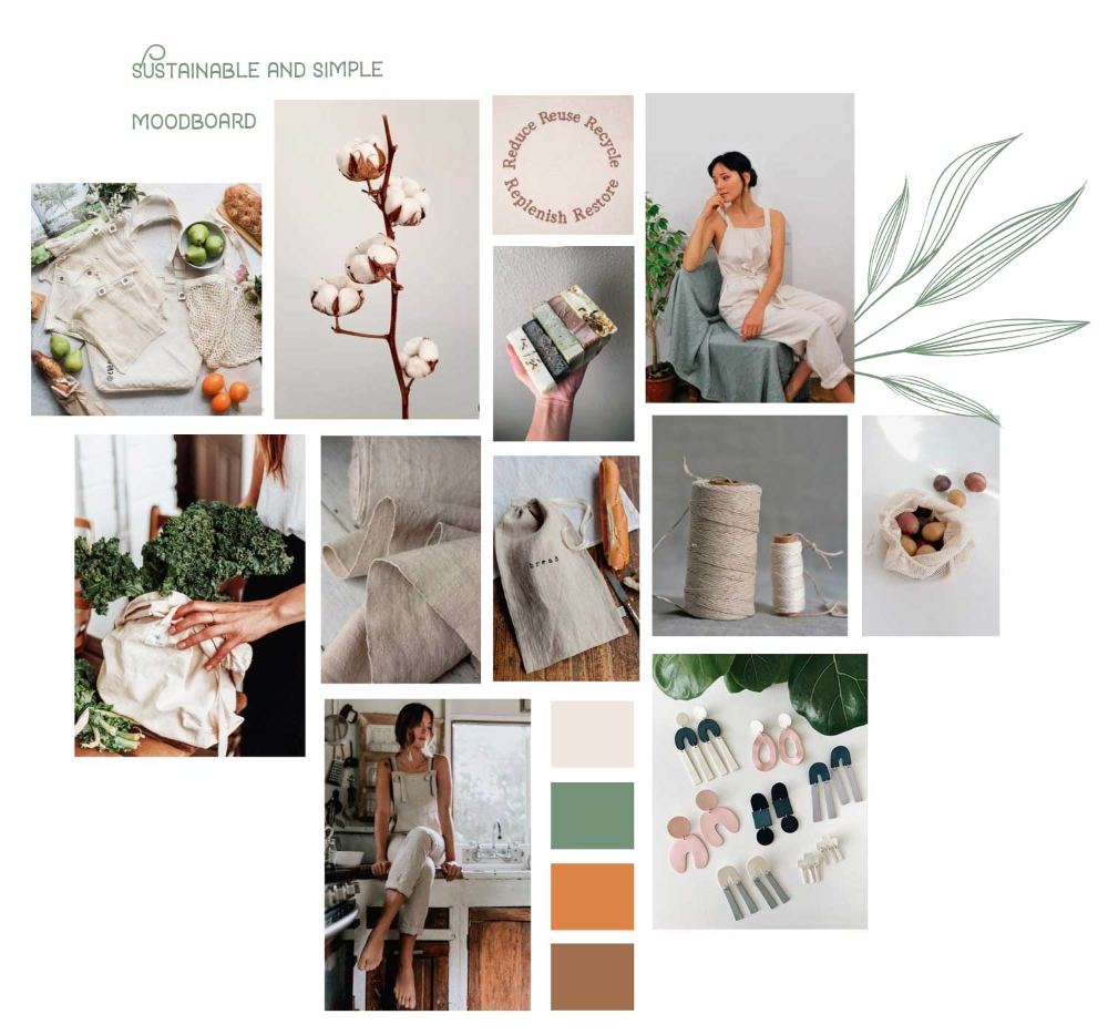
Thumbnails/wireframes:
Photoshop comp:
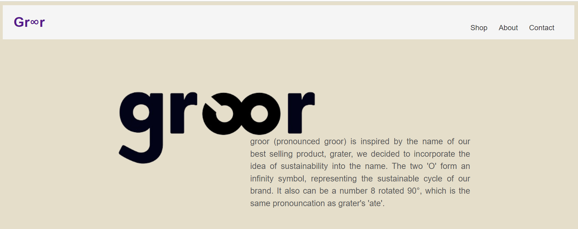
 top of page