Website Style Guide

STUDIO ALAIN MONNENS
Table of Contents:
- Intent
- Voice
- Tone
- Brand
- Persona
- Wireframe
- Copy Deck
- Competition
- Alain Monnens is the founder of his award-winning studio for product design, branding and photography.
- The website is created in order to demonstrate his designing skills in lighting, furniture, and objects that are minimalist in style with maximum functionality.

- The voice of the Alain Monnens website is assured and confident. The language is clear and concise. With this the designers want to project an image of competence and professionalism.
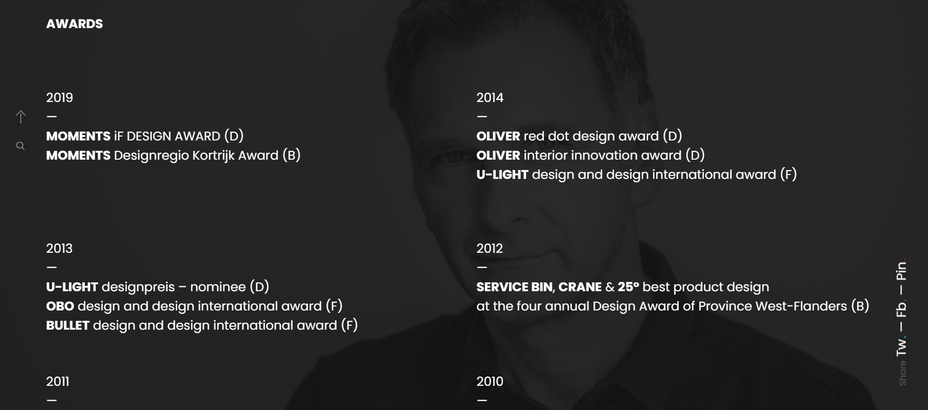
- With the list of clients and awards won, the website assurts trust and faith for potential clients.
- Approachable: The website uses some personal pronouns and a conversational tone, which makes it sound more approachable.
- Mordern: The website design is clean and contemporary, which reflects the designer's modern aesthetic.
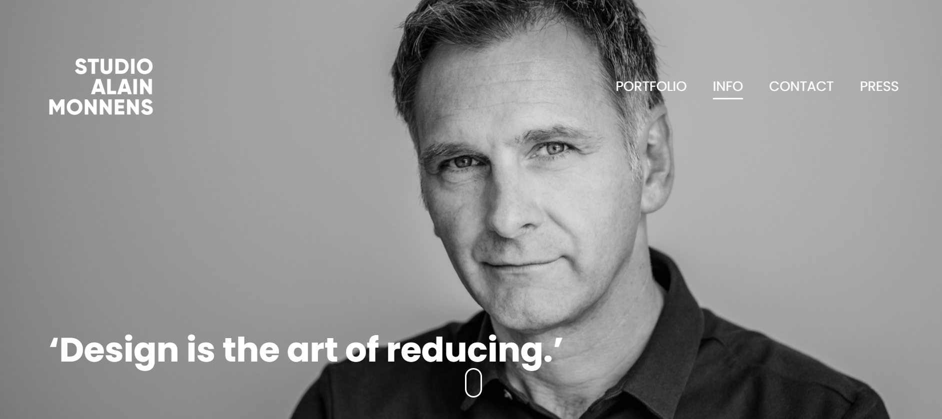
- Professional: The pictures used are clear and focused as well as the website design. No dustarcting background or hard to read fonts.

The overall tone used is professional but friendly. Different pages have a different tone.
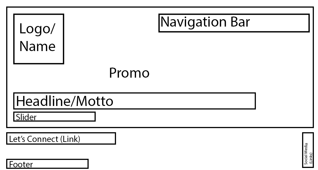
- Home page: The home page largely consites of one one image with some infromation about the designers moto.
- Portfolio
: Work page, are more focused on presenting images of the designer's work. These pages contain very little text, and the text that does exist is terse and to-the-point.
- Info: The about page is more text-centric, contains a lot of information about the designer's background, education, and work process. This information is presented in a clear and concise way.
- Maintains consistent brand image by using the same fonts, colors, and overall design throughout, which helps to create a cohesive and recognizable brand identity.
- The website links to Alain Monnens' social media accounts, which allows visitors to connect with him on a more personal level.
- His brand is "Simplicity" also conveyd by the website design. His focus on reduction and incresing efficecy is evident in the way his work id present. Lots of image from different angle paired with to the point 1-2 line text.
- The sophicted looked achived using bold simple font (Montserrat is a sans-serif font that is known for its clean and modern look) reinforces his idea of minimalsim.
- Name: Sanya Jariwala
- Age: 20
- Occupation: Student
- Intrest
: Insutrial design, furnitue.
- Story: Sanya a student at The new school is looking for inspiration for her own studio class assignment of creating lighting fixture to set a particular mood, so she is also looking for information about how to get started. Sanya is attracted to the Alain Monnens website because of the high-quality images of the designer's work. Sanya learns a lot from the Alain Monnens website, the different techniques that designers use, and the correct way to approach this asignemnt and she is inspired by his aestehtic as well. Sanya is likely to come back to the Alain Monnens website in the future to connect with him, and to look for future internship oppourtunity.
- Brand: Essajees Atelier
- Occupation: Interior Design Firm
- Intrest: Lighting fixtures
- Story: Essajees Atelier is a company estalised in 2014 . She is looking for a designer who is creative, but who also understands the business world. They are attracted to the Alain Monnens website because of the designer's portfolio. The website also helps them learn about the designer's rates and availability. They are likely to contact the Alain Monnens designer after visiting the website and are confident that the designer can aslo help them with her branding and marketing needs beside desiging custom lighting fixtures.

- Name: Ted Mosby
- Age: 40
- Occupation: Professor
- Intrest: Design, technology, business
Story: He is looking for new resources to use in his teaching, and he is also interested in learning more about design branding himself. Professor Mosby is attracted to the Alain Monnens website because of the designer's portfolio. He is impressed by the designer's work on a variety of projects, including branding, marketing, and web design. He learns a lot about the different ways that design can be used to communicate ideas.

Title: INTRO- ALAIN MONNENS
Heading
: ‘Simplicity seems obvious, that’s its genius.’
Hyperlink 1: Portfolio
Hyperlink 2: Info
Hyperlink 3: Contact
Hyperlink 4: Press
Alain Monnens website is profesional creted which makes it easier to navigate. The font used throughout the website is very clear and legible. The main advantage that his website has is a clear, crisp picture with perfect lighting on the main page as the promo, making not onky his work but the website very attractive and sophicated. Another point to be noted is that the website is image oriented more than being text heavy making his projects speak for itself.
