Step 1 - Develop Your Idea
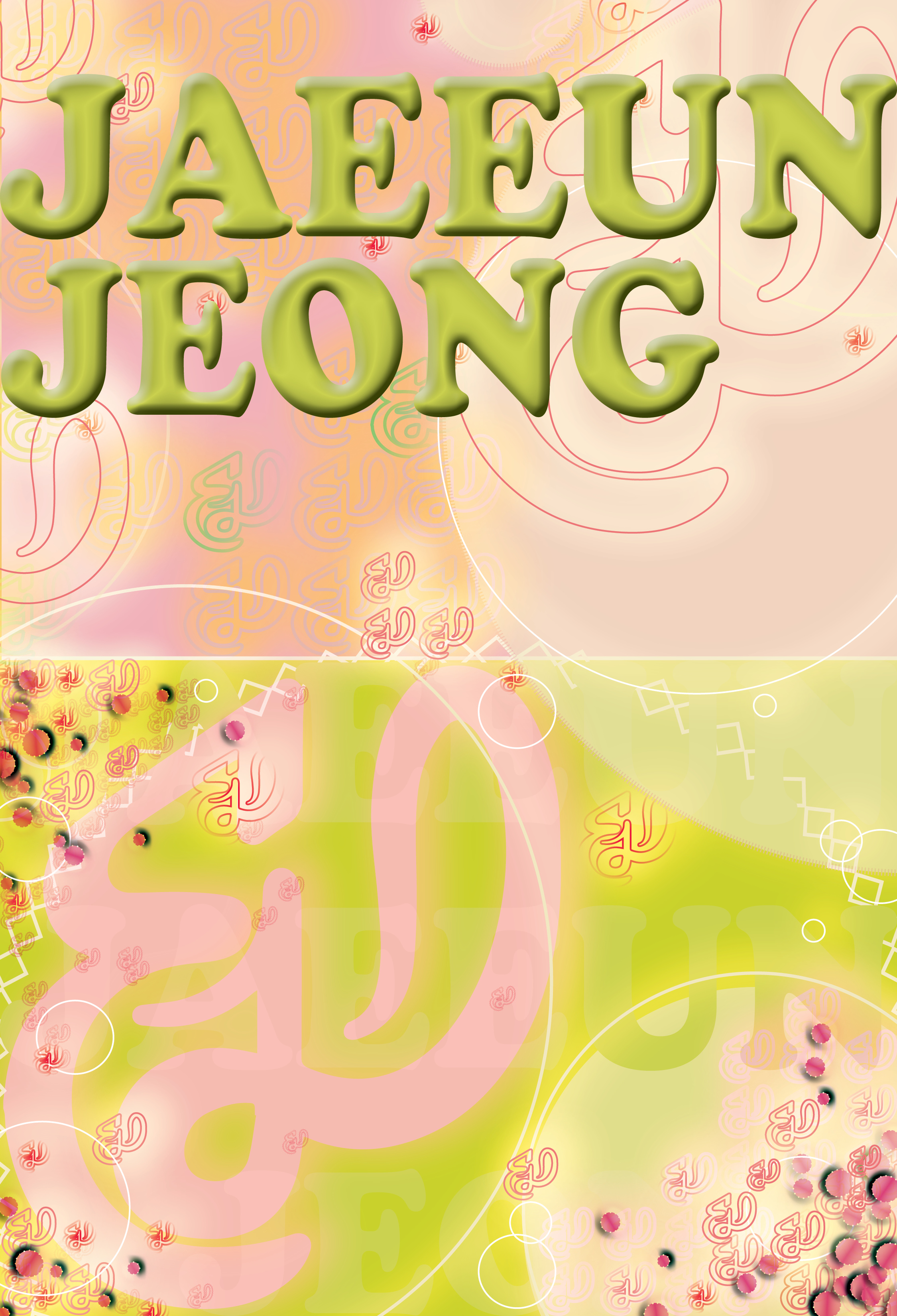
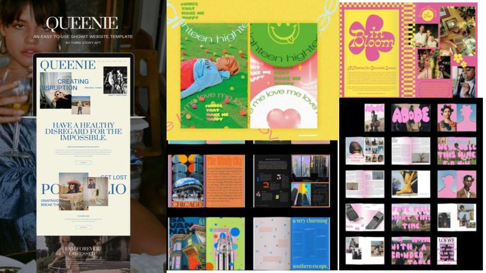
I want to create a portfolio website that can define my art practice. I want to sell my color skills since I think I am good at playing colors. The voice of the website should be sophisticated but eye-catching. This can be done using contrast, and vibrant color, but all in the sense that they are in moderation. Having too much of a single quality would not help me to achieve my goal. The tone of the website should highly be based on the visuals, especially the use of colors. I want to use less type rather than more visuals. Since the website allows me to address my biggest quality as a brand: the use of vibrant colors, if I show my unique skill of moderating the use of colors, I can address my uniqueness and creative talent as a designer.
Step 2 - Discovery and Research
Since I want to highlight my skills in using colors and patterns, I researched for other portfolios which has experimented a lot with such aspects. Integrating fine arts in general to a digital website was something that I have not considered before, so this journey thrilled me. These are some features that I tried to look: use of color, how it is integrated to the digital screen, is it effective? Is there a clear and unique voice? In order to assess these features I created my own categories which would define a "well-made" portfolio website.
A. Use of colors B. Uniqueness C. Communication with the audience
Toyfight
Toyfight.co - A: Eye catching color scheme that immediately grabs visitor’s attention. B:It is minimal nor eye-catching and it clearly navigates the target audience to the images and the text. The combination of the color and the shapes creates a yet creative and but powerful atmosphere. It makes the readers want to spend more time on the website. C:Also, the website interacts with the audience since it moves as the cursor moves around the screen therefore it communicates with the audience in a direct yet secure way.
Buerobuergel
Buero Buergel - A: This is subtle yet classy since it uses black with a contrast of vibrant colors. B: The negatives of the text are overlayed with the vibrant colored video that is played in the background, therefore it makes the audience want to know more about the context. Also, the motion effect is captivating and also unique since it is subtly shown. C: There is a moving graphic beneath the negatives of the letter, which interacts with the audience and grabs the audience's attention.
Milli
Milli Agency - A: Milli Agency's website uses only three colors; white, black and bright yellow. Since black and white are simple and basic colors, yellow in the center looks more vibrant in contrast. B: The layout is simple but it is clear and straightforward. Therefore, it has a unique and trendy voice. C: Also, it has a banner that moves around the edges of the website, making the website more playful. It grabs the audience's attention.
Step 3 - Target Your Audience
My target audience is vast but only to those who have certain intentions. I do not have a specific age group, gender or nationality but I want my audience to be interested in art, or have intentions in viewing my portfolio. These are some examples of the specific persona's of my audience. Persona: The users of the websites are people who needs a brand manager, designer and art director for their own brands or comapnies. They would be looking for someone who is sophisticated and skilled in communicating with visuals.
Persona No.1
(A Company needing a marketing manager/ designer) : They are looking for someone who is really talented with picking the right visuals and colors that would be able to persuade the target audience. They would be searching for an eye-catching, and vivid image that would leave a strong impression on the customers.
Persona No.2
( A fashion brand recruiting a marketing manager) They would be finding a designer who can integrate the fashion brand’s voice in a simple and clear way so that it forms an image of the brand accordingly to their intention.
Persona No.3
(The owner of an art gallery looking for someone to work for the gallery) They would want someone who can communicate effectively, so that the designer can work as part of the art gallery team. The director should have the skill to understand and provide an overview of the aims of the gallery.
Step 4 - Inspiration
Step 5 - Thumbnails
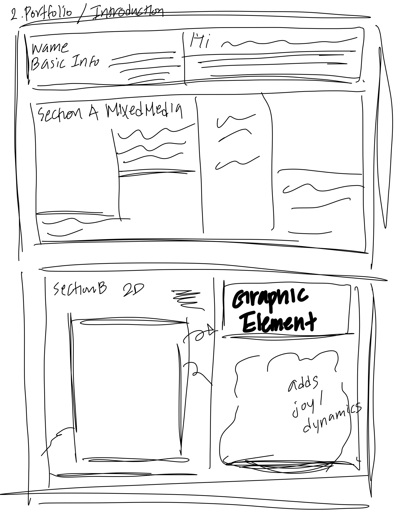
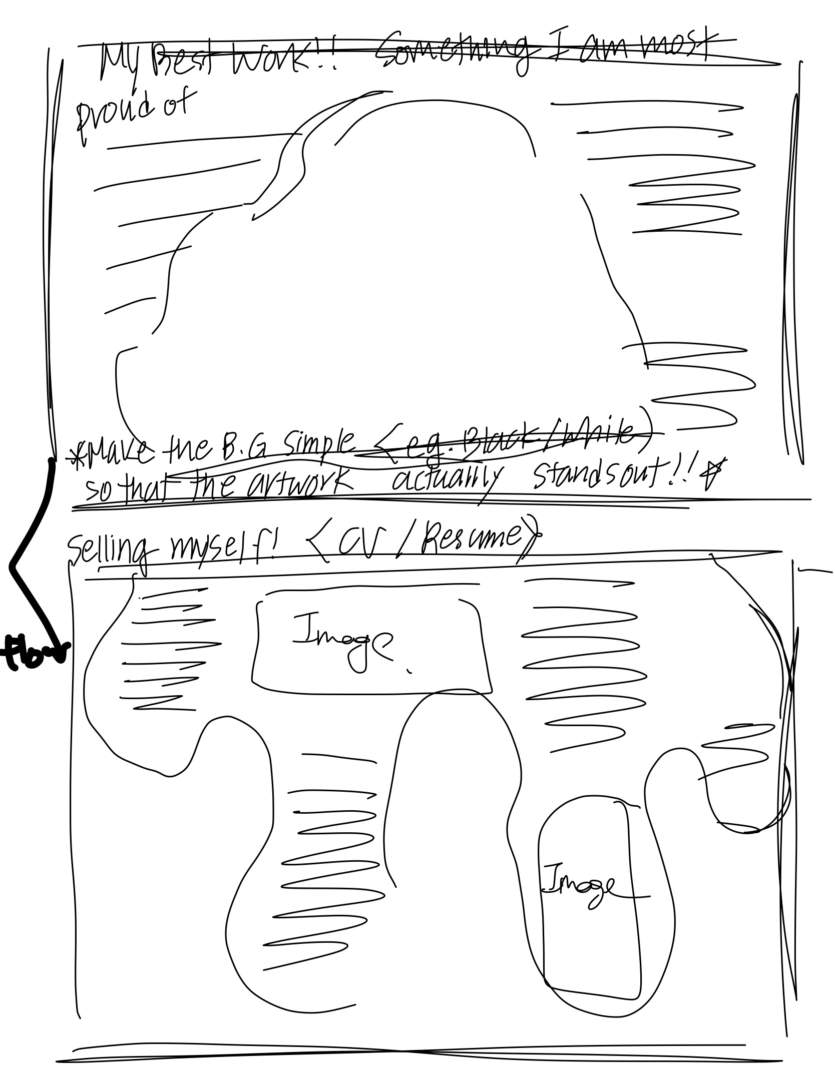
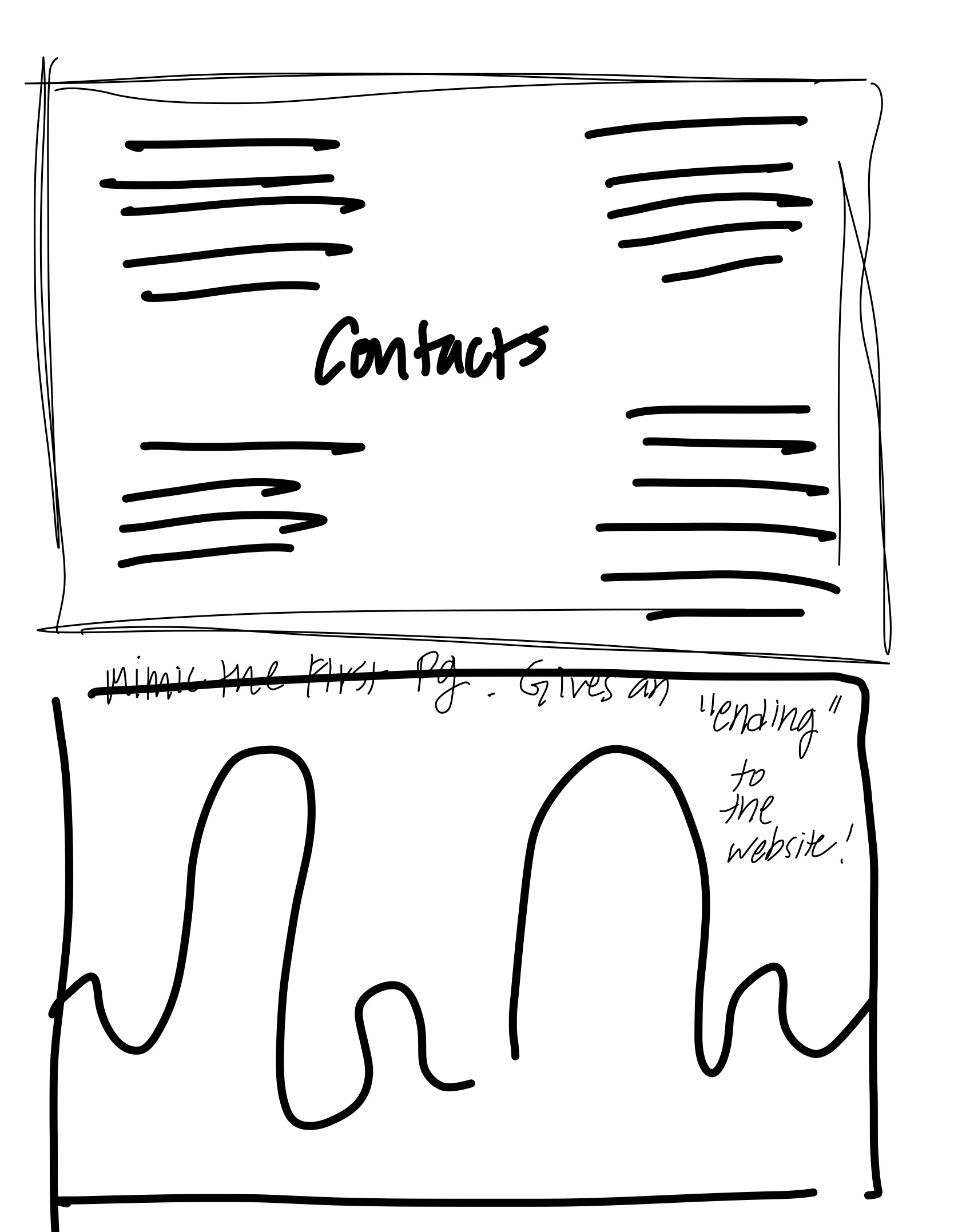
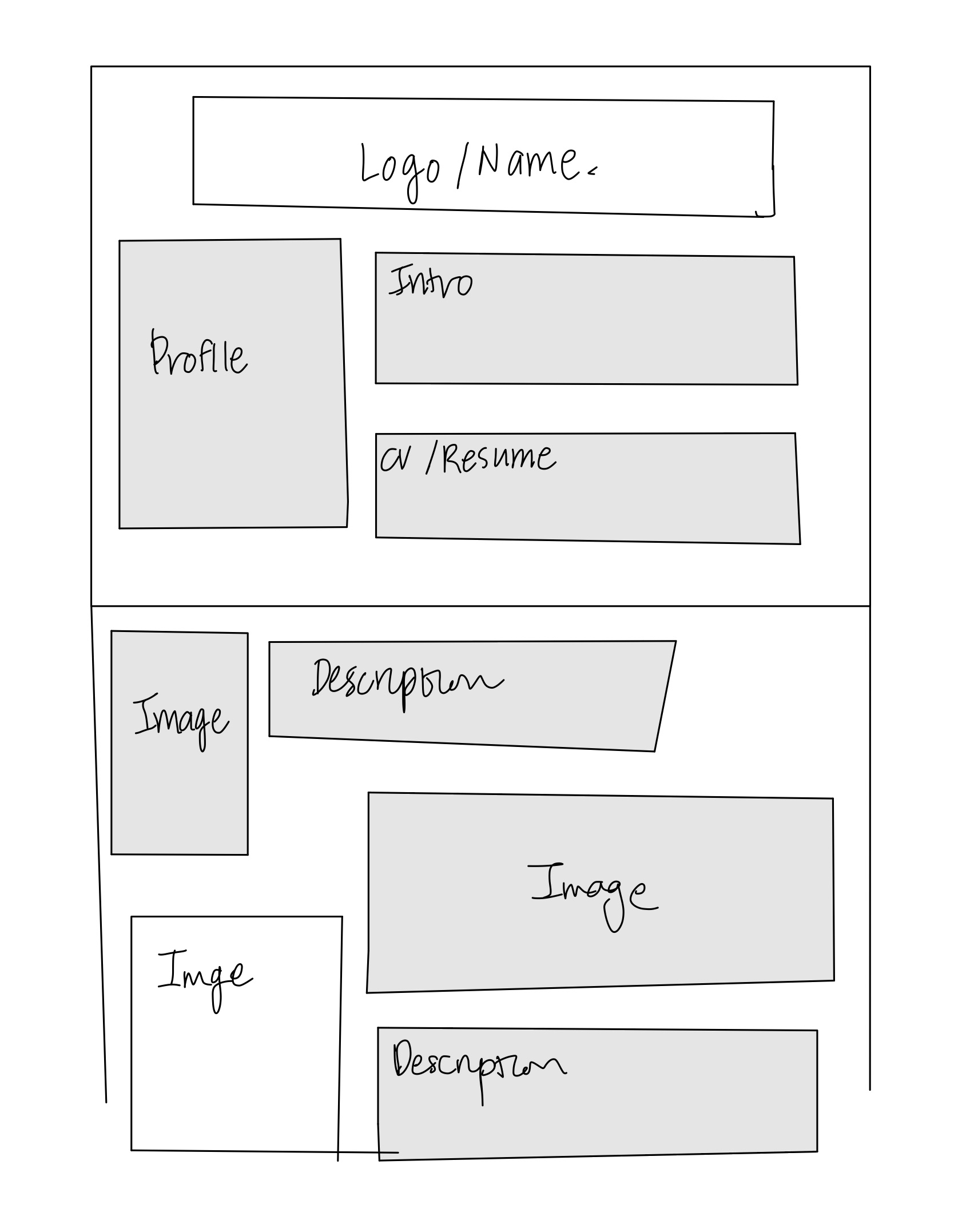
Step 6 - Wireframes
Step 7 - Photoshop Comp
(Colors approximate)
