01. Target Audience
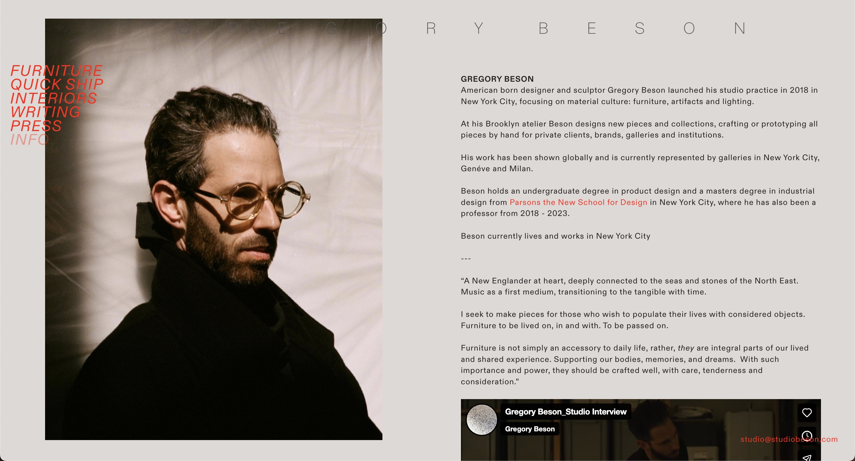
Its target audience is precisely defined, mainly targeting interior designers, art curators, and private collectors. This platform is not only Gregory Beson's Portfolio for showcasing his furniture works, but also his dynamic resume as a designer. It filters out ordinary consumers through a minimalist visual language and directly communicates with those professional decision-makers who are seeking high-end and artistically valuable furniture, establishing a sense of identity.
02. Content Strategy
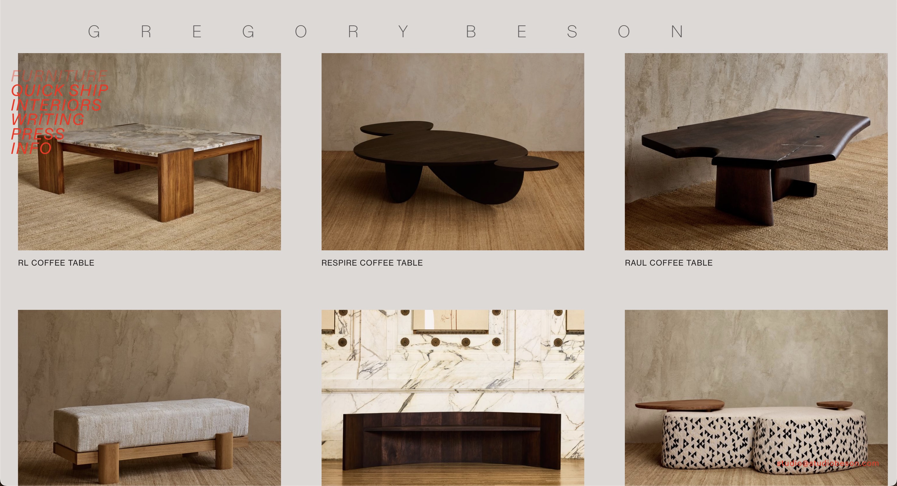
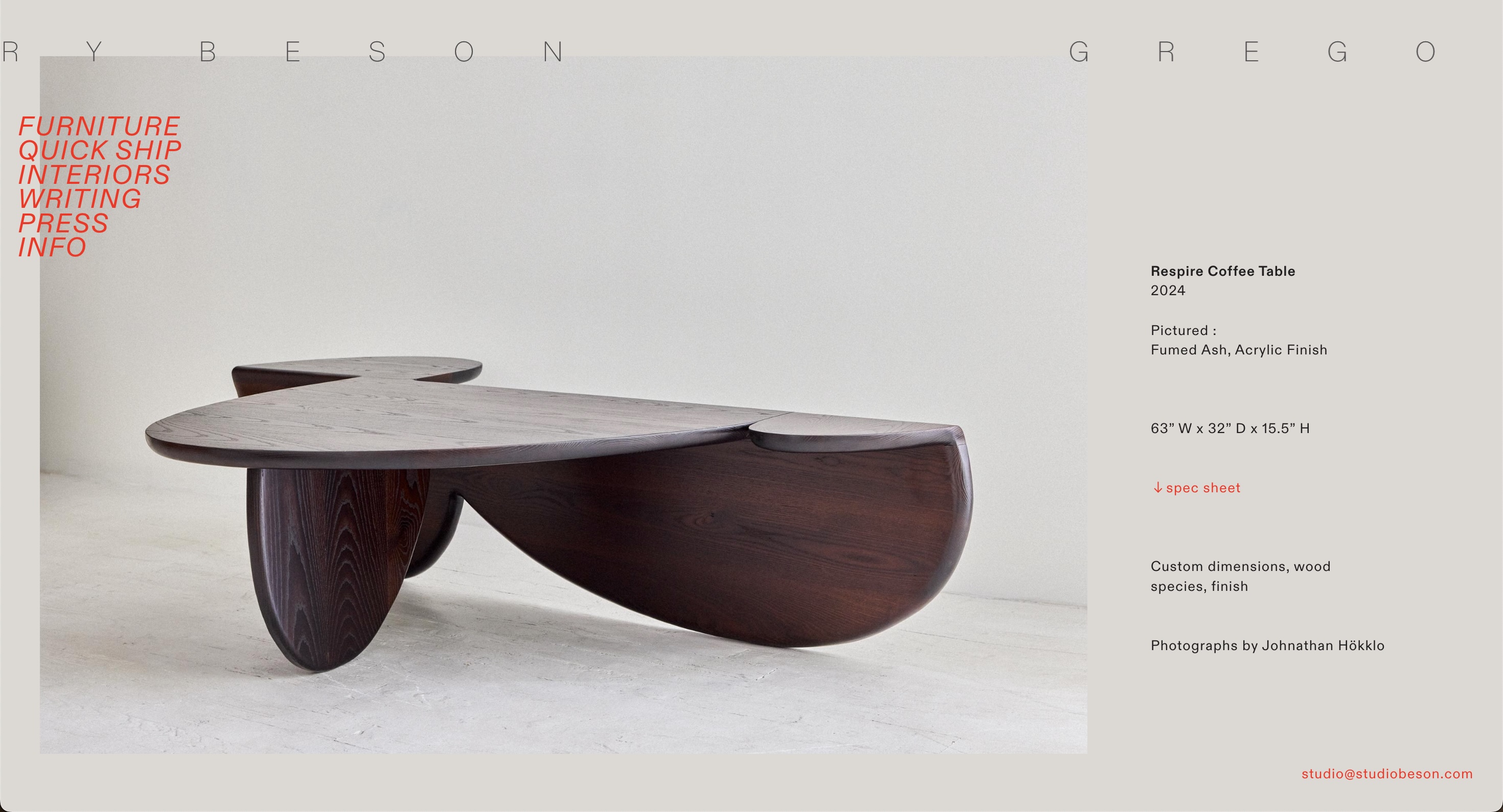
The strategy was to demonstrate professionalism. He wanted to tell everyone that every piece of furniture here is an original design and is handmade, and each one is unique. Although he didn't show the production process, by looking at those very close detail images, it can be seen that he is not only a skilled professional carpenter but also a creative furniture designer.
03. Navigation Design
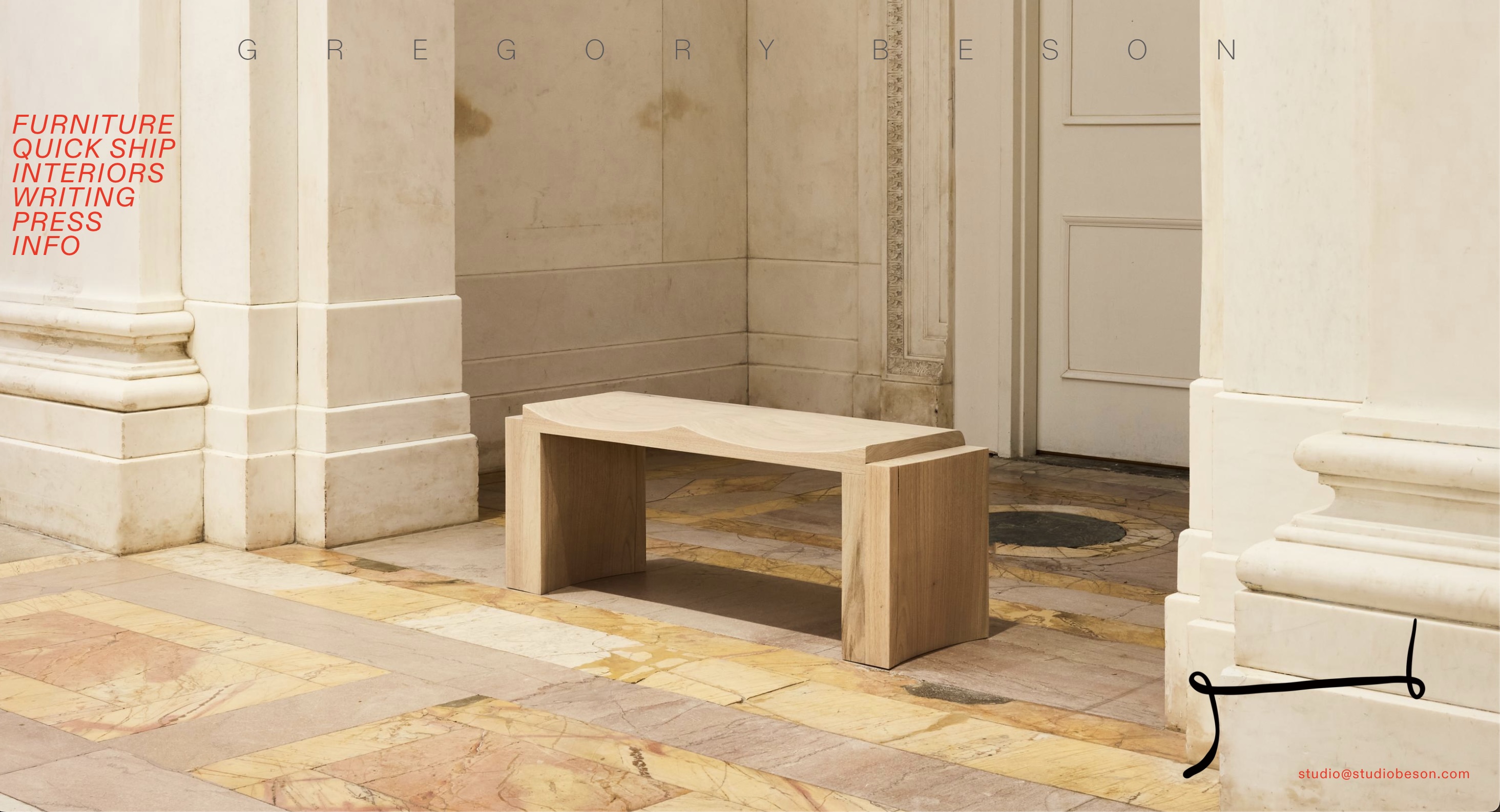
His navigation bar uses a particularly bright red color, which contrasts strongly with the colors of the rest of the webpage. It's like in an art gallery; although the exhibition hall is empty, there is always a very prominent red sign that tells you which way to go. The font of the navigation is clear but quite unique, arranged vertically and although they are very close together, it looks very minimalist and sophisticated.
04. Visual Design
It looks very minimalist, but all the necessary details are present, such as material descriptions and furniture dimensions. What surprised me the most was that although it seemed simple on the surface, when I looked at the source code of the website, the backend was actually very complex. Just the homepage alone had over a thousand lines of code. This "simple on the surface, complex behind" approach makes the entire website seem very profound..