Final Project Worksheet
Develop Your Idea
The website I want to create will sell a a short magazine/guidebook I am creating that highlights some of the best cultural festivals celebrated in Asia. The guidebook will be very visual and contain articles that inform the reader on what each of the festivals featured celebrates, how long it has been celebrated, the significance of the festival, where and when it is celebrated and the traditions and activities that occur. The problem I want the site to solve is to provide my print guidebook/magazine with an online platform that will help publicize the book to a wider audience and get people interested in purchasing it. I also want to site to serve as a place where the user can directly get background information on the book and easily purchase it.
Discovery and Research
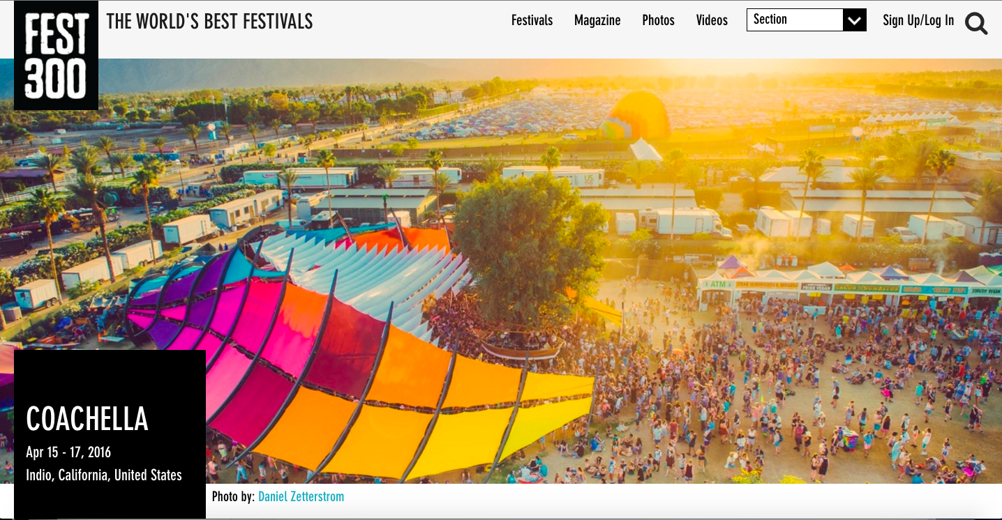
Fest300
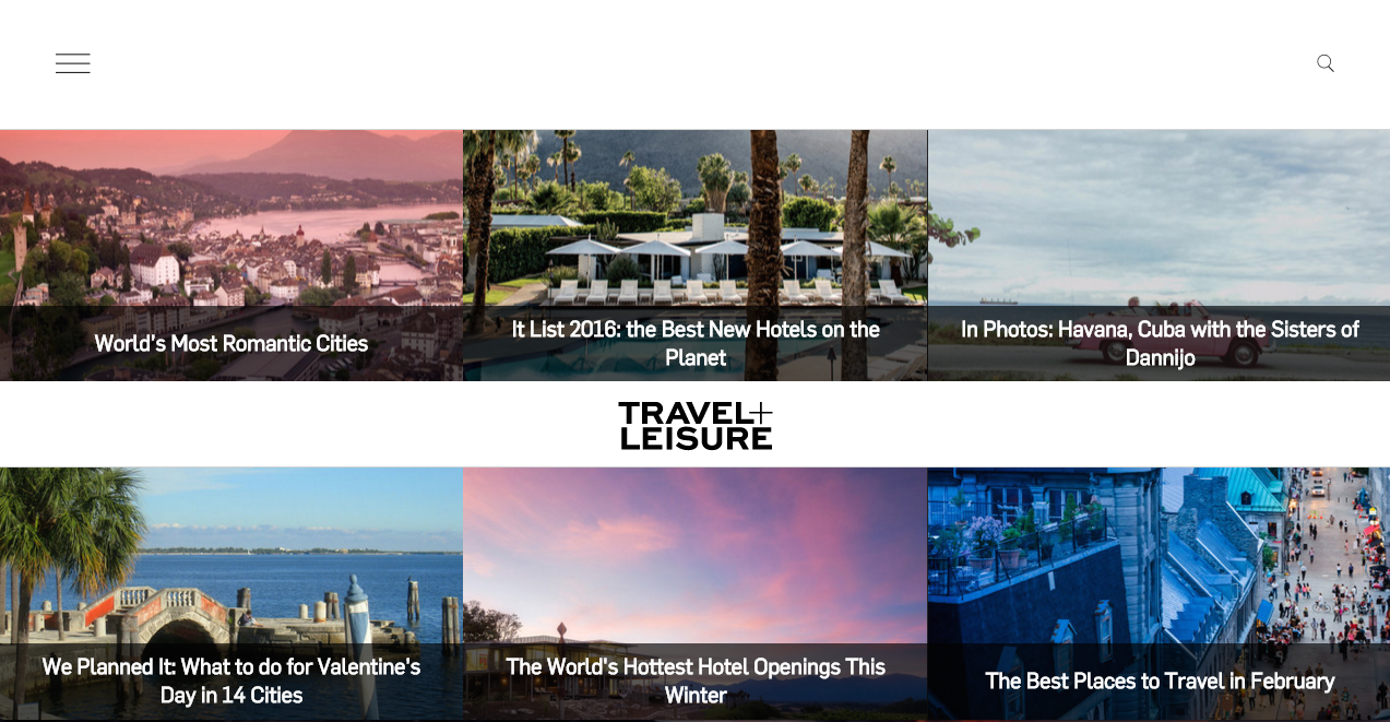
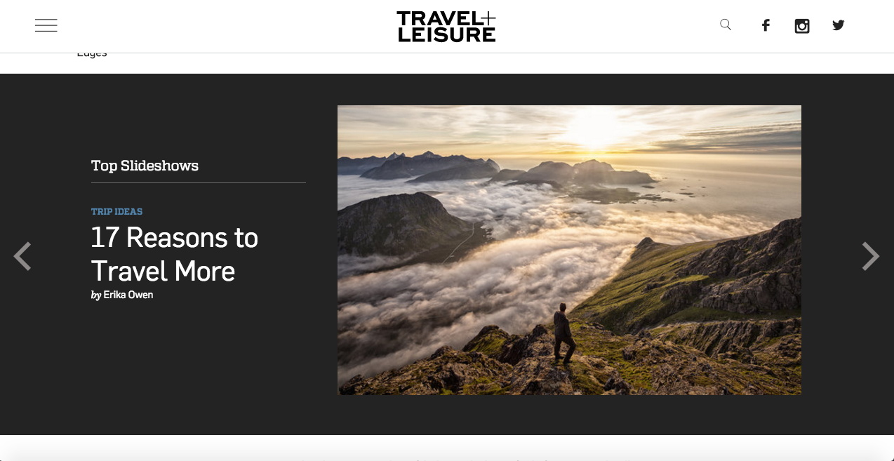
Travel+Leisure
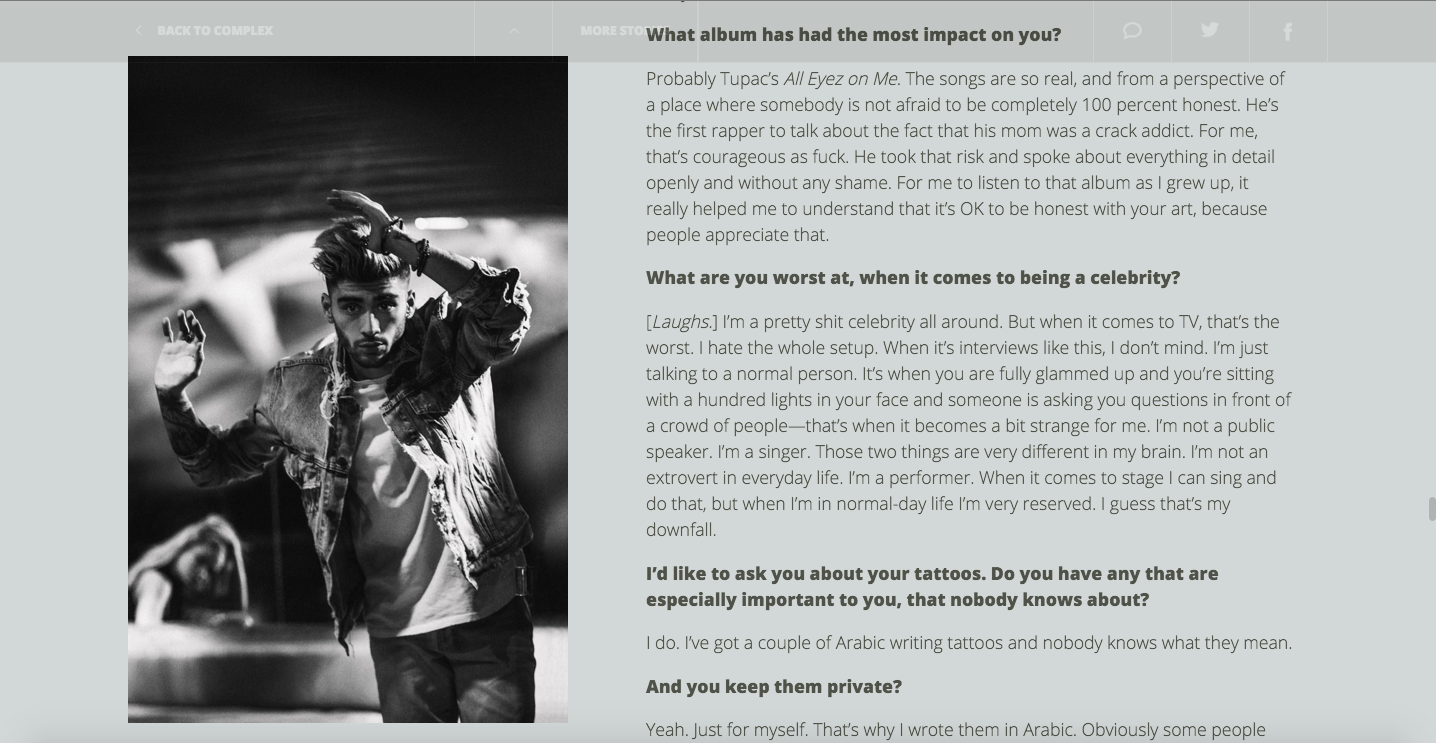
Complex Magazine
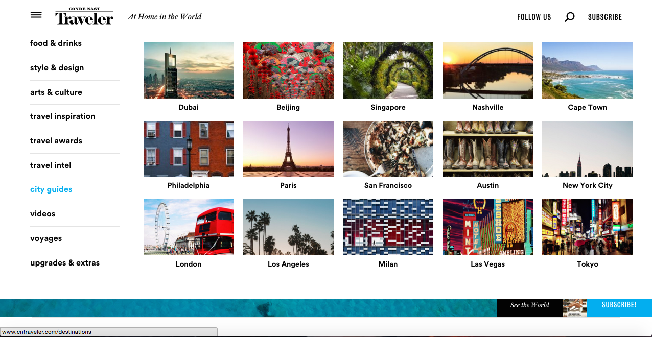
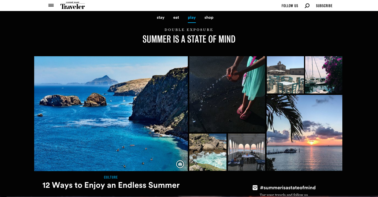
Conde Nast Traveler
Target Your Audience
My target audience is travel or culture enthusiasts, frequent travelers/tourists and journalists interested in writing and visually documenting the festivals and customs practiced around Asia for a story. Interested in finding out what some of the best cultural festivals in Asia are, the audience will use to site to learn more about the guidebook and the content that it offers. The website will also serve as a sneak preview into the magazine’s overall design and layout in order to get the user excited about purchasing and reading the actual publication. By familiarizing themselves with the magazine/guidebook through the website, the audience will be more curious to learn about international cultures and the importance of cultural diversity and feel inspired to travel to these countries and participate in their festivities.
User Profile
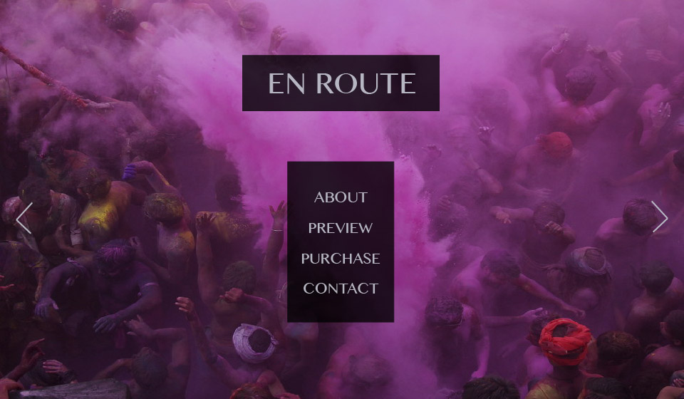
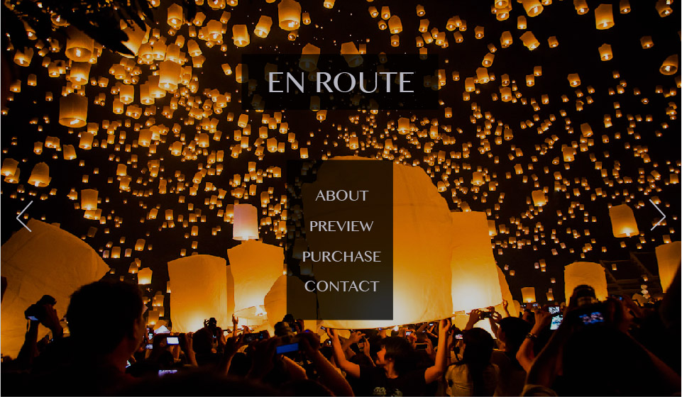
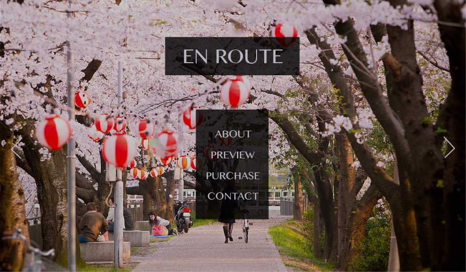
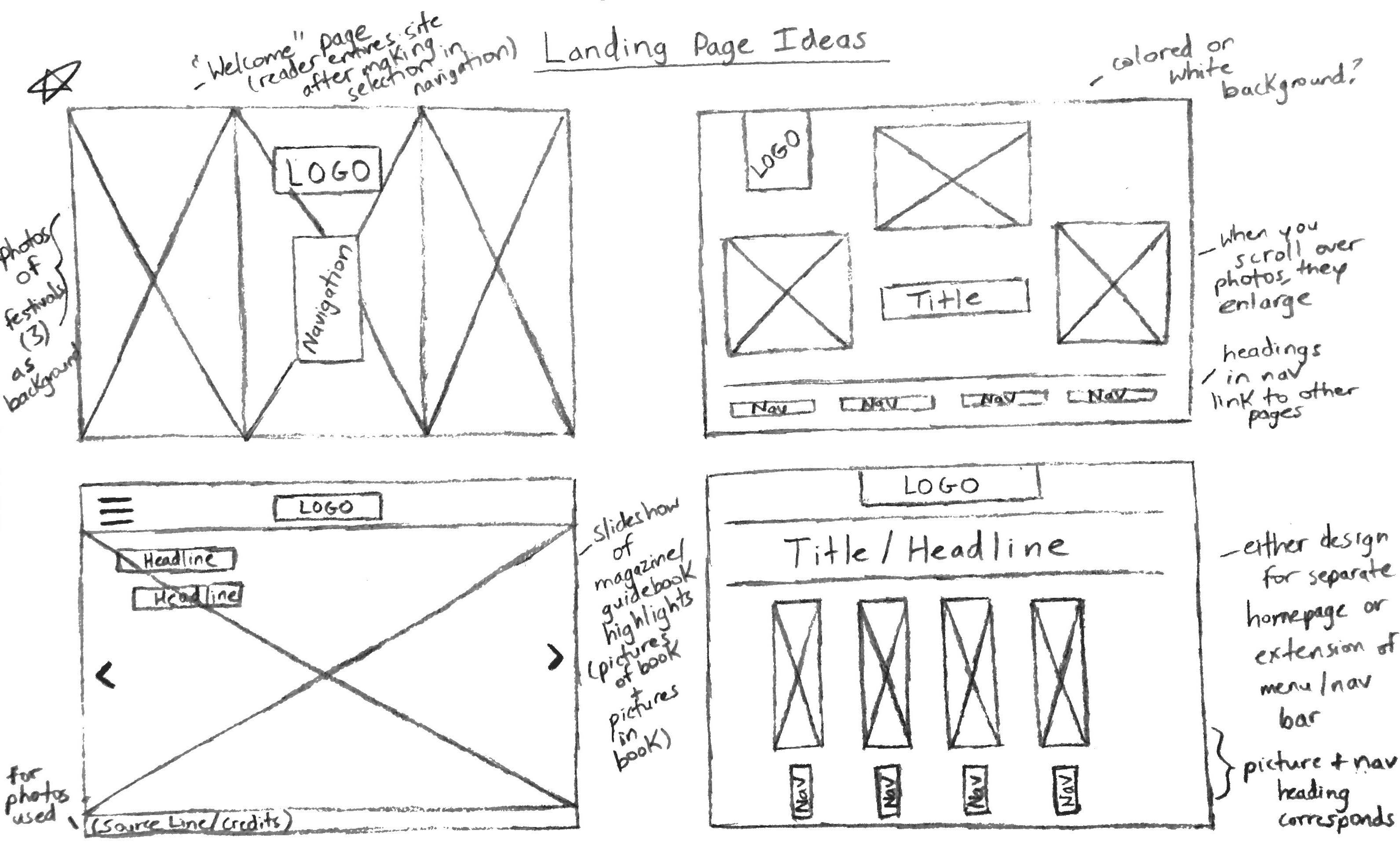
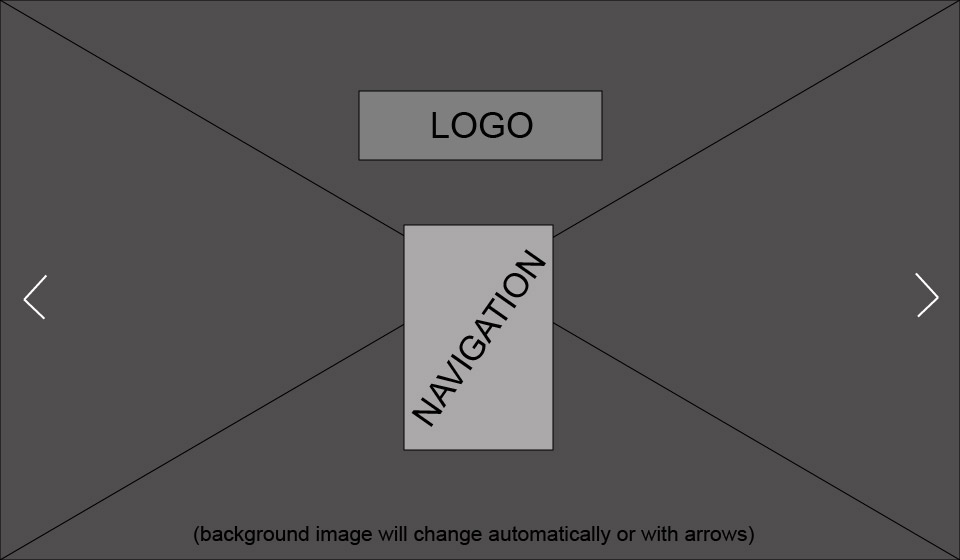
Rani Khol, Student: Rani is an avid reader of travel books and she is looking for one that would teach her more about the culture and customs of India and other Asian countries. When entering the site, she is first brought to the home page where she is greeted with a full page slideshow that she can control using the side arrows and a navigation menu with selections such as "About", "Preview", "Purchase" and "Contact". To delve further into the website and learn more about what the book offers, she can click either one of the menu options and be brought to a new page. She is curious about what the book generally offers so she clicks the "About" tab. After reading an overview of the book, she then clicks the "Preview" tab on the differently designed navigation bar at the top of the page to see sample pages of the interior of the book. She finds herself interested in purchasing the book but before clicking the "Purchase" link, she wants to ask the creator of the book a few questions. To do this, she clicks on the "Contact" portion of the navigation bar and sees a list of ways for her to contact the author.
Inspiration
Thumbnails
Wireframe
Photoshop Comp
