Step 1: Develop Your Idea
The problem I want to solve through my portfolio website is to have a space that brings together all of my creative work and showcases my skills and interests in an organized and visually pleasing manner. I also want my portfolio site to serve as a gallery for potential employers and fellow writers, designers, artists and photographers to get to know me and my work better and to establish a connection with these groups of people. My goal is to make a site that is clean and approachable but also stands out from other portfolio sites in terms of color, typography and visual display.
Step 2: Discovery and Research
I visited and researched a variety of online portfolios from creators and visual artists and noticed how they all varied in their visual layout, navigation and content. They each had unique styles, themes and voices, which have influenced my ideas on how to approach my website and create a product that will appeal to others but also stay true to my own tastes and style.
Arian Behzadi
 Adrian Behzadi's landing page is both minimalistic and detailed in its design. He utilizes light, thin type and a white background to draw out and emphasize the vibrant colors used in his pieces and to avoid overwhelming users when they first enter the site. He also organizes his navigation and work into specific categories, which allows users to see the diversity in his work and helps him stand out from other designers' websites.
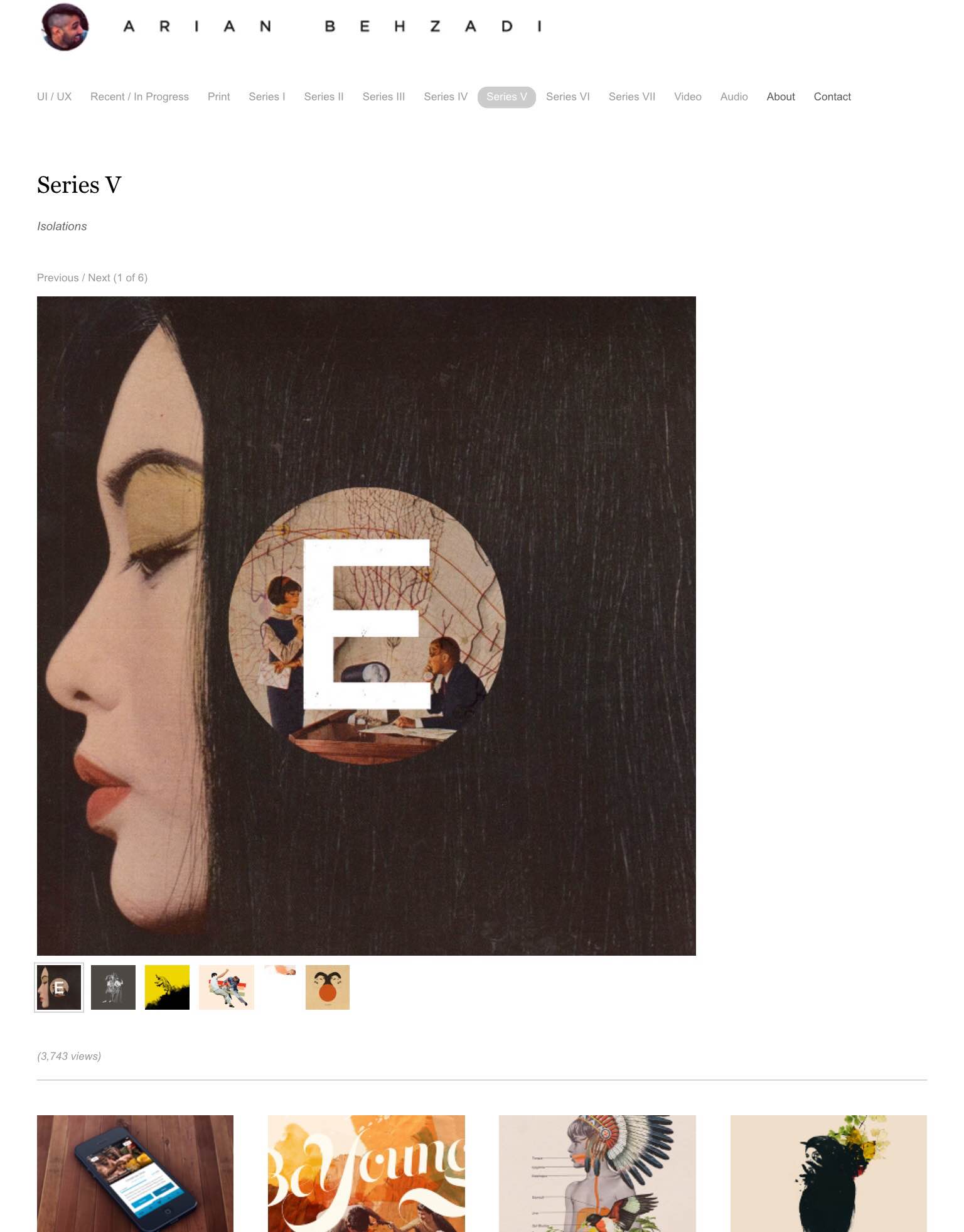 After clicking on a certain category in the top horizontal navigation bar, the user is brought to a new page that is consistent in style with the landing page. I like how Behzadi has arranged his work into a functional slideshow feature that displays each piece on a much larger scale than the thumbnail images on the homepage. The user also has complete control over what specific piece he/she wants to see.
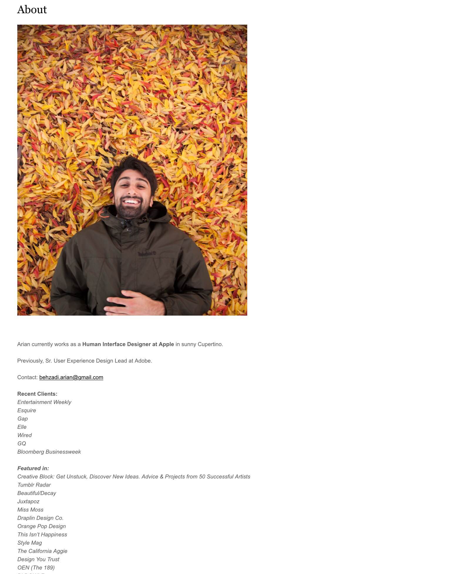 Behzadi's "About" page is also simply designed with small type and a light font but I was intrigued by the stark contrast in color between the vibrant photo of him and the grayscale body of text describing his work experience, projects and credentials. I think including the photo is a nice touch because it makes the user experience and portfolio site more personalized and inviting.
Eric Ryan Anderson
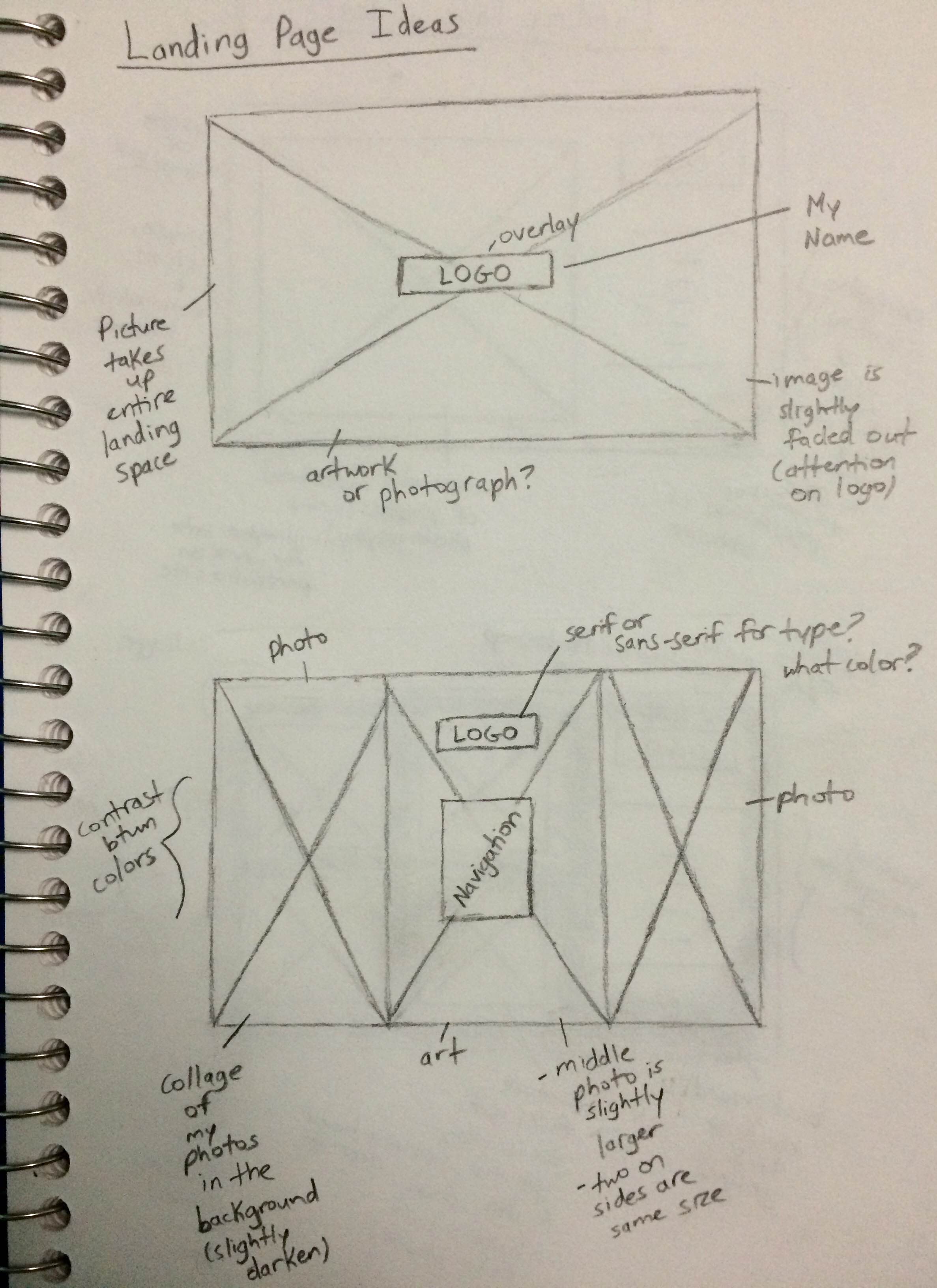
 Eric Ryan Anderson's landing page is successful in creating an immersive experience and grand entrance into his portfolio site. The thin sans-serif type enclosed by a box provides a nice contrast to the header photo underneath and allows the user to appreciate that one picture as it takes up the entire space of the first screen. The arrow pointing downwards also serves as a good aid for the user by guiding them through the flow of the homepage.
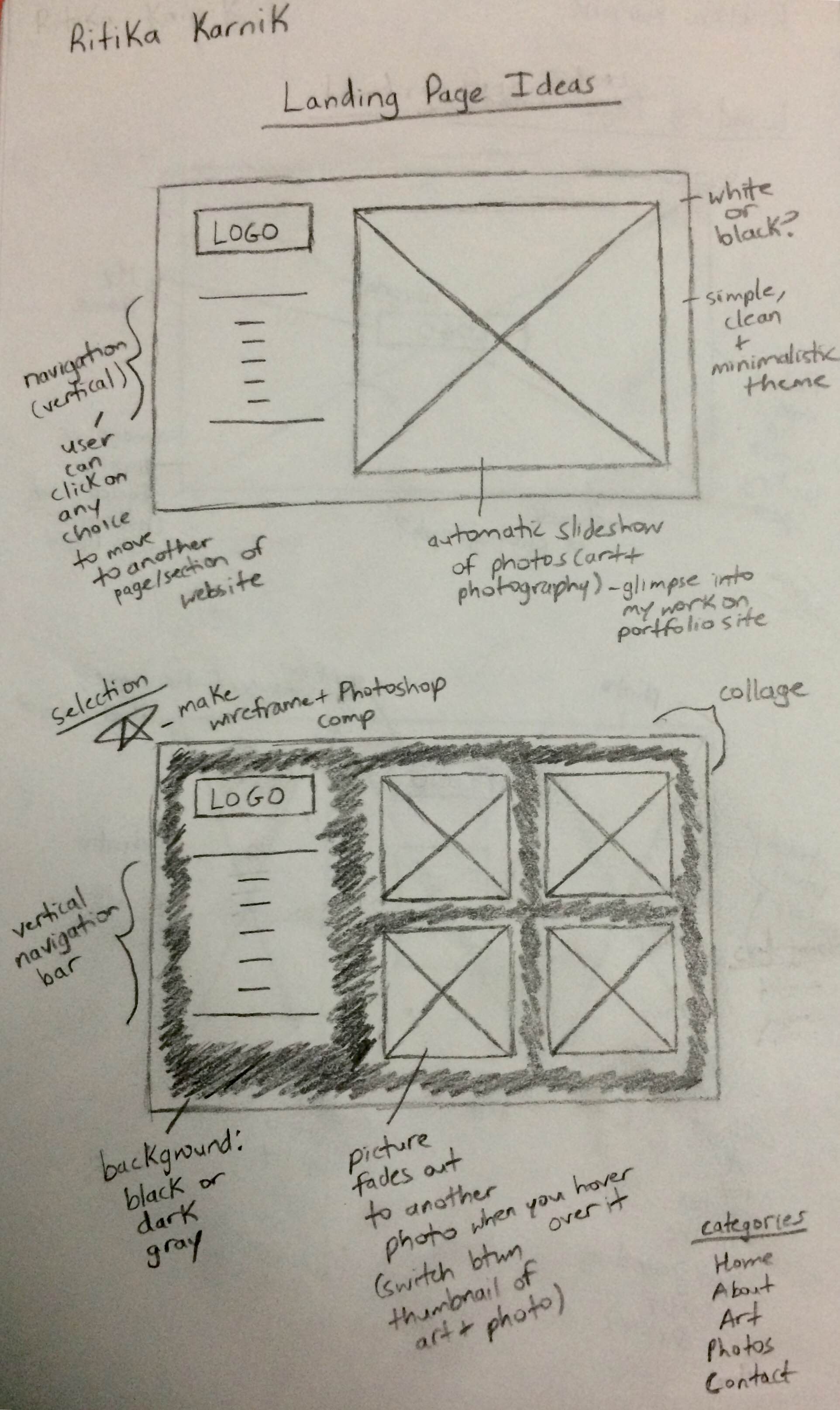
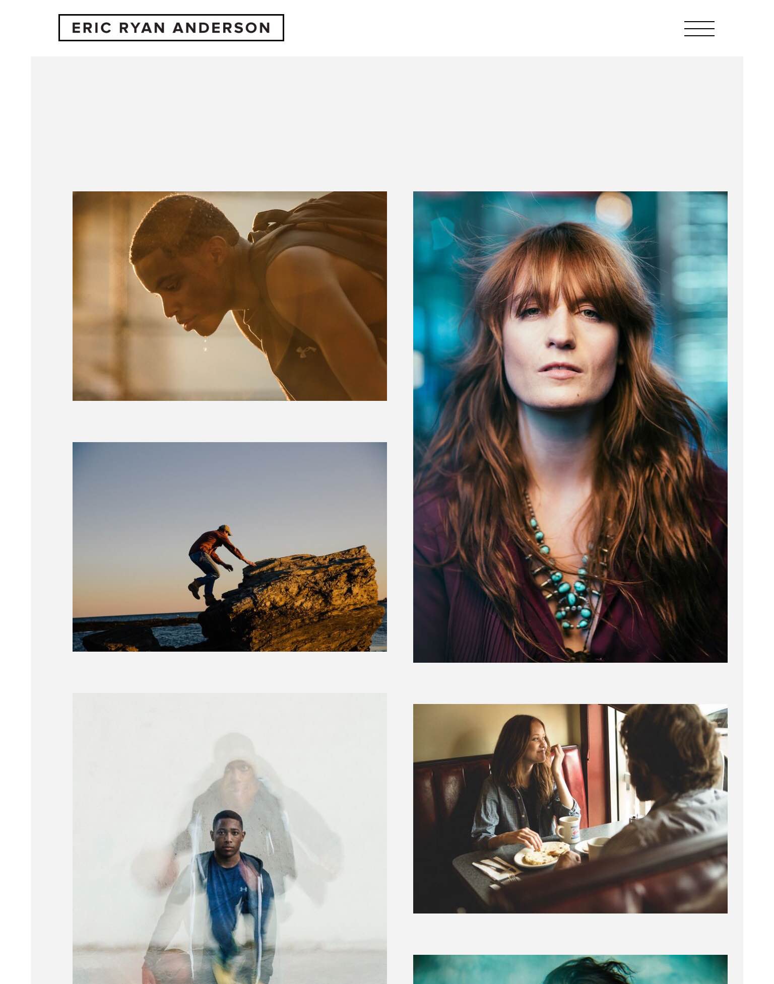 The organization of his featured photos into a collage is a beautiful and noteworthy way of providing choice to the user and displaying Anderson's diverse photos into an organized and visually captivating layout. I have considered implementing this collage layout to my own site in order to better organize my own collection of photos and thumbnails.
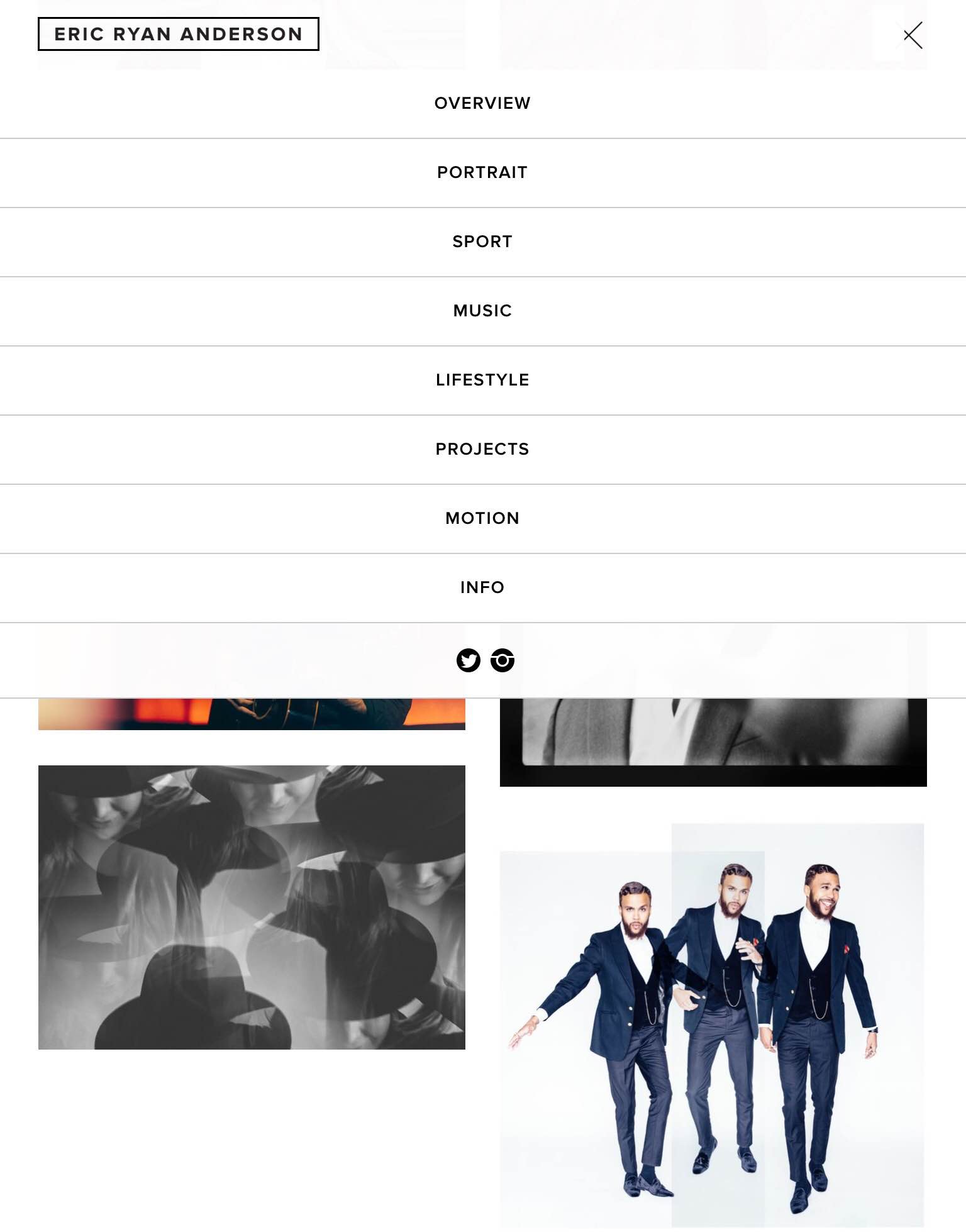 In terms of navigation, the website offers a drop-down menu that provides an overview of the themes and topics that Anderson photographs and categorizes his portfolio work under. The drop down menu is simple and easy to understand and also includes his social media accounts, encouraging visiters to follow his work and engage with him.
Step 3: Target Your Audience
My target audience for the website are potential employers looking to get a more in-depth picture of my creative interests and hobbies and fellow writers, artists, designers and photographers who share common interests with me and are interested in seeing my work. I want to create an engaging user experience for my audience by creating a simple but compelling user interface with categories, text and visuals that will intrigue users into exploring deeper into the site and viewing more of my work.
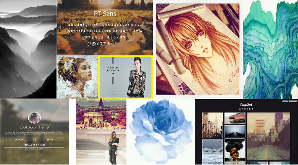
Step 4: Inspiration
Step 5: Thumbnails
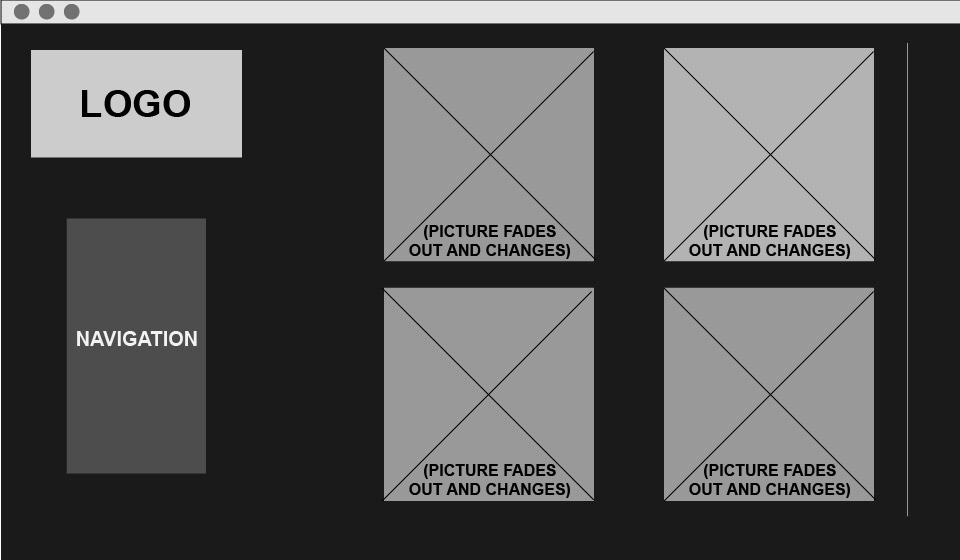
Step 6: Wireframe
Step 7: PhotoShop Comp

