Lumen+Loom Kreative
Website Address: Lumen+Loom Kreative
Intent
The intent of the Lumen+Loom Kreative website is to present and communicate their concept, offers and products, and where to find them to the target audience. This is done by introducing the concept and unique design process that makes the audience and customers a much bigger part of the design process than before. Unique design process, unique products. It is also a way to present a completely new design process to the market.
The website aims to inspire and encourage homeowners, tenants and interior design junkies to visit or contact Lumen+Loom Kreative. It aims as a starting portal for future great relationships. The website wants to reach out to an audience that appreciates unique, custom designs of high quality that is still affordable. It also reaches out to designers with its minimalistic design, structure and the simple style of communication chosen.
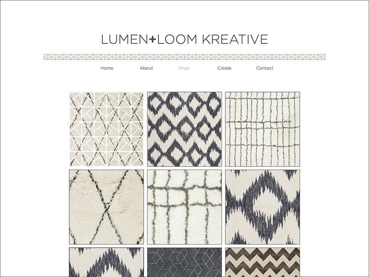
The website works as shop where you can order and buy finished designs as well as starting the design process if you want to create your own.
Voice
The voice of the Lumen+Loom Kreative website is clean, minimal, informative, professional, elegant but trendy.
Tone
The tone of the Lumen+Loom Kreative website is casual and easy consistently through the site. It aims to communicate in a friendly and casual way to break the ice and build relationships with their audience.
Brand
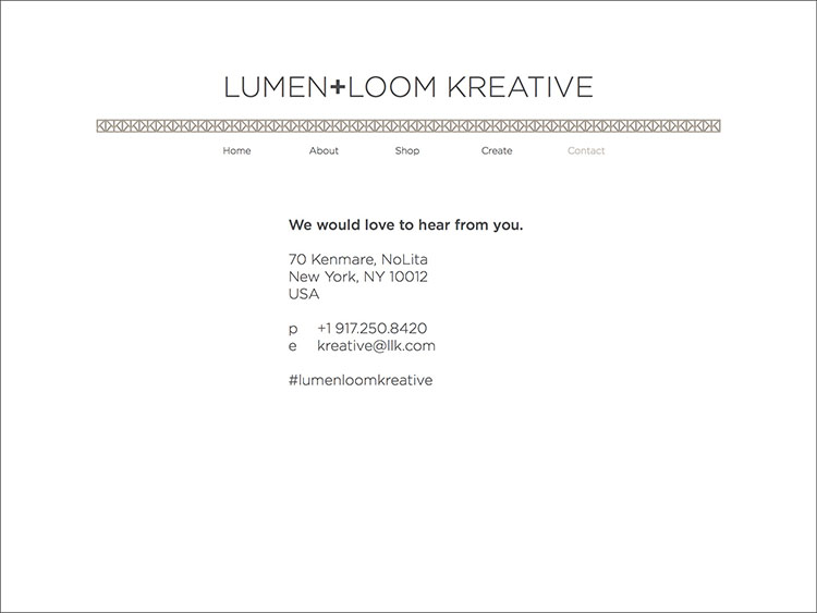
The Lumen+Loom Kreative website are launching a new and unique design process that includes the target audience in the design process creating personal and unique designs for rugs of high quality at an affordable price. The choice of typefaces are both trendy and elegant by using a sans serif for their logo and text. The colors are subtle and minimal and represents the brand and the design process. The graphite and sand colors stands for the use of light and dark in the design process and for the natural materials the end products are made of. It also allows the content and imagery stand out. The simplicity and modern vibe of the website truly represents the studio space and the brand well.
Persona
Homeowners
Greg and Karen are a mid 40s married couple based in New York. They want to redecorate their TriBeCa apartment and wants a custom made rug of good quality. They have searched the web for rug stores but I have not found the kind of rug they had in mind on these websites with overwhelming and endless options. They decide that they are going to put both of their wishes into one design when they stumble upon Lumen+Loom Kreative's website. The website appeals to the couple with its simplicity and straightforward content and navigation. It has the vibe of the neighborhood and the style that they want and when they read about the design process they are sold.
Tenants
Liz is a woman in her mid twenties who lives in Greenpoint, Brooklyn. She just found a new apartment and is in need for a new rug. She goes to ABC Home and Carpets website and finds beautiful rugs but unfortunately the ones she looks at are all too expensive and the navigation is time consuming which makes her give up the search of finding a rug in her price range. She discovers Lumen+Loom Kreative's website and reads about their concept. The website's friendly tone appeals to her a lot and she likes the idea of creating a custom rug that fits her price range. She looks at the finished products they offer and screenshots the designs she likes to bring in the ideas for her own when she makes a visit. She shoots them an email as she wants to learn more about the process and set up a meeting.
Competition
Dan is a web designer at a big rug company based in North Carolina. He is working on a redesign of the company's website to make it more modern and trendy like the rug companies in the big cities. As he is doing research he finds Lumen+Loom Kreative's website. The website appeals to Dan with its minimalistic and clean design. He gets new ideas of how to further develop his own company's website and takes notes of the way this website shares its information and products.
Wireframe
Copy Deck
Title
Header
Body Copy
Questions and Problems
The purpose of the website is to introduce and communicate the concept of the company. This is done through the design of the website – reflecting the design method. The website makes it easy to get in touch communicating in a friendly casual manner with only the most necessary information available and with easy navigation so that the audience do not have to search for the information they are looking for. The company specializes in customer designed rugs handcrafted in India where the customers take part of the design process and get to instantly request and see changes to their designs and how it will look on their rug before the design is sent for production. They sell some finished products as well to reach out to a bigger audience. The design process is reflected in the website design and the brand's own identity is clearly visible giving an idea of their design style.
The Idea
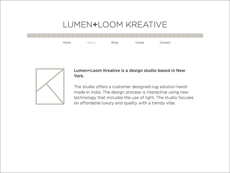
Lumen+Loom Kreative is a design studio launching in New York. The studio offers a customer designed rug solution handmade in India. The design process is interactive using new technology that includes the use of light. The studio focuses on affordable luxury and quality with a trendy vibe.
The branding reflects both the design process and the production aspect of the design studio. "Lumen" stands for the use of light in the design process and "loom" represents the tool used in production of the final product. Kreative stands for the English word "creative" and the Scandinavian word "kreativ" (meaning the same) as the owners of the design studio are Scandinavians.
The mark is an abstract use of the initial letters of the name: LLK. From the mark I have created a pattern that could be used in various ways, shapes and colors with the choice to include or exclude the typographic logo.
The typographic logo has a plus sign instead of the word "and" to give it a more trendy vibe. The typeface used is Gotham Light and Medium which is geometrical like the shapes of rugs, and also reflects the brand's concept of affordable luxury by steering away from the more upscale serifs.
The colors chosen for the brand are "graphite" and "sand" which represents the natural materials the rugs are made of.
The mark, logo and patterns can be used in black or in the various color combinations that sand and graphite allows.
Selling
Lumen+Loom Kreative are selling custom made handcrafted rugs designed in New York and produced in India. The customer comes into the studio and together with the in house designers design their rug with the use of new technology that allows the customer to instantly see the design and make changes if needed. Then the design is sent to India where it will be handcrafted and shipped either to the store for pickup or straight to the home of the customer. The company also offer a small variety of finished rugs that they sell on their website.
The Problem Being Solved
The goal of this website is to introduce Lumen+Loom Kreative to the market of rug design, clearly show the company's concept and their sense of unique style and design abilities through the design of the website. The website is solving this problem by showing the concept through the design, providing only the most necessary information with easy navigation, communicating in a casual manner and friendly manner, inspiring with finished products and showing their own brand identity design as a sneak peak of what they are all about.
Target Audience
Sound Proposal
The proposal is sound because the the company is introducing a new way of designing rugs that is unique to the market. By stating the concept clearly on the website but in an creative and somewhat abstract way, still making sure the concept is picked up easily by its audience, will most likely lead to a great start for the company in the mix of all rug design studios already out there.
Real World
Will it work in the real world? Yes. It will because the website stands out from a lot of its competitors by doing a more clean minimalistic design and content creating an understanding of the unique concept but also a curiosity for how this actually works in real life being their customer and taking a part of a new way of designing. The brand identity is well reflected in the website – trendy but elegant, casual but professional, quality but affordable – and gives an impression of what to expect as a customer.
Different From Other Websites
The Lumen+Loom Kreative website is different from other, similiar websites with its clean, minimalistic design and content. A lot of other websites have a content overload which can make the navigation harder and the experience more time consuming. Since the company is a bit different than other rug producers and retailers offering only a small batch of finished rug design while focusing on the customer designed rug solution, the website content will be quite different from them and more like a design studio with a portfolio section showing what they have done in the past. The company is just about to launch and do not have any past work to put up yet but this will be a future feature to the website – a portfolio page. The website will then be even more a mix of a rug retailer's website and design studio. This will make them stand out even more from other rug companies' websites.
Competition
Lumen+Loom Kreative has a different approach to the design process than its competitors. The use of new technology in the design process is unique to only them and this is reflected in their website. The design of the website is minimalistic and there is not an overload of information – only the most necessary and important information. The use of color is subtle and minimal. The website communication is casual and less formal than many rug design websites as they want to get and maintain it a nonformal with their audience and customers to build great relationships and give a trendy vibe – much like a lot of trendy businesses in the downtown area of New York have done with their concepts and websites. When you look at competitors' sites there is a lot of content and imagery competing with each other and it can be hard to find what you are looking for. By doing a more minimalistic and clean website, Lumen+Loom Kreative appears more professional and if you want to dig deeper into their concept and offers, you can easily get in touch or make a visit. It makes the reader curious. They get introduced to their concept and who they are in a clear and concise way and there is little room for confusion.
Address Target Audience
I will address the target audience by educating and communicating in a non formal and friendly manner and introduce a more personal way of buying a rug for their homes. To the target audience that has a need of a new and unique quality rug that is still affordable, the company is the only rug design studio that uses the technology to make instant and personal designs in collaboration with the customers because there is no rug company to this day using the same technology to design rugs.