Designing for the Web
Midterm Worksheet
1.Develop your idea
2.Discovery & research
3.Target your audience
4.Inspiration and concepts
5.Thumbnails and Sketches
6.Wireframes and prototypes
7.Responsive mockup
8.Photoshop comp
My website aims to showcase my journey as a Strategic Design and Management student at Parsons, emphasizing my passion for graphic design and its fusion with the business world. It's a dynamic portfolio highlighting projects demonstrating my ability to combine strategic thinking with creative flair. Additionally, the website serves as a platform for connection and collaboration, inviting like-minded individuals, potential partners, and fellow enthusiasts to engage in conversations and explore the nexus of design and business. Ultimately, it's a space where I share my passion, expertise, and vision for bridging strategic insights with captivating design.
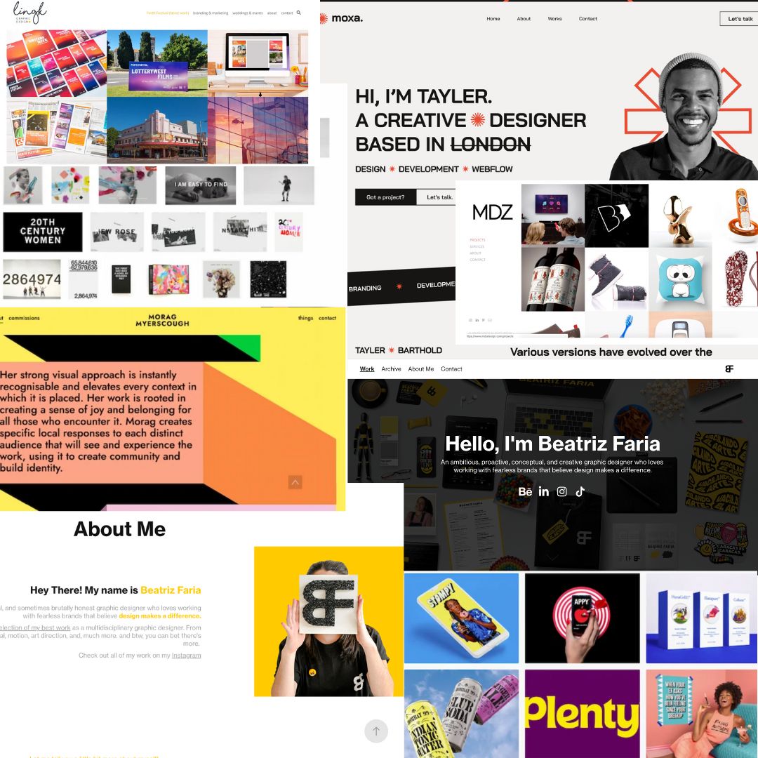
During my research, I decided to make my website a place where people can just go in and feel they understand who I am as a professional and as a person. To understand my mind and my style so they know what to expect. I chose Beatriz Faria’s work as my inspiration because she’s selling herself as a brand.
Beatriz Faria is an ambitious, proactive, conceptual, and creative graphic designer who loves working with fearless brands that believe design makes a difference. The website fully introduces a selection of her best work as a multidisciplinary graphic designer, from branding to hands-on design, editorial, motion, art direction, and much more.
The website portfolio for a Parsons student in Strategic Design and Management, also minoring in Communication Design, shapes a brand that's classy, pro-level, and bursting with creative vibes. The vibe lands right in the middle of pro and innovative, reflecting a mix of intelligent strategy and artsy passion. It's like blending the smarts of strategic design with the artsy flair of graphic design – no sweat.
The brand comes across as expensive yet chill, appealing to a mix of folks – students, pros, and those who dig design. It's got a clear and steady style, showing how this student's skills are both polished and creative. This brand isn't just about showing off; it's about making bonds and showing how those big thoughts and cool designs can be buddies.
Think of the many different users this website is addressing. If I were to write down the characteristics of any of these users and label them, I would create a persona. Personas are composite sketches that reflect end users' real-world behaviors, attributes, and attitudes. Here are 3 personas that I think would use my website:
1.Curious Creative Connie: A university student in graphic design, Connie is excited to explore the fusion of strategic innovation and graphic design. She's keen to find inspiration, learn about the intersection of creativity and business, and connect with fellow designers.
2.Professional Planner Paul: Paul, a mid-level manager in a marketing agency, is looking for collaborators who can add creative depth to his team's projects. He's interested in understanding how the student's strategic design skills can enhance his agency's campaigns.
3.Inspired Innovator Ivy: As an entrepreneur in sustainable fashion, Ivy wants to infuse creativity into her business strategies. She seeks fresh ideas from the student's portfolio and potential collaborations that align with her brand's goals.
Develop your Idea
Discovery and Research
Website Inspiration
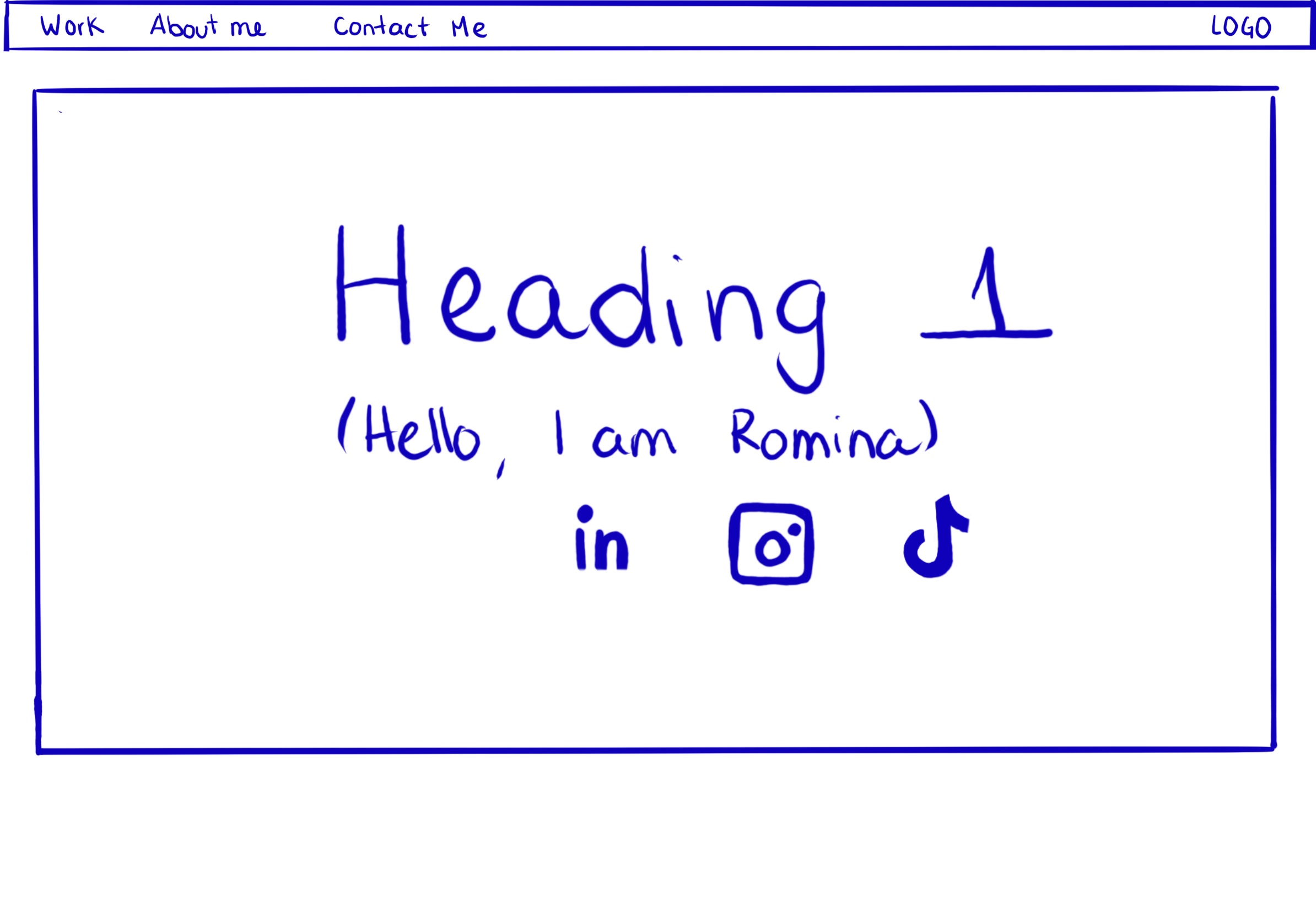
Picture the home page of the website figure

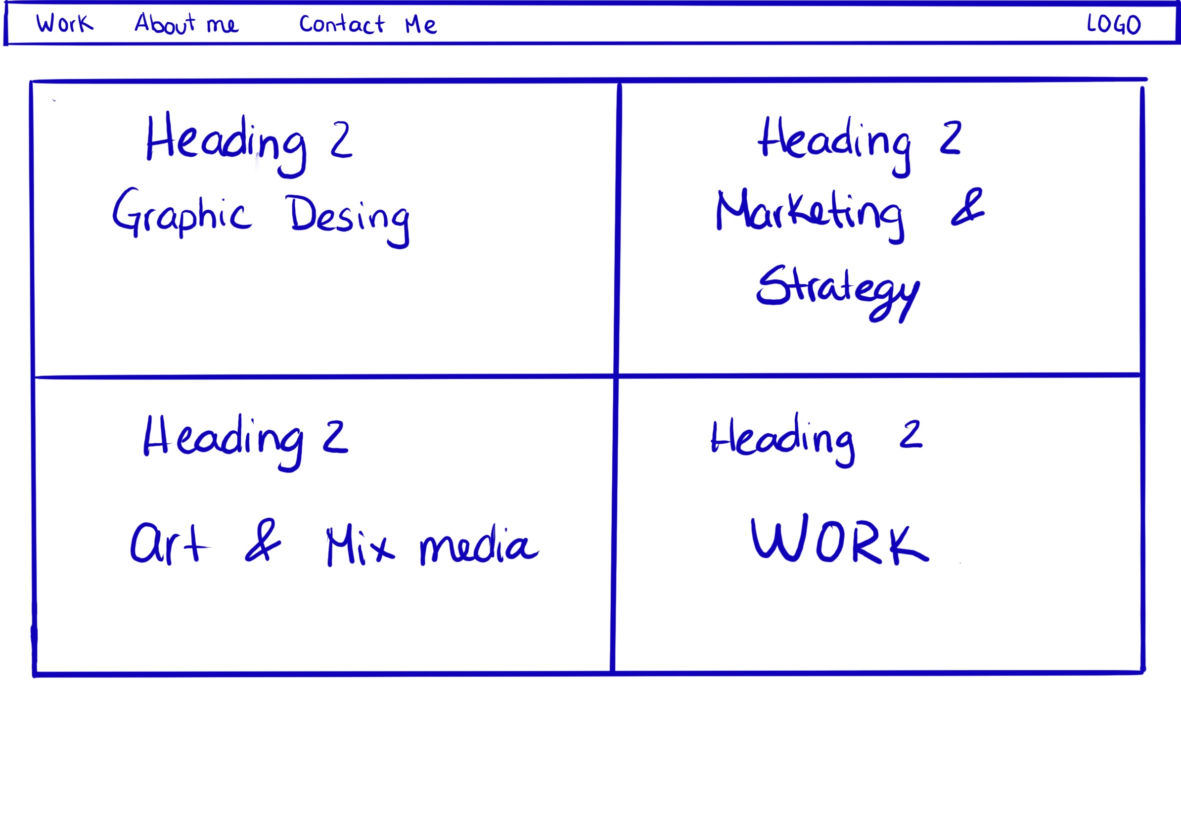
Picture web page of website figure

Target your Audience
Mood board for inspiration

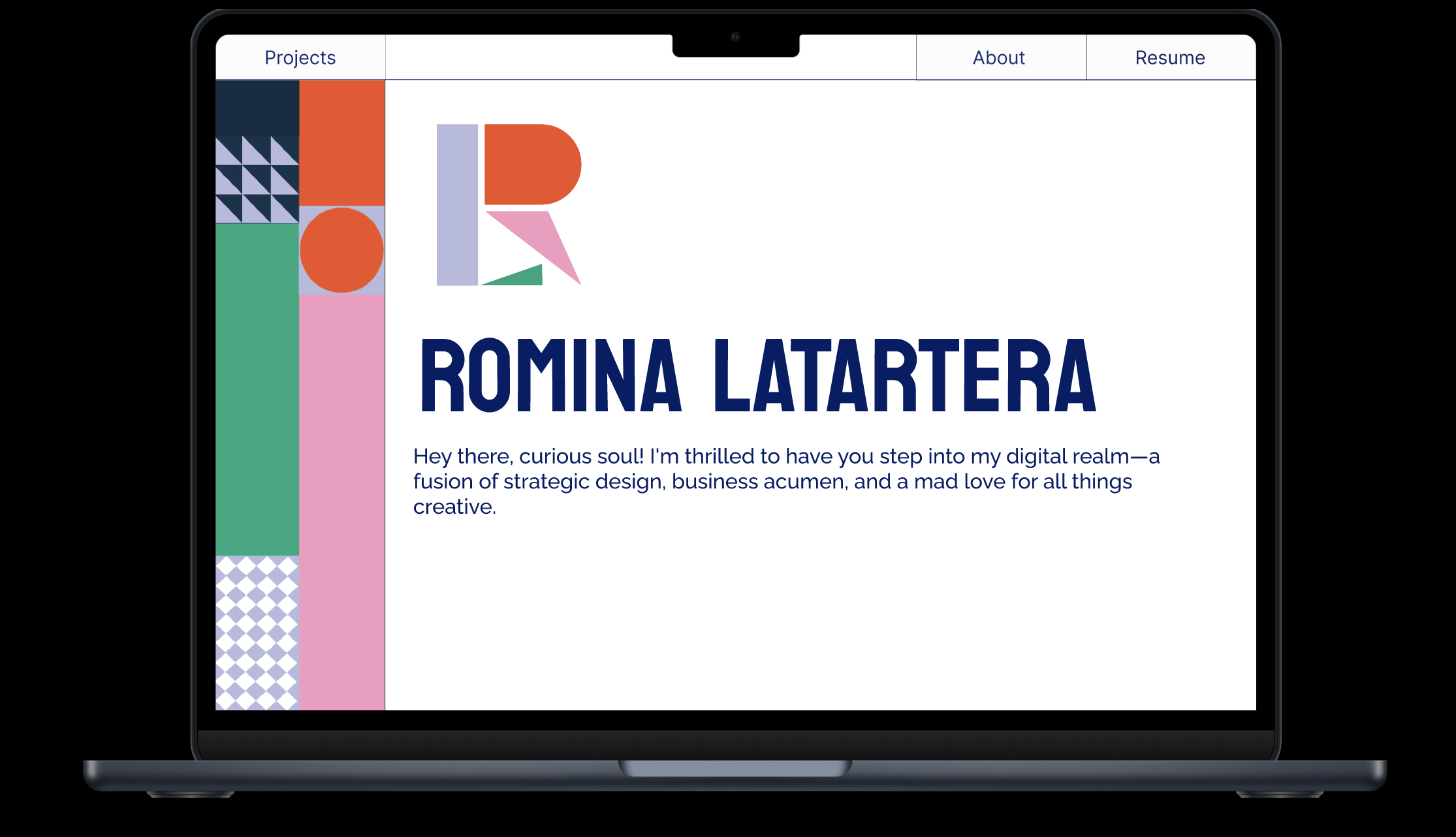
Responsive Mockup
Link to responsive mockup


Thumbnails & Sketches


Wireframes and Prototypes
Link to responsive wireframe prototype