Table of Contents
Voice
Daisy de Villenueve is a contemporary fashion illustrator based in London, England. Her personal website, www.daisydevillenueve.com, presents both her personal and editorial work. The goal of her website it to convey what sets her illustration apart from her contemporaries while emphasizing her experience in the fashion world and the sophistication of her designs and ideas. Her website is less for the general public and more to present her brand and experience to potential clients. This isn’t her personal blog, and the information included has less to do with her personal feelings and more to do with her professional work. Information provided is terse and to the point; images are left mostly unexplained to allow the work to speak for itself.
Daisy de Villenueve is:
- Funky
- Quirky
- Worldly
- Sophisticated
- Professional
Tone
The tone of Daisy de Villenueve's website varies depending on the page. Certain pages that are more text-centric contain a lot of information that might not necessarily be familiar to the casual viewer, while pages more focused on presenting images contain little to no text; text that does exist is terse and to-the-point. The effect is impersonal and can leave the reader wishing they knew more.
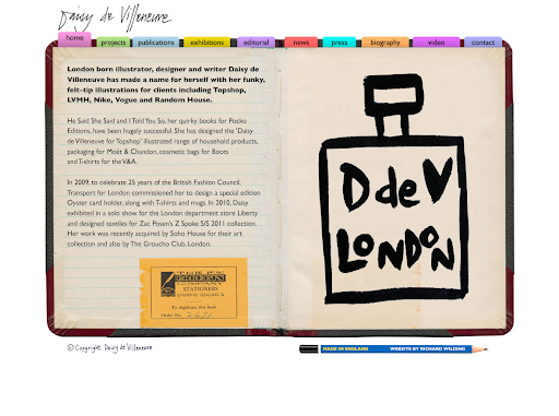
Home:
Text-based, presents highlights in de Villenueve’s career without much elaboration on particular brands she has illustrated for or awards she has received. Meant to impress those in-the-know and pique their interest, making them want to see the work that has attracted so much regard and so many well-known clients
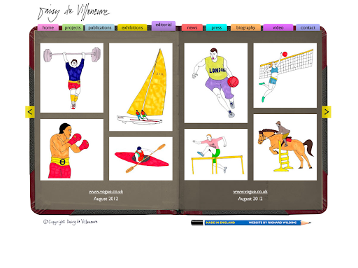
Content pages:
Pages that focus on presenting work, these are listed separate from one another in the navigation bar but are essentially similar. The text here is terse, factual, and non-descriptive. The emphasis on the following pages is allowing the work to speak for itself; no explanations of what or why are offered, only as much information as is needed to understand the context of the specific piece. There are no preview images, the viewer has to click through each photo individually.
- Projects: Explanations of design work de Villeneueve has done for different brands, including Moet & Chandon and Goodfellas pizza. Provides only as much context is needed to understand the piece, assuming that the viewer is familiar with the brands; the focus is mainly on the work itself. No descriptions of the pieces themselves are included.
- Publications: Provides minimal information about books de Villenueve has published, including number of pages, publication date, and where the books can be purchased. Factual and simple, the focus is once again on the images themselves.
- Exhibitions: No description of each exhibition is offered, only the images, the name of the exhibition, whether it is a solo or a group exhibition, the location, and the date.
- Editiorial: The only imformation offered is the name of the publication and the date which it was published. Instead of sample images, all images included in a particular editorial are included, but the information under each image is always the same.
News:
The news included isn’t personal updates; rather updates on new pieces she has done. Information provided for projects is similar to the information provided on the projects page, while the captions provided for everything else tend to be a little more in-depth than on their respective pages; information is still minimal, however.
Press:
Set up similarly to her Editorial page, provides screenshots of press with captions of where the screenshot is from and when it was published.
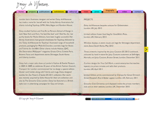
Biography:
A more in-depth version of the Home page, the biography page focuses not on her upbringing or personal life, but her professional experience. Her schooling and projects and editorials she has worked on are all mentioned, but not elaborated on. The assumption is that the reader is familiar with brands, magazines, and designers mentioned and needs no further explanation.
Videos:
Once again, videos are captioned only with the most essential information, e.g. dates, places, and titles.
Contact:
Provides contact info for gallery and press inquiries. Only as much information as necessary is provided.
Brand
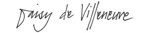
Daisy de Villenueve’s brand is both quirky and upscale. The only descriptive words used in www.daisydevillenueve.com to describe her work are “quirky” and “funky;” both these words appear on both the Home page and the Biography page. The bright colors featured in the website reinforce this playful image, as does her hand-written logo. Each page of the website is featured within the image of a hand-bound book with a pencil to the side, reinforcing the traditional way her images are created. The sophisticated aspect of her brand are mostly reinforced through the text, which name-drops the many brands and magazines she’s worked for; the visuals of the website support the quirky aspect of her brand more so than the high-fashion, exclusive nature of her work.
It can be argued, however, that the layout and design of her website are less "quirky" and more "amateur." The busyness of the colors and layout could take away from the simplicity and modernism that sets her illustration apart and distract a viewer from the actual artwork. The "book" surrounding each page doesn't seem to have much visually in common with de Villenueve's work and illustrative style and appears out of place. What little text there is can be dense and difficult to understand. The presentation on both the Home and Biography pages is less "funky" and more boring and unappealing.
Example Personas
Example 1: Potential Clients
A new fashion and design magazine aimed at young women ages 18-24, Cupcake, has seen Daisy de Villenueve’s work in other magazines, such as Elle and Nylon. Cupcake’s visual aesthetic aims to combine cutting-edge, modern design with playful, traditionally “girly” colors and visual motifs (e.g. hot pink teddy bears, hearts, makeup, etc). It aims to compete with larger fashion magazines by providing a fresh, young look at unknown designers and artists, as well as commenting on contemporary issues related to world of fashion and design. They are considering featuring Daisy de Villenueve’s illustrations in a feature on alternative perfumers they plan to run in an upcoming issue. They visit her website to see other examples of her work and to learn how they can contact her.
Home page: Immediately they are struck by the visual design of www.daisydevillenueve.com, and not in an entirely positive way. It is certainly different from the layout favored by many illustrators, which tends to be very simple and minimalistic, but seems a little amateurish. The colors and book layout seem more appropriate for the website of an illustrator of children’s books, and less for that of an internationally renowned fashion illustrator. Reading the information provided in the home page relieves the negative impact from the layout somewhat, as de Villenueve’s credentials certainly are impressive.
Content pages: Clicking through the Projects, Publications, Exhibitions, and Editorial pages, the editors at Cupcake continue to be impressed by de Villenueve’s work but also continue to be distracted by the layout of the page. They wish they could see the work without the surrounding notebook imagery, which is busy and takes away from the images, which are the focus. They find the navigation system, in which they have to reload the page every time they want to see a new picture, tedious.
Contact: The editors at Cupcake skip through the News, Press, and Biography pages, which contain information they find mostly redundant. On the contact page, they find a few emails, but not much information about which would be the right email for them to contact, what kind of inquiries are welcomed, etc. They decide to email one and hope for the best.
Overall, because the editors at Cupcake are so used to seeing beautiful graphic and web design and using it in their own magazine, they find the design of de Villenueve’s website to be jarring and distracting. They still are interested in featuring her work, but their overall impression of her is somewhat degraded.

Example 2: Collectors
Jenn Taylor, a buyer for Bloomingdales who collects fashion illustration in her spare time, picked up one of de Villenueve’s books at a store that specializes in art books and is interested in learning more about her and her work. She thinks that one of de Villenueve’s prints would work perfectly in the guest room of her apartment on the Upper West Side and is checking www.daisydevillenueve.com specifically to see if she has anything available for sale.
Homepage: Taylor is turned off by the busy and immature look of the website and isn’t particularly drawn in by any of the text on the front page. She thinks it looks like a wall of text and isn’t interested in reading any of it, although when she does she is impressed by the contents. It’s very different from every other fashion illustrator’s website she has used in the past.
Content pages: Taylor appreciates looking at de Villenueve’s work but would appreciate more information about the mediums de Villenueve uses. She also doesn’t like how she has to click through pages of one exhibit/editorial/etc to get to the next one and that there is no warning or preview of what she’ll see next, so she can’t pick and choose what she wants to look at. None of the work pages have any information about whether a particular piece is for sale, other than the books that Taylor is already familiar with, and where they can be bought.
News and Press: Taylor finds these pages redundant and finds the navigation, similar to the navigation of the content pages, to be cumbersome.
Biography: Taylor finds de Villenueve’s achievements impressive, but would like some more information about how de Villenueve became an illustrator, a topic that interests her as a collector. The way the Biography page is set up doesn't make her want to read it; it is a "wall of text" and she merely skims the information.
Contact: Taylor is disappointed that there is no information about where to buy prints of de Villenueve’s work.
Overall, Taylor found de Villenueve’s website to be diverting, but poorly designed and difficult to navigate. She finds another site, www.fashionillustrationgallery.com, de Villenueve’s work is for sale and decides to buy prints from them in the future.

Example 3: High School Student
Maya Peters is a sophomore in high school interested in fashion illustration. For her art class, she has to do a presentation on an artist she admires. This presentation consists of providing biographical information about the artist, with emphasis on what they were doing in their late teens and how that shaped their future careeer, and analyses of various pieces they produced through their lives. She has seen de Villenueve's work in Nylon magazine and is considering profiling her for her project.
Homepage: Maya glances over the info provided in the homepage. She is attracted to the picture on the left, but finds the overall layout of the site a little immature. She doesn't bother really reading any of the text provided.
Content pages: Maya gets bored of the constant clicking and the fact that she can't preview what images there are and has no idea how many more pictures she has to view. These pages don't provide much information for her presentation.
News and Press: She skims through this but again gets tired of the constant clicking. These pages include information that could be valuable for her presentation, but she doesn't see it.
Biography: Maya tries to read through this because she knows it's important for her project, but the tone is so dry and the information so spare that her eyes quickly glaze over. None of the biographical information she actually needs is provided.
Contact: Maya doesn't bother looking at this page.
Ultimately, Maya finds de Villenueve's site frustrating to use and decides to do her project on an other illustrator.
Wireframe

Copydeck (Home)
Title:
Home
Header:
London born illustrator, designer and writer Daisy de Villeneueve has made a name for herself with her funky, felt-tip illustrations including Topshop, LVMH, Nike, Vogue and Random House.
Body Copy:
He Said She Said and I Told You So, her quirky books fo rPocko Editions, have been hugely successful. She has desgined the ‘Daisy de Villenueve for Topshop’ illustrated range of household products, packaging for Moët & Chandon, cosmetic bags for Boots and T-shirts for the V&A.
In 2009, to celebrate 25 years of the British Fashion Council, Transport for London commissioned her to design a special edition Oyster card holder, along with t-shirts and mugs. In 2010, Daisy exhibited in a solo show for the London department store Liberty and designed textires for Zac Posen’s Z Spoke S/S 2011 collection. Her work was recently acquired by Soho House for their art collection and also by The Groucho Club, London.
Competition
Daisy de Villenueve's website differs greatly in design from many of her competitors. Many other fashion illustrators, like {x} and {y}, have simple, minimalist websites without excess imagery. {x}'s website, for example, has a completely white background with dark grey text and no other layout imagery. Each picture in each section has a preview image so the viewer knows exactly what they are about to view. The amount and character of the text is very similar to that of de Villenueve's site, but it is presented in a more palatable and easy-to-read way. There are no walls of texts here to confront the viewer.
Because de Villenueve's site differs so greatly in layout and look from the websites of her competitors, her site can look dated and silly and feel difficult to use in comparison. She could benefit from altering her navigation system to be more streamlined, providing preview images of her work, and either changing the design of the "book" that is her background to be more congruent with her work and her brand or getting rid of it entirely.