Step 1 - Develop Your Idea
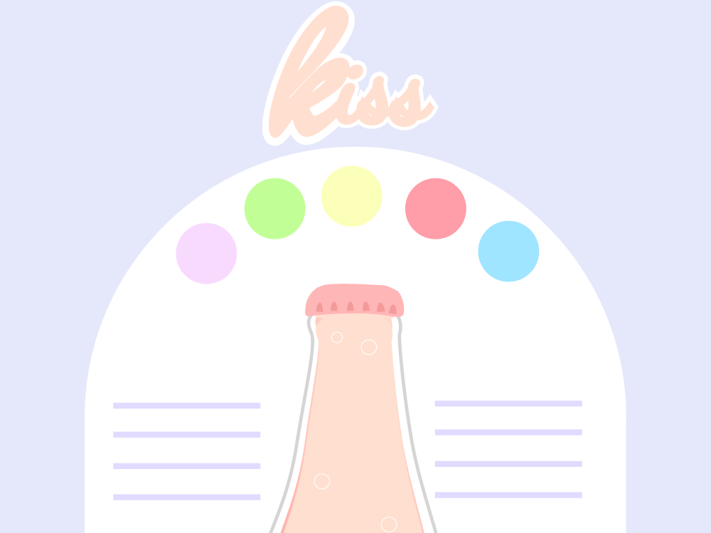
Kiss is a new malt beverage aimed at young women who like sweet, fruity drinks but aren't ready to start throwing down sorbet-flavored vodka or mixing their own cosmopolitans. Fruity, fun, and sweet, this 5% alcohol beverage comes in three different flavors, original, strawberry, and peach, and brings the fun without the headache the next day.
The goal of this website is to introduce this new product, convey its aesthetic and purpose to visitors to the website, direct them to places where they can buy Kiss, and convince them that Kiss is the best beverage to have at their next get-together.
Step 2 - Discovery and Research
I visited different websites for different kinds of alcohol, from high-end to novelty. Overall, it was difficult to find websites that were equally invested in creating an "experience" of the product in their web design as they were with simply conveying the relevant information.I split the different alcohols whose websites I researched into four categories: expensive, mid-priced, liquer, craft/local, malt, and female-targeted.
Expensive Alcohol
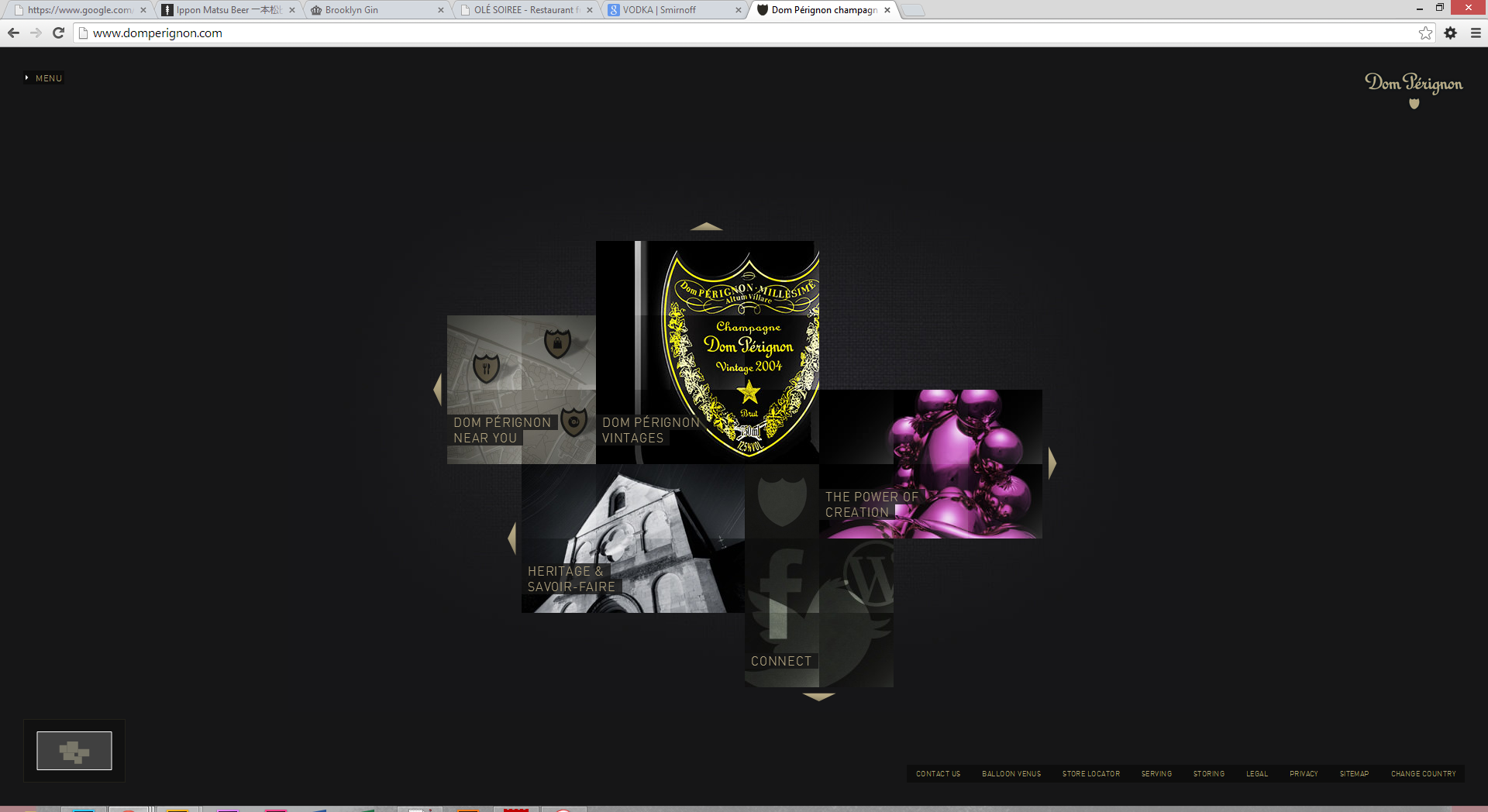
Expensive alcohols tended to have websites that were big on the "flash" (not necessarily actually using Flash itself, although some did), but were not as easy to use as is the standard for many websites today. Glutted with tricks and flourishes, they took time to load, were tiresome to navigate, and often did not even particularly reflect the brand's name or aesthetic. The Dom Perignon website is a particularly egregious example of this, in my opinion. Instead of looking sleek and interactive, it seems more concerned with its own impressiveness than with providing a good user experience.
Mid-Priced Alcohol
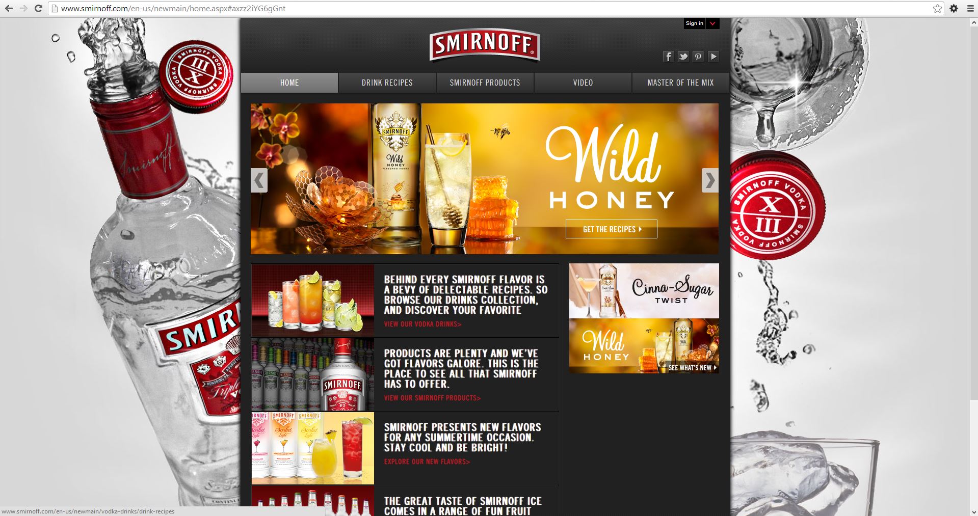
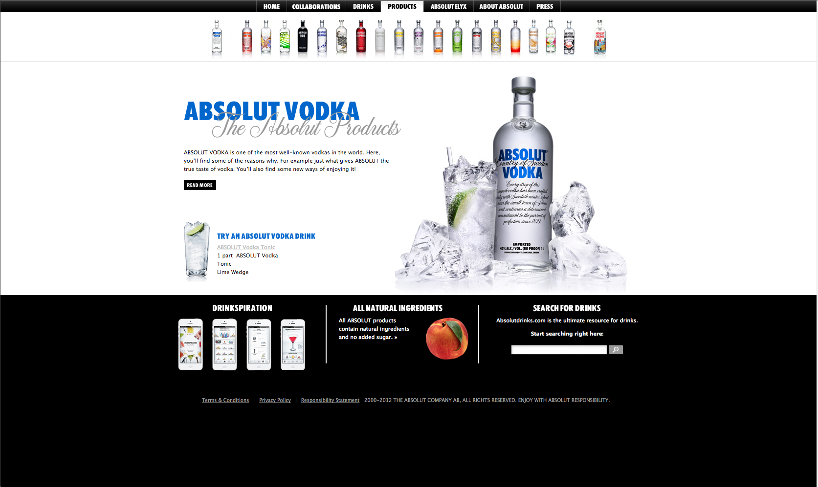
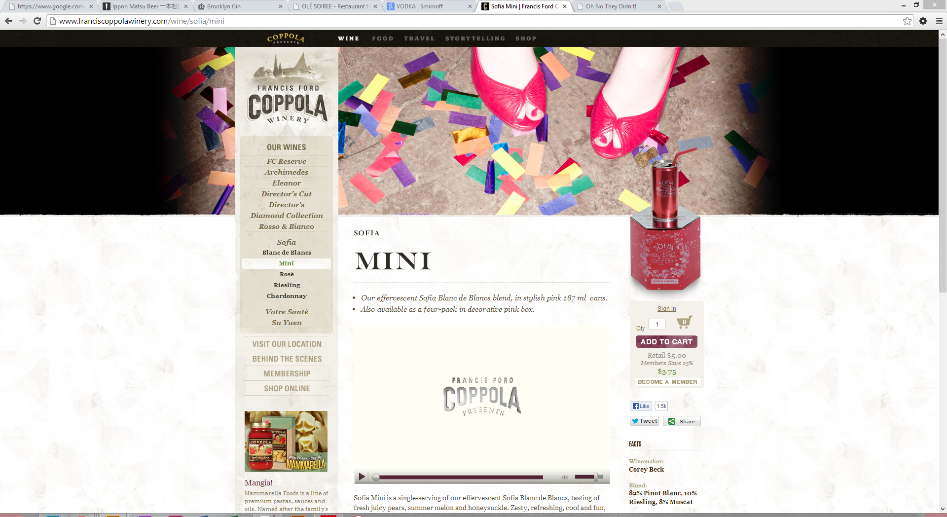
Mid-priced alcohol websites tended to have much more information-- in fact, maybe too much. Although they used beautiful images and some interesting layouts, because brands tended to have more sub-brands and varieties, their websites focused on a) conveying as much information about their different offerings as possible, and b) selling said offerings. Smirnoff, Absolut, and Francis Ford Coppola Wineries, with their myriad options, are all good examples of this. While fairly interesting, they can come off as mercenary and with the amount of aggressive promoting the brands appear to be doing on their own websites. The glut of information offered can also be daunting.
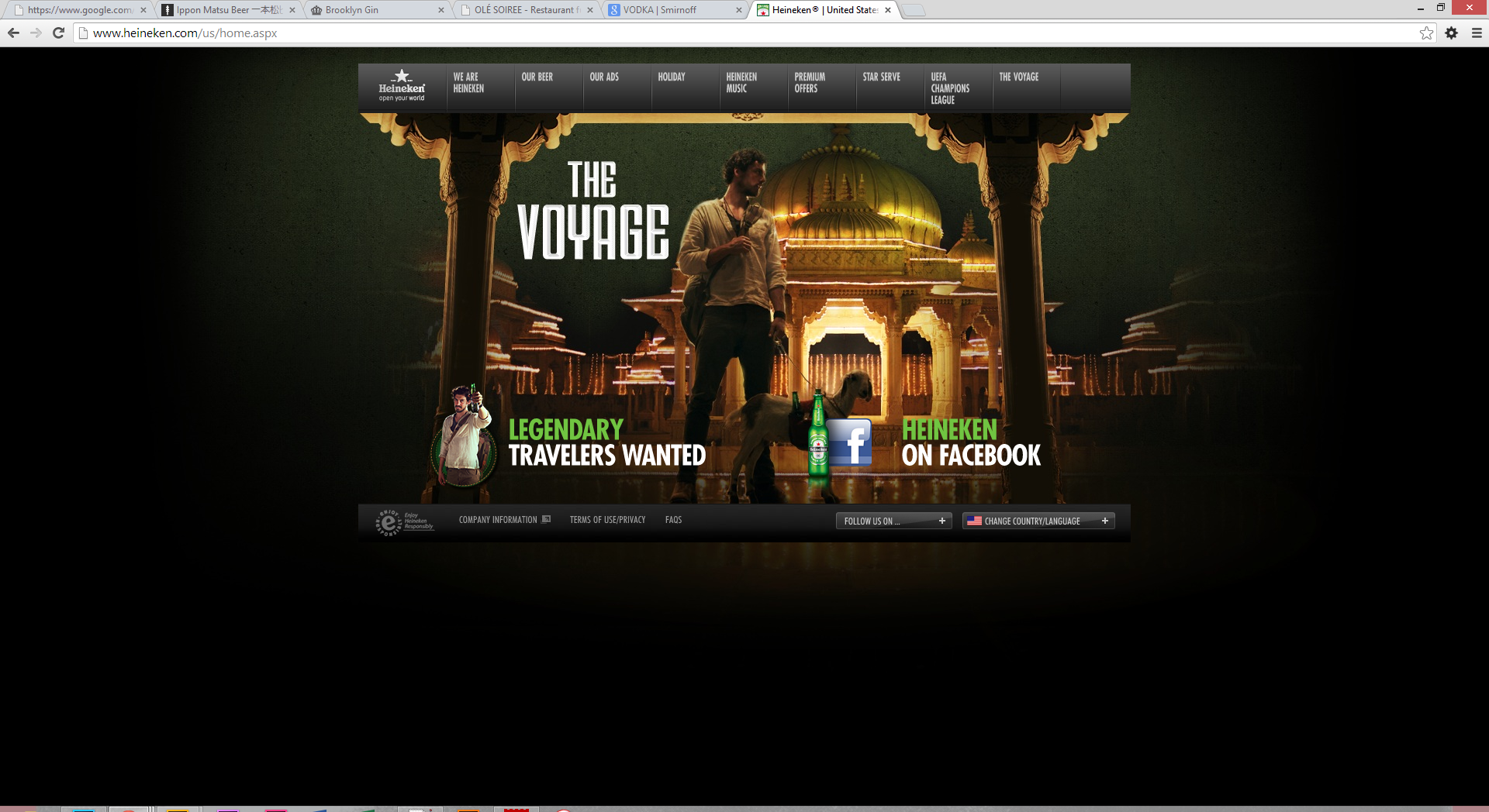
Heineken, although it doesn't have the in-brand variety that Smirnoff and Absolut have, also follows this model.
Liqueurs
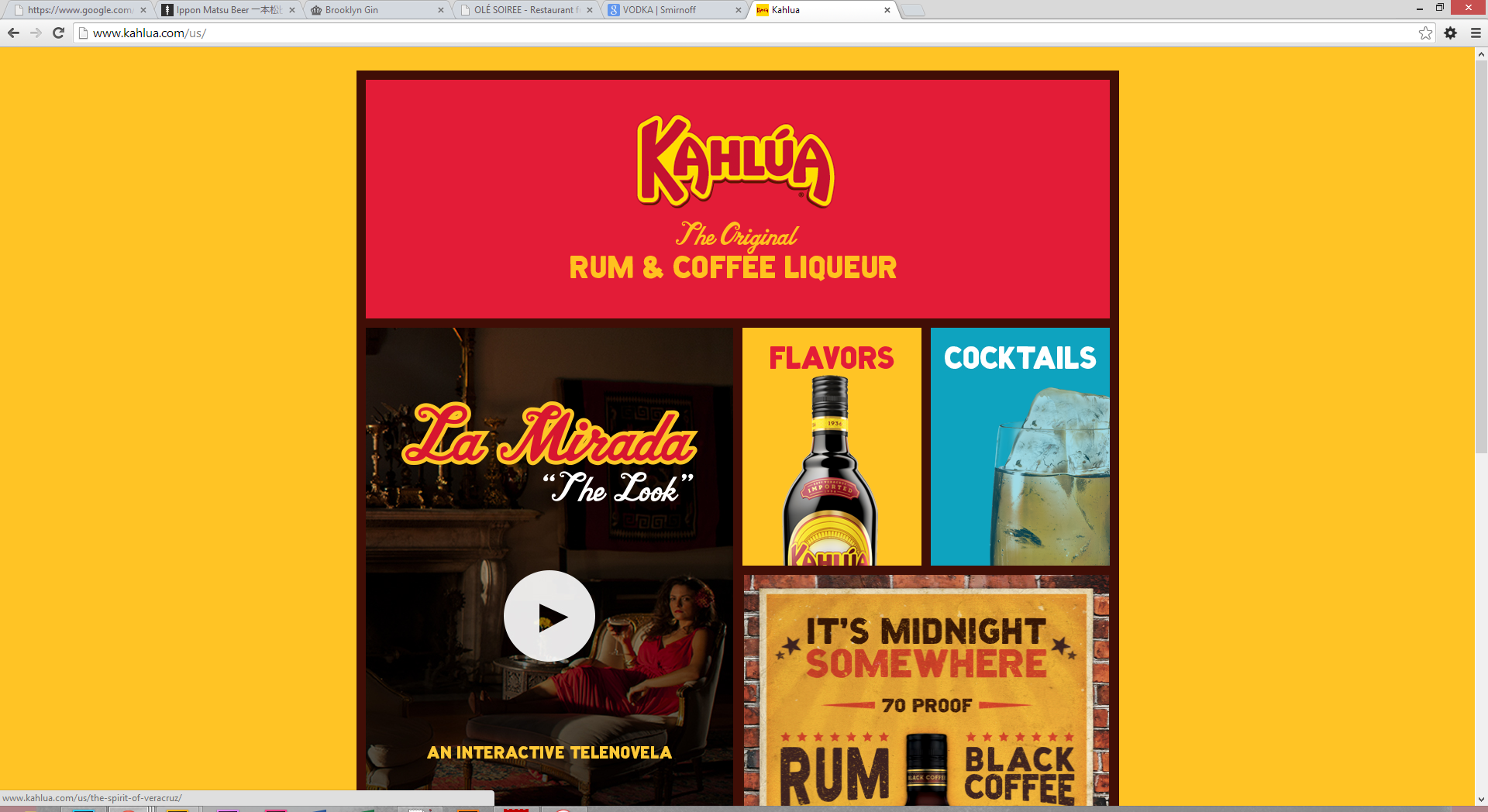
Liqueurs had some of the best websites I visited and provided much of the inspiration for Kiss's website. Rather than including interactivity for the sake of seeming clever, these websites combined interactivity and information in a way that informed and delighted the viewer and added to the user experience. Kahlua, especially, was a delight to peruse and encouraged the viewer to click through the website and learn more, instead of paralyzing them with information as Smirnoff's did.
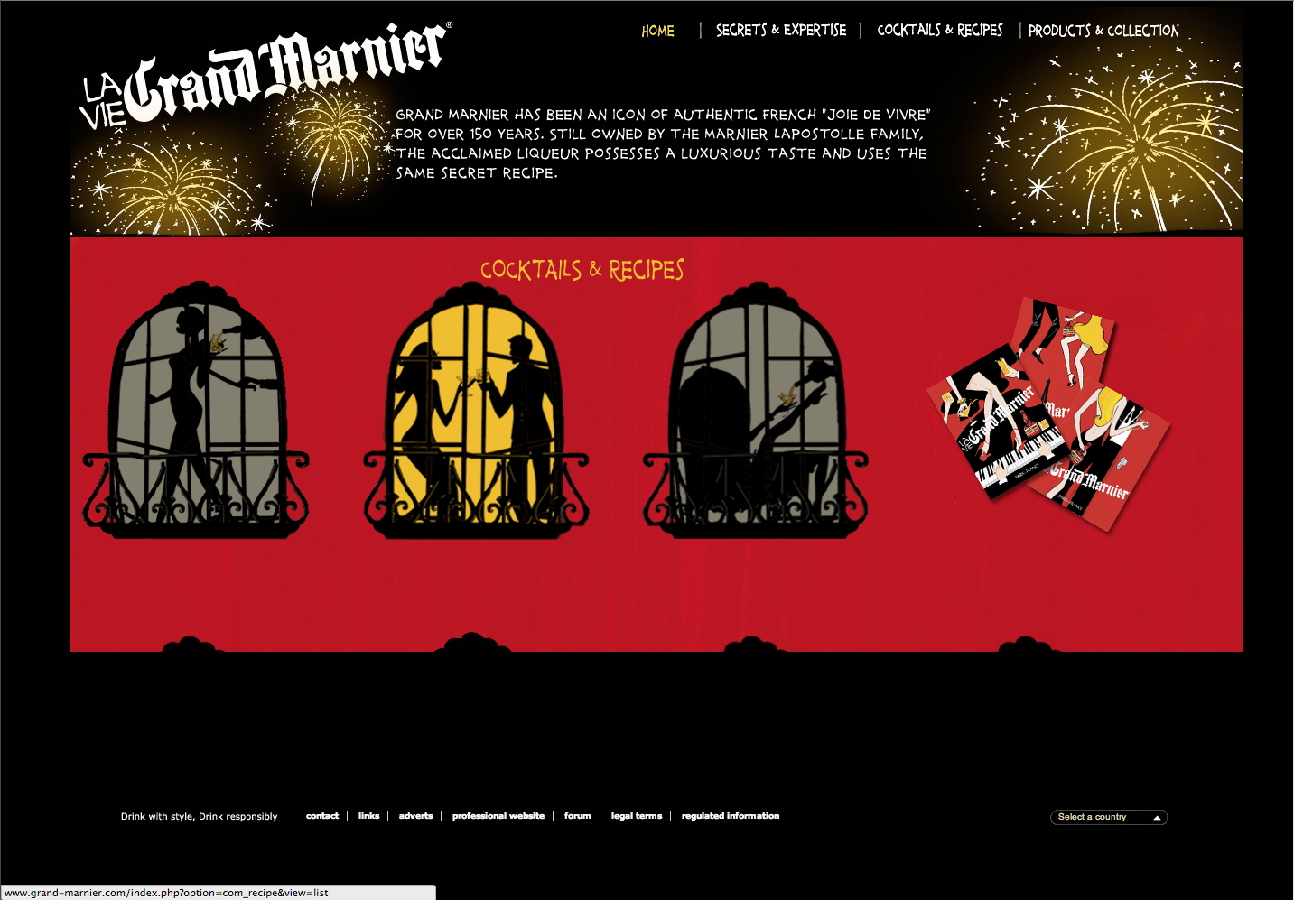
It must be noted that not all liqueur websites were as successful as Kahlua's; Grand Marnier's website is notably clumsier. However, it makes a valiant effort to achieve the same ends Kahlua does.
Craft Alcohol
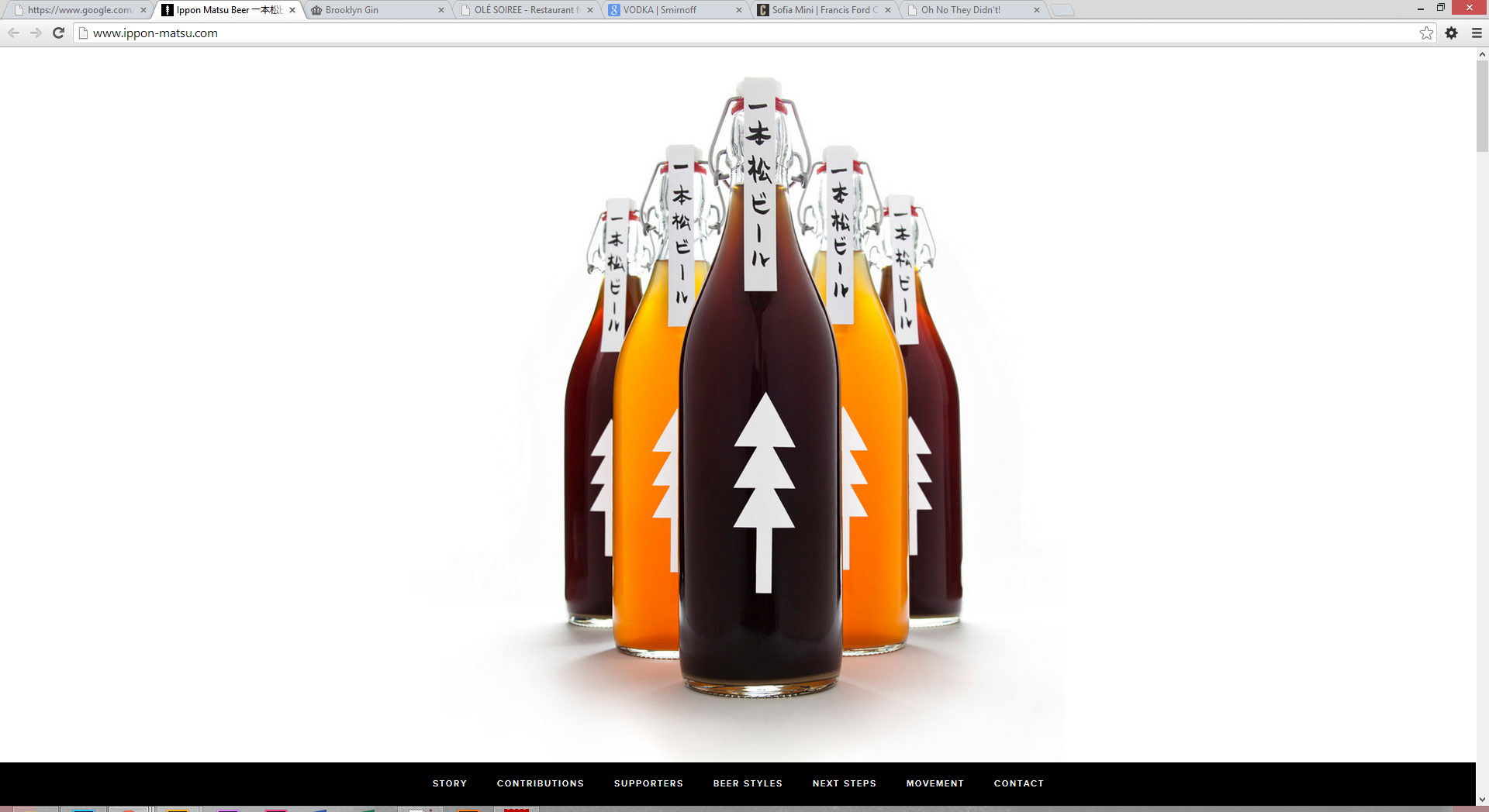
Craft alcohols were, on the whole, clean and easy to peruse, although they tended to be more minimalist and typographical than liquer websites, and lacked the same sense of fun and adventure. Ippon Matsu beer, a locally-produced beer with limited availability, has one of the best websites in this category: an elegant website that is easy to navigate and invites exploration. It's not quite as interesting as Kahlua's website, although it makes a valiant attempt.
Generally speaking, however, most of these websites, so concerned with minimalism, tend to be more boring than anything else.
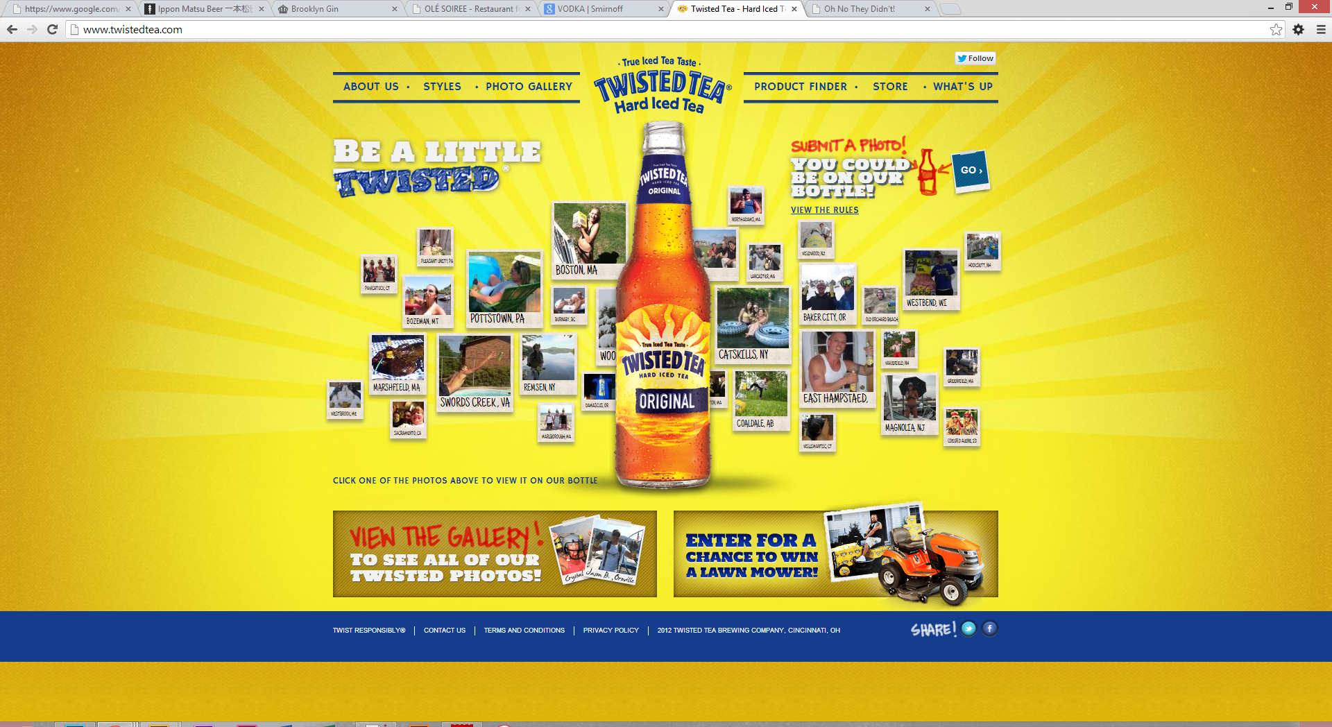
Malt Liquor
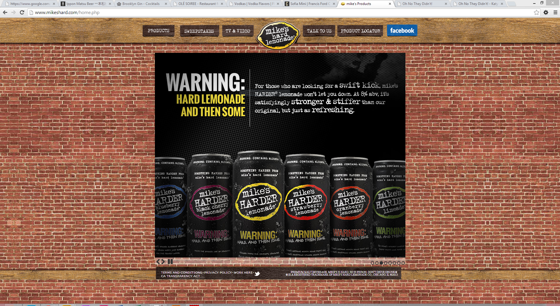
Websites for malt liquors generally have the same aspects of websites of mid-priced alcohols, but clumsier. Mike's Hard is by far the worst in this category: cheesy, amateur, and irritating.
Twisted Tea fares better, but is still too self-referential to be enjoyable, and one cannot help but feel pandered to.
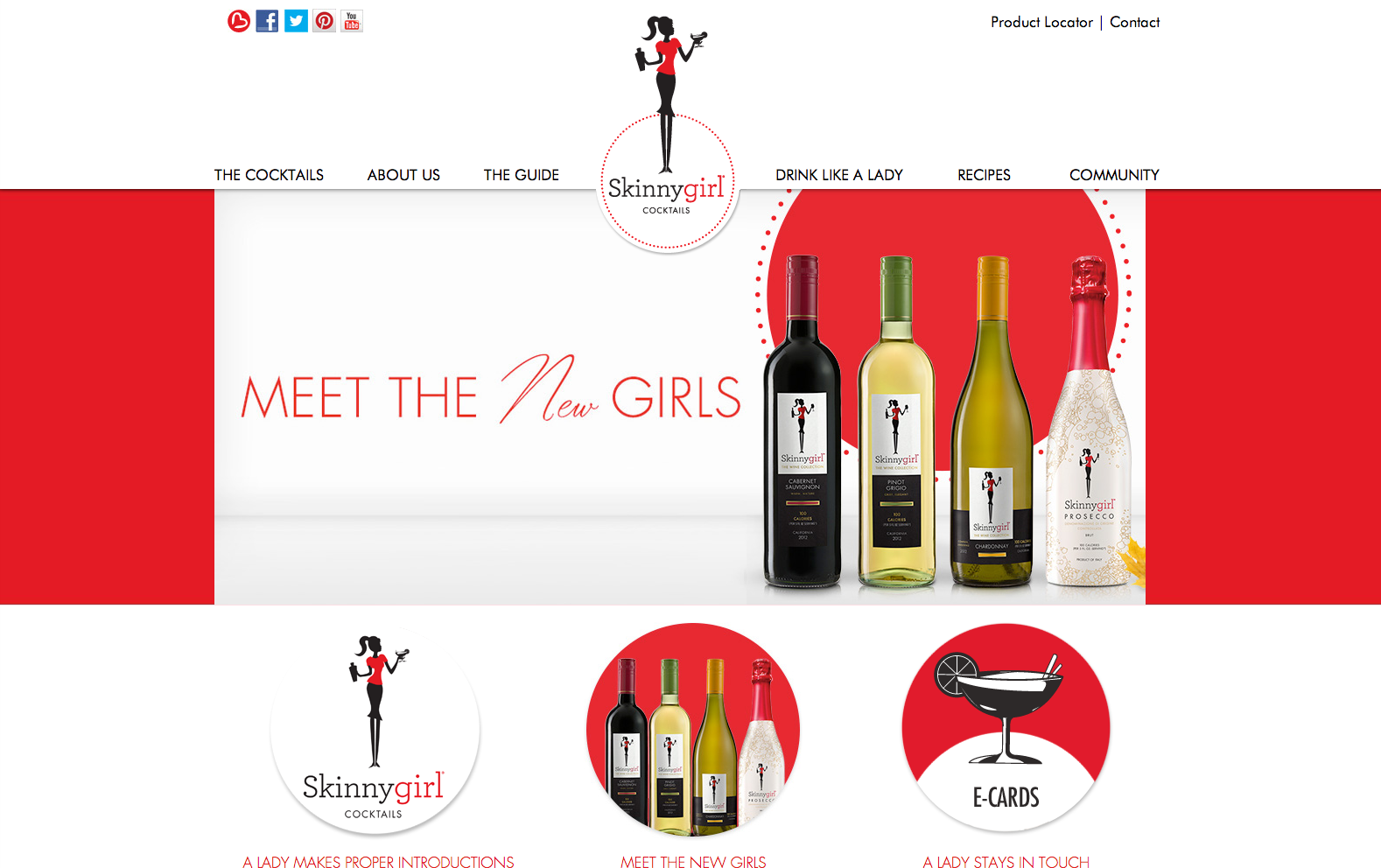
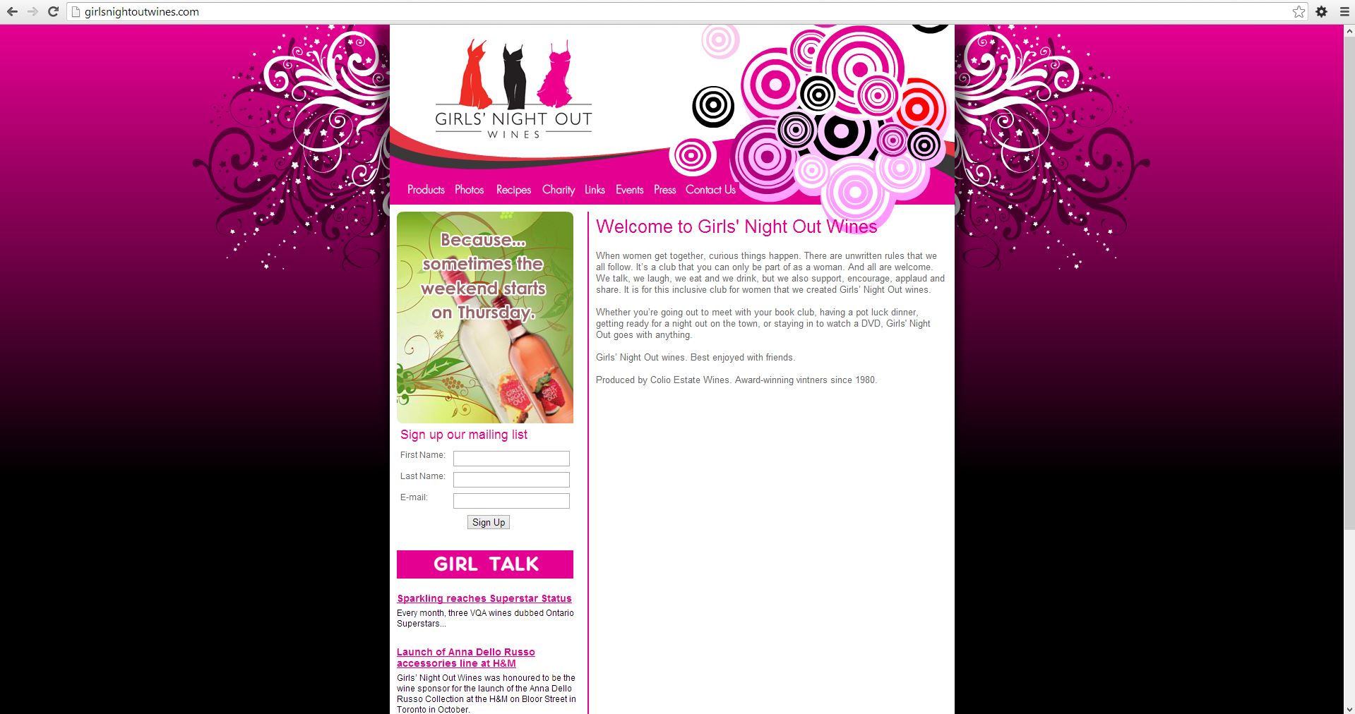
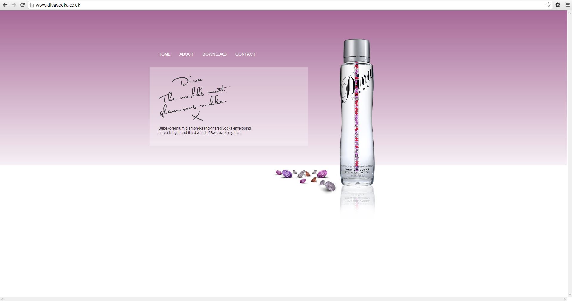
Woman-Targeted Brands
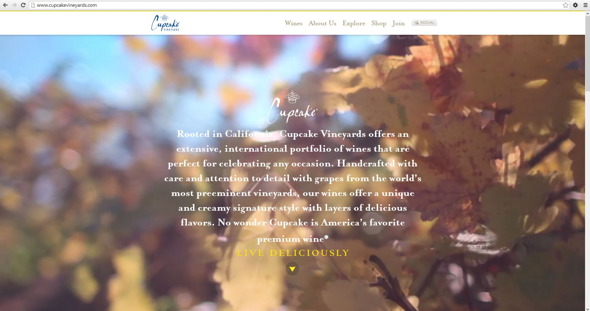
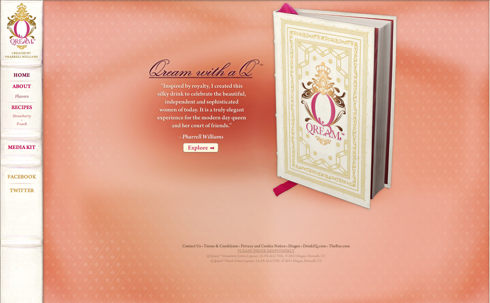
Finally, there are the websites of brands targeted specifically at women. Many of these fall into previously-stated categories, such as SkinnyGirl Cocktails under mid-priced brands and Qream Liqueur under liqueurs. Quality and layout-wise, they run the gamut. Why separate them? Mainly to differentiate between those that pander and deal in negative stereotypes about women (SkinnyGirl, Girl's Night Out, Diva Vodka) and those that seek to take what is generally a less-respected niche and elevate it with a good product a truly elegant website (Cupcake). (Qream falls in between these two categories: the idea could be elegant and enjoyable, similar to Kahlua's website but pinker, but because it is poorly executed it falls short.) A slightly tangential point, more ideological than web design-oriented, but it is important to me that Kiss doesn't condescend to women in both its branding and and its design.
Step 3 - Target Your Audience
The audience I am targeting with this website are consumers of Kiss, possible advertisers, and stockists. Each of these people have specific needs and desires.
Consumers
Kiss's main audience is young women ages 21-30, focusing primarily on the party set. Kiss is not meant to be a beverage that you nurse over an elegant dinner; it is a fun beverage that you have in one hand while you're on the dancefloor or flirting with someone at a bar. If one of the women who choose Kiss at a party decide to visit the website to learn more about what they're drinking, the design of the website should reflect the fun, lighthearted situations in which they are used to encountering Kiss. Content-wise, the website should quickly and easily provide the information they are looking for, while unobtrusively and naturally introducing other things to do on the site that would convince them to spend more time there.
What are these women who visit Kiss's website looking for? This is an important question for determining the hierarchy of information on the site. This will mainly be a consumer-oriented website, with tangential information for stockists and advertisers. All information consumers could be looking for must be featured, including nutritional information, where to buy, available options, and drink ideas. In addition to this content, content like games, videos, and other "fun" content will be included to convince each user to spend more time on the site.
Advertisers and Stockists
A secondary audience for the website will be stockists and advertisers. Links to press information, a media kit, and contact information will be included in a footer so that they are readily available but do not take away from the main focus of the site.
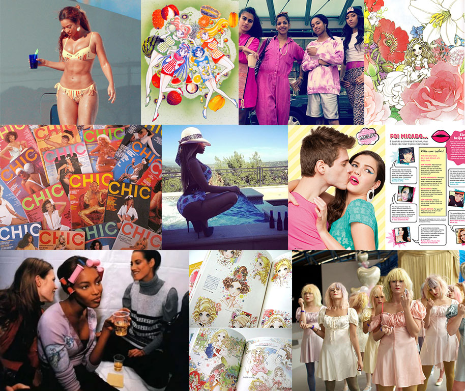
Step 4 - Inspiration
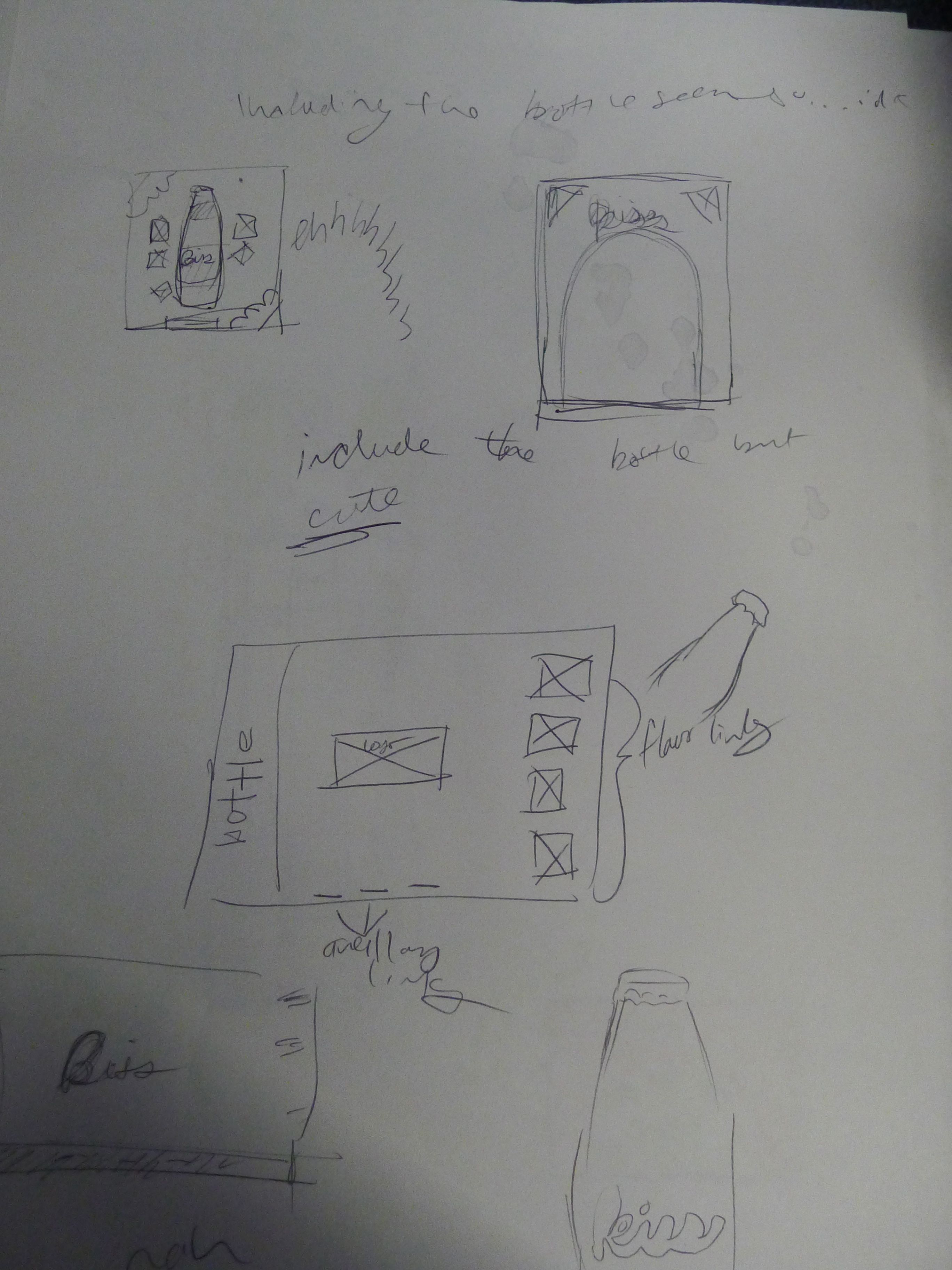
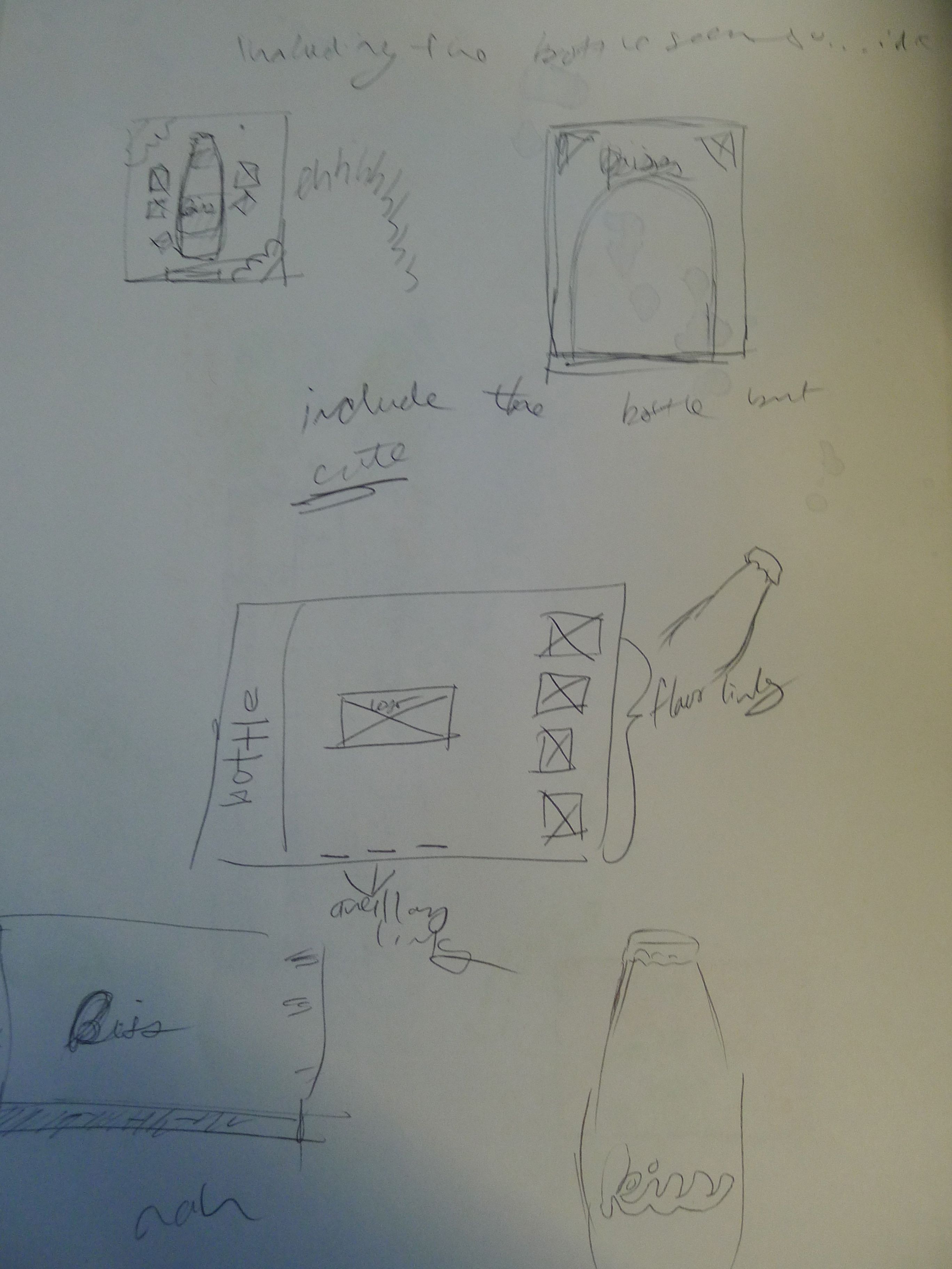
Step 5 - Thumbnails
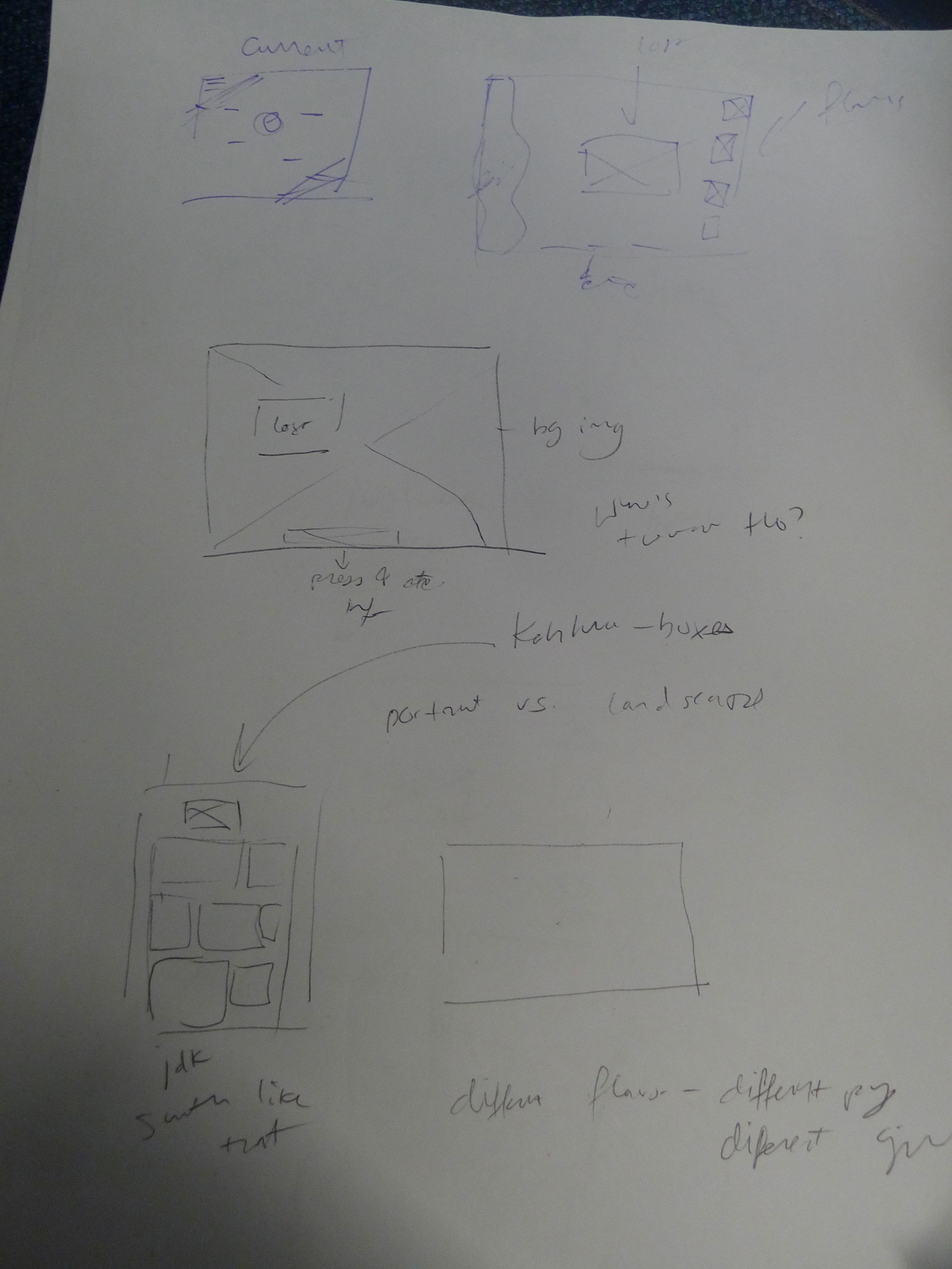
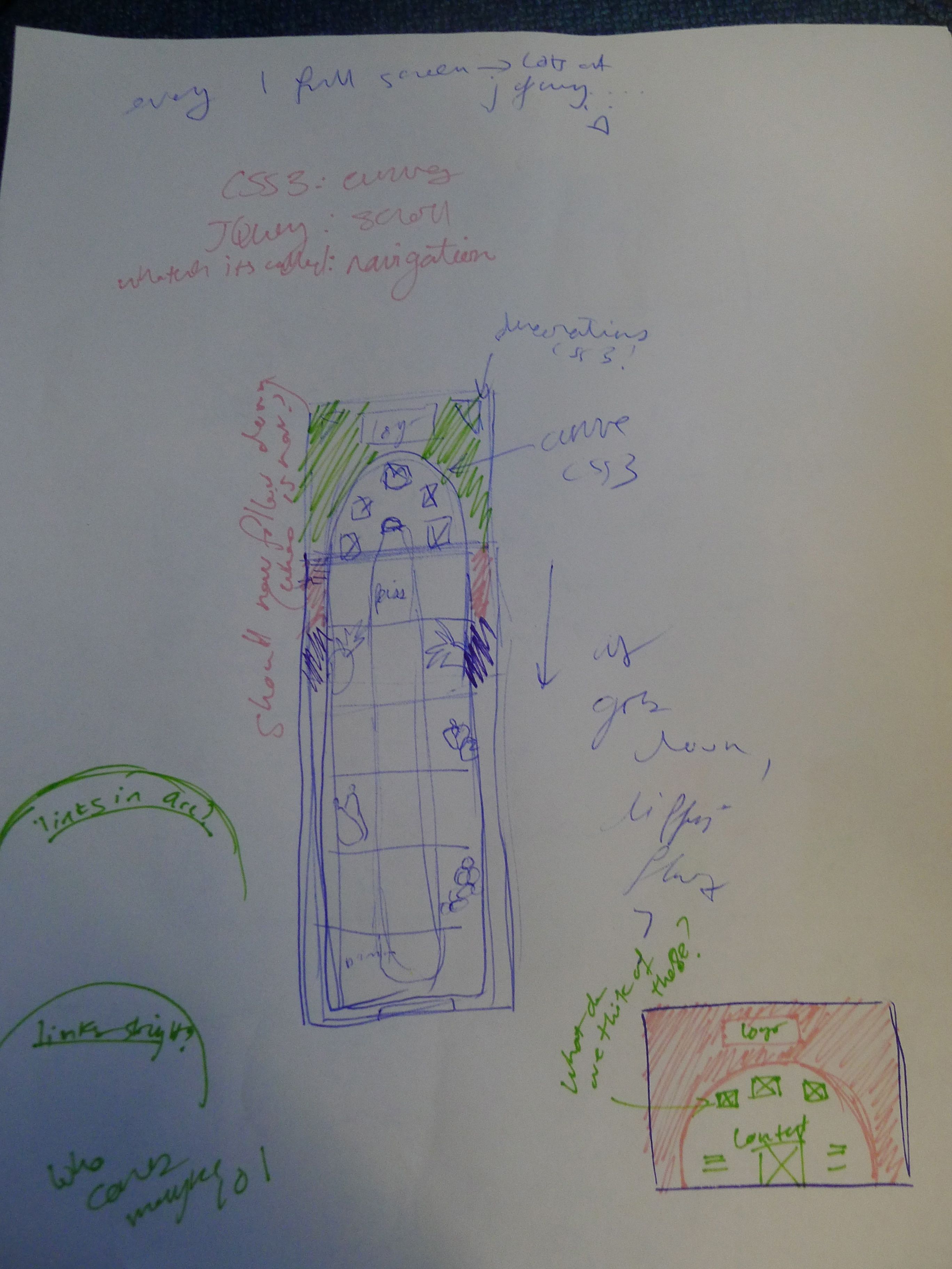
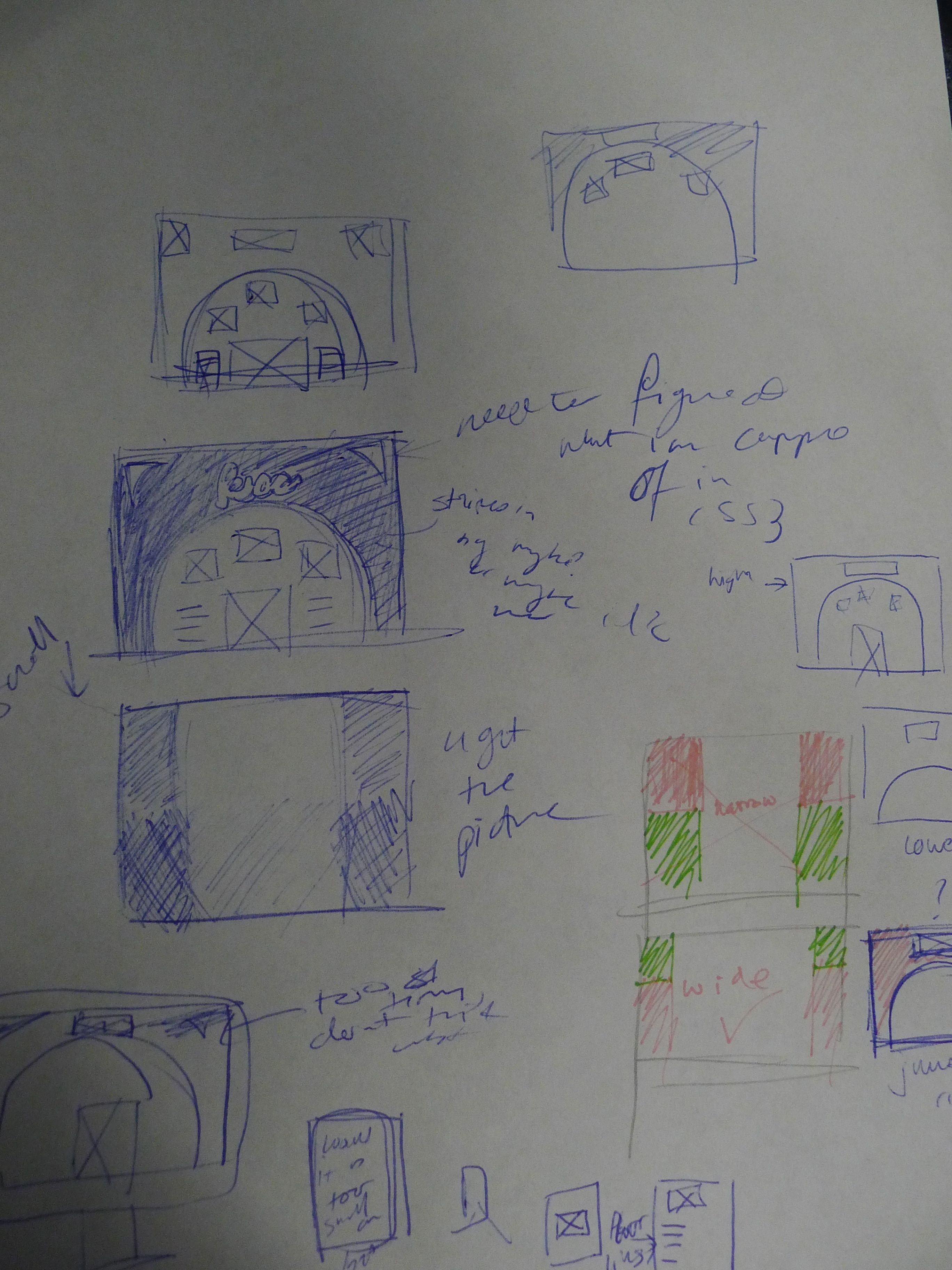
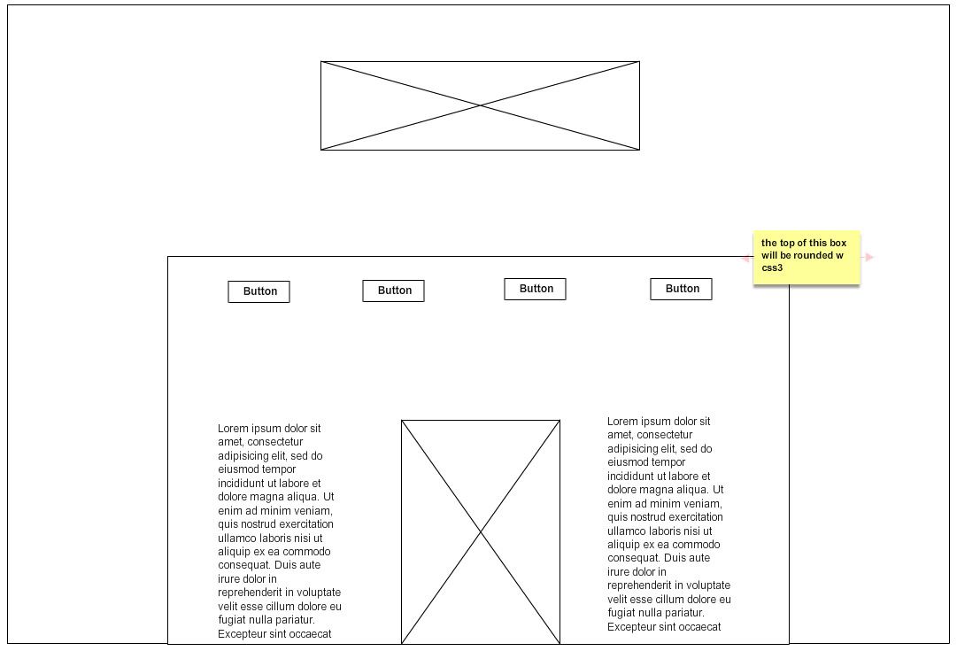
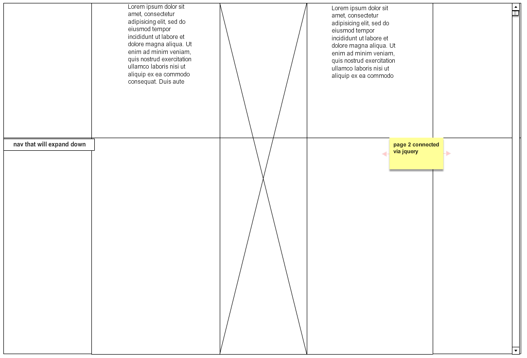
Step 6 - Wireframes
Step 7 - Photoshop Comp
(Colors approximate)