Step 1 - Develop Your Idea
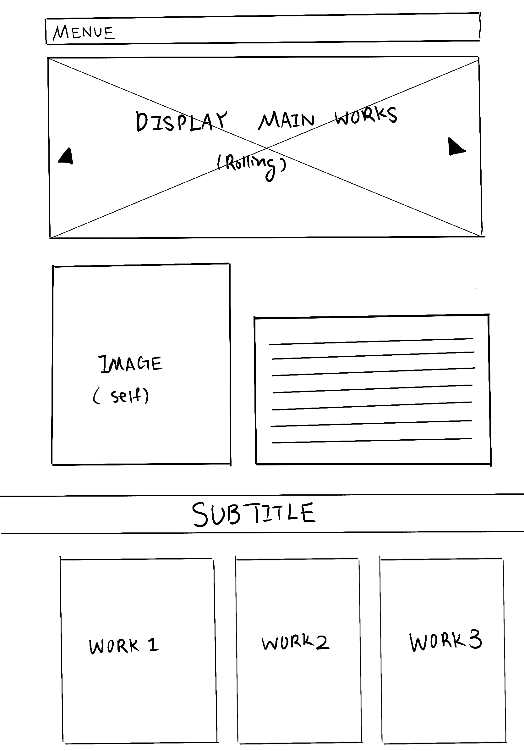
As a student majored in illustration and minored in creative coding, the goal of my website is to not only assemble my creative designs to make them easily accessible, but also to utilize the website as form to more effectively convey my illustrated story not only through the creative art techniques, but also through the audience’s interaction with the form and content these works are assembled into—the portfolio website. In additional to the socializing intention, the website also serves as a platform to facilitate speedy and easy access of contact and trading information.
Step 2 - Discovery and Research
I initiated my research process by conducting an in-depth exploration of the methodologies employed by diverse illustration designers in developing interactive user experiences on their websites. The objective was to effectively convey their illustrative narratives in a more explicit and vibrant manner. Presented below are examples showcasing distinctive approaches utilized by various illustration designers in terms of layout arrangement and interactive user experience design, resulting in a significant divergence in the artistic message and voice conveyed to the audience.
"Yancke van Tonder"
https://www.yancke.com
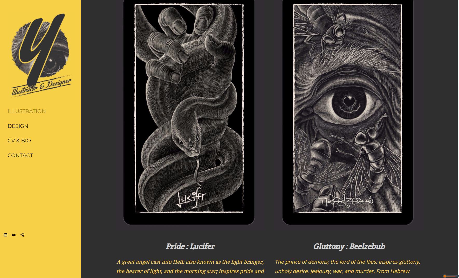
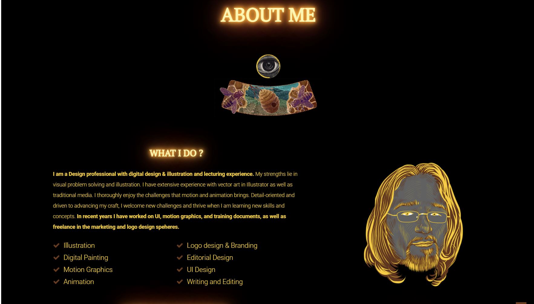
Yancke van Tonder is a professional illustrator who engages in traditional illustrations, motion graphics, logo design, and UI design. His website, which showcases his variety of traditional illustration projects, are presented with animated user experience. For instance, he purposely makes some of his illustrated elements interactive by animating them while the web user hovers their mouse over it. Especially in his CV and Bio page, he created animated effects that too makes his personal identity stand out more as a creative artist who are not so restricted by traditional forms and rules.
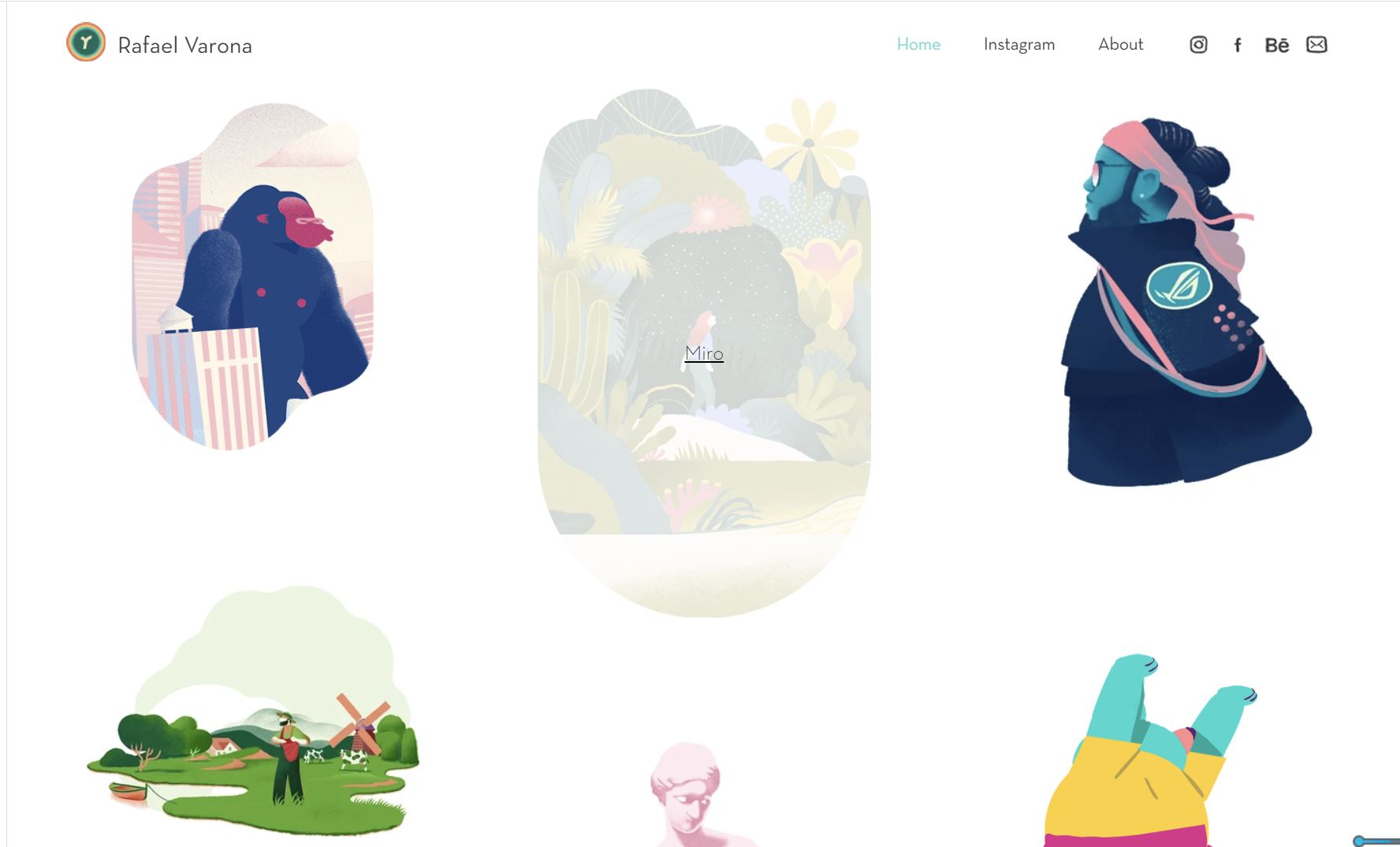
"Rafael Varona"
https://www.rafaelvarona.com/
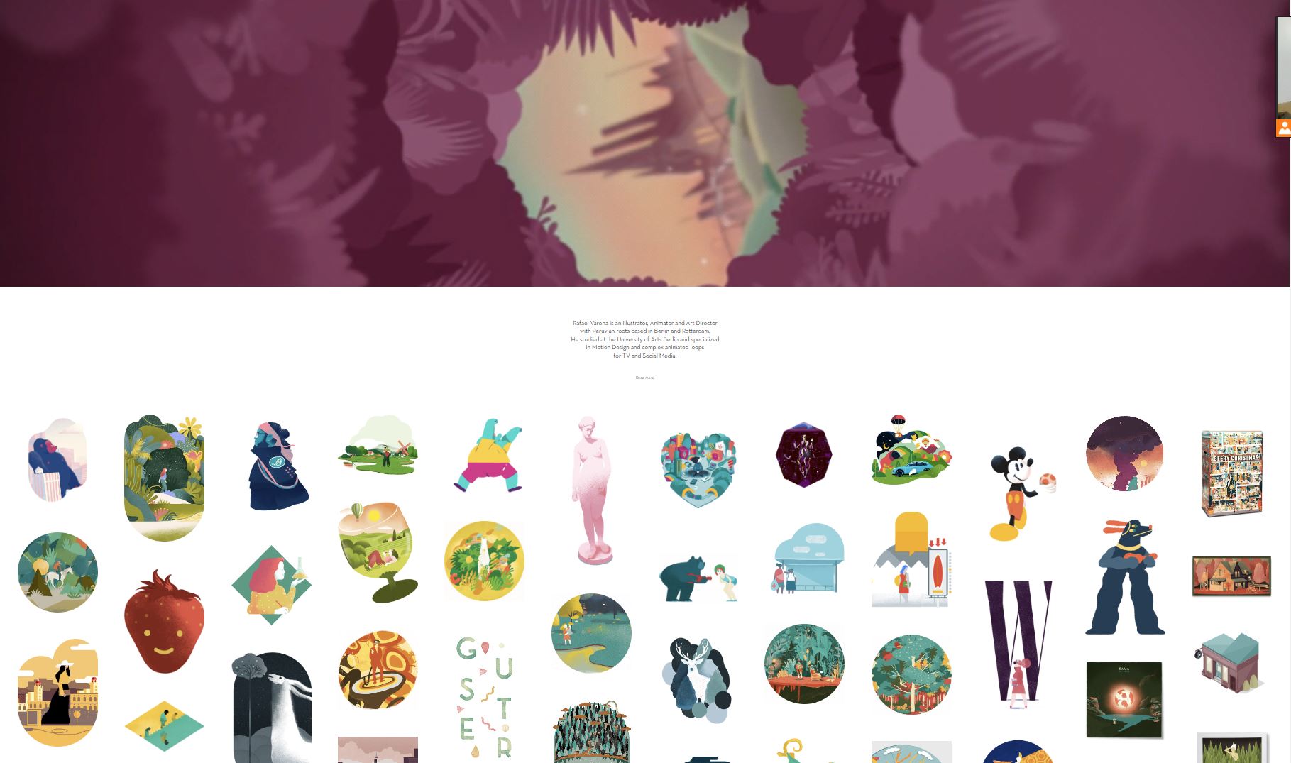
Rafael Varona is an Illustrator who is also specialized in Motion Design. The way he layouts his website is also specialized for his strength at motion illustration design. This is definitely a novel way to express content that he desires to express through his creative works. Rafael created whole big section of his home page for his animated illustration, like a movie theatre’s screen amplifying the visual effect of the animated illustration. In addition Rafael makes each of his individual animated illustration more engaging to the audience by designing a user experience that triggers the motion of each illustrations as the user scrolls down the page.
Step 3 - Target Your Audience
The targeted audience of my portfolio website encompasses a wide range of individuals, ranging in age from approximately 15 to 50. This diverse group comprises students and working professionals, reflecting a broad demographic spectrum. The primary segments within this audience consist of potential clients, collaborators, and art enthusiasts who actively seek inspiration.
One notable characteristic of this audience is their openness to new artistic forms, embracing various mediums and innovative approaches. They are receptive to exploring diverse user experiences and have an appreciation for creative ideas.
Wireframe
