- Website Analysis*
Week 3
- landing page— links to your assignments and a picture next to your name.
- HTML markup of Analysis
Digital Style Guide
http://www.qishenli.com/
Qishen Y. Li
Table of Contents
• voice
• tone
• brand
• Example Personas
• potential client
• collector
• student
• wireframe
• copy deck
• competition
Voice
Qishen Li is a contemporary fashion designer based in New York, USA. His personal website, presents both his personal and editorial work in order to sell the designs he created. The goal of the website is for the general public and more to present his brand and designs to potential clients. This is not his personal blog, and the information included has less to do with his personal feelings and more to do with her professional work. Information provided is terse and to the point; images are left mostly unexplained to allow the work to speak for itself.
Qishen Y. Li is:
• Passionate
• Worldly
• Sophisticated
• Professional
Tone
The tone of Qishen’s website varies depending on the page. Certain pages that are more text-centric contain a lot of information that might not necessarily be familiar to the casual viewer, while pages more focused on presenting images contain little to no text; text that does exist is terse and to-the-point. The effect is impersonal and can leave the reader wishing they knew more.
Home:
Image-based, presents highlights in Qishen’s newest collections. Meant to impress well-known and potential clients and pique their interest, making them want to see the work that has attracted so much regard.
Content pages:
Pages that focus on presenting sales items and work, these are listed separate from one another in the navigation bar but are essentially similar. The images and text here are terse, factual, and non-descriptive. The emphasis on the following pages is allowing the work to speak for itself; no explanations of why are offered, only as much information as is needed to understand the context of the specific piece. There are preview images, the viewer are also click through each photo individually.
• Collections: Explanations of design work Qishen has done for different brands, including Moet & Chandon and Goodfellas pizza. Provides only as much context is needed to understand the piece, assuming that the viewer is familiar with the brands; the focus is mainly on the work itself. No descriptions of the pieces themselves are included.
• Editiorial: The only imformation offered is the name of the publication and the date which it was published. Instead of sample images, all images included in a particular editorial are included, but the information under each image is always the same.
News:
The news included isn’t personal updates; rather updates on new pieces he has done. Information provided for projects is similar to the information provided on the projects page, while the captions provided for everything else tend to be a little more in-depth than on their respective pages; information is still minimal, however.
Press:
Set up similarly to his Editorial page, provides screenshots of press with captions of where the screenshot is from and when it was published.
Biography:
A more in-depth version of the Home page, the biography page focuses not on his upbringing or personal life, but his professional experience. His schooling and projects and editorials she has worked on are all mentioned, but not elaborated on. The assumption is that the reader is familiar with brands, magazines, and designers mentioned and needs no further explanation.
Videos:
Once again, videos are captioned only with the most essential information, e.g. dates, places, and titles.
Contact/Social Media:
Provides contact info for gallery and press inquiries. Only as much information as necessary is provided.
Brand
Qishen’s brand is both sophisticated and upscale. The only descriptive words used in www.qishenli.com to describe his work are “sophisticated” and “iconic” both these words appear on both the Home page and the Biography page. The sophisticated aspect of his brand are mostly reinforced through the text and images of the clothing; the visuals of the website support the iconic aspect of his brand more so than the high-fashion, exclusive nature of his work.
Example Personas
Example 1: Potential Clients
Vogue has seen Qishen’s work on his website. It aims to compete with the largest fashion magazines in the world by providing a fresh, young look at fashion designers and artists, as well as commenting on contemporary issues related to world of fashion and design. They are considering featuring Qishen’s designs in a feature on a spread they plan to run in an upcoming issue. They visit his website to see other examples of his work and to learn how they can contact him.
Home page: Immediately they are struck by the visual design of www.qishenli.com, and not in an entirely positive way. It is certainly different from the layout favored by many designers, which tends to be very simple and minimalistic, but seems a little amateurish. Reading the information provided in the home page relieves the negative impact from the layout somewhat, as Qishen’s credentials certainly are impressive.
Content pages: Clicking through the Projects, Publications, Collections, and Editorial pages, the editors at Vogue continue to be impressed by Qishen’s work. Contact: The editors at Vogue skip through the News, Press, and Biography pages, which contain information they find mostly redundant. On the contact page, they find a right email and social media contacts.Overall, because the editors at Vogue are so used to seeing beautiful graphic and web design and using it in their own magazine, they are highly related to the design of Qishen’s website.
Example 2:Fashion Buyers
Chris O’Connor, a buyer for Saks Fifth Ave who collects fashion lines, saw one of Qishen’s design pieces from Parsons School of Design Exhibition and is interested in learning more about him and his work. He thinks that one of Qishen’s collection would make a good sale in Saks Fifth Ave New Yrk sotre. He is checking www.qishenli.com specifically to see if he has anything available for sale.
Homepage: Chris is turned off by the busy and immature look of the website and isn’t particularly drawn in by any of the text on the front page. He thinks it looks like a wall of text and isn’t interested in reading any of it, although when he does he is impressed by the contents. It’s very different from every other fashion designer’s website she has used in the past.
Content pages: Chris appreciates looking at Qishen’s work but would appreciate more information about the mediums Qishen uses.
News and Press: Chris finds these pages redundant and finds the navigation, similar to the navigation of the content pages, to be cumbersome.
Biography: Taylor finds Qishen’s achievements impressive, but would like some more information about how Qishen became a designer, a topic that interests him as a buyer. Contact: Chris is satisfied with the way how Qishen created in order to be contacted. Overall, Chris found Qishen’s website to be diverting and decides to buy his most recent clothing collection from him in the future.
Example 3: Competitors
Yohji Yamamato is a successful Japanese fashion designer. He would like to browse other fashion designers’ website in order to get the most updated trends and their work. Homepage: Yohji glances over the info provided in the homepage. He is attracted to the picture on the left, but finds the overall layout of the site a little immature. He does not bother really reading any of the text provided.
Content pages: Yohji gets bored of the constant clicking and the fact that he can't preview what images there are and has no idea how many more pictures she has to view. These pages don't provide much information for her presentation.
News and Press: He skims through this but again gets tired of the constant clicking. These pages include information that could be valuable for his presentation, but he doesn't see it.
Biography: Yohji tries to read through this because he knows it's important to understand his competitors’ work, but the tone is so dry and the information so spare that his eyes quickly glaze over.
Contact: Yohji doesn't bother looking at this page as he does not have intention to collaborate with Qishen.Ultimately, Yohji finds Qishen’s site frustrating to use and decides to eliminate Qishen as one of his competitors.
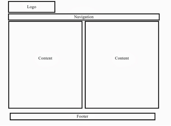
Wireframe

Blocks Copydeck (Home)
Title:
Home
Header:
London born fashion designer Qishen Y. Li has made a name for himself with his sophisticated designs including Oscae Da le Renta, Prabal Gurung.
Body Copy:
Shop the iconic QiQi by Qishen.
Competition
Qishen Y Li’s website differs greatly in design from many of her competitors. Many other fashion designers, like http://www.stellamccartney.com and https://us.burberry.com have simple, minimalist websites without excess imagery. http://www.stellamccartney.com 's website, for example, has a completely white background with dark grey text and no other layout imagery. Each picture in each section has a preview image so the viewer knows exactly what they are about to view. The amount and character of the text is very similar to that of Qishen’s site, but it is presented in a more palatable and easy-to-read way. There are no walls of texts here to confront the viewer.
Qishen Y. Li
2016
- Worksheet: behind the scenes on creative process for midterm (7 steps)*:
Week 4
- Portfolio exhibiting the CSS selections
- HTML Wire Frame from PhotoShop comp
Week 5
- incorporate CSS Layout Strategies in web site
Week 6
- Quiz
- Peer Review Notes / Advice
Week 7
- Typography Poster
- Finished Midterm: Portfolio
Week 8
- Final Worksheet*
Week 9
- Responsive Redesign of Portfolio
Week 10
- CSS3 Collateral
- Class Exercise
Week 11
- CSS3 Animatics
- Class Exercise
Week 12
- Final: Modular Navigation
Week 13
- Multimedia Demonstration
Week 14
- Forms
- Peer Review Notes / Advice
Week 15
- Final
Qishen Y. Li
