Assignment 1: Create a Website Style Guide
Intent
The intent of my website is to showcase not only the work I’ve done at Parsons but also the skill set I’ve garnered as a result of it. My website description on my landing page would look something like “Anica Liu is a BFA Product Design Student at Parsons School of Design in New York City.”
Voice
Overall, the voice of the websites I've chosen as inspiration are assured, professional, and reserved.
Tone
Landing page/index: Descriptions and headlines are concise and focus on delivering intent of the project in a straightforward and familiar way rather than displaying it in a creative way that might give hiring managers/recruiters difficulty navigating
Project pages: Professional; little to no words. Story is told with big pictures - no captions, headlines, or grid layout at all, just one stream of big pictures
Brand
The websites I chose established a consistent upscale and objective brand.
Persona
Personas or target audiences I would be tailoring my website experience to include hiring managers, recruiters, colleagues, classmates, as well as friends and family and other designers who would be interested in my work.
Create 3 personas
Persona 1: Hiring managers/Recruiters might be attracted to my website because they view me as a potential employee or intern. The portfolio showcases not only the final products of my work and projects, but also the design process I underwent to get there. They could use the information from my portfolio to see if my design process is something they would enjoy working with or would be easy to implement, as well as gauge my skillset and see if I can contribute any hard skills to their design team like CAD modeling or 3D printing.
Persona 2: Colleagues/other designers might be attracted to my website out of curiosity for what I consider some of my best works. This can help colleagues and other designers understand what I specialize in, whether that's tech, hardware, homegoods, lighting, or furniture.
Persona 3: Design students might be attracted to my portfolio website in search for inspiration for their own portfolio websites or design ideas. As said before, my portfolio showcases both my final product as well as my design thinking; this information can help guide other students as to what to add into their own portfolios or how to think about their own design work/process.
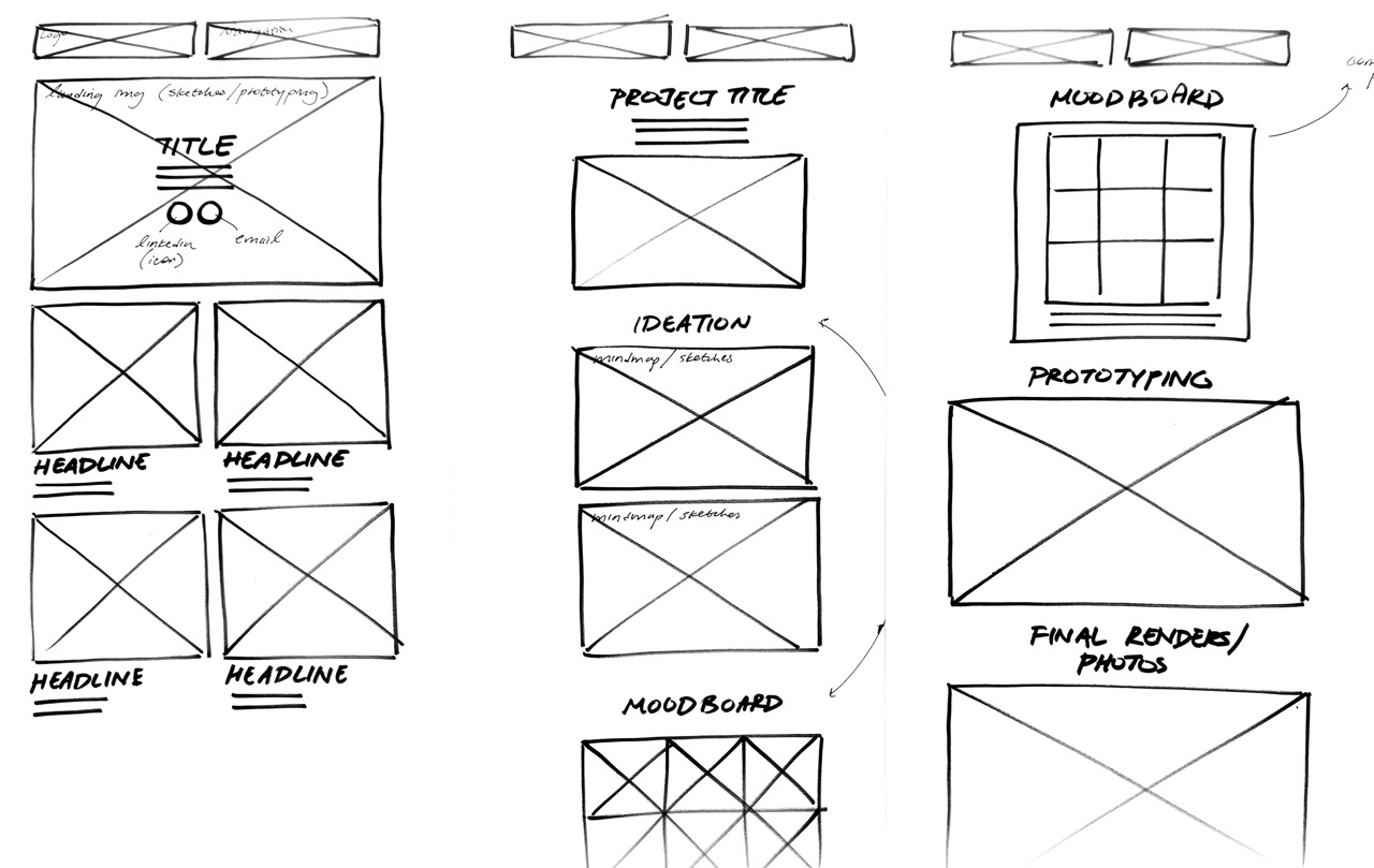
Wireframe

CopyDeck
Linked below it a PDF of the copy deck for my landing page:
Anica Liu | CD Foundations: Interaction | Assigment 1 - Copy DeckCompetition
The websites I chose stack up against competition primarily through the website's content. For example, Arthur Kenzo's design portfolio stood out to me as some of his design works comes from extremely well-known, well-established institutions such as Google. Aside from the contents of his portfolio, I find that his website is more immersive than most other portfolio websites I've come across; his landing page consists of full-bleed images that also act as navigation buttons to his projects. While it is standard, I think it does particularly well in showcasing his projects not only in a straightforward and accessible way, but also an immersive, aesthetic, and minimalist manner.