2. Discover and Research
Simple and Fluid Layout
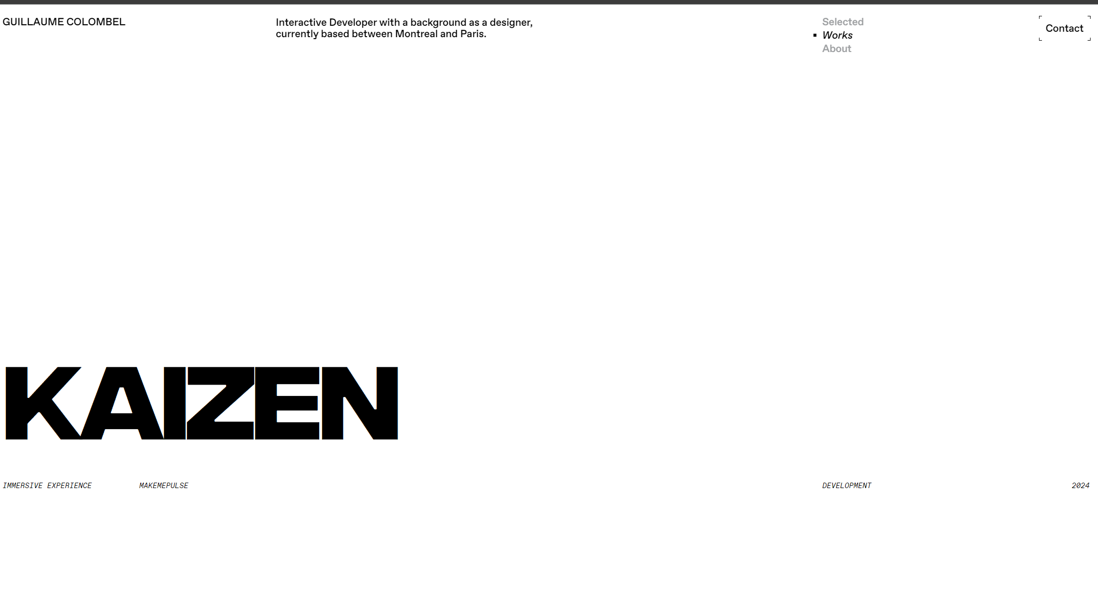
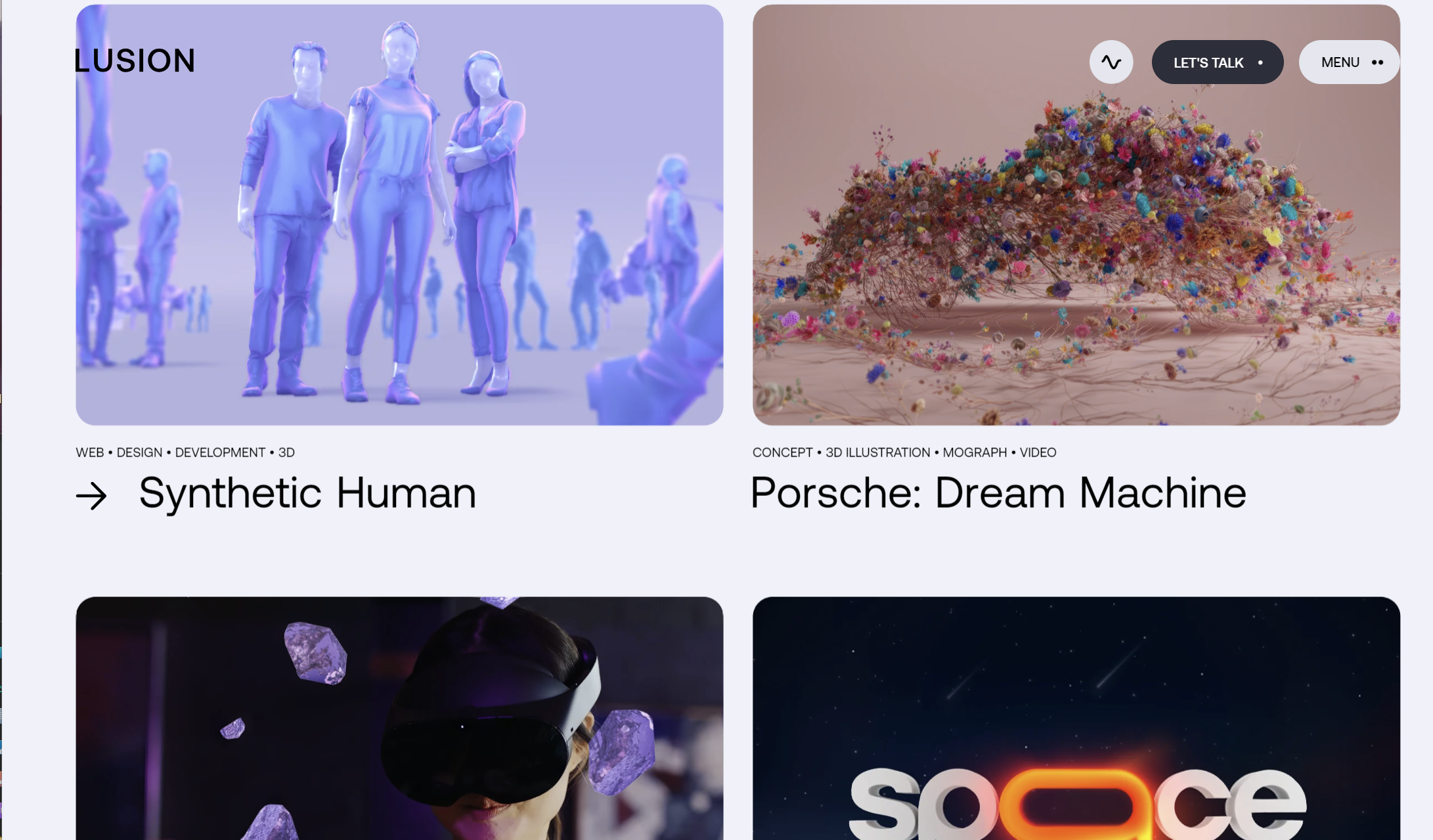
I plan to design a clear, intuitive grid layout with smooth transition animations to demonstrate my understanding of interactive design. I want the website to maintain a clean visual structure, allowing visitors to focus on my work itself.
Brand Colors and Fonts
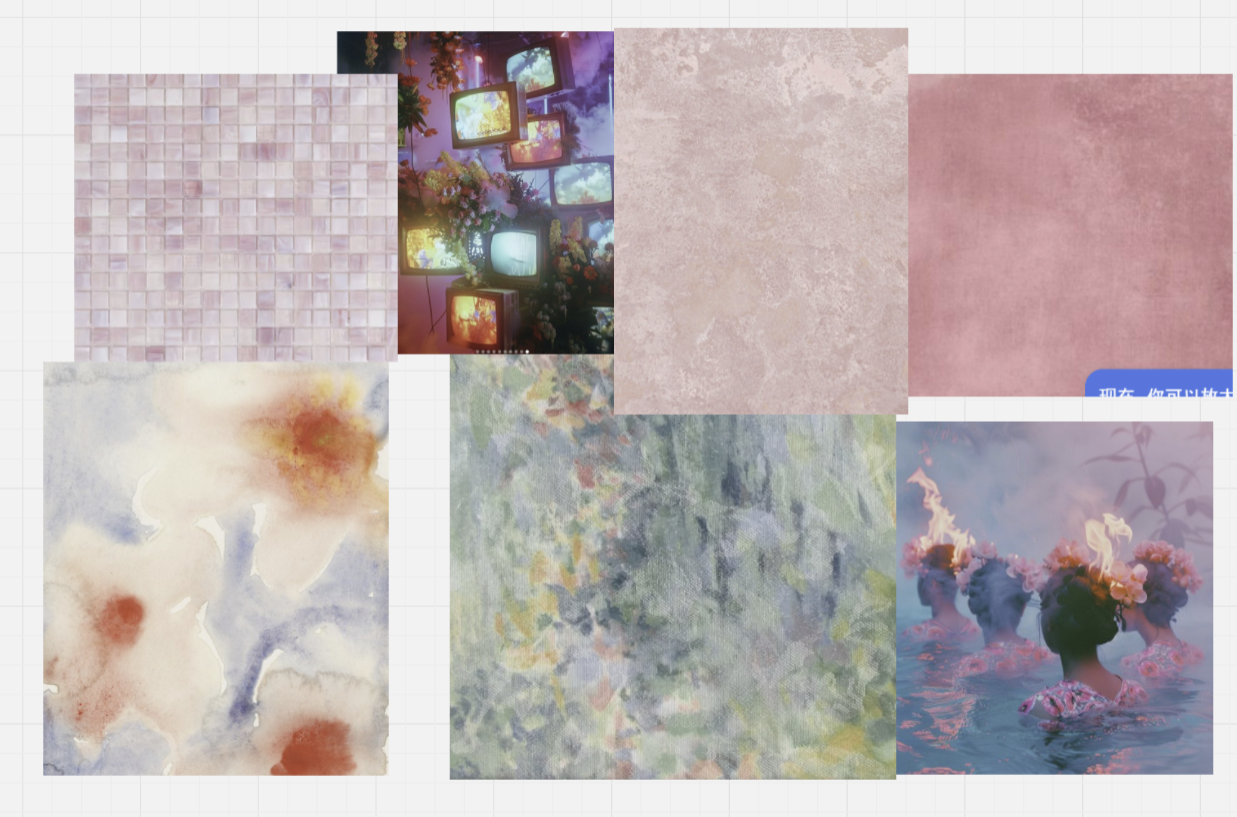
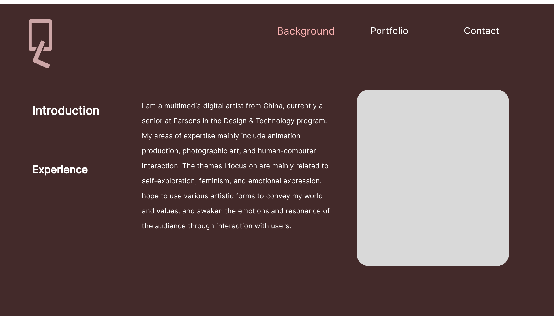
To better convey my personality and style, I will carefully choose colors and fonts that represent me. Since my work is more artistic, I will consider warm tones and slightly unique fonts to reflect my creative style.
Homepage Design
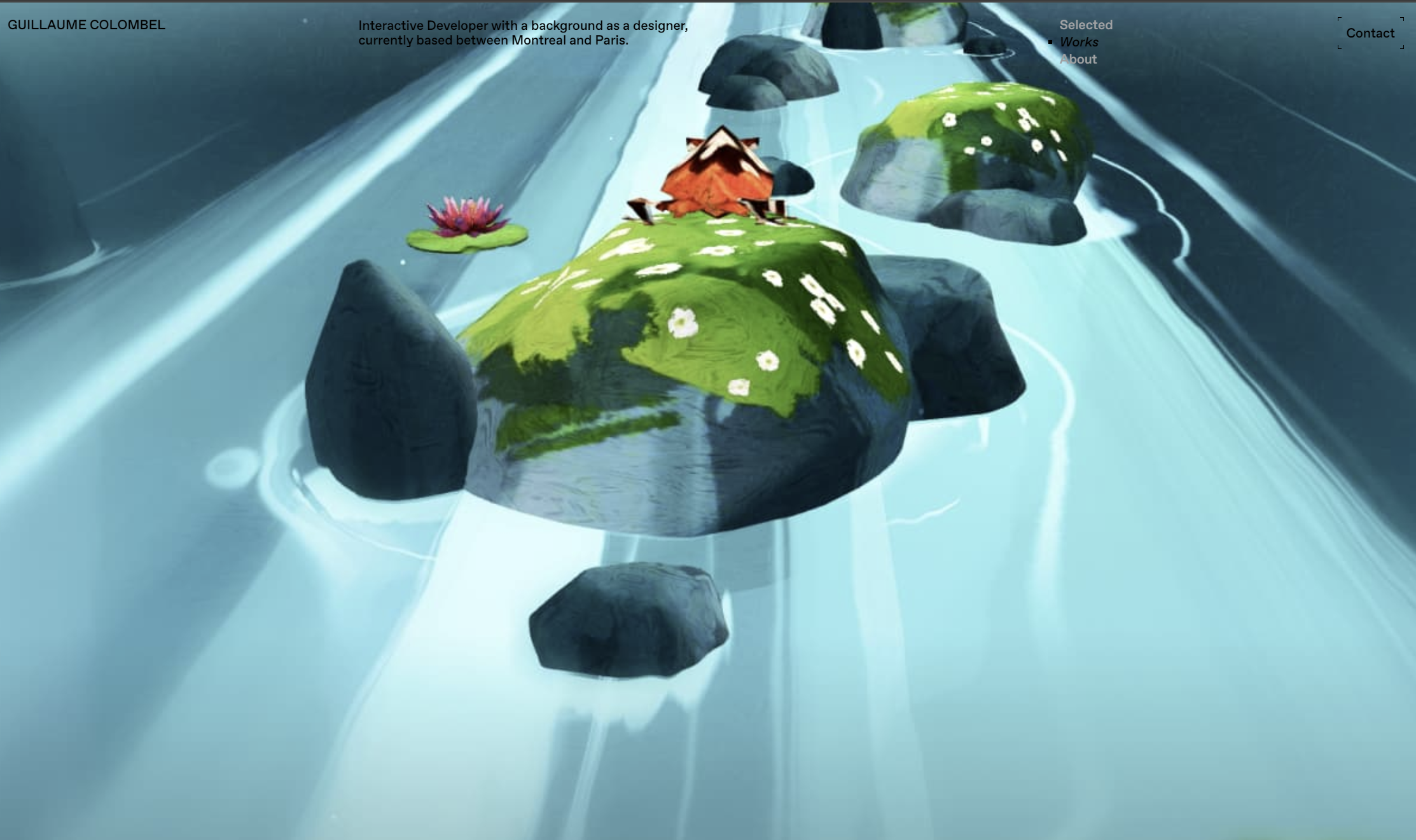
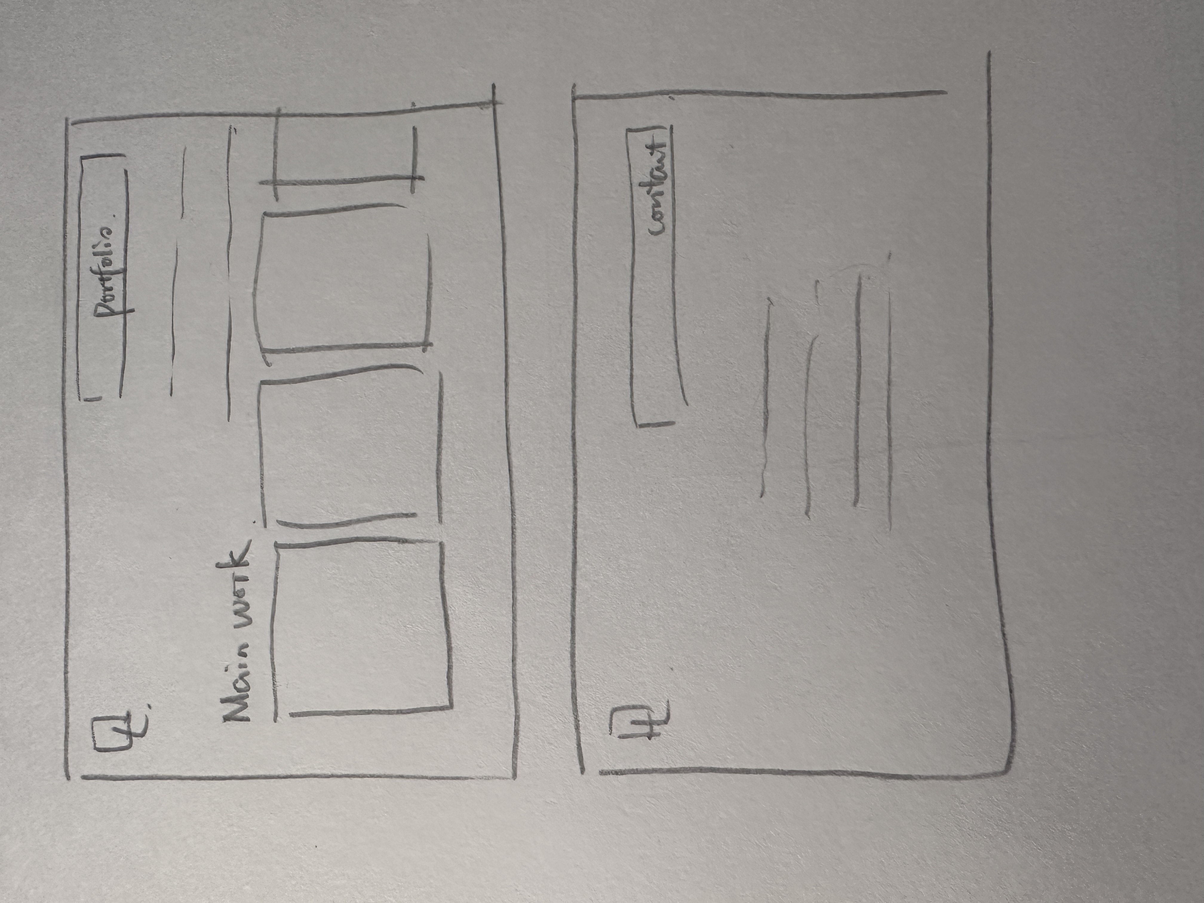
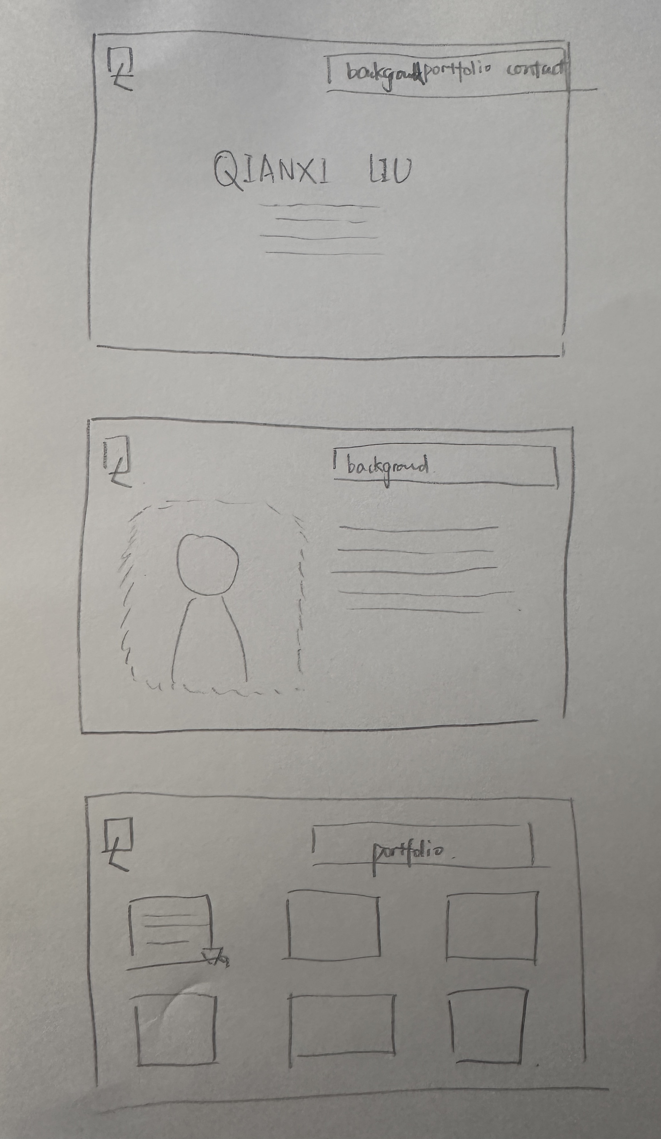
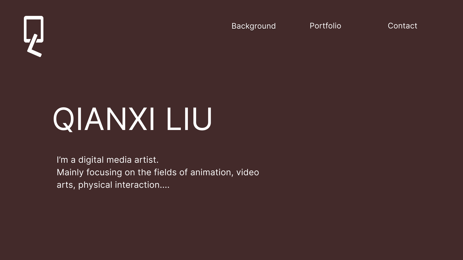
Fullscreen Cover: To give visitors an immediate sense of my style, I will showcase my most representative works or use a dynamic background (such as a short video or clip from an interactive project). This way, users can instantly understand my design philosophy.
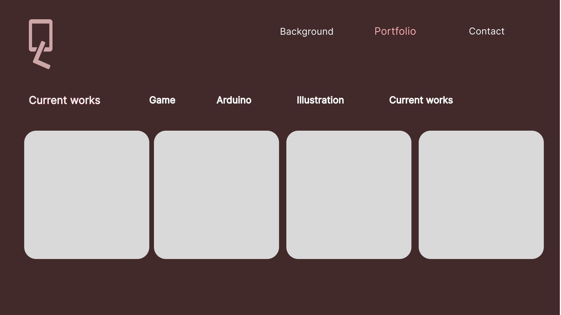
Simple Navigation Bar: I’ll keep the navigation bar simple, with core items like “Portfolio,” “About Me,” and “Contact.” I might use a fixed navigation bar or a hamburger menu style to ensure users can easily navigate the site at any time.
Portfolio Showcase
Project Thumbnails: I’ll use a thumbnail grid layout with hover effects to display brief information about each project. For example, when hovering over a project thumbnail, a short description or snippet of the project could appear to capture visitors' interest.
Project Detail Pages: Each project will have a dedicated page with an overview, creation process, technologies used, and final results. I’ll segment each project’s story using photos, video clips, and charts to narrate the story behind each piece.
Video and Interactive Demos: Since I specialize in interactive installations and video production, I’ll embed smooth video clips or create short interactive demos on each project detail page to highlight the interactivity of my work.
Personalized Design Elements
Micro Animations: I’ll add subtle animations to enhance the user experience, such as button color changes on hover, loading bars, and fade-in effects on scroll. These small details will not only make the website more fluid but also showcase the intricacy of my design.
Scroll Effects: I like parallax scrolling or segmented page scrolling, allowing visitors to progressively immerse themselves in each project’s story and creating a sense of immersion.
Responsive Design
I’ll ensure that the website seamlessly displays on mobile and desktop devices. Considering my target audience (graduate admissions officers and employers) may use various devices, I need to ensure smooth browsing on phones, tablets, and computers alike.
About Page
On the About page, I’ll provide a brief introduction to my background, professional interests, and my passion for digital media and interactive design. I may include a simple professional photo to add a personal touch, along with a list of my skills, technologies used, and industry-related achievements or awards.
