1.Intent
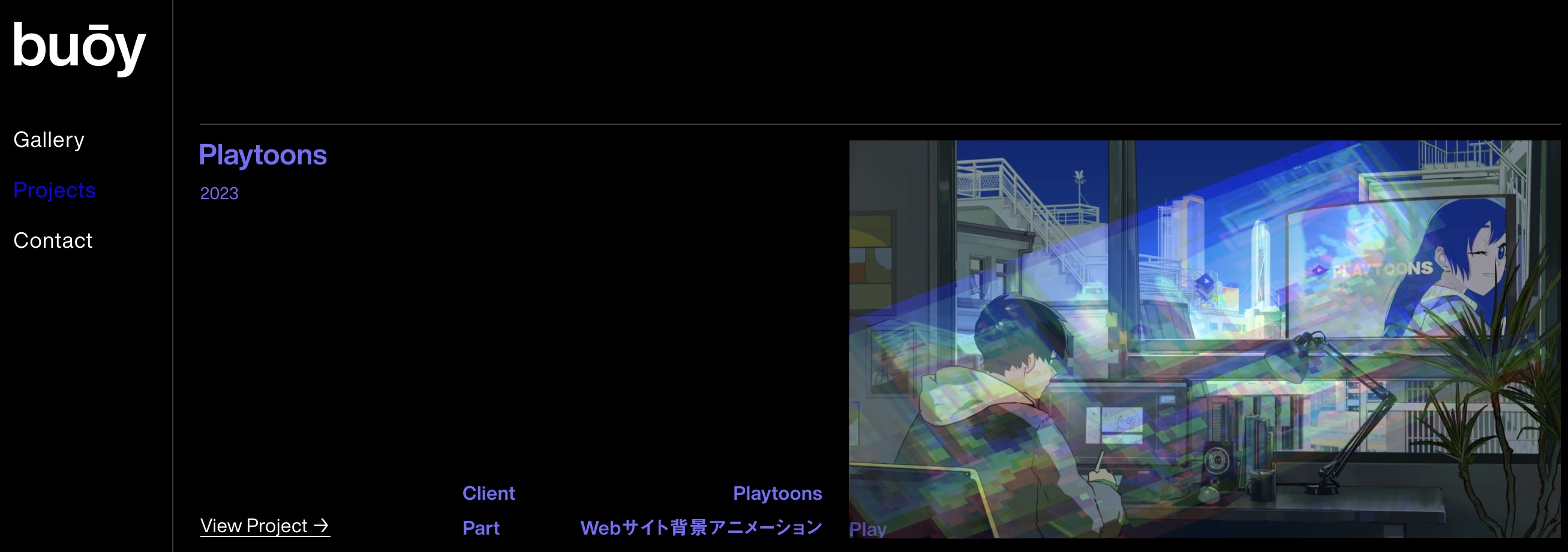
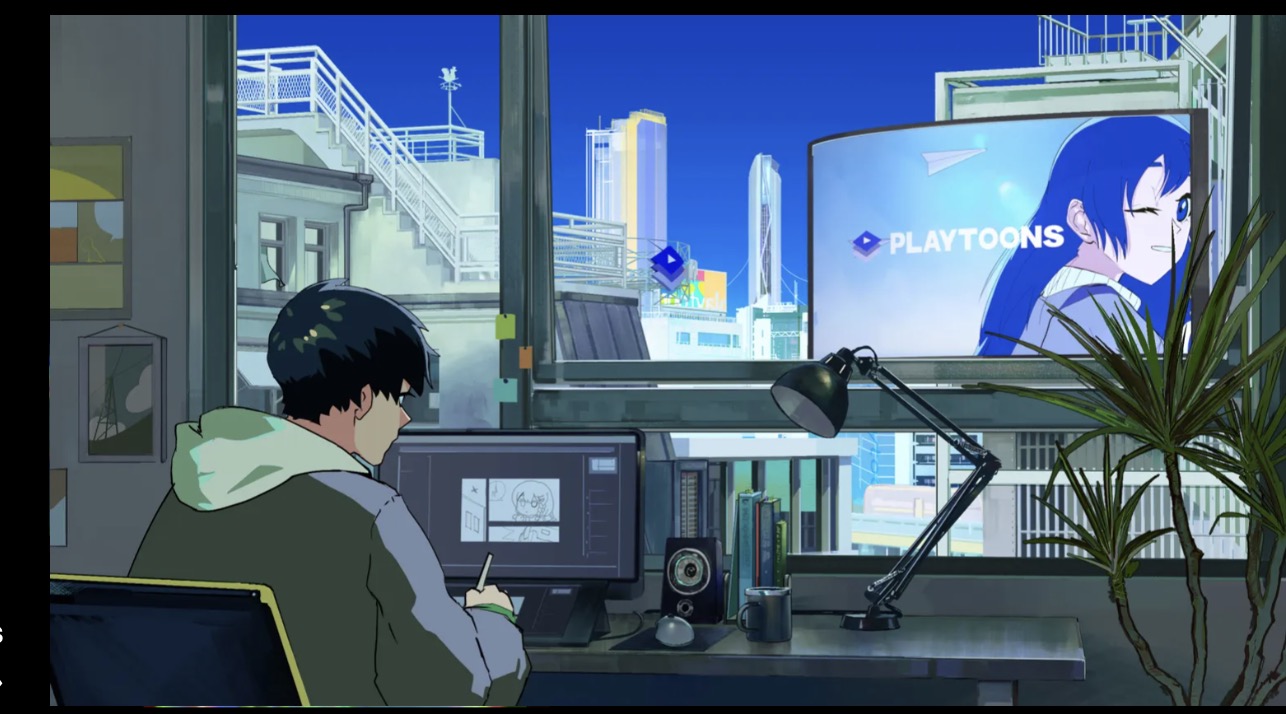
The website I have chosen is the personal website of buoy, a Japanese animator and illustrator.
The main purpose of the website is to give visitors an idea of the artist's drawing style and the types of commercial collaborations.

The website I have chosen is the personal website of buoy, a Japanese animator and illustrator.
The main purpose of the website is to give visitors an idea of the artist's drawing style and the types of commercial collaborations.
buoy's website design is very simple and clear.
While showcasing its own works, the unique design of the website itself also reflects the artist's personal style.

Whereas voice is consistent for the site as a whole, the tone is a contextual refinement that helps convey the content. An about page may have a different quality about it than the home page or a page in the shopping cart.
How does the website establish its brand? Is it consistent? Is it upscale, casual, youthful, objective?
The template contains most used HTML5 elements. Replace this text with the content written for the first assignment. Notice that there is no closing tag for this paragraph or for the list item in the navigation above.
Think of the many different users this website is addressing. If we were to write down the characteristics of any of these users and the label them, we would create a persona. Personas are composite sketches that reflect real-world behaviors, attributes, and attitudes of end users.
You can start with yourself, as you are one of the audiences targeted by the website. Take, for example, Naoto Fukasawa‘s website, a Japanese industrial designer. The audience can be personas representing museums, corporate clients, architects that may use his products in their work, end users, students doing assignments for a web basics class, and the list goes on.
Personas are composite sketches that reflect real-world behaviors, attributes, and attitudes. Create a character sketch for at least three personas.
Tell a story, assign each of these personas a name and personal details. By making them real, you can visualize the audience and walk them through the website. Stories activate many areas in the target audience’s brain, facts do not.

In developing a website for a client, the content is often done by different people and the designer requires that all the copy for the website be assembled into a copy deck. Copy the content of the first page, break it down and label it as if it were part of a copy deck. Take a look at the SAMOCA copy deck example for guidance.
How does this website stack up against the competition? What does it have that competitor websites do not, in terms of voice, tone, brand, style, design and so on? Can anything be learned from the competition?