Illustrator Lorraine Sorlet
Intent
Lorraine Sorlet is a French illustrator and animator who has worked for the New York Times and other magazines. She has also worked to create designs with fashion and jewelry companies. The intent of her website is to showcase the work that she has done and gain clients. Sorlet also includes links to her social media, indicating that she has more work that can be viewed elsewhere and implying that the website is more to show the professional, paid work she has done than to give a broad overview of all of her illustrations.
Voice
Sorlet’s work has a very cohesive and distinct style which is shown clearly on her website. She presents herself as laid-back yet professional, as if she would be a fun person to work with who would bring good ideas to the table while still being excited to accept others’ ideas as well. This website is also very playful, with the header of her name being a roll-over that turns into a symbol of two hands making a heart and her gifs automatically playing on the home page.
Tone
The tone of Lorraine Sorlet’s website is relaxed while still staying professional. As mentioned before, she presents herself as a very open-minded person who would be fun to work with. In her Contact page she specifies that you can contact her “If you’d like to work together, share some ideas, or just say hello” – this makes her seem very approachable and attentive, willing to spend time on her clients and anyone else who may want to talk to her. In the Work section of Sorlet’s portfolio the tone is a bit less personalised. The work is left on its own to speak for itself and the clients’ names appear when you roll over the photos of the work. When you click on a piece of work Sorlet briefly specifies what the assignment was and sometimes includes a description of the client and what they do. The overall tone of this website is fun and playful but still professional and to the point.
Brand
Lorraine Sorlet’s brand is playful and intimate. Her illustrations often portray couples, though her website seems to focus more on the editorial work she has done for clients rather than her personal work, which she shows more of on her Instagram.
Personas of Target Audience
Sorlet’s main target audience is future clients. She clearly shows the range of assignments she has worked on and showcases what she can do, letting her work do most of the talking. Based on the work she includes in her Work section it seems like the type of clients she’s looking for are more on the editorial rather than storytelling side of illustration – magazines, companies that need packaging, and fashion or jewelry companies looking to collaborate with an artist. This audience would be attracted to the clean look of her work and encouraged to hire her due to her experience working with similar clients in the past. It is easy for clients to contact Sorlet through her Contact section and her email is also listed in the About section. Sorlet may also be considering fans of her work as a target audience, including people who find her through her Instagram. Fans who find her website would be introduced to more projects she has done and possibly buy the magazine issues or products she has illustrated for. Sorlet also has a Shop tab, which would be something fans interested in buying prints or other work would enjoy (the tab is currently not working though). This audience would be attracted to the site through her link on Instagram, as would the potential client audience. A third target audience Sorlet’s site may have is fellow illustrators. This group may be attracted to the site by being given the link directly by Sorlet or by finding her on Instagram or somewhere else online. They may also hear of her from another illustrator who knows her work. The site provides contact information for fellow illustrators to talk to Sorlet and form connections which could provide jobs for both parties in the future.
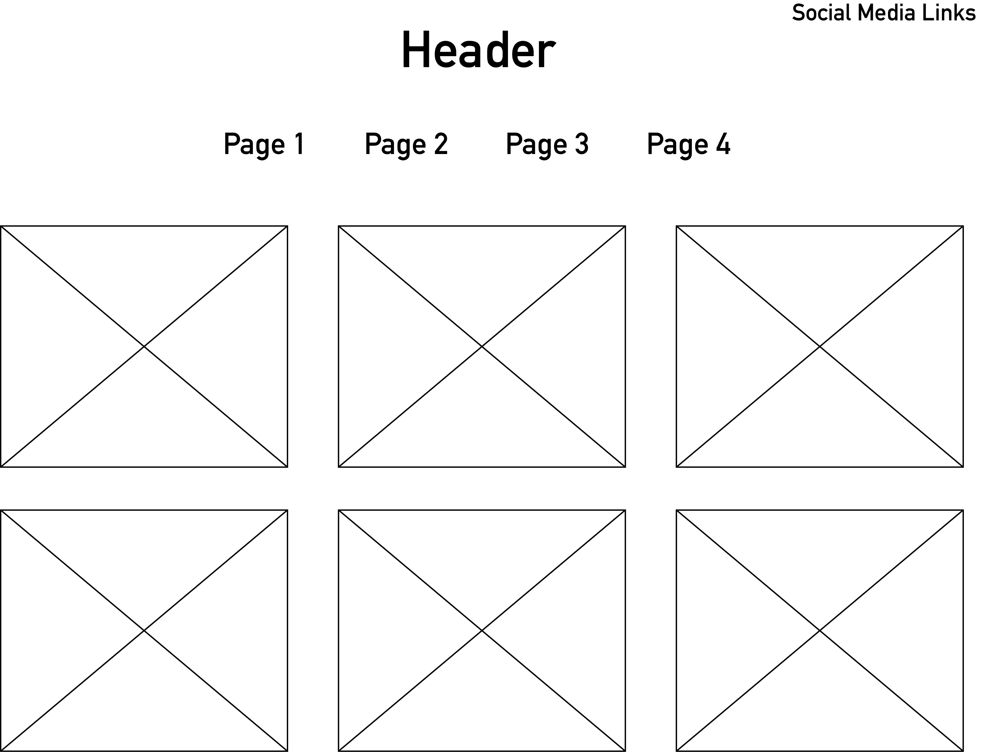
Wireframe

Copy Deck (Home Page)
Title: Home
Header: Lorraine Sorlet
Body Copy: N/A
Competition
Lorraine Sorlet’s website is similar to her competitors’ (other illustrators’) websites in its minimalism and overall layout. Many illustrators choose to let their work speak for itself, some going further than Sorlet and only including the client’s name, with no title or information about the assignment itself. A lot of illustrators use the method of rolling over the work to see information about it. Some of the things that stand out as unique on Sorlet’s website are the dots that appear when rolling over page names and the graphic that comes up when you scroll over her name (the header). These details help to make Sorlet stand out and are a subtle way of referencing the fact that she also does animation work (some of which is included in her portfolio). Though it isn’t radically different from other illustrators’ websites, Sorlet’s website keeps up with her competitors and clearly shows her unique style – her work is what makes her stand out and the website merely presents the work at its best while adding some small details that emphasise her personality.