Step 1 - Develop Your Idea
The problem I want to solve with my portfolio website is to create something that displays my work in a creative way and shows my skills. My main target audience is employers but I also want to target peers/fellow illustrators and designers. I want my site to be minimalistic but also have some creative elements that make it stand out.
Step 2 - Discovery and Research
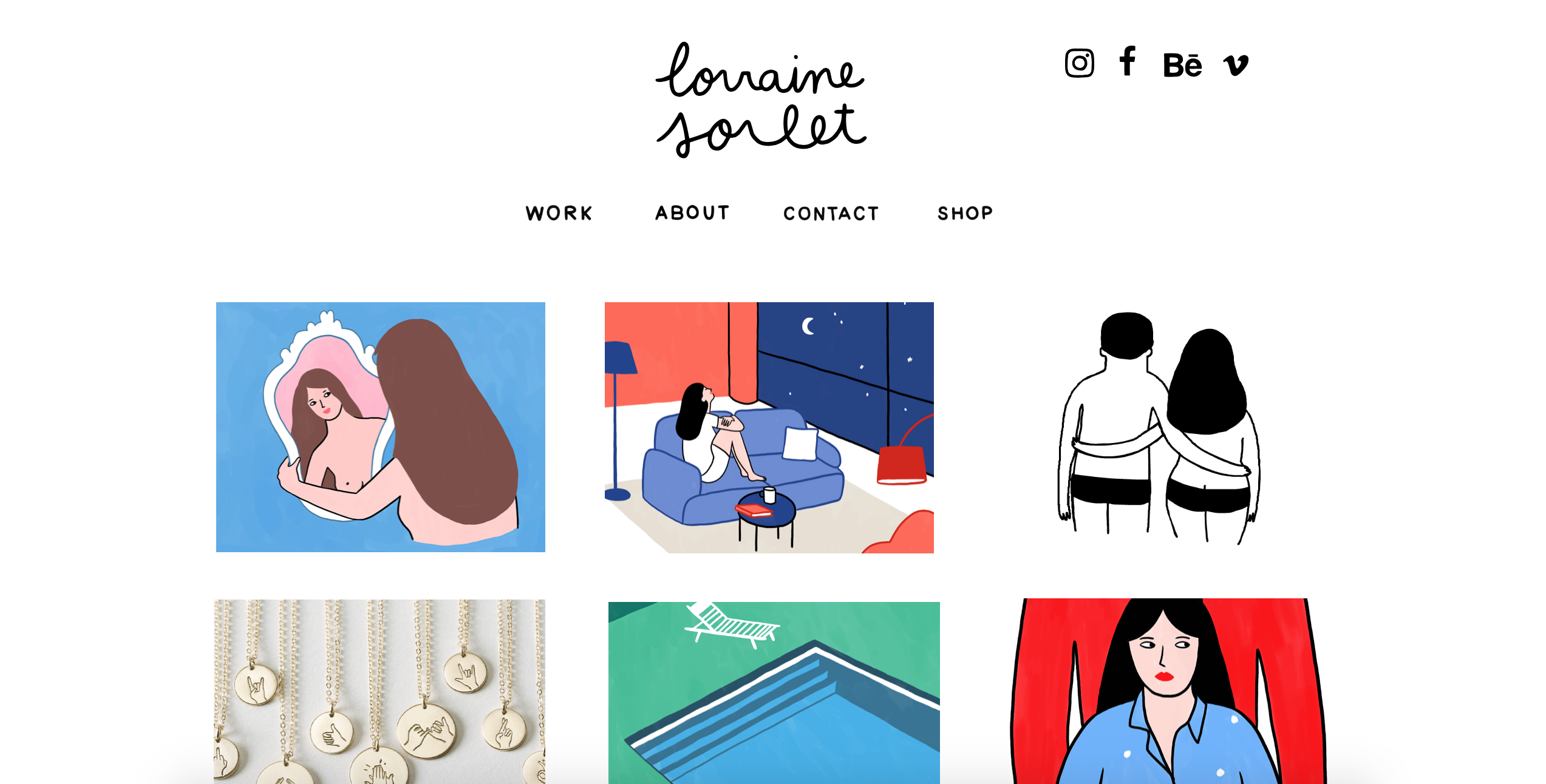
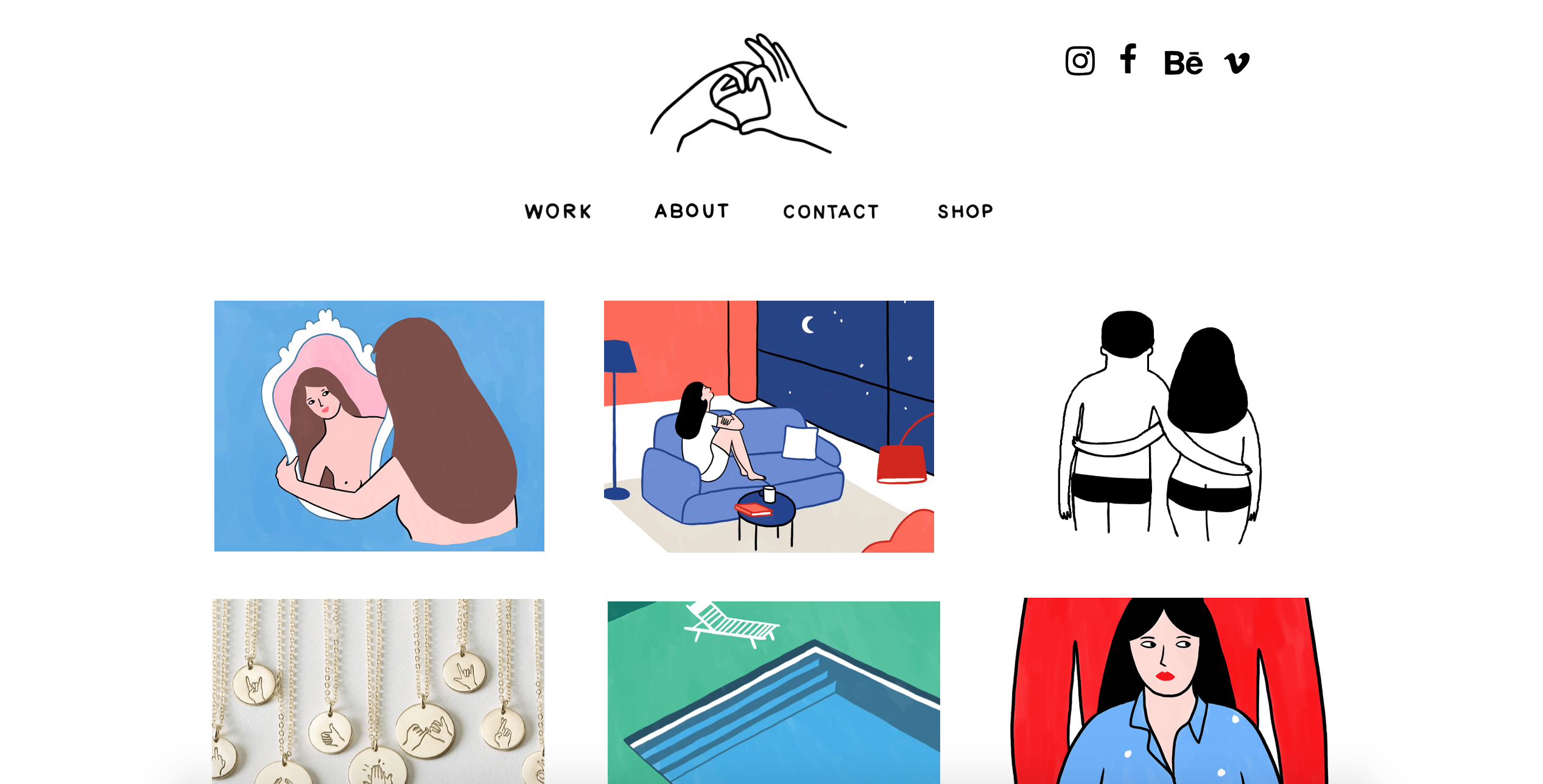
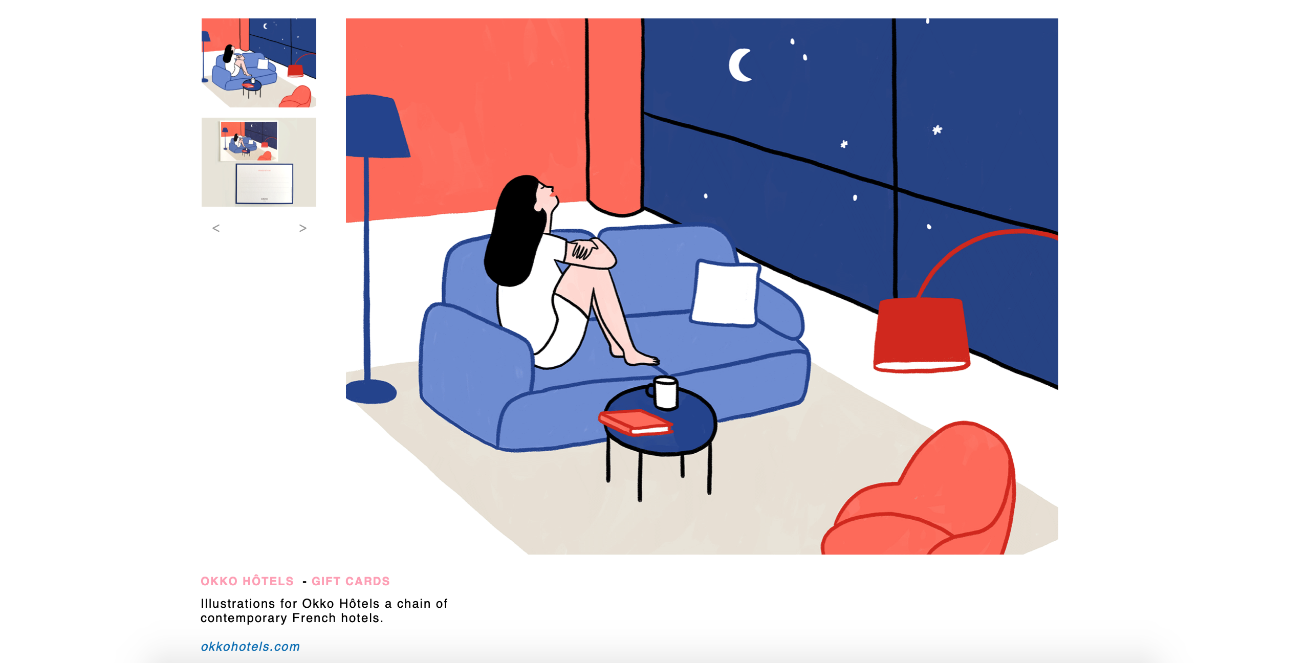
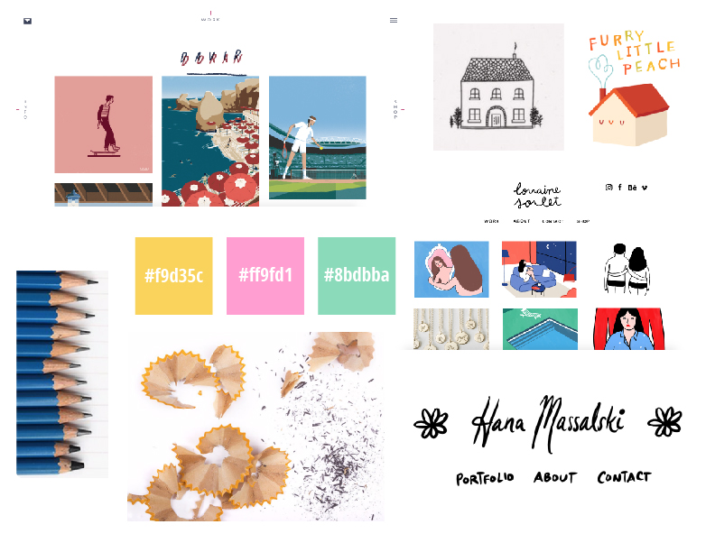
In my research I looked at a lot of illustrators’ websites. The main one I focused on was Lorraine Sorlet’s. Her website is very simple and minimalistic. Something I really liked about it was the way she uses handwritten fonts for her pages. She also has a rollover on her name that turns it into an icon in her style. When you click on Sorlet’s art she has a brief description of the illustration and what it was done for.
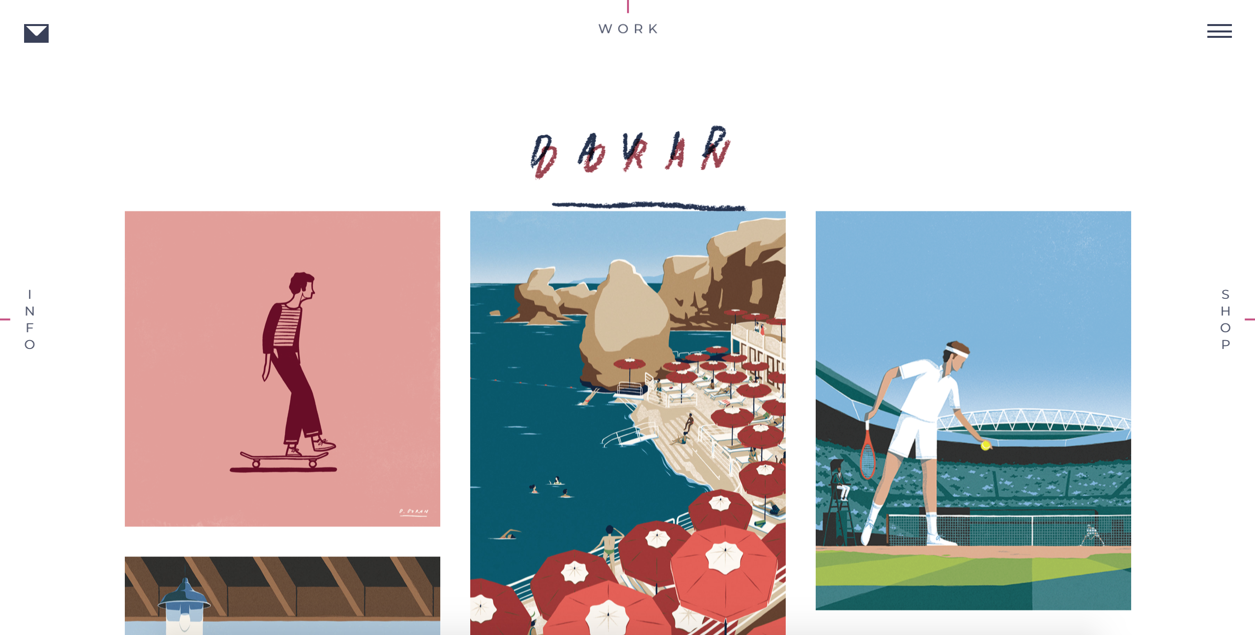
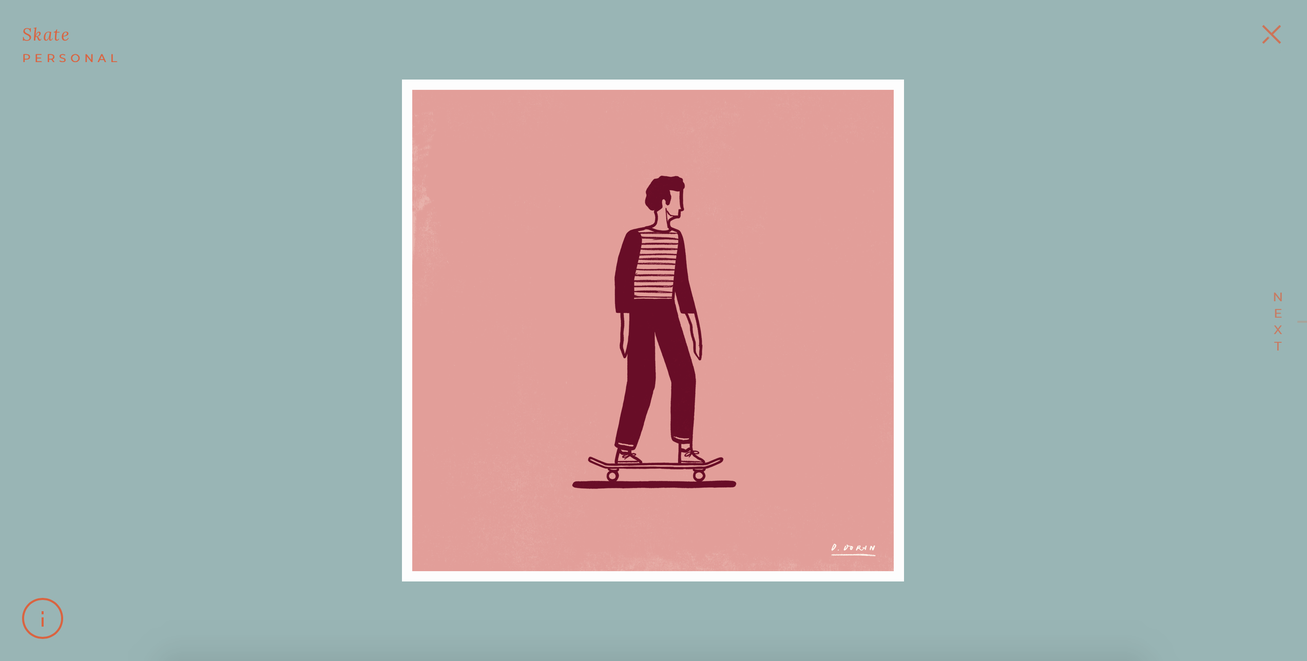
Another site I really like is David Doran’s. He has his page links placed uniquely, on each side of the page, and has a handwritten header for his name. When you roll over his work the name comes up against a colour and when you click the illustrations the background colour and text are chosen to match each image, though still staying in a certain colour scheme to keep the site consistent.
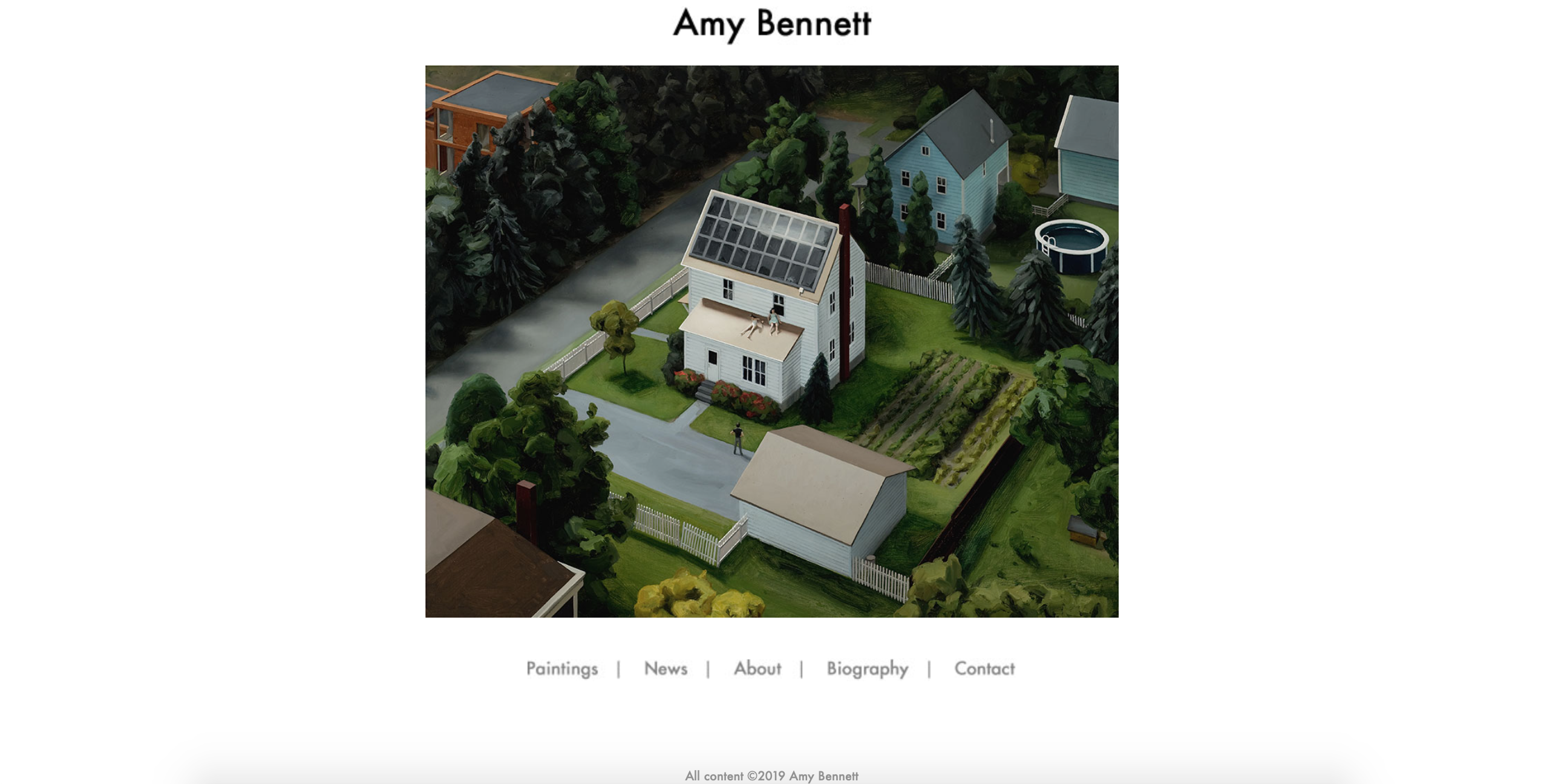
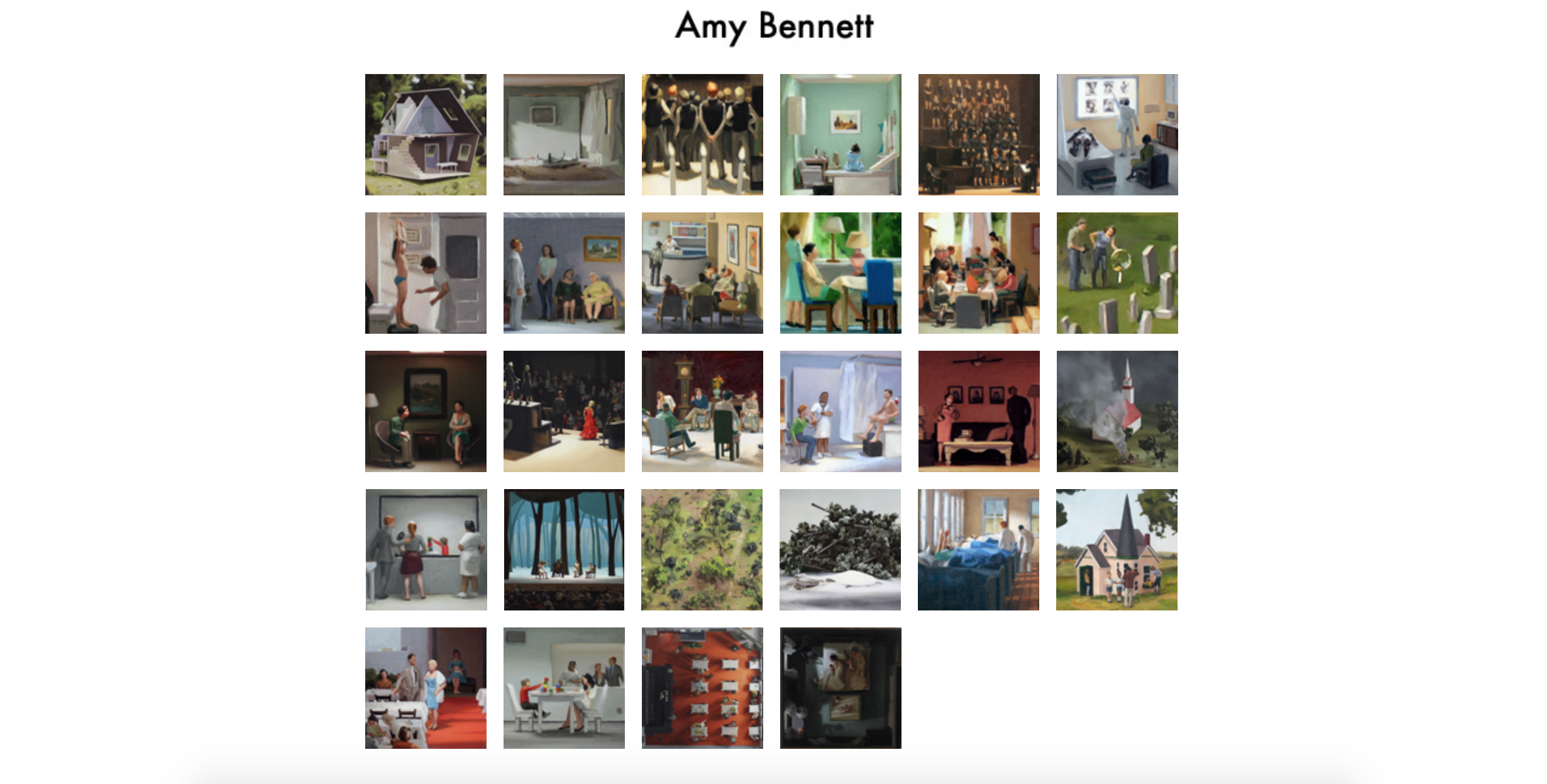
Amy Bennett’s website is a painting portfolio but I liked the simplicity it has. Her landing page is just one image and her name with some links to the pages of the site. I don’t think I want to incorporate this type of homepage in my site but if I do I’d want it to be similar to hers. When you go to her portfolio pages all the work is arranged in squares that you can click to enlarge and see the full image.
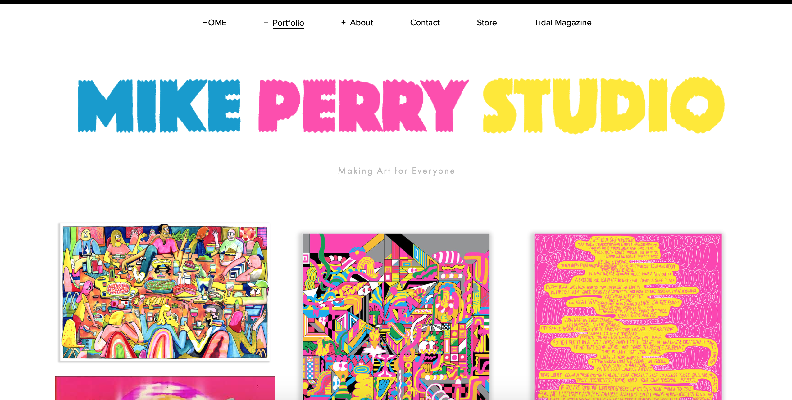
Mike Perry’s website uses a gif for the header of his name, which stands out and makes the site look unique. This matches the many moving gif thumbnails scrolled by in his portfolio. His portfolio is also arranged into categories and I especially like the way he uses gifs to showcase his printed works like zines.
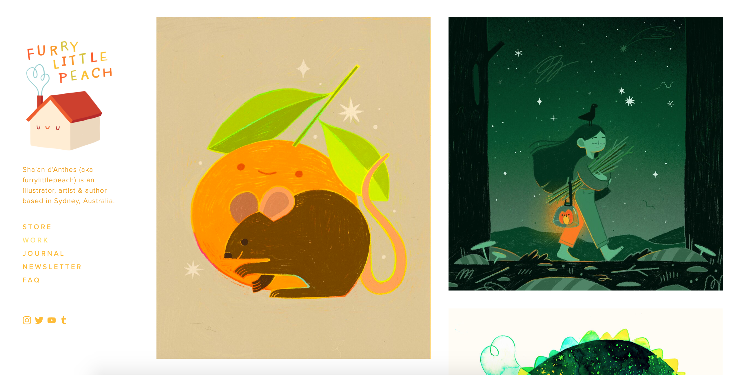
The last website I looked at was Furry Little Peach. I found it interesting that her page links were arranged along the left margin and the art fills the rest of the page. The inclusion of a little illustration with the header is nice also. When you click on her illustrations there is a title and description of the piece on the right so the art is framed by her page links and the details of the art.
Step 3 - Target Your Audience
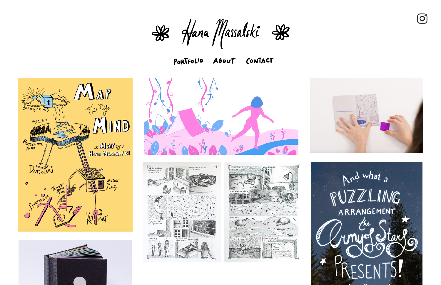
As I mentioned in the first section, my target audience is mostly potential employers and fellow illustrators. I want my site to look professional and like it was made by someone who knows what they’re doing. I also want it to fit or complement the style of my work, as well as stand out as unique in some way.
Step 4 - Inspiration
Step 5 - Thumbnails
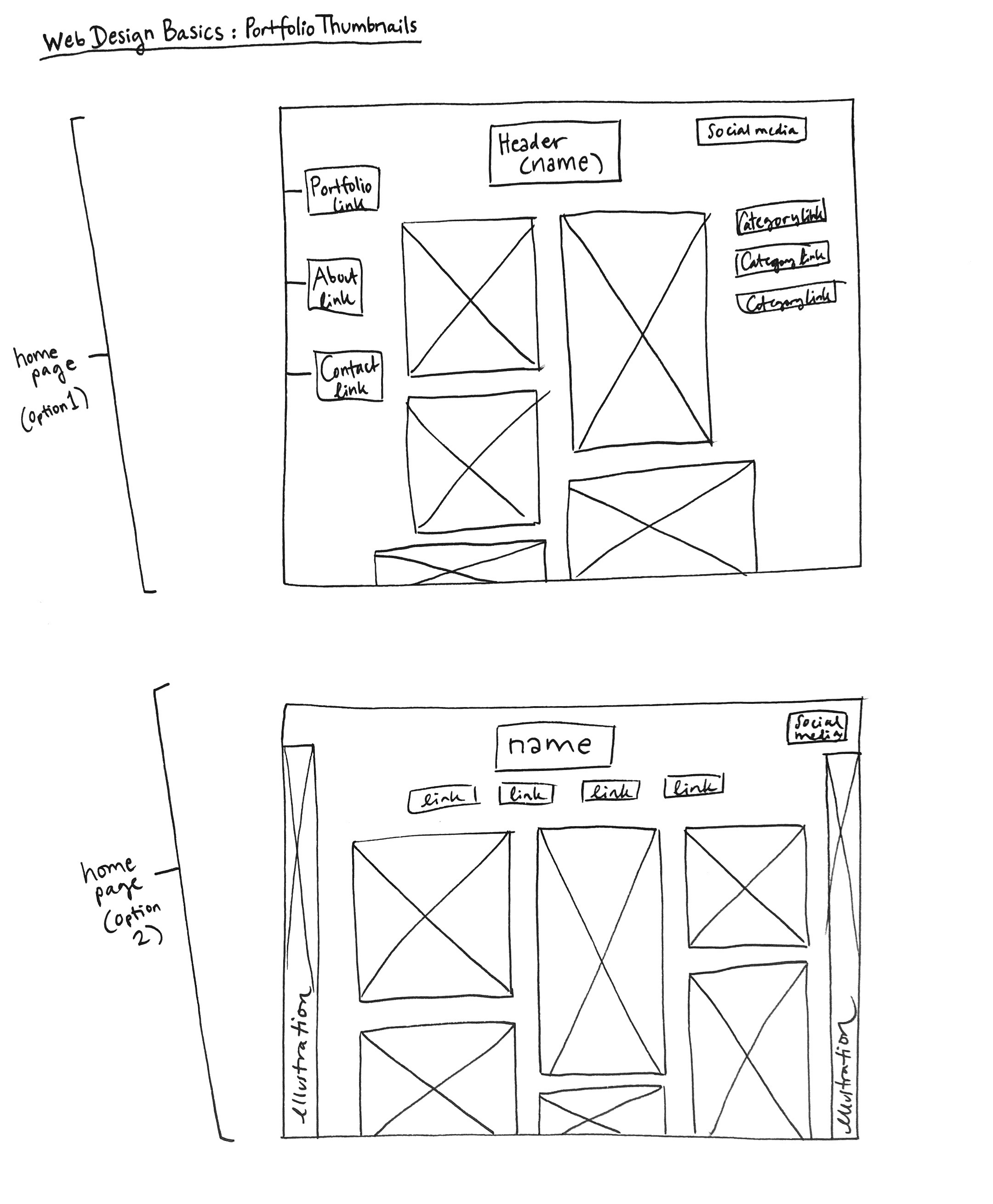
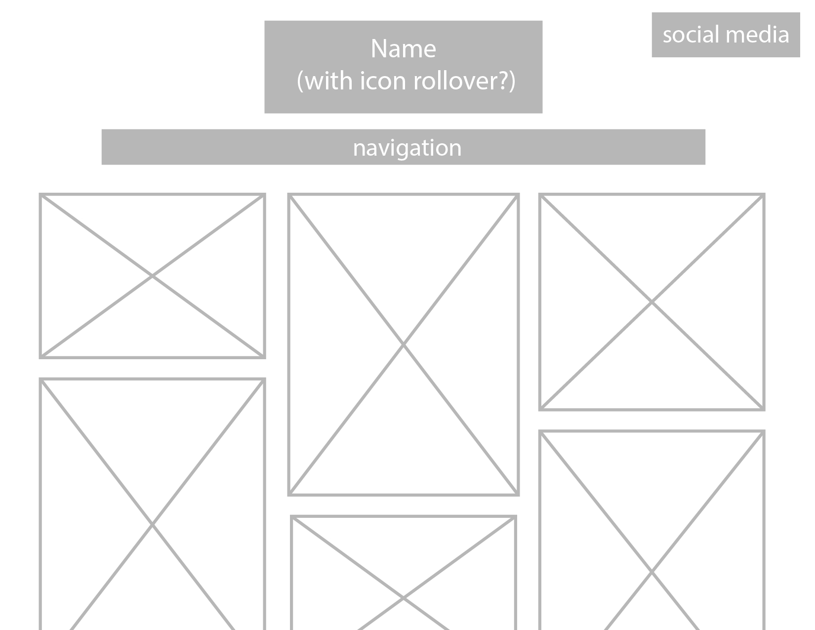
Step 6 - Wireframe
Step 7 - Photoshop Comp