INTENT
The intent of this website can be seen as a portfolio as well as collection of narratives and accounts. The portfolio presents their unique approach on spaces while the narratives and blog include a group of ideologies or curiosities they’re interested in evolving or currently are working on. Website creates an image, tells their story and unites their different
VOICE
Rockwell Group is an interdisciplinary architecture and design firm making impact in the fields of hospitality, culture, healthcare, education, product and set design. The voice is very straightforward and clear. Not only does it reassure the audience of its extreme professionalism but also makes them feel connected and in touch with their beliefs. It’s passionate, innovative and motivated.
TONE
Although the tone of the entire website looks very consistent and universal, each page differs in the way its exhibited. The homepage is simple with only bold text for the audience to explore and an animation in the back. Every page seems clean with no crowding. For example, the “Our Curiosities” page is simply a grid with only titles to click and get more information. Big images and bold but little text create a perfect balance for such platform.
BRAND
“Kaleidoscopes are quite beautiful in their own right, in both experience and appearance”. This statement from their webpage describes their own company very well. The brand is classy, upscale and yet welcoming. The minimal color palette (excluding the project images) and white background create a sense of exclusiveness, modernism and simplicity which lets the audience focus on their work. Their work and open mindedness create their brand. The sliding boxes on “We’re the Rockwell Group” page adds a ‘constantly moving forward’ element to the website and coheres to the brand and image.
PERSONA
CLIENT
The owner of a new hotel, John, is looking for a firm to design his hotel. He wants to see if the Rockwell Group would be a perfect fit. As soon as he opens their page, he can see the “what we make” and “what’s going on” block where he can find what they done in past and are doing. When he is navigated to those pages, he can find links to their social media for more exploration. At the bottom there is a link called “we know hospitality” where he can literally see the whole hospitality industry they’ve worked with in one page. Pictures with minimal but enough text would convey the design aspects of spaces and their aesthetic to John. Finally, after a lot more to discover, there is enough contact information under “talk to us” link; overall easy navigation.
APPLICANT/JOB SEEKER
An applicant looking for a job at their firm, Rock, has plenty to research. Their page exhibits their projects, their motto, their style and their accomplishments. Rock can also find if his interests exist in their “curiosities” page. He can also check out their blog page to find what is happening in and around the world so that it might help him during the next process of application. A link called ‘join us’ is provided below every page and to the right-hand tab called menu. A webpage says a lot about the firm and with such interactivity, it shows their scale and determination.
STUDENT
An undergraduate student like me who aspires to be an interior design can come across their website and make it an inspiration. It not only lets us into their firm but also links us to informational articles like Forbes for a holistic viewpoint. Moving from page to page is extremely easy and the way each page is put out is extremely clean and coherent. There is a search button for us to look for anything with just words put in. Motivating for anyone who possibly want to work with them or be like them one day.
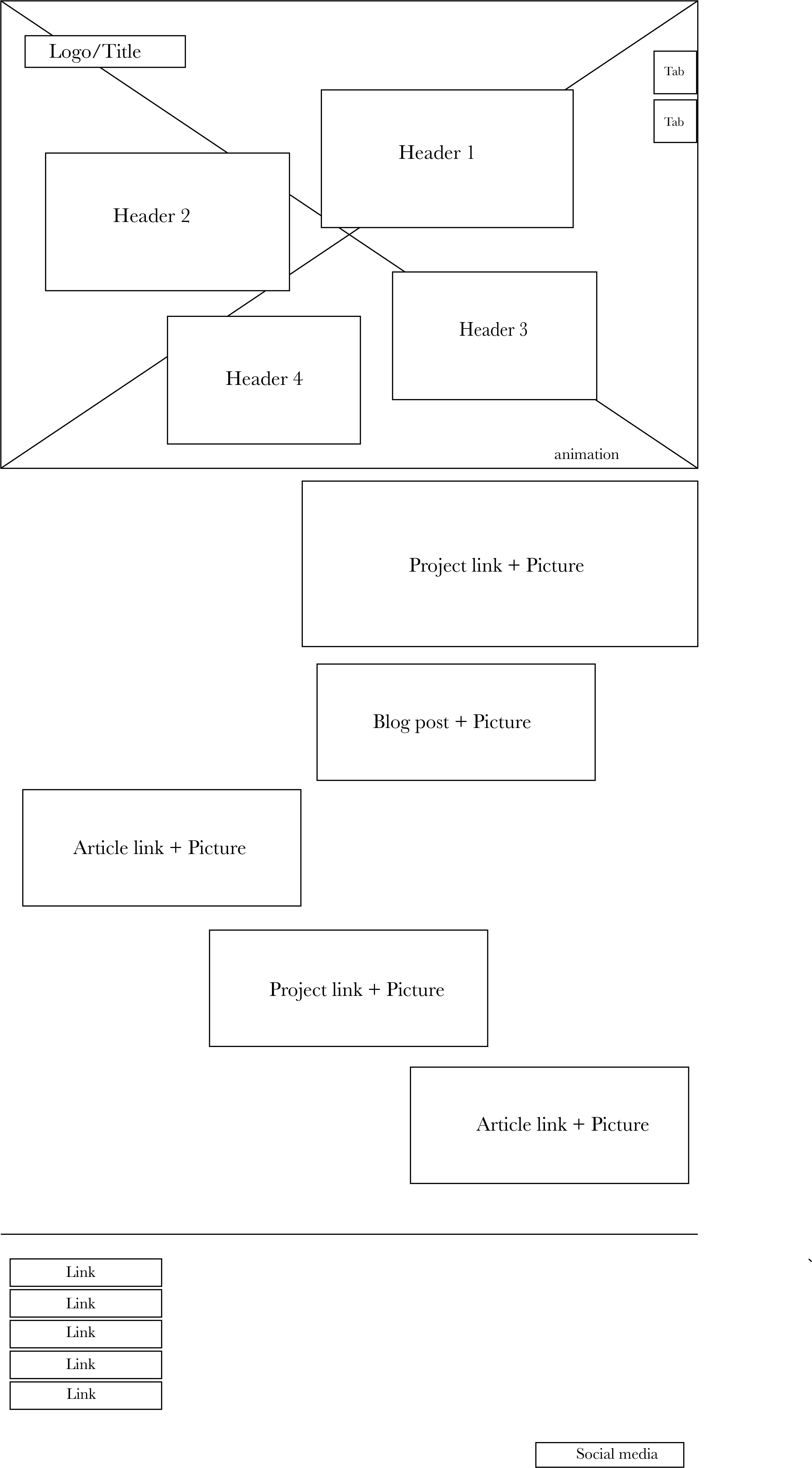
WIREFRAME
COPYDECK
- Title: rockwellgroup
- Header 1: what we make
- Header 2: our curiosities
- Header 3: what’s going on
- Header 4: we’re rockwell group
- Subcopy 1: WHAT’S GOING ON
- Our Hayes Theater Mural: Behind the Curtain
- Subcopy 2:
- WHAT’S GOING ON
- Moxy Hotels To Open Moxy Chelsea In October 2018
- Subcopy 3:
- WHAT WE MAKE
- The Shed in collaboration with Diller Scofidio + Renfro
- Subcopy 4:
- WHAT’S GOING ON
- An Exclusive First Look at TAO Chica
- Footer:
- BLOG
- TALK TO US
- JOIN US
- WE KNOW HOSPITALITY
- PRIVACY POLICY
COMPETITION
Most of the competitors have their websites set in a very standard way with blocks and dropdown lists. While some are overcrowded and way too colorful, Rockwell has an impact with its layout. It is very interactive and screams their label. It stands out because you find different items in separate pages that do not showcase something else. Like the ‘our curiosities’ page will not show their projects from ‘what we make’ page and crowd it, however navigation is available.