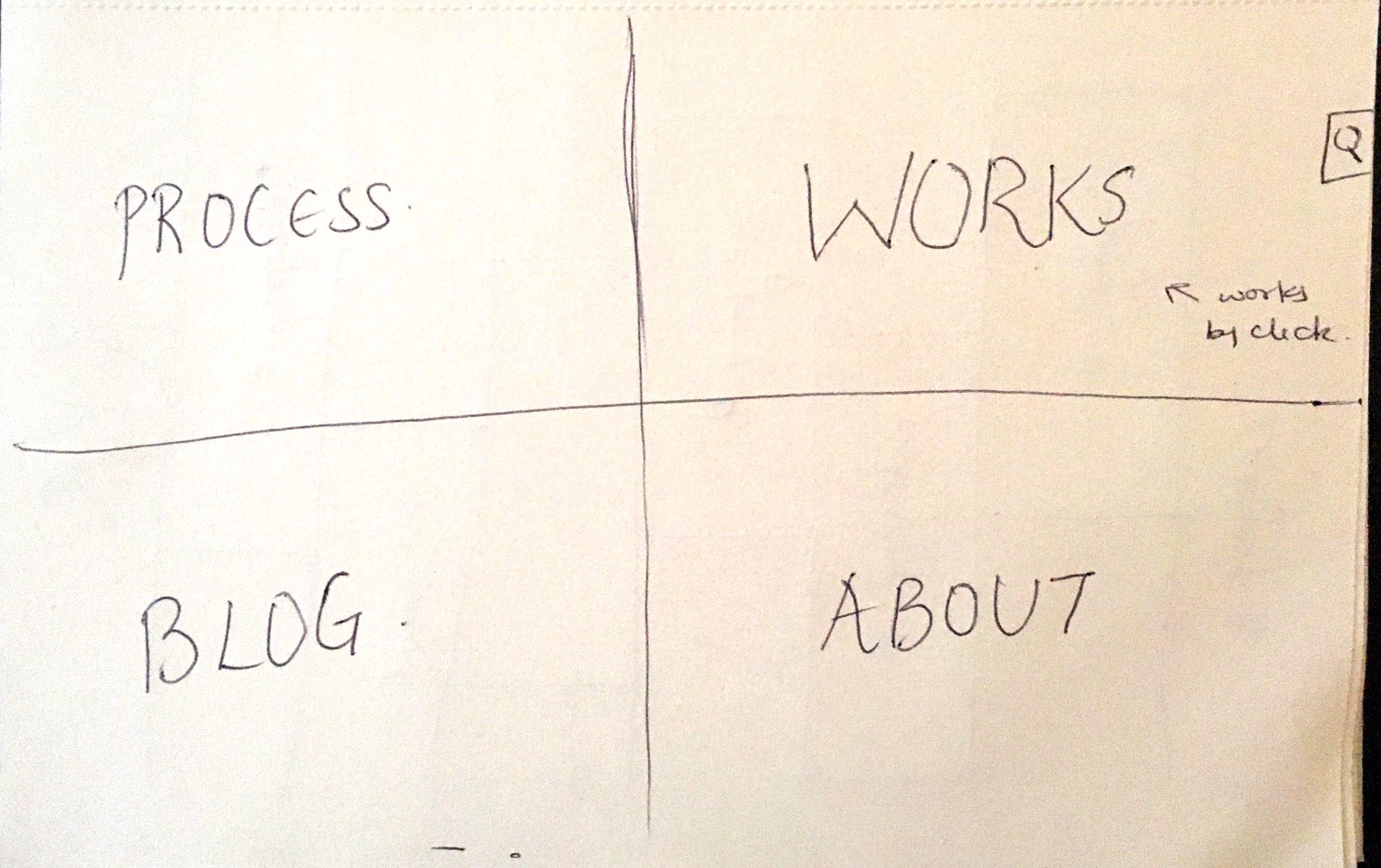
PORTFOLIO WORKSHEET
DEVELOP YOUR IDEA
A portfolio should almost be an extension of one’s personality and that’s what I want my site to exhibit. While one should see my passion and vision through my works, the website should also function in a similar manner; something that reflects and runs parallel to my work. I want my website to focus a lot on my work and its process. It needs to be clean, focused and clearly navigational; minimalistic. The website should not only showcase my works but also provide links to pages that narrate my process and inspirations. I would also like to share articles and things I’m interested in, so my audience can have a feel of my style. I also see my website as a place to network and collaborate with other professionals so there will be space to let others leave their information and contact details.
DISCOVERY AND RESEARCH
H.SACHS
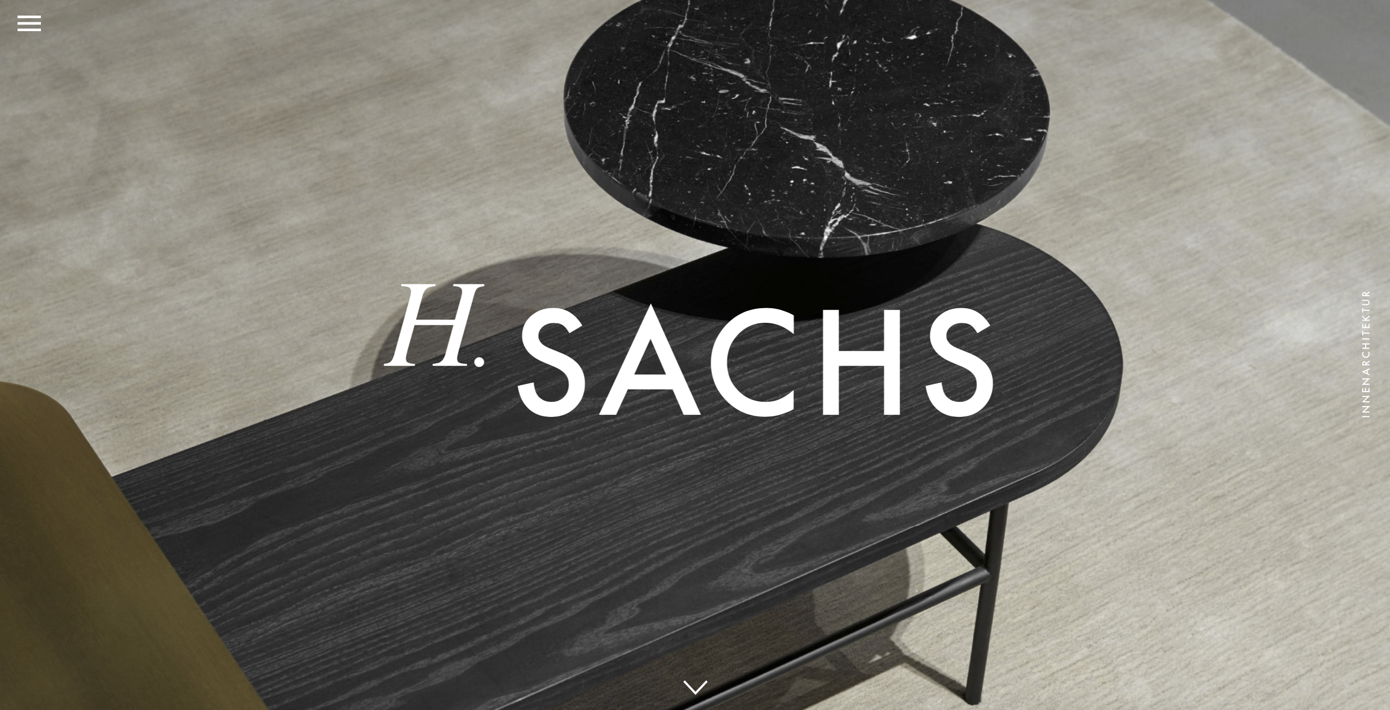
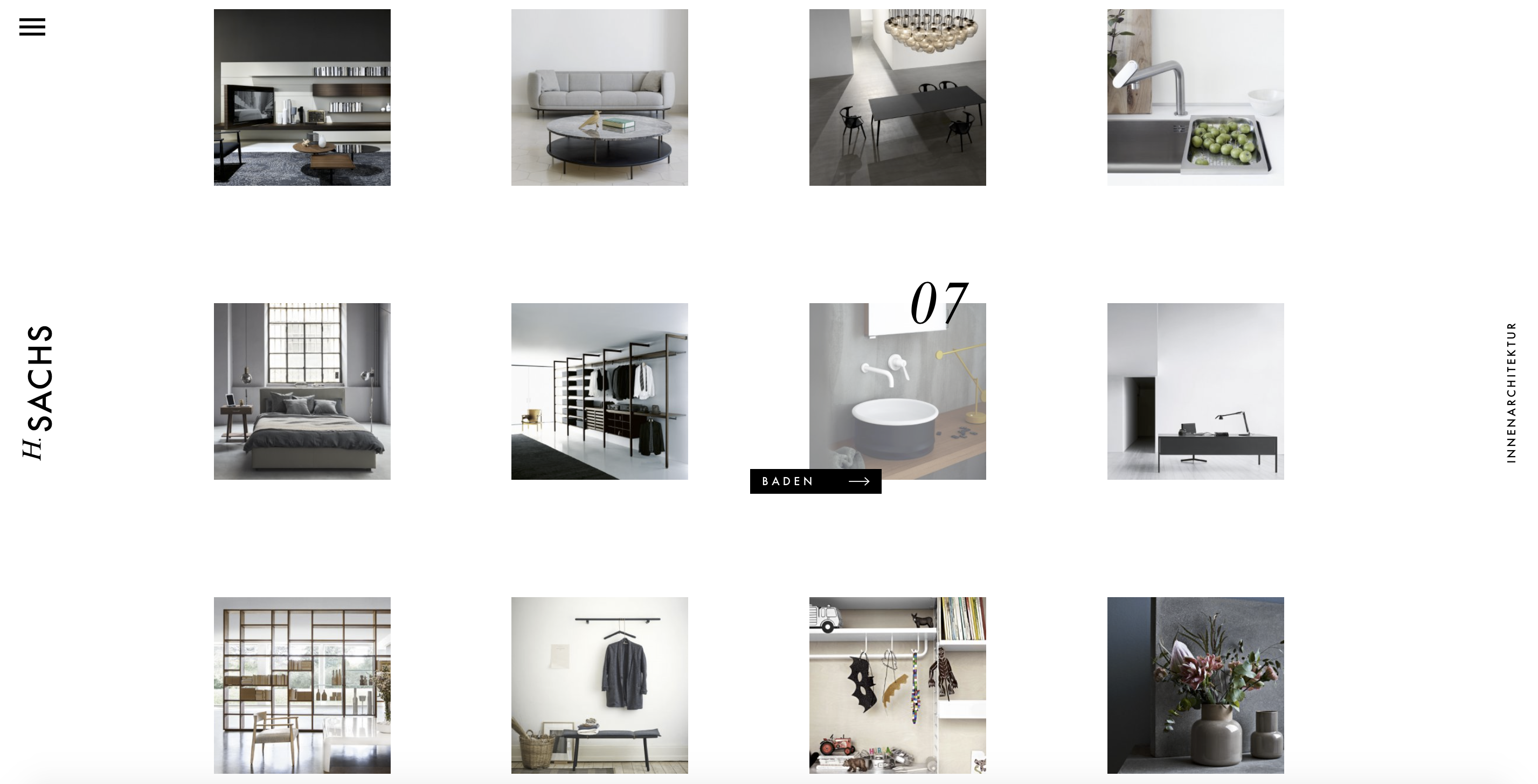
H.Sachs is a product and interior design firm. I found it as a site inspiration because it is a display of its products. I believe it acts as an e-shop with a very clean and focused approach. The pictures of products are neatly placed in equal sized blocks for selection. What I absolutely love about the site is the fact that the pictures speak for themselves and there Is very minimal reading one has to do to understand the product.
CHARLES AND EAMES RAY
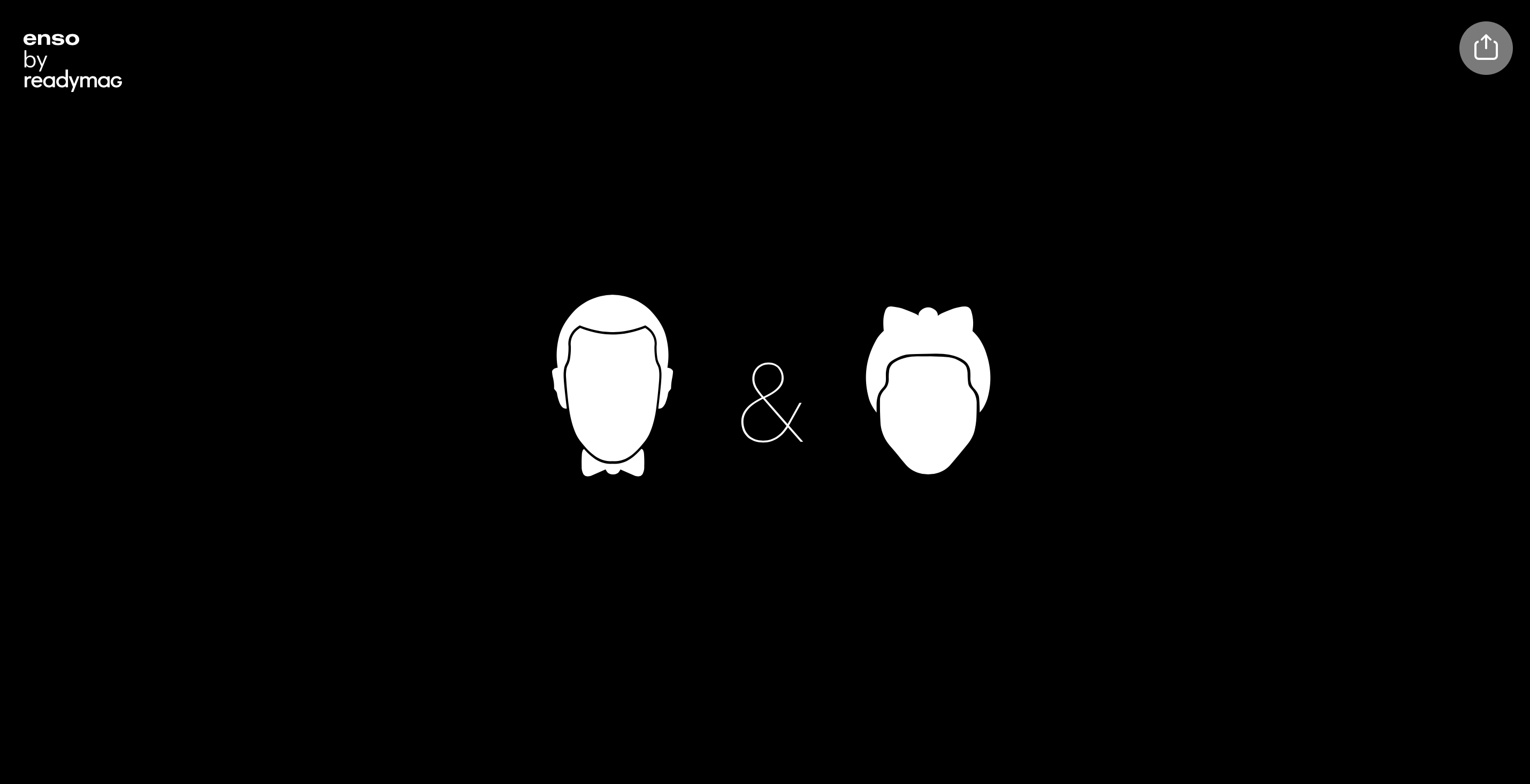

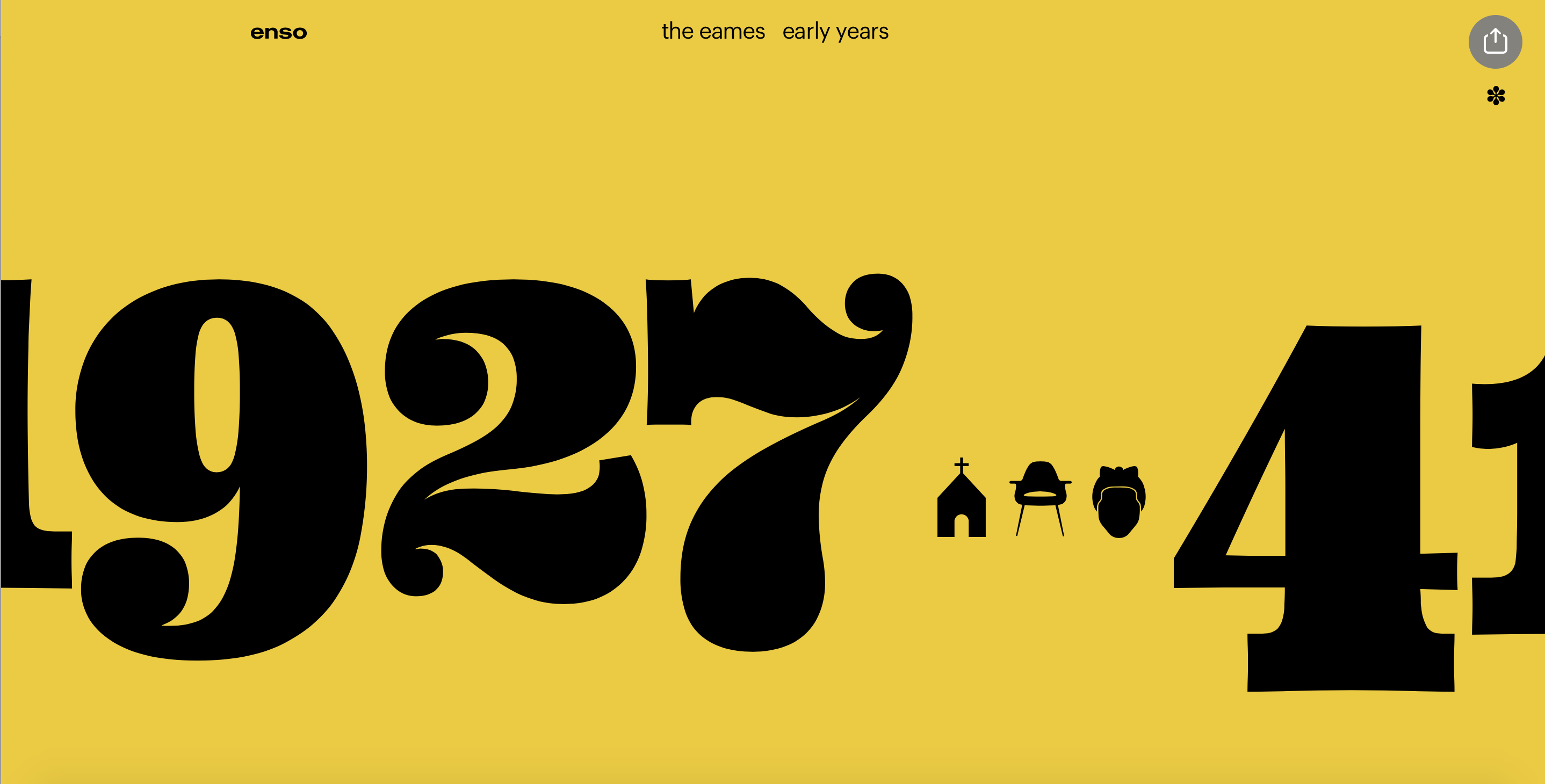
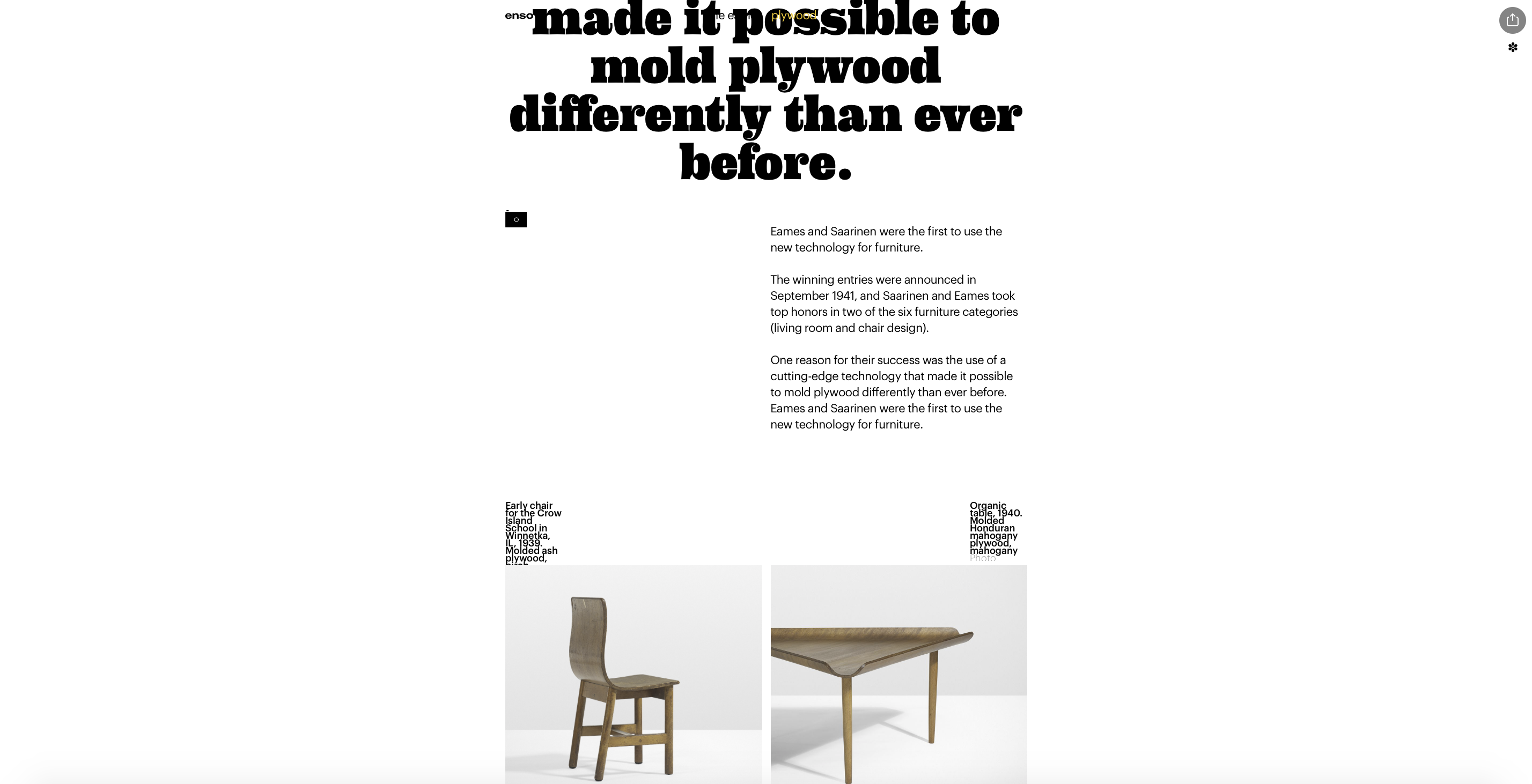
This website dedicated to the designs of Charles and Ray Eames is one of the best websites I have come across. The way things move, align and resize when you scroll up and down through the pages is remarkable. Even with so much motion, the audience doesn’t get lost. It is so interesting to see how they’ve used only 2-3 prominent colors and bold but necessary graphics to begin the page. There is not much jumping from one page to another rather a slide to the next section. I think the user experience is incredible and extremely captivating just like their important and major influential designs in the field of furniture. I also love how the categories are divided according to timelines which makes it much more informational and educational. All in all, a true vision.
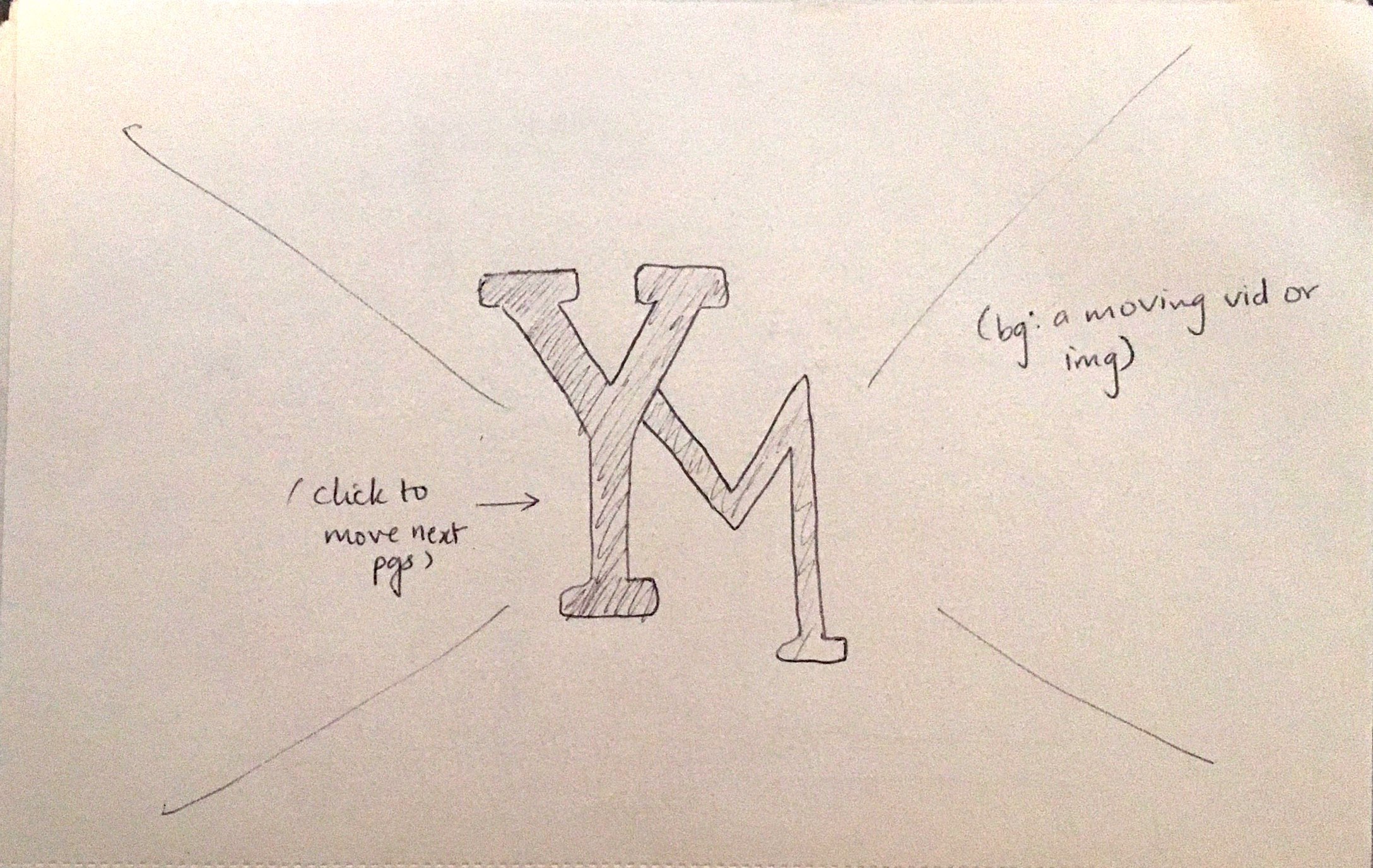
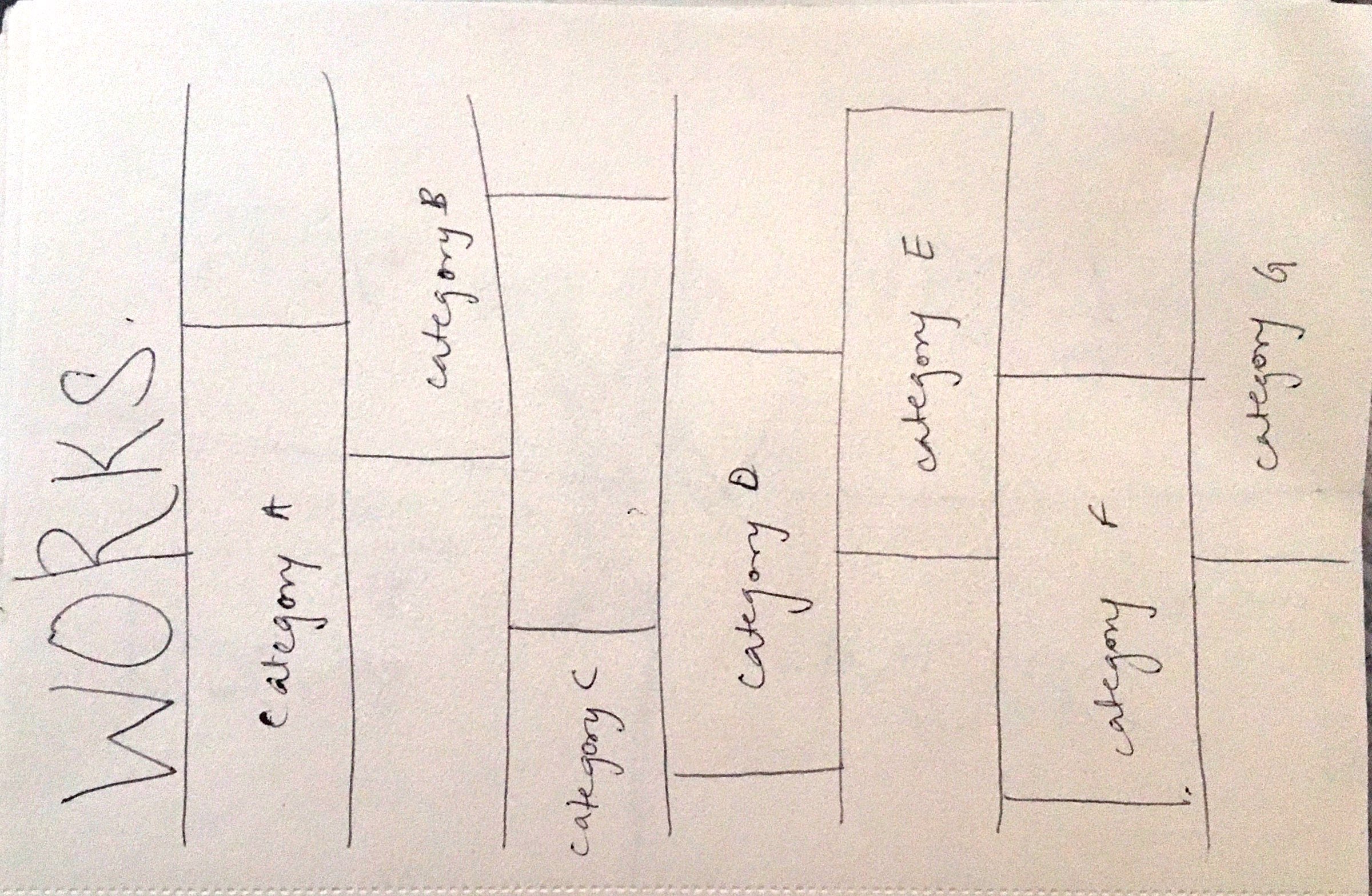
YABU PUSHELBURG
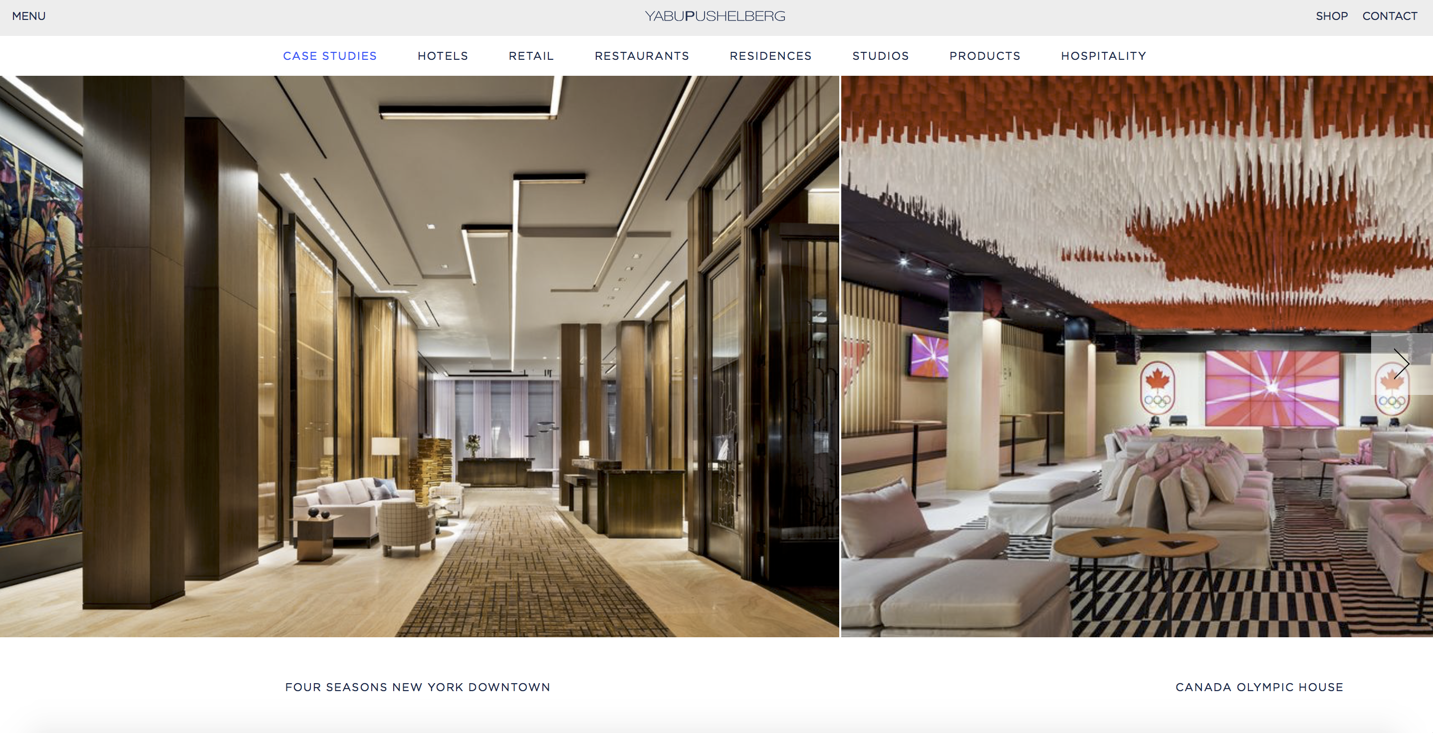
Yabu Pushelburg is an international design firm that is widely known. I like the layout of the images, categories and titles. I would like to create categories in such manner on my website because it is very comprehensible. Even with all the text in upper case, the font is also modern and chic something that I would love to experiment in my website. I think typography plays a vital role in web design.
TARGET YOUR AUDIENCE
My target audience would include other individuals/firm/companies that are in the field of interior design or even simply design, students, anyone who wants to collaborate or is interested in my curiosities, family and friends. Although this is a wide distinctive variety of audience, I really want my interface to be smooth for each individual. While firms can look at my portfolio and its presentation, collaborators should be able find a spot for network and family can see what I’m working on.
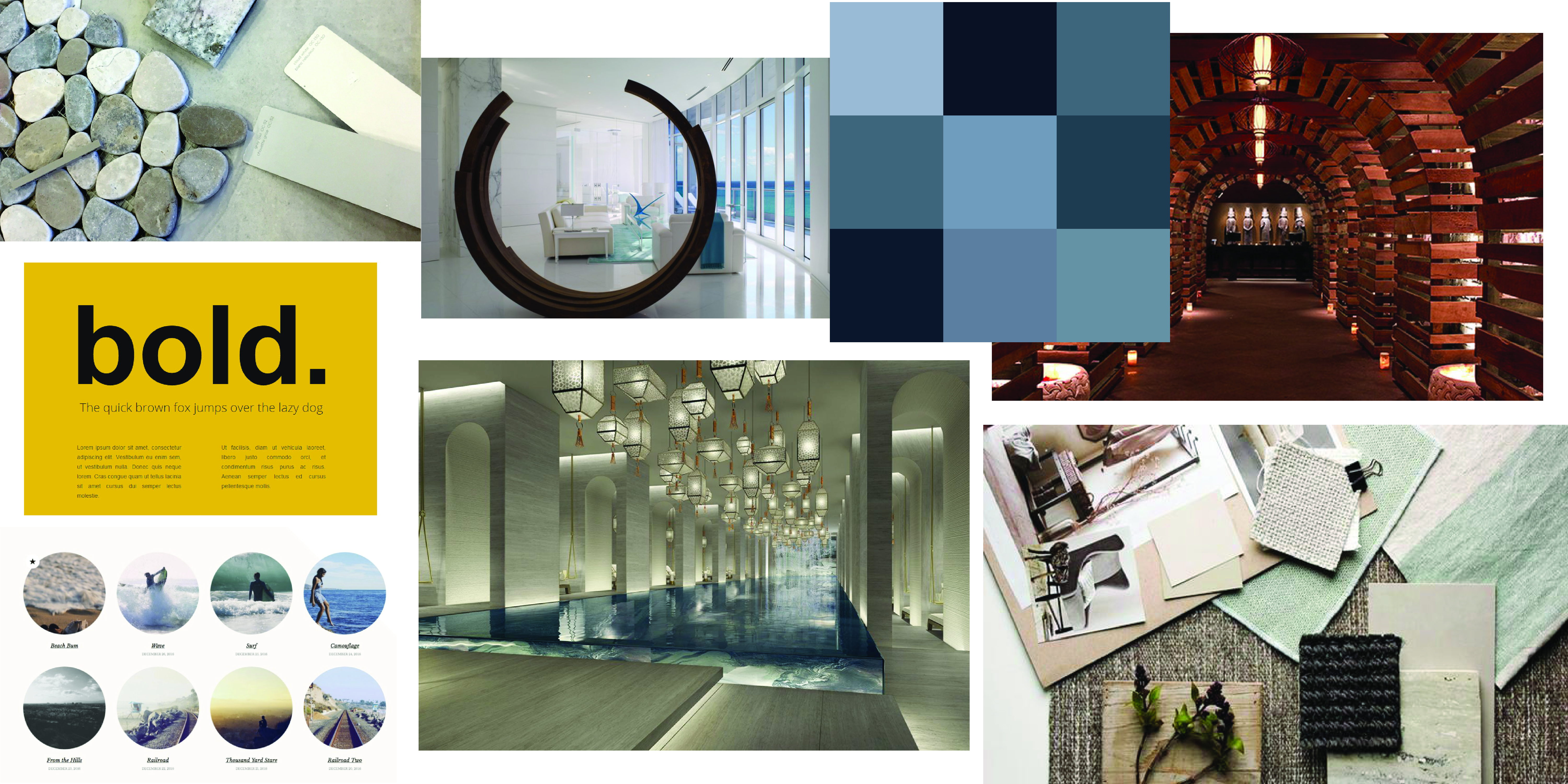
INSPIRATION
THUMBNAILS