DESIGNING FOR THE WEB (8 STEPS)
Step 1: Develop Your Idea
Step 1: Develop Your Idea
I want to create a site that is contributed by a variety of mediums. Because my website is not necessarily a portfolio, rather an opinionated and educational one, I have quite some freedom and a space to operate and design the website and its’ material however I’d like. I want the website to be a visual and textual experience in apprehending collective memory of the Middle East. I want it to include my own personal photography, design, and words (So in some senses, will have elements of a portfolio) Finding the solution is potentially the hardest aspect of this project. Then, laying it out onto the website, finding ways to make the material digestible with the implementation of a variety of mediums will be another challenge because it requires me to cater for all audiences—Those who are interested in global themes and those who aren’t.
Step 2: Discovery and Research
Step 2: Discovery and Research
I find it challenging to find websites that encapsulate what I want my website to be; there doesn’t seem to be a helpful prototype out there. However, there are websites that cover small aspects of my visualizations which I will list and expand on below:
Yesterday, Come Closer ماض يقترب
Yesterday, Come Closer (ماض يقترب) is a website created around a photobook. Made by Ibrahim Hasan, a Palestinian visual artist, the website is an homage of home and belonging which allows anyone who doesn't have access to the book (Which is sold out :( unfortunately) to still interact with its material. This falls back to the intent of his book which grapples with the generational residue of erasure in Palestine. I adore the websites purpose to share wisdom which I would like my website to embody. I enjoy the layout of the site, the way archives are presented and its' confusing nature which adheres to the matter. It takes into account the sentiments that are felt within topics like such and also evokes multiple emotions. The choice of font is also very fitting and simple.
Middle Plane is a very very exceptional example of what I had in mind. Middle Plane is a fashion magazine that explores "the relationship between art and fashion through the work of a single artist on each issue." Middle Plan creates and sells magazine issues and offers space for blogs and stories. Despite my website not covering fashion, this website is an extraordinary example of balancing copy text and art. The theme of this website is additionally very alluring to the eye.
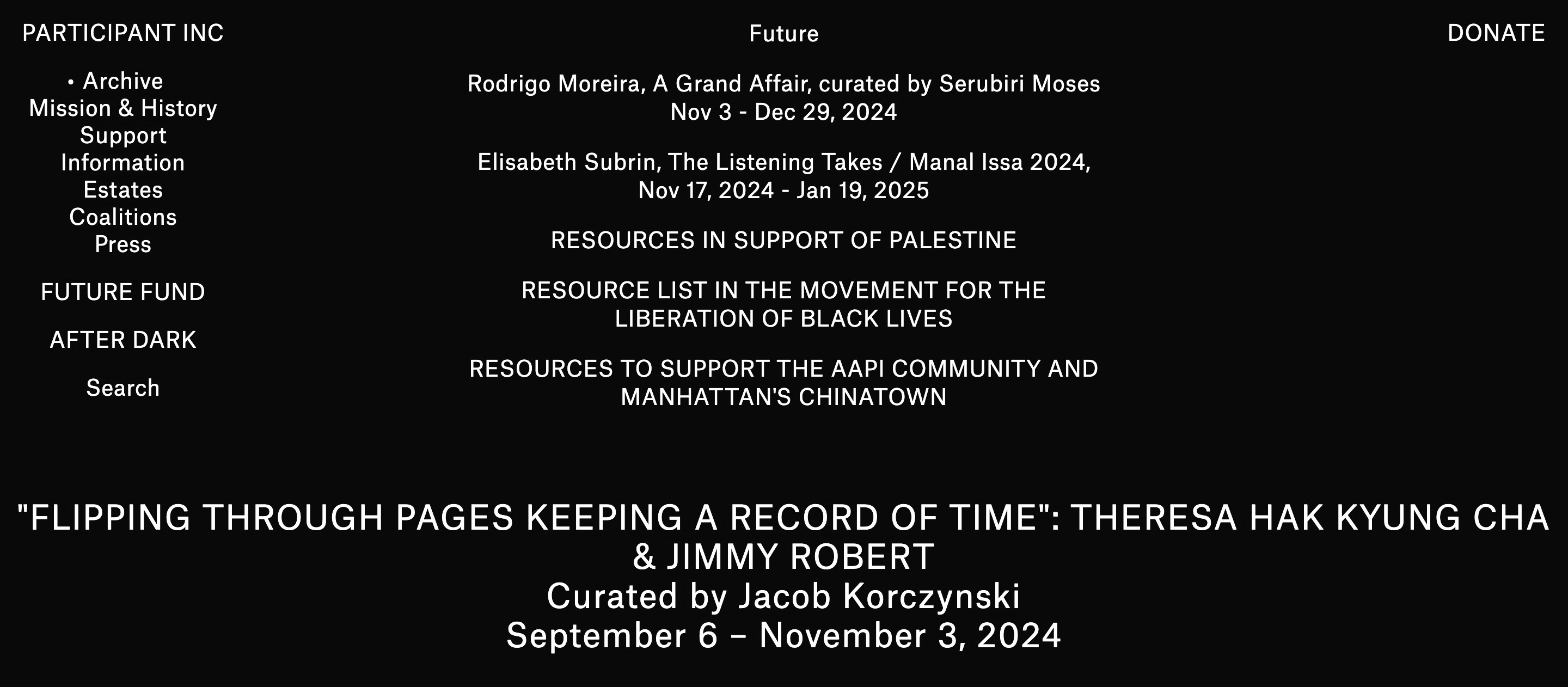
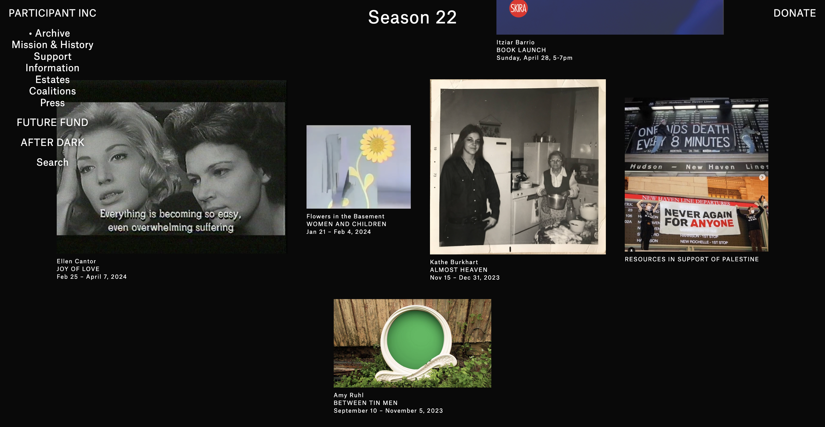
I will also be taking inspiration from this site and organization. ParticipantInc, is a Non-Profit arts organization in New York whose website provides a great deal of information regarding global issues such as Palestine, Black Lives Matter, and AAPi, providing immense resources and further readings and visual aids. The tone of this site is nearly exact to what I'm interested in doing--not harsh on the eyes, suitable for the gravity of the topic, and the choice of font, color, and photographs are intriguing and welcoming. I've attached photographs of the website, and previous websites below to provide an idea of what I envision my website to look like and foster.
Nero is a site that sells a variety of publications. I would like to borrow some aspects of Nero's website to mine. Namely, the attractive typography and the organized format which at times gets complicated as you keep on exploring.
Step 3: Target Audience
Step 3: Target Audience
The website will be valuable, in part because of its’ timeliness. It will be targeted to every person as the topic is planetary, but will be of interest to a certain demographic—an audience that enjoys and learns best about contentious topics through a variety of visual mediums. My target audience are those who want to find alternative perspectives to certain concepts and expand the way they view society. Since I’m discussing the Middle East, I’d like to construct an accessible site for the Arab demographic, meaning, I’d love to translate it into Arabic, my native language. I can’t think of any websites that provide a very diverse range of approaches to a topic. I do have to commit to making the site easy to navigate and simple, but also exciting and challenging.
Step 4: Inspiration & Concepts
Step 4: Inspiration & Concepts
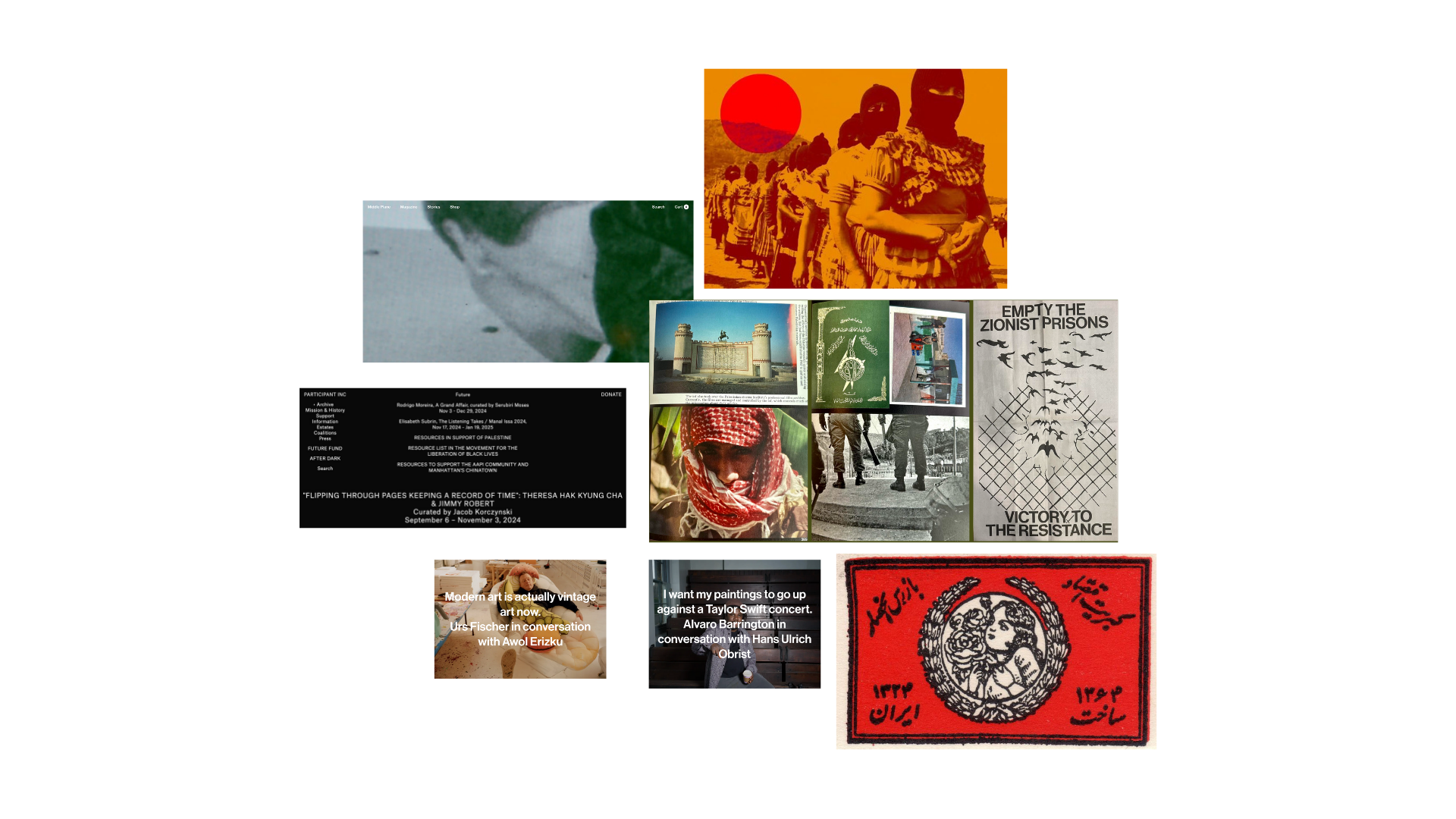
Mood board:
Step 5: Thumbnails
Step 5: Thumbnails
Cargo Website I made for the encampment. I enjoy photography as well, which is emphasized throughout this website.
Step 6: Wireframe
Step 6: Wireframe
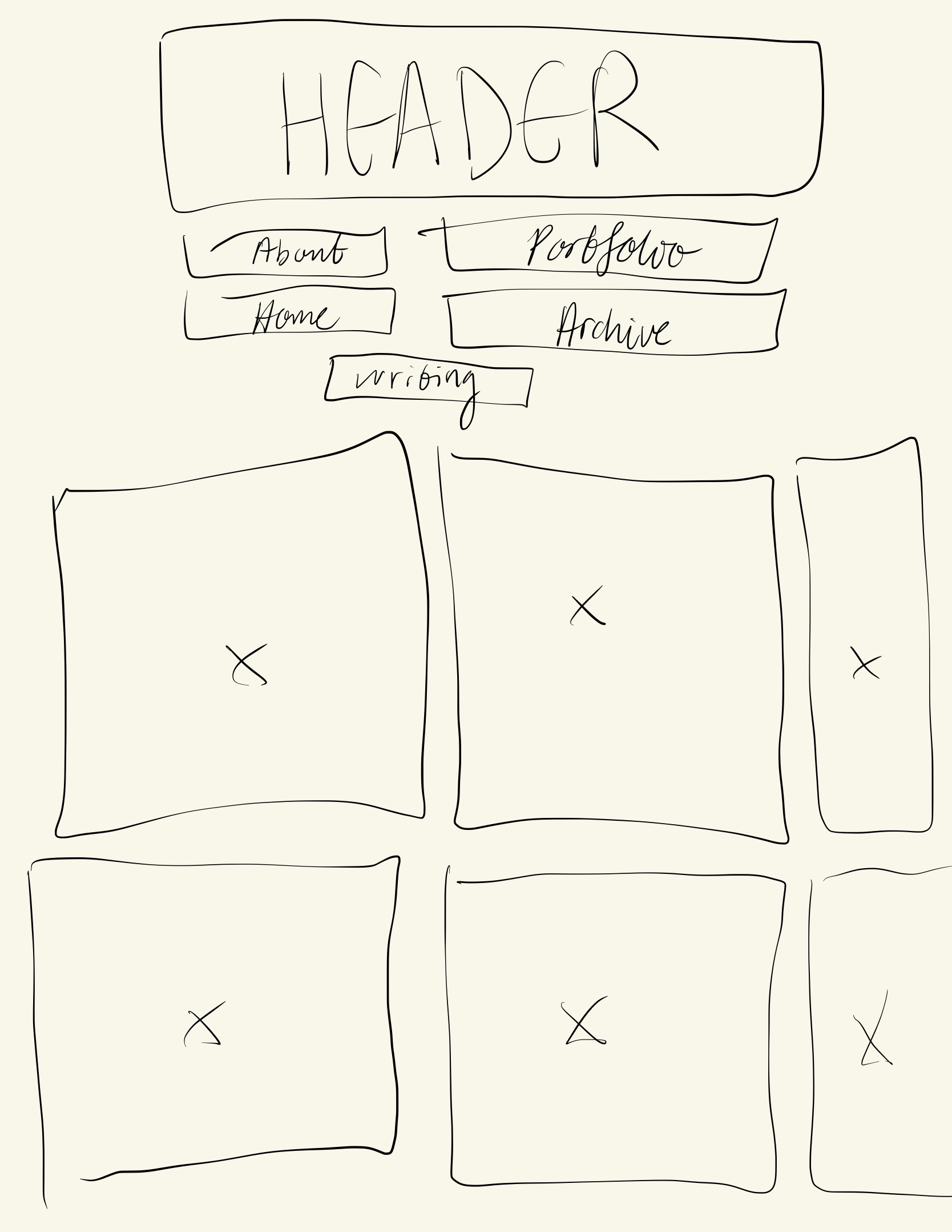
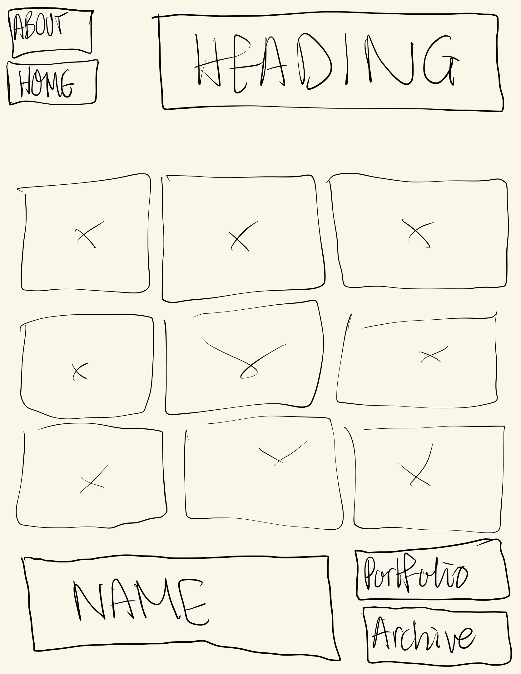
Step 7: Responsive Mockup
Step 7: Responsive Mockup
