1. Develop your idea
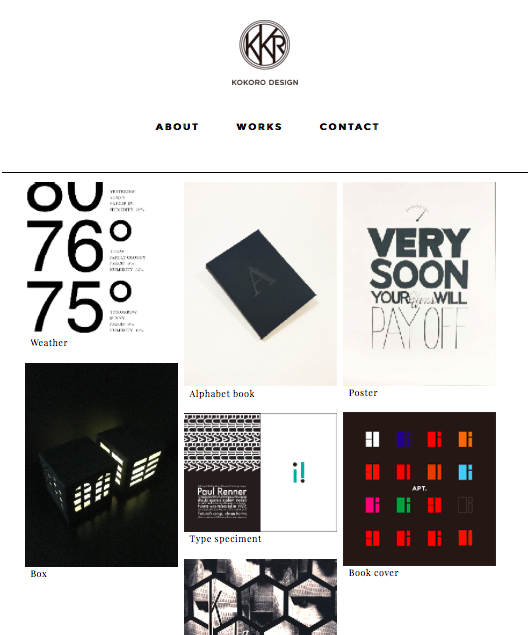
This is my portfolio website. The goal of this website is to design simple and clearly in order to show my works to everyone.
In general, the main purpose to check one's website is to figure out details. Thus, I would like to focus on customers' purposes.
2. Discovery and research
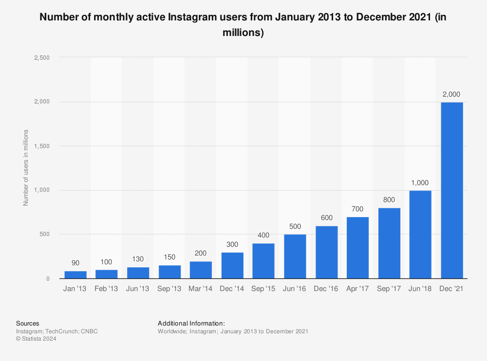
First of all, I researched about statistics of social media, because they are familiar examples to us. I found that Instagram has hit 400 million monthly active users, making it far larger than rival Twitter, as the social networking site looks to boost advertising revenues from the service, according to CNBC.
Also, I found the article from Statista; The statistics portal. it indicates that This statistic gives information on the number of monthly active Instagram users as of December 2014. As of that month, the mainly mobile photo sharing network had reach 300 million monthly active users, up from 200 million in March 2014. The app is one of the most popular social networks worldwide.
 In Instagram, the main element is photography. The user can shoot photos and edit them. Not just that, they can search for the images they want to see.
Instagram is useful to tell user’s stories by using photography without some articles, and user can arrange their photos by using filter, and create shadow or depth easily. Then, their pictures become more impressive. That’s why young people like Instagram.
Why the target audiences want to show their photos more beautiful and eager to search great images in the Instagram? This is because they want to express their reals better.
Then, I visited some design companies' websites which were selected as a winner of awwwards.com. As a whole, those websites are clear and easy to understand.
The main material of this website is photography instead of using texts on the top page. It impresses customer's minds. My website would be simplified and clear, therefore it's easy to understand about my works in this portfolio website.


3. Target your audience
The audience I am targeting with this website are people who want to get new ideas about design especially design college students or clients who want to solve their problems. So, the age of the target is from 18 year olds.
4. Inspiration
The concept is editorial magazine. From the research, I noticed that I should focus on photographies. We can understand what photographers want to tell the viewers without showing articles. This is because they intentionally change the focus and colors in each pictures in order to tell the real story. Of course, all of photography is beautiful. From this situation, I thought the target audiences also like editorial photography. That’s why I chose an editorial magazine as a concept.


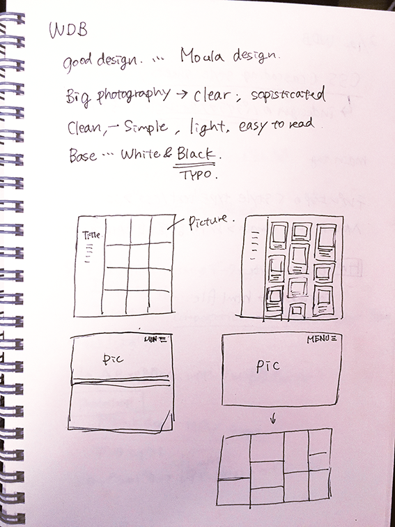
5. Thumbnails
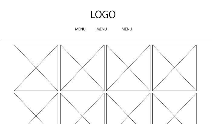
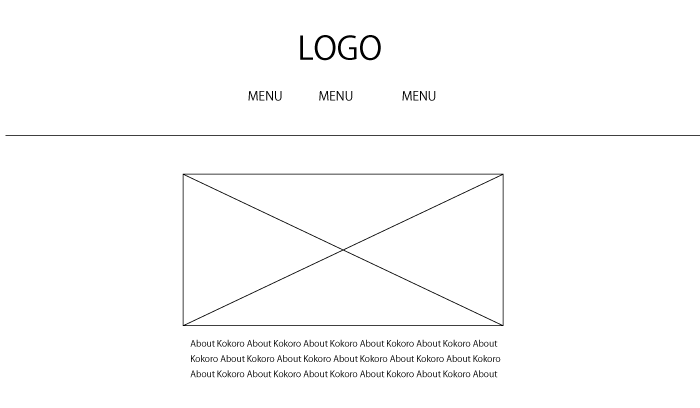
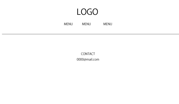
6. Wireframe
7. Photoshop comp
