1. Develop your idea
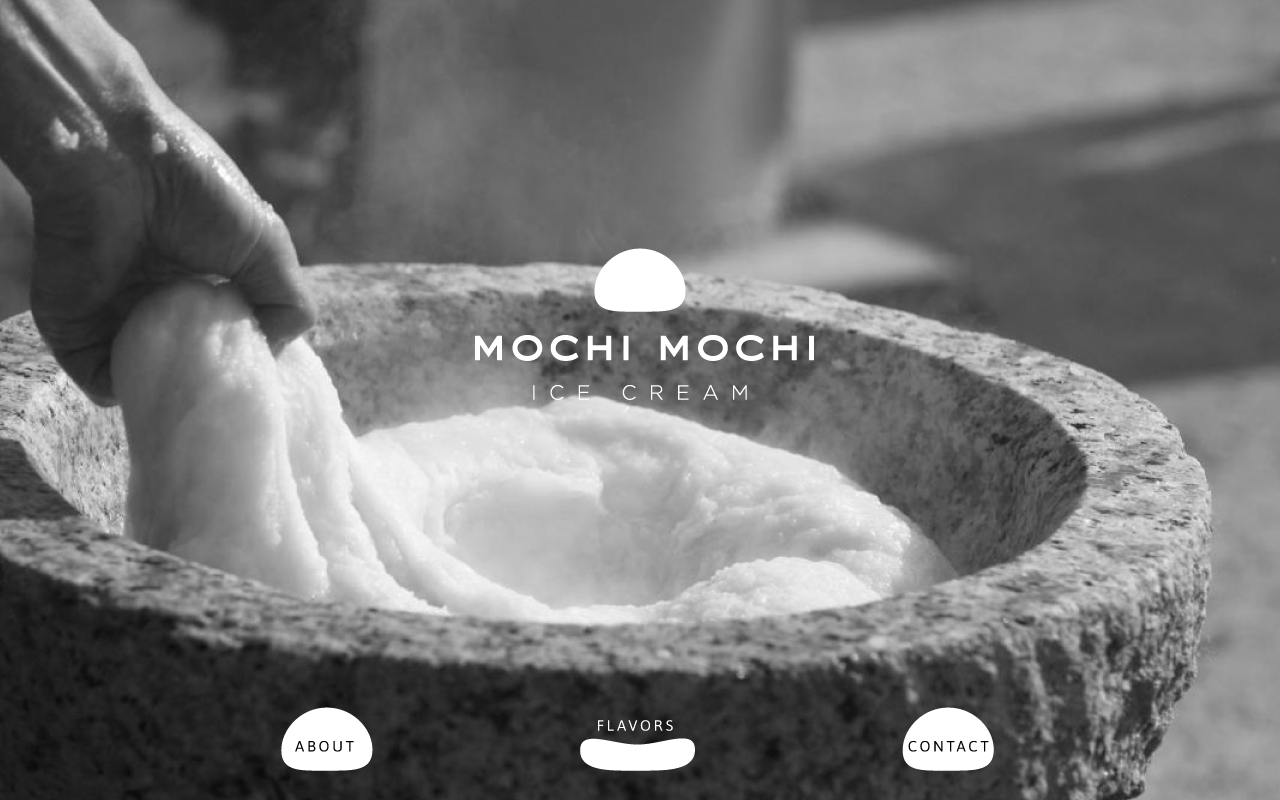
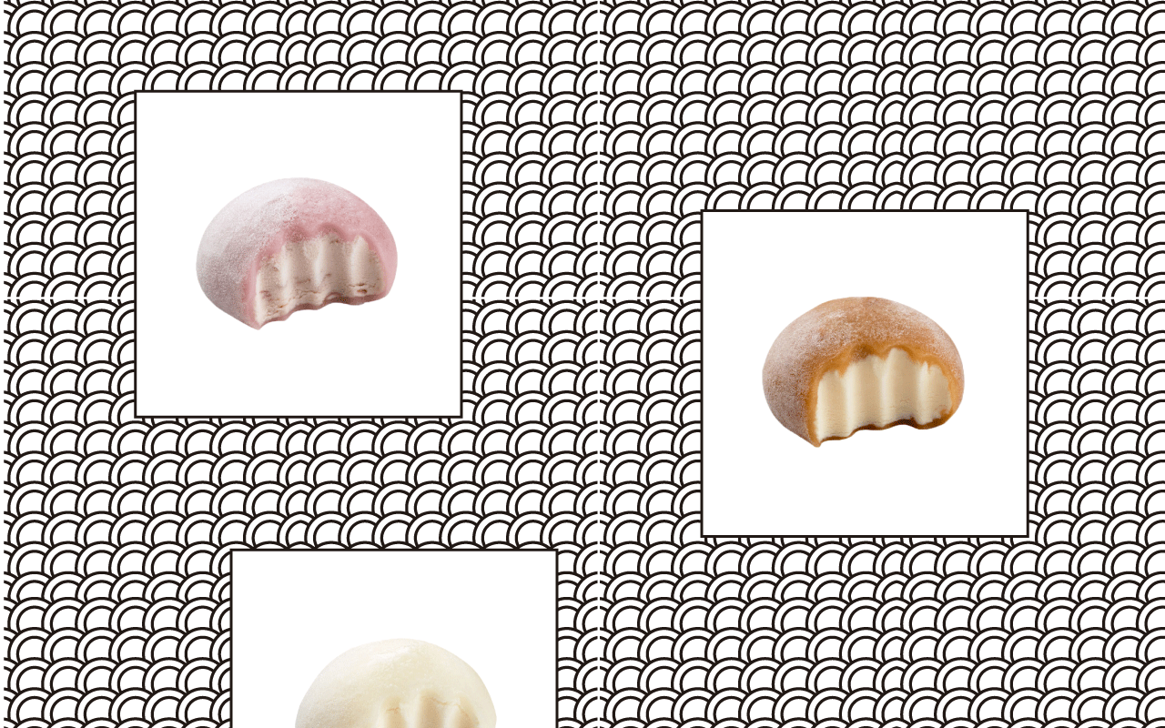
This is MOCHI ICE CREAM website. The goal of this website is to design simple and clearly in order to show what is Japanese product.
2. Discovery and research
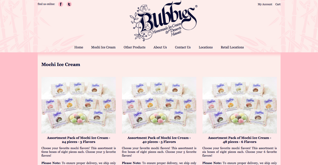
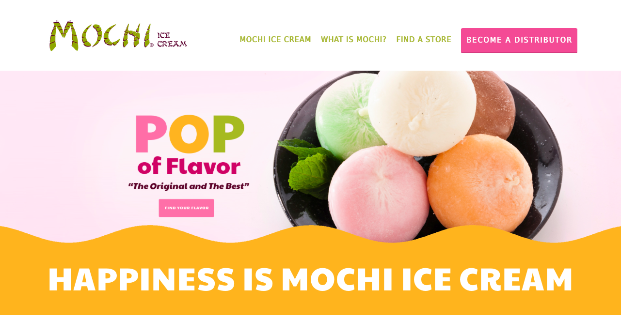
In general, There are a lot of mochi ice cream online shopping stores.
However, some of their websites are complicated and hard to see, also they cannot express Japanese atmosphere on their web sites even though mochi ice cream is from Japan.
I would like to redesign their website that is easy to see and looks attractive.
What am I selling?
Mochi ice cream


3. Target my audience
The audience I am targeting with this website are people who want to eat mochi ice cream and know traditional Japanese style. The age of the target is older than 15 year olds because they purchase what they want to get by themselves.
4. Inspiration
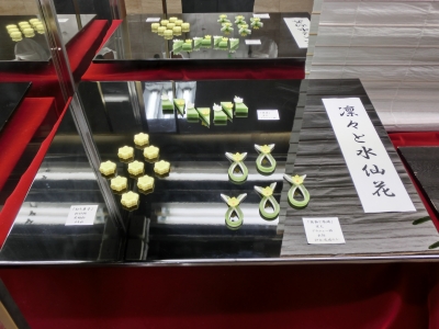
The concept is the showcase of Japanese department store, combining with modern and traditional style. From the research, Japanese also focuses on how to show their food beautifully. I found one article that many tourist love Japanese food sections of department stores because they look like amusement parka because they show their products like an art. I noticed that food can attract people.

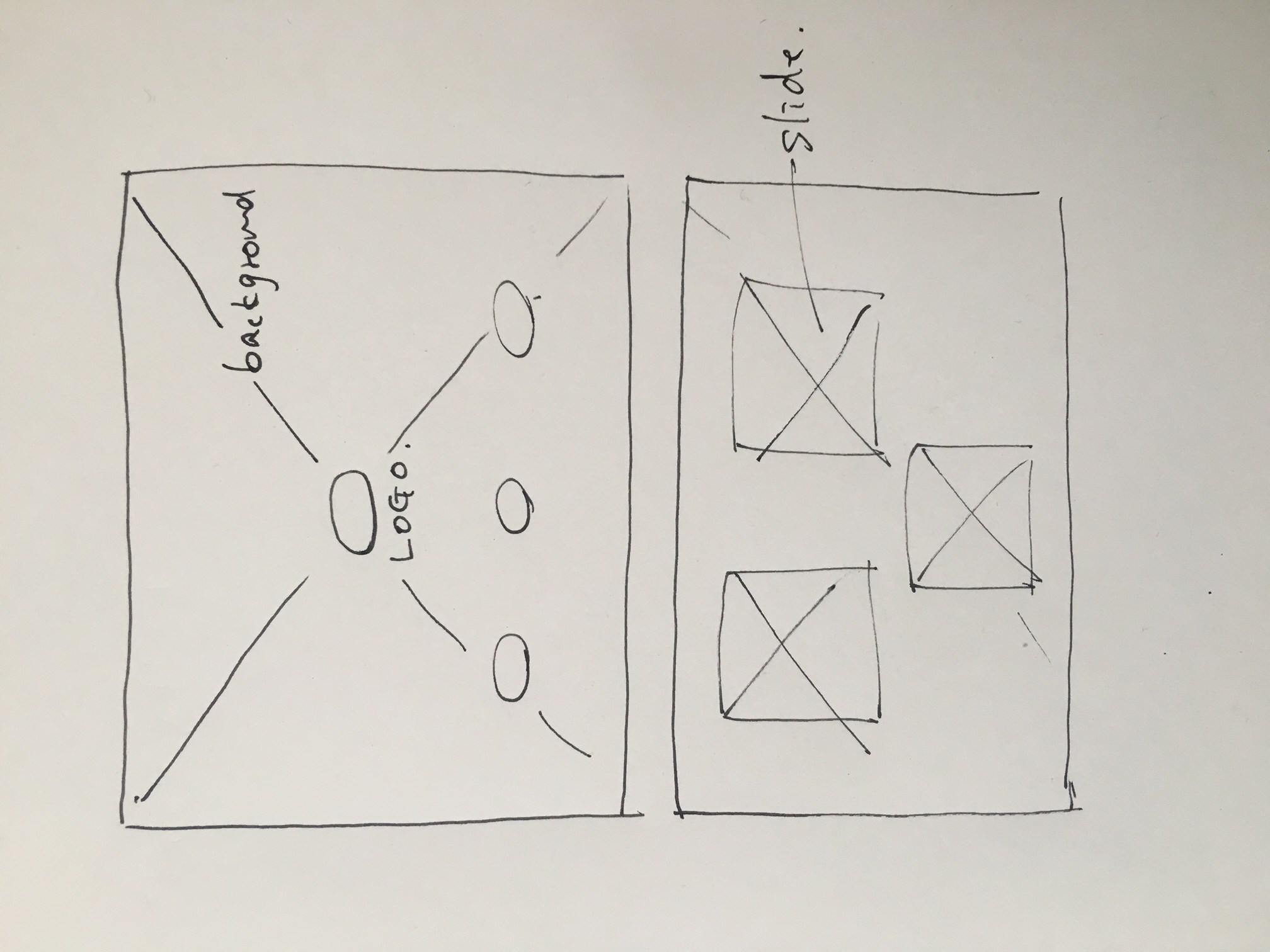
5. Thumbnails
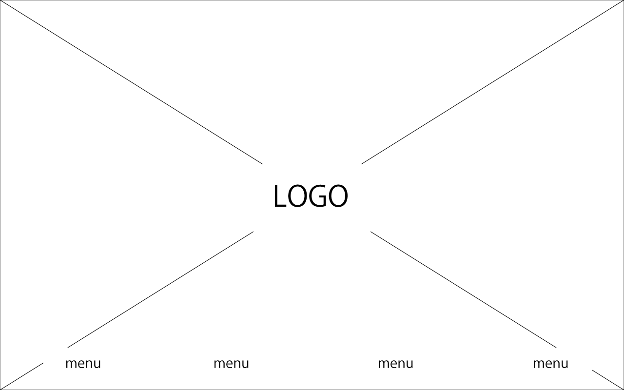
6. Wireframe
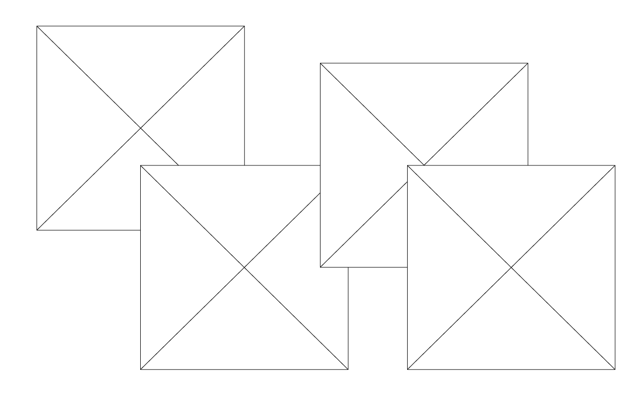
7. Photoshop comp
