Nendo is a design company lead by Oki Sato which produces work for a variety of disciplines, such as product design, interior design, architecture, etc. They are most known for their clean, minimalism style in design. This design aesthetic is very well-reflected in their website – www.nendo.jp – as well.
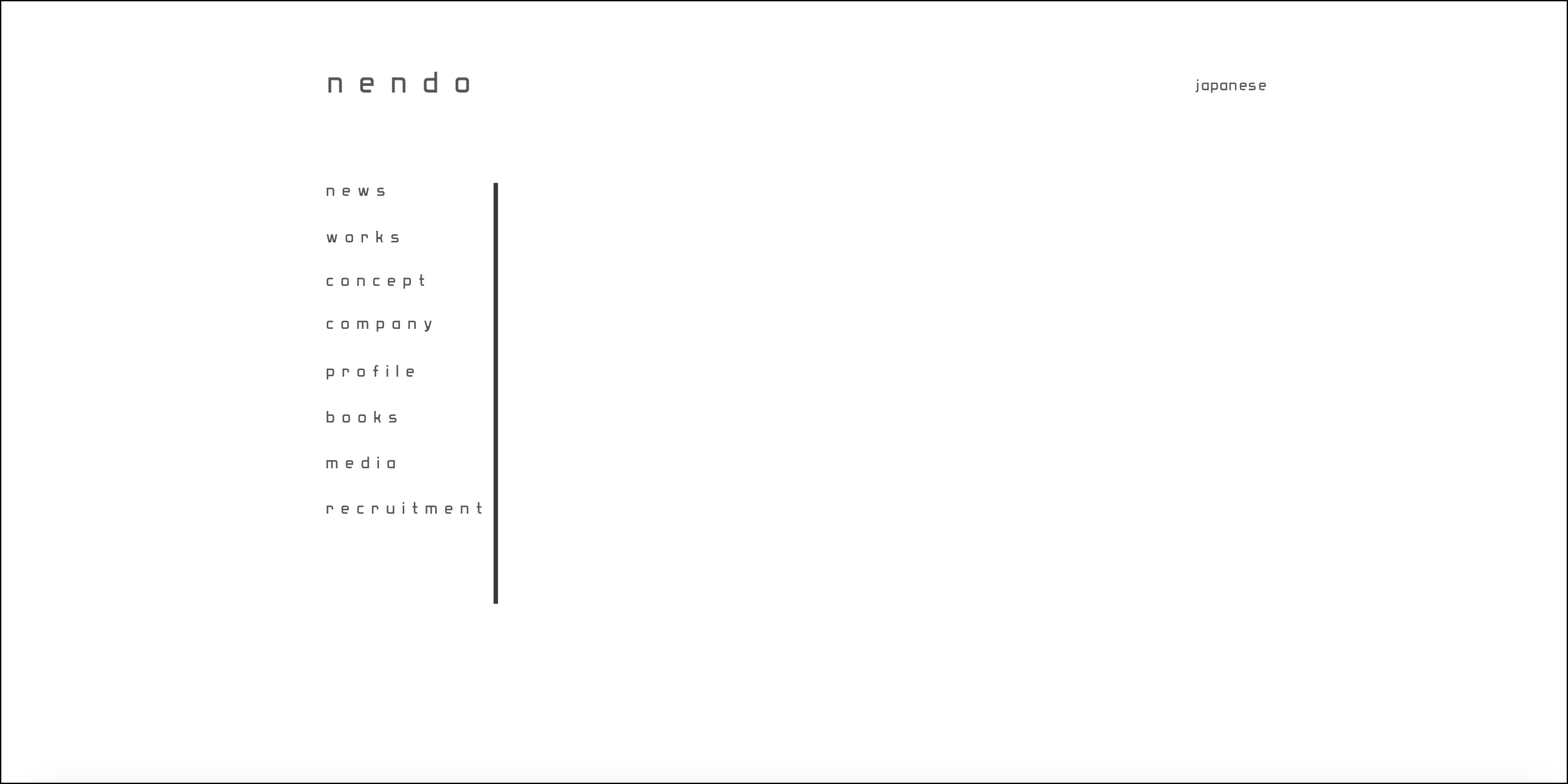
Upon first entering the website, a landing page appears with simply the Nendo logo on the left and a choice between Japanese and English language on the right. The words are in a very geometric, clean typeface which is on top of a white background. While most other product designers would choose to display some sort of image on the home page of their website, the simplicity of Nendo surely strikes out.
After choosing a language, the website redirects into the “works” page, which automatically displays Nendo’s most recent works in a grid format with square pictures. The pictures uniformly show the products neatly with a muted grey background, once again reflecting the cleanliness of the brand aesthetic. Clicking into a work, the title of the project is displayed at the top in lowercase letters, along with the date of the project and a brief description. The rest of the page displays all other pictures/renderings of the project, once again consistently on top of a muted grey background color.
The rest of the website is displayed in a similar manner. Pages such as “concept,” “company,” and “profile” are displayed with a simple typeface aligned to the left and no extra images. Pages such as “books” and “media” which require the display of images show them in a simple grid format.
Intent
The intent of the website is to showcase the brand Nendo and its aesthetics in a simple, clean, and easy-to-navigate format.
Voice
As a minimalist design company, Nendo is most known for its design works that are so simple and void of extravaganza that it becomes utterly beautiful and clever. However, each of Nendo’s works also have a sense of quirkiness and fun embedded within in, shown not only through the cute child-like sketches but also through the outside-the-box designs.
Tone
Because Nendo is a professional design company that has done numerous works for large corporations such as Swarovski and Coca-Cola, the tone of the website is very much professional and formal.
Persona
Jane, 22, Design Student
Jane is a college student majoring in Product Design. As a known figure in the industry, Nendo is one of the many aspirations Jane looks up to. She visits the Nendo website once in a while to look for updated new works by Nendo and to gain inspiration for her own work. Thankfully, the website has a huge portfolio of work done by the company and organized by time so Jane can easily browse through.
Coca-Cola, Company
As a multinational company, Coca-Cola is constantly looking for new, cool designs that would help with their current products. They would seek out Nendo’s website to look through the brand’s style and work. If Coca-Cola likes the minimalist aesthetic of Nendo, they would call Nendo up for a commission.
Core 77, Online Magazine
As an online industrial design magazine, Core 77 would need to scour the web for designers to feature in their articles. They could be doing a quick google image search, and, clicking into a rendering that they liked, landed on Nendo’s website. Most interested in the newest works, Core 77 would browse through the most recent images and read through the research and renderings to find innovative designs from Nendo to report.
Wireframe
Copy Deck
Title:
Nendo
Heading:
News
Body Copy:
2019.01.14 Mon nendo has been awarded “AW Architektur & Wohnen Designer of the Year 2019” 「AW Architektur & Wohnen」Special Edition
2018.11.26 Mon Collaborative exhibition “Escher x nendo | Between Two Worlds” at the National Gallery of Victoria (NGV), Melbourne Australia Escher x nendo | Between Two Worlds images
2018.10.12 Fri nendo received “The Blueprint Award for Design 2018” Blueprint Awards 2018
2018.07.31 Tue TGV of the next generation to be designed by nendo and AREP designlab SNCF press release AREP website
2018.07.31 Tue “Between Two Worlds | Escher x nendo” exhibition will be on display at the National Gallery of Victoria (NGV), Melbourne Australia NGV website
Competition
Unlike Nendo, most websites in the product design world is still very much focused on images and presenting all the work in one glance. For example, the website of Philippe Starck – a currently very influential product designer – shows a fully landscaped zooming/moving picture at the top of the home page. He then has his name/logo in a large fully capitalized sans-serif typeface in the center at the top of the page (on top of a white header). Scrolling down, one can immediately see all his work in pictures in a sort of blog-grid format. It scrolls indefinitely downwards as he displays all his works in that one page. This is drastically different from Nendo in which one has to click through the “years” and also pages because the website only displays a maximum of 18 images on one page.