- Intent
- Voice
- Confident
- Clear
- Colorful
- Minimalistic
- Tone
- Brand
- Personas
- Copy Deck
- Competition
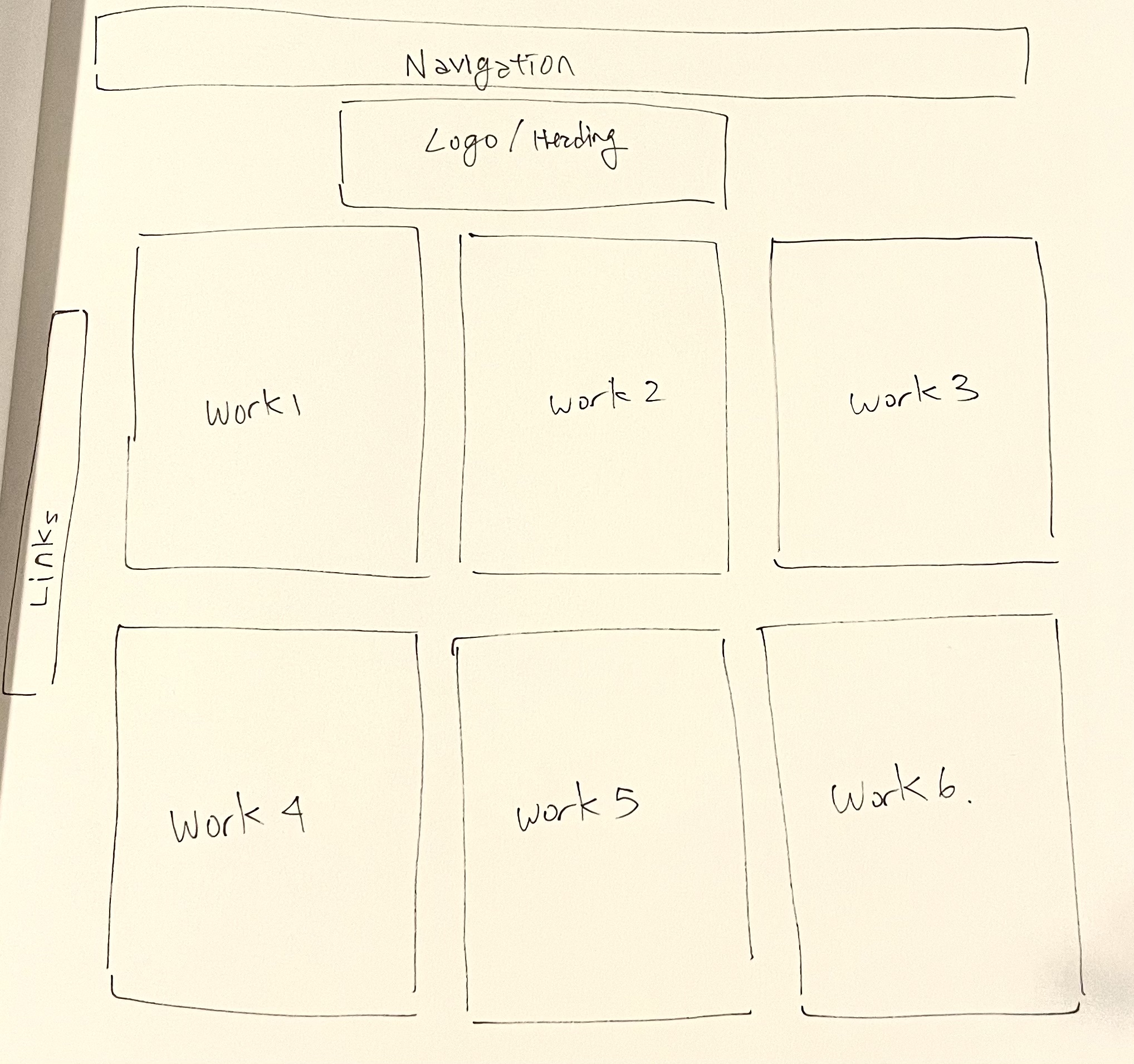
- Wireframe
The intention of this website is to showcase a variety of works done by Naomi Wilkinson.
The voice of the website is light and colorful, fitting well with the style and color palette of Wilkinson’s works. It is also very confident, as the first thing we see as we enter the website is a long gallery of her works, and can click immediately for a more detailed page of her work. It is concise as well, showcasing minimal information other than her projects that indicates the intention of the website as a whole.
The tone throughout the website doesn’t change as much, being consistent with the theme of minimalism.
Works: also the homepage, it has the smallest amount of information possible, possibly so that the audience can focus on the works.
About: it has a small amount of information available; she doesn’t mention her philosophy behind her works, simply the clients she has worked with, her contact information, and her occupation.
Blog: this page brings to an external social media called tumblr, where she also posts her works with a little bit more information (such as intentions). However, the tone doesn’t differ drastically from the “works” section.
Shop: the tone becomes more pop and vivid as she showcases things for sale, inviting customers to take a look at the goods. It doesn’t deviate from the overall theme.
The website seems to support the clear, concise line in Wilkinson’s works by being minimalist, using pastel colors that match her color palette. It is calm, but pops to convey the style of her artworks.
Fans: her works have a clear style and colors that definitely would create a passionate following (especially considering how she has multiple social medias to post her works). Such fans would visit her website to see and appreciate her works, perhaps going to a shop to buy some of her goods.
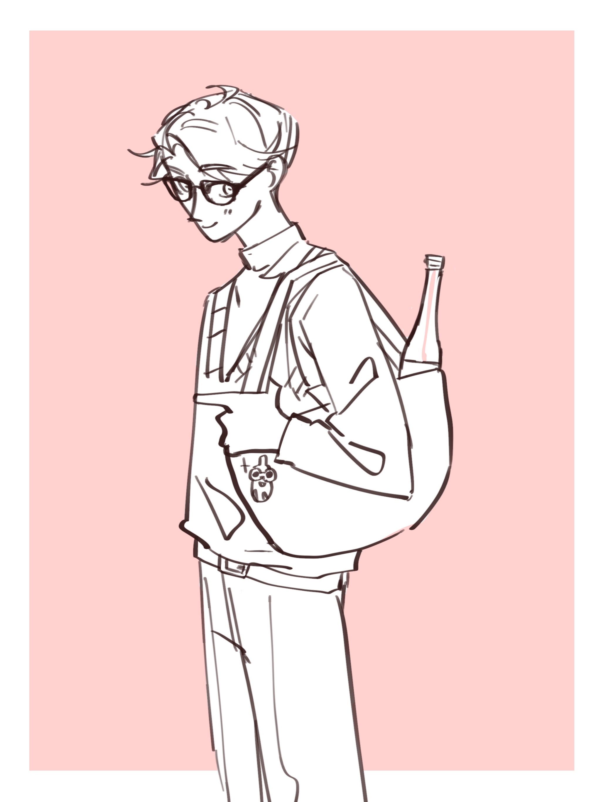
Yuuki
He found an illustration on twitter, then came to this website to appreciate more of her works. Then as he opens the menu, he realizes there is a shop section. He immediately clicks on it, finding himself with a whole bunch of goods in her style. He was overjoyed, and bought some pins to put on his bag.
Advertising department: Because her art is pleasant in general, the illustrations could be suitable to be used for ads that need a warm, friendly image. Wilkinson’s style could then be the representative style for their merchandise, becoming a repeating customer.
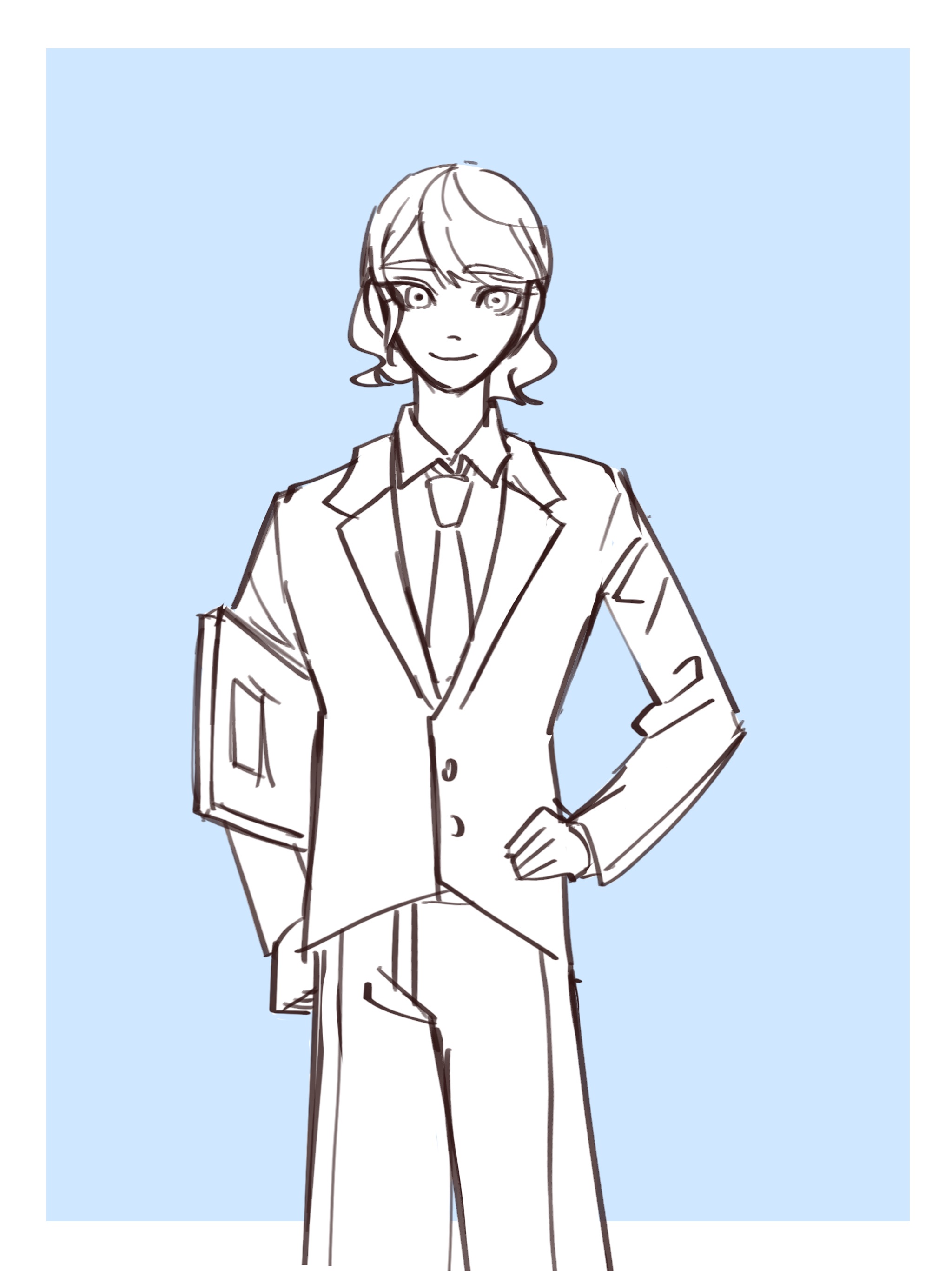
Emma
She was looking for an art style that fits with the friendly nature of a new kid’s toy the company had created, which they were trying to advertise. She came across this website, where she was immediately drawn by the warm nature of the colors, and contacted the illustrator to commission a work. She knew that the advertisement would tie the toy with this cute, warm style of Wilkinson’s work, improving the toy’s image.
Writers: Writers with a book that focus on positivity, calmness, and/or romance might find this illustrator’s work suitable for their book cover, based on the warm, pastel colors used in the illustrations, and the peaceful postures of the subjects. If they write more books, they might come back to this illustrator and commission a new drawing.
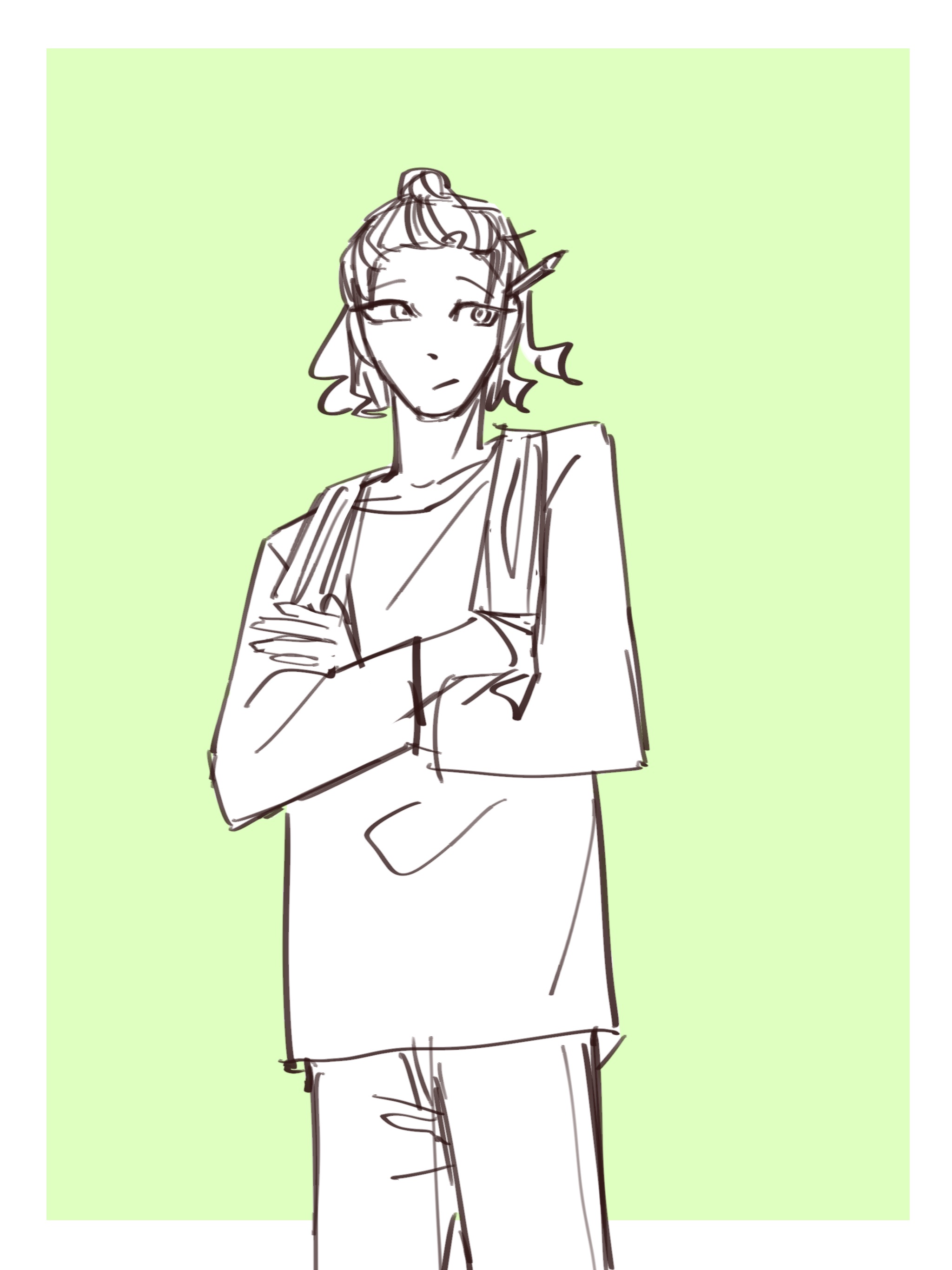
Huston
He had recently finished writing about how to find peace in the urban space, where he had noticed that more and more people are becoming stressed in the city environment. He was looking through social media to see whether he can find an art style that conveys the theme of his book immediately, then boom! Naomi Wilkinson’s works popped into his eyes. The peaceful subjects of the humans fit perfectly into the description of his work, and he contacted the illustrator for a book cover.
Title: Naomi Wilkinson
Heading: Work, About, Blog, Shop
Body: Chien’s Book, Graou Magazine, Sisters in Wine, Casetify x Naomi Wilkinson, etc.
Other competitors (other illustrators), could sometimes be not as consistent or clear in terms of design or the overall tone of the website, cluttering their works so that it becomes difficult to navigate. Wilkinson, on the other hand, is clear in introducing herself and her works by putting her name in the title, and immediately putting her representative works underneath it (that you can click for more information).
I feel like there could be a little more description in terms of the intention of her works, though it could affect the minimalist design she is going for.