Step 2: Research
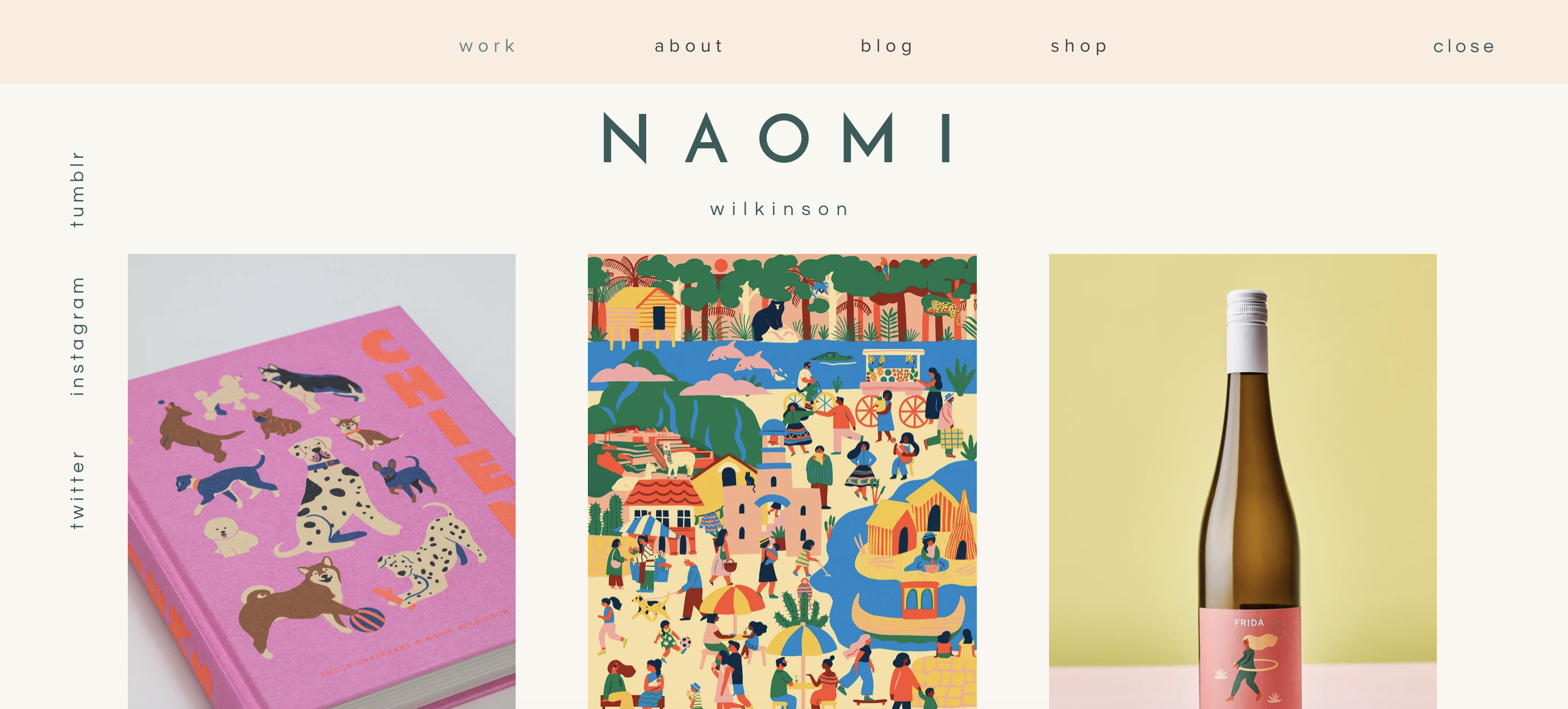
Naomi Wilkinson
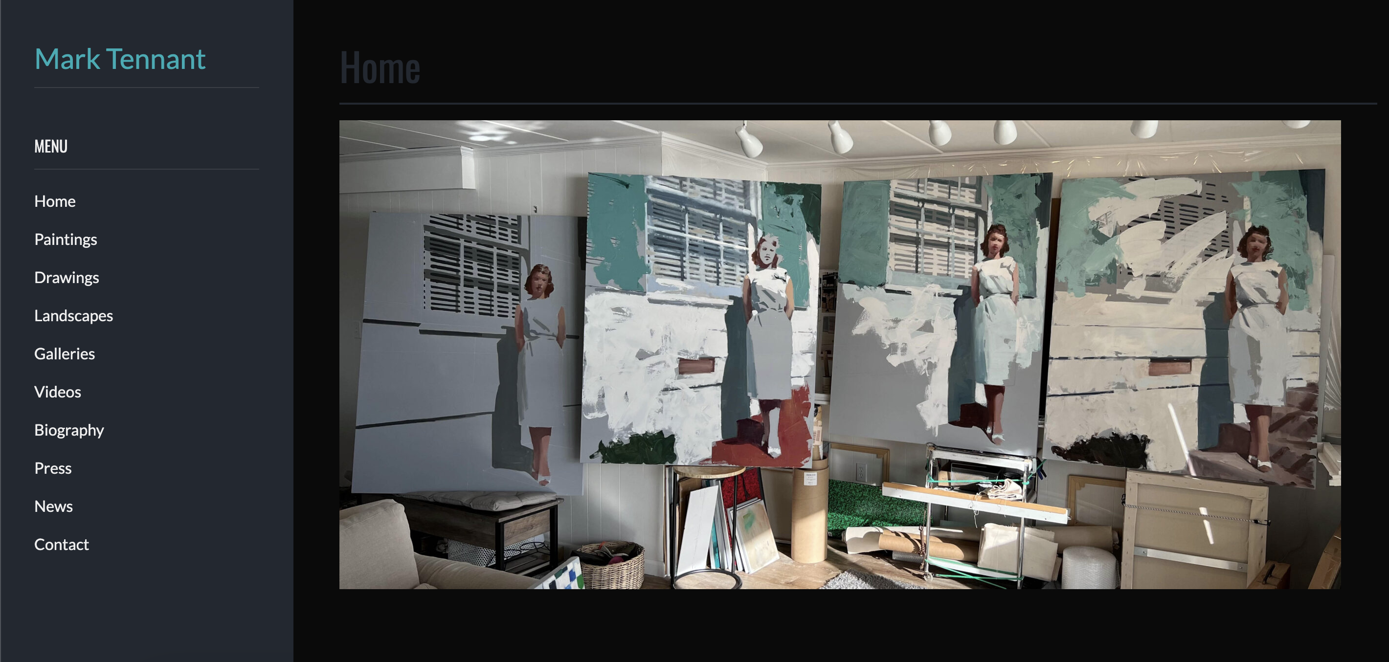
Mark Tennant
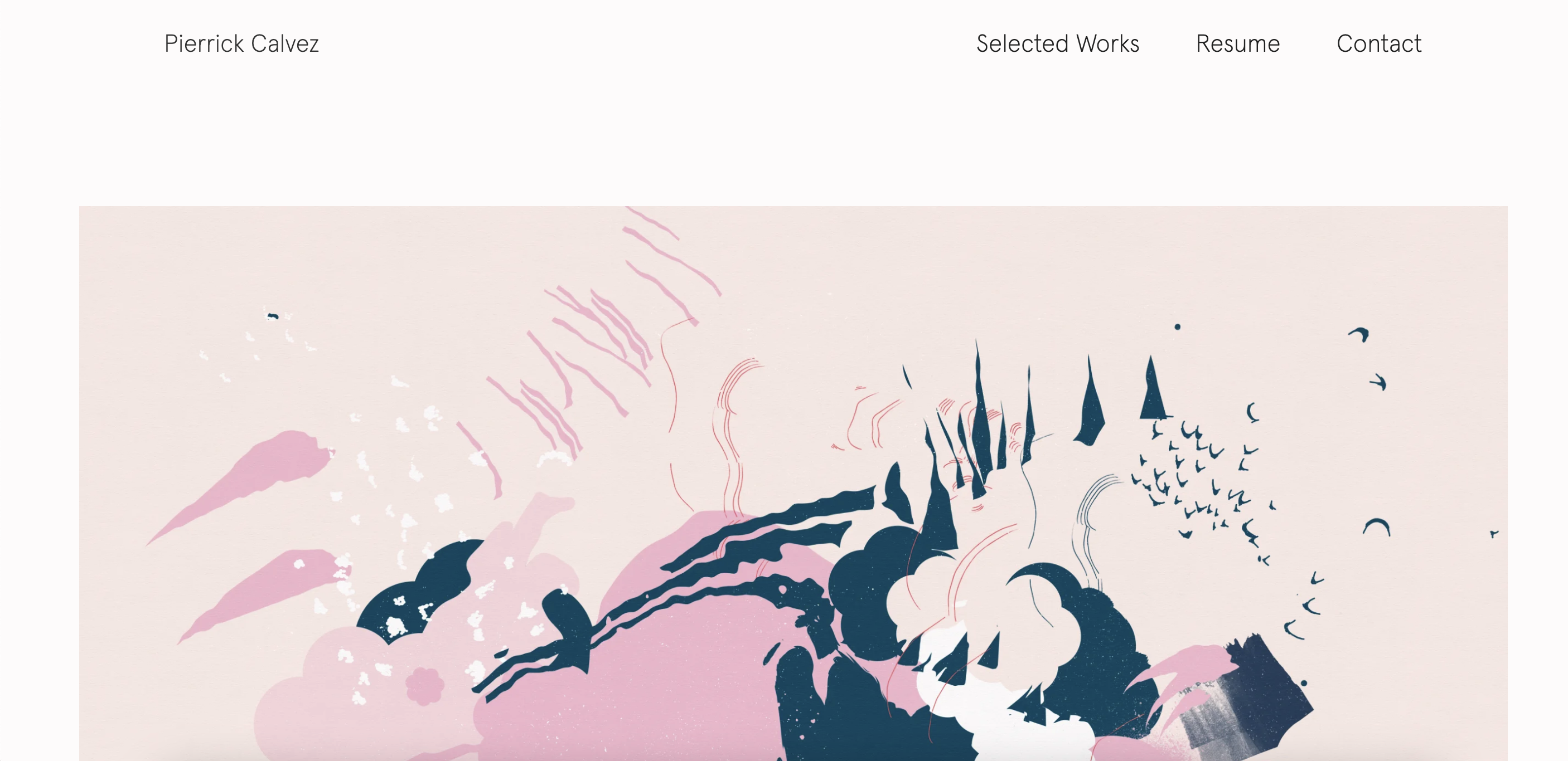
Pierrick Calvez
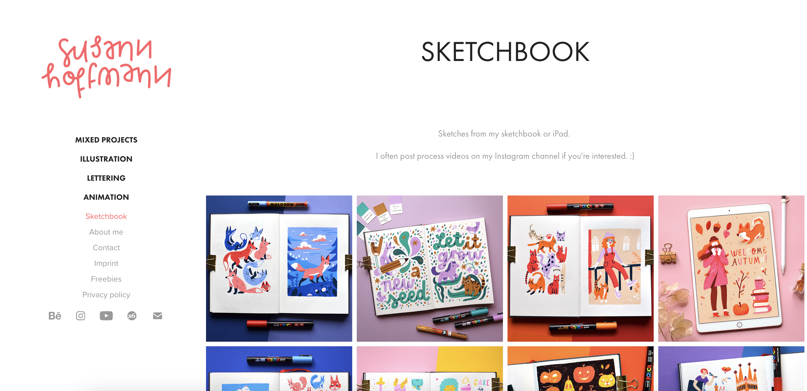
Susan Hoffmann
Her style of the website very well matches with her artworks, clear, concise, and warm. The color schemes are chosen deliberately to reflect and support her works. The menu doesn't hold much except her works, her blog, and her shop. The conciseness makes the website easy to navigate.
His website has a dark background so that the artworks can pop out more (probably because his works are more lightly colored). The navigation shows a variety of the types of work he has done, like landscapes and drawings, seeming to be appealing to a variety of clients, and a video section to showcase the process of his works, as well as press section to validate his value as an artist. The overall design is very simplistic, but the content is worth noting.
There is a big impact on the website with one big art of theirs, their favorite work or a famous one. The client can understand the atmosphere of the website through this. There is a link underneath it to see their series of works, being able to understand their viewing of the world through their titles and the type of series they create. The work section is concise with a simple gallery of their works, but put in a frame to let clients understand how it would look like in real life. The resume section combines all of their accomplishments to backup their value. Simplistic, but one big color to support. The choice of font is very nice.
She showcases a variety of works from upfront so that clients and pick and choose. She bolds navigation that are the most important, her confident works, and has unbolded sections where clients can take a look at her more specific process. The typeface is really telling of the type of work she does; the background color is a warm gray, also supporting the atmosphere of her works. If you try to click her work, you can see the specifics. This way, you can provide most information with minimum movement of the clients: it's convenient.
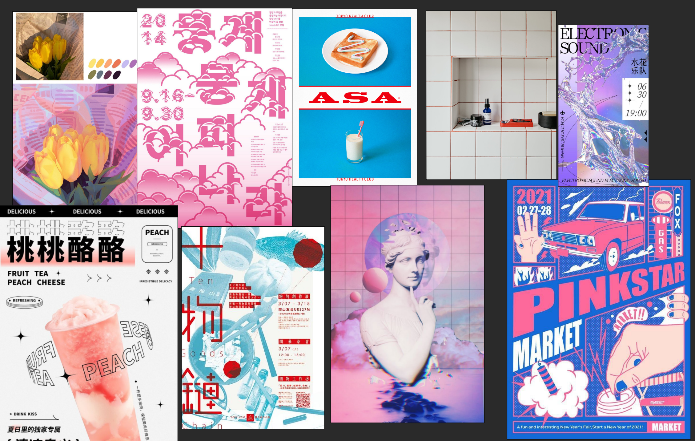
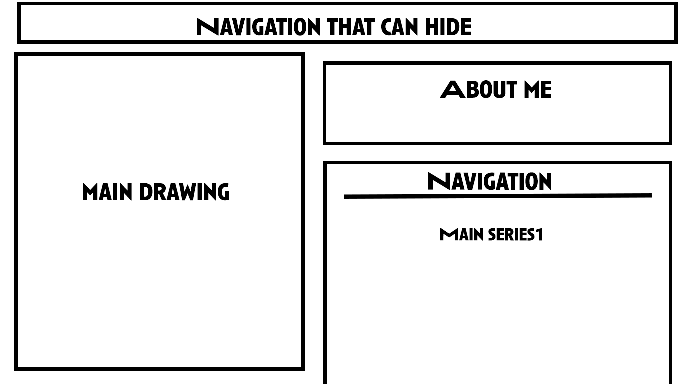
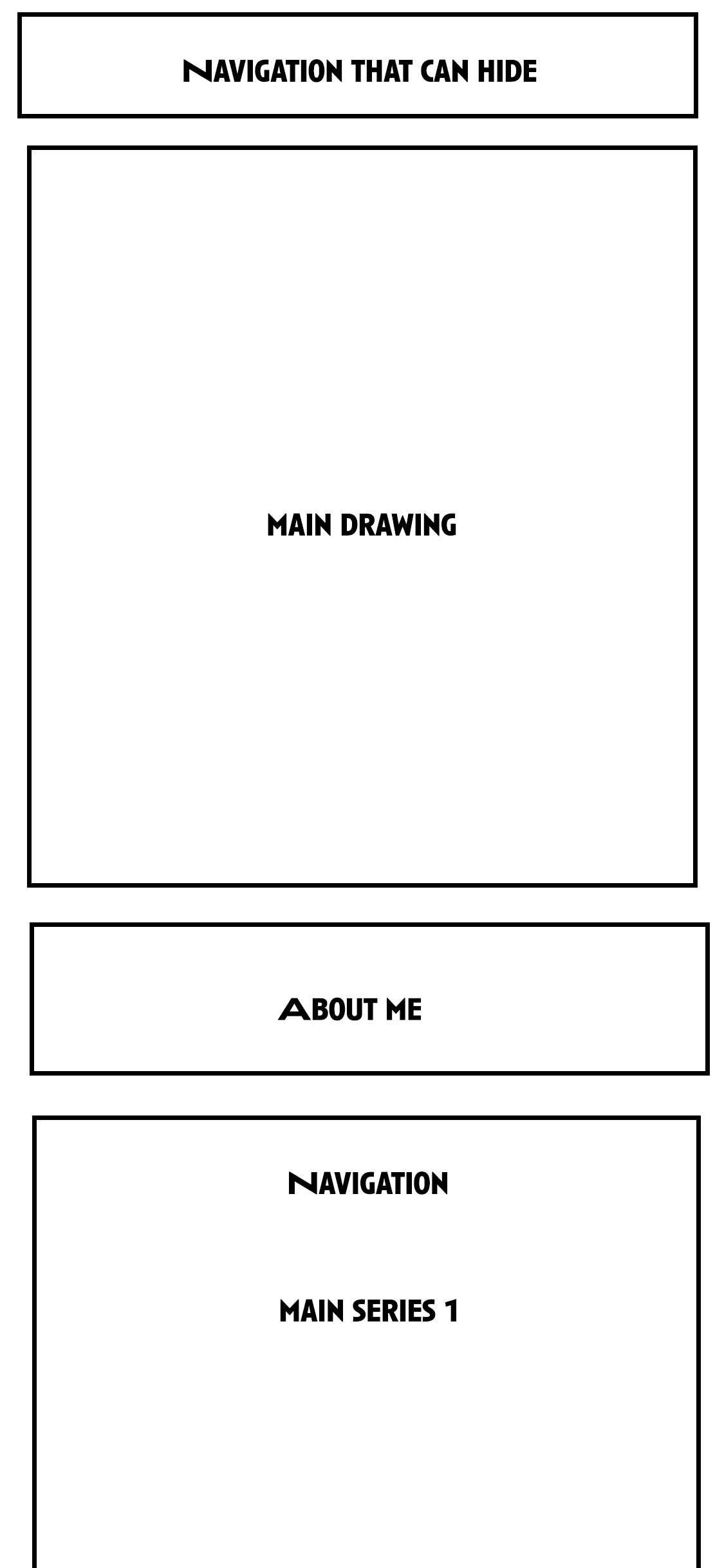
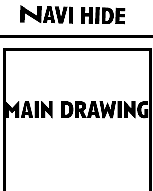
Overall, the websites try to reflect the type of artworks the illustrators offer, with minimum information on the page to allow clients to focus on works. It’s important to have a gallery of artworks, and details once the clients click on the work. People sometimes made different sections for different types of works, others all in one section. This really depends on whether the artist wants to offer a variety of styles or not. The colors and typefaces really matter in terms of illustration portfolios, as it can well reflect the atmosphere of artworks.